The mainstream narrative concerning England’s national lockdowns is that each one arrested a steep upward trend in daily infections that would have otherwise continued unabated. Infections were rising; we had a lockdown; and infections started falling.
However, there are several reasons to doubt this narrative. To begin with, the international evidence suggests the impact of lockdowns on COVID-19 outcomes was marginal at best. They only ‘worked’ – in the sense of halting a nascent epidemic – in a small number of geographically peripheral Western countries, like Australia and New Zealand.
Next, the statistician Simon Wood crunched the numbers on the three English lockdowns, and found that infections were already declining before each one was introduced. His analysis is consistent with the time-course of infections reconstructed by researchers on the REACT antibody survey.
What’s more, the economist David Paton identified seven separate indicators, each showing that infections peaked before the third English lockdown. Indeed, lockdowns are often imposed around the peak of the curve, as governments come under increasing pressure to ‘do something’ about rising case numbers. (Back in July, Chris Whitty told MPs the epidemic was probably already in retreat when the first full lockdown was imposed.)
The way lockdowns are assumed to work is by reducing the number of interactions that result in viral transmission. However, distinguishing their impact from that of voluntary changes in behaviour is no easy feat (see my recent interview with Philippe Lemoine).
What’s more, since transmission is driven by ‘superspreaders’ (those few individuals who account for a disproportionate share of infections), the relationship between interactions and infections isn’t necessarily linear. For example, reducing interactions by 50% may reduce infections by much less than 50%.
Rather than trying to tease out the effect of lockdowns on infections, one can look at their impact on mobility. If lockdowns are what account for the curves peaking and then falling, one would expect to see sudden declines in mobility just after lockdowns are introduced. And you’d expect these declines to be sustained until case numbers had come down substantially.
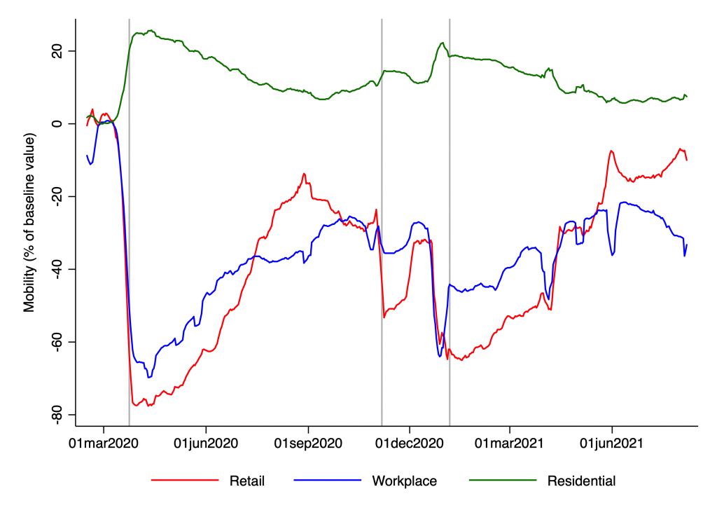
Is that what we see? We know from the Google mobility index that there was a rapid decline in mobility during March of 2020, though that decline began seven to 10 days before the first lockdown commenced (on March 24th). This is shown in the chart below:

Retail mobility fell at the start of the second lockdown, rose slightly at the end, and unsurprisingly plunged on Christmas day, and then again on New Years Day. (This zig-zag is somewhat obscured on the chart because I used seven-day moving averages.) Though retail mobility remained low in early January, there was no sharp decline at the start of the third lockdown.
Residential mobility is more-or-less the mirror image of workplace mobility, so it will suffice to describe the latter. The index fell during the second lockdown, though by nowhere near the same amount as before the first. It then plunged over the festive period, before dropping slightly at the start of January’s lockdown.
Of the three lockdowns, the second had the clearest impact on mobility. Though discerning the impact of the third is difficult, as parts of England were already under quite heavy restrictions, owing to the Tier system. And one could argue that it exerted an effect by keeping mobility low, rather by causing it to fall further.
On the other hand, average mobility between December 24th and January 1st was actually lower than it had been during the second lockdown. Of course, there is the added complication of household mixing around Christmas and New Year, which isn’t captured by indices of overall mobility.
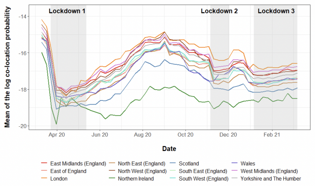
In an unpublished paper, Harry Shepherd and colleagues were able to quantify mobility in a novel way, using Facebook data. They computed the average co-location probability for each U.K. region. This is the average probability that a user whose home location is in that region spends at least one-minute in the same “level 16 Bing tile” (a small unit of area) as another user from a different home location.
They then plotted these average co-location probabilities over time, as shown in the chart below. Interestingly, the overall pattern is very similar to the chart above.

There was a dramatic decline in co-location probabilities in March, which largely preceded the first lockdown. There was a small decline during the second lockdown, and then another small decline during the third lockdown. (Note that the authors seem to have mislabelled the third lockdown, which began somewhat earlier than their shading indicates.)
Looking at both charts, it’s clear that mobility remained substantially below the baseline throughout 2020 and the first part of 2021, even during periods with relatively few restrictions in place. This suggests an important role for voluntary changes in behaviour.
There were declines in mobility associated with the lockdowns, but it’s not clear that these had a large, independent effect on the epidemic’s trajectory. March’s steep decline largely preceded Lockdown 1.0, whereas the declines in November and January were much less pronounced.
While lockdown-induced declines in mobility might have caused infections to fall slightly faster than otherwise, it’s difficult to see how they could have single-handedly turned a rising curve into a falling curve. The pace and timing of various events was, I suspect, driven mostly by voluntary changes in behaviour and the build-up of immunity in the population.


To join in with the discussion please make a donation to The Daily Sceptic.
Profanity and abuse will be removed and may lead to a permanent ban.
I don’t see the point of such articles. We can pontificate as much as we like about bloody C1984 but it is utterly irrelevant. C1984 is simply one of the covers for depopulation and Reset.
Next up will be Climate lockdowns, restrictions on travel – except for the elites of course – and further punitive restrictions designed to destroy societies and like the reaction to the so called PANDEMIC they will be global.
C1984 was simply phase one of the Reset. Phase two is coming, just wait for the Glasgow shindig.
Drop the covid narrative and see what is really going on. The current lull is simply the calm before the storm.
Too many are still fast asleep, plain bloody stupid or both.
100%
1000%
This needs a graph.
Yup! Restrictions on travel!
News from the US…
“Democrats have introduced a piece of legislation in Congress that would ban any American who did not get a Covid-19 vaccine from all air travel, with no exceptions”
https://dailyexpose.co.uk/2021/08/20/democrats-want-to-put-all-unvaccinated-people-on-the-terrorist-no-fly-list-and-permanently-ban-them-from-all-air-travel/
I have no doubt it will happen here too which confirms it has nothing to do with any virus, it is links to the Climate Agenda.
Democrats 😅
Great interview with tennis legend Pat Cash, he gets it!
https://www.youtube.com/watch?v=2qVrepch-f8&t=1s
Watch it before it gets zapped by the blob
Brilliant interview, this is what I thought all Aussies would be like. Thanks for pointing it out.
“ What’s more, since transmission is driven by ‘superspreaders’”
However well intentioned these pieces are, I can’t take them seriously as soon as they regurgitate something like this. The article cited as evidence in Nature is pure bunkum. There’s never any evidence about who infects whom. And it’s just used as justification for masks and for preventing people from talking to each other – particularly those who commit the crime of being “gregarious”.
“Two things are infinite: the universe and human stupidity; and I’m not sure about the universe.” (Albert Einstein)
Useful information, resources and links: https://www.LCAHub.org/
Love it! 🤣
In some respects it should not matter whether lockdowns had a significant or a marginal effect on the “R” number. It was the wrong response in the first place and happened only because the world panicked. It reflects badly on the quality of global leadership. They all seem to think and act in a similar way. This is a slippery slope and we can soon expect more of the same.
Yet the null hypothesis is that the virus rises, peaks and declines of its own accord, without any human input, which is what they always do.
If nothing else, the Plandemic has proved we have a ineffective government who left all decision making to academics who are linked to B & MG and to the Communist Party.
There is no epidemic, there never was an epidemic, in fact if you all turned off your TVs and radios you would not have known about it.
Here’s a question we all know the answer to. How much did lockdown affect UK nobility? Not at all. Not one iota. Not remotely.
That is all the rest of us need to know about this confected global shitshow.