Has Europe seen two mortality peaks or three? According to many news outlets, the continent experienced a deadly third wave of COVID-19 during the spring of 2021.
“Europe is enduring a grim spring,” said an FT article dated 4th April. “COVID-19 infections, hospitalisations and deaths are rising in many countries,” it goes on to claim. The article presents data suggesting that March saw elevated COVID-19 death rates in a number of European countries.
This characterisation is borne out by Our World in Data’s chart of the daily number of confirmed COVID-19 deaths for the European Union – which is shown below. (The chart for Europe as a whole is highly similar.)
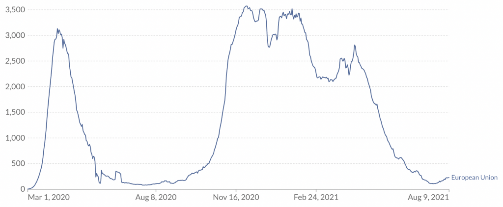
According to the chart, there was a peak of mortality in the spring of 2020, corresponding to the first wave (which afflicted countries such as Italy, Spain and the U.K). Then there was another peak of mortality in the winter, corresponding to the second wave (when countries such as Poland, Czechia and Hungary were also afflicted).
And the chart indicates there was an additional peak of mortality in the spring of 2021, corresponding to the third wave. This peak is lower than the first two, but still quite considerable. On April 13th, there were more than 2,800 COVID-19 deaths in Europe (compared to just under 3,600 at the peak of the second wave).
Yet as I’ve noted repeatedly, “confirmed COVID-19 deaths” can be misleading, since some of the people who die of COVID-19 (either shortly after a positive test, or with COVID-19 on the death certificate) would have died anyway. Excess mortality provides a far better gauge of the pandemic’s impact.
Estimates of excess mortality for 26 European countries are provided by researchers at EuroMOMO. The chart below plots excess mortality z-scores (numbers of standard deviations above or below the average) from week 1 of 2020 to week 27 of 2021. I’ve omitted the last three weeks of data, as these are subject to revision.
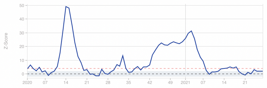
The first and second wave peaks are clearly visible: the former can be seen at week 14 of 2020, and the latter at week 3 of 2021. By comparison, the peak of the third wave (at week 16 of 2021) is barely noticeable.
It does technically rise above the red line, which the researchers oddly classify as a “substantial increase”. However, increases of this magnitude are seen every few months going all the way back to 2017. Hence the third peak cannot be regarded as a major epidemic wave.
Part of the difference between the two charts may be due to the composition of countries. For example, EuroMOMO does not cover Poland, Romania or Czechia. Having said that, the countries it does include make up the vast majority of Europe’s population, so this probably can’t account for much.
The EuroMOMO analysis indicates that Europe has seen two mortality peaks, not three. In terms of excess mortality, the third wave was just a blip.


To join in with the discussion please make a donation to The Daily Sceptic.
Profanity and abuse will be removed and may lead to a permanent ban.
Thank you, and yes, EuroMOMO is a great resource, and it’s especially fascinating to compare the various UK regions – specifically for Wales and Northern Ireland, it’s a question of “Pandemic? What pandemic?”, and Scotchland, despite Greet Leader Nicola’s ongoing shrieking and wailing, got it much lighter than England as well.
You won’t see it cited much, because it tends not to produce alarming headline figures, or flatly contradicts the doom-mongering narratives.
euromomo is good but could be better by getting rid of the ludicrous Z-score and just sticking with overall mortality
By my fuzzy understanding of z-scores, they’re intended to focus on significant excess mortality, without producing big headlines every time a couple of people drop death with-not-from the plague of the day.
I could very well be wrong, but “overall mortality” needs to be scaled by population at a minimum, and age as well unless we want to assume that everyone will live forever.
Which is actually the implicit position of the “Just until nobody dies again, ever” Branch Covidians.
“overall mortality” needs to be scaled by population “
which it essentially is if you are looking at a graph
the best would be to show overall mortality over a decent number of years. your brain can scale whether it is ‘excess’ or not
z- score is a function of standard deviation. ie if you have spikes every year then this year doesn’t look too bad
Euromomo does top graphs here properly
https://euromomo.eu/graphs-and-maps/
but then defaults to Z score for the countries
I think that is the point. There are always spikes, some years more severe than ‘covid’ ones. So the z-scores with all their failings do at least try to demonstrate that.
Indeed, and the Z score for the short sharp spike in deaths around 2020 week 15 was high because that was so unusual.
The Z score for the winter 2020/2021 mortalities is lower because while there were actually more excess deaths over that period than earlier in 2020, that’s not unusual – 2017 and 2018 were both bad winter years as well.
So I like it as a simple metric for answering the boolean question “is anything significant happening?”
Hmm. So we can see that 2017 and 2019 were both bad years, 2019 wasn’t, then 2020 had that short, sharp spike around week 15, and a slightly worse than usual winter excess.
As I understand it, the z score attempts to put that in context, so that you don’t have to look back at 2017/2018 (and who will?) to understand that 2020 and 2021 weren’t actually that bad, in context.
This is particularly useful because Downing and Fleet Streets are only going to focus on selling up the current crisis, and it’s nice to have a current contextualised metric to refute that with.
Our lives are being destroyed by blips
Nero Johnson and the abandoning of ethics By Mark Pickles
https://www.conservativewoman.co.uk/nero-johnson-and-the-abandoning-of-ethics/
Stand in South Hill Park Bracknell every Sunday from 10am meet fellow anti lockdown freedom lovers, keep yourself sane, make new friends and have a laugh.
Join our Stand in the Park – Bracknell – Telegram Group
http://t.me/astandintheparkbracknell
yes. there were 2 waves in europe. spring 2020 and winter 2020/2021
spring 2020 was funny timing but in extent similar to normal winters in recent years and the winter that had just gone had not seen a peak
winter 2020/21 was probably double a normal winter
first graph here for context
https://euromomo.eu/graphs-and-maps/
Indeed, that’s important to bear in mind 2019 was a very mild year for weather and seasonal nasties, so – being harsh but honest – it left a lot of coffin dodgers hanging on to be cleaned up in 2020.
As posted previously, we wouldn’t have noticed this summer’s “wave” if we weren’t obsessively hunting for covid:
“It is crystal clear.
The UK Delta wave is endemic.
[Endemic = case wave, no significant mortality wave, no excess deaths.]
We would not have noticed it in normal times.
All family members create such common cold waves.”
https://twitter.com/prof_shahar/status/1420081080569274376
The more interesting question, given the current political issues, is to what extent can the vaccines be given credit for reducing mortality?
“what extent can the vaccines be given credit for reducing mortality?”
interesting question
we have obsessive testing, a new variant and the middle of summer
we need the IFR for vacc and unvacc in age bands
Yes, and also some idea of the general state of health of vacc and unvacc
No-one in power is remotely interested in an honest investigation into true real-world vaccine efficacy
No-one in power is remotely interested in an honest investigation into true real-world vaccine efficacy
Investigating fake vaccines to quell a fake pandemic, no they are not going to do that. The “vaccines” have a much bigger job to do.
If we lived on Mars we would see nothing. Not because the virus isn’t there, but because across a 24 month year…. nothing happened. Very low deaths were followed by slightly higher deaths, then very low deaths again.
You should know that Euromomo scaling is fundamentally flawed, using a modeller’s ‘excess deaths’ as the baseline for each country.
A pity, because the underlying data is good.
Of course there was no ‘third wave’! What true rationalist thought there was?
Can you expand a bit on what’s flawed, and what they should be doing instead?
Two flaws : the notion of ‘excess mortalty’ and the definition by z-scores. The assumption is that there is a ‘normal’ level of morality when there are always large fluctuations.
Steve-z has touched on this earlier. Much better to stick to simple population-corrected proportions.
Read the Euromomo definitions to see how their calculations are unecessarily complicated. Also note how some basic comparisons in this system just don’t figure.
As I replied earlier, Rick, I don’t disagree that there are flaws with the z-scores. But they do attempt to take into account the fact that there are always spikes in the data series. Their ‘normal’ takes this into account, which is why often when the politicians/health services were shouting about terrible strains on beds etc, you could inspect the z-charts and see the line was at least on SD below normal. Which clearly showed there was absolutely nothing out of the ordinary going on and it was all hot air.
They serve a limited but useful purpose, and as far as I can tell have not been ‘messaged’ unduely.
That’s my understanding, that z-scores take into account that mortality is spiky, and so smooth out the alarmism a bit when we get a tranche of sudden deaths, because it’s not that unusual.
I take steve_z’s point that we can just look back at the raw (or scaled by population) graph for 2017 and 2018 and see that those were also “bad” years, and that 2019 wasn’t, in order to put 2020/2021 into context.
The problem is that our establishment alarmists won’t do that, and certainly won’t encourage us to do it, so a z-score does it for them.
Unnecessarily complicated pretty much sums up anything to do with the pandemic in particular and bureaucracy in general.
What is fundamentally flawed about a rolling poisson regression that includes seasonality? One could just use a data driven approach, as the ONS does, to set a reference range based on the previous five years data for the same week. The Z-score is a reasonable comparator across all countries since it’s reference is the individual country’s variability. Absolute numbers or numbers per capita are also valid, but don’t work as a within-country identifier of an outlier event. Four standard deviations is rare. Forty is unprecedented.
Apologies, I missed the chance to edit my post. Here’s the UK regions, to compare and contrast. You might well ask why the SNP are still squealing like burst bagpipes, and why Northern Ireland and Wales ever took any notice or actions at all.
At what point does the repetition of the theme ‘YOU’RE BEING LIED TO’ become somewhat tedious?
The PCR test by Drosten was and is a fraud, and is the quicksand upon which this nonsense was built. Plus the myth of asymptomatic transmission. The Twin Towers of Covid.
That is really all one needs to know, apart from the failure of the MSM to discuss very much at all, most especially the hideous level of vaccine injury, and failure of the vaccine to achieve very much at all in terms of health.
This site is being reabsorbed into the belly of the beast at quite a rate.
Still, what about the football last night?
Apparently an MP has mouthed-off saying anyone who wants to work from home should take a pay cut. This is how it always starts – one unknown MP says something deemed controversial and is dismissed by the government. Further down the road, it becomes government policy and is promoted by the MSM.
Ordinarily, I would prefer to work in the office – I was loath to work from home at the start of the shit storm. But it is now increasingly difficult for me to work in the office without coercion, without being made to test myself, without being medically discriminated and bullied.
I read yesterday that US employers will start enforcing a medical insurance surcharge on those who refuse the fake vaccine. Everything that happens there happens here.
So we’re looking at being forced to go back to the office or take a pay cut. Then we’re likely looking at being charged a penalty for not being jabbed.
I said early that the first of these is a given. Followed quite quickly by off-shoring as much as possible to low cost areas. Those thinking working from home on well paid salaries is like manna from heaven are just not thinking.
US along with many health services is based on insurances , not free at point of delivery for all. Its relatively easy to introduce an extra premium for non-vaxed , as they do already for smokers. However in the UK system it would have to be taxation/NI based, a lot more difficult.
It’s always the same- everyone thinks they’re OK despite obvious warning signs, until suddenly they’re not. Think back to such as BHS closing- anyone who spent 5 minutes in one of their stores could have predicted it’s demise, (more staff than customers, dreary shops with nothing changing, enormous overheads, etc.), yet everyone was shocked when it happened. Now we have fairly well paid office workers thinking that for some reason companies will continue to pay them and the associated costs when they can get the same job done for much less by making remote working even more remote. It must occur to them surely? All they have to do is ask themselves what they would do if it was their money they were saving and they were responsible for costs/ overheads.
I’ve been told that my office looks forward to welcoming back double-jabbed drones who will be hot-desking, in isolation, and masked in all corridors and common areas.
The question of “Why on earth would I want to commute in order to do that when I have a perfectly good desk at home and don’t have to wear a muzzle every time I go to get a beverage?” remains unanswered.
Also why would you want to spend any time, let alone 8-9 hours, in the company of such people? A sure fire way to suicidal tendencies, surely?
An MP mouthed off?
Most of those lazy bastards worked from home for at least the first twelve months. Some haven’t worked since the Scamdemic started.
Don’t forget they collected a ten grand Brucie Bonus for the privilege.
Hard faced twats.
Without the excessive testing and without the vaccines and lockdowns, I firmly believe we would have seen little excess mortality since June 2020.
There was a modest increase in excess mortality in autumn 2020 but that was starting to reduce before a spike which coincided with the vaccines being rolled out to the most vulnerable in January 2021.
I firmly believe this kicked a lot of frail elderly people over the edge a few months earlier than would otherwise have happened, resulting in the largely negative excess mortality we have seen since March.
The figures in the graph clearly cover all causes mortality, not just COVID, and it is likely that the peak in early 2021 also includes numerous deaths caused by lockdown and its impact on NHS care of non-COVID patients.
You also see there the blip in weeks 2/3 of january 2020, which I have been talking about since march 2020, but no one else has….. THIS, I believe, was the first wave – a Heathrow wave. First contacts of incoming christmas traffic. Which means the virus was here and killing much earlier than the media accepts.
Many people I know who have either been ill, lost loved ones or been involved with large organizations says exactly the same.
It looks as though most of the excess deaths around week 17 are in Ukraine and Hungary, less affected in spring 2020, and a little in France and Italy.
Excess deaths by age group in EuroMOMO as a whole are also interesting. Hard to see anything beyond ‘noise’ until >45s, so the infections in the young scaremongering didn’t amount to much. There is a surge in excess deaths about week 17 in 45-64 and 45-74s, but little substantial in 75-84s or >65s as a whole. In >85s, the ‘surge’ looks like it’s bringing a want of deaths nearer to the baseline.
Is this because the would-be deceased in >65s and, especially, >85s have already succumbed in earlier waves? Could this apply to susceptibility to infection?
Could the age differential in infections in the young in the spring and early summer be shifting relative risk away from the old and vulnerable as arguments that lockdowns increase relative risk to the poor and vulnerable seem to indicate?
Or, could it be because older age ranges were vaccinated earliest…..?
its the terribly phrased ‘dry tinder’ effect. Which explains much of the timing of the curves. The winter of 2019/20 was a very mild flu season, fewer deaths, so when covid hit, there was a lot of ‘dry tinder’ . of course moving ill people from hospitals to care homes caused a large proportion as well. Now not so much ‘dry tinder’ so the older age group represents less deaths, which changes the proprtions of deaths by age group. Most media fear-mongering about more younger people in ICUs etc is rubbish, the absolute numbers haven’t increased, just the proprtion of the total as the deaths in the higher age groups have declined.
Its also probably not much to do with vaccines, just reduction in ‘dry tinder’.
Our lives are being destroyed by blips
Nero Johnson and the abandoning of ethics By Mark Pickles
https://www.conservativewoman.co.uk/nero-johnson-and-the-abandoning-of-ethics/
Stand in South Hill Park Bracknell every Sunday from 10am meet fellow anti lockdown freedom lovers, keep yourself sane, make new friends and have a laugh.
Join our Stand in the Park – Bracknell – Telegram Group
http://t.me/astandintheparkbracknell