There follows a guest post from our in-house doctor, formally a senior medic in the NHS, analysing the latest NHS England data packet.
Once a month, the NHS releases a more detailed summary of COVID-19 related data than provided in the regular daily updates. Although the data set is far from complete, the monthly packets provide a better impression of what is really happening in hospitals than the daily snapshot. I find this month’s information particularly interesting. Apologies in advance to readers for reverting to a more data-driven ‘chart fest’ format for my latest contribution – but stick with it, because there are some important messages here which have not been widely reported so far.
Take a look at Graph One. This rather complicated graphic shows daily admissions in the vertical orange bars and paired daily discharges in the vertical blue bars. Readers will notice that on every day between April 7th and June 30th, there were more discharges than admissions.
The grey line with the secondary y-axis to the right of the chart shows the total number of ‘COVID-19’ patients in hospital on each given day. For the first period from April 7th to May 25th, this was on a falling trend – that’s what one would expect if there were more discharges than admissions each day.
From May 26th to the end of June, however, the total number of patients in hospital ‘with COVID-19’ was on an upward trend – but on each day of the series, there were still more discharges than admissions. How can that be?
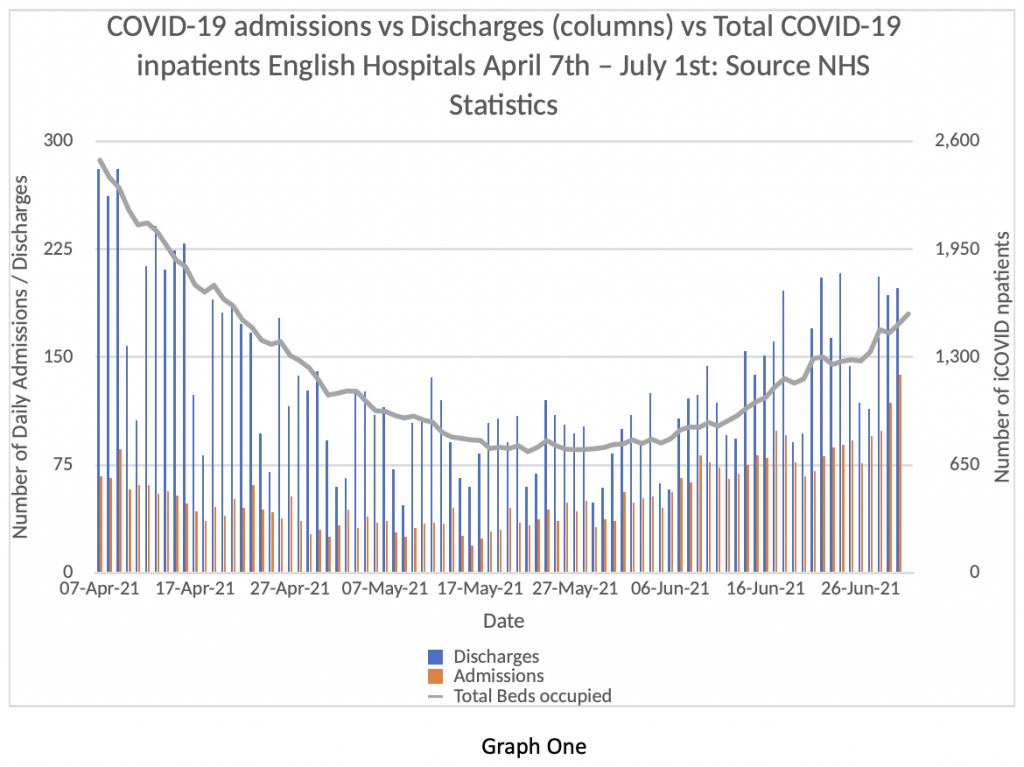
I’ve discussed this issue with colleagues and there are only three interpretations we can think of. One is that there are a very large number of patients contracting COVID-19 in hospital who came into hospital without the virus. The second is that some of the ‘discharges’ are in fact patients who were never admitted to hospital at all, but seen in A&E and then sent home. The other is that the data quality is very poor and gives a misleading impression of the true picture.
If the first proposition (a high rate of in-hospital infections) is true, that’s pretty alarming and needs explaining by the NHS. If the second is true – that a high percentage of COVID-19 patients are sent home from A&E – then it should be made clear to the public that the vast majority of patients attending hospital with COVID-19 aren’t even ill enough to warrant admission. If the data is in fact of such low quality as to be uninterpretable, that’s an unacceptable state of affairs at this stage in the process.
I incline to the second explanation – that the majority of discharges are people being sent home after an A&E visit. Figures released today by Public Health England show that only 30% of patients visiting hospitals need to be admitted. That’s the first time I’ve seen this acknowledged, but the NHS must have known about it for months.
Given the continued restrictions on citizen’s rights, the State should be able to provide accurate and detailed information to justify the continued deprivation of liberty. I will return to this point later.
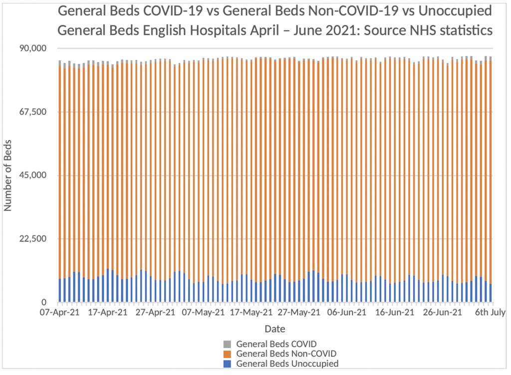
Next, consider Graph Two. We have heard much in the media about the unprecedented pressure the NHS is under with COVID-19 and how worrying it is when cases continue to rise with the Delta variant. Graph Two shows how much pressure the NHS is under with COVID-19 admissions up to July 6th.
The orange vertical bars that make up the majority of this graph represent the patients in English Hospitals who have NOT tested positive for COVID-19. The Blue bars represent the number of empty beds in the system. The grey bars represent the number of patients in hospital who are COVID-19 positive.
Can you see the grey bars? It’s really quite difficult because they are on top of the orange bars and represent about 1.5% of the total beds available in English Hospitals. At present, we have about 8% of bed capacity spare. Readers can draw their own conclusions about the current “pressure on the NHS from COVID-19” from this graphic. I re-emphasise, these are the official NHS figures released on Thursday July 8th – I am not making this stuff up.
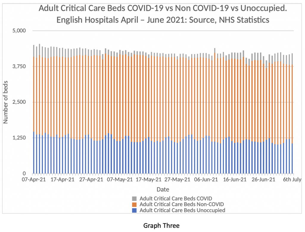
Now consider Graph Three. It’s a similar comparison looking at critical care beds rather than general bed occupancy. Same colour scheme. Blue = spare beds, orange = Non COVID-19 patients, and Grey = COVID-19 patients in critical care. The grey bars are a bit more visible in this graph. For clarity, on July 6th there were 388 COVID-19 patients in critical care in English Hospitals (9%). There were 1,060 spare beds (25%) and 2,761 non COVID-19 patients (66%). That’s a bit more of a strain on the system, but by no means beyond the capacity of the system to cope. Further, when the regional analysis is examined, it is clear that the majority of the burden lies in the North-West and Yorkshire. Leeds in particular has come under strain in the last week and this has been widely reported in the press. However, the situation in Leeds is by no means replicated across the English NHS as a whole – the July 8th data packet shows those areas are outliers and most regions have very low levels of COVID-19 pressure both on general beds and critical care. The PHE figures reveal that of the 1,904 people admitted to hospital in this period, 1,557 (82%) were unvaccinated or had only had one dose. Just 4% of cases had been fully vaccinated with a two-week gap for the effect of full immunity to develop.
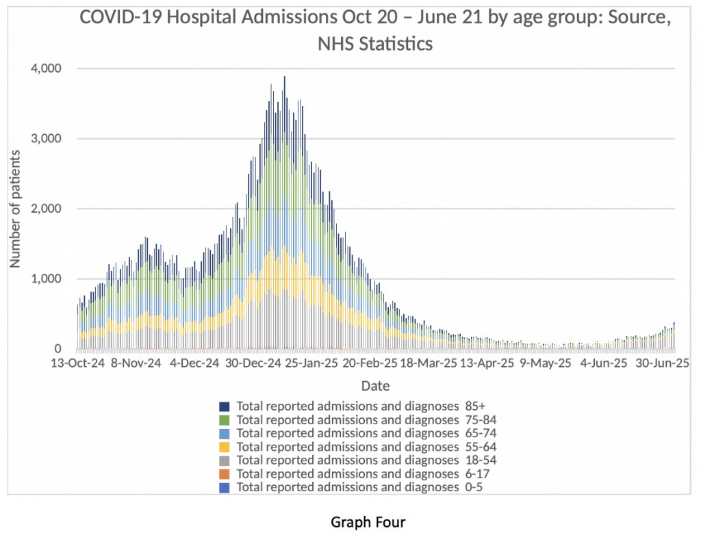
Let’s have a look at Graph Four next. It shows the age breakdown of COVID-19 inpatients from October 2020 to the beginning of July 2021. Quite a ‘busy’ graph, so I will explain. Look at the winter peak, which is obvious. A big spike in dark blue, green, light blue and yellow bands. Those are all patients in the age bracket 55-85+.
Now look at the extreme right-hand side of the graph. That’s the current situation. Very few admissions for the over-55s. What that translates into is shorter lengths of stay in hospital, less demand on critical care, and very few deaths as a result of COVID-19.
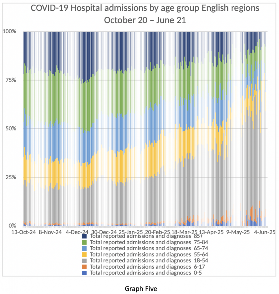
Graph Five shows the same data in a slightly different way – age bands of admitted patients as percentages over the same time period. The same point is quite obvious. Older patients who are more likely to be very ill and far more likely to die are being admitted in fewer numbers than in the winter or last spring. Younger patients have milder illness, spend less time in hospital and are very unlikely to die from COVID-19. Further comment is not required.
Finally, I invite readers to consider Graph Six. This graph looks at people taking time off work from their NHS jobs between April 7th and June 30th. The blue bars represent people taking time off due to COVID-19 related absence – that means either showing symptoms of COVID-19 themselves or having come into contact with someone with a positive COVID-19 test. The orange bars represent people taking a day off from their NHS work for non-COVID-19 related reasons.
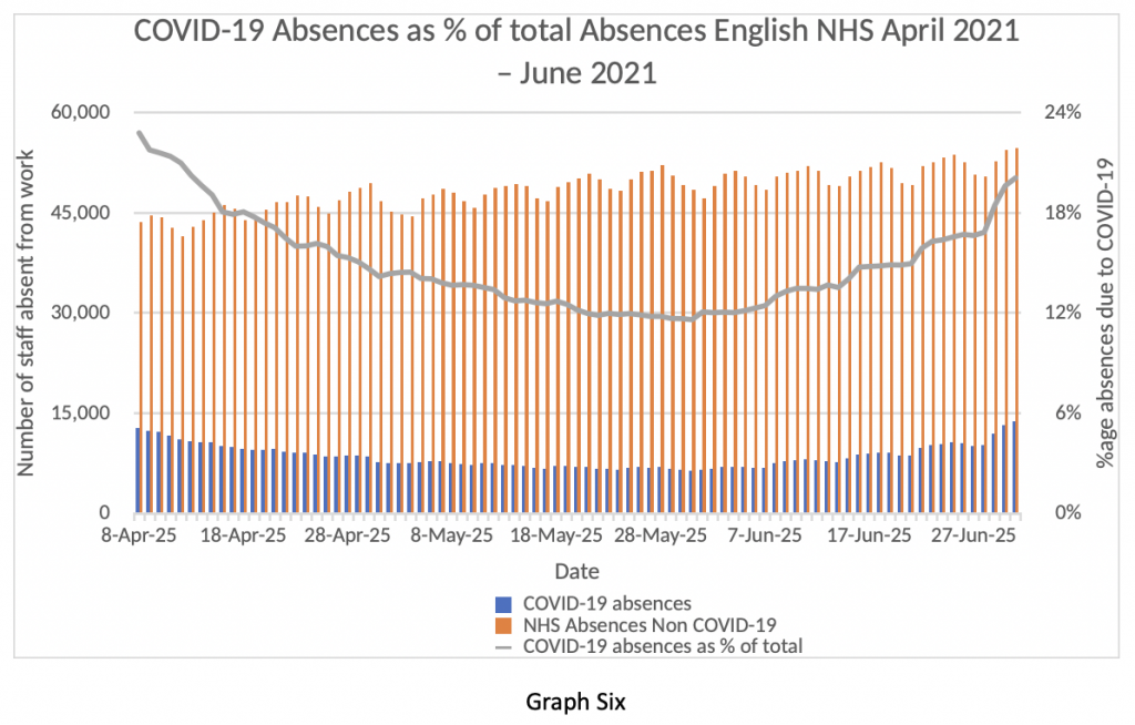
My first observation is that about 50,000 people per day are absent from their jobs in the NHS – that’s about 4% of the total workforce absent every day because of illness – in the middle of summer. Twenty per cent of those absences are “because of COVID-19” – although, actually, they are not “because of COVID-19”. The vast majority of NHS staff are fully vaccinated – so the vast majority of these absences are caused by the Test and Trace rules, not by actual Covid infections.
As I write, the papers are reporting that NHS employees are about to be made exempt from self-isolating if identified as coming into contact with a positive ‘case’. How can the government justify this, while maintaining restrictions for other citizens?
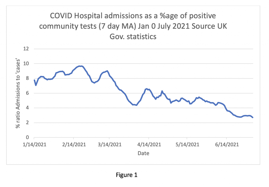
My overall impression of the current data so far is that the ‘Third Wave’ of COVID-19 is much less of a problem than the first two waves. The ratio of admissions to positive tests has fallen from nearly 10% in February to lower than 3% currently (see Figure One below). The vast majority of positive tests are asymptomatic. The symptomatic cases are milder and the majority of patients attending hospital are sent home from A&E. Those admitted have shorter lengths of stay, fewer people need intensive care and deaths are infrequent.
Yet everywhere in the media, warnings of imminent catastrophe from experts on various Government bodies continue to be broadcast. Why?
Am I wrong in my assessment? Is there crucial information I’ve overlooked? Are we about to be suddenly and unexpectedly overwhelmed by a new scary variant with teeth and claws? I’ve been in clinical medicine long enough to know that surprises happen from time to time, but, usually, if all the objective information points one way, then the direction of travel is pretty obvious.
So, what is really going on? Much ink has been spilled hypothesising about the Government’s hidden agenda, as well as that of their advisors, and these theories will be familiar to readers already.
The fundamental problem is the relationship between the NHS, the public and our elected representatives. If the public is encouraged to venerate a taxpayer-funded institution to the extent that it becomes immune to criticism and unresponsive to change, eventually that organisation will become a law unto itself. Elected representatives will be incapable of controlling it. In effect, it becomes a “state within a state”, hungry for an ever-greater share of national resources, resistant to attempts at reform, and keen to exert control over the population.
Contrary to the often-repeated assertion that the U.K. spends less per capita on health than any other European country, when private-sector figures are added in, we spend about the same as our continental neighbours, which all have “mixed health economies”.
The starkest measurable difference between the NHS and our peers in developed countries is in health outcomes – consistently at the bottom of league tables in waiting times, cancer outcomes and other critical areas. The domain in which we really stand out is remuneration – doctors pay in the U.K. is higher than most other European nations. In short, the British taxpayer gets very poor value from a monopolistic state-run healthcare provider. Why is anyone surprised?
NHS talking heads are already changing the narrative, now focusing on waiting lists, the spectre of “long Covid” and a resurgence of familiar respiratory pathogens like influenza to justify extended coronavirus restrictions. I expect the Government to be bounced into reimposing curbs on liberty in the autumn to protect a failing institution that has, objectively, performed poorly and continues to perform poorly in a time of crisis.
It may seem remarkable to Lockdown Sceptics readers, but, to paraphrase Professor Ferguson, I also expect the NHS to keep on getting away with it.





To join in with the discussion please make a donation to The Daily Sceptic.
Profanity and abuse will be removed and may lead to a permanent ban.
The virus is real but the measures taken are one big scam promoted by the MSM who like big Pharma have been willing recipients of the largesse from government and the Gates Foundation. The government have been far too cocky and will be getting their comeuppance. Football and July 19th will ensure that the people have taken control of their lives again.
Everything except the last sentence.
And the first sentence.
Except that following the match tomorrow there’s going to be a catastrophic rise in cases which will mean the 19th will be postponed (my inner cynic is showing)
The papers are already bleating about a “worrying” rise in cases.
Doctors Say NO to Medical Tyranny – Dr. Roger Hodkinson, an outspoken Canadian pathologist and the doctor who took on BIG TOBACCO, now leading DOCTORS SAY NO to COVID tyranny, and Dr. Michael Yeadon, former Senior VP for Pfizer as Chief Scientist for the worldwide Respiratory and Allergic Disease Unit, now bringing critical medical information on COVID Vaccine risks to help save lives.
https://americaoutloud.com/doctors-say-no-to-medical-tyranny/
Stand in South Hill Park Bracknell every Sunday from 10am meet fellow lockdown sceptics, keep yourself sane, make new friends and have a laugh.
Join our Stand in the Park – Bracknell – Telegram Group
http://t.me/astandintheparkbracknell
The virus is not real.
The cartoon expresses it nicely.
Zuby’s twitter thread explains everything else.
“The vast majority of positive tests are asymptomatic.“
This is one of the main foundations of the Covid myths.
Not asymptomatic
They are false positives
or cold positives.. just viral fragments being found in people long since recovered ! OR even just immune!! Fancy that – our immune systems working. TESTING should STOP. Unless it is taking blood to find antibodies for people in hospital with a respiratory illness for the purposes of ruling out misdiagnosis of COVID!
“The PHE figures reveal that of 1,904 people admitted to hospital, 1,557 (82%) were unvaccinated or had only had one vaccine dose. Just four per cent of cases had been fully vaccinated with a two-week gap for the effect of full immunity to develop.“
I presume this sentence refers to people testing positive for covid. However, aren’t the NHS supposed to be distinguishing between people in hospital “because of covid” from those “with covid” but being treated for something else? And do we know if they’re running the PCR test at the same number of cycles for vaccinated and unvaccinated? It makes no sense that far more unvaccinated young people would be in hospital ill “from covid” than vaccinated elderly, given how we’re being told young people should get vaccinated precisely because the vaccination doesn’t protect the elderly so well. Personally I don’t trust these vaccinated vs unvaccinated figures at all. It’s just more spin to try to persuade the unvaccinated to get injected with the experimental shit.
Otherwise, good article!
Yes, the NHS have been told that it must distinguish between those being admitted to hospital with symptoms, having tested positive for the virus and those who are admitted for something else and then test positive whilst in hospital.
The local paper-headline “Covid deaths and admissions rise after Indian (tut, tut) variant surge”, has just reported a statement from the CEO of our local hospital (a major trauma hub).
She says that “We are now seeing an increase in the number of patients coming through our door. As of Monday, we had 16 patients and 5 of those were in critical care. However, what I would say is that not all of those 16 patients were admitted because of Covid or Covid symptoms. Some of them came in with something completely unrelated and were diagnosed as having Covid as well.”
One of the comments below the article refers to the 16 patients and says, “Come on now, there’s few enough of them to easily count. There’s only 16. She doesn’t need a calculator to figure how many are there because of Covid. This isn’t an estimate of an unknown quantity. This is a deliberate concealment of information. So much for transparency in the NHS”
There is no transparency at all. Even the statement “some of them came in with something completely unrelated and were diagnosed as having Covid as well” is completely misleading. A positive PCR test does not constitute a diagnosis. I think what’s worse is that these chief execs and their minions know full well that they are being misleading. They are bought, the lot of them.
If they aren’t stating how many of the 16 came in for something else, it’s a safe bet that it’s a fairly high proportion!
I posted here a couple of days ago that a healthy, clean living acquaintance of mine in his mid forties has just returned home from an IC Unit in Devon after purportedly being admitted for treatment for covid. The timeline was June 27, 28 and 29th he was posting jokey (non pandemic related) memes on his Facebook account, and on 3 July he was posting a smiling, bright eyed and bushy tailed selfie of himself returning home from hospital after “a few days [sic] in IC very ill with covid”.
So in the space of three clear days he not only went down with presumably mild, moderate and serious covid symptoms, was admitted to hospital ICU, treated successfully and allowed home looking glowing, fit and well. Anyone else think that he was admitted to up the numbers of young hospitalised covid patients?
Another LS BTL poster confirmed also that a doctor of his/her acquaintance had said that patients were being admitted who didn’t need to be in hospital and who wouldn’t have been admitted a year ago.
This is undoubtedly happening across the country. The whole thing stinks.
It has always been thus. If you self present with pancreatitis when there are beds chances are they will admit you for IV fluids and anti-bugs. When they are full you will be sent home with oral abx and worsening advice.
Agreed; if you go through the FoI responses from previous day’s – “AG” et al – it is very clear that the DHSC, therefore the NHS, PHE and HMG, know and have committed information into the public domain that PCR/LFT do not detect live SARS COV 2 virus, and need further clinical assessment and testing to say nothing of the extremely high level process of administering, collecting, transportation and assessment of the swabs in perfect lab conditions, to say nothing of the now public admission of the CT rate of an”assessor” of PCR test swabs. IMHO this constitutes crimes against humanity, full stop, and if this is not a criminal act, heaven help us all.
You will be interested to see this Podcast about the vaccinated v unvaccinated situation in the US. Thirty minutes onwards is where this part of the discussion occurs. The evidence suggests (although, they admit, not categorically confirmed) that (a) routine community testing excludes vaccinated people (making statements that ‘more positives are being found in the unvaccinated’ disingenuous), and (b) the PCR cycle threshold for hospitalised vaccinated patients is 28 cycles…and it appears likely that unvaccinated are being tested at the default of 40 cycles minimum.
https://odysee.com/@BretWeinstein:f/EvoLens85:9?r=Yjg42kxyngGqr3f585rKxcR1dx7dEpRR
What a flipping nightmare. No chance of clarity, no chance.
That directive was how they “decoupled” cases and “hospitalisations”. But there’s still a lot of room for manoeuvre in hospitalisation labelling.
“Experimental shit”. Yes this sums it up💕💕
Excellent stuff, as always, thanks.
Struggling with Figure 1, though. Is it messed up or am I just failing to grasp it?
“As I write, the papers are reporting that NHS employees are about to be made exempt from self-isolating if identified as coming into contact with a positive ‘case’. How can the government justify this, while maintaining restrictions for other citizens? “
The lesson of the past 18 months is that rational justification is not needed when fear silences dissent and the institutions supposed to hold government to account – opposition, media, courts etc – collaborate.
Perhaps if you clap long enough for the NHS, you get a couple of days off isolation?
A good dose of clap is good for you, then?
For Graphs Four and Six in particular, I’d be interested to see them extended back to cover the whole of last year as well, to give overall contexts for these recent numbers. (Not part of the topic of this piece, obviously – as further interest.)
This boils down to the basics of Boris’s politics.
Stories matter because people believe them, not because they are true.
We can point out inconsistencies in the beliefs all day long but you have no more chance of changing minds than you have with a Scientologist or any other believer
It’s about being part of a particular club, not being rational.
People became COVID believers because of propaganda
That can be undone in many with sufficient targeted input
Nothing is set in stone, though it may take generations
Yes, this informs us as we meet those beginning to doubt the narrative because, say, their uncle had a stroke a day after the coerced injection.
One of the hallmarks of totalitarianism is that the population is subjected to absurdity with such force that it cannot resist it. One thing is to be defeated by a substantial well constructed idea or argument. But to be defeated by something absurd and illogical is so utterly demoralising that it crushes all hope.
Here is the list of nonsense that we now have to accept as truth:
Those are the big ones. Then there are all the little nonsenses like todays gem:
The dumb masses can’t read graphs. They’ll be given the headline. The thinking minority will just be even more demoralised.
Please don’t be demoralised, even through for my own personal experiences I accept that this is damned hard. From what I have read, distilled, seen and heard over 18 months it is becoming very very clear that there is a web of interconnectedness – Vallance/Fauci/Farrar/Drosten/Zheng Li/Wellcome/BMGF/Daszak/WHO/Big Pharma worldwide/Imperial College London/Ferguson/CCP – the phrase that keeps coming up is gain of function as means of isolating DNA/RNA for the production of vaccines. I am quite willing consider this started with honourable intentions but morphed to the point now where “it” is evidently out of control. Politicians of the 21st Century are too thick to grasp the science so it is “The king’s new clothes” – I prefer the Iago Complex.
IMHO all who can think for themselves, filter the crap and do 2+2=4 have to keep doing so.
View this interview that Del Bigtree conducts: 1625775085444.mp4: EX-NIH WHISTLEBLOWER EXPOSES FAUCI: Former NIH research scientist, Judy Mikovits, PhD, details shocking acts of corruption by key figures at NIH, including Dr. Anthony Fauci, dating all the way back to his mishandling of the AIDS epidemic.
As a non scientist some what this lady says in impenetrable to me – but I get the gist and it is very very scary.
I am confused by the last 4 graphs. They all have dates in 2024 and 2025. I assume it is an error but if these are official statistics then there seems to be little in the way of checking going on which takes us directly to your 3rd explanation for the discrepancy, poor data quality.
Brilliant as always.
https://twitter.com/InProportion2/status/1413833657513652229
England is current going through a bullshit epidemic which started exactly on the day indoor hospitality reopened and is kept alive by mass testing (to large degree, repeated mass testing of the same people) of the healthy. That’s plainly visible from the data on new infections and hospitalizations published by the goverment.
Further, the impression of an ongoing -demic can only by sustained by utmost exertion of the testing regime as the speed of growth starts to come down rapidly whenever there’s a lapse here.
“Susan Michie’s pandemic” is over, folks. She’s just not willing to admit that.
Its been reported that 40% of the 1900 ‘cases’ in hospital were not admitted ‘with covid’. So its dodgy PCR tests whilst in hospital or very poor hospitalisation regimes or a combination of both.
As commented by others I would take the split between vaccinated and unvaccinated with a pinch of salt. The CDC in the US have changed the CT values of PCR tests run on vaccinated to make their results look better, are we naive enough to believe exactly the same has not happened in the UK?
It continues to be an evil scam. With the news of imminent compulsary vaccine passports to enter restaurants etc by the end of September, the whole thing is just designed to illegally put pressure on the unvaccinated in a new apartheid.
The BBC is happily reporting doctors saying it will get worse before it gets better and that hospitals are under unprecedented pressure, and throwing in Long Covid for good measure
Unprecedented pressure after a year of lockdowns and vaccination
I suppose the govt could be playing both ends against the middle but I don’t think so. I think the BBC has an agenda and is not just a government mouthpiece- only when it suits them
It’s high time all these “press releases professionals” get replaced by inexpensive computers programmed to repeat the same statements in reaction to any external stimulus: This would achieve the exact same effect at a much lower cost. :->
The pressure on the NHS is not on inpatient care as the data clearly show – bed capacity has only rarely been exceeded. The NHS is not just patients in beds though – the pressure is on the larger part of it, which is outpatient services. These were largely stopped, and only services which pushed back and demanded to see patients were able to achieve any outpatient clinic space. This should have improved now but I know of many mainstram clinical services across the country who are still not seeing patients face to face. Where services have resumed, waiting lists are enormous and the backlog is being cleared, to avoid fines, by locums at huge expense which is another scandal.
I agree: someone close to me works in the NHS and tells me that inpatients/A&E/ED clinicians are now seeing big increases in numbers and the this is being driven, in part for sure but significant still, by unscrupulous GPs who are refusing to see, and where patients are/have been referred, GPs refuse to do the follow ups and force the patients back to the Hospitals who are seeing increasing numbers…..I think that is a classic “doom loop”.
She also tells me that these medics refer to themselves as “broken” – they are physically and mentally shot after 18 months of unrelenting pressure. “Saving the NHS” – our equivalent of “Arbeit Macht Frei” with respect to the millions who were murdered. Unforgivable, ever.
Great post. Thanks !
I would concur that discharges outnumbering admissions would be through A&E, as a person coming into the ED isn’t a hospital admission.
If you consider the definition of the 4 hour target, a patient will be admitted into hospital or discharged within 4 hours of booking in.
There is a logic behind this, maybe.
When a person attends the ED with a simple arm fracture. That is seen, treated and the patient sent home. However, there is follow up required in fracture clinic and, most importantly, the patient’s GP has to be informed of the attendance for two reasons
a) the GP pays for the ED attendance (£150) {£400+ per day for inpatients}
and
b) any follow up prescriptions.
The only way this can happen is if the discharge appears on the hospital computer system as with any other discharge. It is worth noting that a patient discharged from the ED with any medication dispensed by the hospital pharmacy has to pay for it, whereas an inpatient discharged from a ward doesn’t.
The bottom line is that ED attendees are not admissions but they are discharges.
This is based on my understanding from when I last worked in an ED a few years ago.
Doctors Say NO to Medical Tyranny – Dr. Roger Hodkinson, an outspoken Canadian pathologist and the doctor who took on BIG TOBACCO, now leading DOCTORS SAY NO to COVID tyranny, and Dr. Michael Yeadon, former Senior VP for Pfizer as Chief Scientist for the worldwide Respiratory and Allergic Disease Unit, now bringing critical medical information on COVID Vaccine risks to help save lives.
https://americaoutloud.com/doctors-say-no-to-medical-tyranny/
Stand in South Hill Park Bracknell every Sunday from 10am meet fellow lockdown sceptics, keep yourself sane, make new friends and have a laugh.
Join our Stand in the Park – Bracknell – Telegram Group
http://t.me/astandintheparkbracknell
The conclusion is good, but not spot on. The NHS is now beyond a state within a state. It has completed state capture.
I’m not sure about that. I don’t think the govt give two hoots about the real state of the NHS, only how it plays to a certain portion of the electorate. Other than that, I think the main driver for this is govt love of power for its own sake, power that is easily obtained if the people are frightened.
There’s a nice, American saying “Never attribute to malice what could equally well be explained by mere stupidity”. And that’s what were dealing with ATM: Stupid people who are needlessly worried about risks to themselves who have been given the liberty to try whatever “magic masterplan” they can come up with, regardless of the consequences. Most of them are also completely unqualified to make informed judgements about the situation as they’re mostly “experts” in their own computer simulation programs or in generation of bullshit statistics in order to further political causes.
Because This Is An Emergency (!!1), captain and all hands have been ordered to leave the bridge and hysterical 1st class passengers are desparately trying to figure out how to steer the ship.
There’s another American saying: Of course you can trust the government; just ask any Native American.
Why would “catastrophical ineptness” make people trustworthy?
Why won’t people admit this is only about money. That is it money.
Why? Because doctators are in charge.
I presume that this ‘guest post from our in-house doctor, formally a senior medic in the NHS’ is not an article by Michael Curzon under whose byline it appears. Do we have any credentials for the doctor?
I agree with the sentiments but my previous question didn’t make it to print – what are the credentials of ‘our in-house doctor, formally a senior medic in the NHS’. I would have hoped he could post under his own name rather than under Michael’s byline. Every other academic and scientist is scrabbling to get their names in lights!
… and I’ve found my reply in ‘about’ (the Senior Doctor … had to remain anonymous because if it became known to their colleagues that they are sceptics it would seriously damage their careers), coinciding with my original comment appearing above, which didn’t seem to be there when I searched for it! IT gremlins – spent my career in IT finding them! If the senior doc is a former bigwig he should be able to publish his opinions, I would have thought. Credibility is the thing!
No, it’s not. Statements are not inherently related of the people who make them and starting to talk about people while ignoring statements is a distraction/ disinformaton tactic. Further, trying to infuse credibilty into nonsense by having the nonsense uttered by people with important sounding titles is a COVID propaganda standard.
If he or she is GMC registered there are, I believe, very important considerations regarding professional ethics as well as “run off” cover for post retirement lawsuits, so anonymity is understandable, otherwise if only to protect “against the troll machinery”. You do not have to be a medic to appreciate how the NHS treats any aspect of whistleblowing, in whatever form, or the OFCOM Directive
For many, especially the BBC and much of the rest of the MSM, doom mongering has become a way of life – their very raison d’être. They can’t change.
Data are plural. I will die on this hill.
It’s good news if Covid no longer poses a threat to the NHS but so what if it does? We’ve tried everything all the way up to vaccinations. If none of it works then it’s game over. We have to get back to normal regardless.
Exactly. So what? The words that few have the courage to utter publicly, but that are the crucial first steps to getting out of the mess we’re in. Govts and the people who’ve put their faith in them just can’t let go, can’t accept that beyond the tried and trusted approaches taken in the past, respiratory viruses will circulate and there’s little that can be done to control them.
This simple point has been lost on most people. It’s the height of human arrogance
We haven’t tried ivermectin!
…. formally a senior medic in the NHS…. What do you do informally? Were you formerly a senior medic?
Great analysis though.
Thank you very much for taking the time and effort and explaining simply.
We all know why this is being done, and we all know what’s coming.
Do we really need more doom- laden “the end is nigh” comments on this site?
1904 admissions, 1734 hospitals in UK. Hardly overwhelming is it. Until the population wake up and and fight back nothing will change. The Gov must tell people the truth in a positive manner.
That’s the paradox for me. It’s down to the people so as things stand there will be no change.
It’s all bollox. It’s summer so upper respiratory illness is lower, I.e. less deaths they can fraudulently attribute to Convid.
Majority of current cases are false positives as they have been throughout the whole facade.
What we are seeing this year is no different to last year except now we are testing more and people have started to return to going to hospital with other urgent complaints and happening to be testing positive. Remove ALL of those alleged asymptomatic ‘cases’ and the picture I would suggest is very different again. I appreciate this ex NHS doctor is being cautious and endeavouring to be objective because the data does not distinguish between who is symptomatic and who is healthy. Nor does it advise how many of those ‘unvaccinated’ with covid symptoms and positive test results are within 28 days of vaccination because the anecdotal evidence is that some A&E’s are over-run with those! That would also account for more numbers in the lower age groups
Thank you for this excellent presentation as always. These graphs say it all and should be spread worldwide as most likely the same thing happening (or going to happen) in many countries in Europe. I fully respect the anonymity of the reporter. Having this inside information is so important for the perspective of the pandemic.
There are many valid discussion points like Ct level/use and non use of level for vaccinated/unvaccinated etc but does not detract the essential information. There could also be a tendency to admit more liberally due to knowledge that NHS is not overrun and ICU is not full. The whole picture seems to point to now an endemic virus around. It is impossible for anybody with this knowledge to even consider LDs again for anything. They did not work for C 19 and will not work for any seasonal virus like flu. LD/SD will only increase the 12 million waiting list and increase deaths of other treatable causes.
Any government with any smartness would use this perfect fig leaf which will be believed by the masses. NHS has been saved by the vaccines, the pandemic is over incl. all restrictions. This is now an endemic virus. Let’s turn over the page. I can’t believe that there are no persons in the upper echelon in the government who think along those lines. I know most of the BTL believe in that other motives will prolong this but my gut feeling is that the government know these graphs and and act accordingly. They would never have accepted the ongoing mass events and the given commitment to 19th July if this “wave” was not developing this way.
(Even the reliability of ICU attendance could be in some doubt in the below link by John Dee with some inside NHS information)
https://www.facebook.com/groups/804049023663576
I don’t even trust the government (met office) or BBC to give me a weather forecast these days… I head over to Accuweather instead…
😂😂😂😂😂
A good summary of PHE’s stats. Thank you. Somewhat disappointed wth the lack of comment on adverse events, some serious, and deaths, following vaccination. All data available from MHRA. Also, no discussion of early treatment and it’s success. Most likely would take pressure off the NHS.
The reason for the numbers of “admissions” continually being lower than the number of “discharges” is much simpler than any of the 3 possible reasons postulated here.
The actual number of “Covid admissions” is a count of all those admitted, who had tested positive for SARS2 in the past 14 days.
Then, added to this, is the count of all patients who didn’t test +ve before admission, but were tested on the ward and had a +ve result within 24 hours of admission (allegedly – I’m a bit sceptical of the time lag here). All of this latter group will then be declared as having been admitted for Covid on the day before the +ve test, and thus added to the previous admissions counts.
The resultant numbers do now tally with the daily counts presented in the Gov.UK ‘dashboard’.
Whilst this explains the apparent anomaly, it doesn’t render the statistics any more credible, since it still applies that every single ‘admission’, however counted, is merely a person who has a +ve PCR test, totally regardless of exactly why they were admitted in the first place.
What we are seriously lacking here are the statistics for the actual admitting diagnoses. Sadly the NHS never reports on admission diagnoses, even though they will usually have been made. No, diagnoses (and I mean real diagnoses, not arbitrary viral tests) are only determined and reported on discharge.
So, we remain very much in the dark, which suits HMG after all!
Government lies, damned lie and statistics!!
With regard to the evidence presented to Reiner Fuellmich by David Martin, I thought I heard him imply that all the Sars coronaviruses origins were suspect.
Found this Expert statement regarding Comirnaty—COVID-19-mRNA-Vaccine for children Michael Palmer MD, Sucharit Bhakdi MD, Stefan Hockertz PhD doctors4covidethics.org
https://dailyexpose.co.uk/wp-content/uploads/2021/07/expert-evidence-Pfizer-children.pdf
It clearly refers to the laboratory origin of all the Sars coronaviruses.
The virus that causes COVID-19 is known as Severe acute respiratory syndrome coronavirus 2 (SARS-CoV-2). The World Health Organization (WHO) declared the outbreak a Public Health Emergency of International Concern on January 30th, 2020, and a pandemic on March 11th, 2020. While it has been maintained that SARS-CoV-2 arose naturally in a species of bats [Andersen2020], a thorough analysis of the genome sequences of SARSCoV-2 and of related virus strains indicates unambiguously that the virus is in fact of artificial origin [Sorensen2020, Sorensen2020a, Yan2020, Yan2020a]. Initially decried as a “conspiracy theory,” this explanation has recently and belatedly been gaining acceptance in the mainstream
Re Michael Curzon’s recent post is it possible to confirm that Graph 6 relates to NHS staff absences excluding annual leave, shift patterns and national holidays? I asssume it must as there would otherwise be more than 4% absence, but it doesn’t seem clearly established.