

There follows a guest post in which ‘George Santayana’, the pseudonym of a senior executive in a pharmaceutical company, asks if there is there any evidence that the new lockdown measures will work? After examining the impact of similar measures in Scotland and Wales in the last six months, he concludes that they will not.
Last week, the Prime Minister announced that England would be moving to implement stricter mask mandates, work from home orders and vaccine passports in certain situations to try and do something to limit the rise of the Omicron variant. This is the so-called ‘Plan B’ and, although nowhere near a full Lockdown, involves the U.K. Government flexing its authoritarian muscles and imposing a range of restrictions on England in the name of saving us from viral Armageddon. But is there any evidence that these measures will help?
Effectively since ‘Freedom Day’ (July 19th, 2021), we’ve been doing a real-world experiment in England, Scotland, and Wales because, while England dropped mask requirements and had never implemented vaccine passports, the other two nations maintained the requirement for face coverings and introduced vaccine passports in some settings. In effect, Scotland and Wales all went to versions of ‘Plan B’ and, as a result, we can compare the effect that these extra restrictions have had on SARS-CoV-2 infection and Covid-related deaths to those in England as a way of understanding the potential impact of ‘Plan B’ in England.
Let’s start by thinking about what we might predict would have happened if ‘Plan B’ measures had had any significant effect in preventing the spread of SARS-CoV-2 in Scotland and Wales. Firstly, we would predict that, looking at levels of infection within the general population, we should see a clear difference between England, as the control group, and Wales and Scotland, with England performing worse with respect to the number of infections per head of population or perhaps showing worse trends in things such as more rapid increases in rates of infection or slower recovery from a ‘wave’ of infections. Similarly, if we consider Covid-related deaths, we’d expect that ‘Plan B’ would help Scotland and Wales avoid a larger number of Covid related death compared to England, which would again be at the bottom of the league table. Finally, as the non-pharmaceutical interventions (NPIs) implemented by Wales and Scotland in their ‘Plan Bs’ are similar, we might expect that any trends we observe in looking at infections and deaths in these two countries are more similar to each other than to England, corroborating the idea that these improvements are due to ‘Plan B’.
Let’s first look at the infection data, which we can pull directly from the latest ONS survey that can be found here.
In Figure One, I’ve reproduced the results from the ONS coronavirus infection survey for England, Wales, and Scotland. The arrows on the graphs on the left-hand side indicate the approximate position of July 19th (‘Freedom Day’).
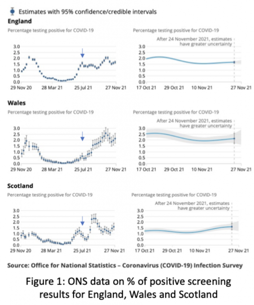
Firstly, as you can see from the graphs on the left-hand side of Figure One, there does appear to be a general difference between Scotland and Wales compared to England. Scotland and Wales both start at lower levels of infections post ‘Freedom Day’, but neither nation sustained this lower level, with both showing increasing levels of positive test results throughout August and into September. Scotland then appeared to partially recover from a ‘wave’ and returned to a more constant, if higher, level of infection, whereas in Wales infection levels went up and stayed up. In contrast, although positive test results started higher in England, they remained relatively flat throughout. There is a weak similarity between the infection graphs in Scotland and Wales because both suffered significant rises in positive results after July 19th, rises that haven’t yet returned infections to pre-August levels, but it’s difficult to see a common trend here. The important observation is that overall neither country obviously out-performed England with respect to preventing or reducing SARS-CoV-2 infections in the general population following ‘Freedom Day’. A point that becomes even clearer if we look at the more recent data on positive test results presented on the right-hand side of Figure One. Now Wales appears to be the ‘worst’ performer, with Scotland the ‘best’ and England somewhere in the middle, although there really isn’t much to choose between any of these as considering the margins of error (the grey shading) they are not significantly different to each other.
If the graphs in Figure One weren’t labelled, would it be possible to say which region(s) had introduced ‘enhanced’ coronavirus ‘Plan B’ measures? Probably not, but I suspect if pushed to select one country as the most likely candidate many people would choose England because, despite starting at a higher level of positive test results, it looks as if here ‘Plan B’ has ‘flattened the curve’ compared to the other two!
So, unless there is something radically different about the ONS screening in England, meaning that the results significantly under-report the prevalence of SARS-CoV-2 within this population compared to Wales and Scotland (extremely unlikely as all three nations use the same methodology), then the obvious conclusion from the ONS data is that ‘Plan B’ has had no measurable effect on coronavirus infections: it didn’t stop either Wales or Scotland from having an increase in coronavirus infections, nor did it help either to really outperform England.
Maybe screening results are not the best way to measure the effects of ‘Plan B’ measures? Perhaps a better way of detecting the positive impact of ‘Plan B’ NPIs is to look at Covid-related deaths within the different populations? After all, this is what is important and perhaps the lack of an effect on infections in the general populous is not the effective way of measuring ‘Plan B’, despite this being the stated aims of these NPIs!
Going to the coronavirus dashboard on December 8th, 2021, I downloaded the figures for Covid-related deaths in each nation. As many have pointed out, death within 28 days of a positive coronavirus PCR test is not the same as dying of Covid, but because England, Scotland and Wales all use this same method to categorise Covid-related deaths using this data does at least mean we are comparing like with like.
Figure Two is a plot of Covid-related deaths in Scotland, England and Wales normalised by the total population of each nation and expressed as the number of weekly deaths per million people for each week since ‘Freedom Day’ over the same period as the ONS screening data. Population figures were taken on December 8th, 2021, from the ONS here.
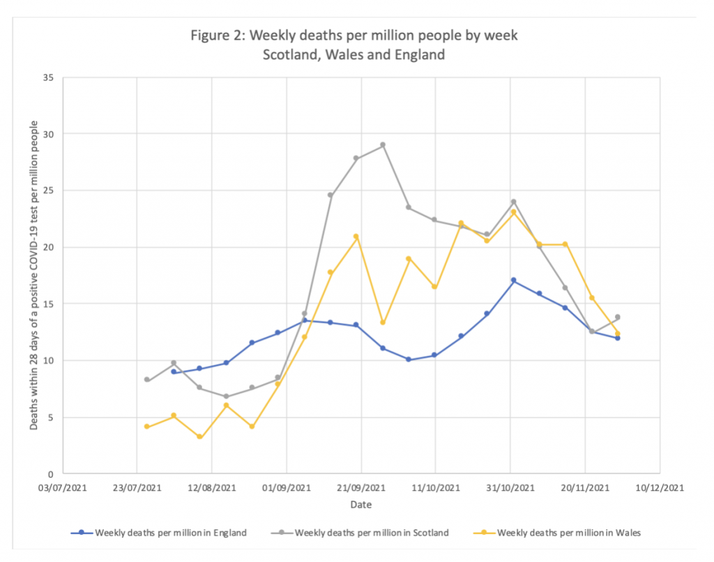
Interestingly, unlike the ONS data in Figure One, Covid-related deaths in Scotland and Wales appear to be very similar to each other and both are dissimilar to England. Is this the effect of ‘Plan B’? Let’s hope not, because although Scotland and Wales both started at lower levels of Covid related deaths in July and August both saw a rapid increase in the numbers of deaths in September (probably following on from the rise in the number of infections in August). However, unlike positive screening results (Graph One) which dropped in October, Covid-related deaths in Scotland remained high and very similar to Wales throughout this period. England, by contrast, has shown a relatively flat level of Covid-related mortality (again reflecting the ONS infection data), a level that has remained below that of the other two nations since September.
This is even clearer in Figure Three, where I have compared the Covid related numbers of deaths between England and those of the ‘Plan B’ countries combined.
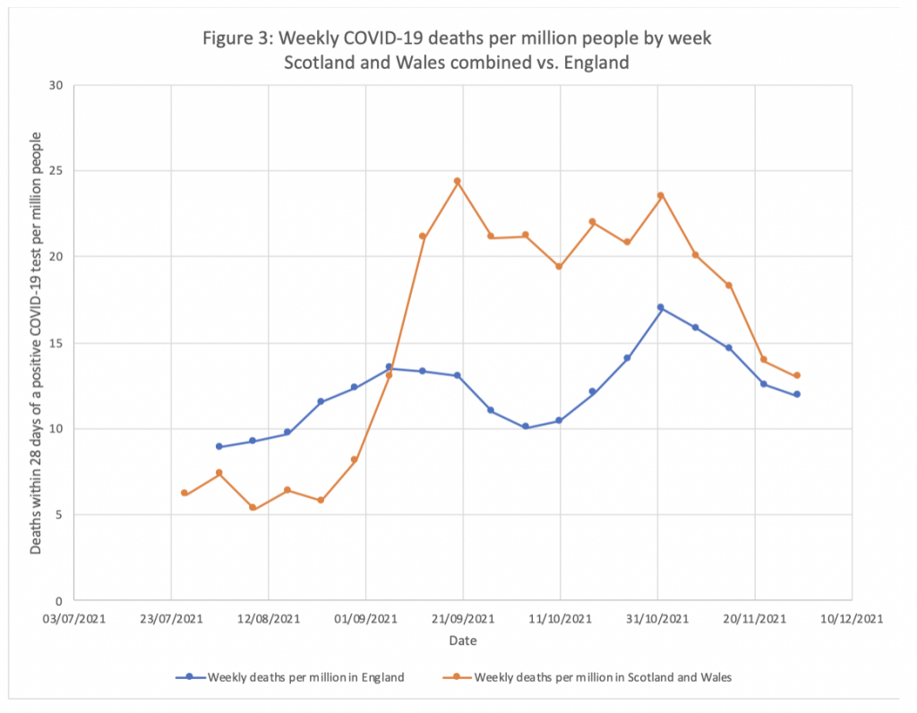
We can again play the game of “Who Implemented ‘Plan B'” and imagine looking at Figure Three without identifying which region is which. If we did this and asked someone to identify the country that had put in place the enhanced coronavirus controls of ‘Plan B’, I’d bet that almost everyone would erroneously identify the blue line as the place where Covid NPIs were implemented. It’s obvious, isn’t it?
And so, there you have it. There is no evidence whatsoever that ‘Plan B’ will do anything to either reduce the numbers of SARS-CoV-2 infections or prevent Covid-related deaths. Unlike other cross-country comparisons which are fraught with potential confounding factors, the geographic, demographic, genetic and cultural similarities of Scotland, Wales, and England, together with their commonality of health service, screening provision and interpretation of Covid-related results, mean that comparing England with Scotland and Wales is a pretty good way of understanding the likely real-world impacts (or lack thereof) of ‘Plan B’ NPIs. The infection figures from England since ‘Freedom Day’ are no worse than those of Scotland or Wales and the Covid related mortality data since September appears to be better. As a result, one might even conclude that not only is ‘Plan B’ useless, but that it might even make things worse.
Unfortunately, showing that ‘Plan B’ is useless, or more specifically does not produce better outcomes than no restrictions at all (or very light touch ones) is unlikely to result in a sensible rowing back of restrictions. No, if noticed at all, it will be likely be used as evidence for the need for stricter measures; ‘Plans C, D, E’ and beyond, none of which are likely to help stop the spread of omicron but all of which will impose increasing levels of misery across the general population with all of the impacts on health and wellbeing that come with those. So, as Mr. Johnson announces the implementation of ‘Plan B’ in England, let me leave the last thought to the real George Santayana:
Fanaticism consists in redoubling your efforts when you have forgotten your aim.
Many thanks to Will Jones for help with this article.


To join in with the discussion please make a donation to The Daily Sceptic.
Profanity and abuse will be removed and may lead to a permanent ban.