The BBC and other media outlets continue to post the chart showing the number of deaths within 28 days of a positive test. And this is the first chart you see after clicking ‘Deaths’ on the government’s COVID-19 dashboard. Here it is below:

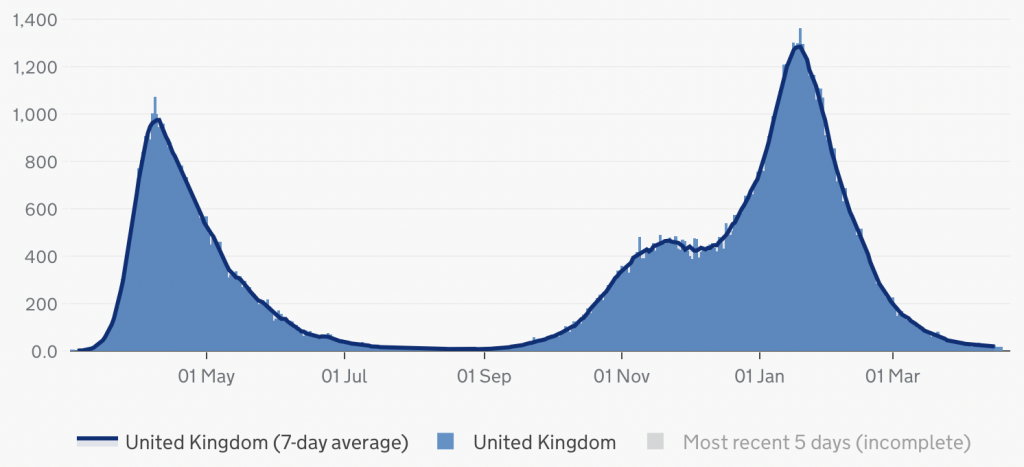
However, the chart gives a very misleading impression of the relative severity of the first and second waves. It has been claimed, for example, that the second wave was “more deadly” than the first. And in fact, if you sum the figures under each of the two curves in the chart above, you find that the total for the second wave is more than double the total for the first wave.
But simply counting the number of deaths within 28 days of a positive test isn’t the best way to gauge COVID-19’s impact on mortality. This method understates the number of deaths in the first wave because some people died of COVID-19 without being tested. And it overstates the number of deaths in the second wave because some people who would have died anyway happened to test positive.
As Sarah Caul (the Head of Mortality Analysis at the ONS) has noted, “For the best comparisons, we really need to look at age-standardised mortality rates.” These take into account the ages of those who died, as well as the age-structure of the overall population.
The ONS recently calculated weekly age-standardised mortality rates going back to 2015. They then calculated excess mortality for 2020 and 2021 by taking the age-standardised mortality rate in each week, subtracting the average over the last five years, and then expressing the difference as a percentage of that average. Here’s the chart they produced:

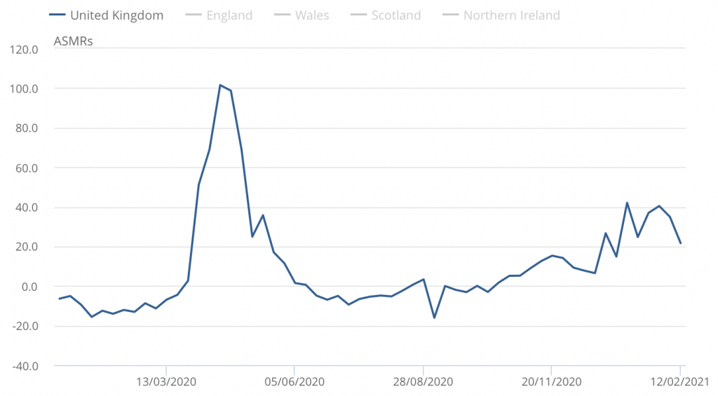
Although the figures only go up to February 12th, they indicate that the second wave was actually less deadly than the first. It’s time to retire the ‘deaths within 28 days of a positive test’ chart. At the very least, it should only be posted alongside the chart showing age-standardised excess mortality – which gives a much more accurate picture of the UK’s pandemic.
To join in with the discussion please make a donation to The Daily Sceptic.
Profanity and abuse will be removed and may lead to a permanent ban.
A picture tells a thousand words!
It should never have started in the first place.
When I was a child and somebody died and I asked my father what they died of, he mostly answered ” Shortage of breath”.
We rest our case.
It’s Time to Retire the ‘Deaths Within 28 Days of a Positive Test’ Chart….
But I bet they don’t
The actual wording is “Deaths for any reason within 28 days of a positive test”, but newscasters never say it in full.
And it’s also time to retire some of the misconceptions in this article :
errr … No! We have no idea of ‘Covid’ deaths in any wave or at any time. The data is completely buggered. But the probabilities are that deaths due to Covid (mainly or solely) were overestimated from the start. Even the distinction between SARS-CoV-2 infection and ‘Covid’ isn’t understood by most people – let alone the distinction from other respiratory pneumonia-type disease.
A fallacy : ‘age standardized mortality’ is a modellers’ concept that pushes purely descriptive statistics into the assumptions of more questionable inferential statistics. The message is ‘stick to the knitting’ – the KISS – of basic population adjustment.
I reckon this shit-show should have alerted every decent statistician to the problems of modelling and projection. Unfortunately, there is too little attention paid to the basic introductory chapters on statistical analysis – masked by a desire to get straight into piddling around with more complex mathematics before the obvious is stated.
Shockingly, the article even implies that there is some credibility to the counting of ‘cases’ as determined by testing, even if the temporal comparisons are wrong.
Oh – and I’ve just noticed the breathless neophyte swallowing of the five-year average as a baseline for calculating ‘excess’. (See last paragraph). Ohh dear, Noah – still in the ark?
As one distinguished academic and statistician put it in a correspondence that we had :
” It’s funny how the five-year average has just been accepted as the standard really without much debate.”
The second wave looks very seasonal to me, accelerated by mass hospital spread. If Bunter had upped hospital capacity it would likely have been a normal year, with or without the failed shutdowns of small business and leisure activity.
I’ve been trying to get my head round the official figures.
The accumulated number of deaths attributed to Covid-19 by the Office for National Statistics (ONS) is currently about 140,000.
The number of excess deaths since last April is around 112,000. (I calculated this figure using 2010 to 2019 as a baseline, but the result should be similar if 2015 to 2019 were used.)
So there would appear to be 32,000 more deaths caused by Covid-19 than there are excess deaths. Or, to put it another way, had it not been for Covid-19 there would have been 32,000 less deaths in the last 12 months than the 2010 – 2019 average. 32,000 is a 6% drop in the average annual mortality compared to the previous 10 years. Quite a reduction!
The ONS has stated that around 40% of the deaths in the first wave were the result of the response to Covid-19, not the disease itself.
If the same holds true for the rest of 2020 and the start of 2021, and assuming that the number of excess deaths is a fair representation of the number of deaths caused by the pandemic and the response to it, the actual number of excess deaths attributable to Covid-19 would be 67,000. With a further 44,000 people losing their lives as a result of the government “following the science”.
The numbers just don’t seem to add up.
Good analysis. Does the 112,000 excess deaths allow for the increase in population since 2010? If not then that will further reduce your calculated 67,000 Covid deaths.
And a report by Sheffield & Loughborough Universities jointly showed that (1) UK Covid19 death figures are “54% to 63% lower than stated”; and (2) “lockdown has increased, not decreased, mortality”. (published 3 Aug but vanished/ put behind paywall in October) https://web.archive.org/web/20200929024105/https://www.lboro.ac.uk/news-events/news/2020/july/new-approach-to-recording-covid-deaths/
PDF of research paper still available here: https://papers.ssrn.com/sol3/papers.cfm?abstract_id=3635548
Of course the numbers don’t add up.
Bottom line (I’m surprised that we’re having to repeat the obvious here) :
There is no credible data on ‘Covid’ deaths. ‘Excess deaths’ is a meaningless term.
So everyone – stop wasting effort on burbling about that non-existent fictional data.
The ’28days’ stats DO NOT underestimate the first wave at all. They include those who have had a clinical diagnosis. Furthermore, the ‘first wave’ consisted of those who died of government policy. There is no pandemic and the ASMR for the entire year of 2020, when compared to previous years, confirms this.
Apart from that I agree that the 28 days graph is only useful as fearmongering propaganda.
Euromomo excess deaths
Graphs and maps — EUROMOMO
4 countries of the UK scroll to the bottom.
Good article.
Here’s the age standardised mortality for England going back to 2001.
The unusual thing about the Spring peak was that it was a bit out of season in that the virus triggered in March/April 2020, and even though it was out of season mortality reached levels that we hadn’t seen over the 20 year period.
You can see the 2001/2002 Winter peak is higher than this Winter’s peak. And this Winter’s peak isn’t that much higher than the 2017/2018 Winter peak.
So the pandemic occurred for a few months in Spring 2020 and it’s just been a severe Winter season of respiratory illness but that’s about it. And that’s before you factor in the deaths through people not being able to access treatment for other conditions, evidenced in part by the huge number of home deaths.
Or put another way it was a Spring 2020 wave followed by a secondary ripple this Winter when you compare against typical mortality for the time of year as shown by the graph in the article.
And here’s essentially the same graph for the UK as in the article (but with other European countries shown too) from the ONS publication of 19th March 2021 Comparisons of all-cause mortality between European countries and regions: 2020
Hector Drummonds blog showed at the time that the spring 2020 ‘wave/spike’ was precisely similar to a normal autumn event except that it took place in spring.
I am looking forward to Dr Clare Craig’s final analysis and conclusions re: number of Covid deaths. I realise that we will never be able to assess accurately but her (and the team’s) report will at least give a good idea. I have no doubt that MSM will do their upmost to ignore it, and it will be left to this website and other advocates to try and spread the word. It has already become very obvious that no matter what evidence is published and by whom, the agenda will not be abandoned. Come on Reiner Fuellmich, pull that bloody trigger!
Small point: it’s the UK’s epidemic, not pandemic.
The death within 28 days metric will be scrapped. Here’s why:
The stat. is actually within 28 days of a first positive result. At some point, there will be too few people, who didn’t have their first positive result more than 28 days ago, available to die.