There follows a guest post by the Lockdown Sceptics‘ in-house doctor – a former NHS panjandrum, now in private practice. I asked him to look at the latest NHS data to see if there was anything to support the recent warnings from various SAGE members that Britain is “on a knife edge” and that going ahead with the June 21st reopening would be imprudent.
It is perhaps a sign of the times that senior NHS figures are using Trumpian methods of communication by Twitter and a variety of governmental advisers have been providing freestyle commentary on the airwaves warning that the U.K. is “on a knife edge” in relation to the relaxation of societal restrictions.
To what extent are these warnings supported by the observable evidence?
As regular readers will know, I’m partial to a few graphs and rather enjoy looking at spreadsheets (there’s no accounting for taste) – so let’s examine a few from the recent NHS COVID data.
Firstly, some high-level stuff. Graph 1 shows the COVID hospital admissions from October 2020 right up to this week. That gives a sense of proportion as to how the overall hospital load compares to the winter peak. Note that the current level of admissions are a tiny fraction of those in October last year.
Can readers discern the rise in hospitalisations widely predicted after the reopening of schools in March? No, I can’t either – because it didn’t happen.
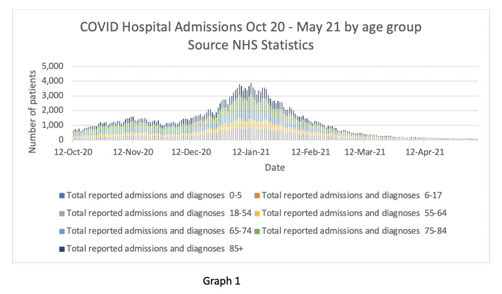
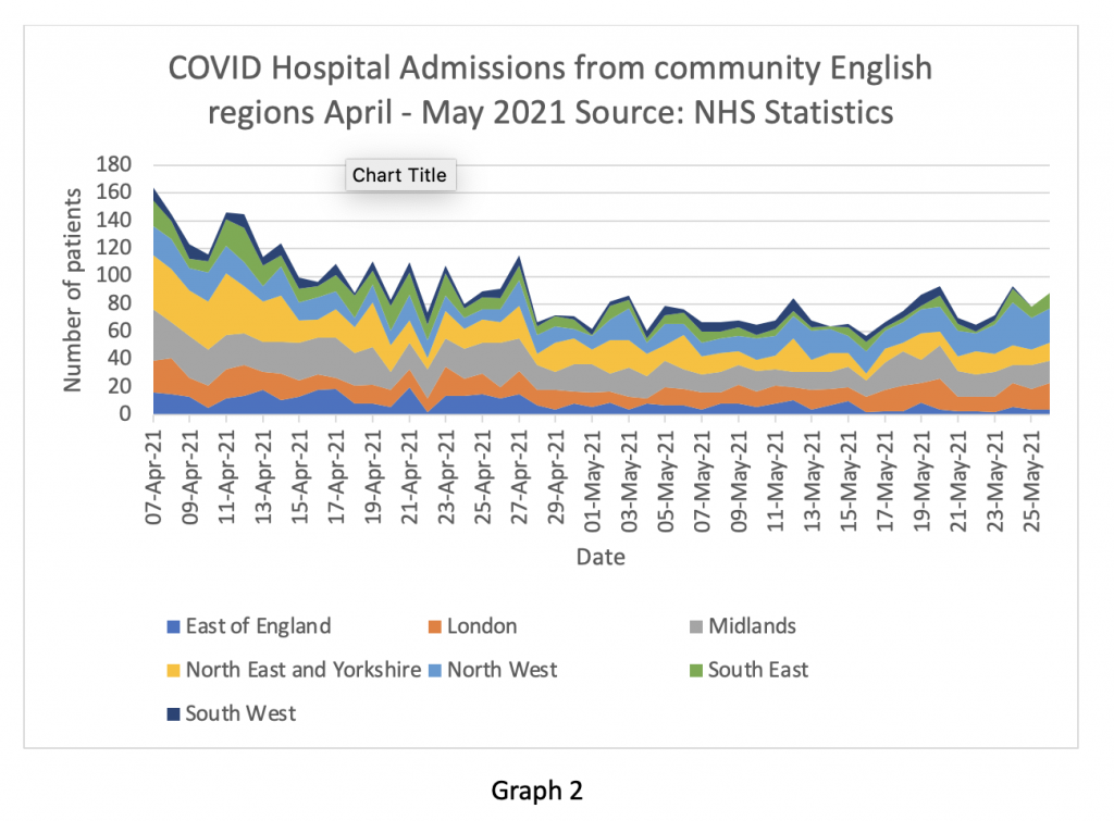
Graph 2 looks at the right-hand end of Graph 1 in more detail – COVID positive hospital admissions from the community between April 7th and May 28th this year. The numbers have been falling gradually throughout April and now seem to be steady at about 100 per day. Bear in mind the scale difference on the Y axis between graph 1 and graph 2. At the end of October, the NHS was admitting about 1,000 per day and at the peak in January, almost 4,000 per day.
Expressing this in ‘Simon Stevens soundbite speak’, there is one patient with COVID admitted every 15 minutes at the moment.
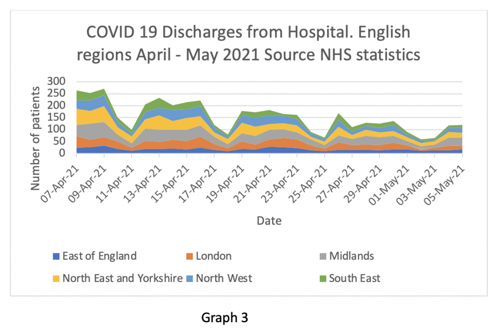
Of course, as regular readers will remember, a hospital can still be in trouble if patients can’t be discharged back into the community at the same rate as they are admitted. So, Graph 3 looks at the discharge figures. Looks like a pretty similar trend to Graph 2 – crucially, admissions and discharges seem to be in balance at about 100 per day across the entire English NHS. (Note the weekend effect seen clearly on the discharge graph – patients aren’t generally discharged at the weekend.)
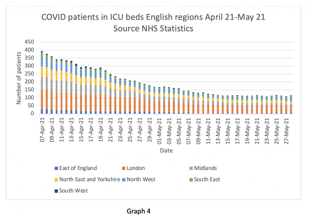
Next, we turn to my favourite area – intensive care utilisation. It’s my favourite metric because it’s a marker of the burden of really serious disease relating to the virus. Graph 4 shows ICU patient numbers. Interestingly, the numbers of ICU cases in the ‘Indian variant’ hotspot – the North West – are running at about 25-30 as of the end of May – a drop from about 50-60 at the beginning of April. How does this fit with the widespread hypothesis that the Indian variant is more deadly and more transmissible than the ‘very deadly and highly transmissible’ Kent variant? My reading of the data so far seems to suggest it isn’t – just as the Kent variant wasn’t more deadly than the original strain from spring 2020. Again, to put this in perspective, in mid-January there were about 3,700 patients in ICU across the English NHS. Today there are just over 100.
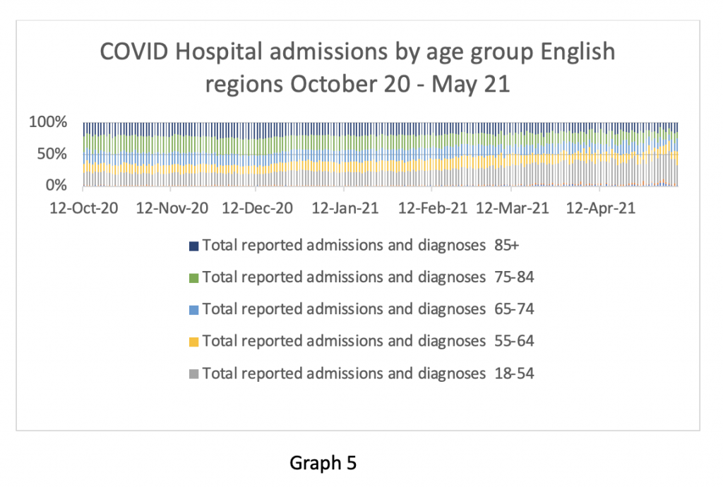
Readers may also recall me examining claims earlier in the year that the ‘Kent variant’ caused patients to be younger and sicker – I couldn’t find any evidence in the figures to support those claims. However, the age profile of admissions now does seem to be skewed to a younger demographic. Graph 5 shows this. The 85+ age group has fallen from about 22% of the total admissions in October 2020 (139/645) to about 14% now (10/69). This is being attributed to the success of the vaccination programme in preventing transmission to the vulnerable elderly – that sounds like a plausible explanation to me.
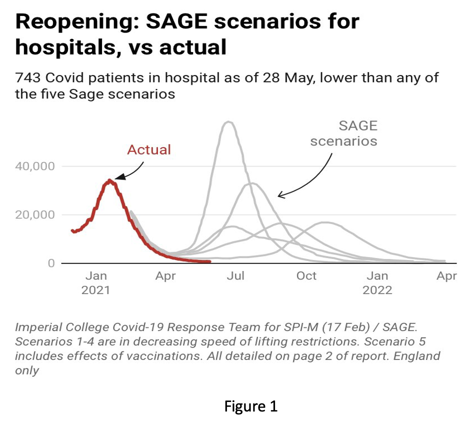
As my final graphic, I include a comparison of the SAGE predictions for hospital in-patients with what we actually see in Figure 1 below. I’m not even going to bother looking at the death statistics in this piece, because the overall death rate in England is below average at the moment – so whatever people are dying of this month, it isn’t COVID-19. I’m also not going to comment further on Figure 1. As ‘my learned friends’ say, it is ‘res ipse loquitur’ – ‘the thing speaks for itself’.
So, to return to the original question – is there any evidence in the hospitalisation data to suggest that the country is “on a knife edge” in relation to COVID-19? If there is, I can’t see it. From my perspective, all the numbers are heading in a downwards direction. All the predictions I have recently seen in relation to an anticipated July spike in hospital cases do not appear plausible. In some ways there is a comforting consistency about the predictions of doom. They have been consistently wrong throughout the entire episode, so it’s quite likely they will be wrong again.
The renowned historian E.H. Carr wrote: “Study the historian before you study the facts.” What he meant was that commentators tend to selectively focus on data that supports their opinion and conveniently ignore information that doesn’t. This is of course the precise opposite of what scientists are supposed to do.
I have noticed in recent weeks that the media have been reporting on the numbers of cases in the community (i.e., positive tests), rather than (as previously) on numbers of hospital admissions or Covid-related deaths. This seems to be an illustration of Professor Carr’s point. The hospital admissions and death data do not support the hypothesis that the Indian variant is about to cause another spike in severe disease, so those figures are not being reported.
It does not matter if the numbers of positive tests rise in the community as long as the hospitalisation rates remain low. My interpretation of the published information suggests that is the case.
So why are the Government’s advisers saying something completely different? I can only think of two broad explanations. It is possible they have information that has not been released to the public for some reason. Or they are selectively interpreting the known information to support an undisclosed agenda.
Over to you, Professor Carr…


To join in with the discussion please make a donation to The Daily Sceptic.
Profanity and abuse will be removed and may lead to a permanent ban.
“All this and the execrable Wheel of Time in Culture Corner.”
Delingpole I think missed out on a treat with Wheel of Time, though understandably, I think. The beginning does seem very Lord of the Rings, and it takes time for the majestic scope, originality and solid plotting and characterisation to become apparent. It would be easy to dismiss it early, never get far into it and come away as dismissive as Delingpole is here. It is in fact justly classed as one of the greats of modern fantasy writing. Far from being sub-Tolkien (which the first book can easily give the impression of), in fact it is almost completely different from any of Tolkien’s work, except in some superficial plot details, and a great complement to Tolkien, in being written from a thoroughly western conservative base without Tolkien’s Christian theology. Not that there’s anything wrong with Christian theology as a basis for art, but Jordan’s classic covers a whole separate area of western conservatism, and is much more American (in a good way).
But the Amazon interpretation is, indeed execrable. Unsurprisingly so, given that they have taken a profoundly conservative work and rendered it into a vehicle for modern woke ideology. In order to do so, they have necessarily gutted it of most that gave it any artistic depth (and introduced a lot of loathsome woke ideological crap).
As one reviewer correctly said of it: “They’ve co-opted this because…they are nowhere near talented enough to make their own story. They could never write something as great as Wheel of Time and have it be as successful, but they want to get the message, their standards and views out. And so they will co-opt something that’s great, inject their bullcrap into it, because they’re not talented enough to make their own, and then ruin it in the process.”
This is nothing unusual – people co-opting art to convey their own message. But it’s especially problematic in cases like this, where the message being pushed is the diametric opposite of the content of the art itself. It’s as though you were to take surrealist art and use it to somehow make conservative propaganda by fundamentally changing and “reinterpreting” it into representational traditionalist paintings, while keeping the attribution to the original artist.
Surrealist art was “reinterpreted” into advertising – there’s no “as if” about it – and the term “surreal” was “reinterpreted” as a synonym for “zany”, or, in the parlance of the especially intellectually challenged among the middle classes, as a synonym for “weird”, “nonsensical”, or “unexpectedly self-contradictory”.
But who watches film version of books anyway? Tolkien’s Lord of the Rings was a superb literary achievement. I’ve stayed away from the films.
“Surrealist art was “reinterpreted” into advertising – there’s no “as if” about it“
And the artists involved would doubtless be figuratively spinning in their graves. Which is roughly the point I made.
“But who watches film version of books anyway? Tolkien’s Lord of the Rings was a superb literary achievement. I’ve stayed away from the films.”
With some regrettable lapses, the LotR films were reasonable adaptations.
The overriding point is that an adaptation of a great work of writing is made into a film, by and large, by a no better than average film maker, so as you imply, it’s rash to have high expectations.
But the kind of intentional ideologically motivated, manipulative vandalism we are dealing with in the case of Wheel of Time is a rather different thing.
The Lord of the Rings trillogy was good.
The Hobbit trilogy was two movies too long. In fact, even the one movie could have been a few years shorter.
Yes, I pretty much agree with this guy:
Amazon’s Lord of the Rings – I’ve Got A Bad Feeling About This
FIVE SEASONS?????
Shove that right in there beside your vaccine mandate!
Got to have plenty of space for the strong empowered women to develop their characters while helping the pathetic men-children to find their inner homo….
Never been more grateful that I have boxed sets of Breaking Bad and Westworld to fall back on. Not to mention the early seasons of Route 66.
Binged the first 5 on Saturday. Usually any anti male, pc bs will turn me right off immediately. Didn’t find this so far.
I don’t mind strong women and long as it’s not women good man bad. The glass cannon spell casters need strong skilful male fighters or they are useless. Some Aisha whatever dislike men, some don’t. It took 3/4 of them to overcome one male spellcaster… etc.
Having never read the books and not knowing anything about it prior to watching it I quite enjoyed it. It was a bit formulaic D&D, 1 archer, 1 barbarian, 1 thief, 1 healer, 1 assassin in the party, but it works for a reason I guess. And the troll-orcs or trollocks was a bit unoriginal 🙂
I think your woke bullshit detector might need recalibrating. I’d prescribe a diet of pre-1950s films and literature only, for as long as it takes.
The “glass cannon” nature built into the idea of female magic users was difficult to avoid entirely, but even there they managed to transform the famously stoic and battle hardened warders into a bunch of cry babies.
There are certainly formulaic fantasy tropes built in, but they (in the books at any rate) are used as building blocks for a genuinely original work of huge scope and real depth. But that’s part of the reason why it’s easy to dismiss as mere sub-Tolkien rehash unless you persist with it through at least the end of the first book. Jordan I believe openly acknowledged a debt to Tolkien, but then again that’s the case (the debt, acknowledged or not) for most fantasy writers from the second half of the C20th onwards,
The D&D formulaic party construction aspect you mention is definitely a function of the TV series, not the book. In the book the characters are very young (about 17, at a guess) when they leave their village, and extremely naive. That’s vital to their development through the story. The TV series trashed all this by making them older, and gave them some actually abhorrent characters and histories, that are utterly wrong for the book roles.
I can’t speak to the book comparison ‘Having never read the books’. What’s really in your face wokey about it so far 5 in?
The whole thing is one long sjw lecture about race, gender roles, religious politics and sexual behaviour that the book story is twisted beyond breaking to fit. As I noted, it bears at best occasional, superficial relationship to the books, and in many significant aspects is diametrically opposite to the books’ approach to key issues.
If you can’t see it, it’s most likely because you don’t have any particular problem with the sjw world view, so its unlikely anything I write will mean much to you. If it doesn’t trouble you that a remote, isolated backwater village is portrayed as a more racially diverse place than a US port city, or that supposedly battle hardened, veteran, stoic warriors are portrayed as shrieking and crying in hysterical emotiveness over battle deaths, that men are systematically portrayed as emotionally incontinent and rarely even minimally competent, compared to the women characters, then you are watching it from a very different cultural place from mine. We would probably be speaking different languages. I can only suggest finding some of the many negative reviews out there and trying to read or view them with an open mind.
The animated version, The Lord of the Rings (1978) Directed by Ralph Bakshi was excellent, the others you didn’t miss much.
And don’t laugh at this, but I would say another animated film i’d consider a classic work of art, is Bambi (1942), not so much the story, but the artwork had incredible ambience in parts, it was clearly a labour of love, & beautiful animation.
Actually the film made me read the book
Ironically ‘evil cannot create only corrupt’ was a Tolkien theme.
I see the irony of which you speak – nice connection 🙂
There is little doubt now that the regime intends to murder the majority of the population
Yup.
Discreetly of course.
They’ve been killing over 20% of the UK population for years now, it was always likely to be extended, especially with the demographic crisis of an ageing population (caused by said measure).
Sorry, but it just was.
According to a recent London Calling it’s pronounced Oh-Micron.
Does the French President’s wife pronounce it ‘Ohhh, Macron….”?
O mi cron?
You should disassociate yourselves from James Dellingpole in order to retain your integrity. N Kirkpatrick
The plan is to kill us
They needed some sort of a solution…
(First they came for people who need an organ donor).
The War on Drugs – Bill Hicks
https://www.youtube.com/watch?v=knq49PqsMLc
Bill is sorely missed and we need his commentary today more than ever.
Still cant get over the BBC RADIO FIVE documentary I heard about drug gangs in Bradford with a central character called Meggy – true life story – which basically spilled the beans on how many main drug dealers are informants, assets, they work with impunity, they get help to launder the money through the police and they tip off dealers who they supply who get busted by the police to make it look like they are doing their job.
‘Police informant and rival drug dealer who set up Yassar Yaqub’ – the claims about Meggy before he was jailed for murder
https://www.examinerlive.co.uk/news/west-yorkshire-news/police-informant-rival-drug-dealer-16212313