

One of the most reliable and informative sources of mortality data over the past year has been the Institute and Faculty of Actuaries’ weekly mortality monitor report. It shows weekly and cumulative mortality for the year, and unlike the ONS, adjusts for population size and age so we get a truer reflection of how the current trends compare with the past.
Last week the report showed that the trend of deaths in 2021 has been so low since mid-March that all the excess deaths in January and February had been almost cancelled out and cumulative standardised mortality stood at just 1.1% above the 10-year average (see graph below).
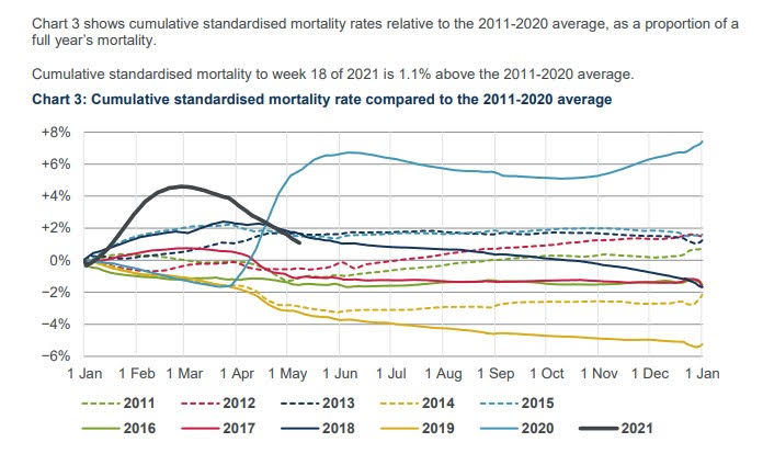
At Lockdown Sceptics we were waiting for the moment when, at some point in the next few weeks, this figure would hit 0% so we could announce that, despite the winter Covid surge, 2021 was now officially a low mortality year with below average age-standardised mortality.
However, it appears that moment now may never come, as unexpectedly this week the Institute changed the baseline on its key chart. The 10-year baseline is gone, and in its place is a straight comparison to 2019.
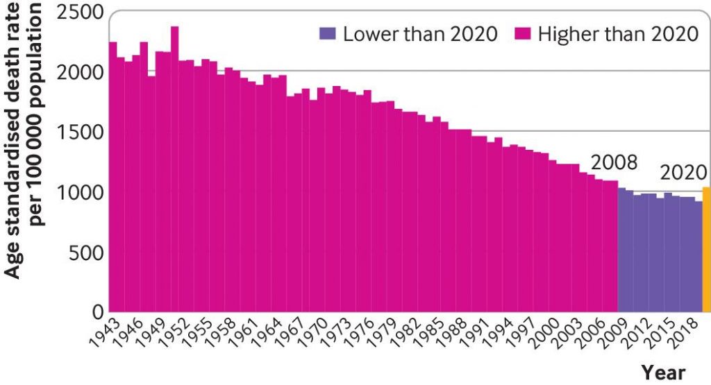
The important thing to know about 2019 is it is the year with the lowest age-standardised mortality ever (see below).
So now, rather than mortality in 2021 being around 1% above the 10-year average, it is suddenly “4.6% above 2019” (see graph below). The 10-year average line is gone completely so no comparison can be made with it at all.
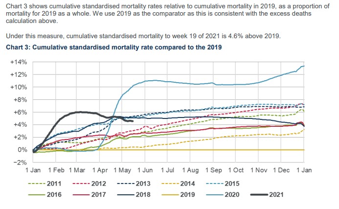
This major change in baseline – which is a big deal when producing statistics for keeping track of trends – is not acknowledged. A sign that the change may have been made without due care can perhaps be seen in the stray “the” left in the heading from when it was edited, so that in place of “compared to the 2011-2020 average” it reads “compared to the 2019”.
The only explanation we are given is: “We use 2019 as the comparator as this is consistent with the excess deaths calculation above.” It’s true that throughout the pandemic period the mortality monitor team have used 2019 for their excess deaths calculation, yet nonetheless they’ve used the 10-year average in the cumulative mortality chart. Why the sudden change? If they wanted now to show the cumulative trends relative to 2019, why not produce charts showing both?
It is frustrating that this change has been made just as their figures were poised to show 2021 heading into negative territory compared to the 10-year average. Even more frustrating is that the baseline is now the least deadly year in history.
They explain in previous reports that they use 2019 for their excess death calculation because they consider it to be the most accurate comparator for deaths “in the absence of a pandemic”, since “2019 and 2020 had similar mortality experience for weeks one to 12”. However, that doesn’t allow for the fact that 2019 was anomalously low even for recent years, not least because of a very mild winter flu season. It also doesn’t explain why they have suddenly changed the baseline in one of their key charts, making it impossible to continue keeping track of the trend against the last decade.
Lockdown Sceptics has contacted the Institute to query the reasons for the change and ask for the original baseline to be reinstated. I will update this post if we get a reply.
UPDATE: The Institute and Faculty of Actuaries (IFA) has responded to our enquiry and said: “The CMI [Continuous Mortality Investigation] has added the rationale for the change to Chart 3 to its website.” They add: “The CMI intends to continue to use the version of the chart relative to the 10-year average in its quarterly mortality monitors, the next of which is due on July 13th 2021.” So we’ll have to wait until mid-July to get an update against the 10-year average.
In their explanation they say:
We recently became aware that some commentators were treating the 10-year average as a benchmark for current mortality, or indeed the CMI’s implied view of what mortality rates would have been in 2020 and 2021 if the pandemic had not occurred. This is not the case. Age-standardised mortality rates tend to reduce over time, and mortality rates in 2020 and 2021 would very likely have been below the 10-year average in the absence of the pandemic.
This raises the question of why they were including the 10-year average at all if not as a kind of benchmark, and why they continue to use it in their quarterly reports if it is so misleading. Their rationale is also incorrect. Looking at the chart of age-standardised mortality above, it’s clear that while the rate declined until 2011, since then it has been largely flat, and 2019 was unusually low. This means the assumption that 2020 and 2021 would, in the absence of pandemic, have resumed decline, rather than potentially see an uptick following a mild year, has no basis. Furthermore, 2020 was obviously not the first year in history to see a pandemic, yet after previous pandemics age-standardised mortality continued its long term decline (despite not having vaccines). The mistaken assumption that pandemics are anomalous rather than part of the normal (if irregular) ebb and flow of annual morality – as though they should therefore be excluded from trends and baselines – is exactly the kind of historically blinkered thinking that got us into this mess. This change from the IFA only reinforces that erroneous strand of thinking.
Here’s their response in full:
This note describes the rationale for a change in the format of Chart 3 of the summary pandemic mortality monitor, with effect from week 19 of 2021.
Chart 3 of the week 19 monitor shows mortality rates compared to 2019. This is consistent with the calculation of excess deaths in the pandemic mortality monitor.
Previous versions of the pandemic mortality monitor, showed rates relative to an average of the previous 10 complete calendar years. This is consistent with the regular quarterly mortality monitors we have produced since Q4 of 2018.
We consider the choice of comparator in this chart to be relatively unimportant, as the aim of the chart is to allow comparisons between cumulative standardised mortality rates in different years. The use of relative rates makes that comparison easier. We have shown the current year and each of the last 10 years, compared against the average of those 10 years. This results in charts that allow the relative mortality for each year to be seen clearly.
We recently became aware that some commentators were treating the 10-year average as a benchmark for current mortality, or indeed the CMI’s implied view of what mortality rates would have been in 2020 and 2021 if the pandemic had not occurred. This is not the case. Age-standardised mortality rates tend to reduce over time, and mortality rates in 2020 and 2021 would very likely have been below the 10-year average in the absence of the pandemic. This is especially true for 2021, as the 10-year average includes the exceptional mortality since the second quarter of 2020.
As our pandemic monitors are aimed at users who wish to understand how mortality during the pandemic compares to what might otherwise have been expected, we are now showing how the current year and each recent year compares to 2019.
As we have noted since the start of the pandemic, mortality in the first 12 weeks of 2020 was similar to mortality in the first 12 weeks of 2019, so we regard mortality in 2019 as a better benchmark of “normal” mortality. Changing the format of Chart 3 means that it is now consistent with the calculation of excess deaths in the pandemic mortality monitor.
We intend to continue to use the version of the chart relative to the 10-year average in our quarterly mortality monitors, the next of which is due on July 13th 2021.


To join in with the discussion please make a donation to The Daily Sceptic.
Profanity and abuse will be removed and may lead to a permanent ban.