I was recently involved in a fairly lively discussion with a group of acquaintances, just about all in their 40s. Most of them had recently had bouts of Covid of varying levels of severity, yet they all seemed to think they’d been lucky that they’d dodged a bullet and that without the protection of their multiple vaccines they wouldn’t all be here to tell their tales. I thought their faith was misplaced and that their recoveries owed much more to their general health than any vaccination. The fact that the discussion occurred in a gym where they all regularly exercise their relatively healthy, lean bodies, made the whole conversation even more bizarre. I suspected they wouldn’t be interested but for my own peace of mind I thought I’d go away and see if the data supported their view or mine.
However, finding real-world data on vaccine efficacy is increasingly difficult. In recent months the UKHSA, ONS and NHS have stopped releasing real-world data on Covid cases, hospitalisations and deaths by vaccination status. This makes it effectively impossible to see if claims for vaccine efficacy turn out to be substantiated.
In previous articles I’ve used data from UKHSA and ONS to question both the protection vaccines afford against infection and against death. However, the data I’d used in these pieces only covered a relatively short time period. I wanted to see if I could find data covering the impact of vaccines on 40-somethings right through the vaccination period.
I thought a good place to start would be the fascinating paper by Professor Norman Fenton, Martin Neil, Clare Craig, Joel Smalley and colleagues, “Official mortality data for England suggest systematic miscategorisation of vaccine status and uncertain effectiveness of COVID-19 vaccination“, which delivers a devastating critique of so much of the official narrative. Could this give me any pointers? It led me to a report, “Deaths by Vaccination Status“, produced by the ONS. Tucked away in the dataset I found a set of data, Table 9, which seemed to have just what I was looking for: data on deaths by age cohort in the weeks following vaccination. Using these data I was able to compare deaths of vaccinated people in the different age cohorts, week by week in each of the sequential weeks from their last vaccination.
Because the report analysed data on a week by week basis from vaccination it effectively created something of a control group. People getting vaccinated were supposed to be clear of the virus for at least four weeks prior to vaccination and, as we know, it takes about two weeks before the vaccines have much impact. This means that deaths soon after a first dose, or after a later dose where the effectiveness of the previous dose has waned significantly, aren’t impacted by vaccination. Consequently, we are able to compare deaths soon after vaccination with deaths at a later date, once the vaccination has worked its ‘magic’, to see the impact of the last vaccine dose. We should expect deaths to decrease rapidly as we get further away from the date of vaccination.
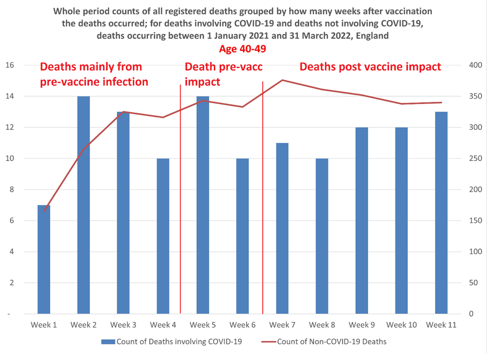
As I was interested in the deaths of younger people I focused my analysis on the 40-49 year-old cohort. Fig 1 shows the number of deaths of 40-49 year-olds recorded by ONS in the 15 months from January 1st 2021 to March 31st 2022 by week following vaccination. The ONS report covers about 530,000 deaths in England (from all causes) across all age cohorts, of which 3,640 were deaths of people in the 40-49 age cohort.
In the chart below, the red line shows 3,514 deaths not associated with Covid, whereas the blue bars are the 126 deaths that were associated with Covid, week by week over the first 11 weeks post vaccination. I included the non-Covid deaths to highlight the issue of the healthy-vaccinee: people close to death may not be vaccinated, which is why the week immediately following vaccination has an artificially low number of deaths. It’s perhaps just worth noting that Covid deaths in this age group represented just 3.5% of the total, meaning if you’re in your 40s you’re 28 times more likely to die of something other than Covid.

Just to clarify, deaths occurring within one week of vaccination are put into the “week 1” group. Deaths occurring in the second week following vaccination are allocated to “week 2”, and so on up to week 11. Deaths occurring 12 or more weeks after a vaccination are grouped into a single 12+ group. For the purposes of this analysis I’ve only looked at deaths in the first 11 weeks.
In the chart I’ve separated the weeks into three groups:
- Deaths mainly from pre-vaccine infection, these are the deaths occurring in weeks 1-4 following vaccination. Average deaths per week were 11.
- Deaths pre-vaccination impact. These are those deaths occurring in weeks 5 and 6, where it’s likely that infection occurred around the time of vaccination but before the latest vaccination would have had any impact. Average deaths per week were 12.
- Deaths post vaccine impact. Deaths occurring in weeks 7-11 are likely to have been of people whose vaccination should have reached full effectiveness by the time they were infected. Average deaths per week were 11.6.
Remarkably, the average number of weekly deaths in the first six weeks after vaccination was 11 whereas deaths during the period from week 7 to 11 averaged 11.6. Deaths actually increased in the later five weeks compared to the first six weeks.
The average number of weekly deaths in the last three weeks (week 9-11) was 12.3, as high as any other consecutive three week period during the 11 weeks.
This doesn’t look like 90% efficacy against death to me. Of course, many of these vaccinations are a second or third dose of vaccine, so perhaps we shouldn’t expect such a dramatic reduction in deaths, assuming the earlier doses are already giving some protection. But surely, if the efficacy has declined sufficiently to justify giving an additional dose, we should be seeing some impact of the latest dose?
But let’s just check the lag times involved. Naturally we’d expect relatively low deaths in the first few weeks after vaccination because people presenting for vaccination were supposed to have been clear of the virus for four weeks. The surprise here is that any one at all died of or with Covid in weeks 1 or 2; yet deaths in week 2 were the joint highest with week 5.
The ONS has estimates of the most likely time lags between infection, hospitalisation and death as follows:
- The time between COVID-19 infection and symptom onset varies between one and 14 days, with an average of five to six days.
- The median delay (lag) between symptom onset and hospital admission varies between one and 6.7 days depending on age and whether the patient lives in a nursing home.
- Time between symptom onset and death from COVID-19 ranges from two to eight weeks, with reported median times of 16 or 19 days.
This suggests a median time from infection to death to be about 24 days, with the shortest period being about 17 days. Yet in week 2, deaths are as high as in any week. Wouldn’t this indicate, as Fenton et al. suggest, that many of the deaths are simply miscategorised?
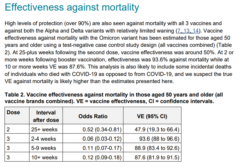
The official narrative would lead us to believe that fatality rates during weeks 3, 4 and 5 would increase to the prevailing rate of non-, or not-recently- vaccinated people as these are people who were clear of virus prior to vaccination and whose vaccine impact shouldn’t kick in a week or so after vaccination. The UKHSA weekly COVID-19 vaccine surveillance report (see below) claims 93.6% efficacy against death after two to four weeks for the over-50 cohort; I don’t suppose its claim for efficacy in 40-49 year-olds would be very different. This means that we should expect to see fatalities dropping off dramatically after about week 5. But we don’t; in fact, deaths start rising again after the middle weeks.
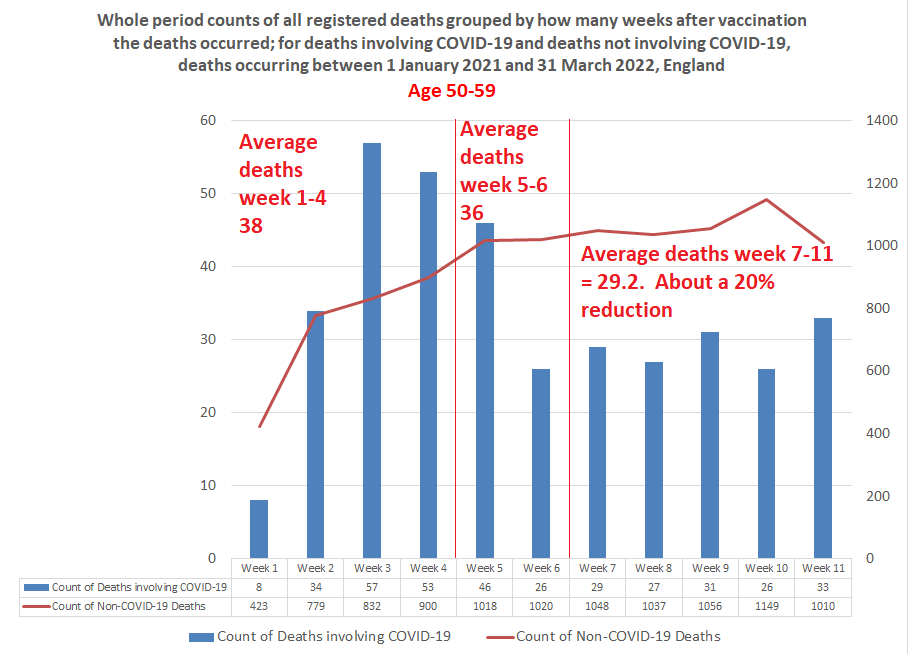
The picture for the 50-59 year-old (see below)) cohort follows more closely the profile of deaths following vaccination that we’re led to expect. Deaths in the first week or so after vaccination are low, rising in week 2 and 3 before declining. However, deaths in the last five weeks are only about 20% lower than the average number of deaths in the early weeks, though about 40% below the peak weeks. Still, this is a long way from the reduction in deaths we might expect given 90%-plus efficacy. What’s more, from week 7 deaths appear to be rising modestly. Has the vaccine effect already worn off?

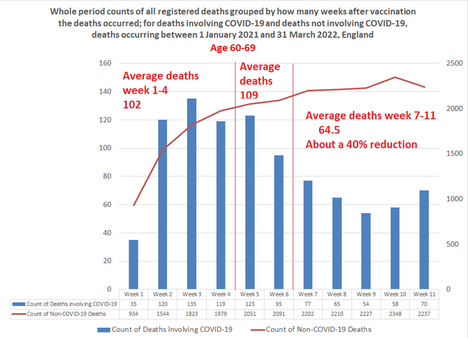
Deaths amongst the 60-69 year-olds (see below) again seem to follow the predicted path. However, the trough in week 9 at 54 deaths, a drop of 60% on the week 3 peak, appears short lived. Indeed, by week 11 deaths have climbed back up by 30% to 70. Overall, deaths in the final five weeks at 40% or so below the earlier weeks still seems a long way short of the claimed level of efficacy against death.

We keep hearing that vaccine efficacy is short lived. From this real-world data it appears it may be absent altogether in the 40-49 year-old cohort and both shallower and transient in the 50-69 year-old cohorts – though we must allow that efficacy from previous doses may be confounding the estimates.
What to make of it? I’m not sure. For me, the fundamental problem is that I’ve lost confidence in the data released by the various Government bodies and even more so in their interpretation of that data. Time and again we see that real-world data doesn’t match the narrative and rather than explain the discrepancy the real world data is simply withdrawn. Personally, I’m as sceptical of the claims that vaccines are doing untold harm as I am that they’re doing untold good. By continually overstating their benefits and understating their risks there’s been a huge growth in vaccine resistance. About 25% of the people who had their first dose haven’t had a booster, with this drop-off most marked in the younger age groups. With real-world efficacy data like these, we should hardly be surprised.


To join in with the discussion please make a donation to The Daily Sceptic.
Profanity and abuse will be removed and may lead to a permanent ban.
H is for Hunt – Hardline Lockdown Fanatic
Well good morning everyone.
Now to read the ATL posts.
what does ATL mean please?
ATL = Above the line, meaning the articles etc provided by the site owners/creators/editors.
BTL = Below the line, meaning comments from the public viewing the site.
Morning all….does anyone else think that the ‘rise’ in Covid cases might have the slightest thing to do with this headline in December…?
UK ministers secure 114m more Covid vaccines for next two yearsExtra Pfizer/BioNTech and Moderna jabs for 2022 and 2023 ordered to ‘future proof’ vaccine programme.
Seems like an awful lot of stuff when numbers of people willing to be jabbed ‘again’
is plummeting….?
Morning to the dwindling few
 , 114 million doses , let me think
  ….. will coercion still be craftily used as cash is squeezed out & 5G surveillance ramped up – China style !..
Afternoon!
How could you be so cynical? Of course it doesn’t!
What’s wrong with Rwanda, Africa, Your Royal Highness?
Will “racist” interpretation of remarks lead to cancellation?
When Woke is hoist on their own petard.
Yes, what’s so bad about Catholic Rwanda? Or perhaps it is sub-Saharan Africa that people find objectionable, like those medical scientists in South Africa?
Rwanda’s a lovely place. I know because it said so on Top Gear!
I suppose they could always be sent to a centre in France instead (though to be fair that would probably be worse than Rwanda)…
Why I’m 99% certain that Justin Bieber’s facial paralysis was caused by the COVID vaccineWas it vaccine related? That’s what the math says. Here’s my calculation.
Steve Kirsch
6 hr ago
395
353
and the wife likely vax injured too:
Just shared on Facebook and anything else you can too.
Share if you can…..
https://www.conservativewoman.co.uk/we-begged-the-government-not-to-vaccinate-children-now-ten-are-dead-and-nearly-2000-injured/
We begged the Government not to vaccinate children – now ten are dead and nearly 2,000 injured.
Update….this article has now just vanished, both from the Conservative woman, and Kathy Gyngell’s Twitter???!
A pity. I seem to remember some months back that the figure for healthy 15-17 year olds dying of (or with) “covid” in the UK was given as zero. If it can be confirmed that children have died from this experimental muck, then that strongly suggests that children’s lives have been sacrificed in the name of the “vaccine” narrative.
Is that a fair conclusion?
Bloody hell! I read this article this morning and no question it was a shocker but everything seemed fully referenced and the evidence was clear.
What’s going on?
Well…tyrannical vile people do have to stick together don’t they?
Justin Trudeau
Keeping our air clean, protecting our nature, and growing our economies – that’s what the new partnership between Canada and California focuses on, and that’s what Governor @gavinnewsom and I are committed to. More on what we announced this morning:
egghhh! Shudder!!
Just found this at Off-G in the BTL comments:
“Russia’s former health minister is a bigwig in the Global Pandemic Preparedness Board that Bill Gates has set up with the WHO as a front organization to make billions from his vaccine-pushing pharma investments. The man’s greed is beyond evil.”
There is something not quite right with this Russia war business but it’s beginning to look like we are being spun another one.
This is interesting & deserves to be widely shared.
Anyone with even one brain cell had worked this out….
https://www.planet-today.com/2022/01/bombshell-veritas-documents-reveal-dc.html?m=1#.YqFn4eresfX.twitter
More evidence to support the conspiracy theory of eugenics by the lovely caring WEF & philanthropic Billy Gates…..
https://www.redvoicemedia.com/video/2022/06/exclusive-moderna-foia-bombshell-males-will-be-sterile-and-ask-dr-jane/
Causing harm with an experimental drug can result in the death penalty being imposed. Maybe this will finally convince those injectors of the toxic bioweapon that doing so is not such a good idea? Self preservation might win the day where appealing to their integrity has failed dismally…..
https://t.me/A4Army/132
I thought they said these didn’t exist?….
https://www.defense.gov/News/Releases/Release/Article/3057517/fact-sheet-on-wmd-threat-reduction-efforts-with-ukraine-russia-and-other-former/
June 9th 2022.
The United States has also worked collaboratively to improve Ukraine’s biological safety, security, and disease surveillance for both human and animal health, providing support to 46 peaceful Ukrainian laboratories, health facilities, and disease diagnostic sites over the last two decades.
Good article rounding up various things around the problem of children, pregnancy and vaccination…food for thought, but this bit chills me to the bone …
https://igorchudov.substack.com/p/developmental-disorders-in-babies?s=r
Imagine a vaccine enthusiast mother, who gets three doses during her pregnancy. Say, two doses during month 4 and one during the last week of pregnancy. The unborn baby is, obviously, exposed to all that.
Then the baby is born.
If the June 14-15 FDA meeting goes as planned, FDA will approve a three-dose Pfizer vaccine for infants and toddlers. So shortly after being exposed to THREE doses of mRNA vaccines prenatally, the recently born 6 months old baby will get THREE MORE Pfizer mRNA shots.
That’s a total of, drumroll, six spike protein, and nanoparticle exposures. For a tiny newborn, all during one first year of her life.
They are evil. I can’t think of another word that appropriately describes them.
We have our own cache of evil beings here in the U.K. The NHS has now included the shite in a syringe in the vaccination schedules – 2 doses – for children aged 5 – 15. They will be working hard to include the newborn to age 5 in the jabs schedule asap.
Science be damned. It’s evil. Sheer, unadulterated evil.
https://www.nhs.uk/conditions/vaccinations/nhs-vaccinations-and-when-to-have-them/
If the poor little mite survives to life birth in the first place…
They are truly, truly evil.
Yes…Let it sink in…my Government wish to harm me…not just keep a status quo, want to actually harm me……beggars belief…