
The big news in the last week was that the authorities in Scotland have decided that enough is enough; they’re going to stop publishing data on infections, hospitalisations and deaths by vaccine status. This isn’t surprising – the best way to stop people knowing that your public health interventions have failed is to stop giving them the information that will inform them that they have failed. Without these data the Scottish authorities can keep on saying that the vaccines are magnificent and have saved the nation, whereas the data suggest that even if they had some short term positive impact, they at best ‘paint a complex picture’.
At least in England there is still fairly good data being published on the performance of the vaccines, for now…
And onto this week’s update. I saw a good summary of the most recent UKHSA data on the Freedom Podcast Twitter feed:
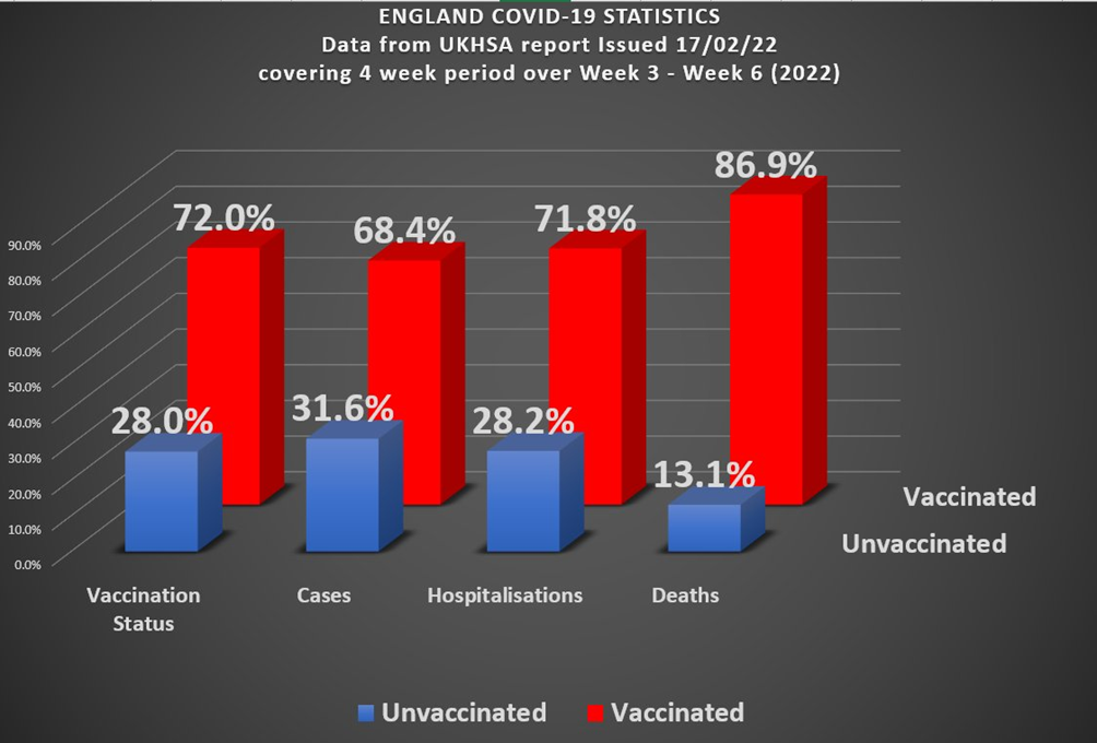
We’re clearly in a situation where the Covid vaccinations haven’t solved the Covid epidemic, and might even have made things worse (deaths). It certainly isn’t the case that this is a pandemic of the unvaccinated, when 72% of hospitalisations and 87% of deaths are in the vaccinated. Of course, the devil is in the detail, and in this specific case the variation between different age groups (older people are more likely to be vaccinated but also more likely to die). This week’s data indicate that infections continue to tumble for all age groups and vaccination status – the December and January Omicron wave appears to be receding fast. The data continue to show that for nearly all age groups the more vaccine doses you have the higher your risk of infection with Covid.
Two age groups stand out as different from the others – those aged under 18 and over 80. For those aged under 18 it is likely that the higher infection rate in the unvaccinated at least partially reflects their more recent vaccination (for all doses). It isn’t clear what is going on for those aged over 80 (and, to a certain extent, those aged 70-80). It is always worth remembering that the immune system of those under the age of about 12 and over the age of about 65 isn’t the same as for the majority of adults and you might expect to see different disease patterns and characteristics in these groups.
From the infection rate data we can again estimate the vaccine effectiveness against infection – negative for all age groups other than those aged under 18, and significantly so for those having taken a booster dose.
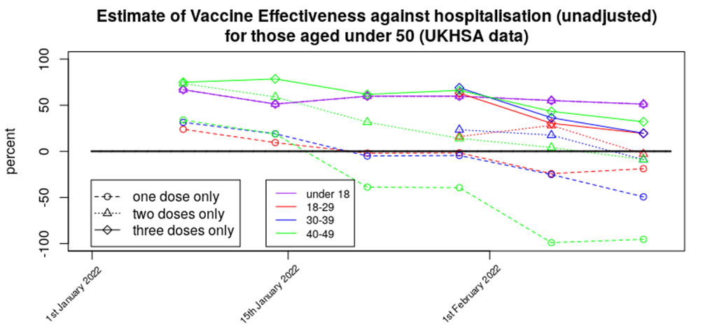
For this week we’ve got enough data to present graphs of vaccine effectiveness against time (this year) for all age ranges – as this is now rather a lot of data to present in one go I’ve split it into a graph for those aged under 50 and another for those aged over 50. First the changes with time for those aged under 50:
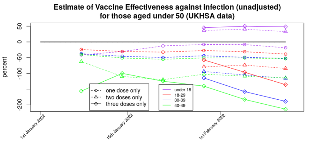
One dose of vaccine appears now to offer a relatively low but stable increase in the risk of infection, two doses offer a stable but higher risk of infection, while the risk of infection appears still to be increasing for those that have had a booster dose – those in their 40s being up to three times more likely to be infected than the unvaccinated. The silver lining in these data is that the impact of the vaccines in terms of increasing infection on those aged under 18 appears to be low; I hope that this reflects their robust innate immune system and isn’t simply because their recent vaccination means that there hasn’t been time for the increased risks to emerge.
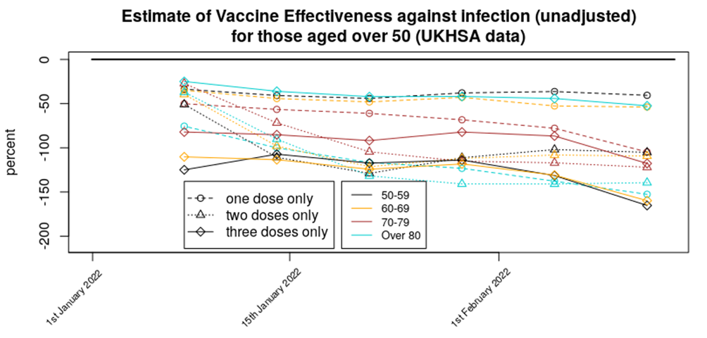
The infections data for those aged over 50 paints a different picture. The only clear indication is that all age groups for any number of vaccinations have an increased risk of Covid, compared with the unvaccinated.
It is still unclear why the vaccine is resulting in increased risks of infection. There are several mechanisms that might explain it and really there should be much more research being done on this because they’ll determine the likely longer term outcomes of the vaccination programme.
The complication with the infections data is that there are concerns about reduced testing levels (including the likely-immient removal of free tests) and with the impact of reinfections. While reinfections are now included in the total, they’re only classed as reinfections if 90 days have passed since the previous test; whether 90 days is appropriate remains open to question.
The situation with testing is illustrated by the difference between official case number for the past month with people reporting symptomatic Covid to the Zoe symptom tracter – I’ve included graphs for both below; official data top, Zoe data middle. I’ve also included the latest ONS Infection Survey graph for England (bottom).
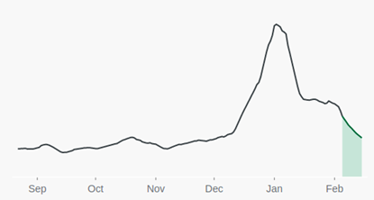
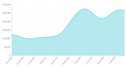
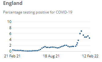
Note how official case numbers have dropped since the Christmas Omicron peak, while the Zoe Symptom Tracker is showing a second peak in the data. The ONS Infection Survey shows a pattern part way between the two. The impact of this complication on our analysis is unclear. It is of note that genomic analysis of a sample of test swabs suggests that the second peak in the Zoe data isn’t simply the BA.2 variant – that doesn’t seem to have infected large numbers in the UK (yet).
On the topic of variants, we’re now beyond the point where the arrival of Omicron variant would still be causing vaccine effectiveness to drop in our analysis – if it were simply an effect of Omicron having achieved more vaccine escape then the vaccine effectiveness should have flatlined over the past two or three data points, however the data suggest that more is going on – but is it continued and rapid antibody waning or something else? Consider the the data on variants published by the UKHSA:
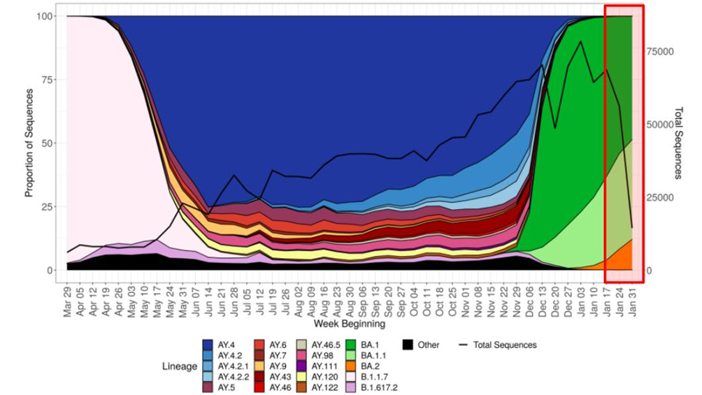
The period covered by the latest report is highlighted in the red rectangle to the right of the graph. The continued decline in vaccine protection suggests that it is possible that variant Omicron BA.1.1 (and/or perhaps BA.2) has achieved further vaccine escape, compared with variant Omicron BA.1, and these variants might even be causing rapid reinfections in the short term. Again, more information is required to explain the disparity between the official and Zoe data.
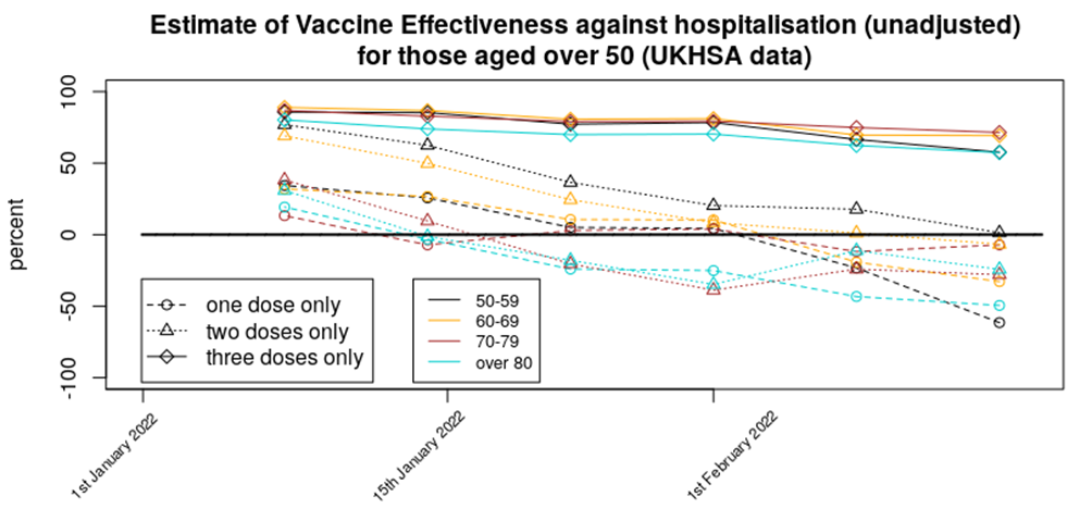
Regarding vaccine protection against hospitalisation, the data are fairly consistent – three doses of vaccine still offer some protection against hospitalisation for all age groups, two doses appear to offer approximately zero benefit, while those having had only a single dose appear to have an increased risk of hospitalisation.
Note that unlike the infections data, the data for hospitalisations is rather robust, albeit complicated by the question of ‘with vs of’ Covid.
The data for protection against death is similar to the hospitalisations data; a fair amount of vaccine protection remains for those who have received a booster dose, two doses appear to give negligible protection and a single dose appears to offer negative protection (i.e., increases the risk of death). Note that I only included data for 40-80 year olds in this graph; the death rate in those aged under 40 is very low and gives ‘noisy’ results, while the data for those aged 80 or over is complicated by the very large range in vulnerability within the group.

It is important to note that although this last graph shows those with only one or two doses of vaccine to have an increased risk of death, the advent of Omicron has reduced the mortality rate of Covid significantly. The widespread ‘fear of Covid’ that is affecting so many lives is based on the information we had about the risk of the virus in early 2020; this level of fear isn’t appropriate in early 2022.
Amanuensis is an ex-academic and senior Government scientist. He blogs at Bartram’s Folly.


To join in with the discussion please make a donation to The Daily Sceptic.
Profanity and abuse will be removed and may lead to a permanent ban.
I’m unvaxxed and have Covid for the second time. The vaccines are not effective and natural immunity in my case was short lived (6 months). Strangely enough when I nursed for 15 months during the pandemic I was fine.
Or you’ve got the flu.
Stop testing.
Tests are Fake!
It’s a strange way of looking at it.
In the past when you got a flu or a cold, did you consider that you had acquired immunity? Did you ponder how long the immunity would last?
If you were like most other people, you caught it, you got over it and expected to get another one sometime in the future, but didn’t really give it too much thought.
It seems really odd to me that we now expect to gain some sort of permanent immunity to colds or flu like illness.
Exactly – other than when you are infected it generally is milder. Worked in health care for years and rarely get colds etc. It’s repeating the obvious that we build up immunity over time. Staff would have infinite fun with my diet of oranges, but when the bugs were a circulating I was the one without the sniffles. That and exercising and having a sensible diet with vit D and zinc supplements. Plus natural immunity – done deal. Regularly around the unwell and totally chill and unconcerned. It’s called living.
I couldn’t agree more with this.
Linus Pauling is good on vitamin C in particular.
A decent amount of sleep is also important.
Sleep. Yes. Always been a bad sleeper. Went Carnivore + low carb a year or so back. Sleep like a baby.
The situation appears to be that all infants catch every coronavirus strain (the four that existed prior to 2020 plus sars-cov-19 from this point on) and build up an immunity to it. The immune system of infants is ‘strange’ and they ‘tolerate’ the infection — as a result they get sniffy and moan a lot but it don’t harm them further. This immune memory then surfaces on every reinfection in their life (about once every two years) and stops them getting serious illness, but it doesn’t stop the infection itself.
What’s interesting is that the immune system doesn’t particularly try to gain long-lived immunity to the ‘cold’ infection. There is an immune response in the mucous membranes (lungs and gut) but that only lasts about 2-3 months or so.
I suggest that we’d know more about the immune system and our expectations of the covid vaccines if we fully understood why our immune system doesn’t create long lived immunity to ‘colds’.
It might be useful to look at the immune system in the wider context of evolution. To do his we need ignore the past 1,000 or so years when, for at least some, people there was enough food and improving medical care. For the rest of our evolutionary history the resources needed to sustain the body (energy and nutrients) were in short supply and if too many resources were devoted to one part of the body e.g. the immune system then other parts e.g. muscles or the reproductive system would be starved of resources. In this context it would be possible for an immune response to be “too good” in that it wasted resources that could be used elsewhere in the body. Since the “cold”, flu and sars-cov-19 would be mild infections, due to the fact that the high risk groups would’ve previously died of something else and the vast majority of the population would be healthy under 40’s, there was no need to maintain a long lasting strong immune response since each new infection could be defeated easily with few resources. Indeed natural selection would penalise those individuals that “wasted” scarce resources on maintaining lots of antibodies/T-cells at the expense of the rest of the body.
Kids immune systems are not properly formed, so don’t react like adults do to such viruses.
Oddly enough, since a bad flu experience more than 20 years ago, I’ve had nothing more than very minor sniffles since – requiring no time off work. Never had a flu shot.
I like to think that my immune system disliked that long-ago flu so much that it has become hypervigilant. But, whatever …
Colds and flu-like illness are part of the minor irritants of life. They are not abominations – like repeated testing of oneself or wearing masks “to be safe”.
I find complaints about the vagaries of coughs and colds as boring as complaints about the weather.
Good point!
And while everyone’s obsessing about the virus, serious threats and conditions like heart disease and cancer are shunted off to the side in the public consciousness.
I think it varies from person to person. If I get a cold, it’s a sniffle at worst, every few years. I have never had influenza – maybe man flu a couple of times, but not the full blow illness which can be as vile as Covid it seems. So I don’t have the ‘flu jab (am 70), similarly am unvaxxed for Covid, on the basis of why on earth would I get injected for a disease that is not a threat to me, in that I am a very healthy 70 year old, who gardens all day when he can and walks dogs every day, eats only very good local food and NO processed food whatsoever. Carnivore + low carb suits me very well indeed. Supplement D3 + K2, and Zinc + Quercetin during the worst phases of Covid.
But it does seem to me that I have some long term immunity from respiratory viruses. One of my sons, unvaxxed, got Covid with his family last year (“bad flu”, his description) and them Omicron a few weeks back (“just a cold” – sorry Gove) as well. No problems with either infection.
If you got Omicron the second time I think it is well established that infection from previous variants doesn’t protect you against that one.
Is it well established? There are indicators that a combination of at least one so-called vaccine and actual infection results in much narrower immunity than natural infection alone. Of course all the studies that would show this effect suspiciously omit any data broken down by so-called vaccination status.
According to what you’ve said, natural immunity was good enough to get you over two doses of SARS‑CoV‑2 and its variants, so well over them, in fact, that you’re now on here making comments.
Hmmmm, what did you expect from natural immunity? A holiday in Barbados?
Also, bear in mind, if you are perhaps lying about being unvaxxed, your natural immunity may also be fighting a battle to get you over the “vaccines” and boosters.
First of all, unless you got double pneumonia, then you didn’t get Covid-19 at all, something that I would assume a nurse to understand. Secondly, I’ve heard far too many people claiming to have had a SARS-CoV-2 infection when they haven’t had symptoms and they are just relying on dodgy tests, or sometimes they have a cold with no test and call that “covid”. So you need to be a bit more specific. Remember that if you get exposed to SARS-CoV-2 and your immune system successfully smashes it to bits before symptoms develop, you may well get a PCR positive, even though you were actually immune.
How would you, or anyone know if they had ‘covid’? The genome sequence used in the Drosten protocol was computer modelled ie it doesnt exist in real life and was cobbled up from bits of SARS 1, the common cold and anything they thought might fit. What a joke – and this website takes it all seriously!
Keep getting thre truth out there!
For the Downtick mobsters, please read this:
ILLA
The PCR Disaster
Genesis and Evolution
of the Drosten Test
Available on the net, and as a sign of its worth has been attacked by the FactCheck Nudgers with no effect whatsoever. And also please investigate for yourselves the circumstances how the WHO prescribed this mass testing regime con, who was involved, who within the MHRA ( in a different role at the time ) was part of the WHO “committee” that signed it off, and how the process of formulating this scam regime was carried out, revised and introduced, whether that was robust, ethical and scientifically sound – if “you” all do not have the capacity to read and understand how this mass testing regime was used to drive the biggest con in human history, may I suggest you ask for a refund on the costs of your education.
I’m unvaxxed and have Covid for the second time.
I very much doubt it. Were you actually medically diagnosed on each occasion, or is that your assumption based on PCR testing, which as you must surely know is not a diagnostic test?
Two positive PCR tests six months apart does not mean that you had Covid on either occasion.
Good comment!
I had covid in Dec 2020, confirmed 4 months later with 2 blood tests. I supposedly had omicron last week, I will get a blood test done this week to confirm. I had very mild symptoms, shortlived but had to have a PCR which said “+”. I am sure you can get it twice as it is just a cold. I am unjabbed. My double jabbed husband has been much more sicker!
Did a GP confirm you had Covid ‘for a second time’?
Would you believe a GP if they did?
You made the correct decision to avoid the ‘warp speed’ clot shot.
Being ‘a Covid case’ can mean anything from no symptoms at all to dying whilst attached to a ventilator.
When you say ‘have Covid for a second time’ do you mean that you have suffered significant illness consistent with (the regularly changing) supposed Covid symptoms?
Do you mean that you have been perfectly healthy but tested positive twice AKA asymptomatic?
Do you mean you had a bit of a cold, felt poorly for a few days and then felt better?
Had illness similar in severity to a flu?
69, not ‘vaccinated’, nit worn mask, no ‘social distancing’, not had CoVid despite my best efforts. Is it discrimination?
I’m confused. I thought we had established that covid was a scam virus which could only be detected by a scam test, yet here we are again looking at graphs. It seems to me that we’re going round in (insert own rude word) circles! Perhaps it’s the jabs/vaccines whatever you like to call them that are causing all the problems (sarcasm).
Depends what you mean by scam virus and scam test. The tests seem to be of questionable value as they seem to detect a lot of positives of people who are unlikely to be infectious to others and who are usually not ill. The scam aspect of the virus is the Big Lie that covid was/is such an exceptional threat that unprecedented measures were and are required.
I’m not much interested in “case” numbers but I think analysis of vaccine effectiveness is reasonable, even if the underlying data is not really there to be able to do it properly (which is probably deliberate). Debunking the lie (in my view) that the vaccines saved us is important.
In a country with a 3rd world health service I don’t believe we should wasting more time/money on this covid farce. That’s all.
I completely agree – the vaccines seem like a huge waste of money to me
Aren’t they free?
(Sarc,)
Yup, that’s a big part of the problem, them and the “free” tests
There was a point in time around January to March 2020 where it was reasonable to take firm measures to stop the spread of covid. From about April it was fairly clear that the main risks were to fairly well defined groups (the elderly, mainly) and that targeted measures for the vulnerable were warranted, but nothing else.
I find it bizarre that the actual measures taken were the opposite of what was required — do ‘not very much’ during the time when the risk wasn’t well understood, and then when we knew the risk was limited we went bonkers with interventions that were unlikely to make much difference to the disease but would have incredibly damaging consequences to the nation’s wellbeing and economy.
“There was a point in time around January to March 2020 where it was reasonable to take firm measures to stop the spread of covid.”
Which covid are you talking about? The one that made ham actors pretend to fall over dead in China, the one that hit Northern Italy where it was later found that 89% of supposed covid deaths were not actually ‘covid deaths’, the one that required death certification to be changed in order to inflate ‘covid’ deaths, the one that needed hospitals in the US to be bribed to say a patient had ‘covid’ or the one that required its ‘genome sequence’ to be cobbled up on a computer because it disnt exist in real life?
Great post!
People must stop swallowing the same old lies about the “Made in China” Scamdemic – there is just too much truth out there!
A vaccine is a substance that gives immunity to a specific disease. The mRNA pseudo-vaccine do not do that. They are not vaccines, therefore de facto they cannot be effective with respect to their claimed function. Less serious, lowering number of hospital admissions, fewer deaths – these are non-falsifiable claims, therefore non-provable – even if true, is not the function of a vaccine. Other things could be done to achieve the same, like treating vulnerable people immediately instead of waiting for their cases to become critical.
You are partly right. The jabs feed the strange psychotic obsession that society has acquired with colds.
A bit like the mad germaphobe in As Good As It Gets that obsessively washes his hands, eats with disposable plastic cutlery and thinks he is in mortal danger if anyone touches him. But on a societal scale.
The virus probably exists. The actual impact of the virus on the country (world) without all our interventions is open to question (eg, Sweden vs UK).
Perhaps it is the “vaccines”? Why the perhaps?
What has been established is that in the UK in Mar/Apr 2020 there was a spike in deaths in mainly the elderly and there was an unusually low Oxygen level that was hard to restore in some people who had felt unwell/had a fever for a week or more. Since then we have been pondering why the World has acted in a very strange and knee jerk manner.
A study published last year by the U.S. CDC found that vaccinated people were less likely to die of non-Covid causes, suggesting that they’re inherently healthier and/or more risk averse than unvaccinated people.
Those who are unvaccinated that end up in hospital and die could quite easily be due to the “unhealthy unvaccinated” effect.
A rough sleeper or anyone else who is not on any health records who ends up in hospital is regarded as “unvaccinated”.
Someone who had their first vaccination less than 14 days previously is regarded as unvaccinated in some studies. So if they end up in hospital due to Covid or vaccine induced health problems similar or the same as Covid they are regarded as unvaccinated in the study even though it was the vaccine that caused it.
The vaccinated are also more likely to catch Covid within 14 days of their vaccine than the unvaccinated due to a compromised immune response.
https://www.hartgroup.org/why-do-they-hide-what-happens-in-the-first-two-weeks-after-vaccination/
The vaccinated have been told that it stops them needing hospital treatment which creates the placebo effect whereby a vaccinated person who catches Covid doesn’t feel the need to go to hospital because they’ve been told by a “higher authority” that they are protected. This skews the figures in favour of “Vaccine Effectiveness”.
Conversely an unvaccinated person with exactly the same symptoms have been told via propaganda they are likely to die and will therefore present themselves to hospital through fear which again skews the figures against the unvaccinated.
All these “healthy vaccinee”, “unhealthy unvaccinated” and vaccine induced Covid patients within 14 days of the jab (regarded as unvaccinated in some studies) are skewing the figures making the jabs look a lot more effective than they really are (if they are effective at all).
The ONS has also grossly underestimated the unvaccinated population.
You’re right. There are differences between the unvaccinated and vaccinated (and each vaccine dose) that isn’t taken into account in nearly all analyses.
We really need proper matched cohort clinical trials to investigate the impact of the vaccines (this means that you create a trial where the vaccinated and unvaccinated groups have known and ‘similar’ characteristics). Given the scale of the costs of covid so far this would essentially have been ‘free’ (it would have cost a few million £s).
Without these data we’re working with one hand tied behind our backs.
I note that the trials would also have picked up side-effect/complication risks of the vaccines. There’s very little being done in this regard (a tiny fraction of the money spent looking in every nook-and-cranny for the mysterious long covid).
A study published by the CDC has as much validity as dollar bills ‘published’ by the Mafia.
Do we have conclusive proof that the ‘vaccines’ have reduced deaths from covid?
Yes the government said they do, I hope this answers your question.
To repeat what Jacinda in NZ said, the government is the single source of truth! 😉
No.
The bigger question should be whether they reduce deaths overall; the impact of the vaccines on health (in general) isn’t particularly well understood.
Uh…what’s not understood about healthy athletes dropping dead, babies dying in utero, teenagers developing myocarditis, fit 40 year olds stroking out, cancer surging in patients who were in remission, Bell’s Palsey, GBS, Mad Cow etc., etc., etc.?
I think they base their assumption on less people test positive so of course this means lives are saved which is probably the least scientific assumption ever made 🤣
No. But we do have conclusive proof that the ‘vaccines’ haven’t reduced deaths from Covid.
None whatever!
The evidence I have seen points in the opposite direction.
The jabs have increased the prevalence of Covid and more people are dying from Covid after being jabbed.
The unjabbed are fairing much better.
The jabs have also increased deaths from causes other than Covid.
There is NO conclusive proof that ANY vaccine has reduced deaths, simply because studies with a control group were never carried out in the past. The present day bullsh*t studies have either been hijacked, or designed to avoid ‘confirmation’
No.
We have no conclusive proof of who actually died of CoVid… by design.
Maybe there’s some truth in what GVB has been saying for over 2 years now.
Also seems to be backed up by a plethora of scientific literature :-
https://www.authorea.com/users/455597/articles/552937-innate-immune-suppression-by-sars-cov-2-mrna-vaccinations-the-role-of-g-quadruplexes-exosomes-and-micrornas
Basically, the mrna jabs are very good at degrading the immune system, both innate and acquired.
I like Geert (although he doesn’t try to make it easy to understand what he says), but his thesis is that mass vaccination will drive the virus to evolve to escape the vaccines (bad — this has already happened) and also to escape innate immune mechanisms (worse — I don’t think that this has happened yet).
But that paper is very interesting. It is the sort of research that’s done a few years after a new medical technique has been thought up, with considerations as to what the risks might be — these types of papers then drive policy about whether the medicines should be used, and where.
Unfortunately, we’d done it the other way around, and vaccinated the world before understanding what the longer term consequences might be.
That was their objective all along!
Time to go short Pfizer/Moderna?
I guess that’s a bet on if authorities will do anything…
Yes I was thinking that, the Big Short springs to mind, triple A credit ratings on sub prime mortgage bundles, CDO’s etc. However those traders, fund managers, although ultimately proved right nearly lost everything by plunging in too soon. Timing is everything.
You might be too late (with Moderna at least).
Just watched a very interesting analyst’s take on the Moderna share price spliced together with the initial roll out and highs and lows of their clot shot. https://www.youtube.com/watch?v=YAr2CkGPJ8M
The two graphs would seem to contradict each other. In the first, the proportion of “infected” is higher among the jabbed than the unjabbed. In the second graph, the proportion of “infected” is higher among the unjabbed (but deaths and hospitalisation lower).
Which two graphs?
The first two
HRA Reform – Tips for responding
https://www.gov.uk/government/consultations/human-rights-act-reform-a-modern-bill-of-rights/human-rights-act-reform-a-modern-bill-of-rights-consultation
Some points you might like to consider, and paraphrase in your own response if you resonate with these:
1. The “Modern Bill of Rights” you propose MUST NOT contradict, contravene, or in any way reduce the rights of any human being already established in UK’s existing body of laws. If it does, it will be unconstitutional in whole or in part.
2. The most important human right is bodily integrity. That means NO bodily interference without fully informed consent, freely given. The right to bodily integrity, therefore, MUST be included as an UNQUALIFIED right in any “Modern Bill of Rights.”
3. Attempts to prevent frivolous or dubious human rights claims (for example, a sociopathic/psychopathic killer wishing to avoid extradition/deportation by claiming a right to family life, his family being his cat or dog) MUST be addressed only by the discretion and wisdom of the courts, on a case by case basis and NOT by prescriptive legislation, because the latter will inevitably lead to unintended consequences (for example, if society became conditioned in the future to believe that mass vaccination was more important than bodily integrity or informed consent, then a “permission stage” could block access to legitimate and important claims from individuals who believe in bodily integrity and informed consent.
These are just a few ideas, if you’re concerned about your MEDICAL FREEDOM being compromised.The above can be integrated into your responses within the online process, answering specific questions OR can be emailed as a freeform response.
If emailing, begin with a sentence to introduce your response (“I’m responding to the consultation on the HRA Reform proposal….. I’m a [mum/student/teacher/electrician/etc]……. I feel it’s important to….. etc”) and conclude with a sentence thanking for the opportunity and entrusting the recipient to carefully consider what you’ve written (“thanks for your time, I’m sure you will consider each response carefully/respectfully/….. future society depends on the decisions we make today/etc”)
Outlaw Medical Mandates, Everywhere, FOREVER:
GOV.UK
Human Rights Act Reform: A Modern Bill of Rights – consultation
All the data is pointing me to the conclusion I made in March 2020. Very old, very frail people will die eventually. Nothing more to see
Of course you might want to not let them die if simple interventions might help — this was the point of Great Barrington.
Our ‘everyone is at risk’ response was extremely damaging; the impact on the nation’s (world’s) health will resonate for years and years.
“Nothing more to see”! Except the “Yellow Card” underestimations of ‘vaccine’ induced deaths and serious, often life-changing, side effects.
While the onus is not on us but rather those pushing ‘vaccines’ with no appropriate/long-term safety data on billions of human beings, since you asked:
https://palexander.substack.com/p/so-you-say-dr-alexander-you-keep
https://gettr.com/user/edwarddowd
Oh bloody hell.
I posted on DS some weeks ago when the story initially broke that the insurance industry could blow the lid off this Scam. Nice to see that it is happening.
Never upset actuaries – they get their own way every time.
Actuaries deal in death. Death gets its own way every time.
Big Pharma stocks down. Wall St turning.
https://gettr.com/user/edwarddowd
I went long dignity. Hasn’t paid off
The Scottish government’s decision to keep the figures secret so as to avoid having their thieving and killing policy on spiking criticised won’t do them any favours when eventually they are put on trial.
Mitigation? Forget it. Compounding the offence by seeking to hide evidence of its effects – that’s what’s happening. Each and every one of them deserves the maximum penalty prescribed by law. Note too that not a single one of these criminals have resigned over it – they all support it; they are all guilty.
Here are their names, these men and women who know exactly what lowlifes they are and who think they can escape justice.
Cabinet
Nicola Sturgeon – First Minister
John Swinney – Deputy First Minister and Cabinet Secretary for Covid Recovery
Shirley-Anne Somerville – Cabinet Secretary for Education and Skills
Humza Yousaf – Cabinet Secretary for Health and Social Care
Kate Forbes – Cabinet Secretary for Finance and the Economy
Keith Brown – Cabinet Secretary for Justice and Veterans
Mairi Gougeon – Cabinet Secretary for Rural Affairs and Islands
Angus Robertson – Cab Secr for the Constitution, External Affairs and Culture
Michael Matheson MSP – Cabinet Secretary for Net Zero, Energy and Transport
Shona Robison – Cab Sec for Social Justice, Housing and Local Government
Ministers
Angela Constance – Minister for Drugs Policy
George Adam – Minister for Parliamentary Business
Richard Lochhead – Minister for Just Transition, Employment and Fair Work
Ivan McKee – Minister for Business, Trade, Tourism and Enterprise
Tom Arthur – Minister for Public Finance, Planning and Community Wealth
Maree Todd – Minister for Public Health, Women’s Health and Sport
Kevin Stewart – Minister for Mental Wellbeing and Social Care
Clare Haughey – Minister for Children and Young People
Jamie Hepburn – Minister for Higher Education and Further Education, Youth Employment and Training
Mairi McAllan – Minister for Environment and Land Reform
Jenny Gilruth – Minister for Transport
Ash Regan – Minister for Community Safety
Christina McKelvie – Minister for Equalities and Older People
Ben Macpherson – Minister for Social Security and Local Government
Neil Gray – Minister for Culture, Europe and International Development
Patrick Harvie – Minister for Zero Carbon Buildings, Active Travel and Tenants’ Rights
Lorna Slater – Minister for Green Skills, Circular Economy and Biodiversity
Law Officers
Dorothy Bain – Lord Advocate
Ruth Charteris – Solicitor General
I make that GUILTY 29 times.
This is the government led by Nicola Sturgeon who (as the whole of the Edinburgh “political bubble” is aware)
The titles of the ministers demonstrate, in themselves, what a useless load of pseuds this ‘government’ is.
Negative efficacy is the gold standard for eugenicists.
How tragically inconvenient for the narrative…Has anyone told the monstrous Trudeau?
It is in his interests to ignore (and mandate that everyone else ignore) things that don’t support his policies over the last 2 years.
Apparently his horse-mounted Black Shirts trampled a woman in a wheelchair – who just happens to be a clan leader of the Mohawk Nation. These native Mohawk Nation and similar groups are exempt from the provisions of the Emergency Powers Act Trudeau has invoked. Ooooops!
It is time those “scientists” start trying to figure out what the heck is going on instead of constantly trying to either hide or misrepresent the data.
They don’t want to know because they are really politicians, or business people, not scientists
The lone down-ticker got a few negative comments in a previous thread. There’s no doubt this individual is certainly not playing with the full deck.
The Christian in this video very succinctly describes this sad down-ticker and his/her ilk. In fact, in about 12 seconds this Christina preacher very adequately describes Boris, Carrie, Justin Trudeau, Horseface in NZ and a plethora of other gits in the modern world.
The video is about 10 or 12 seconds, but this chap is worth a listen to. He’ll brighten up your evening.
Video had 785 views in 45 minutes! Mr Downticker, you are wasting your time.
No longer available – “Session expired” … whatever that means. What is the title of the video?
Try this link.
I’m unvaxxed and have Covid for the second time.
I very much doubt it. Were you actually medically diagnosed on each occasion, or is that your assumption based on PCR testing, which as you must surely know is not a diagnostic test?
Two positive PCR tests six months apart does not mean that you had Covid on either occasion.
Surely it is time to give up the feeble attempt to use multiple graphs and charts to defend and explain the total failure of the magic ‘experimental’ mRNA injection to protect or prevent anything?
However, we do know that the injections can kill and seriously damage those injected – we also know the more jab spike proteins you get the more likely your immune system will be destroyed.
Latest Globalist Power Grab: The WHO is trying to impose its health and vaccine mandates on independent countries by requiring then to sign over all authority over Medical matters to them – the WHO – which is controlled by the CCP and Bill Gates, (who is also by chance the most important source of private funds. -so important in fact that they want to give him the same status as a ‘country’!
What’s not to like?
The Joe Rogan Experience – #1780 Maajid Nawaz
https://open.spotify.com/episode/1ugbn7cuab3mNgKbo81ajM?si=44b4ad0817e94b5a
How do you solve a problem that hasn’t and doesn’t exist? Unless we’re talking about flu and common cold of course, but you’d still not inject something into your blood to deal with such illnesses.
It’s common knowledge now, surely, on these pages at least, that the ‘vaccine’ causes spike protein that triggers symptoms that match the flu/cold, ie., Covid19.
We’re witnessing double/triple jabbed people getting ill or testing positive for ‘the virus’ because of the ‘vaccine’.
Come on DS, just admit there never has been a pandemic over the last 2 years.
The most obvious comparison is unvaccinated vs vaccinated (any dose)
Still negative vaccine efficacy against testing positive in every age group when comparing unvaccinated vs vaccinated (any dose). See attached chart.
Effectiveness is worsening in every age group. And in the age groups covering ages 18-79 the experimentally vaccinated are testing positive at least double the rate that the unvaccinated are.
And down to just 13% of deaths within 28 days of +ve test in the unvaccinated and 87% in the vaccinated. Notice how it has been increases in vaccinated +ve test deaths that have been driving things since week 1’s report (covers weeks 49-52) to week 7 (covers weeks 2-6).
And now down to just 28% of emergency care +ve test admissions in the unvaccinated, and 72% in the vaccinated.
Let the unvaccinated give a big cheer for our immune systems and natural immunity.
🤣 🤣
And just look at the history of +ve test rate per 100,000 in the 40-49 age group by vaccination status. I’ve marked on +ve test rates at various points to help the comparison. Note the position doesn’t improve when booster uptake occurs.
(note the third dose % is for the week shown and the case rates are for the previous 4 weeks)
Nice summary of the current situation. I am wondering why Dr. Geert Vanden Bossche continually reminds the health authorities, vaxxing during a pandemic will potentially create dangerous mutation of the virus. Also, Zoe app is just that. A subjective app anyone can respond app. No objective data…..just subjective, based on how someone felt on any given day. Funding for Zoe and its lead “scientist”? I am sure there is no conflict of interest here. Just like there are no conflicts of interest in sage and our cabinet and politicians.
“The widespread ‘fear of Covid’ that is affecting so many lives is based on the information we had about the risk of the virus in early 2020; this level of fear isn’t appropriate in early 2022.”
Do you think it might be a good idea if we stopped taking the “tests” it might stop the fear mongering that is going on. Indeed while we’re about it why don’t we stop the gene therapy treatment roll out too with over 2,000 deaths and 1.4 million adverse reactions it’s time to call a halt to this madness.
You can see that despite a far milder variant, a mild winter, masses if pre-infection & 4bn vaccine shots, deaths this year v last year aren’t so different.
Much of last years death was vaccine caused but first dose deaths were classed as unvaccinated when occurring within the first 14 days.
Imagine if the MMR data (and daily human experience) showed children vaccinated with MMR jab contracted measles at 3 times the rate of the unvaccinated. We’d be taking the data & the vaccine apart looking for explanations- as we should.
What happens if the next covid variant isn’t benign? (Something which of course SAGE is constantly warning about.) And vaccinated people are infected by a non-benign variant at 3 times the rate of the unvaccinated? What will the authorities do with the data then- still try to sweep it under the carpet?
A government and public health establishment that actually gave a toss about the health of its citizens would be all over the awful data on vaccine efficacy against infection. SAGE – given their supposed fear of a dangerous variant emerging- would be screaming about it. A vaccine which appears to actually increase infection? Infection with a rapidly evolving virus? What does it say about our government and public health figures that they’re not just ignoring the infection data, but trying to suppress it? Why is no one in the medical establishment pointing out that unless these infection figures can be explained, vaccinated people are at huge risk from future non-benign variants?
Coz they’d ave to admit they woz rong.
Wow, a drug that makes people who take it more likely to be ill than those not. Now that’s what I call a great business plan. I bet they also have another drug that will enable those ill people to cope with the effects of the first drug.
Not trying to plug myself (and I’m no scientist) but I’ve covered these topics in some posts over on Gab.com recently.
Vaccines and AIDS (and the differences between age groups) – https://gab.com/ManDownUnder/posts/107829541676133530
Waning Immunity – https://gab.com/ManDownUnder/posts/107795787277603810
Keep up the good work and don’t stop spreading the Truth, DS Team! This is the fight that we were born for and you’re doing God’s work!