A new report from the Office for National Statistics (ONS) was all over the papers on Monday afternoon making the striking claim that COVID-19 caused more deaths last year in England and Wales than other infectious diseases have caused in any year for more than a century.
Here is the story in the Mail.
The ONS report, entitled “Coronavirus: A Year Like No Other”, was released to mark the one year anniversary of people in the UK first being told to limit their non-essential contact with others and to stop all unnecessary travel.
The report confirmed that COVID-19 caused more deaths last year than other infectious diseases caused in any year for more than 100 years.
More than 140,000 people have died in the UK with coronavirus either described as the underlying cause or as a contributory cause on their death certificates.
Some 73,500 people in England and Wales who died in 2020 had COVID-19 registered as the underlying cause of death.
The ONS said coronavirus is “likely to be classed as an infectious and parasitic disease”, allowing a comparison with previous deadly outbreaks.
The statistics body said: “This means COVID-19 was the underlying cause of more deaths in 2020 than any other infectious and parasitic diseases had caused in any year since 1918; that year there were just over 89,900 deaths from various infectious and parasitic diseases registered in England and Wales.”
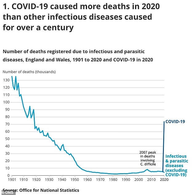
It’s certainly a striking graph, and it produced the fear-inducing headlines it was presumably intended to generate. But is it a sound use of statistics? Not at all. The comparison it’s making is completely misleading. Most significantly, those “infectious and parasitic diseases” it is comparing Covid to do not include the various strains of influenza and other respiratory viruses that do the rounds each winter. Which is why the numbers of deaths it shows for each year is so low since the 1960s – just a few thousand each year.
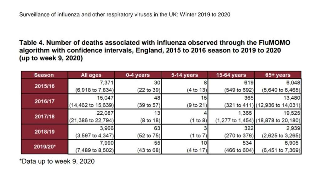
The ONS itself records that winter respiratory viruses in England can kill tens of thousands in a season (see table below).
Dr Clare Craig, a Consultant Pathologist and member of HART, told Lockdown Sceptics:
The infectious disease graph is so so wrong. They have omitted all respiratory infections from the numbers including influenza. Where for example are the 1918 flu deaths? They must have some category in their database that they record as “infectious disease” and for some reason they categorise flu under a different heading. Even flu cases that get diagnosed by PHE would have higher numbers than the numbers they’ve given.
It appears that the ONS coding system classifies “certain infectious and parasitic diseases” together under A and B codes and this is what the graph is plotting. ONS anticipates COVID-19 being in B code. Flu, however, is in J code (J09-11), so is not included.
David Livermore, Professor of Medical Microbiology at the University of East Anglia and Lockdown Sceptics contributor, writes:
There is clearly a lot amiss here.
First, the graph indicates infectious disease deaths dip below 10,000 a year around 1950, then as low as 2,000 a year by 1980. Aside from a minor blip attributed to Clostridium difficile around 2006-7 they stay below 5,000 a year until the COVID-19 pandemic, which shows as a massive spike, with 70,000 deaths in 2020.
This cannot be reconciled with annual (bacterial) sepsis deaths of around 50,000 across the UK, meaning around 45,000 in England and Wales. Nor do bad flu years show. For example, PHE indicates 22,000 flu deaths in England and Wales in the winter of 2017/8 but the graph has less than 6,000 total infection deaths in both these years. Similarly, but likewise absent from the graph, there reportedly were around 30,000 UK deaths in the 1968 flu pandemic and at least as many in 1957. The trough of 2,000 annual infection deaths in the 1980s and 90s is scarcely more than were then attributable to AIDS/HIV alone by 1994-5.
In other words, for most of the period shown, the graph wildly underestimates infection deaths. It may be objected that many of these, particularly in the case of bacterial sepsis, are severely-ill people who succumbed to bacteria that would ordinarily be harmless, and that deaths were often “with the pathogen, not due to it”. But that is true of many COVID-19 cases too: it is a virus that predominantly kills those with poor underlying health, particularly care home residents and those who catch it whilst sufficiently unwell to have been hospitalised.
Next, the spike for the 1918 flu is remarkably small. Excess infectious disease mortality (i.e., above the falling trend-line) looks to be only 20,000 or so and, even if spread across 1918 and 1919 (the peak was in Oct/Nov 1918) would still only be less than 40,000. This is far below conventional estimates of around 228,000 deaths (a review of total deaths recorded by the ONS suggests an excess spike around 130,000 to 150,000).
The ONS’s generation of the present graph has missed any sort of common sense check by a microbiologist or infectious disease specialist. It makes no sense whatsoever to put flu deaths into a totally different category when flu and SARS-CoV-2 are both mRNA respiratory viruses causing deaths (mostly) in the vulnerable.
It is truly distressing that it is plastered across numerous media outlets at face value.
What was the ONS thinking producing such a misleading graph and report, knowing full well it would grab lurid headlines and feed the hysteria that has characterised the last 12 months? A clarification should be issued explaining that these deaths from “infectious diseases” do not include tens of thousands of annual deaths from common infectious diseases, not least from influenza and the other winter respiratory viruses to which COVID-19 is most comparable. The report should be withdrawn as a particularly egregious example of the misuse of statistics.
But then, maybe it is a perversely apt way to mark the anniversary of a pandemic, one of whose central features has been the abuse of statistics to drive public panic and induce compliance.


To join in with the discussion please make a donation to The Daily Sceptic.
Profanity and abuse will be removed and may lead to a permanent ban.
The graph is just another example of the government “following the science” – the science of its SAGE behavioural sub-committee, which advised the government to wage a fear mongering propaganda campaign: https://assets.publishing.service.gov.uk/government/uploads/system/uploads/attachment_data/file/882722/25-options-for-increasing-adherence-to-social-distancing-measures-22032020.pdf
Once again as we have been saying for almost 12 months; the Telegraph punts it as a new idea.
That’s the thing. There’s been very little that’s come out about this “pandemic” that’s caused me to change my mind. All the data points to us being right.
The only time I thought that maybe my view of the virus outbreak was incorrect was right at the beginning when the infection and death rates appeared to be around 5-7% IFR, and during April when the deaths were so high.
It’s an absolutely ridiculous graph. Look at it. Something that jumps like that is a pointless thing to include as it just generates more questions, mainly about how they came to plot such a thing rather than the message it wishes to convey. I had to zoom in on it to see if it was an arrow pointing at something or the continuation of the actual line.
Not suprised to learn that you’d get as much insight from it by comparing covid to deaths from lightning strikes.
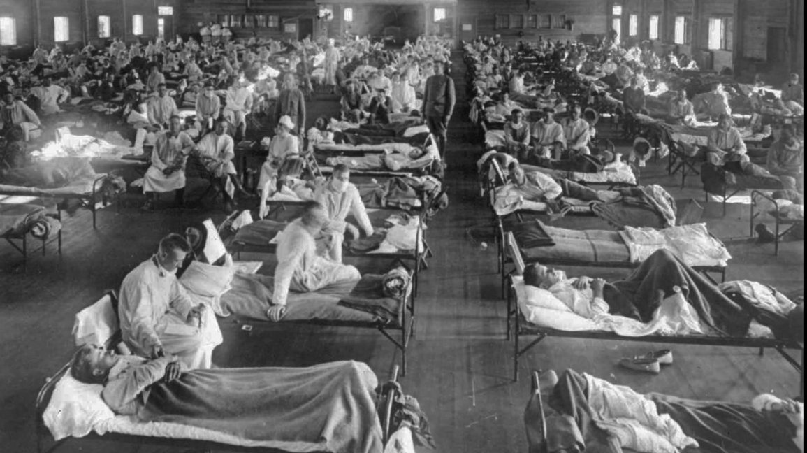
Hardly; my father born in 1920 was told by his parents that during the Spanish flu pandemic in 1918 that a mass grave was dug to bury 40 victims including 6 extended family members in their small part of the Black country (Gornal near Dudley).
“What was the ONS thinking producing such a misleading graph and report, knowing full well it would grab lurid headlines and feed the hysteria that has characterised the last 12 months?”
I think the question answers itself.
The government and its advisors, media campaign, etc, have deliberately set out to cause this hysteria and are still continuing that policy. It’s deceitful, and should be criminal.
This is just the most outrageous example. They should withdraw it and apologise. I think Prof Spiegehalter called them out on something last year as he is on a panel that overseas them
The problem is that Spiegelhalter also shows signs of toeing the party line to some extent.
This is serious. Of all the depressing news, for me this is one of the most serious items, as what has been a minor beacon of light becomes corrupted.
The ONS has chosen to turn to the dark side that is pure propaganda.
Before we even start, we know that the role of Covid-19 in mortality is unknown, and can never be known. We do know however, that all the indications are that it is massively inflated.
What we do know is that all-cause mortality – the one reliable indicator – shows no such apocalyptic nonsense. Far from it.
Did others clock the Chief Statistician engaging in Mystic Meg propaganda a few days ago? There was a massive smell of stinking fish.
To many it will seem a small addition to the shit-show, but I see it as a marker of the profound corruption of public life that has deepened measurably under this government.
The other thing to remark – building on what Claire Craig has said – is what other reason than propaganda is there to produce such a bent, exclusionary analysis when there are so many obvious flaws in it? As LMS2 has said.
There is absolutely no statistical legitimacy behind it.
As a behavioural scientist I am outraged at this use of what are called “dark nudges” in the presentation of data. This is nothing less than scientific fraud. It goes directly against the professed philosophy of “Libertarian Paternalism” and is instead aimed at manipulating and scaring people by deluging them with misinformation. Here in Scotland our government has been listening much less to either statisticians or life scientists but to public health academics.
These people have agendas for controlling and manipulating behaviour which see this emergency as their biggest opportunity. It’s also a great time to harvest data to analyse “natural experiments where changes like school and hospitality closures.can be gauged against the “control” condition of pre lockdown. This will drive funding and publications for years ahead.
The influence of public health behaviourists as opposed to the economic variety is one of the reasons Scotland has gone sooner and come out later than anywhere else. The idea that this is being driven by data not dates in Scotland is nonsense. The case data have been plummeting , vaccination rates accelerating , hospitalisation and death rates negligible. Unfortunately the authoritarian alliance government of SNP and Greens, will use testing as a way to slow things down when it suits them.
Expect the appearance of Jason Leitch, Linda Bauld and Devi Sridhar, wearing pained, concerned expressions on TV appealing for caution. Despite the fact that testing has long since ceased to be predictive and false positives are distorting the case numbers massively, they will find a few more cases to argue for another lockdown. They are pursuing the psychotic policy of zero covid. Part of their mindset is a grandiose protective behaviour which sees themselves as saviours, yet their expertise is not fit for purpose. It’s time to put life scientists and economists back in the advice loop.
“These people have agendas for controlling and manipulating behaviour which see this emergency as their biggest opportunity.”
Yes. I’m sure that this self-regarding professional corruption is clear, linked as it is to the issues of academic funding based on ultimate finance from the pharmaceutical industry.
Unherd has a good discussion re statistics in light of the ironic panic re the Astrazeneca jab: ‘How safe is the AstraZeneca jab?’ https://unherd.com/2021/03/how-dangerous-is-the-astrazeneca-jab/
That’s not a ‘good discussion’. It’s by Tom Chivers – a contradiction in terms.
Yes, the immediate dangers of the vaccines have been exaggerated (even tho’ the levels of adverse events should raise concerns).
But that was never the central issue around the corruption of process regarding proper testing.
… and does Chivers quote absolute risk reduction figures? – a sure marker by their absence of weak statistical understanding. He’s happy to use the term in quantifying the dangers – but not in putting the benefits of the vaccines in context (somewhat less than 1% against a placebo).
But, of course, the main, glaring issue is that, by definition, we have no longer term and independent assessment . An analysis that misses this crucial point doesn’t speak of a penetrating intellect.
It is also notable that he has been less enthusiastic in jumping n the continual statistical distortions promoted by government and its satraps.
Also worth noting is that this graph only refers to the raw number of deaths, rather than the death rate. The population of England and Wales has dramatically risen since 1901, and yet the death count has dramatically fallen.
Even considering this graph to represent accurate information (indulging for a moment the fairy-tale that it’s comparing like with like), I ran the numbers roughly, and in 1901, out of a population of about 32 million, 135,000 deaths of this category were recorded – that’s about 0.42% of the population. In 1918 roughly 90,000 deaths were recorded out of a population of 34 million – about 0.26%. If 73,000 lives were taken by Covid-19 in 2020 out of a population of 59 million, that goes down to 0.12%.
But once again, people, including journalists (and even if this WERE properly representative data), will look at graphs like this be alarmed regardless of the absence of context.
Yes. Absolutely. First chapter of ‘Statistics for Noddies’ : correct for population numbers before any analysis of such figures.
… which, again points towards corruption rather than incompetence; it is impossible to believe that the level of understanding at the ONS, even if imperfect, hasn’t grasped that one.
The organisation should be embarrassed at such blatant manipulation of data.
Why aren’t all viral respiratory infections grouped together in the ONS classification scheme?
I call it as I see it: duplicitous and deceitful. It’s lies, and we should be beyond soft-soaping by now. To imagine this amount of detail ended up in a long official report but might somehow have been an error, really is magical thinking.
When a layperson can pick out a more accurate perspective of the past year from the ONS’s own figures then we really have reached peak cynicism. The lockdown wonks don’t even bother to cover their tracks: they know this will be picked up and run verbatim by a supine media. They know most readers would sooner keep the blinkers on than risk the discomfort of cognitive dissonance.
During the covid period, ONS stats show (E and Wales) a significant decline in deaths attributed to respiratory disease, eg five yr average 92K versus 70K for 20/21.
Further, over the same period, ONS has twice altered the way it presents the stats thus making it more difficult to evaluate/ compare with previous years
Roll up, roll up get your jab before you add to these stats. Death is just around the corner. The only thing I’ve learned during lockdown is how gullible a lot of the population are, a shameful reflection of failing education system.