Despite the record reported infections in recent days, the latest data from the UKHSA suggests probable Omicron infections in London are already in decline.
The above chart has been created by Professor Anthony Brookes of Leicester University using the total number of probable Omicron infections (S-gene dropout, SGTF) reported each day by the UKHSA, applying a two-day smoothing and then plotting the daily increase as the day’s new reported infections. It gives an estimation of the number of Omicron infections reported for each English region each day. It shows reported Omicron infections in London peaking on December 18th and declining in the five days following it.
It’s worth noting that there was a data anomaly in Thursday’s report in which several thousand reported Omicron infections for London were retrospectively removed, resulting in a negative infection report on that day, which is why the last two days have dropped so low. This should resolve itself over the next few days, but even so there is no sign of continued growth in London.
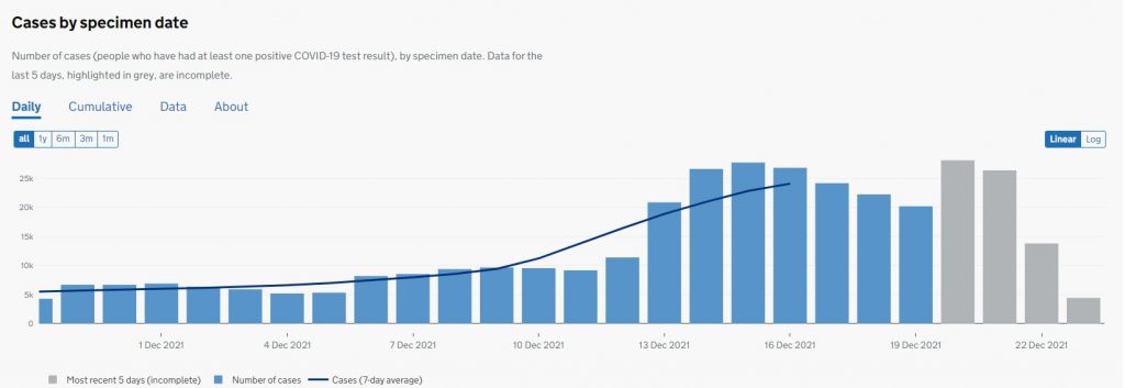
The U.K. Covid dashboard shows London total reported infections initially peaking by specimen date on December 15th, which fits with a peak of Omicron by report date of December 18th. According to the UKHSA, Omicron infections were 80-90% of the (low-Ct) infections in London at that point.
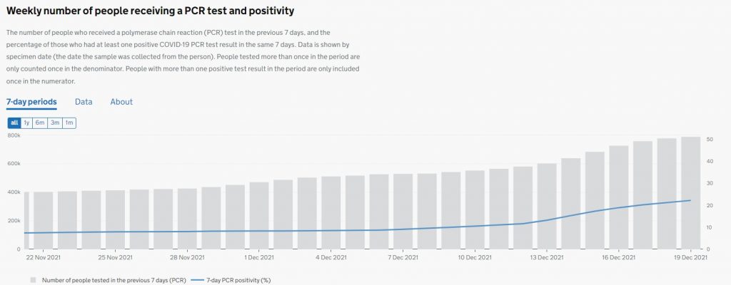
However, there is then a second peak by specimen date on December 20th – the incomplete data from the last few days does not suggest it will rise much further, though the bumpy course of the outbreak it is hard to predict. With testing up massively in the last few weeks, there is clearly a testing artefact going on here, possibly with people getting tested 10 days before Christmas and then in the immediate run-up to it. The chart below shows PCR test numbers and positivity in London up to December 19th and there is no sign in that of a dip, only a steady rise up to 22.2%. That compares to a winter peak last year of 27.8% on December 31st. While positivity is rising, then, it is not anywhere near as fast or as high as the raw infection data. If the data from the UKHSA Omicron reports is an accurate reflection of what’s happening on the ground we should see the positivity in this chart start to fall shortly.
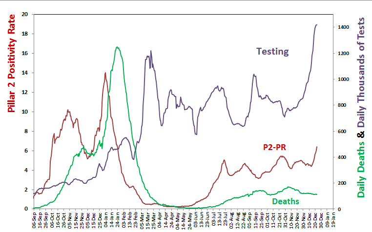
The following chart shows the national picture for all Pillar 2 tests (not just PCR tests) up to December 23rd. Positivity here has increased modestly to 6.4%, well below last year’s peak of 14% on January 4th (though the introduction of mass LFT testing since then will have changed the parameters somewhat). Deaths continue to decline at present, and are multiple times lower than this time last year, for which increased population immunity can probably take much of the credit (plus possibly milder variants).
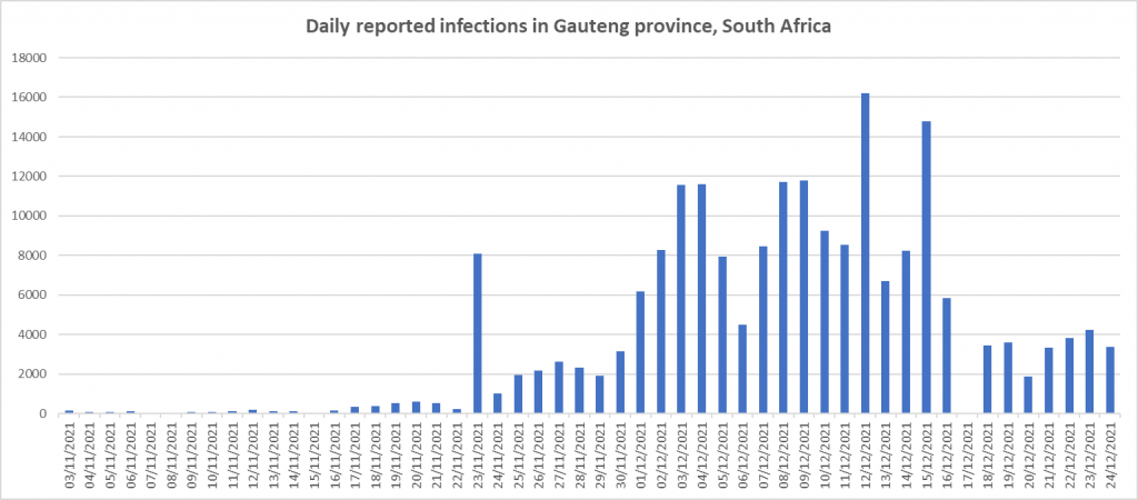
Reassuringly, Gauteng province in South Africa – the original Omicron epicentre – continues to show no growth in daily reported infections.
Last year analysis by Imperial College London found that new daily infections in England began to decline from around December 26th. It will be interesting to see if something similar happens this year, perhaps as a post-Christmas herd immunity kicks in following all the mixing in the festive season. Watch this space – and in the meantime, enjoy your Christmas celebrations, and be glad that this year the sceptics won and there was no Christmas lockdown.






To join in with the discussion please make a donation to The Daily Sceptic.
Profanity and abuse will be removed and may lead to a permanent ban.