I’m not usually a big fan of making predictions. I love the quote, reputedly from Nils Bohr: “Prediction is very difficult, especially about the future”. But I’m going to go out on a limb here, and say I don’t think the graph shown by Boris Johnson’s “scientists” yesterday, of over 6000 deaths a day in the UK is going to happen. The fact that it was even shown I just find embarrassing. As a Brit. I’m not sure if it’s because it’s so scientifically illiterate, or whether it’s evidence that the authoritarian elite have so little respect for the people of this country that they can just put up such transparent garbage, to get what they want. Which appears to be the destruction of our wealth and way of life.
But there clearly are increasing Covid hospitalisations and deaths currently happening in the UK and in other places. My hypothesis below is that this is because the epidemic was artificially suppressed in April, and now reality is catching up again. The Grim Reaper wants his souls. And I think we can make a reasonable prediction of how many he is coming for, based on how many we tried to prevent him getting the first time around. Apparently, deaths during respiratory epidemics normally follow the Gompertz curve, a feature of which is the straight line decline once the epidemic has peaked. A comparison between Sweden and the UK shows this.

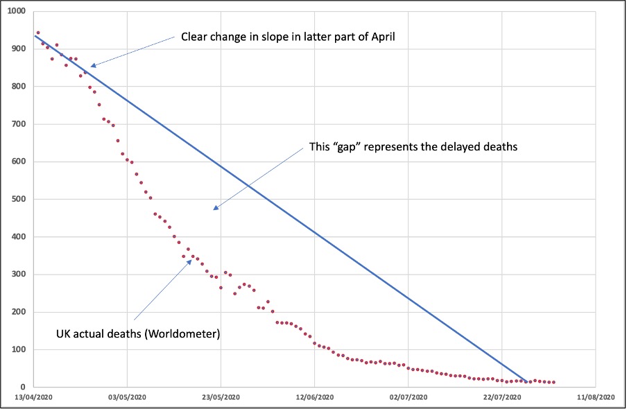
The artificial suppression of the virus progress back in March and April took the UK off the natural Gompertz trajectory. The change in the slope is clearly visible around the last week in April. What I am proposing here is that those lives which were saved from the end of April through to the end of July were only really delayed deaths, as this virus is not eradicable. And now they are due. And they are also predictable. If we look at the UK in more detail (showing actual seven day average death counts):

The break in slope at around April 23rd is clear, and makes sense when you consider that it would have taken about a month for any effect of the lockdown to become visible on the death count. And as can be seen with the change in slope, we have had less deaths than should have occurred.

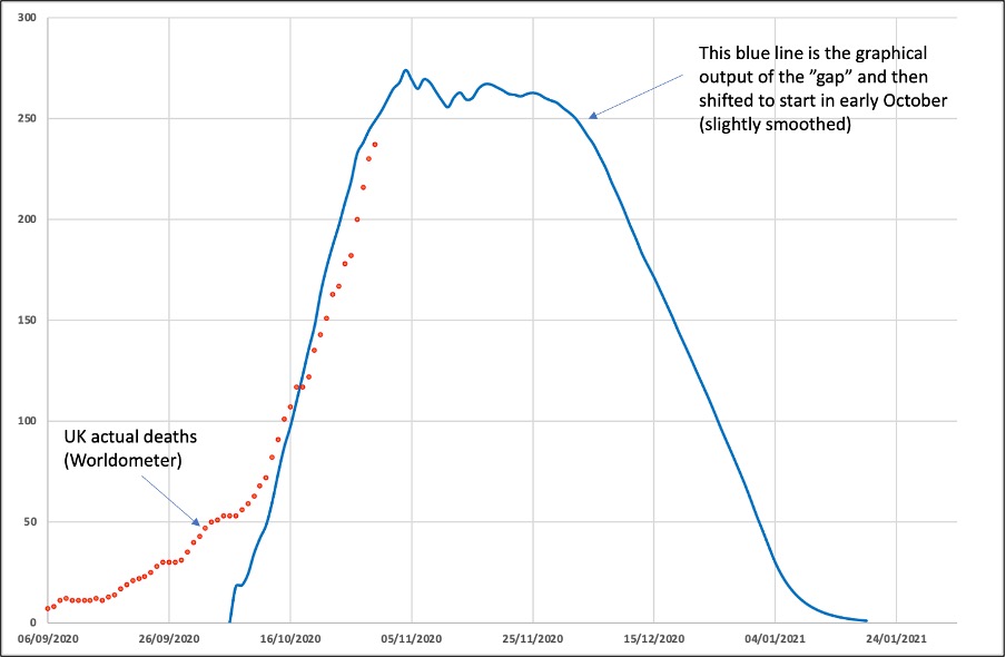
And then all I have done is the graph up these daily ‘missing deaths’ that were the ‘gap’ between April and July, and overlay them against what is being observed as ‘the second wave’. As can be seen in this graph, the fit to the actual rise in cases in October is actually quite good. Up until now.
This ‘model’ would suggest that deaths will peak within a week or two, and after a month’s plateau at numbers between 250 and 300 per day, rapidly decline through December.
Now of course this could all be complete nonsense. Time will shortly tell. But I thought it would be good to put out an alternative hypothesis to the rubbish that Boris Johnson has based his reasoning on. Unfortunately, even if what I have shown above comes to pass, our liberal elite leadership will claim this is based on their lockdown response and assure us we need to remain with restrictions as there will still be cases in the community, and according to SAGE only a few percent of the nation will have been infected. Hundreds of thousands could still die. And don’t forget the recent ‘study’ from Imperial college, showing that immunity is only transient, so lots of scope for us all to be reinfected. We may be down this rabbit hole for a very long time.


Donate
We depend on your donations to keep this site going. Please give what you can.
Donate TodayComment on this Article
You’ll need to set up an account to comment if you don’t already have one. We ask for a minimum donation of £5 if you'd like to make a comment or post in our Forums.
Sign UpWales, The Firebreak – A Re-run of The Prisoner?
Next PostLatest News