
The new ONS data on deaths by vaccination status seem to have a bias such that deaths in the unvaccinated are more likely to be included in the ONS sample, whereas deaths in the vaccinated have the opposite bias and are more likely to be excluded from this dataset. Oddly, the bias is different for Covid deaths. Differences with the accuracy of record matching could be enough to explain the bias.
The ONS data are based on only a sample of the population, albeit a large one. If the sample were representative we would find the mortality rates in the population included and excluded from the sample to be the same. But it turns out this is not the case.
For simplicity, going forward those excluded from the sample are referred to as the ‘ghost population’. Analysis which compares the mortality rates (per 100,000 people) between these groups shows a systematic bias.
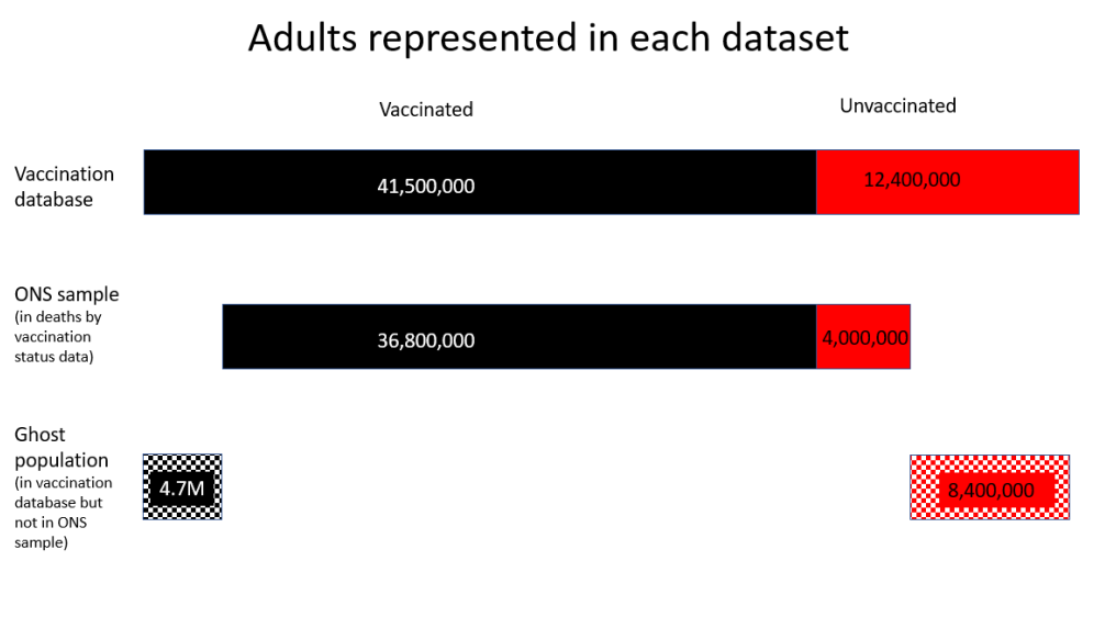
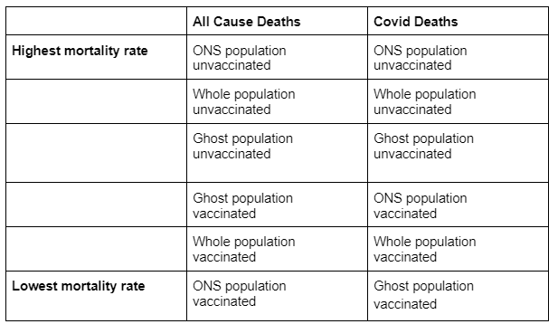
For every age group, the mortality rate of unvaccinated people in the ghost population was lower than the ONS sample mortality rate, meaning the ONS sample over-represents deaths in the unvaccinated. Conversely, the mortality rate for the vaccinated ghost population was higher than the ONS sample for every age group except the over-80 year-olds, meaning the ONS sample under-represents deaths in the vaccinated under-80s.
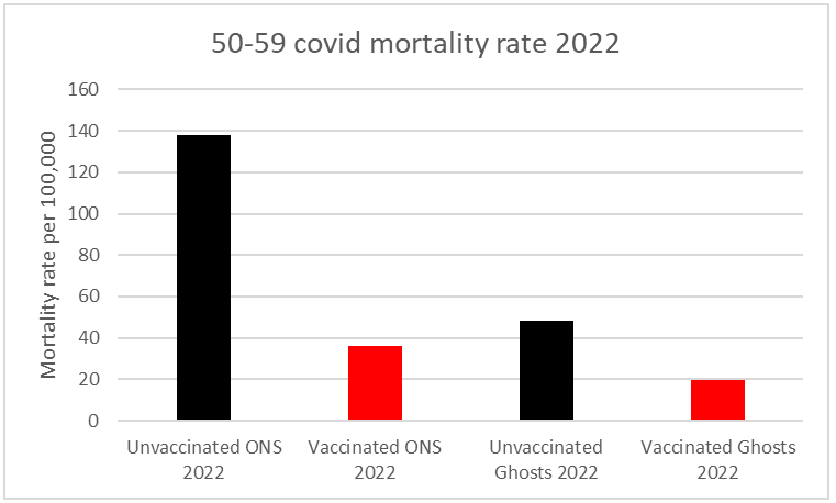
For example, figure 2 shows the mortality rates in the 40-49 year-old population. Graphs for all age groups can be found here.
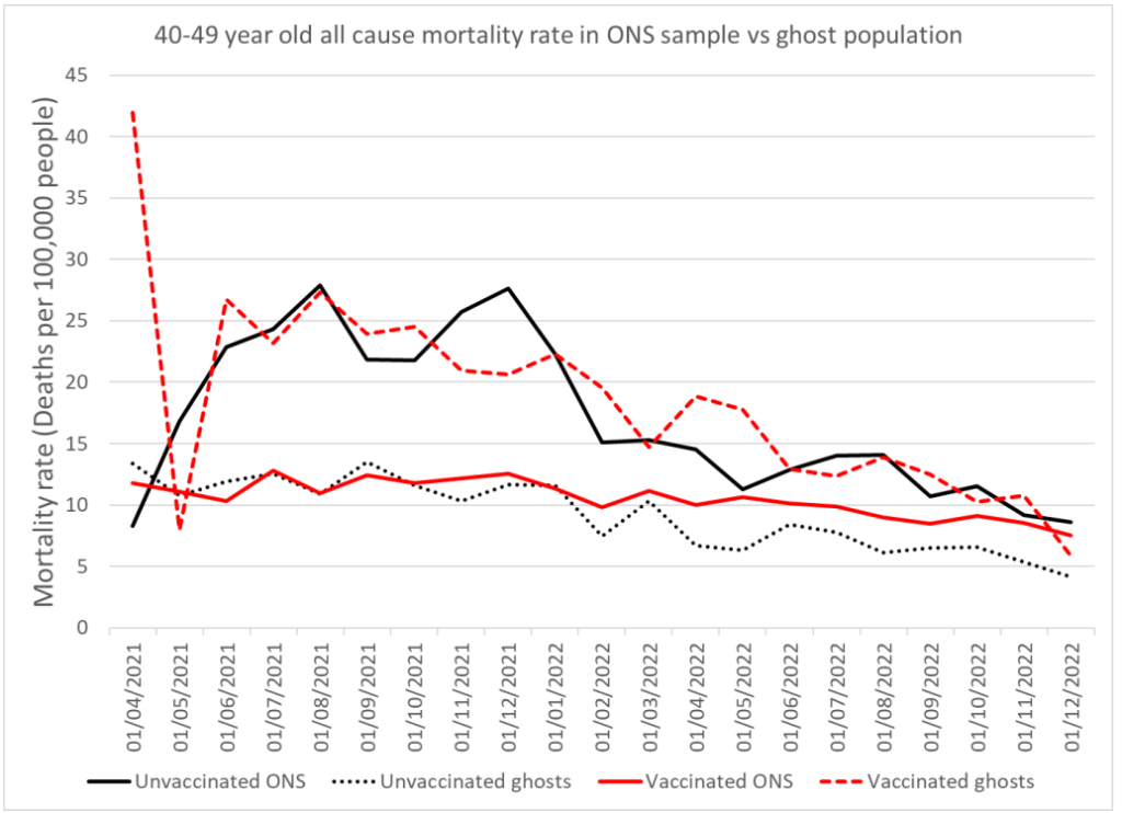
Many people have claimed that it is invalid to use the vaccination database (NIMS) as a measure of the whole population because it may contain duplicate records such that the population is overestimated. If that were the case, then the mortality rate in the vaccinated ghost population will have been artificially lowered by exaggerating the size of the vaccinated population. This would show up as a persistently lower than expected mortality rate in the vaccinated ghost population.
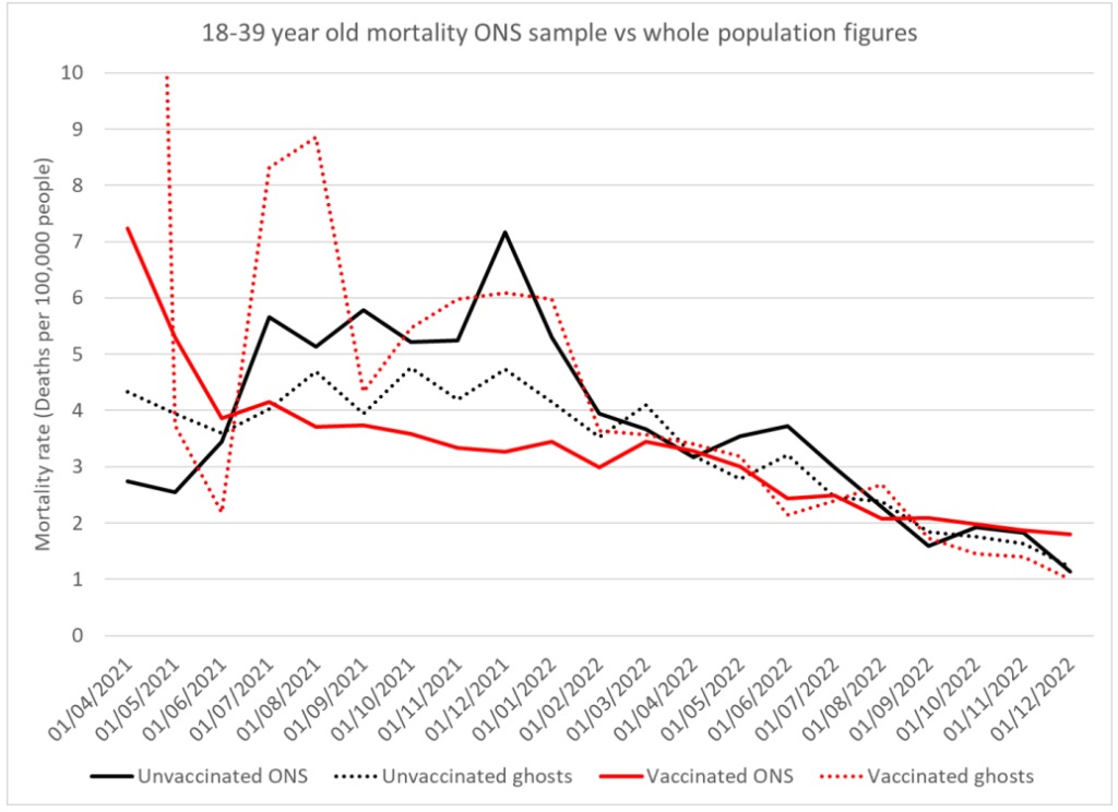
However, the mortality rate for the ONS sample and the ghost population (those excluded from the ONS sample) converge in later months to the same figure for the 18-39 year old group (see figure 3 below) indicating that all four populations are in fact comparable, and the vaccinated ghost population (and thus the vaccine database population) is not overestimated. A bias in population size could not disappear for a period of time whereas a bias due to misclassification of records may well vary over time.
The bias between the mortality in the ONS sample and in the ghost population suggests that deaths in the vaccinated have been disproportionately excluded from the ONS data, while deaths in the unvaccinated were disproportionately included.
Data for deaths with Covid show a totally different bias. For Covid deaths, the mortality rate is substantially lower in the ghost population regardless of vaccination status, meaning the ONS sample over-represents Covid deaths for both vaccinated and unvaccinated. There are two important implications of this. Firstly, any kind of human bias in how data were assigned is unlikely to have resulted in a bias one way for all cause deaths and the opposite way for Covid death. Secondly, there must be something different about how all-cause and Covid deaths are being recorded that results in this opposite bias depending on the cause of death.
One major difference between Covid deaths and all-cause deaths is the proportion that occur in hospital, which is 44% for Covid vs 71% for all-cause. The ONS has previously said that 94.6% of its ONS records match to the NHS database.
If we make the simple assumption that a higher proportion of death certificates for in-hospital deaths are correctly matched to an NHS number and vaccination status than for deaths outside hospital, we can recreate this bias. In fact, even an assumption of 95% matching for hospital deaths and 94% for deaths outside of hospital is a sufficient difference to create most of these biases. The only oddity that could not be replicated in this way was having a significantly higher vaccinated mortality rate than unvaccinated mortality rate in the excluded ghost population.
The ONS recorded anyone as unvaccinated if they did not match to a vaccine record. That means there will be a risk of vaccinated deaths being wrongly classified as unvaccinated if their vaccine record is missing, which would artificially increase the unvaccinated mortality rate and decrease the vaccinated mortality rate. While this effect may be small in the large vaccinated cohort, it may make a significant impact in the small unvaccinated cohort.
If we take a hypothetical population with identical mortality rates for the ONS and ghost populations, then the discrepant mortality rates seen above can be largely created simply by having a higher failed match-rate to the vaccine database for in-hospital deaths compared to other deaths. The ranking of mortality rates is shown in table 1. Even only a minimal difference in matching has this effect.
Whatever the cause of the bias, it requires thorough investigation in order for people to be properly informed about the effectiveness of the Covid vaccines. As it stands, the ONS dataset exaggerates deaths in the unvaccinated and underplays deaths in the vaccinated.
Dr. Clare Craig is a diagnostic pathologist and Co-Chair of the HART group. This article was first published by HART.


To join in with the discussion please make a donation to The Daily Sceptic.
Profanity and abuse will be removed and may lead to a permanent ban.
So deliberate manipulation occurred then, a.k.a, fraud.
See Profs Fenton and Neil’s latest on this data;
”It seems to us that detailed blow-by-blow take downs of ONS are pretty laboured and this is the simplest and most obvious way of showing how useless the ONS data is. You don’t really need any more than this to win the argument. It’s clearly not representative of anything. It’s postmodern science.”
I think they’ve nailed it when they state the ONS is ”churning out garbage.” lol
https://wherearethenumbers.substack.com/p/postmodern-science-delivers-immortality
It is very difficult to make sense of the latest ONS deaths data — it is almost as if the ONS spent 6+ months trying to create a ‘plausible looking’ dataset.
I’m disgusted at their apparent arrogance/stupidity if they think nobody will notice!
Totally agree. I’ve looked at it carefully and can’t make sense of it because the information to do that hasn’t been given to us by the ONS.
And the ONS didn’t even update their methodology article despite the significant changes in using the 2021 census. So all we have is the absolutely most basic outline given to us in the main report.
“Plausible looking” only to their betters who created the official narrative?
This is very worrying.
It is possible the bureaucrats (including statisticians who should have ethical obligations to a professional body) are will fully distorting the data. If so one wonders at their moral turpitude. Is there no one among them to complain internally and leak the fact.
another equally worrying possibility is that the quality of record keeping by the NHS and ONS in the case of Covid and vaccines is typical of their performance. That would make almost all statistics unreliable. Scientific-medical research and wider public policy would be severely damaged and trust in the state further reduced. This must surely be a possible explanation.
if either explanation is true, especially the second one, then all public policy is based on unreliable data, perhaps leading to perverse corses of action throughout government. Thus would at least explain why political decision making so often seems slow and just wrong.
The DS reported as long ago as 26/11/21 that the Office for Statistics Regulation had had to rebuke the ONS for its dodgy statistics and the claim that the risk of death was 32 x higher in the unvaccinated. It seems that, while acknowledging at the time that they were inexpert in their own field, the ONS has reverted to its old mendacious ways.
The highly complex statistical analysis in this piece seems rather pointless.
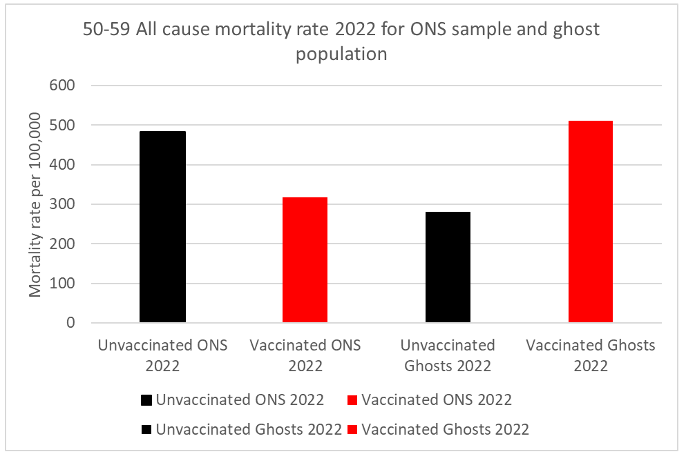
All the real world data presented in the graphs indicate that the vaccines played a significantly positive role in reducing mortality rates over the period at hand – in all the age groups covered and whether through all causes or just covid itself. The most striking example is a mortality rate from the disease of 138 per 100,000 in the unvaccinated 50-59 cohort versus 38 per 100,000 in the vaccinated – around 4 times lower.
All the ‘ghost’ numbers are irrelevant to these basic facts. It may be the case that the ONS carried out some statistical manipulation to exaggerate the mortality-reducing benefits of vaccination, but if so there was no need – they are self-evident regardless.
I am aware that any of the numbers, definitions etc used could be open to question and require further investigation and interpretation (eg the old ‘from’ rather than ‘with’ covid dichotomy), I am simply taking them at the same face value as the article itself.
I should also point out that I have throughout been totally opposed to vaccine mandates or any other form of external pressures being put on individuals to take them.
Sontol, what percentage of the UK population are totally unvaccinated, and how do you know?
I am afraid I have no idea why you are asking me that question and assume you haven’t read my comment, which pointed out that I was referring solely to the graph data made use of in the article and taking it at the same face value.
I get that you were commenting about the data used in the article, but nevertheless can you answer my question: What percentage of the UK population are totally unvaccinated, and how do you know?
“What percentage of the UK population are totally unvaccinated, and how do you know?”
I will answer that question if you explain its relevance to the points I made about this article (which you have completely ignored).
I’m simply trying to find out where you are coming from.
As you have twice avoided answering my basic question, I can only assume that you want to avoid answering it.
Here is what Professor Norman Fenton et al have said about this:
“There is also now strong evidence that the ONS underestimates the proportion of unvaccinated, which leads to inflated mortality rates for the unvaccinated relative to the vaccinated. This underestimation is a major issue: the ONS claimed in May 2022 that 8% of adults are unvaccinated whereas the UKHSA estimated approximately 20% and an extensive and representative ICM survey estimated 26%. Because the ONS data are based on a subset of England residents that excludes all those not registered with a GP and not registered in the 2011 census, it is missing some 8 million adults who are not at all representative of those in the ONS sample. Hence, whilst it is conceivable that both the ONS 8% figure is correct for its sample, and the proportion of all adults in England unvaccinated is at least 20% as per the other sources, this means that at least 69% of adults missing from the ONS sample are unvaccinated. Hence, either the ONS is underestimating the proportion of unvaccinated in its sample or the sample is so unrepresentative of the whole population that any inferences made using the ONS data are worthless. Either way, the ONS estimate of the proportion unvaccinated must not be used for any comparisons of vaccine efficacy or safety of the whole England population.”
https://www.researchgate.net/publication/365202828_What_the_ONS_Mortality_Covid-19_Surveillance_Data_can_tell_us_about_Vaccine_Safety_and_Efficacy?channel=doi&linkId=636a8ece2f4bca7fd040d999&showFulltext=true
“I’m simply trying to find out where you are coming from”
This is a comments section relating to an article and I fully explained where I am coming from about it; points you have completely ignored.
In any case if you wish an overview of my attitudes in this area here is a reply I gave to Freecumbria above:
[re the argument that increased mortality must be being caused by the vaccines]
Correlation is not causation, and increased mortality rates can of course be brought about by any number of factors
.
In my opinion deaths as a result of COVID 19 itself (especially 2020-2021, and overwhelmingly in the very elderly as your graph seems to show), an NHS which turned itself into an NCS (National Coronavirus Service) and massively reduced treatments / increased waiting times, locking millions of people into their homes / preventing them from working leading to emotional problems, excess drinking, lack of exercise etc, an ongoing catastrophically harmful Green based national economic policy via Net Zero contributing to drastically increased inflation and resultant poverty (between 2000 and 2019 60,000 people died of cold related factors, and fuel prices have massively increased since then) etc etc –
Are far more likely to be contributing to any increased death rates than a vaccination which has been taken repeatedly by tens of millions of people (ie in the UK alone) with no direct evidence of anything other than a minute number of fatal reactions (and all medical interventions can have negative side effects, occasionally very serious ones).
The anti-vax movement, at least in its more extreme manifestations, exaggerates and manipulates statistics in exactly the same way as the pro-lockdown / mask and vaccine mandate etc one did over COVID 19.
You seem to have interpreted my basic question as an attacking question, and responded very defensively, whereas my question was neutral.
You seem to know something about statistics, so I was interested to find out either if you agree with Norman Fenton, or, if not, I’m open to considering an alternative opinion.
“You seem to have interpreted my basic question as an attacking question, and responded very defensively, whereas my question was neutral.”
I interpreted your question as one which had no relevance to the comment you were allegedly responding to (which dealt purely with the article at hand) and I pointed this out in a perfectly polite and non-defensive manner.
In spite of your repeated refusal to address any of my points I still responded to your request to ‘know where I was coming from’ with a more extended reply. You have just ignored all of that one as well, so we are having a completely one-sided conversation.
In any case, re “You seem to know something about statistics”
If you mean in some sort of specialised sense I made no such claim.
I do know, however, that statistics (very few of which can ever be known with certainty) are hugely prone to being manipulated for biased ideological and practical agendas – including both the anti coronavirus vax movement and the pro-lockdown / pro vax and mask mandate ones.
So we should all just look at primary evidence where it exists and make our own minds up about both its credibility and our interpretation of it – rather than rely on third party commentators.
“so I was interested to find out either if you agree with Norman Fenton, or, if not, I’m open to considering an alternative opinion.”
The Normal Fenton piece you have cited is a classic example of complex statistical bombardment leading only to further confusion.
In any case my own opinion remains that regardless of exact percentages of vaccinated and unvaccinated the coronavirus shots had an overall notably beneficial medical effect;
But that is hugely outweighed both by the forcible manner in which they were introduced (including mass sackings of those who refused to take them) and the catastrophically damaging and tyrannical basis of the coronavirus policy agenda (again vax and mask mandates, lockdowns, school and business closures, printing £100s of billions etc) in general.
“In any case my own opinion remains that regardless of exact percentages of vaccinated and unvaccinated the coronavirus shots had an overall notably beneficial medical effect;”
I don’t see how you can have that opinion if you don’t know what proportion of the population are unvaccinated.
Is it 8% as has been claimed?
Or is it around 25% as has been argued?
Or is it something else?
However, if you know what percentage of the population are unvaccinated, I’d like to know how you know.
But I can’t force you to tell me.
In which case, I can only conclude that your opinion may just be a belief, like a religious belief.
“I don’t see how you can have that opinion if you don’t know what proportion of the population are unvaccinated.”
I said exact proportion.
It is self-evident that the vast majority of people in the UK took repeated doses, and these endless and ever-more intricate / convoluted attempts to try and obscure this fact by the anti-vax lobby exactly mirror the government’s own manipulation of statistics in its desire to massively exaggerate the dangers posed by coronavirus itself
“In any case my own opinion remains that regardless of exact percentages of vaccinated and unvaccinated the coronavirus shots had an overall notably beneficial medical effect;”
If “the coronavirus shots had an overall notably beneficial medical effect”, then the same Coronavirus vaccines should have had an overall notably beneficial medical effect in virtually every country where the same vaccines were given to a high percentage of the population.
But this does not appear to be the case:
According to the New York Times website, “Tracking Coronavirus Vaccinations Around the World”, 82% of the population of Japan have been “fully vaccinated”.
According to Wikipedia, the vaccine rollout in Japan began on 17 February 2021.
1 March 2020 to 28 Feb 2021 – when nobody was vaccinated:
7,807 Covid deaths in Japan
1 March 2021 to 28 Feb 2022 – as 82% got vaccinated:
15,639 Covid deaths in Japan
1 March 2022 to 28 Feb 2023 – after 82% had been vaccinated:
48,941 Covid deaths in Japan
The Covid vaccines were intended to reduce Covid deaths, so it’s difficult to argue that the vaccines have been effective in reducing Covid deaths in Japan when deaths have massively increased as more people got vaccinated.
You could argue that there were exceptional reasons in Japan – except that Japan is not exceptional. There were similar massive increases in Covid deaths after mass vaccination, compared with before, in many other highly vaccinated countries, including South Korea, Vietnam, Malaysia, Taiwan, Hong Kong, Singapore, Australia, New Zealand, Philippines, Thailand, Indonesia, Israel, Turkey, Lithuania, Latvia, Greece, Denmark, Norway, Finland…
Re your Japanese coronavirus death figures – the only relevant statistic in relation to vaccine efficacy is infection fatality rate (IFR) rather than absolute numbers.
Feb 16 2021 (according to you the day before the vaccination programme began): IFR = 1.77%
Feb 16 2022: IFR = 0.65% ie down by 63% from pre vaccine levels
Feb 16 2023: IFR = 0.33% ie down by 81% from pre vaccine levels.
See ‘Outcome of Cases (Recovery or Death)’ Graph:
https://www.worldometers.info/coronavirus/country/japan/
Although other factors could be involved this very strongly indicates that vaccines in Japan were hugely effective (as opposed to either completely useless or actively harmful as your own use of irrelevant statistics sought to imply).
And also using your own logic this must extrapolate back to the UK (haven’t been able to find the same type of IFR over time figures to check this yet)
“I do know, however, that statistics (very few of which can ever be known with certainty) are hugely prone to being manipulated for biased ideological and practical agendas…”
Correct. The notable distinction between Government data analyses and so-called ‘anti-vaxxer’ analyses is the latter cohort is being discredited, censored and deplatformed by the former. Why is that? Here are four positions the Government propagated using flawed/manipulated statistics: 1) natural immunity is inferior 2) masks work to mitigate viral spread 3) school closures are needed 4) lockdowns work.
“The Normal Fenton piece you have cited is a classic example of complex statistical bombardment leading only to further confusion.”
There’s nothing complex about Norman’s analysis, it’s simply how one should analyse a dataset.
“In any case my own opinion remains that regardless of exact percentages of vaccinated and unvaccinated the coronavirus shots had an overall notably beneficial medical effect”
The irony here is that without the exact percentages it’s impossible to infer an effect in either direction.
Define ‘“vaccinated”.
Is it one dose, both doses, both doses with 3rd, 4th, 5th booster? It is a movable feast when it comes to statistics.
Are you vaccinated when they stick the needle in your arm or not until 14 or 21 days later? Are you unvaccinated until after 14 or 21 days and/of until you’ve had the latest dose.
And no – the data tells us nothing about the efficacy of the vaccines, because there are so many confounding factors including lying about cause of death.
“And no – the data tells us nothing about the efficacy of the vaccines, because there are so many confounding factors including lying about cause of death.”
In which case you must be dismissing the entire article, including its central allegations that the ONS exaggerated over this – because it is all based on exactly the same data you are stating is invalid.
Incidentally I accepted that the data in the piece could be open to further scrutiny, but taking it at the same face value as the author it unambiguously shows significant medical benefits of being vaccinated (and any subsequent exaggeration, though obviously to be condemned, is irrelevant to this central point).
There has been significant excess mortality particularly in all the working age groups since the vaccine roll out compared to 2015-2019.
This chart shows that.
And note that chart is before you allow for the 1.2%pa long term improvement that ONS assume (except in the oldest age group) in their mortality projections based on historic trends. So you can add another 5-6% onto those excess %s (apart from the 90+ group).
We can debate how much of this excess death is caused by lockdowns and how much by vaccines. But to claim vaccines saved lives in every age group covered based on flawed ONS data is nonsense, when the exact opposite appears to have happened.
Correlation is not causation, and increased mortality rates can of course be brought about by any number of factors.
In my opinion deaths as a result of COVID 19 itself (especially 2020-2022, and overwhelmingly in the very elderly as your graph seems to show), an NHS which turned itself into an NCS (National Coronavirus Service) and massively reduced treatments / increased waiting times, locking millions of people into their homes / preventing them from working leading to emotional problems, excess drinking, lack of exercise etc, an ongoing catastrophically harmful Green based national economic policy via Net Zero contributing to drastically increased inflation and resultant poverty (between 2000 and 2019 60,000 people died of cold related factors, and fuel prices have massively increased since then) etc etc –
Are far more likely to be contributing to any increased death rates than a vaccination which has been taken repeatedly by tens of millions of people (ie in the UK alone) with no direct evidence of anything other than a minute number of fatal reactions (and all medical interventions can have negative side effects, occasionally very serious ones).
The anti-vax movement, at least in its more extreme manifestations, exaggerates and manipulates statistics in exactly the same way as the pro-lockdown / mask and vaccine mandate etc one did over COVID 19.
Do you have a plausible explanation for this massive increase in disability claims which only started happening from the summer of 2021 onwards – as reported by the Institute For Fiscal Studies:
“In summer 2021, each month 15,000 or so working-age people started a PIP claim. That monthly figure had remained little changed for years. It then steadily increased, such that by July 2022 (the latest data) it had doubled to 30,000. This report investigates the increase.”
“The increase in claims has been seen across ages and conditions. Essentially all ages have seen their claim rate roughly double, although for teenagers it has tripled. Claims for most major conditions also increased by a similar amount.”
https://ifs.org.uk/sites/default/files/2022-12/The-number-of-new-disability-claimants-has-doubled-in-a-year-IFS-report-R233.pdf
Re “Do you have a plausible explanation for this massive increase in disability claims which only started happening from the summer of 2021 onwards ”
If as you are implying coronavirus vaccinations inherently caused profound medical injury, do you have any plausible explanation as to why 10s of millions repeatedly took them in the UK over the period at hand, yet disability claims only increased by about 15,000?
I am afraid that you have swallowed exactly the pill they wanted you to take. By obfuscating and obscuring the data we need to understand the effectiveness and safety of the vaccine, they were hoping that people would shrug and accept the message in bold just as a magician uses a wand or a pretty girl to distract you from the sleight of hand that makes the trick work. The results are only ‘self evident’ if you fall for the trick.
Like you l look at any data I consider to be relevant (including allegedly ‘obscured’ material that the anti-vax movement somehow manages to locate and publicise) and come to my own conclusions – which in this case (as I pointed out in another post) is that regardless of exact percentages of vaccinated and unvaccinated the coronavirus shots had an overall notably beneficial medical effect;
But that is hugely outweighed both by the forcible manner in which they were introduced (including mass sackings of those who refused to take them) and the catastrophically damaging and tyrannical basis of the coronavirus policy agenda (again vax and mask mandates, lockdowns, school and business closures, printing £100s of billions etc) in general.
“anti-vax movement”
What is this movement of which you speak? Who is a member? What do they believe?
A movement is not the same thing as an organisation (though they can coincide) so doesn’t require formal membership.
In any case I use the term anti-vax movement primarily as an ideological rather than personalised description for those arguments which describe the coronavirus shots as on balance medically malign, something I disagree with (though people are of course entirely entitled to make this case).
It is also in the interests of those who introduced and supported what I consider to be the genuinely and catastrophically harmful aspects of coronavirus policies such as lockdowns, businesses and school closures, throwing away hundreds of billions of pounds on furlow, track and trace etc, mask and vax mandates (ie the enforced aspects) to have attention distracted from these areas by spurious medical claims – which simply mirror their own completely unsubstantiated / exaggerated ones about the virus itself.
The more extreme end of the anti-vax ideology is also useful for dismissing the entire COVID-sceptical movement through associating it with obviously ludicrous theories about worldwide genocidal levels of mass murder (vax D-day coming any day now…) similar levels of mass enforced sterility etc;
All requiring tens of thousands of individuals in governments, private companies, research labs, universities, medical establishments etc across the world to have secretly conspired in such a James Bond esque evil plot (with a certain head of the WEF cast as the all powerful cat stroking villain).
Not 100% sure where that leaves me. We’ve been lied to repeatedly, covid has been a complete shitshow from start to (not finished yet) and everyone in power has got pretty much everything wrong at every step of the way. Why should we assume the “vaccines” are benign or useful or that any claims made about them are true? Goodness knows Big Pharma haven’t been exactly saintly in the past, so why assume they are being entirely virtuous now when the financial stakes are so high and what they can get away is expanded enormously. Not to mention the “vaccines” were forced on people, especially the young – if they were so good/needed then you wouldn’t have had to force people to have them, surely? Does all this make me part of the “anti-vax movement”?
For the avoidance of doubt I have no past history of vaccine scepticism, I have had the usual childhood jabs and so did my kids.
Due to my own opposition to pretty much all the government’s other coronavirus policies I was highly inclined to find the vaccines to be faulty or useless.
However I had to try and remain objective when I looked at any relevant evidence and it pursuaded me that they were on balance medically beneficial (primarily for the elderly and infirm in reducing severity of symptoms, there was never a need for younger and fit people to take them).
For me the most important aspect of vaccination (like most of the other COVID19 policies) was the enforcement aspect which I opposed throughout.
Well I’m not convinced they are medically beneficial but agree with your other points. I think that’s where most of us here are – looking at relevant evidence objectively. Possibly a few have always been sceptical of vaccines, but I don’t think people like amanuensis for example are part of an “anti-vax movement” or espouse “anti-vax ideology”.
There’s enforcement which you agree is wrong, but there’s also mis-selling and licensing harmful medical treatments and wasting huge amounts of public money – those are also very wrong.
I am sorry but you are mistaken. Statistics is hard, and many people are prone to these types of errors, but you should really stop digging now. Ideally we would have large scale RCTs but these were not done so we have to rely on observational studies. The problem with these is that to be accurate you have to have unbiased data. We already have the healthy vaccinee bias, which is not even discussed here, but has a significant impact on the results. When you add in the group biases identified by Claire and others, you have a data set that does not show what you think it does. This simple video from Norman Fenton illustrates the impact of just one of the biases, and there are many others.
Flock off troll.
Tiresome arseholes like yourself. Immoral, deceitful, ignorant, fascist.
Just f ck off.
What ‘real world data’ are you citing?….
The ONS use models, they even use models to work out the population in the first place, as they don’t even have a clue what the actual figure is…I think it’s called the dynamic population model….then they do more modelling around numbers of vaxxed and unvaxxed….and then they model vaccine efficacy on those models…!
This was the answer from a FOI request for the % of the English population who were unvaccinated in April 2022…(there’s no reason to think they have changed the way they calculate)..
“The Office for National Statistics does not hold analyses on the proportion of people who are unvaccinated in England or in the United Kingdom.
You might be interested in our modelled estimates of the proportion of adults who have received one or more vaccination doses in England, Wales, Northern Ireland, and Scotland we previously produced.”
Nothing real-world about it…..
The fact the ONS might not maintain records of the proportion of adults vaccinated other than modelled estimates is relevant to the article – which is based on actual numbers of deaths (both all cause and from coronavirus) in relation to actual vaccination status (derived from NHS records via National Immunisation Management Service / NIMS).
The point the author was making is not that any of the numbers involved are inaccurate guesstimates but rather that the ONS’s most recent assessment has used a large sample of the relevant population rather than the total (i.e. down from c 53 million to c 41 million) and that the selection chosen artificially inflates proportionate deaths of the unvaccinated / reduces proportionate deaths of vaccinated.
And my own point was (taking the author’s figures at face value) that any such alleged relative exaggeration / downplaying is irrelevant to the basic self-evident implication from the non-adjusted (or non ‘ghost’) figures shown in the graphs;
That vaccination had a significant effect in reducing mortality.
The ONS latest report states that they covered 91.6% of the population and 90.5% of all deaths. On the surface that sounds good. It’s most of the deaths and population and similar percentage between deaths and population. So it must be fairly representative, or at least that’s what ONS want us to believe. But when I looked at the age and vax status breakdown I started to see problems.
ONS stated in the main report that 895,135 deaths occurred between 1/4/2021 and 31/12/2022 and were reported by 4/1/2023. I tried to take out the under 18 deaths and so estimated that this means they are saying about 889,000 18+ deaths occurred between 1/4/2021 and 31/12/2022 and were reported by 4/1/2023.
And table 5 18+ deaths total 883,784 (which is about 99.4% of the 889,000 figure). So I assumed that table 5 deaths were close enough (within 0.6%) to all deaths of those in the 2021 census to be the same thing. That assumption may or may not be faulty but I worked with it all the same.
Noticing that I then thought why not compare the ratio of table 2 to table 5 deaths and compare it to the ratio of table 2 population/census 2021 population. Because 99.4% is close to 100%, the table 2 population/2021 census population ratio should be roughly the same as the table 2 population/table 5 population ratio.
The chart that results is attached.
The deaths are whole April 2021 to December 2022 period figures. The monthly death figure percentages which I’ve looked at but not posted here fluctuate fairly closely around the whole period average. So I’ve used the whole period here rather than the single month April 2021 percentages. The population percentage shouldn’t really change much over the period so it’s sensible to use the whole period to compare.
And the populations are at census day for the 2021 census population and the April 2021 average population for table 2 (using the 365/30 method). I’ve ignored the 4 week date difference in population dates.
Now you start to see the mismatch in the table 2 population by vax status and age, in that a much lower % of unvaxed deaths are included than vaxed deaths especially in the younger age groups.
I started to ask myself questions such as:
If about 70% of unvaxed 2021 census deaths (matched or unmatched to NHS number) are included in table 2 and about 92% of vaxed 2011 census deaths (matched or unmatched to NHS number) and if about 91% of the all status 2021 population is included in the table 2 population, what is the equivalent of the 91% all vax statuses population figure when split by vax status? If that isn’t around 70%/92% also then there’s a bias. And even if it is 70%/92% will the 30%/8% excluded give the same answers as the 70%/92% included.
And more importantly how do these things compare by age band? And what miscategorisations of vax status deaths such as those not linked to NIMS, in table 2 and table 5 still exist?
It’s worth saying that if we unrealistically assume for the purposes of discussion that the ONS sample did include say 70% of unvaxed deaths and 70% of unvaxed population and 92% of vaxed deaths and 92% of vaxed population and these were entirely random samples, we would need to scale up the implied table 2 unvaccinated percentages to compare with the UKHSA weekly NIMS unvaccinated percentages.
I was starting to get confused with all the different groups who were either in or not in the census, who were linked vis the Personal Demographics Service (PDS) or not, were in NIMS or not and so on and how that tied in with the table 2 (also tables 3 and 4) main ONS dataset and the wider table 5 ONS dataset of all deaths in the census not just those linked to NHS number by the PDS.
So to help my clarity of thought in relation to the deaths rather than the population side, I drew a diagram (not to scale) of all cause deaths to help me think it through. It’s attached.
I’ve ignored the under 18 deaths for the purpose of that diagram for which there is only limited data in table 1. As an aside the ONS don’t even tell us what age group table 1 covers; another sloppy error on their part if that’s right. It looks like it might be 10+.
The ONS started with the census population and then after linking to the PDS allocated deaths but I’ve put all the deaths in the column on the far left as it’s easier to visualise it that way.
The accuracy of the diagram is subject to challenge but is my best understanding of what the categories are.
Shown on there are the categories that make up table 2, the main ONS dataset (and tables 3 and 4) of people linked to the 2021 census who don’t have erroneous or ambiguous vaccination status. So it excludes “199,772 people who have multiple entries for the same dose or who have a recorded first and third dose or booster but not a second dose”. These excluded are shown on the diagram as ‘unclear vax status’. Note it includes an unknown number who are linked to the census but are not in NIMS; these have unknown vax status but are problematically assumed by ONS to be unvaxed.
And table 5 is all the deaths except the two groups excluded because of erroneous or ambiguous vax status. Note table 5 does include those not in NIMS not linked to NHS number by the census and although they have unknown vax status they are are problematically assumed by ONS to be unvaxed. Again a problem but only in relation to table 5 analyses.
Note that table 5 deaths are very close to all the all cause deaths (numerically 883,784 of about 889,000 total deaths). So roughly speaking table 5 covers most deaths.
What the ONS must have done to get the table 5 figures is work back from the deaths and in relation to those not linked to the census through the PDS look them up in NIMS. They had to have done that to get the extra 62,603 vaxed deaths (= 823,502 – 760,899) in table 5 but not in table 2.
What we need is to know from the ONS even to get started with analysing is the numbers in each category in that chart.
The mismatches of percentages of deaths and population by status included in the ONS dataset are significant, the selection biases potentially very large, and that’s on top of the misallocated unvaxed.
”Why Does the ONS Sample Under-Represent Vaccinated Deaths and Over-Represent Unvaccinated Deaths?”
To hide the crime and protect the guilty.
Why do you ask?
Might just be me, and I could well have missed the point….(I am no data expert LOL)….……
But to accept any of the assumptions made in the article don’t you first have to believe at least two completely unsupported assumptions which introduce unconscious bias into everything that follows.?
Explicitly that…1. That there has been an actual pandemic…?
and,
2. That the vaccines are safe…i.e not leading to significant deaths….?
How many actual Covid deaths were there? How many could be attributed to failed care, lack of medicine, intubation, DNR, Midazolam etc?..and then deaths from the Quacksine?
It seems to me there is ample evidence to show that many deaths attributed to ‘Covid’, were nothing of the sort….and the ‘Covid attributable deaths’ have got less and less as time has gone on….
So both of those ONS assumptions seem to me to be completely wrong and anything the ONS churns out based on them will be useless?
It’s bureaucratic number shuffling…obsessed with mathematical minutiae, and isn’t very informative to the lay person….
I understand Ed Dowd much better….
“We count 1’s & 0’s
Dead…not dead
Disabled…not disabled
The trend if it continues will lead to a glacial Mad Max scenario globally.”
Something I have learned over the last couple of years is that you need to be very careful indeed when you look at statistics and we are very lucky to have people like Claire, Norman Fenton and Joel Smalley to see beyond the obvious. Here is another terrific example, where Professor Retsef Levi of MIT looks at a study of the effect of vaccines on pregnancy. One the face of it, the study exhonerates the vaccines, but careful analysis shows very concerning signals about stillbirths. There are implicit biases in the data and it does make you wonder whether the researchers who publish these studies are either ignorant or mendacious.
I am also a fan of the people you mention, and I don’t doubt their necessity…..but it seems to me it would be very simple to assess vaccine related death and injury if they just told you simply and clearly, who was unvaccinated, and of those vaccinated, exactly when were they vaccinated, and with what?
The Scottish Government I think had those details for pregnant women, and it’s the reason they stopped publishing them last year.
I sometimes think that the stats should come afterwards, maybe to make things clearer…or to make better assessments….but I can’t help thinking that the ‘statistics’ are part of the scam to a certain extent…because they can be manipulated to tell you anything you want to hear, and a correlation could be found with much simpler methods?
You are right in that a large scale RCT would have been pretty definitive (i.e. we would know exactly who had been vaccinated and their outcomes, as you say), but they were abandoned when it was ‘obvious’ that the vaccines were saving lives. So all we are left with is observational studies and these are subject to biases, which is why we need people like Claire and friends to disentagle these for us.
Statistics are easily manipulated and the government has been manipulating the figures ruthlessly to ensure the people are kept not only in the dark but stressed out too.
Anyone who thinks the government is working for us needs their heads examining.
ONS? As morally bankrupt as the Government, Parliament, and this country’s institutions.No surprise there then.
The finding that the vaxed mortality is higher in the vaxed ghost population is important
However I don’t think we can draw any conclusions about the unvaxed ghost population mortality.
It’s a big assumption to assume that NIMS doesn’t overcount the population of England which is what is effectively happening in calculating the unvaxed ghost mortality here.
However you don’t have to make this assumption to find potential flaws in the ONS dataset or reach similar conclusions to Dr Clare Craig, you have to simply make the less restrictive and I suspect close to correct assumption (in my view at least) that the % unvaccinated in each age group is near to correct in NIMS, but that there is also some level of proportionate overcount of people both vaxed and unvaxed in NIMS.
Let’s work on that basis and assume, right or wrong, that the population of England is correctly counted by the 2021 census total at March 2021 and that the NIMS percentages unvaccinated are correct.
Pretty much making these less restrictive assumptions gives us this chart for example for the 70-79 age group from the latest ONS dataset. This clearly shows how deaths and populations are likely to be biased in the ONS dataset.
Firstly note the much lower % of all unvaxed deaths captured in the dataset than the % of vaxed deaths captured in the ONS dataset (the solid green line is below the solid red line). That is there regardless of any assumption about NIMS unvaccinated percentages being right. It’s a big warning flag that there are strong biases at play and this discrepancy in other age groups is huge; in the 40-49 age group 57% of unvaxed deaths are included and 85% of vaxed deaths are included for example. ONS hide this huge anomaly by just stating, that very broadly to round their figures, about 90% of all deaths and 90% of the population over the whole period is included in the dataset totalled across all age and vax statuses.
Secondly in the 70-79 age group a higher percentage of the vaccinated population are included in the ONS dataset than the percentage of vaccinated deaths included (the dashed red line is above the solid red line). To state the obvious the ONS vaxed mortality is hence understated by the ONS.
And thirdly a lower percentage of the unvaccinated population are included in the ONS dataset than the percentage of unvacinated deaths included (the dashed green line is below the solid green line). The ONS unvaxed mortality is therefore overstated by the ONS. Or to put it another way the ghost unvaccinated population have lower mortality than the unvaccinated actually in the ONS dataset.
When you adjust mortality rates for this, the inexplicable ONS dataset implied lower recent non-covid mortality in the vaxed disappears in this 70-79 age group.
These conclusions replicate in some other age groups the 50-59 and 60-69 age groups for example, and the 40-49 age group although there are a few population anomalies there.
Of course the assumption that the percentage of unvaxed is right in NIMS can’t easily be proved although there are many reasons that have been set out before to believe it is a broadly correct assumption. Importantly the ONS dataset doesn’t contradict this assumption that the NIMS unvaxed percentage is correct on the information given to us by ONS. The assumption just determines what proportions of the unvaxed and vaxed English population are included in the ONS dataset, and hence the extent of the biases present.
Add in other likely miscategorisations of the unvaxed and unvaxed still there in the data, then it is highly likely the vaxed are experiencing perhaps 10% higher mortality than the unvaxed (of similar health) but that’s impossible to prove at the moment and is nothing more than an informed guess.