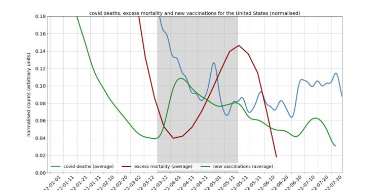
A colleague prepared this graph which shows an interesting correlation between the timing of the spring booster rollout in the U.S. (green line) and a wave of excess deaths (red line), made more striking by the fact that Covid deaths (blue line) were falling at the time.
It should be noted that in absolute terms the excess deaths shown here are relatively low, which is perhaps not surprising after a large number of additional deaths over the last two and a half years; the units on the above graph have also been normalised to make the trends clearer. Still, the correlation is striking, and in light of similar correlations in the U.K. and Netherlands I thought worth drawing attention to. Correlation doesn’t equal causation, of course. But given other indicators of vaccine injury, it’s a trend worth investigating, I would have thought.


To join in with the discussion please make a donation to The Daily Sceptic.
Profanity and abuse will be removed and may lead to a permanent ban.
The timescales are very interesting.
There’s a delay between the peak in new vaccinations and excess deaths of about 40-50 days. This is significant because very few studies have bothered to consider deaths (any side effect, really) beyond a couple of weeks post vaccination (28 days max).
There’s also a strange mini-peak in covid cases about 25 days after the peak in vaccinations — perhaps this is also relevant.
Most the data shows that for a short period after being assaulted (about two weeks I believe) that the victim is more prone to being infected. Given the delay from infection to death, the peak in Covid deaths fits perfectly.
Yes, good points. This is the sort of stuff that needs teasing out.
Obvious question comes to mind: what might be the mechanism that causes death 40 to 50 days after the vaccination??
I have no medical training, but that sounds pretty ominous to me. Invites the question: what long-term damage has been done, in those that have survived?
I remember ages back Dr McCullough showing in a presentation that most deaths occurred during the first 2 or 3 days post-injection. I think he was citing VAERS data. But this was the initial first or/and second shot while this info pertains to the booster. So I wonder why the sudden and distinct difference in speed of most deaths due to the booster specifically. Is it because there is less mRNA involved?
… most deaths occurred during the first 2 or 3 days post-injection
Yes, that’s what makes this 7-week delay the more notable. Could it be that the stabs are causing most deaths up to two months out? Where they are not so likely to be linked to the stab?
And hence might here not be far, far more deaths than being recognised (by all but people like us)?
I’m just working on the premise that if the booster has 50% ( I think ) less mRNA than the original 1 shot of Covid jab, but you would require 2 of those ones, then it stands to reason any ill effects would take significantly longer to manifest compared to the previous jabs, thereby being less likely to be linked to the booster.
At the end of the day you’re rocking up for regular shots of toxin being introduced to your body, only in smaller doses. Like a cigarette smoker who goes from 20/day to 10/day, you’d still expect to have negative side effects but over a more protracted period of time perhaps.
Just my musings as I sit on the train…🤓
Post-choir-practice adjournment to the pub, and a couple of us were comparing aches and pains. I was rather surprised when one of the men said that his wife and her friends were blaming the jabs for their various woes. I must have looked taken aback because he then said ‘of course! You don’t go in for these things, do you….’ I just murmured something about the boosters seeming to be particularly problematic.
(It gave me a bit of hope that people are gradually becoming aware.) My other friend stoutly said she’d had no problems with the first 3 so she will have the next one
You can only do so much.
We are seeing a big reversal about lockdowns; wait til the vaccine damages become too big to hide.
Well if it takes somebody to experience bad effects personally before they dispense with being a brain-dead junkie sheep then I guess lots are gonna be learning the hard way. But by then will the damage not have already been done?
‘The Spartans do not ask how many are the enemy but where are they’ – Plutarch
On safety grounds the big pharma divvy machine should have been withdrawn long ago. The fact it hasn’t is because big pharma has paid off the political and scientific classes sufficiently to keep their mouthes shut. I’m of the Fenton school where the so called “efficacy” was merely a distortion of the data using the “fully vaccinated” 2 week window to shift ppl around and bias the data nicely.
More to the point, they have been granted financial immunity from being sued for damages. If that had not happened, they might not have taken the risk at all. Unfortunately, it’s likely that billions have taken on risks for little real benefit, unless it’s bureaucratically manufactured.