The UKHSA Vaccine Surveillance Report from week 10 is out. Rather than go on and on about the details in the numbers, perhaps it would be easier just to say that the vaccine performance appears to have declined even further.
Well, perhaps I’ll delve a bit more into the details, but I’ll omit the endless graphs for this week and only summarise the current position, and use the space to discuss some other points in the data. For methodological details and discussion of limitations, see last week’s post.
Infections
Although the official data from the Government’s Covid website suggest that we’re seeing the signs of a resurgence in cases, because of the delayed nature of the UKHSA reporting this isn’t yet visible in its data; this week sees another reduction in cases across the board (although this reduction is barely noticeable in the triple vaccinated over 60).
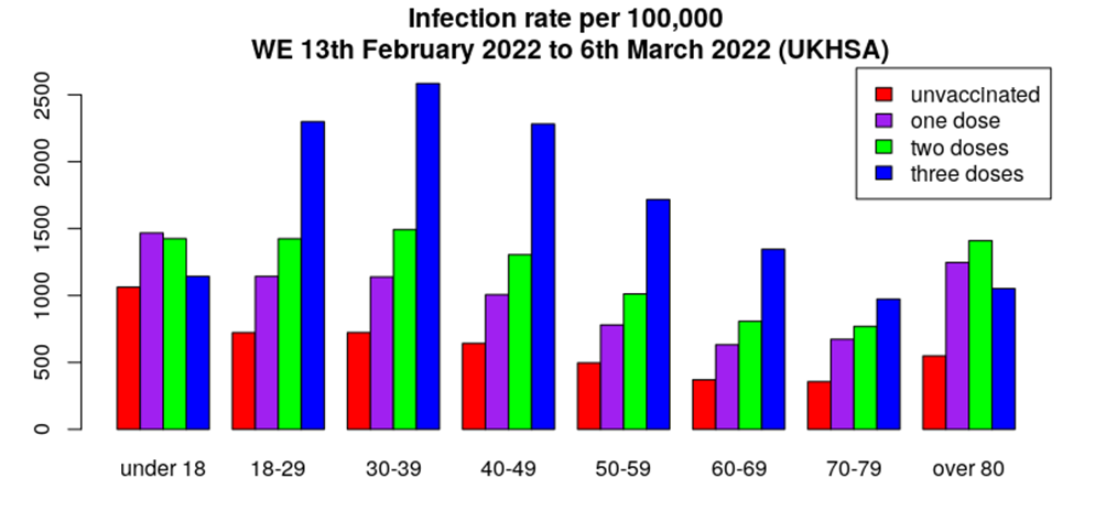
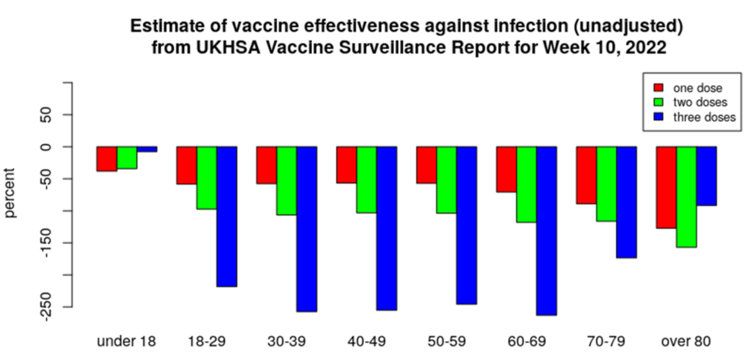
This translates into rather poor vaccine effectiveness across all ages (note that it has now dipped below zero for the third dose for those aged under 18, so no VE values are now positive):
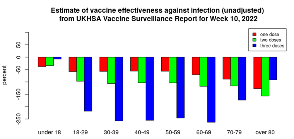
I imagine that next week’s data will show a slight increase in infections.
Last week I noted that the UKHSA does offer some data on infections within 21 days of the first dose and after 21 days. There are relatively few people getting their first dose these days and the week by week figures are a bit too variable to offer insight, but we can report the average relative difference in infection rates for first dose individuals, comparing infections occurring within 21 days of vaccination and infections occurring after 21 days for those still on their first dose:
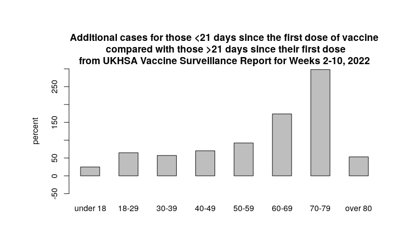
There do appear to be more cases within 21 days of the first dose of vaccine, compared with those that had been vaccinated for longer. However, a note of caution – it isn’t clear who these people are. I suspect that in the age range from 18 to 60 there will be a significant number of healthcare workers, seduced into taking their first dose of vaccine to comply with Nadhim Zahawi’s proclamations – these individuals would have had a higher exposure to Covid than the general population and thus might be expected to have a higher infection rate. On the other hand, the UKHSA is very eager to tell us that:
People who have never been vaccinated are more likely to have caught COVID-19 in the weeks or months before the period of the cases covered in the report. This gives them some natural immunity to the virus which may have contributed to a lower case rate in the past few weeks.
In other words, the UKHSA suggests that the type of person that was unvaccinated up until very recently but has just chosen to take the jab is more likely to have natural immunity and thus should have a lower rate of infection than those vaccinated earlier in the vaccination programme; the data presented above suggest otherwise – or maybe the UKHSA are correct and the increased risk during the less-than-21 day period is even worse than suggested in the above charts.
Finally, I have one note of caution on these infection figures – and this caution should extend into the UKHSA data on hospitalisations and deaths as well. The UKHSA is very keen to define what constitutes a ‘case’: cases start at the first positive test, and after that the individual has got 28 days to become hospitalised and up to 60 days to die. If he or she falls beyond this period then the case or death is not considered ‘Covid’. What’s more, the UKHSA has a rather intriguing definition of what happens after that 28-day period – quoting from its Flu and Covid infection report: “It is important to consider reinfections in the context of first infections and there is a 90-day delay before people with a first infection can become eligible for reinfection.”
I love that phrase, eligible for reinfection – that could only come from a Government official. I’m afraid to inform the UKHSA that, like Canute’s officials and the tides, the powers of officialdom don’t extend to viruses and the human immune system – Covid will reinfect individuals when the time is right and certainly won’t be influenced by their 90 day exclusion period.
I note this because of what we’re seeing in Covid infections data in the U.K.:
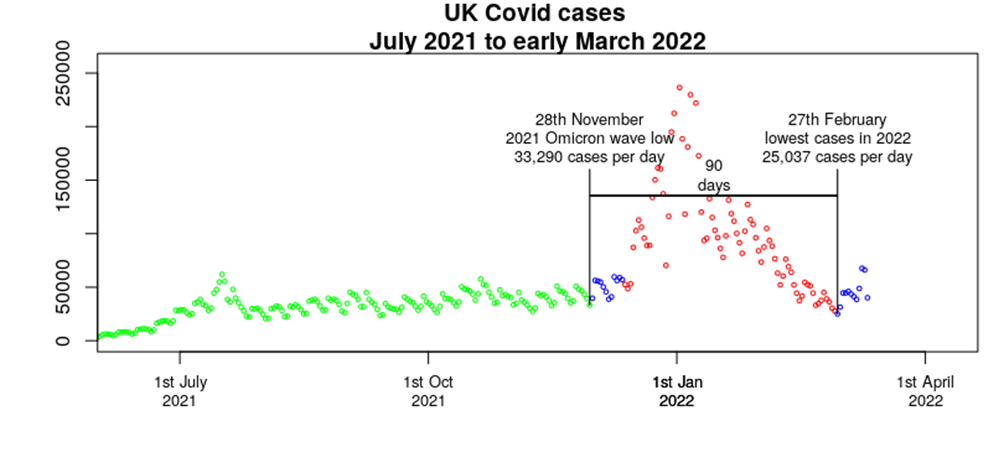
I’ve colour-coded the different areas of the graph above. The most recent data (blue, on the far right) show cases increasing, with the low in cases for this year occurring around February 27th. Prior to this we had this past winter’s Omicron wave (red), but exactly 90 days before the recent low was another low in cases (around November 28th), which marked the approximate point where the Omicron wave started in the U.K. I have also marked in blue the data points from the start of the Omicron wave which are now eligible for reinfection. I suggest that the rapid reduction in cases seen during January and February was in part a statistical illusion caused by the UKHSA not allowing any cases in those already infected in the Omicron wave from being counted, either because of a single prolonged infection or because of reinfection. (It was also in part a result of a sharp drop in testing.)
When viewed in conjunction with the data presented last week from the ONS (no 90 day limit) and the Zoe Symptom Tracker (we don’t know how its algorithm works, but it’s showing that infections levels have remained high since Christmas) it very much suggests that the 90 day rule used by UKHSA has contributed to the illusion of recovery from the Omicron wave.
The big question that remains is whether there the vaccination status of an individual would have any impact on their liklihood of reinfection – if we do see a substantial increase in cases over the coming weeks then we might find hints to the answer to that question.
Hospitalisation
The increase in hospitalisations that can be seen on the official U.K. Covid dashboard is also not yet visible on the UKHSA data. Nevertheless, the hospitalisations data continue to show that the vaccines offer little protection against hospitalisation for the younger age groups:
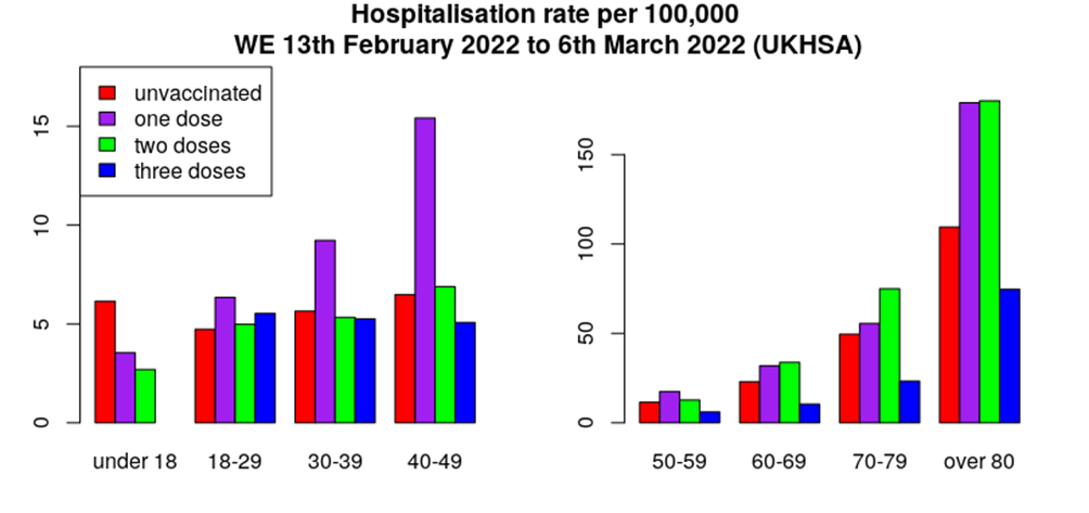
For those aged over 60 the full three doses appear to offer some protection against hospitalisation, although the data continue to show that the vaccines increase the risk of hospitalisation for those with one or two doses only.
It isn’t clear if the hospitalisations data also use the same 90 days eligibility criterion to be allowed to be a Covid reinfection (I suspect that it does).
Again, we can compare the relative rate of hospitalisations in those given their first dose of vaccine within the previous 21 days with those only having one dose but for longer than 21 days:
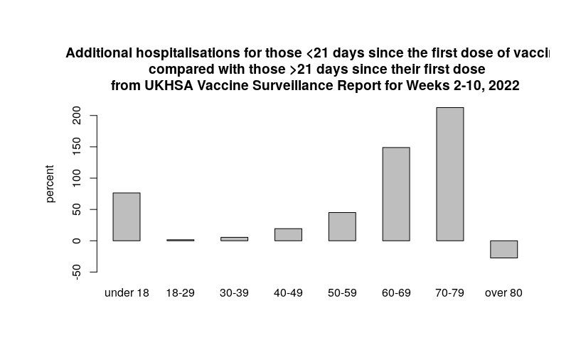
Here we see a much more mixed-bag compared with the relative rates of infections presented earlier. The data certainly suggest that there might be an increased risk of hospitalisation immediately after vaccination for older age groups, but thankfully there doesn’t appear to be an increased risk of hospitalisation in those aged 18-40. It is unclear why there are increased hospitalisations in those aged under 18 and over 40. However, I remain puzzled as to what type of person chooses to take their first dose of vaccine after all this time, and I’d like to have more information about average morbidities in those that have recently received their first dose.
Mortality
The deaths data for week 10 continue to show deaths falling, and, unlike infections and hospitalisations, we’re also not seeing an uptick in deaths in the official data. I hope we don’t see deaths rise but hope doesn’t always work out.
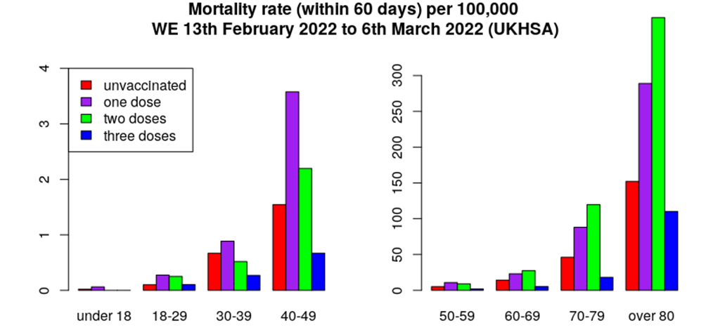
We again see a small reduction in mortality rate in those triple-vaccinated, with higher mortality rates in those only having one or two doses of vaccine. I think that it is important to note that mortality rates are very low in those aged under 60-70, regardless of vaccination status.
The difference in mortality rates by dose looks suspicious; as mentioned in previous weeks’ reports, I believe that there are differences in the proportion of individuals very close to death between those that have received one, two or three doses of vaccine. I also believe that the unvaccinated group contained a small number of these very ill individuals but that they have (sadly) died and thus the unvaccinated group is now more broadly representative of the general population. Because of this I believe that it is useful to consider mortality rates for the unvaccinated versus those that have received any vaccine dose.
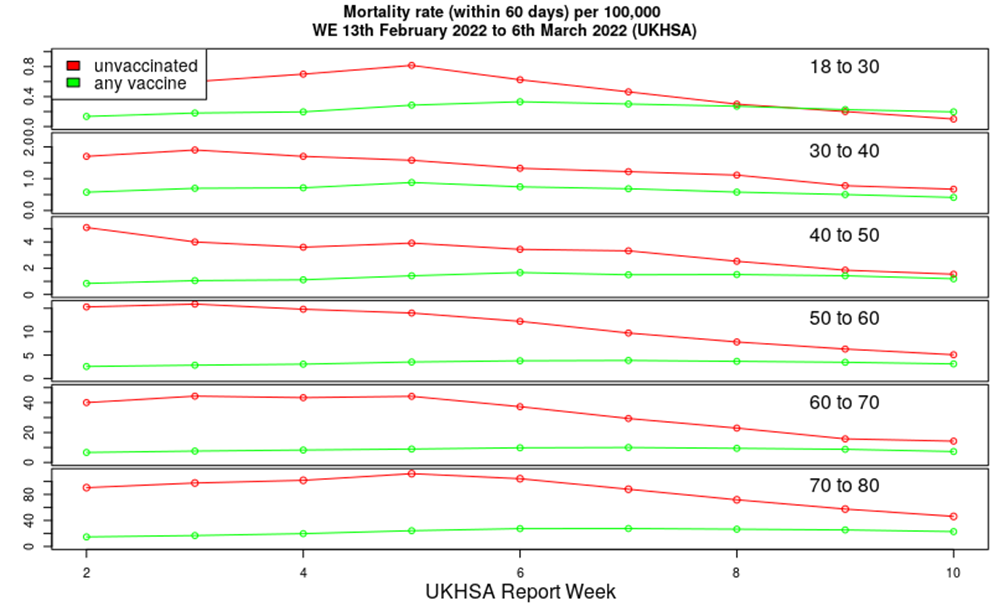
The red curves above suggest that there were still residual deaths due to Delta variant early in the year, but now that Delta has been displaced by Omicron the Covid death rate in the unvaccinated is now close to that of the vaccinated (green curve). The change in mortality rates over the last nine Vaccine Surveillance Reports, comparing the unvaccinated with those having taken any vaccine, is strongly suggestive that the vaccines now offer little net protection against death for the Omicron variant.
Presentation of the mortality rate for those given their first dose of vaccine was not possible; there are so few people receiving their first dose these days and the number of deaths is too low, even in older age groups, to allow meaningful analysis.
Other news
Last week saw the release of the latest data on specialist consultant activity in NHS hospitals. These datasets contain huge amounts of information, but arranged in a complex format that makes analysis difficult at a casual level – it is unfortunate that the NHS don’t present its data in a format that is easier for the general public to browse.
I’ve selected three different specialist areas to discuss today:
- Stroke medicine – This should give an indication of any changes in the rate of strokes in the U.K.
- Medical oncology – This relates to cancer consultation and treatment that doesn’t involve radiotherapy.
- Cardiology – This is an ‘obvious choice’ given that our authorities have reluctantly accepted that the vaccines create a risk of heart problems.
I’ll present the data in graphical form, with the timescale covering the full range made available to us from the NHS, from early 2018 to January 2022. To aid interpretation, I’ve colour coded each data point; red for the pre-Covid period, grey for the Covid period pre-vaccine and blue for the post-vaccine period. I’ve also included lines to indicate the pre-Covid and vaccine-period averages, and the percentage change between the pre-Covid and post-vaccine period.
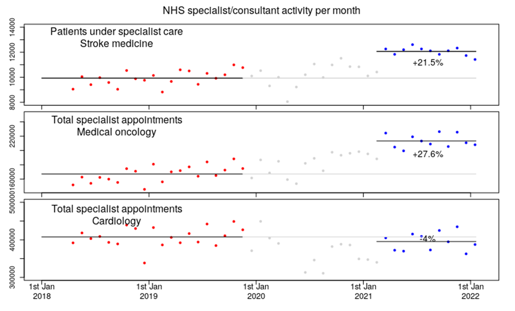
The data are concerning. There appears to be a 21% increase in hospital activity regarding strokes in the post-vaccine period and a 27.6% increase in cancer specialist activity. We don’t have data on why these increases are occurring; they could be due to Covid itself, lockdown, the vaccines or be completely unrelated to Covid (climate change has become a popular excuse reason for all sorts of medical problems in the past few months). We’d know more if the NHS released data on hospital consultant activity by patient age-range and vaccination status, but I fear that this is unlikely to ever be seen – our authorities appear very keen not to release additional data on anything that might show their Covid response (vaccines or lockdown) to have caused harm.
The big surprise in the data above is the cardiac consultant activity – we see a small decline in activity in the post-vaccine period, compared with the pre-Covid period. I note a few important points about this particular aspect of the data:
- Even with a confirmed risk of myocarditis from the vaccines there’s no visible change in the hospital statistics. This shows how difficult it can be to identify problems with medical treatments just by waiting to see if anyone notices that there’s a problem.
- If there’s no visible change in cardiac consultations even though there is a known risk of myocarditis from the vaccines, exactly how large might the real stroke or cancer risk be?
- It might be that the cardiology data are complicated by sheer numbers – very high numbers of people over the age of 70 or so will have some interaction with a cardiac specialist at some point, so an increase in heart attacks as such might be drowned out by these more regular consultations. By contrast, stroke and cancer specialists are only seen in the event of a stroke or cancer diagnosis.
I could put together a more comprehensive analysis of these data if people are interested.
Amanuensis is an ex-academic and senior Government scientist. He blogs at Bartram’s Folly.
This post has been updated: the graphs comparing rates before and after 21 days after first vaccination have been updated to take into account time of exposure, and the text under the hospitalisation chart amended accordingly.


To join in with the discussion please make a donation to The Daily Sceptic.
Profanity and abuse will be removed and may lead to a permanent ban.
Comparing unvaccinated vs vaccinated (any dose) is the most obvious comparison
See attached chart showing effectiveness of vaccine (any dose) at preventing +ve SARS-C0V-2 test.
Negative effectiveness in every age group. And worsening effectiveness in all age groups covering ages over 18.
And just 10% of deaths within 28 days of +ve SARS-C0V-2 test in the unvaccinated and 90% in the vaccinated (any dose).
IMO the ‘any dose’ approach is very informative.
By this measure the vaccines are pretty much useless against Omicron, and were only offering low levels of protection against hospitalisation/death before.
The increase in risk of infection in the vaccinated appears to be a real effect — and is likely responsible for much of the increase in case numbers seen in the last few months.
And down to just 21% of emergency care admissions within 28 days of a +ve test in the unvaccinated vs 79% in the vaccinated (any dose)
In relation to rising hospitalisations not yet apparent in the UKHSA data because it is based on the 4 weeks prior to the report:
Looking at the official NHS primary care supplement that goes up to 8th March shows us (if we look at the far right of the chart) that the small increase in hospitalisations is being mainly driven by increases in +ve tests for those ‘with covid’ rather than those being treated ‘for covid’ (their definition not mine). That’s why the % treated ‘for covid’, the purple line in the chart is falling.
I’m sorry, Amanuensis – that can’t possibly be right.
Here in Oz (where political wizards dwell), triple “vaccination” is required and unvaxxed are severely restricted because we might kill people by breathing on them.
This is to save us all from Omicron, you understand.
The “Cult of Unreason “has arrived we are utterly lost!
You cant reason a person out of a position which they didnt reason themselves into.
Excellent!
That absolutely nails it!
Well being in Oz all the above graphs will be the other way up, showing great success.
Don’t tell them that! God help us – that’s exactly what they’ll do (explaining their mistake on page 72).
Everything is dangerous in Australia. I once went on a hike in the country to the north of Adelaide — before I could go my boss stopped me and arranged for me to have instructions in ”how not to die‘ with a contemporary of Les Hiddens (was a Major too, IIRC). I didn’t die on that hike, which just goes to show how important that advice was.
You’d think that being in a land where everything was dangerous would make for tough people, but I think that it has bred a fair proportion of the population that has a dependence on the state to help them not to die on a daily basis. Of course there are many in Australia that are perfectly capable of managing to not die without state assistance; I imagine that those individuals have had a tough time time over the last two years.
Australia is heavily urbanised. The tough people, I suspect, are those who live in the sparsely populated (towns, villages, farms of the) bush, because life there can be tough.
Indeed it is – but it seems more generational than geographical. Australian suburbia used to be a helluva lot tougher – even in the late 20th century.
There is a section of the population wondering what the hell happened.
A people who joked about deadly snakes and spiders (while making sure they could recognise one if they saw it) have been scared witless by COVID, of all things.
This has been very sudden – and is deeply shocking to many. I have never seen such unreasoning fear or such extraordinary compliance with an officialdom we also joked about. We’re not laughing anymore.
No surprises here for the “Awake” – sheep still snoring inside their useless masks .
Happy to report getting fewer – even in Waitrose!
Duck and Cover
Meanwhile the CDC is putting out new materials about how to act in a radiation emergency.
To be honest, this whole business about hiding from a nuclear event has puzzled me for years. How in the hell is hiding under a desk going to save one from a nuclear explosion?
Anyway, I digress. At this point, everything is so surreal that it’s impossible to tell when the officials are serious, when they are saying dramatic things to justify their budget, and when they work with psychologists to make the population scared and timid. In any case, check out Duck’n’Cover 2.0:
https://tessa.substack.com/p/its-duck-and-cover-all-over-again?s=r
Duck & cover. It makes some sense, but is poorly explained in keeping with ‘do as we tell you’ approach.
It depends how far you are away from the detonation. Most initial damage, trauma is caused by heat. In the immediate radius everything is vaporised, then a bigger radius is blast damage. So if you are miles away and standing in front of a window, for example, a few seconds after the flash you will be shredded by flying glass and/or buried under masonry.
Being low down and under something sturdy is not a bad idea.
Just wear a mask right? Or do you want to kill granny with your radiation breath?
The CDC’s advice is so funny. Municipal water may be contaminated so … take a shower to wash off the radiation. If you can’t have a shower, basically use a wet wipe. Don’t go out, but store your irradiated clothes out of the way. [Where? Like, in your kids bedroom?] If you can’t change your clothes, take them off, shake them or brush them [but no need to hoover the carpet, eh?] WHILE WEARING A MASK [knew that advice would be there, lol]. Oh, and use hair conditioner at your peril: “radioactive material will stick to your hair”.
The cdc is another one of our institutions in the USA that needs to be deleted and rebuilt from the ground up by brighter minds than the current ones. They have lied, obfuscated and committed crimes against humanity.
The office-shy triple vaccinated are still busily testing themselves multiple times per week. My boss was out last week because he “tested positive”. No symptoms at all.
Just had a message from another colleague who’s managed to do the same so will be out this week. Of course he’s encouraging everyone else who was in last week to go out and test so no doubt we’ll see a few more positives popping up.
morons the lot of them.
All the real science tells them that PCR tests are a fraud – but they just can’t get it – we are truly lost aren’t we?
UnIversal fear propaganda and the suppression of all alternative views is so much more effective than we ever realised.
It seems they have crushed the search for truth, common sense and reason for a very large part of out population – the future looks grim.
The majority will be begging for more injections, universal surveillance, digital passes and the ‘Great Reset’!
The motto of RT is ‘Question More’ – no wonder they wanted it banned!
https://ourdecisiontoo.com/Issue/there-s-nothing-left-to-do-but-go-our-separate-ways/320
The suppression of alternative views is the killer in all of this. In Oz, people put slips of paper in letterboxes, in the hope that some will read them.
Everywhere (from what I can gather in un-splendid isolation), questioning voices have been turned into “noises off”.
Somebody’s saying something about the “vaccines” being dangerous, but that can’t be. If there were even the possibility of that, it would be on the telly.
Opposition parties aren’t: they’re a chorus, usually trying to out-sing the governments they’re supposed to be holding to account.
Yes …sadly the “Stalingrad Moment” to turn the tide currently seems far away, lost in the imagination’s false optimism.
It is not an easy thing to deal with determined, at least moderately coordinated and immoderately well-resourced liars, with no moral scruples.
They are injecting children under the age of five, and they have convinced their parents to line up and offer them..
We seem to be surrounded by Evil!
It is interesting that some Aussie quack is now ‘certain’ that Shane Warne died of a heart attack brought in by him having 2 or 3 “cases” of Wu Flu.
Then “of course his life style was a major factor” he was a smoker!
So there stop smoking and get your boosters.
No mention of mycarditis which so far has killed over 600 known healthy fit young athletes due to this New world order nectar injections.
I think we are into obsessive compulsive disorder territory.
The Michie psyop has clearly stewed the brains of 70% of the population, who have simply now switched from “Covid Fear” to the “Russia/ Putin Hate” propaganda mode without a pause .
It seems that the evil manipulators and abusers of Behavioural Psychology can now get them all to believe anything they choose and produce a Pavlovian reaction on cue – foaming at the mouth for good measure.
Masterful use of mass deception, hypnotism and control psychology !
David too true.
If you can spare a minute, Sundance over at The Conservativetreehouse has a great piece on propaganda this morning.
Lord HaHa and Saddam’s propaganda Guy are now old hat.
I strongly suspect I have Omicron at the moment as I have symptoms and a family member tested positive. Minor cold at best. For example, it wouldn’t stop me from going to the gym if it was a gym going day today. Not going to test myself. If I feel unwell I’ll work from home, if I feel fine I’ll go in to the office.
At my kids school almost half the class is off. They were all on zoom for a chat the other day and none of them seem unwell. Bouncing around on the screen, no hoarse voices even. I know for a fact that many parents test their kids every single day. Idiotic.
Abusive, rather than simply idiotic.
They’ve created a type of OCD in these people.
IMO there is a need for a period of psychological assistance for many in the population to get over their irrational fear. You’d could imagine that over a three month period they could get people to move from zoom-meetings, socially distanced meetings in the church hall, small gatherings in the corner of the church hall (no more than six!) and by the end of the programme they could all go down the pub and laugh about how silly they’d been.
Increased strokes due to climate change! Actually I think you will find it’s ‘Increased strokes due to existential worry about nuclear war’. Was going to suggest you couldn’t make it up – but, obviously, you could make it up (somebody did).
Also increased strokes when going 2 nil down at football match. A lot of teams are not defending well lately
Watching the BBC News causes strokes – all viewers should make their will and arrange their funerals as advised by all Day Time TV advertising .
They have made it all up since Jan 2020
https://pubmed.ncbi.nlm.nih.gov/32200732/
“The influence of climate change on human cardiovascular function”
https://www.niehs.nih.gov/research/programs/climatechange/health_impacts/cardiovascular_diseases/index.cfm
“Cardiovascular Disease and Stroke”
Now, if extreme heat were causing more cardiovascular disease in the UK in winter, that would be climate change!
What about the symbiotic relationship between the infection and the vaccines?
After all, both involve billions of Covid Spike Proteins or fragments circulating in the body don’t they ( only thing is that the injections are designed to get them right into your cells, by- passing your immune system, to reproduce themselves!)
Anyone just a teeny bit curious?
It is a very interesting point. There doesn’t seem to be much discussion (in the mainstream press) about the pathogenicity of the spike protein.
Personally, I think the main problem lies with the immune response to the virus and how this is modulated by the vaccines; we’re training the immune system to consider that covid is a systemic disease that results in very high levels of spike protein (only) in the body and thus it uses a very high IgG antibody response. This could result in autoimmune side effects, but as far as the immune system is concerned it it ‘worth it’ because each vaccine dose tells it that the problem is very serious. The downstream consequences of this are unclear.
Very informative – thanks for this!
They might be unclear, but what is not unclear is that have to be downsides. The more you jab the more you at the very least inhibit the usual operations of the immune system, and at the worst you destroy it.
100%.
If things are unclear you try to clarify. You don’t proceed and hope for the best.
O/T oh dear, Russia few allies, Ukrain no Partisans.
Day 14, Russian advance slowing down ?
Russian advance has been slowing down since day 1. Soon they’ll be meeting themselves coming back.
Similar to the ‘less seriousness’ caused by the vaccines, after a few more doses CoVid will be so ‘less serious’ it will result in immunity to death.
How can you tell when you do not know what their objectives or orders are?
Do you expect the Russians to take cities by force, those occupied by Ukrainian Azov brigade units, hiding behind civilians and so cause massive civilian casualties ?
If so you will wait a long time.
At present their focus is on clearing the US/ CIA illegal Biolabs all over the country and putting the facts and documents before the UN Security Council.
“how can you tell . . . ?”
I can’t, hence ” ? “
If I had to guess i’d say that it looked like the establishment of a base-position to allow logistics to catch up, followed by a country scale pincer movement up the Dnieper to capture the whole of Eastern Ukraine. I’m not sure they want western Ukraine.
Forces to the south look like they want Odessa (oblast and city). Transnistria might as well be Russian already, which would probably have some impact on this.
Odessa matters to Russians, strategically and culturally.
I know with certainty that everyone I know personally who has three jabs will just as eagerly roll up their sleeves for fourth jab and even a fifth if required – they will do so without asking a single question. I’m not sure whether its naivety or just plain stupidity … probably a bit of both. They don’t understand why I haven’t had the jab yet – they seem to associate having the covid jab as like having the flu jab when its nothing of the sort – two totally different vaccines.
mRNA is only a “vaccine” if you’re reading the dictionary they updated to give mRNA injection as a subsidiary definition for “vaccine”.
However, following the Operation Armshot sh*t show, I am much more questioning of ‘flu vaccines.
The (net) protection offered by the flu jab isn’t as simple as is usually portrayed. The data seem to suggest that in younger people we do find that the flu jab reduces infection risk, but that this isn’t found (to a significant effect) in older (>65) individuals — it helps the people that don’t need help and doesn’t help the people that do. Ie, what’s the point of it all?
This is a good paper on the situation: https://doi.org/10.1016/j.vaccine.2009.07.008
There’s actually an interesting section in that paper:
I believe that this effect applies to the covid vaccinations as well, and likely explains much of the supposed benefits of the them in protecting against hospitalisation and death.
I have never taken a flu vaccine – and have not had anything even approaching the flu for almost 30 years.
I had a friend – worked outdoors all his life – took a flu vaccine for the first time five years ago – ill for two weeks, said he had never been so ill in his life!
Nobody in my immediate family takes flu vaccines – and we don’t get the flu. We try telling our cousins that they’re safe too (it’s in the genes!), but they get jabbed every winter and … get the flu.
I suppose the answer to the first question is “profit”, to justify it’s development in the trade.
My money is on stupidity. There is far, far more of it about than I ever considered prior to 2020 – it is now endemic.
Yes – one of the biggest shocks has surely been the extraordinary level of mass stupidity and compliance – which in effect has allowed all this to happen!.
It is a quasi-religious belief. These people have faith, and it isn’t simple to challenge faith with logic.
It’s not even quasi-religious, it’s just religious. The instinct for faith-based ritual as a means of dealing with the anxiety of unmitigatable risk is hard-wired in the human mind (and is even present to some extent in higher primates according to some research).
You can’t remove it – you just change its focus; in this case from believing a magic sky-man will give you control of the uncontrollable if you make sacrifices, wear his symbol and believe in his omnipotence, to believing scientists can stop you dying and change the world’s weather, if you sacrifice your wealth and freedom, wear their masks and refuse to accept any fallibility on their part.
It is all religion.
I find it rather interesting, actually. We’ve managed to educate the population to a rather high level, but really ‘science’ education is about belief in what you’re told, not so much about applying ‘scientific reasoning’ to the information you’re given.
A truly great example of this is ‘the flat earthers’. Now, I’m not suggesting that the Earth is flat — it isn’t (probably) — but rather that everyone learns at a young age that the earth is broadly spherical and this ‘religious tenet’ then comes truth-without-evidence. The ‘believers’ consider anyone that says otherwise to be a scientific-heretic and thus should be ridiculed/ignored/etc. But the vast majority of individuals have no understanding of why the Earth should be a globe (ie, the actual science) — all they have is the words of the science evangelists that tell them it is so. Note, these evangelists are seldom the scientists themselves, but usually the media celebrities that inform them in easy to understand snippets of information, told with an enthusiastic and confident tone and accompanied with some lovely pictures/videos.
I’d like it if everyone said ‘how do I know that the Earth isn’t flat?’. In the process of asking the question they might consider how much that they consider ‘knowledge’ is just a veneer covering a sea of ignorance, and in that recognition of ignorance they might start to think about educating themselves (apologies for channelling Socrates here…)
anyone asking himself “how do i know the earth isn’t flat”, should really try to stop crawling on the floor on all fours and try to learn to walk upright.
What would the core symbol of Covidianism be? You know,like Christianity has a cross.
I’m thinking either a blue disposable face-nappy, or a syringe – not sure which has the stronger claim!
The mask is the cross, the jab is the sacrament
The face-mask is used as an easy way to identify a believer (actually, to identify a non-believer).
I have suspicions that this was done on purpose — that the promotion of mask wearing was done because it is a self-reinforcing policy — people will comply so as to not be singled out as ‘different’.
over here in the netherlands mask mandates were lifted a couple of weeks ago.
there is not a mask in sight any more.
except in the places where one would expect the knowledge of the non functioning of the mask would be abundant: hospitals….
So many people seem to have developed an unhealthy looking, greyish tone to their skin or sometimes fine burst blood vessels/blotches on the face – like an alcoholic – anyone else noticed?
Yes – and brain fog. I’m quite serious.
Jabbed friends keep asking me anxiously, “Are you ok?” I reassure them, and then learn that – yet again – they’re unwell.
I noticed a slight jaundice in my father after dose 3. It seems to have gone now, but I have wondered if there was a link (liver damage is implicated with the vaccines (mNRA anyway))
Had the three jabs, in part to reassure vulnerable/nervous friends. Last week I turned up for a hospital appointment complete with negative covid test for the day in question and the day before (compulsory) and remained masked throughout (also compulsory). Three days later I felt so ill I took a covid test which was positive. i never had any faith in masks and am now pretty cynical about vaccines.
Hospitals do seem to be very high risk areas re. covid.
It is unequivocally correct that being jabbed makes it easier to catch it, and also easier to be killed by it, if you catch it within a few weeks of receiving a jab.
The drive to give people fourth jabs because of a rise in cases is absolutely ridiculous.
I increasingly feel that I am in another dimension. I look at those around me and they mindlessly repeat what they have seen or read as of it is the absolute truth. The same is happening now with the Ukraine as did with covid, nobody seems interested checking for themself. Last week was particularly disillusioning. I met some former (now retired) universe lecturer colleagues. Not one knew the average age of death with or without covid. They felt comfortable citing excess deaths yet knew nothing of the effect of the time series analysed. What hope is there? I always thought the term ‘sheeple’ was simply a derogatory term. Nowadays I am witnessing sheeple being herded with apparent simplicity. It’s scary.
https://ourdecisiontoo.com/Issue/there-s-nothing-left-to-do-but-go-our-separate-ways/320
Thanks
Yes it is a wired feeling. What is worse is people whom I assumed to be sane and intelligent, just can’t be persuaded or even reconsider, no matter how much evidence you show them.
i read this on today: you cannot reason people out of a position they did not reason themselves into…
Over at a friend’s yesterday and the news comes on showing “evil russian tank shelling residential block”.
Friend starts on “putin is evil needs to be removed, disgusting how they’re randomly killing civilians like this, yadda yadda”
I ask, “do you think they may have actually had a good reason for shooting an apartment building? It’s not like you’d just do that for fun so you know, perhaps there were snipers in there?”
The reply, “Oh no, nobody would put snipers in a residential building, especially the Ukranians, the Russians are just evil. ”
Lost for words…
I’m not sure how much truth is being told re. Ukraine (from either side).
That said, a certain amount of withholding of information or even misinformation is to be expected with armed conflict. This is not ever the case with medicine or information re. medical products.
Yes, but in this case it goes to the level of the western media withholding all the background, and why this has been brewing for years as the west (NATO / US) stirred things up, and Ukraine headed further towards being a failed state.
All the maintream media is pushing the simplistic notion that Russia has done this without any provocation or any logical reason.
It is doubly odd because there’s just so much pre-recent-conflict available on the crisis — all the information is there, but people keep on ignoring it.
I’m not saying ‘Russia is right’ here — just that there’s a complex history to the situation that isn’t being explained at all.
Not likely to be when they have banned RT precisely to make sure it isn’t!
you think rt is providing explanation of the complex history?
really?
have you ever seen the coverage by rt of the shooting down of flight mh 17 over ukraine by a russian buk missile in 2014?
Know that you are not alone with these exact experiences or your sentiments!
Thanks. A relief if only partially reassuring.
Off topic but I can’t help myself.
Just having a little look at what our lovely government is working on, vaccine-wise.
On Tuesday they published their joint statement with CEPI (aka World Economic Forum aka Gates Foundation) and Pfizer and Moderna and others about their joint 100 Days Mission to create novel vaccines within 100 days of “finding” a “novel pathogen” that could cause a “potential pandemic”.
Sounds ever so slightly like they plan to jab people whenever they feel like it, before it’s even necessary.
Of course, these novel vaccines will be just as safe and effective as the current ones. Do read the blurbs from Pfizer where they congratulate themselves.
Ties in nicely with WHO’s power grab Pandemic Preparedness Treaty aims where we all have to fall into line whenever Tedros feels like declaring a pandemic.
Gotta love $cience.
https://www.gov.uk/government/publications/joint-statement-on-delivering-the-100-days-mission/joint-statement-from-the-uk-government-cepi-ifpma-abpi-bia-bio-and-dcvmn-on-delivering-the-100-days-mission
We need to get out, and stay out. No subordination to big government, itself subordinate to the WHO, just people using their common sense to make the best they can of their limited time on this Earth.
https://ourdecisiontoo.com/Issue/there-s-nothing-left-to-do-but-go-our-separate-ways/320
Have you seen this?
Reality Check: “100 day vaccines” are NOT possible. – OffGuardian (off-guardian.org)
I have now! Thank you.
Only the Covid vaccine …”one we prepared earlier”! Others already “on the shelf” ready to go?
Is there anyone left on the side of humanity?
Well, they’ve now tried it once.
The results are that they created a vaccine-thing that didn’t stop infections, didn’t stop onwards transmission, had a mild impact on reducing hospitalisations for about 3 months and might have reduced mortality for a few months.
Hardly a glowing success.
The first two points are very important — we were lucky that Covid isn’t very dangerous for most people — if this had been a dangerous pathogen (eg Ebola) then the fact that the vaccines didn’t stop transmission would have meant that the disease would have rapidly spread through the population as soon as lockdowns were lifted, killing many of those for whom the vaccine didn’t work (for some reason).
I’d suggest that the covid vaccines are an excellent illustration of how it is very easy to get things wrong with novel medicines.
Isn’t that confusing them with people who give a damn?
Very very scary – no MPs in sight – no Media interest as Johnson does as he pleases signing away our lives and freedoms. WHO power grab…Gates owns WHO…Gates on tape saying the ‘vaccines’ could help reduce global population by 10-15%.
Alarm bells ringing yet!
Radio ads urging parents to get 12 to 15 year olds vaccinated to give them best protection.
And… second booster available next few months for The Vulnerable™️ – if third dose didn’t get you infected, try a fourth.
I am very concerned about children taking these covid jabs. There just doesn’t seem to be any benefit at all, but the risks remain (not that we know much about them yet).
Concerned!!! I am bloody horrified
Amanuensis, you are amazing. Thank you.
Thank you. I wasn’t sure how to respond, but eventually thought this expresses my views:
Let not any one pacify his conscience by the delusion that he can do no harm if he takes no part, and forms no opinion. Bad men need nothing more to compass their ends, than that good men should look on and do nothing. He is not a good man who, without a protest, allows wrong to be committed in his name, and with the means which he helps to supply, because he will not trouble himself to use his mind on the subject.
John Stuart Mill.
In summary therefore, the ‘vaccines’ have been an abject failure; do not stop infections; do not stop the spread of the virus and subject the recipient to unnecessary risks, harm and injury…
But the vaccine industry has made staggering amounts of money and returns on investment; has massively increased the power of the state; given virtually unlimited and unwarranted authority to politicians and bureaucrats; drastically diminished the freedoms and liberty of the individual.
Excuse me if I do not clap like a demented seal or draw rainbows everywhere…
”I could put together a more comprehensive analysis of these data if people are interested.”
yes please!
Okay. I’ll put something together. They’re certainly interesting — a mixture of failure of the NHS to get back up to speed (most things), a few worrying signs of lockdown and the outliers that suggest a vaccine or covid related problem. I’d caution that none of the data is by vaccine status, so links with the vaccine can only be suggested.
Cases,portmantus,and trunks!
Which reminds me when can I pack my case for an overseas holiday, we are un muzzled and un jabbed.
And the biggest irony is this …when the covidiots finally realise that the jab puts them at a higher risk of dying, having demanded the unjabbed be put in prison for not taking the jab, they will then demand compensation … and I’m sure they’ll get it … which because the only people paying for it and not getting it will be the unjabbed, it will effectively be a wealth transfer from the unjabbed to the stupidly jabbed …for being stupid.
Almost like redefining “Wealth Tax”, in effect, Mind you, redefining things is par for the course at present.
Mike, do you mean they will use the global Warming template where wealth is transferred from the poor to rich to pay for windmills?
appointments for cancer and cardiology and under specialist care for stroke.
two completely different data.
and most people do not have an appointment to have a heart attack….
Two thoughts amen….I now know six people who had new cancers or reoccurring cancers in the past six months. Four of them are now dead.
Why is Pfizer’s study data recently released, banned, ignored, suppressed by ALL msm and ALL health authorities. The data is showing six pages of adverse events and over 1,200 deaths. More mice, I mean people, died who were injected with the experimental biological (eb) than in the control group as this data shows. Which means, (1) these eb’s should have never been released and/or (2) should have been halted immediately once these findings were known.
And the they buried the chance of long term monitoring of the cohort group by injecting them; if Pfizer and any ethics whatsoever they would NOT have sanctioned this. In my Panglossian world that should instantly remove any and all protection from liability- therefore won’t happen.
So – to summarise – the use of so-called ‘vaccines’ has been generally pointless and has done more harm than good. Is that about right?
Yup I agree
Drop that stupid, meaningless insertion of ‘sadly’!
Can you find any data re fertility problems in women post vaccine? I’ve come across some cases anecdotally of a sudden drop in egg production and sudden early onset of menopause in young women (34) but I’d love to know if this can be seen statistically.