Another week, another Vaccine Surveillance Report from the UKHSA (week 9). This week’s analysis is a little longer than usual as we’ve included methodological information.
Infections
According to the UKHSA data, infection rates continue to drop, infections continue to have lower rates in the unvaccinated and the vaccines continue to increase the risk of infection. The impact of the recent Omicron wave can be clearly seen in the rates data:
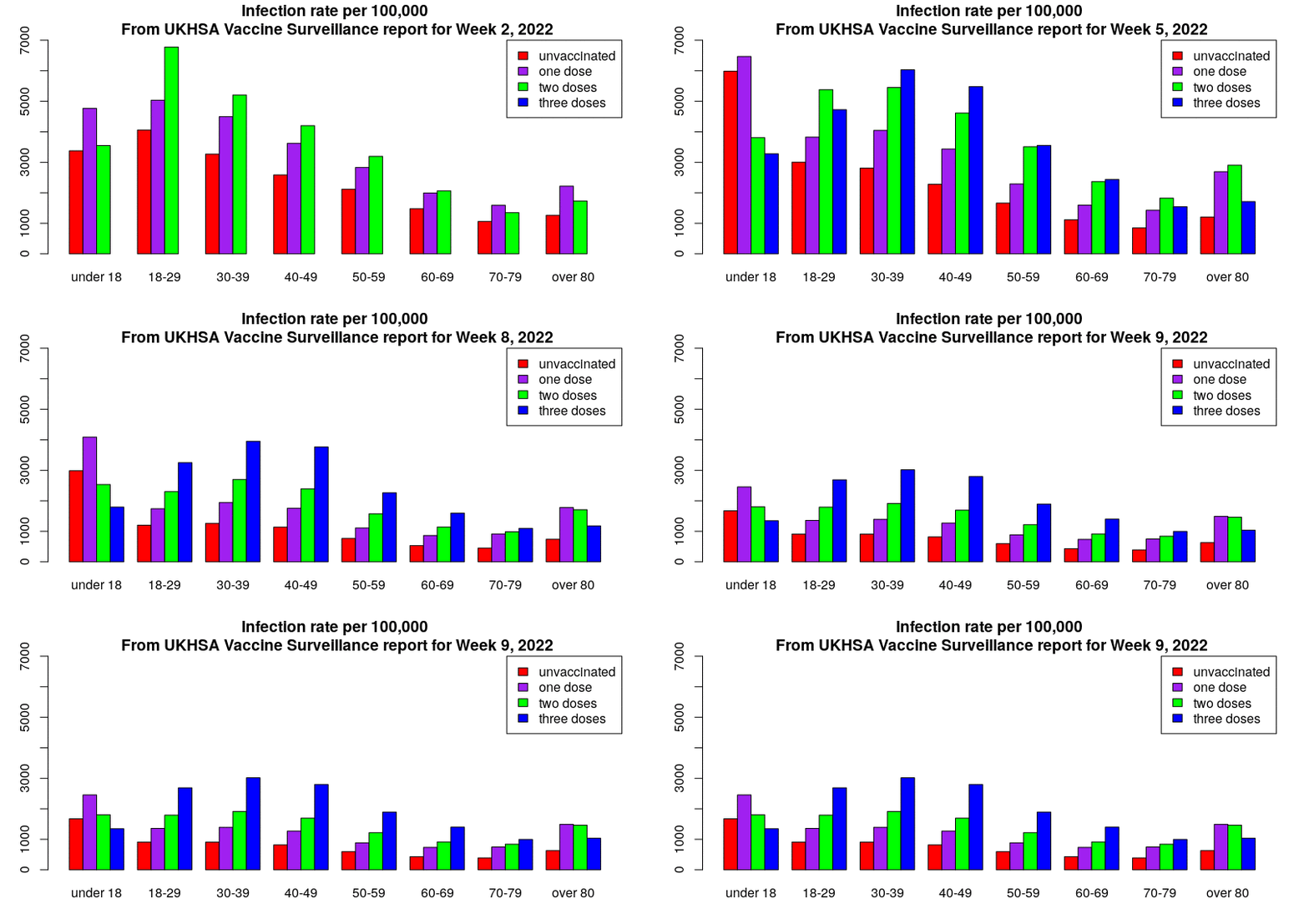
This gives an unadjusted vaccine effectiveness of:
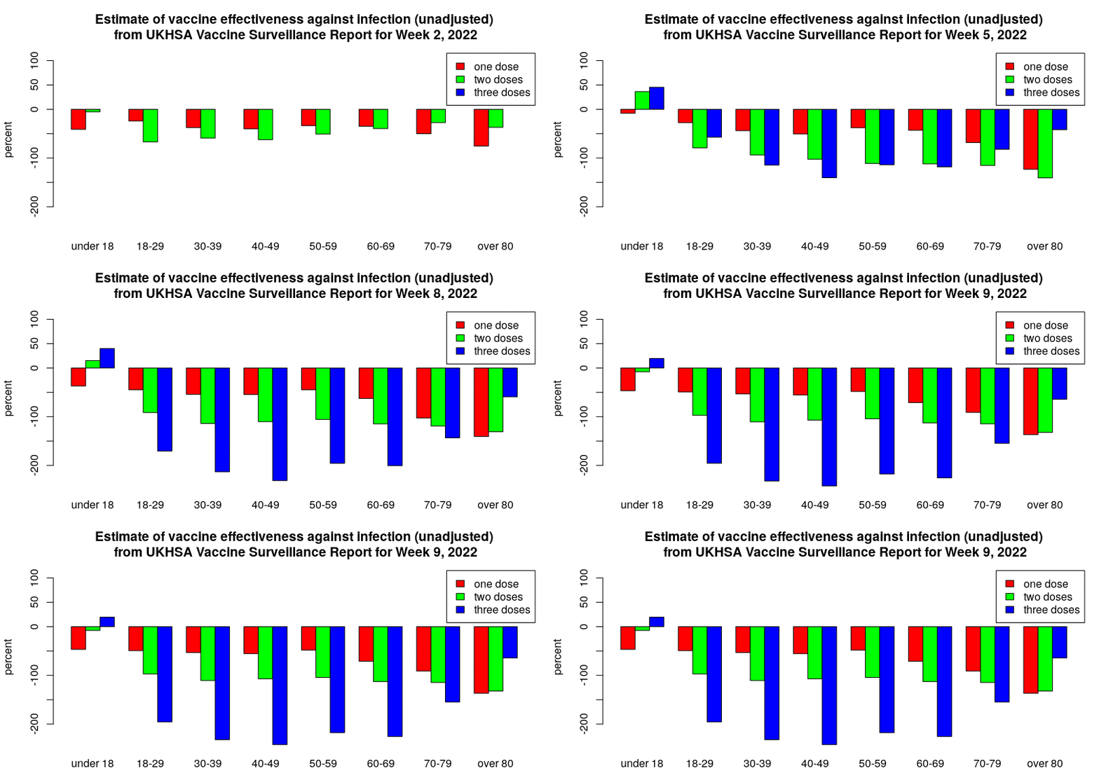
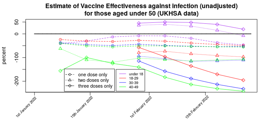
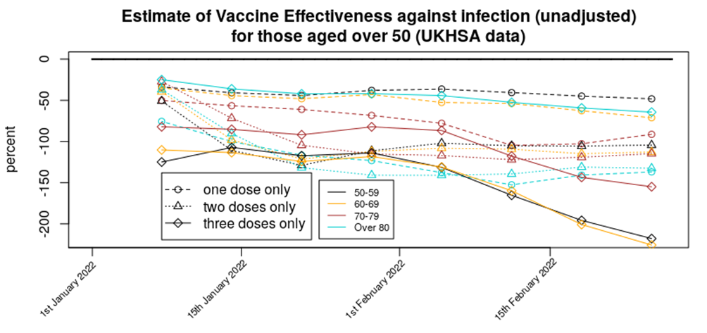
Displayed in this way it can be seen that apart from in those aged under 18 we’re seeing a broadly level but negative vaccine effectiveness for one and two doses, with a rapidly declining vaccine effectiveness for three doses of vaccine.
For completeness, here are the above VE data in a standard graphical form:
Method: The infection data come from the UKHSA Vaccine Surveillance Reports. Note that these data are always a week behind and cover a four week period, so the week 9 report covers the period from week 4 to week 8 2022. The vaccinated population numbers come from the NHS vaccination data spreadsheets. Note that there is a difference in vaccinated population between the start of the four week Vaccine Surveillance Report period and its end. Also note that the data in the Vaccine Surveillance report are for >21 days after vaccination (first dose) and >14 days after vaccination (second and third doses). As a result of this we have to use a vaccination point some time before the week of the Vaccine Surveillance Report – we consider the four week period shifted two (one dose) or three (two or three doses) weeks before the Vaccine Surveillance Report window, and use the vaccination data from the midpoint of this period. For example, for this week’s report the cases data cover week 4 to week 8, the vaccination period for the third dose data (>14 days after vaccination) covers week 2 to week 6 and thus we use vaccination data from week 4. The UKHSA uses the vaccination data from the end of the four week period, which will have the effect of artificially reducing rates in the most recently vaccinated population (i.e., currently the booster vaccine).
Are these data reliable? The UKHSA data have appeared to be somewhat reliable up until the end of 2021, but there are now questions regarding how much the infections data in the report reflect actual Covid infections in the population. For example, consider the cases data that have come from the Government infections website (essentially the same as the UKHSA data but with a slightly larger remit), the Zoe Symptom Tracker app and the U.K. Office for National Statistics:
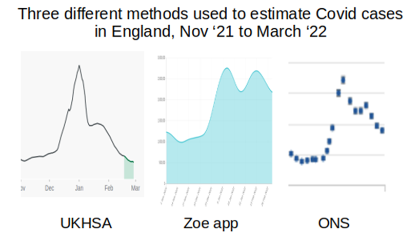
I’ve not included scales in the above, but have adjusted the graphs to cover approximately the same date range (the start of November 2021 to start of February 2022); what is important is the shape of the curves. The UKHSA data suggest that cases are now somewhat below the level they were at last November, the Zoe app data suggest that case levels are now approximately double what they were last November, and the ONS data similarly suggest that case loads are now approximately double the level seen last November. (Note that the UKHSA data are daily infections, while the Zoe app and ONS data are both ‘currently infected’; while this will have an impact on the data, this should not be to the extent suggested in the above graphs.)
Why is there this discrepancy, and where is the ‘real’ level? There is a fundamental difference between the UKHSA data and those of the Zoe app and the ONS – the UKHSA data are a simple count of positive tests, whereas the Zoe app and ONS datasets are the results of a calculation based on asking a large sample of people if they’ve got Covid (whether symptoms of Covid or the results of testing) and applying the proportion of positive cases to the U.K./English population to get an estimate of current infections. It appears that testing is now dramatically lower than it was last November and this is very likely the cause of the the lower case rates found in the UKHSA report; the Zoe app and ONS data are not significantly affected by the testing rate in the country and are thus offer better estimates of the level of Covid infections. I do note, however, that both the Zoe app data and (to a lesser extent) the ONS data are affected by a bias in the motivation of the contributing individuals – Zoe app users have to have been sufficiently motivated to sign up to the app, whereas the ONS data rely on individuals responding to the invitation to contribute. It is of note that neither the Zoe app data nor the ONS data offer sufficiently detailed information by vaccination status (the Zoe data used to show this but they stopped just at the point where vaccine effectiveness turned negative).
There is another potential explanation for the disparity between the UKHSA, Zoe app and ONS data – the UKHSA only includes new cases where any prior case was more than 90 days before, whereas the Zoe app and ONS data measure those currently infected/symptomatic. It is possible that Omicron and/or vaccination has led to longer term/persistent infections, or reinfections within that 90 day period; if this is the case the UKHSA would not report these additional cases.
It is unfortunate that we don’t have sufficiently reliable data on infection rates. This information could be obtained from other sources. For example, the Government could use data on hospital admissions that arise because of accidents – these data would have no motivational bias (because people don’t choose to have an accident and then be tested on admission to hospital) and already exist (as all hospital admissions are tested). It would be best, of course, if there were properly conducted trials into the impact of vaccines in infection rates, but there appears to be little will in Government to properly investigate the impact of the vaccines on reducing Covid rates.
Hospitalisations
Hospitalisation rates continue to decline as the Omicron wave recedes into the distance:
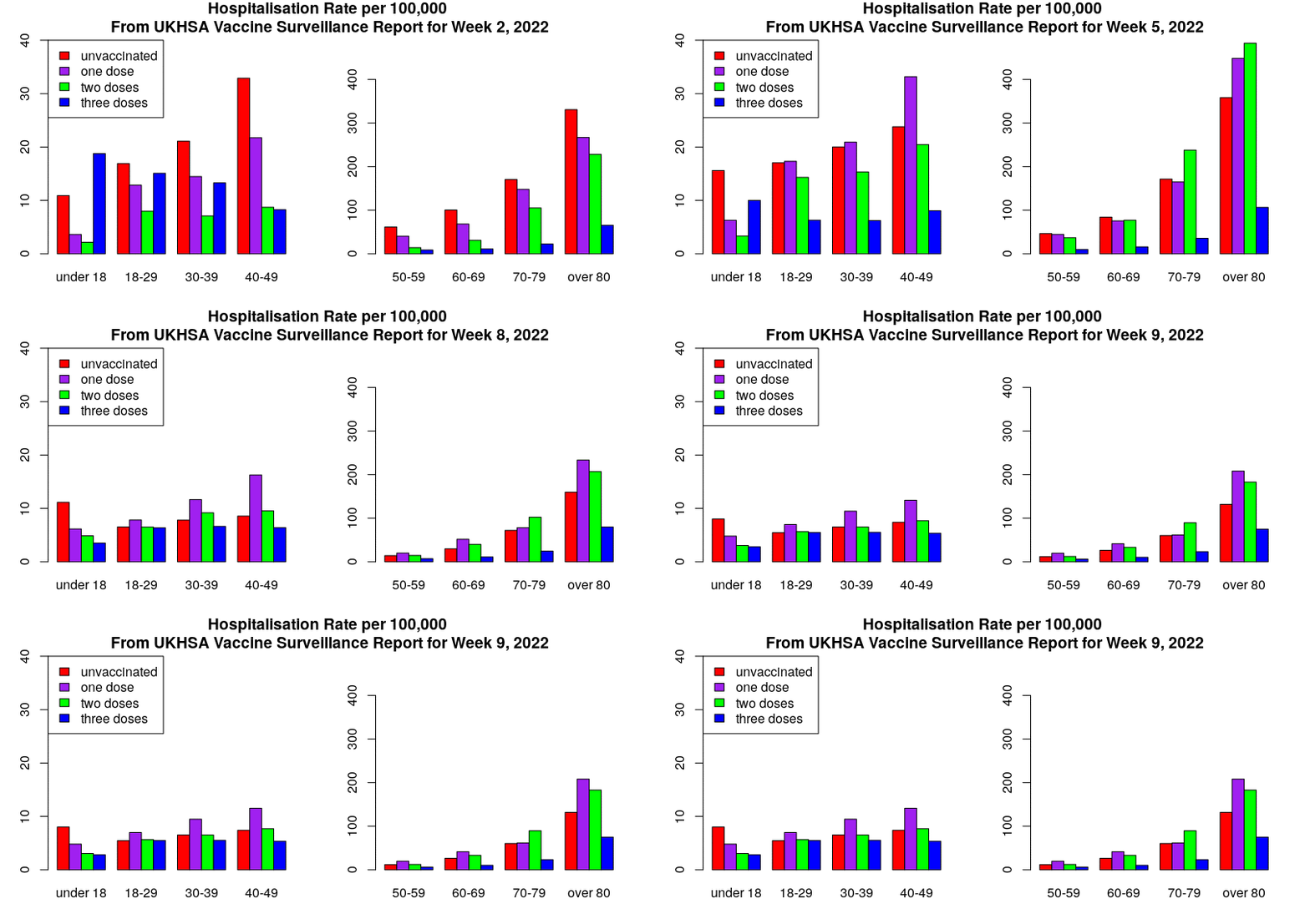
It is worth noting that the hospitalisation rates in the triple-vaccinated don’t appear to have changed (risen then fallen) over the latest report period as much as rates in the unvaccinated, single jabbed and double jabbed; the booster vaccines appear to have done their job in protecting against hospitalisation with/from Covid. However, rates in the single and double vaccinated are higher than in the unvaccinated in all over-18s. Note also how low the rates are for those aged under 60; in this age group there were very few hospitalisations regardless of vaccination status.
Here are the VE data for protection against hospitalisation in standard graphical form:
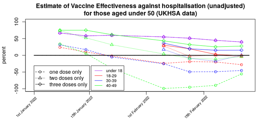
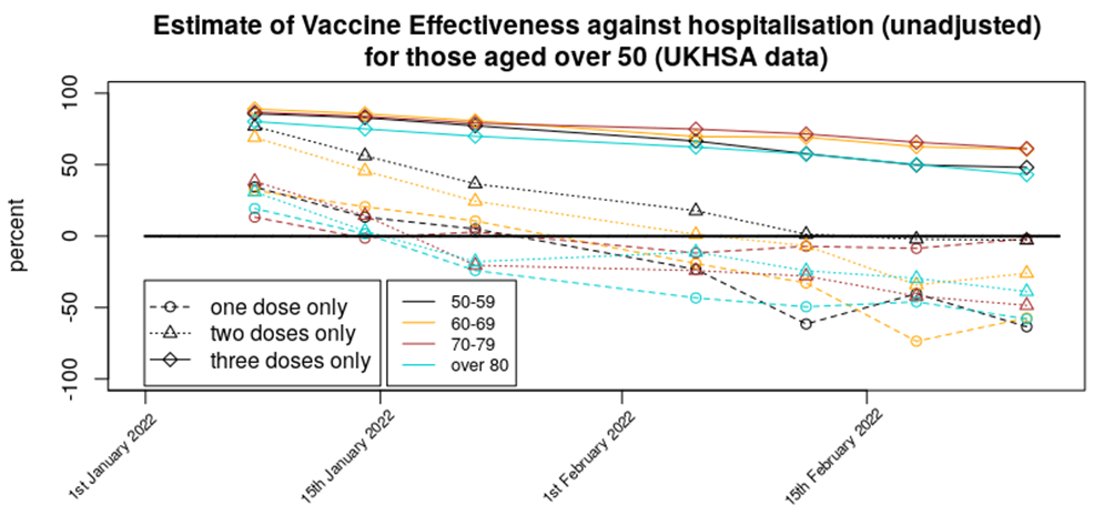
Methods: Data were analysed in a similar fashion to the analysis for cases. However, vaccination data were used for the week prior to that used for the same time period for the infections analysis; this was done to account for the delay between symptomatic infection and the disease worsening to the point where medical assistance was sought.
Are these data reliable? Hospitalisation data tend to be reliable; healthcare workers simply test each individual that is admitted to hospital. There is an assumption, however, that the unvaccinated and vaccinated will be equally likely to attend hospital; if there are differences in the propensity to seek medical help between the unvaccinated and vaccinated populations then this could introduce a bias.
In addition, the data doesn’t inform as to the seriousness of the hospitalisation, nor even if the hospitalisation was with Covid or for Covid. Without these crucial aspects to the data it is difficult to tell what practical difference the change in hospitalisation rates has made.
Deaths
Deaths rates appear to have hit their peak and are now declining across all age groups. Here are the death rate data, excluding those aged under 40 (as rates are too low to see clear trends) and those aged over 80 (as death rates are much larger and will be overly affected by with not of deaths.
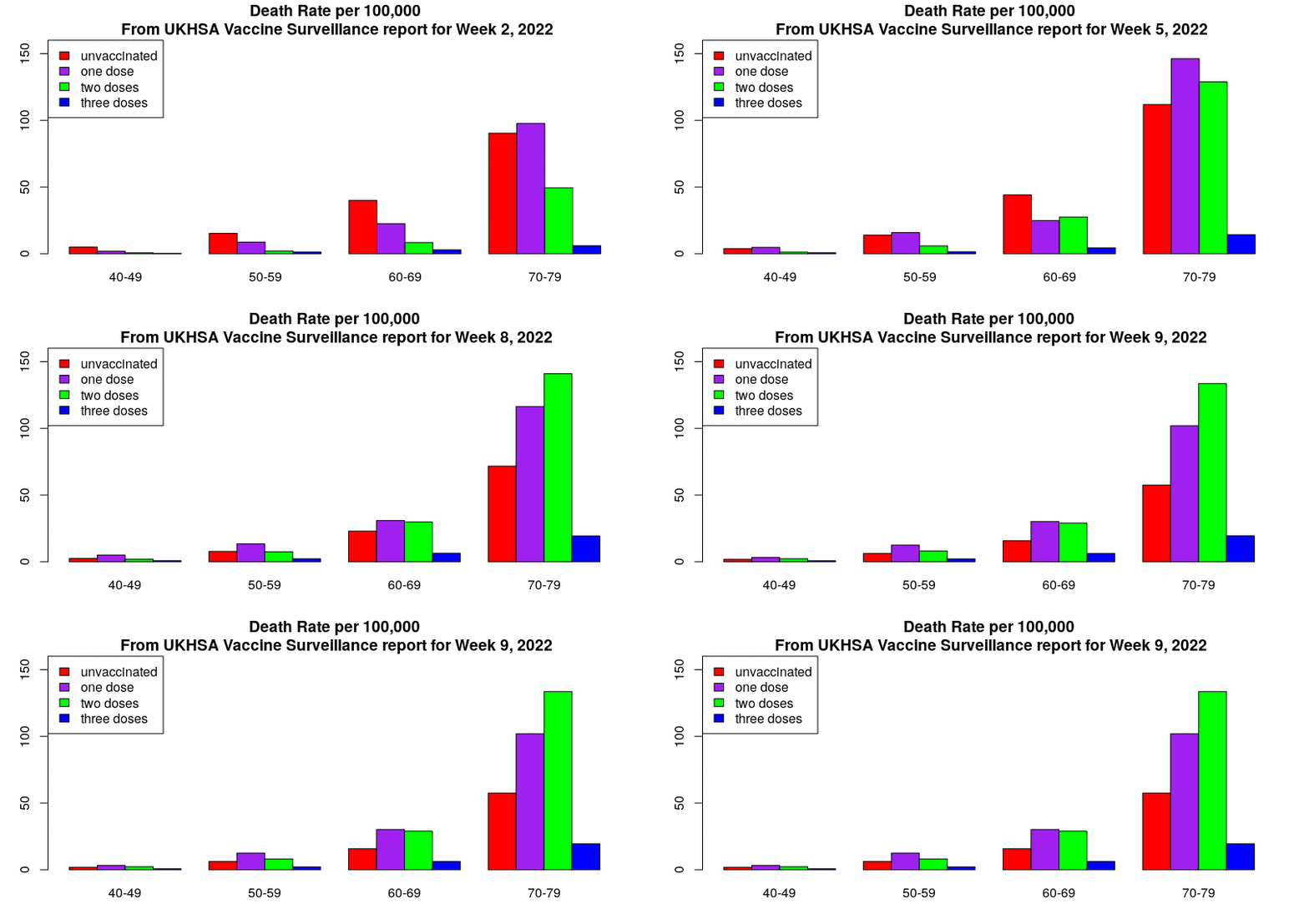
Note how the decline in deaths in unvaccinated, single jabbed and double jabbed is very prominent, but the death rates in the triple-vaccinated appear to not yet be declining significantly. Also note how the deaths in the unvaccinated (red bars) appear to lead the changes, with deaths in the vaccinated following a week or two later. It isn’t clear why this might be.
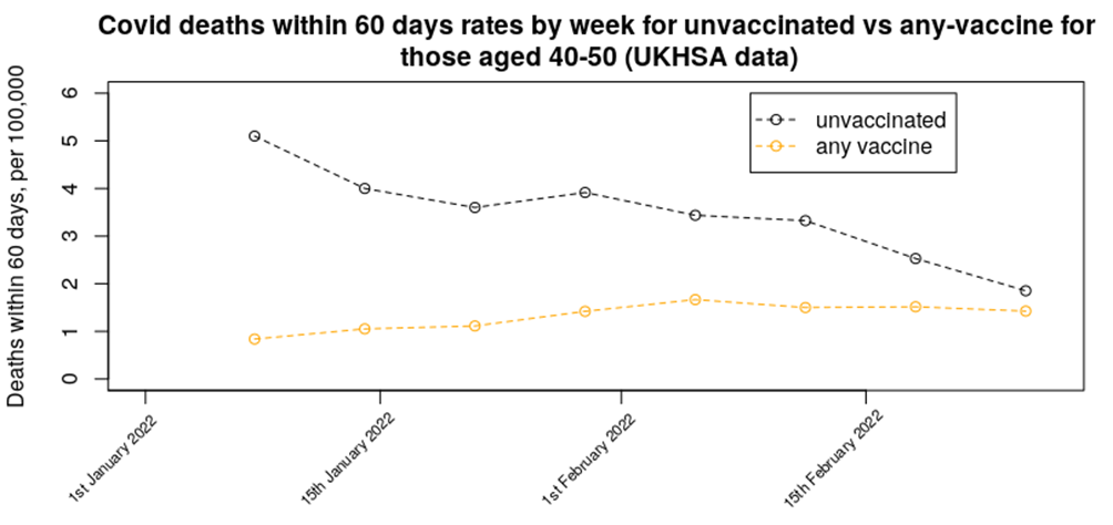
In last week’s data we presented a graph on the relative mortality rate (within 60 days) for unvaccinated versus any number of vaccine doses in the 40 to 50 age range – the updated chart for this week shows a continuation of the decline in mortality rate in the unvaccinated, while the mortality rate in the vaccinated population appears to be maintaining its increased rate. The trend in the data suggests that mortality in those aged 40-50 who have had any number of vaccine doses should rise above the unvaccinated mortality rate either next week or the week after.
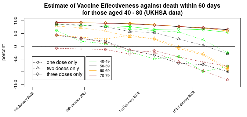
Here’s the VE against death in standard graphical form:
Methods:
Data were analysed in a similar fashion to the analysis for cases. However, vaccination data were used for three weeks prior to that used for the same time period for the infections analysis; this was done to account for the delay between symptomatic infection and death. If the delay between infection and death is actually greater than three weeks then our mortality rates will be lower than they should be.
Are these data reliable?
You’d think they would be – there’s no confusion over the end point (death) – but of course there’s always the problem of ‘with not of’ to consider. But there’s a deeper problem with the deaths data, which is the ‘healthy vaccinee’ effect.
It is worth going into what the ‘healthy vaccinee’ hypothesis means in this context. To begin with, we’re not talking about those who are generally unhealthy or who have unhealthy lifestyles; indeed, people with general health difficulties were targeted for vaccination, not spared it. Instead, in this context we’re talking specifically of those very few that are closest to death; the most very frail of the elderly and those diagnosed with a terminal illness or condition. While there are always deaths due to sudden illnesses, heart attacks, accidents, etc. a good proportion of deaths are expected some time before they actually arrive. These types of deaths are thankfully rare in the young, but become a large proportion of deaths in those over 50 or 60.
Is there any evidence to support this hypothesis that they didn’t vaccinate those closest to death, and how would this bias the results? We have a glimpse of supporting data for this ‘healthy vaccinee’ effect in data available from the ONS on deaths by vaccination status. These data helpfully break down the mortality data into deaths with Covid and deaths not with Covid, and they tell an interesting tale. The data we’re interested in are the mortality rate not from Covid during 2021.
Consider first the first dose of vaccine and what happened to non-Covid deaths in the unvaccinated for those aged 70-80:
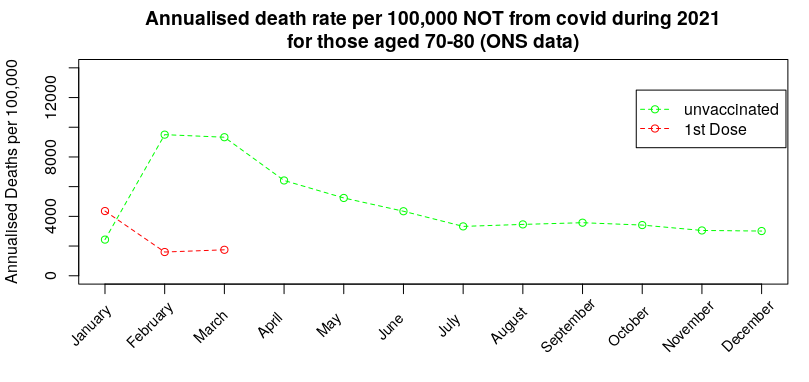
During January there was a spike in non-Covid deaths in those that had received their first dose of vaccine. The ‘healthy vaccinee’ hypothesis proposes that this is when the medical authorities realised that the vaccines were causing high rates of death in those who were very close to death (anyway); at that point they switch policy to not vaccinating those close to death, but because very few in this age range (70-80) chose to not get vaccinated the eventual deaths from those that were close to death get concentrated into the unvaccinated group, resulting in a very high death rate from reasons other than Covid in the unvaccinated, which then slowly reverts towards the background rate.
Three months later they start with the second dose of vaccine – while the vast majority that took the first dose choose to take the second dose, the ‘healthy vaccinee’ hypothesis suggests that there was now a new group of individuals that were deemed sufficiently well to take the first dose but who had by this point deteriorated such that the medical advice was to not take the second jab:
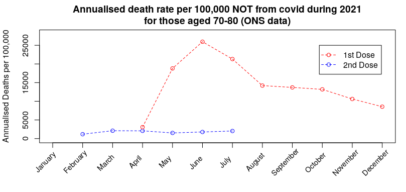
Again, the hypothesis suggests that the spike in deaths for any reason other than Covid was due to those that were deemed to ill to take the second jab being concentrated into the one-dose-only group, resulting in a spike in death rate that then slowly reverts towards (but not reaching) the background rate by the end of the year. Note that this spike in non-Covid deaths in the single-jabbed isn’t seen in the unvaccinated (prior graph).
By October the booster dose started to get given in this age group. Once again, while many chose to take the third dose, the ‘healthy vaccinee’ hypothesis suggests that there were individuals that had been deemed sufficiently well to take the second dose, but were not well enough to take the third dose:
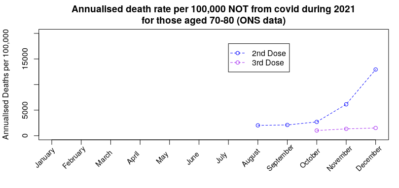
Once again we see the death rate for reasons other than Covid in those not taking the third dose rise without any similar rise in those taking the third dose. Note, again, that there is no similar rise in the unvaccinated or those having taken only one dose (prior graphs).
The important inference is that if the approach taken in choosing which people to vaccinate with each dose has had an effect on deaths from anything other than Covid, there will also be a consequential impact on death rates with Covid.
I believe that this effect dominates the vaccine mortality statistics; the data suggest that each new dose offers significant benefits in protection against death, but this is in reality only the result of sparing each new vaccine dose to those that had become close to death.
Can we get some idea of the impact of the ‘healthy vaccinee’ effect on the Covid deaths data by vaccine status? Prior to vaccination starting (January 2021 is as far back as it goes) and the mortality rate by vaccination status in December 2021 (the most recent data, and close in terms of seasonal effects to January):

The January mortality rates in the unvaccinated serve as a proxy for the background rate – most people had yet to be vaccinated during the first half of that month, at least. The rates in December then indicate the ‘healthiness’ of those left in the vaccine group, as the vaccines are less likely to affect deaths that aren’t due to Covid (note, this doesn’t mean that there isn’t an increased risk of death following vaccination, only that the ‘healthy vaccinee’ effect might dominate in the short term at least).
Examination of the table above shows that the January mortality rate in the unvaccinated is broadly comparable with their December mortality rate, but the mortality rate in those given a booster is about 45-50% lower than the rate in the unvaccinated. But perhaps this simply means that the vaccines make people healthier? The answer to that comes in the mortality rates in those having received only one or two doses of vaccine – in all cases their mortality rate is multiple times that in the unvaccinated, i.e., it appears that the ‘deaths saved’ in the triple vaccinated are simply moved into the one and two vaccine dose group; the reason that the rates are so much higher is because there are relatively few in the one and two vaccine dose groups, particularly in the older age ranges, and so a relatively small number of deaths gets concentrated into a very small group, increasing the mortality rate for the group as a whole.
Given that we have this decreased mortality rate not from Covid in the triple vaccinated, the immediate suspicion must be that there should also be relatively fewer deaths with Covid in the triple vaccinated. Analysis of the Vaccine Surveillance Report week 9 data shows that there were: 6.3 deaths per 100,000 in the unvaccinated aged 50-59 vs 2.2 in the triple vaccinated, 15.8 vs 6.3 in those aged 60-69 and 57.5 vs 19.4 in those aged 70-79, i.e., in each case the mortality rate in the triple vaccinated was approximately 60% lower than the unvaccinated. Thus it is likely that a large proportion of this reduction in mortality rate that has been attributed to the vaccine is in fact a ‘healthy vaccinee’ effect, and the true impact on mortality is actually far lower.
This then brings us back to that graph of mortality rates in vaccinated (any vaccine) vs unvaccinated in those aged 40 to 50 – most of the ‘healthy vaccinee’ effect appears to have worked its way out of the unvaccinated data (most of those close to death and spared from vaccination have now died), leaving only the single and double jabbed data to show the ‘healthy vaccinee’ effect. Thus by considering all deaths in anyone that has received any vaccine we should remove the ‘healthy vaccinee’ effect. As the graph in question now shows the unvaccinated and vaccinated groups to collectively have similar mortality rates, it is very likely that the vaccines no longer offer any protection against death in those aged 40 to 50 years. I’ll examine this effect for other age groups next week, so long as Russia doesn’t invade Wiltshire.
It is an ongoing crime that there haven’t been more rigorous studies into the impact of the vaccines, whether in terms of reducing (increasing) Covid infection rates, reducing hospitalisation rates from Covid, reducing mortality rates and their negative impact on health unrelated to Covid. We really needed to have the ‘Gold Standard’ of clinical trials – prospective matched cohort studies (matched cohort studies pick groups of people with similar characteristics (e.g. gender, health, morbidity, behaviour) while prospective means that you choose which people go into which group before you start the study). These could have properly removed complications such as the healthy vaccinee effect. Official studies have fallen far short of the gold standard, despite Government experts insisting that they’re the best approach (official measures usually use the test-negative case-control methodology, which is a very useful approach but it isn’t appropriate in all cases, particularly when there are likely to be biases in the test-negative cases).
Other News
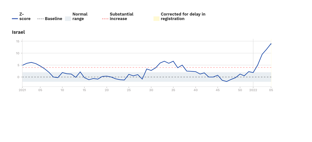
Excess mortality in Israel. Last week I noted that excess mortality was high in Israel in those aged over 65 years. I’m sad to say that things have got even worse; in this weeks Euromomo release their excess deaths rate for those aged over 65 has increased to approximately 14 standard deviations above the normal level for this time of year. Hopefully the death rate in Israel will start to come down soon.
New Zealand. After two years of New Zealand imposing one of the harshest lockdowns in the world and vaccinating a very high proportion of the population (some under mandate), it’s now suffering its first real Covid wave.
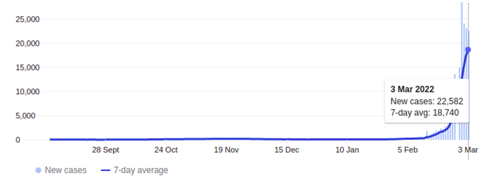
Yesterday it was at 22,582 new cases – and that’s in a country with a population of approximately 5 million people; in the U.K. the equivalent rate would be about 300,000 cases a day. The graph above looks to be starting to roll-over, but this may be because they’re at the limits of their testing capability, not because the increase in cases is slowing down.
On the face of it there is good news from New Zealand – hospitalisations and deaths are very low. However, it looks ‘too good’ – given its huge case numbers there should be approximately 50 deaths a day in the country with Covid, but instead it’s only had 10 since the start of this Covid wave. It very much looks as though the New Zealanders are only recording a Covid death when there is no other potential reason for the death, rather than the much more broad Covid mortality categorisation in the U.K. and most other countries. Thus the death rate from/with Covid in New Zealand doesn’t appear to be easily compared with the death rates seen in other countries.
Amanuensis is an ex-academic and senior Government scientist. He blogs at Bartram’s Folly.


To join in with the discussion please make a donation to The Daily Sceptic.
Profanity and abuse will be removed and may lead to a permanent ban.
It’s clear that the more injections you have the weaker your immune system becomes. Yet still they are going into schools and jabbing as many kids – with perfectly good immune systems – as they can.
Sick!
And I quote from RFK Jnr’s book ‘the Real Anthony Fauci’:
‘A specially assembled CDC research team led by Belgian epidemiologist Thomas Verstraeten compared health outcoomes in hundreds of thousands of vaccinated vs unvaccinated children. The raw data from CDC’s 1999 Verstraeten study showed that children who took thimerosal-containing hepatitis B vaccines in their first 30 days suffered an astonishing 1,135% higher rate of autism than children who did not’.
Quote is from page 327 of the hardback edition of the book. The reference quoted is: https://childrenshealthdefense.org/wp-content/uploads/safeminds-generation-zero.pdf
Read that again, that report was in 1999.
20 years on, and anyone who quotes that link between mercury and autism is shut down.
I could find you 100 other quotes about the vaccine crime syndicate.
The USA needs to abolish the 1986 vaccines act as soon as possible.
And the UK needs to stop giving manufacturers indemnity from prosecution.
I’m still reading the book – my concentration span must have diminished maybe it’s long Covid (joke) but almost every page has a bombshell revelation. After getting the Kindle edition decided this morning to pre order the hardback. I want to send a copy to my Mum with a note:
“If you read any book this decade, read this”. (She actually reads about a book a week. )
I’m just hoping that she gives it a try.
On the autism or ADHD or whatever umbrella term – when I was 10 there were none or maybe one kid in school who had very bad behaviour. Kids were rude, naughty etc but what I see in supermarkets and around is a lot of kids maybe 5% who seem to have a significant impairment. Is it the triple vaccine? Not sure what year it was introduced
After a lot of reading, I wonder if the triple one is another final insult to an infant’s system on top of all the others which also cause damage. The frequency of physical or cognitive impairment within 30 kids in a class seems enormous, what with allergies, asthma, learning and behavioural issues etc etc. Microclotting following vaccination could potentially account for a wide range of damages, and destroying the natural immune response would account for others.
The destruction of the integrity of the individual to make us all Pharma dependent and deficient in every way – just look at the current NHS advertising – so many ‘sick’ people being patronised under their”Care” ( sic). The “transformed” NHS is crucial for their plans for us!
Sick people are helpless- dependent on Pharma and the hand-outs from the State to survive ..
Make them ‘sick’ and then there is so much money to be made out of exploiting them- no wonder Gates has been pushing mass vaccination for over decades and now ‘owns’ the WHO and has “interests” in all international regulatory agencies !
Schwab already has his army of drugged, brain-dead drones in in the making!
Single dose measles was introduced 1968. MMR in 1989.
Autism is a spectrum, with high functioning Asperger’s through to complete autism where the person is behind a transparent shell unable to communicate or understand other people. Attention Deficit (Hyperactivity) Disorder probably was around, looking back I think I was, finding it difficult to concentrate on one thing, mind bouncing around like a grasshopper. I could never have got a diagnosis in the late 60’s. Nowadays it’s regularly diagnosed, but are they real diagnoses?
Greatly enhances the sales of Ritalin.
Remember Andrew Wakefield?
My hairdresser blames Andrew Wakefield for the fact that his two children (now young adults) had expensive privately-bought single vaccines rather than NHS triple. I told him he should be grateful: he made the right decision.
The MMR vaccine is as safe as any other vaccine, the tetanus prophylactic booster given in cases of tetanus prone wounds is a triple vaccine, tetanus plus polio plus diphtheria.
Keeping people “safe” these days has developed very sinister connotations.
So? Different constituents of a tripe vaccine may have profoundly different effects. Jabbing kids with three whatevers at the same time, into an immune system not yet properly formed, is insane.
Disclaimer. None of our 4 kids, born 1975 to 1983 had ANY of the childhood illness jabs. This was supported by our GP, who said fit kids don’t need them and that it is better to achieve immunity from infection.
And yes, they are all fine, fit adults.
Teenage Eagles raised on a small holding in a rural area. Never been jabbed with anything. Kids know to wash any injury with soap and water, and let it bleed. Seem to be more resistant to almost everything. I think we’ve had only a couple of stomach upsets in 15 years, one brief evacuation and then recovered. Any sign of illness we shovel a few extra 1000 mg vit C in by whatever devious age appropriate means.
Great typo – tripe instead of triple! Or was it deliberate?
I bet they don’t bother to inform the patient…
And the Valmara 69 landmine is as safe as any other landmine.
if the wound is tetanus prone why can the booster not just be for tetanus alone? why do you have to add in polio and diptheria?
At least MMR has the benefit of being properly tested and it does offer protection against diseases that can be quite serious in the vaccine group (the young).
OK ….just read up all the work done on the MMR – not that commissioned by the Pharma industry .
Ask the perfectly reasonable question: Why has there been such an exponential increase in levels of autism in our society and when did this become apparent?
Then there are testimonials from harrowed parents on vaccine reactions in their children after the jabs to consider seriously – not dismissed and smeared.
Have you read RFK’s book on Fauci to see the extraordinary lengths this man would go to to protect his patents his ‘friends’ and his Pharma companies from any criticism? ( as he has done throughout the Covid episode).
To understand men’s actions you need to know the Masters they serve.
Take a look at the book ‘How to end the autism epidemic’ by J.B. Handley if you want to get an indepth look at the scientific evidence pertaining to vaccines and autism.
You make valid points and I certainly think there’s a need to have a mature conversation about the impact vaccines have on the body. As it stands there’s far too much promotion of the view that they’re perfectly safe and that any opposition is stupid.
Eg, I’d suggest that the measles vaccine probably offers net benefit in children, whereas the chickenpox vaccine probably doesn’t (and it increases shingles rates in older adults, which is seldom factored into any assessment of ‘value’).
‘At least MMR has the benefit of being properly tested’
Who told you that?
What evidence did they produce to convince you, or are you just trusting what ‘the experts’ say?
Fair point. But it has been around for some time and we’ve got a fairly good idea of the impact of it.
Really we should undertake proper prospective matched cohort trials including those that choose to forego MMR to try to identify rare side effects — these tend to not get done (we do undertake retrospective studies, but these have problems in that they don’t properly take into account the differences in general behaviours between the vaccinate and non-vaccine groups).
Was he grateful? it was his choice after all. I wonder why he regrets it or is it just the money aspect? Some people just baulk at opening money on health issues.
Yes, he said that many autistic spectrum children present with bowel disorders.
Still no-one suggests that that was inaccurate….
Everything starts in the gut. Did you know Serotonin is created in the gut?
To a certain extent the human body is a support system for the gut…
There does seem to be complex interactions between some vaccines and the mucosal immune system.
We appear to be seeing some increase in gastric disorders in the vaccinated (and after covid infection) — this side of the side effects seems to be underinvestigated.
Read the book by Natacha Campbell McBride “Gut and Psychology Syndrome”
Through following her dietary programme to heal the lining of the gut (much of the damage caused by childhood immunisations) many children that mainstream medicine couldn’t help have been cured and gone on to live productive and happy lives.
I think he was bang on the money – unfortunately he just didn’t go about it the right way and TPTB seized on that gladly as a desperate way to discredit his research and succeeded into the bargain.
You can almost hear the sighs of relief in the corridors of power:
“thank God he shot himself in the foot there”
“Indeed old chap”
We have a Government ‘on side with Big Pharma and the Schwab Great Reset agenda.
How many Schwab “Young Leader” sleepers in Johnson’s Cabinet?
Look who Schwab’s hero is…
Vladimir Ilyanovich.
Do I get a Star?
Note that in the U.K. we do not vaccinate children against hepatitis B.
This used to be true, but it is included in the 6 in 1 administered to infants under 1. Whooping cough is administered to pregnant women in the third trimester to protect child post partum.
https://www.nhs.uk/conditions/vaccinations/mmr-vaccine/
Vaccination of pregnant women because vaccinated toddlers spread whooping cough which is a risk to new borns. Create a problem with vax and the answer is more vax…
Yes.
Chickenpox is the opposite (much less chickenpox around, leading to lack of stimulation of the immune system for herpes zoster in adults, leading to increases in episodes of shingles, leading to the need for a shingles vaccine).
Really? Why is that? We don’t routinely vaccinate against chicken pox in the U.K.
Or are you talking about the US? (where they do)
Under normal conditions adults get re-exposed to chickenpox from children and grandchildren, allegedly in the US where they vax kids for pox there is more shingles in adults. Alternatively the adult immune systems could already be compromised due to poor diet, health and too many prophylactic shots.
You may be re exposed to varicella zoster but if you’ve had chicken pox then re-exposure makes no difference as you cannot “catch” shingles. Varicella zoster remains dormant/latent in nerve cells post chicken pox, it never disappears. The same with all of the human herpes virus family.
Shingles develops in a person who has previously had chicken pox. What exactly causes shingles to develop is unknown, but stress is a known trigger, astronauts returning from space have been found to have reactivated varicella zoster. Poor diet and health put a body under stress and so could be responsible for the reactivation of zoster.
It is thought that regular low level exposure to the virus keeps the immune system trained. The normal exposure comes from infected children. Once all the children are vaccinated there’s much lower levels of virus floating around, the adult immune system stops getting regular exposure to the virus to top up immunity, and as a result shingles appears at a younger age.
That’s why we don’t vaccinate for chickenpox in the UK. In the USA they do, and it is why they’ve had a epidemic of shingles (started about 4-5 years after their mass vaccination campaign) and have lowered the age to give the shingles vaccines (50 in the USA, 70 in the UK).
This is a reasonable paper on the subject: https://www.sciencedirect.com/science/article/pii/S0264410X12007761
This figure gives the impact of vaccination on chickenpox (blue curve) and shingles rates (red curve)
90% of the adult population are believed to have latent herpes zoster infection.
This is in the USA, HHV3 is not regularly vaccinated against in the U.K.
You cannot have shingles unless you have had chicken pox. You cannot catch shingles from someone with chicken pox, but someone can catch chicken pox from someone with active and visible shingles rash.
When you have had chicken pox the virus remains latent in nerve cells. If this becomes reactivated then you develop shingles. The shingles rash is on one side of the body, it doesn’t cross the midline and follows dermatomes. The rash is infectious when it is fluid filled, but if covered by clothing then it poses no risk. If acyclovir is administered within 48 hours of the rash appearing then the symptoms are reduced. Post viral pain may need codeine, particularly if the trigeminal nerve is affected.
The vaccine is offered to 70+ to reduce the symptoms.
As a nurse practitioner I noticed that children were catching chicken pox earlier which led to 9/10 year olds developing shingles, when it used to be that adults developed shingles.
My sister who has never had chicken-pox (neither have I) had shingles following her booster jab.
Your sister must have been infected at sometime with varicella zoster (human herpes virus 3) to develop shingles. Shingles is the reactivation of HHV3 which lies latent in nerve cells. Shingles has been reported after the vaccination or SARS-CoV-2 infection. 90% of all adults are thought to be infected with HHV3.
My mum got it after her second jab. It was the last thing she needed.
Just recovered from shingles (at the over-ripe age of 59), and can confirm all of the above.
Among other things, it’s put me off roofing forever.
Clearly you do not understand the relationship between mum and foetus in utero. Whilst in utero IgG antibodies pass from mum to foetus. If mum is vaccinated then the antibodies cross to the foetus. Post partum IgA antibodies pass from mum to neonate through breast milk. This provides the baby with antibodies to fight pathogens until it’s own immune system develops over the first few weeks of life. Don’t forget that an infant depends primarily on its innate immune system and the adaptive system isn’t fully mature for several years.
Pertussis is endemic and can be fatal for neonates.
If you are going to down vote then please have the courtesy to explain your reasons and more to the point where I am factually incorrect.
My wife is now violently allergic to egg thanks to the whooping cough jab, just one of the little side effects no one bothered to mention.
If you have any interest at all in the “safety” of vaccines in general please read :-
http://vaccinepapers.org/
Research which bigpharma know very well but will never publicise.
The MSM and most medics are wilfully ignorant of it.
So how are the British people allowing this to happen to their children? Wger are our MPs campaign against it?
So where are the Police ? Where are the Courts? Where are the Judges? Where are the media? How long can they continue to cover up the manifest evil of what is being deliberately done bh so many agencies and individuals ?
How many will eventually die as a direct consequence of this Government’s forced injection campaign?
These are questions I ask myself every day. Except in reality we know everyone and everything with a modicum of power is corrupt, and those doing their bidding are brainwashed and ignorant and stupid. I’ve run out of any sympathy whatsoever for stupid people now.
Many are simply evil and greedy. I know at least two people who qualify for that description. They like status and a bit of power, love looking at the size of their bank account and lie to order whenever the Establishment narrative is being contradicted.
The recognition of the now overwhelming level of total corruption in our society is one of the biggest shocks for even the already cynical among us!
For many, they now longer inhabit the country they fondly imagined they knew.
I couldn’t agree more. Some days I just think I have been taken to another dimension. Everywhere I look there is corruption. Everywhere.
Where is the fading country of Empire of my youth?
Just to clarify, are you advocating that infants and children receive no vaccinations at all?
One of my lads, whose kids were already autistic, have had any jabs. 5 and 8. No problems.
Surely only ones proven to be necessary, efficacious thoroughly tested and under the Medical Code, which do no harm whatever – isn’t that what we all want?
How can anyone possibly morally justify any alternative approach to vaccinating the young who can make no personal choices for themselves and whose whole lives may be affected by the consequences?
Just a few cases of myocarditis after the Covid injection in young males, who never normally suffer from the condition would have led to a halt in the ‘experimental’ programme only 20 years ago.
So where are we now? Simple we are in a deep, immoral pit of our politicians’ making .
That is what I was asking, general childhood vaccinations not the SARS-CoV-2. Note that even the smallpox vaccine in young adult males and childhood vaccines are known to cause myocarditis and other adverse events.
Cheng et al (2016),”Post-vaccination myositis and myocarditis in a previously healthy male”, Allergy Asthma Clinical Immunology, 12,6
Dilber et al (letter) (2003), “Acute Myocarditis Associated WithTetanus Vaccination”, Mayo Clin Proc, 78, pp1431-1433
Eckart et al (2005), “Comparison of Clinical Presentation of Acute Myocarditis Following Smallpox Vaccination to Acute Coronary Syndromes in Patients <40 Years of Age”,The American Journal of Cardiology, 95, pp1252-1255
Engler et al (2015),”A Prospective Study of the Incidence of Myocarditis/Pericarditis and New Onset Cardiac Symptoms following Smallpox and Influenza Vaccination”, PLOS One
Helle et al (1978),”Myocardial complications of immunisations”, Annals of Clinical Research, 10,5, pp 280-287
Kim et al (2019),” Acute fulminant myocarditis following influenza vaccination requiring extracorporeal membrane oxygenation”, Acute and Critical Care, 34, 2, pp165-169
Kuntz et al (2018),” Myocarditis and pericarditis are rare following live viral vaccinations in
adults”, Vaccine, 36, pp1524–1527
Mantdakis et al (2010), “Thrombocytopenic Purpura after Measles-Mumps-Rubella Vaccination: A Systematic Review of the Literature and Guidance for Management”, The Journal Of Pediatrics, 156,4
Murphy ey al (2003),”Eosinophilic-lymphocytic myocarditis after smallpox vaccination”, Lancet, 362, pp 1378-1380
Polat et al (2008), “Severe thrombocytopenia after hepatitis B vaccine in an infant from Turkey”, Vaccine, 26, pp 6495-6496
Ronchi et al (1998), “Thrombocytopenic purpura as adverse reaction to recombinant hepatitis B vaccine”,Archive of Disease in Childhood, 78, pp 273-274
Saurina et al( 2003), Myocarditis after Smallpox Vaccination: A Case Report”, Clinical Infectious Diseases, 37, pp 145–6
Schattner A. (2005),”Consequence or coincidence? The occurrence, pathogenesis and significance of autoimmune manifestations after viral vaccines”, Vaccine, 23, pp 3876–3886
Woo et al (2011), “Thrombocytopenia after vaccination: Case reports to the US Vaccine Adverse Event Reporting System, 1990–2008”, Vaccine, 29, pp 1319-1323
Mine haven’t.
If a child is properly nourished, loved, has access to clean water, sanitation and a reasonable place to live they will need no vaccines of any sort.
They are designed to deal with illness all by themselves.
Roald Dahl’s daughter had all of those, but she still died from measles induced encephalitis.
Mumps in adult males can cause sterility, as the testes have little or no immune system.
I have had Diphtheria, tetanus, polio and whooping cough vaccinations as an infant. There were still polio outbreaks when I was a child.
I had measles and rubella as a child.
Whooping cough can kill young babies, which is why pregnant women are vaccinated in the third trimester.
We forget how nasty these diseases can be. It does make sense to consider protection against the worst of them.
It doesn’t make sense to risk side effects for a disease that’s benign in that age group.
And covid cases on the rise in Scotland – but not to worry, they are about to begin their “spring” booster campaign. Mind you, they don’t say whether the rising is happening in the jabbed or unjabbed.
My money is on the jabbed as if it was rising in the unjabbed they would be shouting it from the rooftops (“bad unjabbed people”).
As if that was somehow a ‘normal’ spring kind of thing to do. A covid jab booster when the daffodils begin to bloom.
Watch those cases rise even further Nicola. In the jabbed.
Of course jacinda psychopath ardern will count deaths for her liking! So then the data will look convincing. Safe and effective!
We have to look at excess death like in Israel.
I wonder if any school teachers are using the Covid19 story to teach children about statistics and the meme ‘there are lies, damned lies, and statistics?’
You could analyse all the official figures to teach children all the statistical methods used to identify means, calculate standard deviations from the mean, study effect of age on outcome etc etc.
And then you could discuss how you know whether the statistics are reliable or not, how you might go about ascertaining whether they were reliable or not, why certain actors might want to ‘fiddle the figures’ etc etc.
Great education for children that.
Not convinced that the politicians want a bunch of well educated children if that’s what they have been getting up to, eh?
Much better to stick to theoretical Bell curves, eh?
You’d be gutted if you fell for the narrative and injected your self with the safe and effective toxin.
That is now being classed as “suicide” the the Insurance Companies to annul Life Insurance polices !
You were, after all, giving “your fully informed consent” based on the provision of “full objective information” about the experimental injections weren’t you?
(Not a hint of arm-twisting persuasion, mass hysteria propaganda, .psyop and coercion now, was there?)
A State Funeral the perfect cover up
Mass graves?
when the state kept using the phrase “safe and effective” I always wondered what they meant by “effective” as the word effective could be interpreted differently depending on intentions.
And still they lie about their “poison”( Luc Montagnier) “vaccine”injections and still the media conceal the truth and still the silly sheep believe…it will only end in an avalanche of truth and anger directed against all those who have plotted against humanity.
In the UK they are still ( quietly now) vaccinating our children!
That’s coz the kidz need it to go on skool trips and holiday etc, not to mention the cost of a pcr test . That’s the full extent of the logical reasoning I’ve witnessed.
Then humanity is is in a state of mental regression – we will hardly be needing Schwab’s ‘chips’ to become Zombie Slaves controlled by 5G!.
Many are clearly already there!
This worthy statistical breakdown can only be properly understood when read in conjunction with the link tucked away in yesterday’s Vaccine Safety Report labelled:
Seek it out, read and inwardly digest. The description doesn’t quite convey the full horror of it. (There’s one available for SAGE too on the same site.)
The jaded sceptic will not be surprised but it is excellent to have a handy aide memoire that discloses the extent to which these organisations are merely the Praetorian Guard to Emperor Fauci.
The pharmafia are the cancer. They run the casino and the gaming board.
The statistics are smoke and mirrors.
More mixed metaphors are available!
Please feel free to use as many excellent mixed metaphors as you like – the truth of this abomination and the evil men and women behind it must be shouted from the roof-tops by whatever means !
The Evil Billionaire ring-leaders are still plotting against humanity and have their next trick well advanced !
I’m afraid that a large number of Consultant doctors in the UK are fully signed up. OK, they’ll be full of their ‘escape hatch’ justifications. I just hope they get the Nuremberg answer…..
See also in TCW the article The Deafening Silence of Dame June Raine
https://www.conservativewoman.co.uk/the-deafening-silence-of-dame-june-raine/
A banana republic death squad commands more respect than these Welcome Gates Fauci quangos.
“Silence is tacit consent “……….
Pharmafia are just one crime family. They don’t represent the Capo di Tuti Capi.
That’s the banksters, the ueberbillionaires and some shady lawyers.
This just has to be the biggest and most lethal con trick in the history of the world.
The CCG covering this area has already started burbling on about more “jabs”, and they “urge everybody to continue with the vaccinations they are eligible for to maintain their defences against Covid-19”. It seems that everyone in the medical establishment here is unable to read, see or understand anything other than the orders from on high, and the torrent of lies.
Nowadays, I consider that two of the most loathsome expressions in the English language are “come forward” and “called forward”, for the administration of the toxic gene therapies (pace Mr. Moderna).
And the most evil…and it is by no means over!
Hate to say so, but you’re correct on both. After Spanish Flu, it didn’t take that long for it to disappear into folk memory, which I can attest to, with my immediate preceding family generations having lived through it. WW2 probably hastened it into oblivion.
That was “just” a disease, and although it had some societal and political effects, they were relatively minor, compared to the cataclysmic forces, from all directions, now involved; and whose effects on every aspect of human existence, especially in the West, will be felt for generations to come.
After their recent exploits, I detest modern soothsayers, but, harking back to more respectable and perhaps reliable sources, I wonder what Nostradamus, and others, have to say about it all.
Another, perhaps better, example is Russian flu (1889). It disappeared into folk memory soon after as well.
Except in this case Russian ‘flu’ was coronavirus OC43, which we happily live with these days (it is one of the 4 ‘classic’ coronaviruses that we get infected with every couple of years).
What is needed is a nice war – oh!
‘at pace’ is up there on the loathsome scale
The medical profession is full of people who have got to where they are by doing as they were told. They’re only doing what they’ve always done.
Before: “Oh, case rates just appear lower because the unjabbed refuse to do the right thing and get tested.”
Now: “Well, death rates just appear lower because they refuse to do the right thing and die.”
Or all the unvaccinated have died, so there are no more unvaccinated left. They wish…
I’m still alive. Hypothesis disproved.
Still some way to go before they achieve this “objective’ – the Eugenicist want 15% I believe – that’s currently around 1 billion.
The “world famine” they are busy engineering right now will take care of a few.
‘Also note how the deaths in the unvaccinated (red bars) appear to lead the changes, with deaths in the vaccinated following a week or two later. It isn’t clear why this might be.’
Not clear? Hasn’t it been shown by a number of analysis that this is explained by the Smoke & Mirrors Dept counting anyone 14days or less from last does as unvaccinated, and by working back from date of hospitalisation or death to see if the infection might have occurred in that 14 day window, labelling people 3 to 4 weeks after vaccination as unvaccinated?
I think this was missed in this whole analysis. There is no healthy vaccinee effect. The effect is the 14 days statistical trickery. Everytime the death wave happens in the [actual shot number]-1 cohort because of the 14 days delay window. So 1st death wave was in unvaxed, then 1,2 shots when the one higher was introduced. 3 shot people will have a death wave when 4th shot will be introduced. All this just to show the vaccine to be effective…
It is possible, yes. It is unfortunate that data isn’t available for ‘within 14 days’ for dose 2 and 3.
We do have data for ‘within 21 days’ for dose 1 — I’ll try to include these data in the analysis next week.
And if only they used accurate numbers of unvaccinated people to calculate the rates, instead of just 2011 census cross checked with 2019 gp records…..
Many more than the rigged stats allow.
In fact they don’t even have an accurate count of the population. Tesco estimated on its own calculations ten million more than the official number years ago!
Anyone who relies on NHS records of anything clearly needs psychiatric help.
Can you make a block booking for th entire government?
Don’t forget the opposition numpties.
It is remarkable that the government don’t know how many people are in the country.
That would require them to be honest about the scale of post-WW2 immigration.
key question: does anyone or the OP know if these figures account for the 2 week post dose ‘unvaccinated’ status of the vaccinated?
This is a very good point — I should clarify it in the text.
The answer is ‘we use data as supplied by UKHSA’, which isn’t as simple as you’d imagine.
So, it is a fair point to consider that elevated infections/hospitalisations/deaths in the one and two dose groups is affected by increased rates in individuals immediately after vaccination.
The one bit of information that we’ve got that isn’t being presented is data for those within 3 weeks of their first jab — would people like this to be presented next week?
Thank you for that clarification, and in answer to your question, yes please if it is reasonably straightforward to include it.
Ok. I’ll try to put it in next week.
many thanks, look forward to it
indeed it seems telling that they’re not including much if any of the early outcomes data post-dose
since everything i am reading indicates this is a massively risky window
Latest evidence on covid increasing after vaccination – HART (hartgroup.org)
I think the issue people are talking about here is immortal time bias, no? Or maybe I misunderstood and that’s what you mean.
A basic problem with their methodology is that the delayed classification of someone as vaccinated creates a period of “immortal time” such that if an outcome occurs within that time period, the outcome is assigned to the unvaccinated bucket (or the 2 doses bucket etc). In other words there’s a denominator issue.
Prof Fenton has demonstrated that this effect is by itself sufficient to create the repeating data we see here:
That is, we’d expect to see this outcome entirely independent of what policies are used to select who gets the vaccine or not. In fact you could blindly inject people with water and this methodology would yield an apparently high initial effectiveness that rapidly wanes, combined with a spike in (arbitrary) outcomes in the those who didn’t get the water shot.
To me, an explanation derived purely from methodology is more robust than an explanation that posits the existence of a policy without any independent evidence to support that existence. It’s just more Occam’s Razor compliant.
Would be interested in your thoughts.
It certainly would have an impact.
The argument against it is that where we do have data separated out into pre-vaccination, shortly after vaccination and ‘longer term’ (eg, ONS data), we still see the jump in death rates. Norman considers at least some of this as due to delays in the reporting of death and/or misattribution of vaccine status (delays in updating the database?) and I’d agree that these would also result in the data that we see.
Had to smile, I was just reading the comments about the death of Shane Warne and that he had been on a strange diet 14 days before he died. Anyway I was reading a comment about could it also be associated with a certain jab he had had and whilst I was reading it the comment disappeared as it breached guidelines.
I don’t know if the vaccine contributed to the death of Shane Warne, but if it did it would be yet another tragedy — he was probably the finest spin bowler ever.
He was a hero in Australia — I’m sure that his death is making many Australians think about the safety of the vaccines.
Also note that he wasn’t just ‘some guy’ — as an elite sportsman (even semi-retired) he’d have been checked over by medics regularly.
Why does the certain jab necessitate a strange diet? I’m curious
be interesting to see if the average person still remembers boris breaching his own restrictions since the media have now moved on to ukraine. You do feel that the average person is now only just a blank sheet up paper that is written to daily,
A mate reckons the news is written ten days in advance
People can only worry about one thing at a time.
I never forget anything, especially when it relates to misdemeanours or other scandalous behaviour. These are the first things that I remember about anyone. But I am not very average.
Most people only remember the first thing they’re told about a subject and the most recent thing.
Those 3rd dose deaths don’t look so bad when you kick them back into the 2nd dose group using the 14 day trick, but it does kinda make your 2nd dose deaths look bad.
While there probably is an effect of higher death rates ‘within 14 days’ of the third jab, it is a relatively small number of individuals and shouldn’t affect the second dose totals too much.
But it is an unknown — really they should report the numbers separately (doubly so given that we do know that it is a risk period).
All this data needs to be viewed within the context of the colossal efforts made by government/pharma collaboration to suppress effective early treatment.
If known safe early treatment had been supported rather than suppressed the unvaccinated category would be kicking vaccines rear end even more impressively.
This is one of the crimes of the Covid times.
The data supporting the use of ivermectin, in particular, is very robust — I’ve no idea why it hasn’t been used.
I see data now coming out of Israel very much supports the use of vitamin D as a preventative measure wrt Covid. I was in a team trying to get gov to investigate the use of vitD in spring 2020, but it went nowhere.
I also note that it is now 8 months since the end of the Coronavit trial and the results still haven’t been released. The data supporting the vaccines was released in a few weeks and the vaccines were approved for use a week or so later. The data for the Paxlovid (Pfizermectin) trial was released days after the study ended, and it was approved for use by the NHS a week or so later.
I used Vit D and caught Covid.
Conclusive proof that it doesn’t work?
Of course not,,, but that’s the standard of reasoning you anti-vaxxers apply to your insane arguments..
You clearly didn’t die, so it did some good — imagine how bad it would have been without the vitamin D.
That’s the standard of reasoning you pro-vaxxers apply to your insane arguments.
Just for completeness, this is the study from Israel https://journals.plos.org/plosone/article?id=10.1371%2Fjournal.pone.0263069
Note that they measured pre-covid levels of vitamin D and found a protective effect, which counters the main argument about vitamin D not helping with covid (that the low vitamin D levels found in covid patients are due to vitamin D depletion by the disease — this study measured vitamin D levels before infection).
Thank you – very clear. If our vaccine approval body had released the Pfizer trial data in late 2020 I’d not have taken the jab. Can one sue for their dereliction of duty?
Auto Recording, On: “It’s not a vaccine…” “It’s not a vaccine…” “It’s not a …”
(Memo from Tech: Tape is wearing out. Must replace soon. Thanks.)
I use the term in the interests of simplicity.
But in general the problem here isn’t semantics.
“It is of note that neither the Zoe app data nor the ONS data offer sufficiently detailed information by vaccination status (the Zoe data used to show this but they stopped just at the point where vaccine effectiveness turned negative).”
Why do so many people continue to trust these people?
I must’ve skimmed over that bit.
Shocking.
How can Zoe app be reliable? Most likely zealots the only ones using it. Omicron has been milder with less suspicious symptoms. Could Zoe app users be the last hypochondriacs putting in the latest sneeze? In that case the pandemic will never be over. Zoe app is now totally unreliable and is an obstruction/deviation to finish the pandemic.
interesting and scary at the same time read
https://finance.yahoo.com/news/chd-says-pfizer-fda-dropped-205400826.html
“Are these data reliable? Hospitalisation data tend to be reliable; healthcare workers simply test each individual that is admitted to hospital.”
No, they don’t. For starters, testing an entirely healthy cohort is screening, not testing, and they don’t screen you if you DO NOT GIVE YOUR CONSENT.
Secondly, what happened to Bayesian probability Theory, by which we can assume that most positives are false ones? Why would anyone be screened for a so-called fatal disease they didn’t know they had, without first knowing the specificity and sensitivity? Publish those and I might finally take one!!!
The statement applies only to hospitalisations, and I stand by it — you’re unlikely to get hospital treatment in the NHS is you refuse to be tested (if you’re unconscious they’ll test you without asking).
Not true! I had an operation last month followed by a two night stay. I just said no thank-you to the covid screening. The same way that you can decline any screening. Some staff asked why (presumably solely out of curiosity), most didn’t care. All treated me with respect. I got a nice private room with windows. Some staff bothered with ppe, some didn’t. The bottom line is that the mandatory test requirement is nothing more than a bluff.
That’s my suspicion regarding the Austrlian and New Zealandian success stories as well: As both countries went full Zero COVID, there was never a reason to inflate the number of deaths in the hope to achieve that. In other words, these numbers likely reflect real COVID mortality (regardless of social gymnastics).
Thank you Amanuensis for continuing to chart the dismal failures of these devices, while vaccine injuries continue to mount. I remain flabbergasted that they are still being pushed.
They are trying to jab as many people as possible so that their great reset aka depopulation plan work. If I get sick I will take my Ivermectin that I stashed just in case and leave rest to God. When i searched where I can get ivm on google I couldn’t find exactly what I was looking for. Every search query was censored. If I can save 1 person that will use this product instead of going to icu and plugged into ventilators that will burst her/his lungs. that is enough for me. I feel good when I put a spoke in big pharma’s wheel. If you want to get Ivermectin you can visit https://ivmpharmacy.com
Many thanks again for always the absolute read every time you publish. Zoe app must be totally unreliable 2 years into this pandemic,how “specific” symptoms are they reporting? But why can’t UK do studies as done in Denmark where they have tested regularly blood donors for anti-nucleocapsid IgG antibodies and defined by calculations the amount of persons naturally infected? Going to comment on this also on the general comments but could be relevant here. In Denmark they reckon that 60% of the population was infected by mostly omicron during only 4 months. 3 million infections and at most 0.07% IFR.
https://www.ssi.dk/aktuelt/nyheder/2022/ssi-skonner-at-59-af-de-voksne-danskere-har-varet-smittet-med-covid-19-siden-november
60 % of Danish population adults have been infected with covid since Nov. This is true infections as they used anti-nucleocapsid IgG antibodies which develop from natural infection. There are no regional differences and the whole country seems to have been infected. That is 3 million cases in Denmark (5 million) of covid infections in 4 months. There has been about 2000 deaths during that time stamped as C 19 deaths most likely an over estimation. Let us still use that figure .IFR 2000/3million IFR 0,07%.(almost all elderly co morbidities).Most people would not had noticed anything or very mild disease and during these 4 months few cases ended up in ICU. This is not anywhere near a pandemic disease. Denmark had low covid cases compared to the rest of Europe before omicron but now they must have reached herd immunity. There would be minimal need for any vaccine at all in the population and any new variant in the future would encounter a very high resistance in the population as almost all possible reinfections are even milder as the T cells immunity kicks in immediately. Is this relevant for other European countries? Omicron will not treat Danes differently from other nationalities. The pandemic is over with the omicron wave. Time to stop all measures including vaccination. Just prepare to vaccinate the very,very few in LTCH and the extreme risk groups in the elderly and nobody else and only during the start of next winter(vaccine antibodies drop fast).
Why is this still referring to ”cases” rather than ”positive results” or even ”infections” (which they may not be anyway)?
When all these ‘scientists’ and ‘experts’ will take responsability and get fired?
Do we need another referendum to get rid of all the un-qualified but with a good networking officers comfortably enjoying a high salary paid by tax-payers money and the rest of us struggling with everyday life?
As Brian Gerrish keeps on saying in UK Column News “words fail me”.