
Denmark has become a standout sceptical hero of late, having lifted all restrictions at the start of the month and reclassified Covid as no longer “an infection critical to society”. The Government has even put out a fact check to counter misinformation about its approach – the right kind of fact check, countering actual misinformation.
The Danish shift in strategy was all the more remarkable in that it came at a time when reported infections and deaths in the country were at or close to an all-time high. Infections have since plateaued, underlining that it was the right move. However, given that the near-record deaths have come two years in and despite high levels of vaccination, it is worth digging into the data to see if there’s anything more they can tell us.
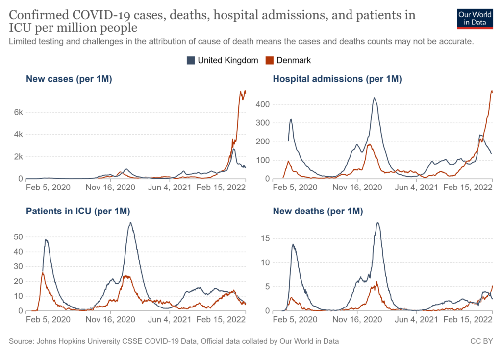
The first thing that stands out is how high hospital admissions are, though as the Government says, many of these will be incidental admissions or mild cases. In addition, while hospital admissions are much higher in Denmark than the U.K., the number of patients in hospital is around the same (see below, plus the admissions (above) appear to be peaking), which presumably reflects mild cases with short stays.
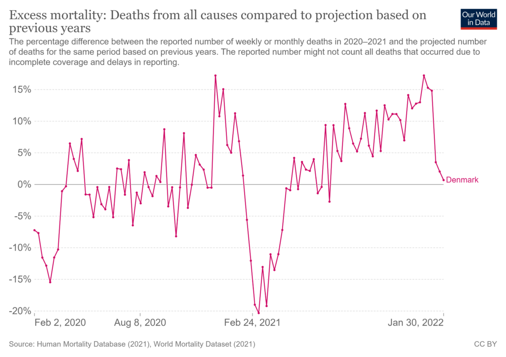
The second thing of note is that ICU patient numbers are right down since Omicron came along – as you would expect for a milder variant – and following the same trajectory as the U.K (see top chart). However, the big oddity is that deaths are rising steeply and even headed towards a new record. This is very different to the U.K., where deaths are headed down, and it prompts us to ask why. It is especially odd given that ICU patients are down so low, as it means the ratio of deaths to ICU patients is higher than ever. The Government has felt obliged to clarify that the criteria for admission to ICU has not changed. This means that either more Covid ICU patients are dying or more Covid patients are dying outside ICU. How many of the deaths are with Covid rather than from Covid is unclear, and this may be a factor. The Government points out that overall mortality was down to normal levels by the end of January (see below), so this suggests many of the Covid deaths are incidental or otherwise part of normal mortality – though be aware that the data for excess mortality is not yet available for the period covering the recent sharp rise in Covid deaths. The deaths-to-ICU-patients ratio in the U.K. is also currently very high, as ICU patients have come right down while deaths have stayed higher, though unlike in Denmark deaths are now headed down.
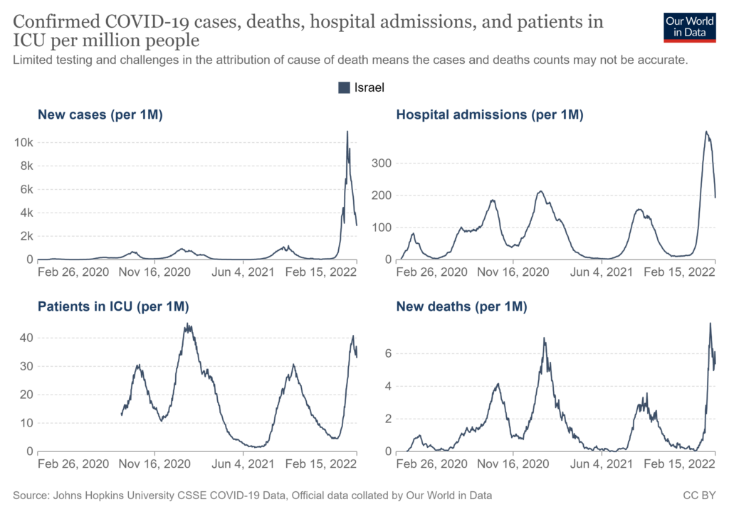
The surge in Covid deaths in Denmark is also happening despite high vaccination rates. Israel has shown a similar pattern, with record deaths this winter, though in Israel’s case it had high ICU numbers as well. Israel’s excess mortality was also below average in mid-January, but again, we don’t yet have data for the Omicron surge.
The dominant Omicron variant in Denmark is BA.2. Is this part of the reason for the currently higher deaths? A recent study on hamsters found BA.2 causing more severe illness than BA.1 and being back to liking the lungs, which sounds concerning. However, humans are not hamsters, and you would expect a large clinical change like this to show up in ICU numbers, which it hasn’t so far.
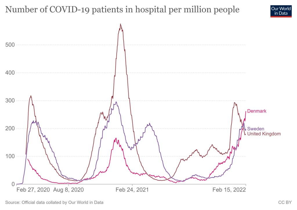
The picture in Sweden is similar to Denmark, with low ICU numbers but higher hospital numbers. Like in Denmark, deaths have headed up recently and reached a similar level (in Sweden’s case, no record is being approached, but that’s because earlier waves were more severe). This means Sweden, too, has a surprisingly high deaths-to-ICU ratio, around the highest it’s been. This is particularly odd as in spring 2021 (its Alpha wave) it had lots of Covid ICU patients but very few deaths, whereas now it has few ICU patients but a disproportionately high number of high deaths. Excess deaths in Sweden, like in Denmark, were low in mid-January, but, again, data for the recent Omicron surge are not yet available.
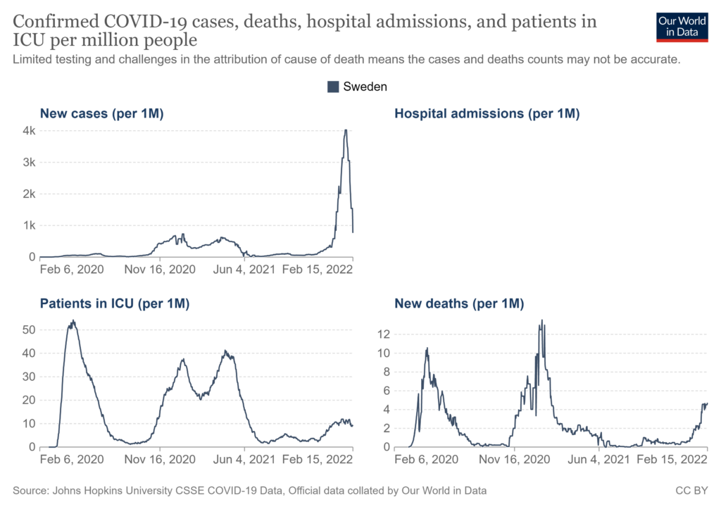
Overall, the picture from the Omicron wave in these four highly vaccinated countries is mixed and perplexing. There is no consistency in the ratio of reported infections to hospital patients, hospital patients to ICU patients, or ICU patients to deaths. (We don’t yet know about ratios of Covid deaths to excess deaths in the recent Omicron surge, except in the U.K., where overall deaths have been below average since Christmas.)
The oddity in particular of the deaths-to-ICU ratio being up in Denmark, Sweden and the U.K. needs explaining. It may be some kind of artefact, such as because deaths with-but-not-of Covid are higher, but it needs looking into. In Israel that ratio isn’t up, but that’s because ICU admissions also went high as deaths did. In Israel and Denmark new Covid death records have been hit or approached – though the level of Covid deaths in those countries is not much higher than in the U.K. or Sweden, it’s just that Israel and Denmark had milder previous waves. This means at least part of the explanation may be that Sweden and the U.K. have more acquired immunity, which is more robust than vaccine immunity. Whatever the explanation turns out to be, the fact that record or near-record deaths have occurred in Denmark and Israel despite vaccination and the mildness of Omicron is striking and should prompt further investigation.


To join in with the discussion please make a donation to The Daily Sceptic.
Profanity and abuse will be removed and may lead to a permanent ban.
Um. Sounds like fodder for slavery addicts. Behave like human beings, and people will die, waaaaah.
Or maybe omnicon is more dangerous for jabberoids than for purebloods.
Who knows?
J.K. Rowling was onto something with Mudbloods and Purebloods – never thought it would have real life application!
Isn’t that what the differing infection rates have been pointing towards – that the jabbed are more vulnerable?
Omega variant?
Nobody knows why “deaths in Denmark are approaching a record high”. Nobody knows if that is even true. It’s all speculation and can range from people becoming ill through lack of treatment and testing for illnesses throughout the ‘pandemic’, to suicides going up because people have been trapped within Denmark and it’s such a boring country.
Perhaps it’s something to do with ‘Climate Change’?
My anecdotal evidence from friends and acquaintances is that I’m seeing people get repeatedly sick, albeit mildly, and testing positive… BUT… only those that are jabbed. Of those that aren’t jabbed, some got sick over Christmas and that’s it. And I know plenty of both jabbed and unjabbed.
May I suggest you watch the first five minutes of this lecture on vaccines by Vincent Racianello https://www.youtube.com/watch?v=bGdnLOdCe0M&t=162s I deliberately linked to the 2019 version to avoid any mention of SARS-CoV-2/CoViD19, to avoid any suggestion of bias in the presentation towards the current situation regarding vaccination.
No vaccine is a suit of armour, it needs waking up by the presence of the pathogen. This means that the memory T and B cells have to be exposed to the pathogen, which may mean a person does not become unwell or they may have mild symptoms.
Note the length of time that antibodies are present after any vaccination and how long it takes for the antibodies to increase on second exposure.
With regards to the SARS-CoV-2 vaccination, irrespective of your opinion of its mechanism of delivery or technology, the concentration on antibodies falling off after x weeks and thus multiple doses being required is a nonsense because antibodies naturally fall after x weeks, as shown in the lecture.
Finally, the vaccine, again irrespective of your opinion of it, provokes the production of the antibody IgG, which is blood based. It does not provoke the production of the antibody IgA which is only found in the mucosae, such as the mouth and the upper respiratory tract, the lungs have both IgG and IgA. Search for Brianne Barker on YouTube for her series of lectures on immunology.
I think, note ‘think’, that no-one has any idea if these vaccines work at all. On this site we have seen interesting graphs of the apparent effect of them on infection, hospitalisation and death. Those graphs don’t measure antibodies or T and B cells , just effect. And there we have seen how the effect has dropped substantially over a very short time period.
The implication ( again the word is important) is that whether its antibody or T/B cell response, it has fallen. The reaction by health authorities is to jab and jab again especially over a winter period to help alleviate hospital numbers.
Israel is the most advanced, and the effect appears to change little, it drops off quickly.
So its likely that T/B cell response is not being activated to any significant effect by the vaccines. IgA is not affected. The relative mildness of omicron is mainly due to natural IgA defences kicking in irrrespective of vaccination.
All that is left is IgG in the blood stream.
You correctly state that this should drop after normal vaccination. But what if it doesn’t with mRNA jabs? What happens if repeated mRNA jabs just heighten and keep at a high level those antibodies in the blood? What do they do? Do they start attacking healthy cells?
If the overall excess death rate starts to climb……
Speaking of Israel, here is a presentation about the life of Albert Bourla – or Israel Abraham Burla as he is actually called.
UNMASKING The GLOBAL EXTERMINATOR(s), Meet “Israel Abraham Burla” aka Pfizer CEO Albert ‘Bourla’
https://www.bitchute.com/video/Bilo162CJgWB/
They do not work as vaccines – a vaccine produces immunity against a specific pathogen – and that has been admitted in the mealy-mouthed… well of course they don’t stop people getting CoVid but it is ‘less serious’, so it is a treatment not a vaccine. And, less serious compared to what? Unvaccinated people who get CoVid and hardly notice?
According to data from Pfizer’s ‘trial’, 0.88% with symptoms tested positive in the placebo cohort, and 0.04% in the active ingredient cohort. From this they produced their ‘95%’ effective misinformation. That is Relative Risk Reduction. The Absolute Risk Reduction is 0.88 – 0.04 = 0.84%… so next to nothing. Plus from the WHO prior to pseudo-vaccine roll out, Infection Mortality Rate was calculated at around 0.15%.
if risk of infection in the unvaccinated is 0.88% and risk of death from infection is 0.15%, then risk of death in the unvaccinated is 0.00132% and vaccination brings it down to 0.00006%. That’s an Absolute Risk Reduction of 0.00126%.
These are rounding errors. Crossing the street has higher risk of death. The pseudo-vaccines do not provide a benefit greater than the cost.
If the overall excess death rate starts to climb……
And especially for those not in their dotage.
the SARS CoV-2 vaccine isn’t.
Not quite.
Quote:
“A fundamental mistake underlying the development of the COVID-19 vaccines was to neglect the functional distinction between the two major categories of antibodies which the body produces in order to protect itself from pathogenic microbes,” the doctors note.
“The first category (secretory IgA) is produced by immune cells (lymphocytes) which are located directly underneath the mucous membranes that line the respiratory and intestinal tract,” they point out. “The antibodies produced by these lymphocytes are secreted through and to the surface of the mucous membranes. These antibodies are thus on site to meet air-borne viruses, and they may be able to prevent viral binding and infection of the cells.”
“The second category of antibodies (IgG and circulating IgA) occur in the bloodstream,” the doctors go on. “These antibodies protect the internal organs of the body from infectious agents that try to spread via the bloodstream.”
“Vaccines that are injected into the muscle – i.e., the interior of the body – will only induce IgG and circulating IgA, not secretory IgA. Such antibodies cannot and will not effectively protect the mucous membranes from infection by SARS-CoV-2,” the article continues. “Thus, the currently observed ‘breakthrough infections’ among vaccinated individuals merely confirm the fundamental design flaws of the vaccines.”
“Measurements of antibodies in the blood can never yield any information on the true status of immunity against infection of the respiratory tract,” they add. “The inability of vaccine-induced antibodies to prevent coronavirus infections has been reported in recent scientific publications.”
In other words, there was never a time when any scientist could claim these “vaccines” could “prevent transmission” based on any empirical evidence. They either lied about claiming they knew that they could stop transmission or they deliberately designed the “vaccines” to be vectors for virus transmission in order to justify universal vaccine mandates.
endquote.
And. Mucosal antibodies are useless against virus that have penetrated mucosal cells. Since 100 000 new virus copies can be produced per cell, mucosal antibodies are easily overwhelmed if only a few cells are colonised.
The main protection is from T cells which destroy the cells in which the virus are reproducing. The mRNA does not stimulate T cell production.
Pfizer was right when it initially rebuffed an approach by BioNTech: their ‘vaccine’ would never work and it was too dangerous. Of course, they became interested when they found that they would be screened from liability, and that by the time everyone realized they were useless they would have made shedloads of money.
Immunologists know very well that no vaccine works for a respiratory disease unless that disease seriously invades the bloodstream, which usually only happens when two lines of natural defence in the airways have broken down. Early treatment will in most cases prevent those defences breaking. Those that are inhaled or are transported by the body especially to the lungs (e.g. ivermectin) are promising.
The Covid ‘vaccines’ don’t stop people being infected, or transmitting, or reduce the viral load in the airways because any protection they afford is blood-borne, a protection of last resort. It’s not for no reason that vaccinations for many different respiratory viruses have been tried and failed for sixty or more years, and the Covid ‘vaccines’ have not miraculously overcome the fundamental obstacles to their success. And because they are so dangerous they are more than just another vaccine trial failure, they are positively harmful.
What he’s saying there contradicts this lecture that shows how small Pox etc was not eradicated by vaccination, rather it was done by better hygiene, sanitation etc. A lot of the places where they had the highest vaccination rates seemed to have the highest deaths
https://pennybutler.com/vaccine-lies-forever/
In researching the hypothesis that the novel coronavirus was spreading widely around the world months before the lockdowns of mid-March 2020, I have spent a lot of time thinking about the point you make – that IgG antibodies fade fairly rapidly. Or the cutoff values used in “certified” antibody assays do not detect antibodies after about 2 to 3 months in most people who may have been infected.
I maintain that we really don’t know the “prevalence” of this virus in the late winter of 2019 and January 2020 because most people who came to think they may have been sick with COVID either never got an antibody test or didn’t get one until April or May of 2020. By this time, it was almost certain that the test results would be “negative” for most people. For example, if you thought you had COVID in December 2019 (and tested negative for the flu) and then got an antibody test in May (when these tests finally began to be administered in large numbers) this would have been 4 to 5 months after you had symptoms. It would be expected that almost all of these assays would come back “negative.”
This said, it is not hard to find media reports of people who were sick in November or December 2019, who still tested positive for antibodies in April or May 2020 (I have found 17 people in America who fit this profile). So antibodies don’t “fade” in every person. Indeed, those with more pronounced symptoms tend to have detectable levels of antibodies for longer periods of time.
As you must also know, the antibody assays actually test for IgG and IgM antibodies. The IgM antibodies, per my research, tend to be present for a brief time shortly after infection. They then “fade.” Of all the people I have read about who tested positive for antibodies in April or May 2020, they all tested “negative” for the IgM antibodies (and positive for the IgG antibodies). This is evidence that they did NOT have the virus in a more recent time period. They almost certainly had the virus when they were sick with flu-like symptoms four to five months earlier.
Anyway, I’ve come to think that the “fading antibody” hasn’t gotten near enough attention, especially as it involves people who likely or possibly had the virus in November and December 2019 or even January 2020. I also wonder if authorities dissuaded people from getting antibody tests at earlier dates perhaps so there would be no documentation or evidence that the virus was spreading sooner than authorities have claimed.
All of this is important as it speaks to the credibility of public health officials, who have categorically stated that this virus was NOT spreading in America before January 2020. Since there were no PCR tests in these months, the only way to “prove” people might have been infected is antibody tests – which few people received in the early weeks and months of the pandemic.
Everything bad is something to do with “Climate Change”.
Especially when the climate has changed to rampant fear and official disinformation.
Gosh! Countries where lots of people took a poison* had higher deaths then countries that took less poison*
*In the pfiser trial the placebo group had lower all cause mortality
https://www.sott.net/article/460909-More-people-died-in-the-key-clinical-trial-for-Pfizers-Covid-vaccine-than-the-company-publicly-reported
Isn’t this a fairly clear example of dying with SARS COV 2 rather than from “covid”? Denmark probably has a very high level of natural immunity because they, sensibly, reopened their schools in April 2020 and allowed the virus to circulate naturally in this younger cohort and their parents. Israel has a higher ICU admission because they have little natural immunity (original antigenic sin in action)
you have your head in the sand of with/from.
Occam’s applies. See an above comment – what’s the denominator in countries with high death rates? – “vaccination” roll outs
It’s comparable to the warmunists bleating on about temperature rise following CO2 concentration….utter garbage.
There are none so blind as those who will not see.
Burundi a natin of 12million and a jab rate of 1500 for the whole poulation is still registering 38 deaths,
Yes. Or rather, it certainly seems so, and Denmark is one of the few countries we can depend on that will actually try to find the truth. Eventually. Maybe.
Media pushing “HIV variant” narrative as cover story for vaccine-induced immune system collapse
https://www.naturalnews.com/2022-02-16-media-pushing-hiv-variant-narrative-as-cover-story-for-vaccine-induced-immune-system-collapse.html
by: Mike Adams
Don’t get complacent. Let’s keep getting the message out with our friendly resistance.
Thursday 17th February 4pm to 5pm
Yellow Boards By the Road
A321 Wargrave Road (Twyford Side)
near Junction A4 new Bath Road
Twyford RG10 9PW
Stand in the Park Sundays 10am make friends, ignore the madness & keep sane
Wokingham Howard Palmer Gardens Cockpit Path car park Sturges Rd RG40 2HD
Henley Mills Meadows (at the bandstand) Henley-on-Thames RG9 1DS
Telegram Group
http://t.me/astandintheparkbracknell
I don’t know what we’ve done collectively to deserve the media with which we’ve been saddled. But it must have been something very, very bad.
These stats are not broken down into vaxed and unvaxed. The unvaxed are an important minority for seeing what is going on here but hey it’s heads in the sand elephant in the room time nothing to see here.
Things seem to be quite quiet with respect to the unjabbed. I take it as a clear sign that the stats are not showing what they would like to show. If they did, they would be screaming about it like maniacs.
They are not just quiet but silent as the grave
An independent not Pfizer big trial needed of vaxed v unvaxed regarding effects of the jabs. And make Pharma pay for it. Problem though is such a high proportion of jabbed in the developed world; there is no skin in the game for them
This is a fascinating new interview with among many other things revelations about the scam Pfizer trials – they basically had more deaths in the jabbed group in the trial and covered it up.
Breaking Exclusive: Former Blackrock Portfolio Manager Exposes Pfizer Fraud
https://www.bitchute.com/video/wlt1te8DWAB1/
These ‘revelations’ are all laid out in full in Kennedy Jr’s book.
I’d say make Fauci and his mates pay for it, since their underhand enabling of the vaccines’ approvals are to blame.
Its Putin’s fault – he done it!
How true!
Very good and important point.
Perhaps they just got unlucky
Maybe by lowering immunity, these jabs are creating the problem and leaving people for dead… here’s a deep dive by a great journalist https://www.thelastamericanvagabond.com/deep-dive-vaccine-acquired-immune-deficiency-syndrome-hiv-inserts-sars-cov-2-aftermath/
Maybe switch channels.
‘Question everything, draw your own conclusions, and stay vigilant.’
“Believe nothing you are told and only half of that what you see”.
An old Black country saying that has served me well in my 73 plus years.
And always be prepared to sprint away when hearing the words: ‘We’re from the government, and we’re here to help’.
And: ” We’re following the science”.
One thing that this makes clear is that none of the state interventions has a clear and attributable effect on hospitalisations and death rates, meaning that after two years they still don’t know what they are doing.
Precisely. A Ship of Fools. Too much intervention making everything worse and driving us all crazy whether jabbed or not
Or, even worse, they do.
“What a tangled web we weave” etc etc…A pot potpourri of ADE and virus variants created by jabbing during an alleged pandemic. Could i also suggest, anecdotally, people who’ve been fully vaxxed seem to be getting ill again and again, incidentally not just with the Rona! Is it the onset of the fabled VAIDS?
Replace the word Covid19 with Scam19 and you will be closer to the truth. For those still in love Vaccine, you’ve been warned.
There is a problem in places where many have been coerced into being injected in order to keep their jobs. If you have independent means or substantial savings, okay. But others, facing the loss of their homes, decided to hope for the best.
What does one say to anxious and angry people about the dangers of what they have been forced to take?
I can’t tell you what I would say to each and every individual who has blindingly accepted the covid narrative, all I am saying is I believe it’s a scam. I’m past being interested in looking at the science, I think the more oxygen we give to the subject the longer it will burn. I admit this is not helpful to those who put their trust in the government and the NHS but it’s all I can offer at the moment.
Those thus affected should be afforded front-of-house seats when the stringing up begins.
This is in fact a perplexing difference. One explanation might be the different variant. But what about the different products used for vaccination? Might this have something to do with this? I believe in the UK AZ was used predominantly, but Pfizer in Denmark if I’m not mistaken.
I’d say it’d because viruses gonna virus and the vaccines aren’t vaccines.
If Carlsberg made Covid vaccines it wouldn’t be the ones rolled out.
The situation in Denmark is replicated across Europe.
To quote the article:
This really is a huge point and shouldn’t be underestimated. If Omicron is much more transmissible and therefore more widespread, in conjunction with reporting deaths for any reason following a positive test, it really should be a priority of public health bodies to provide more clarity on this point and give out better figures.
I think Clare Craig is reporting the same thing in regard to South Africa, (not highly vaccinated!)
”Something odd is happening in South Africa.
Deaths can no longer be predicted from case data – no matter what lag is used….Superficially it looks like they have a problem of a disease which is becoming more deadly but less severe.
Clearly a contradiction.”
https://twitter.com/ClareCraigPath/status/1493867592058085377
I liked “Israel’s excess morality” – though I should say there is actually a distinct lack, rather than too much! Not that many other countries have done much better, of course.
Oh: now corrected – never mind!
Well, look what we have here in the Scotsman!
“Anti-vaxxer concerns force removal of deaths by vaccine status data from Public Health Scotland reports.”
FOI on its way I trust.
It has to do with the methodology. Covid death counts have nothing to do with covid. A milder variant with higher transmission exposed the whole fraudulent system of registering ‘covid deaths’.
Yes. One stat I keep coming back to is that in October 2020 the UK supposedly saw a new wave of thousands of “Covid deaths”. Theere were supposedly around 8,000 of these in the month. The difference in total deaths from the previous October in England and Wales? Forty-six. In a population of well over 60 million.
If a ‘covid death’ is defined as a death within 28 days of a positive test, then if the number of positive tests skyrockets, as it has in Denmark, then in the succeeding 28 days the number of ‘covid deaths’ will necessarily soar.
For example, if over a period of several weeks 40% of tests come back positive – as in Denmark lately, then if we assume these positives to be evenly distributed throughout the population, in the following period we can expect 40% of deaths to be ‘covid deaths’ as a matter of statistical necessity.
The definition of ‘covid death’ is devoid of causality.
All cause mortality is the only relevant metric under these circumstances.
Euromomo shows nothing special happening with Danish mortality.
Ha!
https://www.ons.gov.uk/aboutus/transparencyandgovernance/freedomofinformationfoi/covid19deathsandautopsiesfeb2020todec2021
<7k deaths FROM Covid during the major panic – Feb 2020 to Dec 2021
Average. 10 per diem. And for that…
From the UK regime’s website:
“If you are travelling to Denmark from the UK and have not been fully vaccinated or recovered from COVID-19 you will need to:
This does not sound like a country that has “lifted all restrictions”. This sounds like a country that has successfully manipulated most people on to a Chinese digital ID system and is punishing others for non-compliance and failing to make money for The Cartel.
In fact the only country we can find that comes close is Costa Rica and even then you have to buy their ‘special insurance’ if you’re not jabbed and they have left it up to local businesses to demand a vaccinated QR code. So you may go to Costa Rica and sleep on a beach but that’s probably about it.
Mexico and El Salvador and from today, Norway
Reports from Mexico are that masks are expected on buses and in some hotels, no other restrictions
Don’t know about the other countries internally
The fact of the matter is that human life has a 100% fatality rate. Every human ever born will eventually die.
What explains Denmark’s high fatality rate? Very possibly the fact that very old people who didn’t die last year are instead dying this year. With-, of-, or without covid being pretty much irrelevant.
If there is data to suggest people in their 40s, 50s, and 60s are dying at a higher rate in Denmark, then that would suggest further inquiry. But absent that, I suspect that this is merely an aberration, possibly rooted in different countries’ methods for classifying deaths and infections.
If people in their younger years are dying it would also suggest that the injections are what is killing people – not because of Convid, because their immune systems have been meddled with and genetically reset in the face of a made-up, nonexistent threat which has been proven to be a scam many times over. The obsessive desire to unquestiongly attribute death and disease to convid wihtout caveats and put faith in the unvalidated tests which prove NOTHING and believe in the COVID tag is to do the work of the criminals running this scam which is very disappointing from a so called sceptics site. The fact they will not even touch the valid science which refutes the now discredited field of virology as a fraud is also very telling.
Top notch discussion about the true nature of disease. Explains something called PLEOMORPHISM: our own cells can morph into bacteria.
Hidden Science Greater Cause Of Disease With Dr Robert Young and Andrew Kaufman MD
https://www.bitchute.com/video/RBw1QhMB6qVb/
LBC’s James O’Brien has linked the rise in Danish Covid deaths directly with the lifting of restrictions. This simplistic nonsense has been the norm across the mainstream media for the past two years. Will Jones’ piece begs the question how accurately we are recording Covid deaths or indeed deaths in general? After all we have never microanalysed death statistics in such a way before. We ( ie the whole world) might eventually discover that were chasing our tails all along and panicking for no good reason.
People like Whitty and Vallance and Van Tam know very well we are chasing our tails. They’re not stupid.
‘fter all we have never microanalysed death statistics in such a way before.’
True. In the past Winter ‘flu deaths were quantified by excess Winter season mortality and recognised as a crude measure since there could be other causes of excess mortality in a particular year. It recognised there was no practical way to get the true number.
LBC lunacy: there is a 21 to 28 day period between infection and death from CoVid. Adding reporting delays means these people were infected prior to the lifting of restrictions.
Worth noting: peak deaths occurred in the first week of March 2020 and declined thereafter. This means the actual transmission phase of the epidemic peaked in early to mid-February and viral activity was in decline in early March. Lockdowns in late March were therefore too late – even if they could have any effect on the natural course of a virus abroad in a population.
it is a recurring (deliberate?) error not to take account of the fact there is a lag between infection and when death occurs, and attributing either lockdowns as reducing deaths when restriction were introduced after peak infection so infection was already on the wane and can have had no effect, or to credit the pseudo-vaccines with reduction in hospitalisations and deaths when natural Gompertz decline and end of Winter season were confounding factors.
O’Brien? Nobody pays any heed to that nasty little gobmouth, do they? He’s an irrelevancy, along with the rest of the MSM.
I think that the O in O’Brien is actually a zero and represents his IQ.
While accepting that these radio folk need something to differentiate them from their peers, the man gives middle-aged hair loss a bad reputation.
Torture data enough and they will tell you what you want to hear.
In the CoVid panicdemic, data is just an alternative spelling of propaganda.
None of the CoVid data are reliable because they have been manipulated and misrepresented for political reasons and to play mind games on the public; they are beset by confounding factors, changing criteria and assumptions based on correlation to ‘prove’ causality without support from external corroborative data.
Trying to make a reasoned, critical analysis of them is a hiding to nothing.
SARS Coronavirus 2 is a seasonal (Winter) respiratory virus just like the ‘Common Cold’ (which is a catch-all name for a set of symptoms which can be caused by any one or combination of respiratory viruses including other coronaviruses) or ‘Influenza’ which is caused by influenza viruses but often attributed to symptoms actually caused by other respiratory viruses.
The truth is unless diagnoses are made based on symptoms and presence of antibodies, nobody truly knows what the patient has or dies from.
In the case of CoVid, actually making a proper differential diagnosis is dis/mis/information and fake news.
I do wonder whether we’ll discover one day that the reaction to covid-19, and especially the vaccines, will prove to have been more injurious than the virus itself. It’s starting to look that way.
How many of those that died took 1, 2 or 3 jabs? Was their blood clotted. Steve Kirsch on his Substack is video interviewing Embalmers who are reporting a 50% jump with cases from strange blood clotting.
Add in OneAmerica Life Insurance CEO reporting 40% rise in disability & deaths. UK actuary insurers are also reporting upticks in their 4Q claims. The end of Feb will see more 4Q published.
I can see excess deaths for the next two years until Joe Public figures out they’ve been poisoned by the Nanny (state).
Vaccines are definitely not helping as much as “suggested”, and I think they are harming immune systems.
UK let us out last Summer and allowed a lot more transmission and infection when it wasn’t too dangerous, and with Delta about. Sweden have always had more herd immunity than most.
Pushing vaccines on anyone under 60 and reasonably fit has kept this plandemic going.
It’s a little disappointing that Will Jones in his article didn’t even countenance the idea that it maybe the experimental jabs that are causing the increase in deaths.
should read
This article does not compare or even mention test rates.
Next.
Denmark had pretty consistently out-tested the UK, except for the period between June and October 2021.
However their share of tests which were positive was generally lower than the UK until December 2021 when it absolutely took off.
I suspect the answer is simply a matter of conflating the “from COVID” and “with COVID” figures and also indicates the numbers have never been very reliable. Omicron is highly communicable, and it is no surprise that people at end of life test positive for it.
The US numbers for hospitalization were never reliable, not after the CARES Act and its cash incentive for COVID patients.
We will probably never really know how deadly this disease was unless the countries with integrity like Denmark and maybe Israel go back and look carefully at the numbers. No one in the US (my country) would ever do anything like that. We already know what we want to know.
I am not an anti-vaxxer, and am an anti-mRNAer.
They have been experimenting on many many levels including interractions between serums and radiation. They say that data is gold. The last two years have been a meticulously crafted data gathering and gold mining exercise and it is only going to get worse. Grasp the nettle.
All of this is very interesting. In the States, I keep hearing and reading about “unexpected” and “sudden” deaths both of people in my community and from reading news reports of celebrity deaths. I also think the story of the life insurance CEO who said that “all cause” deaths had spiked 40 percent in the last two quarters is one of the most important uncovered stories of recent months. Some funeral home directors or figures from annual reports of funeral home companies support the notion that “all cause” deaths are up. Many of these deaths are NOT happening in hospitals either, which should be noteworthy. Who knows, but I think the bulk of the evidence is supporting the hypothesis that deaths are up in large part because of adverse vaccine effects. Delayed treatments, diagnoses and deaths of misery probably also explain these apparent spikes. I would question any figures labeling certain deaths as “deaths from COVID” when many of these deaths probably were not FROM Covid – but were people who just happened to test positive for COVID (many probably infected while in the hospital). Something is “off.” We are not getting the full and factual story/data … as usual. It’s nice that one skeptic is taking a deep dive into all available data.
When they talk about novel or unrestricted or unconventional warfare they really mean it. Like Jung said in his famous three hour interview, the unconscious is really unconscious and we must never forget that. This applies to civilisations too. We are seeing the hidden laid bare.The longer term data is even more troubling when you look at trends in cancer amongst the vaxxed. And a lot is being hidden I am being told that by a few people. Huge absences from work even among younger people and this is just the start.
They test for the flu since they’ve never isolated Covid-19. Which makes me wonder how they can tell there is a delta variant. They never isolated the virus but they use a test to show the damage of a solution does on monkey kidney cells then show the cellular debris as proof of the virus. So, they can use this method to claim an UNENDING! amount of variants. A lot of cancers and “viruses” are probably just different forms of parasites. Since the tests can’t differentiate between cold and flu and covid then doesn’t that mean ivermectin cures both the cold and the flu? Welcome to “they’ve been lying to us our entire lives about everything”. Get your Ivermectin while you still can! https://ivmpharmacy.com
Well, it is the flu season.
Thnks Will for a very interesting article especially comparing Sweden and Denmark data. They have roughly the same amount of patients per capita in ICU.And deaths increasing not caused mostly by hospital deaths. Denmark would have many low hanging fruits in long term care having low immunity in the population which would genuinely die even with omicron(and due to old age not admitted ICU) but they are still testing like mad having enormous figures which would render death certificates within 28 days of death very unreliable.Sweden stopped mass testing around 5 February and have very low “cases” because of this but had almost 60% pos rate in tested samples when they stopped mass testing. Perhaps what will happen with Sweden’s death rates after 28 days stopping mass testing would give the answer to the question.
“Why Are Deaths in Highly-Vaccinated Denmark Approaching a Record High?”
Really, as soon as millions of people got toxic injections the begin to die, but can it be these injections? Of course not, it’s just deadly, toxic waste and garbage. That’s good, the body needs it desperately to create antibodies, right?