Despite all the mess that are the official sources of data regarding Covid infections, hospitalisations and deaths, we should at least be grateful – not only that they give us a chance to glimpse beyond the spin-doctors and into the reality of what’s going on with the pandemic in the U.K., but also that the data are also giving us insights into the way diseases propagate through the population.
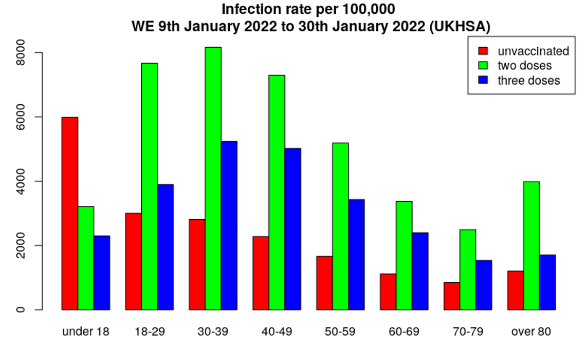
First of all, just to make things clear – Table 12 in the UKHSA Vaccine Surveillance Report once again shows data for those triple-jabbed rather than two-or-more doses, as was given for the data for 2021 since September. However, we can estimate the rates for those with only two jabs using data in Tables 9-11 and vaccination data available from the NHS. Using these data we can estimate infection rates by vaccination status (above); from these data we can then estimate the unadjusted vaccine effectiveness for infection for those having two or three doses (below). The infection rates continue to be considerably worse in the vaccinated, both double and triple jabbed, translating to highly negative unadjusted vaccine effectiveness estimates. Note that these figures are rates per 100,000 so take into account the different sizes of the cohorts, meaning it’s not because there are more vaccinated people than unvaccinated.
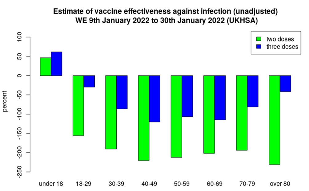
It won’t immediately be obvious from the above charts, but what we see this week is the infection rate in the triple-vaccinated continuing to worsen, but an improvement in the infection rate for the double-vaccinated. This then is reflected in the estimated vaccine effectiveness – better for two doses, worse for three doses. This can better be seen in the graph of the change in unadjusted vaccine effectiveness by age and dose, below. Note the scale on the y-axis, and the fact that all values are negative, most considerably so, reflecting higher infection rates in the vaccinated, both double and triple jabbed.
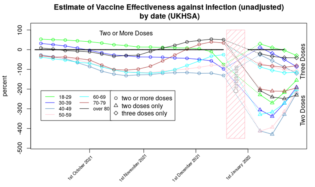
In that chart the rebound in the vaccine effectiveness for those having had two doses of vaccine looks rather remarkable.
Of course, this is difficult to explain as a simple ‘change in vaccine effectiveness’ – we all know by now that vaccines wane in their effectiveness, but while it is possible for vaccine effectiveness to get better, this is always seen close to the point of vaccination as the immune system response to the vaccine matures. We don’t tend to see such significant improvements some time after vaccination.
So what’s going on? While there are several potential mechanisms to explain this sudden drop and then recovery, I believe that the most likely explanation is that we’ve fallen foul of some of the the small print in the data: “Third dose 14 days or more before specimen date.” More specifically, we have already seen that there is an increased risk of infection in the three weeks following both the first and second doses of vaccine; it is likely that a similar effect is occurring after the third dose. The “14 days or more” in the small print means that if there were increased infection rates in the recently boosted then these cases would be counted within the data for the double-dosed.
Is this effect enough to explain the sudden increase in cases in the double dosed? Looking at the booster dose rollout data (below), it is clear that the time window for the low point in the vaccine effectiveness curve for the double-dosed is aligned with the rollout of the booster programme in those aged under 40, and there were still high booster-vaccination rates for those aged under 70 around weeks 48-49. Note that the data for the week two and three 2022 vaccine surveillance reports actually come from weeks 49 2021 to week two 2022, which I’ve highlighted in the pink rectangle.
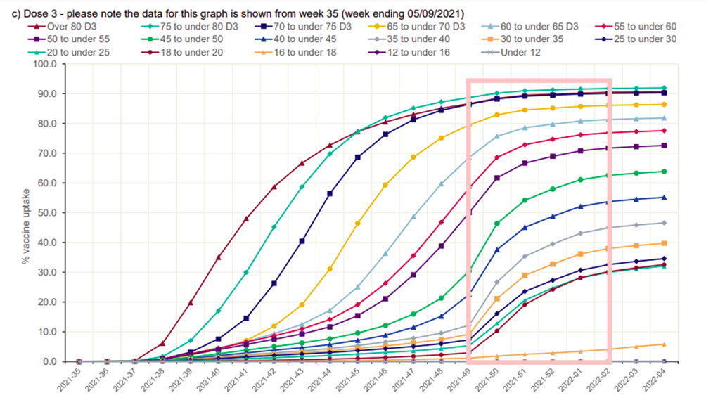
A reasonable question to ask at this point is why this effect wasn’t seen before. I suggest that it is likely that this effect was responsible for the dip in vaccine effectiveness seen for older age groups from October 2021, just before the impact of the boosters resulted in vaccine effectiveness increasing once more from November. It is unfortunate that we don’t have data for two and three doses separately for this time period, as these data could have supported the hypothesis that the drop in vaccine effectiveness was an effect due to the ‘recently boosted’ having higher infection rates.
There remains the question as to why the dip in vaccine effectiveness was so deep during the first few weeks of this year; this is almost certainly due to this being the peak of the Omicron wave. I have heard many times that it is foolhardy to undertake mass vaccination programmes during an epidemic wave, and these data likely show why. Note that it isn’t just that the recently boosted would have been more likely to be infected – they’d also be likely to infect others, making the peak of the epidemic wave higher than it would have otherwise been. This effect is true of negative vaccine effectiveness in general – the current data suggest that the impact of the vaccines, including those boosted at the start of the booster programme, will be to have more cases than we’d have had if we had only vaccinated the most vulnerable, with concomitant increases in hospitalisations and deaths.
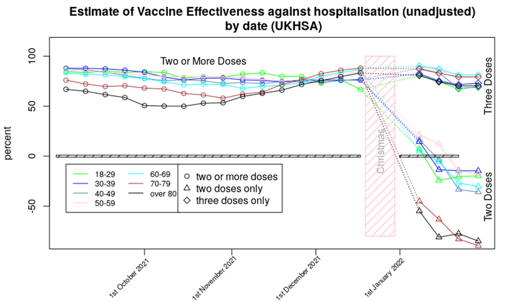
The hospitalisation data show only minor changes from last week’s report. The vaccine effectiveness against hospitalisation for those aged 70 and over shows a continued fall; the double-vaccinated in this age group now appear to be approximately 75% more likely to be hospitalised compared with if they’d never been vaccinated. It is possible that this is due to a ‘healthy vaccinee’ effect – I discuss this below. While it is possible that we’re seeing a delayed version of the ’14 days or more’ effect mentioned earlier, note that the most negative vaccine effectiveness is seen in those aged over 70, who had their booster doses some time ago; I don’t think this effect explains the increased risk of death that we’re seeing in the data.
All that said, I’d suggest that those aged over 70 are very likely to be vulnerable to Covid and thus would benefit from a booster. This would likely offer them protection against hospitalisation, with short and medium term side effect risks likely to be lower than the health risks they face every day (which are substantially greater than found in the healthy young). While questions remain about longer term impacts of the vaccines, in the short term at least they seem to be offering some protection to the elderly and infirm. With this in mind the important aspect of the very negative vaccine effectiveness seen in the chart above is what it tells us of the risks that might come for the non-vulnerable vaccinated. Also, it is important to remember that the elderly are used to having to take medicines to counteract the negative consequences of other medicines, or continuing to have to take medicines to stop the negative consequences of withdrawal – this is not a situation that the healthy young are familiar with, and in my opinion there would have to be significant benefits of a medicine or treatment to make exposure to this type of ‘lifelong medication’ worthwhile.
The gap in unadjusted vaccine effectiveness between those aged under 70 and those aged over 70 appears to have increased slightly. It is possible that this reflects the time delay between the first vaccinations for the vulnerable in January 2022 and the rollout of the vaccine into less vulnerable groups a few months later. Alternatively, this gap might reflect age-related changes in the immune system and how it responds to the vaccines.
The data for vaccine protection against death shows a mildly worsening picture compared with last week’s Vaccine Surveillance Report, with negative vaccine effectiveness for two doses of vaccine seen for all age groups over 30 other than the 40-50 age range where there is still some positive effect of vaccine. Of course, the series of well-defined data points suggest precision, but in reality there will be uncertainty around each data point – without additional data it is difficult to add error bars or confidence limits. I’d suggest that it is best to consider that two doses of vaccine offer around zero protection against death for those aged under 60. The situation for two dose vaccinees older than 60 is more complex – the data strongly suggest that these individuals will have an increased risk of death compared with the unvaccinated, but I again note the possibility of a ‘healthy vaccinee’ effect, that is, where the increased death rate in the double-vaccinated actually reflects those most close to death not being given a booster. Without data on the morbidities of those that die (and that are hospitalised) it is impossible to confirm or deny the presence of this effect.
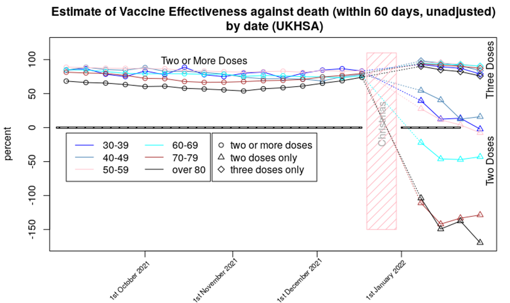
That said, last week I considered that if were are seeing a ‘healthy vaccinee’ effect then we should expect to see those very negative effectiveness figures for protection against death from two doses of vaccine for those aged over 60 rebound a little further and then flatten out over the next few months. I don’t think we’re seeing this effect yet.
Note that I present the data for deaths 60 days from a positive test, rather than the normal 28. This is because the data suggest that the vaccinated have a relatively high risk of death in the 28-60 day period, compared with the unvaccinated; this suggests that the vaccinated have a slower disease progression, but with similar outcomes. I would very much like more data on this potentially important subject, but more data isn’t available (a common problem with any data that might show the vaccines in a negative light – compare this with the extraordinary efforts being taken to identify more cases of the mysterious Long Covid).
Finally, one point not shown in the data above: U.K. reported cases have flatlined since mid-January at around 90,000 cases per day, and mortality is still hovering at its recent peak of approximately 250 deaths per day. But perhaps this is to be expected – in the U.K. we get around 50,000 to 120,000 cases per day of OC43, the most common variety of ‘coronavirus cold’, and perhaps an average of 50-100 deaths a day within 28 days of catching an ‘OC43 type cold’, with more during winter and fewer during summer. Is our current situation not far from where we’d expect to be once Covid became endemic in this country?
In summary, the latest data suggest that:
- Infection rates continue to be elevated in the vaccinated, with even those boosted seeing higher case rates than the unvaccinated.
- The increased risk of hospitalisation for those with only two vaccine doses appears to be getting slightly worse
- The increased risk of death in the double-vaccinated compared with the unvaccinated continues to be troubling.
- It is likely that our current infection rates are getting closer to what would be expected from an endemic ‘common cold’ caused by a coronavirus strain. Hospitalisation and death rates appear to remain slightly high on that comparison.

Amanuensis is an ex-academic and senior Government scientist. Find him on his Substack page, Bartram’s Folly.


To join in with the discussion please make a donation to The Daily Sceptic.
Profanity and abuse will be removed and may lead to a permanent ban.
Two things…neither James nor Toby saw anyone at the funeral wearing a mask. TV presenter Holly Willoughby was. (Why?!)
Also, ‘The Capture’, now on BBC IPlayer, was shown on BBC about three years ago. It’s very good. The ending suggested a sequel, and I was waiting for one. Although James thinks it’s part of the ‘orchestration’, I’d been wondering if it was a bit too near to the nub for the Beeb…if it’s just appeared on BBC IPlayer why did it take so long?