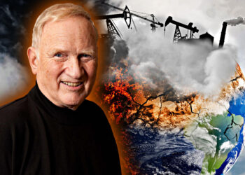
Canaries in the Mine: Seasonal Peaks
by Rudolf Kalveks Since the onset of autumn it has become increasingly clear that SARS-CoV-2 (‘coronavirus’) epidemics cannot generally be analysed as waves with single peaks. The virus, which had largely disappeared from Europe by the middle of summer, made a comeback during the autumn. So, what conclusions should we draw about coronavirus dynamics from the historic time series data? And do these justify ongoing Government responses? Figure 1. Cumulative Death Statistics for Selected Countries. Cumulative coronavirus deaths, expressed as a percentage of country populations, are plotted on a logarithmic scale, as time series up to December 21st, 2020. Source: Worldometer. As previously, we focus on the ‘Canaries in the Mine’, or the coronavirus death statistics for a selection of European and other countries, published by Worldometer. It has been shown that these statistics exaggerate the impact of the coronavirus. Several countries classify deaths simply according to the presence of coronavirus, rather than apportioning causation to other contributing pathologies. This problem is compounded by the PCR test, which is notorious for false positives (as discussed elsewhere). Nonetheless, the death statistics are considerably more relevant than the ‘cases’ identified by PCR tests alone (which continue to provide the basis for much of the prevailing government and media narrative). Before proceeding, it is helpful to recap the coronavirus fatalities for our selection...