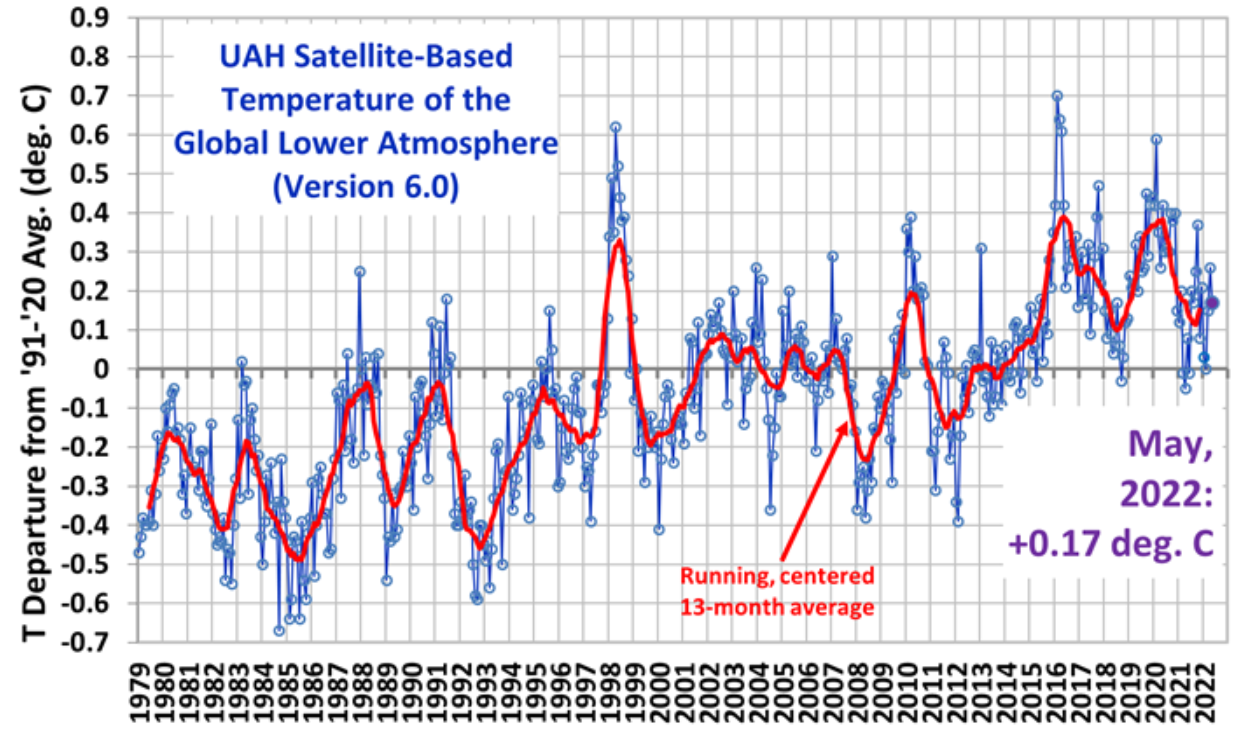
We haven’t published the University of Alabama’s satellite global temperature chart for a short while, so here it is for May showing that the latest pause – what the alarmists call ‘global heating’ – now stretches to 92 months. Readers will recall that the above graph, compiled by the NASA scientist Dr. Roy Spencer, has been banned by Google AdSense, is rarely mentioned in polite mainstream media and clearly shows that global warming started to run out of steam about 20 years ago.
Before the deluge of tweets and blog posts arrive suggesting the author is ophthalmically challenged since the graph shows upwards movement, let me agree about the rise. Since the early 1800s, the global temperature has probably risen by around 1°C. From the start of the satellite record in 1979, there was a small jump until the late 1990s. The pause that set in after that date is clearly visible in the above record. As we have seen, this pause has been massaged away in the major surface datasets run by the Met Office, NASA and NOAA following 30% heating boosts over the last 20 years. A particularly strong El Niño natural weather fluctuation pushed temperatures a little higher in 2016, where they have since stayed.
But one is inclined to remark – so what? All of this is margin of error stuff, footling increases picked up only by highly sensitive measuring equipment. For their part, surface datasets are incomplete, heavily affected by urban heat distortions and subject to constant revision, smoothing and modelling. Global green hysteria is sweeping the planet over marginal increases in temperature undetectable by human bodies that can adapt to live in a 40°C range. Ceiling ‘danger zone’ figures of 2°C and 1.5°C are simply plucked out of thin air, with no scientific basis, to concentrate political minds at past COP meetings. Some scientists suggest that a less chilly planet, emerging from an ice age and, in geological terms, denuded of carbon dioxide, may prosper with more warmth and CO2.
Let us consider the following graph produced by Emeritus Professor Richard Lindzen in a zoom lecture last year.
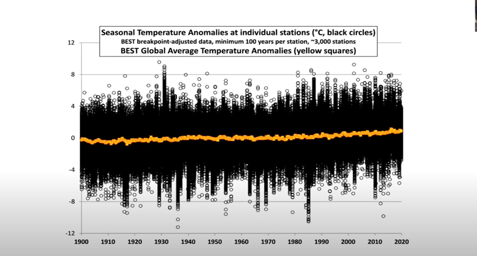
It barely moves. Panic over! Probably not, but when was the last time you saw global temperatures displayed in this way? Where is the hockey stick you might ask, as you track the barely noticeable rising thick line over the last 120 years? Instead of a few tiny part-degrees on the vertical axis, we see a larger, more realistic, spread, with the barely discernible trend set against the wide range of actual temperature measurements.
Next time mainstream media display a hockey stick temperature graph with a hugely compressed vertical – and horizontal – axis, using information from an adjusted surface temperature database, ask yourself where the information has come from, and why has it been displayed in this fashion?
Starting next Monday, the BBC green activist-in-residence Justin Rowlatt will present five short radio programmes about so-called climate tipping points. It is said Rowlatt will discuss “how global warming may trigger irreversible change to our planet”. The casual use of the word “may” suggests the programmes will owe more to the overheating of Rowlatt’s imagination than the actual science of climate change. The whole panoply of BBC argument that global warming is causing more ‘extreme’ weather events leading to ‘tipping’ points is opinion, without a scintilla of scientific proof. There is no way to prove or disprove such opinions, but alarmists vie with each other to produce increasingly improbable tales of climate Armageddon.
At the heart of all this scaremongering is an attempt by established elites to push their command-and-control Net Zero agenda. In his zoom lecture, the atmospheric scientist Professor Lindzen rails against some of the ‘settled’ science arguments that have produced widespread climate hysteria. The inconsistencies in the paleoclimatology record show that carbon dioxide is not the climate control knob. There is little if any connection to be seen over 600 million years to show that the temperature rises or falls in line with CO2 atmospheric levels. In placing the entire ‘settled’ science argument on CO2, there is little role seen for natural climate variables. In addition the sensitivity of climate models – the rise in temperature from a doubling of CO2 – is unknown. Again, as we have seen, any figure is just a guess, despite decades of work by atmospheric scientists to produce a credible figure. Guesses in, guesses out, sums up the temperature predictive value of climate models, yet these instruments lie at the heart of IPCC climate predictions.
In a ‘normal’ world, these counter arguments would be compelling, said Lindzen. The current narrative is “absurd”, yet it has universal acceptance, he noted.
Perhaps it is the trillions of dollars being diverted into every green project under the sun, the relentless propaganda from grant-dependent academics and agenda-driven, unquestioning journalists, along with the political control offered to elite groups in society by Net Zero, that currently makes it ‘not absurd’. It will be interesting to see when the ‘tipping point’ back to some form of reality will occur.
Chris Morrison is the Daily Sceptic’s Environment Editor


To join in with the discussion please make a donation to The Daily Sceptic.
Profanity and abuse will be removed and may lead to a permanent ban.
The Climate Alarmist scientists (more accurately computer modelers) are, more than anything else, absurd as well as corrupt. They don’t deserve anything more than mockery.
Then we must defund them.
Instead of which they reside at Clown Court in Downing Street and tell Johnson and Carrie what to do to advance their Zero Carbon Woke Psycholand!
Meanwhile, what poisons are the Chemtrails dropping o our heads from their hazy skies every day now ?
Oh…”they don’t exist” (offical). That’s OK then.
Another conspiracy theory turns into conspiracy fact.
Chemtrails Law Suit Filed.
https://youtu.be/sMedYDBFGOI
No, filing a case proves nothing.
When the case is heard and we have a verdict, then the discussion can begin, or not.
No. Reading the extremely detailed and carefully researched information on the website of Dane Wigginton proves the climate change scam.
https://www.geoengineeringwatch.org/
Even IF a case like this ever gets to be heard in court, we will never get a “just” verdict because the system is rigged just as it is/was against those trying to bring suits against covid, climate, you name it atrocities.
Most of us are nothing but game to be harvested or used as sport/experimentation. Unless the majority of us wake up.
We don’t have to DO anything except wake up to what’s going on. It’s simply about the 100th (poxless) monkey syndrome!
So why is he raising a court case?
Sounds a bit futile and defeatist so, again, why bother going to court?
I also assume at this point, you are a well qualified lawyer able to assess the evidence.
“I also assume at this point, you are a well qualified lawyer able to assess the evidence.”
In same way as jurors need to be well qualified to assess evidence to deliver their verdicts?
Curiously enough, long before powered flight, these “chemtrails” were part of meteorological observation training:
”
Cirrus Howard 1803
(On the modifications of clouds, etc., see Appendix 2)Cirrus fibratusThis type of cloud was initially called Cirrus filosus by Clayton in 1896 (Discussion of the cloud observations, etc., see Appendix 2“)”
https://cloudatlas.wmo.int/en/appendix-3-history-of-cloud-nomenclature.html
It’s the birds wot dunnit.
computer modelers
is it all models that arouse your anger or just computer models.
I loved Airfix models as a kid, but I don’t know of any climate models that aren’t on computers.
Suggesting that we paltry humans can have anything more than a negligible effect on “the climate” (whatever that means) is arrogance in the extreme.
Do you think that an all-out nuclear war would have no effect? All those cities burning, all that soil debris and ash pushed up into the stratosphere?
Perhaps a little, for the blink of an eye in geological terms.
Nuclear winter, so the opposite of global warming but the exact same process just more radioactive.
And how likely is that to happen?
As likely as the scenarios predicted by the Piltdown Man fantasists of SAGE.
You mean like the volcanoes exploding millions of years ago? Or when Krakatoa erupted?
Or when we drive our cars?
Oh dear. Irony lost on the rabid downtickers 🙂
It wouldn’t have zero effect. But it hasn’t happened yet.
Looking at their current diabolical plans for us all, it increasingly looks like a “preferred option”!
The point is that there is zero proof that humans have a significant, or any, impact on climate. To think otherwise is a belief only; a faith. It is just another form of the Covid hysteria. A faith that has captured easily manipulated minds across the globe.
It is also evidence of extreme arrogance – hubris- on behalf of the privileged nerds and self appointed ‘elites’ who spin the line on behalf of a ‘mankind’ they laughingly claim to represent.
Perhaps Krakatoa will blow again, then we will have a real natural “problem” to deal with.
Or how about that super volcano gently slumbering under Yellowstone Park?
Something like the Siberian Traps?
The planet would shrug it off over time.
So global warming is easily stopped by a few nuclear weapons … so what’s all the fuss about?
Maybe Putin will unleash global nuclear Armageddon and save us all from the climate change catastrophe.
NOTE: humour alert!
With his hypersonic missiles, he doesn’t need to go nuclear.
Those things travel at nearly Mach 9 and there is no defence to them.
He could take out an entire carrier fleet with 20 or 30 of the things fired from 500 to nearly 1,000 miles away. They are both smart, and directable in flight.
Travelling at that speed, even if the conventional warhead didn’t detonate, it would probably punch a hole the size of a house in the side of a carrier. If the warhead went off, its bye, bye carrier, and every one of its support vessels from the other missiles.
The head of the US hypersonic missile project was hauled over the coals in Congress as to why the US ones weren’t in service yet.
But I did get your humour.
Do you realize that Germany won two world wars in the last century after military theoreticians had proven that a certain amount of submarines employed in a certain way would force Great Britain to sue for peace as it’s war effort would collapse and its population starve to death? Well, of course, since the Germans already won the first world-war in this way, there was never a second world war.
Morale: Not everything which looks nice in theory turns to be equally nice in practice.
WTF are you dribbling on about now.
I was stating facts, not an expected outcome.
Non sequitur and does not follow. Sure MAD – a Nuclear winter likely caused through detonating some many nuclear fission warheads and in time man and nature would recover, always we rebound. This of course has absolutely nothing to do with the politically woven and preposterous supposition of, man made CO2 somehow causing warming.
> always we rebound
that’s a bit of an assumption.
On No! Not nuclear winter… again.
Damn. What did I miss.? I had a feeling I should have bought a paper today..
If we have an all out nuclear war no one will be left to care.
When did that happen then?
King Canute made the point many, many years ago – but the new generation don’y do history or philosophy do they – just Genderswap, Netflix and Pizza.
History? You mean, like, the olden days when women were beaten daily and black people in Wakanda had their space age technology stolen by the British shortly before they were genocided?
Yes, those were the days…..( sigh).
🤣
Sorry to sound a discordant note but there’s a clear upward trend in that graph. Yeah, sure it’s not much, and that wouldn’t matter if we were talking about daily variations in the air temperature at Porthcawl or Bridlington.
However, we are talking about global average temperature, and that has been around 14C since the end of the last ice age. And only about half a degree centigrade separates the end of the last ice age from the present, climate-stable Holocene which has permitted the rise of agriculture.
You still live in an ice age, the quaternary, it started 2.8m years ago. Be precise. You are talking about glaciation which are caused by the orbit of the sun.
Well, if you want to be strictly accurate you could go back 35 million years when the Antarctic circumpolar current first kicked in. Or maybe a little further to when the Himalayan Plateau was pushed up by India colliding with Eurasia and causing increased rock weathering and a dramatic drawdown in carbon dioxide levels.
If you are trying to argue that the climate at present is no different than the eon we had when ice sheets extended as far south as the Thames, your position is untenable (although you may beat me on the ticks v downticks count)..
I’m not trying to argue anything of the sort, just pointing out yr completely loose usage of the word ice age. The quaternary is just useful context when comparing the present climate to geologic climate history.
I distinguished the ice age from the Holocene, so I was not being loose with my language.
You seem to have missed the whole continental drift thing there, you know when land masses were in totally different locations on the Globe.
I referenced India colliding with Eurasia and pushing up the Himalayan Plateau. how is that missing continental drift?
It looks more like India has collided with Western Europe – in particular the British Isles
Hey! Life is just too short for Continental Drift!
I wish the downtickers would agree to follow the scientific method whether in relation to COVID *or* climate.
In my view the only difference between the two is that
COVID is a fairly simple scam of the kind ‘Oh what a tangled web we weave …’
but
Climate is genuinely complicated.
Climate has always changed, for billions of years before people where worried about it.
“Before there were people to worry about it”? (Ed)
Humans tend not to go back thirty million years – we don’t have the time.
Life on Earth seems to have done pretty well so far.
Don’t tell the “Zero Carbon” nerds – they’d just blank you!
‘we are talking about global average temperature’
So, presumably, the measurement data producing this average will consist of measurements both above and below the average? Given the miniscule amount of increase indicated, I cannot see what the issue is.
Miniscule is relative and depends on on the context. Half a degree Centigrade separates the end of the last ice age from the current Holocene. Half a degree is miniscule for the seaside resorts I mentioned but a huge amount for the global average temperature.
I know there’s a great deal of nostalgia on here but surely you are not yearning for Birmingham to be covered in a mile of ice.
And a miniscule amount of ricin will kill you.
The old ricin strawman, because the world is about to boil narrative is so convincing. There’s no nostalgia on here just you have a bizarre the “end is nigh” belief. Apologies for using the geologic temperature record to debunk yr AGW conspiracy theory and pointing out you don’t understand the difference between an ice age and a glaciation. Pure ignorance. Just because yr view is in vogue, because it’s backed by so many government dollars, doesn’t make yr silly theory any more correct.
Please, not that old trope.
An excess of anything will kill you.
An excess of Gates doesn’t do you any good either!
It’s an unfortunate coincidence that the satellite record starts at the end of the 1970s, a particularly cold decade, exaggerating the significance of the upward slope over the last 40 years.
A cold decade with an intense summer of 1976?
62/63 where coldest by far for hundreds of years before.
Erm… I thought ’47 was colder?
….separates the end of the last ice age from the present, climate-stable Holocene….
The climate is not stable. It is constantly, though imperceptibly, changing, You might as well say that the tectonic plates we live on are ‘stable’…
To be blunt, so what?
What harm has it done?
Exactly!
The flora and fauna of the earth have adapted to much worse – it just takes time ….say a few million years plus?.
Of more immediate interest is the gunk they are pumping into the skies with their Chemtrails – visible to all who bother to look up!
But then: “All of us are lying in the gutter but (only ) some of us are (still) looking at the stars”. (Apologies to O.W)
And if you were to look at any period of global temperature, you would see much the same level of changes either going up and down.
It depends where you start. If you start in 1996 there isn’t, it’s flat. If you used 1979 as an end point for the preceding two decades, it would show a decline – giving rise at the time to doomsayers declaring a coming ice age.
Considering global temperature changes in anything less than periods of tens of thousands of years, is meaningless.
Averages don’t exist. Every met the average man, woman, child?
Anybody seen Greta recently?
Busy globetrotting to sell her new book?
Surely she has served her purpose and is “over”?
Probably having a fit of the vapours somewhere, due to all the CO2 she can ‘see’.
She is currently in the middle of her appointment with the Wicker Man.
Sadly, Sir Christopher Lee can’t lead the singalong….
Nah: she’s too old for Andy!
Yes. Here is a recent photo.
I love this. And I would probably love the gas guzzling hero who did this to his Fiat. Or is it a Nissan. Can’t tell these days.
Pretty certain it’s the Nissan Skyline.
Nature loves warmth and CO2. Temperatures around the tropics don’t change much, most warming, what little there is, is up in the northern latitudes where there are vast, mostly uninhabited, cold and inhospitable regions. I don’t see the down side.
Climate hysteria seems designed mostly for those missing a sense of purpose in life, and people with a strange need to feel guilty that they exist.
Climate hysteria is what it is.
It’s a substitute for religion.
Seriously. The morons are ‘scientific’ (something less than 10% of the plant’s population have a higher science qualification) so whilst they have been told God is a figment of someone’s imagination, they believe in something they can’t see, feel or smell (C02) and attribute it to mankind’s self inflicted Armageddon – The Four Horsemen of the Apocalypse if you like – Extreme Weather, Rising Temperatures, Rising Oceans and Melting Ice.
They believe in various scientific sage’s pronouncements of their sins of burning fossil fuels to cook and heat with and feel compelled to demand we flagellate ourselves by denying each other access to material goods and life sustaining warmth.
But not them, they expect to continue as, well…..high priests, bedecked in finery, living in comfort, whilst the minions pay the penalty for their beliefs and worship at their feet because they are custodians of ‘The Science’ which they assure us only they can understand.
The similarity is remarkable.
Looks more like proto-religion – before the invention of the human soul.
A subject I know absolutely nothing about. 🥶
Neither does anybody else – especially those who claim they do!
A bit like ‘Climate Change’ really .
“Does the Climate change?” “Er… yes it does.”
Next?
All true. Most of them are hard lefties so believe capitalism is evil so totally open to any wacka doodle theory that knocks free markets. Most off all they hate that the biggest bi-product of the fossil fuel industry is plant food.
They hate everything and understand nothing.
That’s why we used to have ‘Education’.BB (Before Blair)
Precisely. Milder winters means less heating would be needed. Only ever having lived in the UK, I have often fantasised about a winter climate so balmy that all you need is a bit of extra clothing now and then. Life would be pleasant indeed.
Historical temperature data has been subjected to extensive adjustment and is never put in a longer term context about climate variability. For these reasons (among others) I don’t trust claims about temperature rises since the late 1800s.
Absolutely right.
I love the smell of Orwell in the morning…
‘Who controls the past controls the future. Who controls the present controls the past.’
Apparently the warm medieval period didn’t happen. The English wine trade from this period was a testament to the genius of our farmers apparently.
What about the Saffron in Saffron Walden?
I think we’ll get some kind of a tipping point in the UK if, as anticipated, we get extended power cuts this winter and people start dying because they can’t afford to heat their homes
Hopefully, it was definitely a mean frog boiling trick to whack the prices up now while the weather is a bit warmer.
Well, don’t forget there is another 42% (+?) cost rise coming in October.
Totally unjustified – pure punishment and a deliberate “take down” of the population.
Watch the cretins nod it through in Parliament!
It may begin sooner than that as America is projected to have rolling blackouts over much of the country this summer.
Floridians and Californians won’t be happy losing their air conditioning.
They have rolling blackouts every summer, especially in California.
https://www.nbcnews.com/news/amp/ncna1268879
https://en.m.wikipedia.org/wiki/2000%E2%80%9301_California_electricity_crisis
I did say much of the country.
“Man Made Genocide” jus a touch more of a threat than “Man Made” Climate Change!
They will be dying not from cold but from of a New “Deadly Virus” cooked up by the Chinese helped by Daszak, Fauci and Gates, for which Pfizer are already brewing up the “experimental” jabs and taking orders!
( Suggested names for the virus on a post card to Pfizer HQ)
A smart civilisation would anticipate the problem and fix it in the summer when it’s not needed so it’s plentiful when it is.
like fixing the roof when the sun is shining or cutting wood now to dry for winter (I know likely next but still).
It’s always worth a deeper look when TPTB change the language, ie they can’t call it global warming any more so they switched to climate change, much broader and more nebulous to hide a variety of sins…
Talk of “conspiracy theories”, the biggest of the lot AGW passes the MSM by no questions asked because it’s back by so many dollars. There is no more ridiculous conspiracy theory than “the world is about to boil, the end is nigh”. Quick, quick save the world by taxing the poor more and giving it to land owners!
🤠
The Maldives must be underwater by now!
Yes, they have just built 5 (I think) underwater aeroplane landing strips.
Clever buggers those Chinese belt and road people.
If memory serves me well the Maldives have been underwater for nearly 50 years. They are however builing an airport on Male I think.
It seems like a stupid question, given our laughable expertise on just about everything and reminds me of the arguments I used to have at home in the winter, when everyone had a different opinion on what the correct temperature should be inside the house.
But for the sake of argument would you like it a bit warmer or a bit colder? There are no other options!
I’m still waiting for that Mediterranean climate the BBC used to tell us was coming, before they realised it wasn’t having the desired effect on the chilly British public.
Now it’s all “extreme weather” – which isn’t happening either.
Errrr, it is.
Just no more frequently than in the past, and in some cases, less so.
Perhaps I should have said AGW-induced extreme weather.
👍
Well, I should like the same temperature!
{ Call me a fence-sitter! }
What this article SHOULD have done is show the estimated global temperature over a variety of timescales.
If it did, people would see that during the entire history of the Earth we have swung between global periods of ice, with shorter intermissions of warmth. We are currently in a warm period – our entire species has evolved during one of these warm periods.
Inside a warm period, there are occasional dips into icy conditions, but most of the time it is warm enough to keep the ice limited to the poles, and the temperature is fairly stable.
Inside one of these stable periods, there are occasional dips, and occasional pulses of heat. We have recorded these – the Roman Warm Period and the Mediaeval Warm Period (MWP) are two examples. We have also noted cold periods – the most recent was the Little Ice Age (LIA), which we went into after the MWP, and started to come out of around 1800.
We are currently just about out of the LIA, and the temperature is still climbing very slowly. It was climbing much faster 150 years ago! So we are approaching a climate ideal for humanity.
On top of this slow, and welcome, climb out of the LIA, there are shorter term swings of slight temperature changes. The most obvious one for the Northern Hemisphere is the Atlantic Multi-decadal Oscillation (AMO). This is a swing of about 1/2 to 1 degree centigrade over a period of 60-80 years.
In the 1970s the AMO was at its lowest dip, and stories about a new ice age started. During the 80s and 90s the AMO swung upward, and the Global Warming panic started. By 2010 the AMO had peaked, and we are now starting on the downward path.
The best understanding of current temperatures is that we have an underlying slight upward swing as we come out of the LIA, with an acceleration in the 1980s and a deceleration in the 2010s due to the AMO. It is likely that the AMO will reverse the LIA trend and drop temperatures slightly over the next 30 years or so.
Best explanation I’ve read so far
Thanks. That’s because I’m not a Climate Scientist….
No such thing. There isn’t a person on the planet who could master every ‘ology’ demanded to understand how the clime works.
On a much longer scale.
No relationship between temperature and atmospheric CO2 whatsoever.
We are also at the coldest point in time with, simultaneously, the lowest atmospheric CO2 content the planet has ever been without being in a full blown ice age.
All meaningful life dies around 150ppm (Parts Per Million) atmospheric content. We are currently at about 400ppm, only 250ppm from certain extinction.
C3 plants (95% of all plant life) flourishes around 1,000ppm – 1,200ppm, we are some 600ppm away from perfect growing conditions.
I don’t know about anyone else but, faced with the choice of falling or rising atmospheric CO2, even if it did affect temperatures, I’ll happily risk the unknown of rising CO2 and temperatures than face the certainty of extinction by CO2 falling just 250ppm.
Bottom line: we are actually on a path to create the very extinction the ignorant ‘Zero Carbon’ loons bleat on about in their relentless propaganda the pig-ignorant politicians ( no names) are shoving down our throats .
The ‘Tower of Babel’ is looking like a great success, compared to what the psychopaths have planned for us.
It could almost be called divine providence that humanity, just as CO2 levels were dropping towards a level that would have resulted in the extinction of all life on earth, discovered how to make use of some of the sequestered stores of carbon and in so doing, by releasing it back into the atmosphere, saved Mother Nature in the process.
You could almost imagine God dropped a clanger and invented mankind to solve the problem of falling CO2.
Only…….we contribute 3% – 4% of all CO2 to the atmosphere and, by the IPCC’s own numbers, it would take us 25,000 years to raise the temperature of the earth by 2ºC.
Still no good explanation as to why that red line goes from -0.36 to plus 1.7.
that’s a 0.53c swing since 1979 which is a good amount.
I’d be more worried if the climate was not changing, but I would like a sensible explanation as to that 0.53c swing, all we get is that there was a pause after 2000 which we can see but it then drops & then rises from 2008. The graph shows a low of -0.2 in 1999 and +0.17 today, a swing of 0.37c.
the graph shows temperatures have clearly risen so why is the author glossing over the rises since 2008?
again I don’t think its much of a problem, largely because we have too little satellite data to understand if this is normal or not.
Since ~1920’s 0.5c delta is not margin for error stuff.
Because satelites went up when global temps were in a trough, at the start of the graph scientism was screaming about an impending ice age.
So what.
What harm has it done?
The ENSO state somewhat matches the peaks and troughs of the satellite record.
Perhaps you should ask why the 1979 start year was chosen by the eco-loons. Couldn’t be that it was a rather cool period (just at the end of the period when the ‘threat’ was global cooling!)?
I assume the author chose 79 as that was either when reliable satellite data is available or if it matches what the eco knobs are starting from?
my point really is that we don’t have enough accurate (satellite and other computerised readings) data to really make an opinion either way.
it’s clear and obvious that temps have gone up.
the question the eco loons want us to ask is is it good or bad, with the consensus being it’s bad.
my view is that we can’t tell and you’d need likely hundreds of thousands of years of satellite data to spot some trends and likely 10’s of millions of years to spot others.
I font think a few hundred years or so of humans releasing co2 into the atmosphere is a big deal when nature releases far far more co2.
removing growing vegetation and replacing with buildings, roads etc likely has more impact on solar/water absorption and changes rain patterns etc than a tiny amount more of plant food going into the air.
damns for hydro power are known to wreak havoc to local ecosystems but as it’s deemed green no one complains.
Who is worried?
Worry about Geoengineering Chem trails.
Does anyone else see the disconnect in this article between the [correct] rubbishing of abused data from the last century or so and the holding up of inferred data from pre-historical interpretations as if they were factual?
“There is little if any connection to be seen over 600 million years to show that the temperature rises or falls in line with CO2 atmospheric levels.”
I would suggest there are three periods:
1) records of the ‘scientific’ era,
2) historical witnessed events, conditions of human history, and
3) pre-historical inferences.
Each of these can be given a weighting according to their provability.
This obviously prioritises what can be seen and measured in the current era, without giving ammunition to those with an agenda by raising unprovable, ad nauseam arguable contentions.
Climate change is a successful ploy because it forces us to argue about data, numbers, temperatures, date ranges and the possible impact of increases in temperature.
We therefore lose sight of the real issue. There is no place for the government interfering in our choices even if every gloomy prediction is correct.
As a ploy it is effective. When we want to push back against quite obvious negative consequences like high utility bills, we are forced instead to tackle scientific theories, a process few people are confident about. The basis of science is scepticism, so it is an endless litany of argument and counterargument.
In its own way it is impressive. But perhaps we need to recalibrate and force the assortment of clowns like Extinction Rebellion and Greenpeace to explain in detail why we should allow our elected government to do anything?
Simply assume all “data” is selected and rigged to suit the argument of the presenter and take it from there.
Strictly speaking, we elected MPs who chose the government. The former seem to have less and less influence on what the government decides to do either using emergency powers or, sometimes, no obvious democratic mandate at all.
Increasingly MPs ‘arrive’ in Westminster by default -I suspect the turnout at the next election will be the lowest on record so watch out for the lobby-fodder, brainless dross, who will land there on the make!
I am yet to understand what they have been paid for during their last two years “Furlough” sabbatical during Johnson’s “Personal Rule”. (Apart that is from stonewalling constituents, concerned at our vanishing freedoms with patronising platitudes and standard letters from “Ministers” while voting for ever more draconian “Fake Emergency” measures)
Correct. And my contention is we need to start at ground level and move local elections away from a popularity contest.
I mean, who the hell in their right mind would consider Dianne Abbott and Angela Raynor qualified candidates to potentially run the country.
Not that the Conservatives are any better, they have their fair share of dunces.
We have a by-election here, to replace a disgraced MP. 8 candidates, and the Conservative woman has been told by HQ not to speak to the press in case she mentions Partygate by mistake.
The “resistance” vote is divided between 4 small parties, two started by the same man. So it looks unlikely one could save a deposit, let alone strike a blow for change.
If our government really was worried about it getting hotter because of emissions would 2021 have been a record year for immigration, given that the vast majority of immigrants come from lower emission countries?
Similarly, if they really believed that Russia poses a serious military threat to the UK, would our armed forces be so tiny, so badly equipped and led by PC dolts?
And their drunken partying revealed exactly how scared they were about covid.
Ignore what they say. Watch what they do.
Interesting point about immigrants coming from lower emission countries,
perhaps they know something about the coming “climate crisis” with runaway warming. It will be too hot for us but they will feel at home /sarc
The UAH record is not a direct temperature measurement. Its a modeled interpretation of energy radiations at a certain point in the lower atmosphere. Its also a bit weak over polar regions as the ‘white’ of snow and ice interferes with the radiation readings by the satellites.
If you put error bands around the graph they would swamp and ‘trend’, just like the graph produced by Lindzen. This is completely acknowledged by the UAH team.
So when people try to argue that the trend is showing an upward movement, they are trying to count angels on a pin head.
But at least the UAH are trying to produce a consistent series of numbers unlike the NASA people for instance.
The very idea of a global average temperature is a nonsense. It has no meaning and is impossible to measure. Its typical of the people living in a simulated world of computer models.
I sometimes wish that we destroy all computers and their like. They will allow human’s to destroy their planet and themselves. As a species we do not have the wisdom to use their power intelligently.
My contention is, only allow scientists access to pencil, paper and an abacus.
That way they would be less inclined to go back and make little adjustments to their models on an excel spreadsheet so the data match their expectations.
The very idea of a global average temperature is a nonsense. It has no meaning and is impossible to measure.
If I offered you a choice of living on one of three planets and I told you the global average surface temperature was a) 460C, b) 14C, c) -62C would you discard the information as meaningless nonsense? (That is of course Venus, Earth, Mars).
What an idiotic response.
So what is the answer – yes you would discard the global average as meaningless or no you wouldn’t?
The answer was “What an idiotic response”.
The MSU Satellite Record
The MSU satellite record measures the troposphere at various heights – the one in the article shows the lower troposphere. We don’t live in the lower troposphere.
Turning the satellite data into a useful record is not straightforward and involves some subjective decisions. There are two widely used analyses: RSS and UAH. For some reason sceptics only ever refer to the UAH one.
Like the surface record, both analyses have been subject to adjustments and corrections. For some reason sceptics do not have a problem with these adjustments.
The Surface Record
The surface data is messy – coming from thousands of different sources and with wide variation in geographic coverage. But it does measure the right height.
There are many analyses of the surface data e.g. Met Office HADCRUT, NASA GISS and Berkeley BEST. (BEST was created by a group including sceptics to avoid debates about the objectivity of the other records). All of them agree on significantly more warming than the satellite records.
Like the satellite records, they are adjusted from time to time as better techniques are used to analyse the data. The effect has to been to increase the warming trend but there is no reason to suppose this is some kind of conspiracy amongst the different analysing organisations. All the data, the software used to do the analyses, and the justification for the changes in analysis are publicly available from the relevant web sites.
The surface record analyses do allow for urban heat islands.
The recent pause
Global average temperature is a stochastic process so if you are going to see a trend you need to smooth over a number of years. That is just standard statistics used all the time on this site. The question is how over how many years should it be smoothed? Most climate scientists think smoothing should be in the order of a decade. For example, when showing trends HADCRUT uses a smoothing method over 21 years but with more weight given to the measurements close to the one being plotted. If you smooth over this kind of timescale, the recent UAH data makes little difference to the warming trend. Another way to look at this is to see that the recent “pause” is almost entirely an artefact of the 2016 El Nino. This was very high so it made the subsequent years look as though they were not going up – but the trend should not be dictated by a single measurement. That is an example of why you need to smooth.
Is the Rise Significant?
Even the UAH satellite record shows a rise of about 0.13C per decade (0.18C over land). Is this significant?
I am not sure what Lindzen was trying to show with his chart but it seems irrelevant to whether the increase is significant. Any slope can be made to look insignificant by stretching the horizontal scale enough and of course individual station records will vary far more than the global average.
The global average temperature during the last ice age was about 6C cooler than now. This was a time when ice sheet extended to northern Scotland and sea levels were 120 metres lower than today. So a few degrees in the global average temperature can make a big difference. Perhaps more to the point, the change from the ice age to the present took place over thousands of years. So the rate of change was 0.01C per decade or less. Climate change is a problem of rate of change as much as anything. The climate has always changed – but rarely this quickly and never with this many people on the planet.
The reason many sceptical of ‘global warming’ don’t refer to RSS was because it went through a harmonisation process with surface trends. It disguised this as adjustments when satellites were changed, however it was obvious what was done.
The main thrust of global warming is the so-called hot spot somewhere in the lower atmosphere over the equator. Here we are supposed to see the first of the evidence of rapid increase in water vapour ‘greenhouse’ effect due to ‘forcing’ by CO2 molecules. Without this effect, the IPCC models show only moderate temp increases. The satellites are continually scanning this area, so its the best place to see warming. For 30 years they have been scanning with absolutely no sight of the fabled ‘forcing’.
Lindzen is showing how error bands swamp so called trends. Same with a lot of stats associated with covid. I noted at the time you were at least consistent in ignoring both. Of course recognising error bands in statistics never helps the contrived message people want to give, which is why fundamentally its a con, and not science.
Averages are made up of lower as well as upper bounds. The increase in CO2 ( mainly natural) has no doiubt had a small effect on increasing the lower bounds which is exactly what you would expect. We have a very slight outbreak of mildness. Which leads to less extreme weather, which the facts point to rather than the media hype.
The emperor has no clothes. CO2 as a control knob of the climate is a sick joke.
Thanks for mentioning that. I ran out of space to address the many other ridiculous points MTF made and I really can’t be bothered continuing to educate the moron.
The reason many sceptical of ‘global warming’ don’t refer to RSS was because it went through a harmonisation process with surface trends. It disguised this as adjustments when satellites were changed, however it was obvious what was done.
The fact that you believe the RSS disguised the adjustments due to satellite changes presumably means they don’t agree it was a harmonisation with the surface measurements. I would be interested to read this debate if you have reference (I tried searching but nothing came up)
The main thrust of global warming is the so-called hot spot somewhere in the lower atmosphere over the equator. Here we are supposed to see the first of the evidence of rapid increase in water vapour ‘greenhouse’ effect due to ‘forcing’ by CO2 molecules. Without this effect, the IPCC models show only moderate temp increases. The satellites are continually scanning this area, so its the best place to see warming. For 30 years they have been scanning with absolutely no sight of the fabled ‘forcing’.
I thought the models predicted the artic regions would warm most quickly (which they have). I am confused by the rest of what you write. Are you saying there has been no increase in columnar water vapour over the equator in the last 30 years? As I understand it, it is extremely difficult to measure water vapour in a meaningful way – but maybe you have a reference that shows otherwise?
Lindzen is showing how error bands swamp so called trends.
The Lindzen chart in the article doesn’t show error bands. Are you referring to another?
If you don’t know about the ‘hot spot’ and forcing, you have no right to try to engage in this conversation.
And Lindzen’s graph is one of ‘anomalies’ , not actual temperature points. The range of anomalies on the graphs y-axis is a measure of uncertainty or error bands. Surely you recognise the usual trick of warmists to produce anomalies around a selective average of years?
I begin to think you are picking arguments from little basis of knowledge.
If you don’t know about the ‘hot spot’ and forcing, you have no right to try to engage in this conversation.
Why? Don’t you want me to learn the truth? (I believe I do understand about forcing. It is the hot spot I am not sure about.)
And Lindzen’s graph is one of ‘anomalies’ , not actual temperature points. The range of anomalies on the graphs y-axis is a measure of uncertainty or error bands. Surely you recognise the usual trick of warmists to produce anomalies around a selective average of years?
There seems to be a double confusion here.
Anomalies
It is standard for both climate scientists and sceptics to use anomalies rather than absolute temperatures. Spencer does it for the UAH satellite record (it is “The Version 6.0 global average lower tropospheric temperature (LT) anomaly”). He uses the 30-year (1991-2020) average. We use anomalies because what matters is the change in temperature whether it be from -40 to -39 in Antarctic +39 to +40 in Saudi Arabia. It really doesn’t matter what base you use as long you use the same one for all measurements.
Measures of uncertainty
The range of measurements (whether they be anomalies or absolute figures) is not a measure of uncertainty of the average of the those measurements – you have to take into account the sample size which is massive in this case. Nor is it a measure of the uncertainty round any individual measurement. I am sure I don’t need to explain/prove that to you – do I?
It is a shame you couldn’t come up with a reference to the debate about RSS surface harmonisation.
And its a shame you you can’t either. If you can’t stop posting about it.
Anomalies are an invention of warmists, not ‘climate scientists’ there is no such thing. Its a invention that arbitrarily picks a period of years to produce an ‘average’ then compare variations from it. Its absolutely meaningless. Unfortunately, as I have previously stated some real scientists have used them in order to speak the same language as ‘warmists’ in order to show their stupidity.
I am not going to go down your rabbit hole of ‘average of measurements’. Uncertainty is the measurement of error around each and every measurement. ‘Warmists’ believe this can be averaged out, it can’t, that is a statistical nonsense.
I refer you to several papers on this at WUWT site by far more qualified than me to refute this.
And its a shame you you can’t either. If you can’t stop posting about it.
I had never heard about the harmonisation. You were the one who brought it up and now you seem to be unable to refer to it. Initially I just wanted to learn about it but now I have to wonder whether it was a figment of your imagination.
Anomalies are an invention of warmists, not ‘climate scientists’ there is no such thing. Its a invention that arbitrarily picks a period of years to produce an ‘average’ then compare variations from it. Its absolutely meaningless. Unfortunately, as I have previously stated some real scientists have used them in order to speak the same language as ‘warmists’ in order to show their stupidity.
If you are interested in the change in temperature it makes no difference what you use as the base – the average 1991 to 2020 as Spencer does, 0C or absolute zero. It is just a convention which makes it convenient. After all centigrade values are just a convention that we happen to have chosen the freezing point of water as an arbitrary base. Fahrenheit chose the freezing point of salt water – again just a convention. Surely you can understand that? Spencer isn’t using anomalies to show how stupid someone is. He is using them because it is the best way to do his analysis.
I am not going to go down your rabbit hole of ‘average of measurements’. Uncertainty is the measurement of error around each and every measurement. ‘Warmists’ believe this can be averaged out, it can’t, that is a statistical nonsense.
We were debating the significance of the Lindzen chart. If you have a lot of measurements as Lindzen appears to show in the chart then the range of those measurements is not a measure of the confidence limits of the estimate of the population mean. This is not subtle stuff. Nor it is particularly related to climate change. It is GCSE statistics .
But now you write .
“ Uncertainty is the measurement of error around each and every measurement. ‘Warmists’ believe this can be averaged out, it can’t, that is a statistical nonsense.2
This is a different assertion. But it is also wrong. If you have a set of measurements of anything with some uncertainty as to whether those measurements are correct and you want to estimate the population mean then taking the mean of a large enough sample will reduce the error in the estimate to as small as value as you wish – simply by taking larger and larger samples. The only proviso is that if there is a bias in the error then that bias will be reflected in the estimate. But if you only interested in the change in the population mean that doesn’t matter. Again this nothing particularly to do with climate change. It is basic statistics.
I refer you to several papers on this at WUWT site by far more qualified than me to refute this.
Good. So give me the references.
Take a course. We are not here to educate you.
He just did. WUWT. Do some work for a change.
I went on to WUWT and searched first on Harmonisation – 50 hits – so I narrowed it down by searching on Harmonisation and RSS – 4 hits none of them relevant. What more am I supposed to do to track down this supposed harmonisation of RSS with surface temperature?
RSS includes data from NOAA-14 satellite when its well known this corrupts the data base. It does that to harmonise its data with that of NASA ground source data.
The link below discusses why RSS and UAH diverge and mentions this, whilst being too polite to say why.
https://wattsupwiththat.com/2022/03/25/uah-vs-rss/
Thanks. This is interesting and informative. I notice that the question of which is better UAH or the three others including RSS is an area of dispute. It even seems to be a matter of dispute as to which matches the radio sonde data better! Either way, I don’t see any evidence that the adjustments to RSS are in some way intended to harmonise with the surface data other than the argument that “the adjustments increased warming so it must have been a fiddle” – which is obviously ad hominem.
Anyway, I will explore the debate over the coming days and thanks for pointing it out to me.
The article is very clear that UAH is closer , indeed very close to the radio sonde data.
The RSS use of a defunct satellite data was for one reason, to better fit the NASA data. The satellite data showing very mild warming was very annoying, so a way was found to bring them more in line. Except UAH did not play, which is why its now on the ‘naughty seat’.
I have had enough of this banter. Just as with covid you are here to dissemble. Do it someone else’s time.
I am here to improve my knowledge and understanding (and maybe correct a few misunderstandings). This you have done for me thanks. However, it does not extend to leaping to conclusions about people’s motives.
No your attempt at explaining statistical errors is wrong.
The error band is in each measurement. Simply taking many measurements and averaging them out does not diminish the original error band. This is a common stats mistake by warmists, quite deliberate I believe.
Simple exercise. Take temperature of room using mercury thermometer. Typical error band of each measurement is +-10%. Taking thousands of readings does nothing to diminish that 10%.
This is an example of people using computer driven stats models, which produce stats with apparent confidence limits. But they ignore the actual error of the measuring device itself.
Take temperature of room using mercury thermometer. Typical error band of each measurement is +-10%. Taking thousands of readings does nothing to diminish that 10%.
I am sorry but that is wrong. Unless the errors are systematic then the more readings you take the closer the mean of those readings will be to the true value.
This is so basic it is in the GCSE syllabus.
To reduce the effect of random error on the accuracy of a measurement, we should take multiple readings and then work out the mean (average) value
No. The error is in the actual ability to measure using the instrument you are measuring. It doesn’t matter how many times you measure you never reduce the measuring device error band.
As with most non-physical scientists you are confusing statistical analysis of probability with actual physical error bands.
Very good example of people using computer tools without really understanding their limitations and where and where not they are applicable.
I would not get on an aircraft designed by using your statistical understanding.
I fully understand that the error is in due to the limitations of the instrument. The fact remains that with repeated use the thermometer will give a range of readings with a mean of the true value and various other readings up to +-10% either side. This is a sample of all possible measurements and by the law of large numbers the mean of this sample will approach closer and closer to the true value the larger the sample.
I have given you a reference. If you like, I can give you the maths and a worked example. No computers need be involved (except to access this forum). All you give to support your case is insults. Why not ask one of the sceptical scientists if you don’t believe me? I am very confident of their answer.
The law of large numbers does not apply.
I don’t think you you understand the basics here.
Say the thermometer recorded 20C, 22C and 24C. You would say that the ‘answer’ was 22C +-10%.
But in fact the 20C reading has an error band of 10%, ie can be anything between 18C and 22C; the 24C reading is anywhere between 21.6C and 26.4C. So the error band is from 18C to 26.4C which is far greater than 22C +- 10% which would be your ‘result’.
I the real world, not probability statistics which you are using, the error band can expand greatly with each reading. Indeed this is exactly what happens in the IPCC models the real error band is huge and grows almost exponentially every year in the future projection. Indeed it is huge going backwards in time, which is why the models have to be forced to line up with reality using huge fudge factors.
I am totally confident in my reasoning as a Physicist by training.
Ok. Let’s take your example. In this case I do not have to use statistics – simple logic will suffice.
The true value is within +-10% of the reading. We know from the first reading it lies between 18 and 22, from the third reading we know it lies between 21.6 and 24.6. They are both readings of the same true value therefore it must conform to both readings. Therefore, we now know it cannot be lower than 21.6 or higher than 22 i.e the true value lies between 21.6 and 22.
That is just ridiculous! You haven’t used logic, just tried to fit numbers to support your argument.
Enough! This conversation is at an end.
OK I leave you with a summary of the argument. It is short and simple. You might want to ponder which step is at fault.
You say each measurement is accurate to within 10% of its reading (in Centrigrade – 10% of Fahrenheit or Kelvin would give completely different constraints)
Therefore, it is not possible for the true value to be more than 10% distant from any measurement.
Therefore, the first measurement constrains the true value to between 18C and 22C.
Therefore, the third measurement constrains the true value to between 21.6C and 24.6C
Therefore the true value lies between 21.6C and 22C.
Fascinated to know which step you think is wrong.
‘Therefore, it is not possible for the true value to be more than 10% distant from any measurement.’ Rubbish.
You are using probability statistical thinking. This is NOT probability. Its actual measurements in real life. They are ALL equally likely, you have no idea what the ‘real answer’ is, you just take individual measurements with a tool that has a +-10% error band.
The only reason I came back to comment on your response is that I felt it necessary to puncture any misleading ideas you might put in the heads of non-scientists reading this thread.
Whatever your inane response ( and yes finally I am being rude, because you deserve it!) this is the end as far as I am concerned. Your ignorance knows no bounds and your arrogance in continuing this is telling.
Here we go. MTF attempting to demonstrate how smart he is.
Usual, puerile response.
The point of the UAH measurements is consistency. They are unaffected by UHI’s and massive holes in surface temperature data from sparsely measured regions like Africa, Russia, China and, of course, oceans.
The lower troposphere accounts for everything on the planet affecting temperatures, the entirety of the land and the entirety of the oceans.
Whataboutery and distraction. Satellite data is ‘adjusted’ as new technology has been introduced, and to allow for orbital degradation. It’s all known, published and accepted as accurate.
Surface temperatures have been meddled with, with few, if any records kept. Climatgate was the classic illustration of that.
Meanwhile, whilst CO2 has risen consistently and unabated over the last 150 years or so, global temperatures have not tracked them. Were proof needed that the CO2/Temperature had nothing to do with each other, it’s right there. And that’s judging by surface temperatures which have undoubtedly been meddled with.
And what a lot of bollox about RSS data. Both RSS and UAH employ radiosondes (balloon data) which accurately reflects the UAH data.
Why is UAH data the most commonly cited? Because Spencer worked for, and now with NASA. He is the U.S. Science Team leader for the Advanced Microwave Scanning Radiometer (AMSR-E) on NASA’s Aqua satellite. He has served as senior scientist for climate studies at NASA’s Marshall Space Flight Center. He was awarded the American Meteorological Society’s Special Award for his work on satellite-based temperature monitoring work. (various sources)
Spencer and John Christy (also UAH) were responsible for the first successful development of a satellite temperature record. (various sources).
Care to find better credentialed scientists than them on the subject?
LOL, the “right height” is the ONLY thing it has going for it.
Anthony Watts of WUWT did a survey of surface station in America around 2012, from memory. It was riddled with examples of badly sited stations in the middle of tarmacadam car parks, on airport taxi way perimeters, next to air conditioning units, many in disrepair, other not conforming to standards, you name it, he found it.
He’s resurrecting the project to see how things have changed.
Meanwhile, Stevenson Screens were designed for local weather measurement, they were never intended to be part of a global network. There are also at least three different designed, the original British one, the American one and the very new Australian digital one which measures temperatures second by second.
The standard for digital measurement is internationally agreed, and should be smoothed over (again from memory) a five minute period to allow for momentary temperature spikes caused by wind etc. The Australians BOM doesn’t do that, they take every spike and declare it some sort of record. https://jennifermarohasy.com
The Australian screens have also shrunk dramatically from 230 Litres to 60 Litres.
We are then left comparing historic data measured with slow responding mercury thermometers to second by second records with digital equipment.
The Stephenson screen itself was invented by Thomas Stevenson (1818–87), the father of Robert Louis Stevenson. It came into use in the late 1860s (1870?). Yet somehow we are supposed to believe that accurate temperature data goes back to 1850 when alarmist’s like you screech about the industrial revolution.
Almost 20 years of data wiped off your fantasy scare stories at ground zero.
The Steven screen wasn’t suddenly, immediately adopted across the world, it took decades to roll out. I won’t go into the competence of the people using them, but if you imagine some highly qualified scientist was going to religiously trek through snow, rain and blistering heat (depending on location) to record the data you have lost grasp of reality. It was probably, more often than not, the tea boy on his way out to the shop for cakes.
We are now, somewhere about 1900 by the time the screens were internationally adopted. That’s another 30 years wiped off your historic surface temperature data, not to mention the blank data where people had forgotten/couldn’t be bothered/illegible handwriting/lost records etc. etc.
Then there’s the difference in height between people reading the mercury thermometers which, incidentally, would be impossible to calibrate between locations other than by ship borne letter.
Yet the data is presented by the alarmist community as, somehow, sacrosanct and irrefutable.
But I guess it’s at the RIGHT HEIGHT. So that’s something.
We might disagree about Ukraine/Russia, but we are on the same postage stamp re ‘warming’.
👍
Finally, as I have repeated ad nauseam, what harm has any warming done?
The planet has enjoyed Virgin greening of 14% over 35 years of satellite observations according to NASA. 70% of that greening has been directly attributed to increased atmospheric CO2. Two continents the size of mainland USA worth of extra vegetation according to one of the researchers.
Meanwhile, the IPCC tells us there is no increase in ‘extreme weather’ and sea levels continue to rise between 1mm – 3mm per year, on average, consistent with the last thousand years of SLR.
One aspect of all this is that sea levels were predicted to rise as a result of this warming, I am guessing that sea levels are a relatively straightforward thing to measure? Do we have any idea as to how sea levels are doing?
1mm – 3mm per year rise, consistent over more than 1,000 years.
Difficult to quantify though. Sea levels at either end of the Panama Canal are different.
Nature doesn’t do easy.
And the land falls which makes sea level changes a bit tricky.
👍
Still rising at the same rate they were in the 1800’s. Thousands of tide gauges all over the world agree there has been no acceleration.
https://sealevel.info
Aye, can’t beat a bit of (totally natural) isostatic rebound.
At least it isn’t going down, because if you think the money-grabbing climate alarmism is bad for this miniscule rise, just you wait till it starts naturally falling and they claim the ice-age is nigh.
Man made warmunism. Erm, who to believe. A Professor of Atmospheric Physics or Johnson and his priceless nutnutz?
Oh and Tony Blair and the eu crew.
The UN have admitted it, agenda 2030 is nothing whatsoever to do with climate and CO2 and has everything to do with a banana republic invention, Christina Figeures spilled it: a redistributive revenue stream from west to the rest.
W.r.t your last sentence, western countries have internally had the reverse of redistribution. I fail to see the world agreeing to transfer wealth from countries such as Sweden and Switzerland to Afghanistan and Yemen … still less from the USA which has tens of million of people unable to afford health insurance.
I understood that CO2 was supposed to cause the atmosphere to get hotter. As simple as that. Is this not the endless mantra that is pushed into our faces on a daily basis as proven scientific fact endorsed by every expert worth listening to? Hence as we continue our officially certified insane policies of pumping more of this dangerous heat-inducing gas into the atmosphere, thus increasing the concentration in that supposed blanket that envelopes us all, should the temperature graph not show a continuing rise year on year? How can it be otherwise? There simply can’t be any dips or levelling off. It must carry on going up and up year by year, with no falling back. But that is what this graph is showing.
When you apply a heat source continuously to a kettle of water, the temperature of the water continues to rise inexorably until it boils, doesn’t it? It doesn’t heat up a bit, then cool down a bit, then heat up a bit more, then cool down a bit more, and so on, up and down, until six months later you find you can still dip your finger in the kettle without it scalding you. If so, would you not reckon that maybe there was something else going on beyond the simple equation that the heat source = increase of temperature in the kettle?
……
‘All of this is margin of error stuff..’
Their junk-science temperature ‘record’ has an output with accuracy far greater than the raw temperature data input. The alleged global warming of small fractions of a degree is created within their mathematical manipulation of the raw data (to give the result they want) so it is indeed ‘Manmade’ global warming.
Meanwhile, here on Earth none of the long term meteorological data is showing any trend in weather patterns (aka climate change) outside natural variability.
It’s a faith, nothing more. No amount of data will change the minds of the believers. Like Covid, some things are unquestionable.
In my view, the biggest environmental challenge is over population, and it’s knock on effects on resources, crowding, immigration and so on.
The UK is one of the most densely populated countries in the world and the most densely populated major country in Europe. Many environmental problems, from rubbish to fumes, stem from this and are more naturally balanced, or at least not a major concern, when the population is not too big.
There’s no point encouraging growth and immigration only to cause so many environmental and resource problems that the cost then outweighs the benefits of that growth
Correct in the population of the UK being more than enough, especially with 3% of the country being under tarmac or buildings of some sort.
The rest of it should be disregarded as giving aid & comfort to the Soros/Schwab/WEF agenda, with their nefarious schemes for population reduction
It’s not about the climate, except for a few deluded souls who believe the hype, but about control. CO2 and fossil fuels are an excellent way to control the population, and impose taxes and restrictions. Mostly, its about wealth redistribution and ending capitalism.
i dont think there has been what is labelled “extreme weather” in the last say decade, yes say some summers have been hotter, some colder, not really extreme though.
You will notice that this graph goes up (climate warming)
You will notice the scale is short (shows less warming)
You will notice the scale is set to flatten it out (looks less dramatic)
You will notice the average is set arbitrarily to show less warming.
You will notice the data is the same as that shown here: (just a different time frame)
You will notice this is not a model, but a measurement.
You will notice I have not voiced an opinion, but listed some facts, based on the authors original piece.
You will notice that all those facts say the climate is getting warmer quickly.
You will notice the author says that is nothing to worry about.
You will notice ‘I like numbers not narrative’, regardless if it is BS from Boris or BS from DS, Narrative is normally BS. So if you are infuriated by numerical facts please notice that I am not at all bothered by how you feel about it. Numbers are numbers. CO2 is going up, planet is getting warmer. You do the maths.
~Sigh~
Numbers are numbers after all, and there is no correlation whatsoever between rising atmospheric CO2 and temperature progression.
Thank you for providing more numbers. You will notice that in your graph, both lines go up showing correlation. Not sure what numerical value your sigh has.
Correlation is causation??
I agree that correlation does not necessarily mean causation. I am sticking to the authors original point that there is no significant warming.
The cause of the warming is another discussion entirely, as is what we should do about it.
I am no supporter of Nuts Zero, but I would like the the Sceptical argument to be founded in measurable truth, rather than outright denial of things that can clearly be measured.
Now if DS want to write an article about how the current policy does more harm than good, I would encourage that discourse. Sceptics need to hold the high moral and scientific ground, or we are no better that BS Boris or Starmer.
It is a pity that the first graph doen’t start in 1976!!
My point exactly. The second graph does cover that period.