Fear of Covid now 70% more transmissible
by James Ferguson
Blind faith in authority is the greatest enemy of truth.
Albert Einstein
On December 20th the UK Government put 44% of the English population into Tier 4 lockdown, cancelling Christmas get-togethers for 24m people, following a recommendation from the New and Emerging Respiratory Virus Threats Advisory Group (Nervtag).
Nervtag had identified a new variant of the novel coronavirus in the South East of the country, which was 70% more transmissible than its predecessor, carried a viral load up to 10,000x higher and which the primer on the widely used Thermo Fisher TaqPath PCR machines failed to pick up.
However, these conclusions are highly dependent on the interpretation of the data and logically (Occam’s Razor) none of the claims made at that time about the new variant’s increased transmissibility, higher viral load or ability to escape detection appear justified.
The PCR test
The primers used to detect short gene sequences in reverse transcription polymerase chain reaction (RT-PCR) machines under the COVID-19 protocol, search for three gene types: ORF1ab (or just ORF), N and the ‘spike gene’, S. Positive test results require at least two of the three genes to be found but since amplification is run to a very high cycle threshold (Ct) of 40-45, known as ‘the limit of detection’ (LoD), usually all three genes are found, albeit at slightly differing Ct values. However, in October researchers started to notice that an increasing number of PCR results, though positive for ORF and N, were failing to pick up the S gene at all, suggesting a mutation to the S gene that meant it could no longer be detected by the PCR primer. Furthermore, this ‘S-dropout’ variant of concern (VoC) was concentrated in the South East, having originated in the Medway area of Kent (right-hand side of Chart 1 below).
Chart 1: England local authority daily positive tests (Apr-Dec)
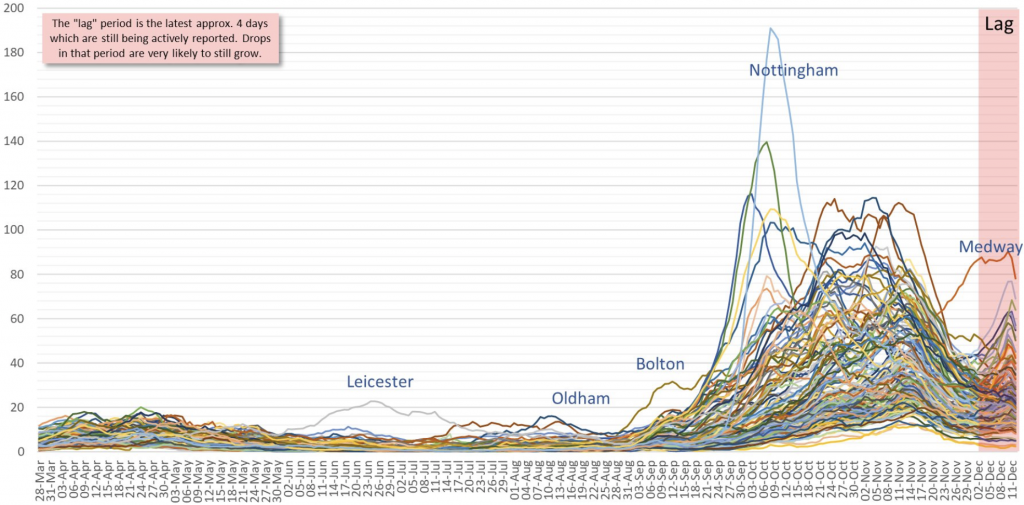
The initial Italian variant had burned itself out by end-June and hospitalisations were down by -97% from their April peak (Wave 1). Since September though, a new variant D614, was picked up by Spanish holidaymakers before being spread by students returning to university in early October. This variant too appears to have been in decline from end-October, aided by the November 5th to December 2nd lockdown. The new S-dropout VoC, which incidentally only occurs with the primer supplied with the widely used Thermo Fisher TaqPath PCR machine (other makers’ primers are still identifying the S gene), has now been traced back to late September but has become ever more predominant throughout the South East. However, the virus is constantly mutating and there have been over 4,000 different variants worldwide to date, so what is it that makes this new variant so special?
New variant (relative) growth rate
On December 14th, UK Health Secretary Matt Hancock told parliament that the new variant of coronavirus was “increasing rapidly. Initial analysis suggests that this variant is growing faster than the existing variants…predominantly in the South of England.” The UK Government’s New and Emerging Respiratory Virus Threats Advisory Group (Nervtag), which reports to Chris Whitty the Chief Medical Officer, announced on December 18th that the “growth rate of (the variant under investigation) VUI-202012/01 is 71% (95%CI: 67%-75%) higher than other variants.”
Higher viral load
Almost immediately, on December 20th, a Tier 4 lockdown was imposed on the 24m residents of London and the South East, effectively ‘cancelling Christmas’ for 44% of the English population. Over 50 countries responded by banning flights to or from the UK. The same day, Susan Hopkins the PHE liaison with NHS Test and Trace, told the BBC that we “won’t know for definite” if the new variant is more deadly but it does have a “higher viral load” though this is merely inferred because it is positive at a lower Ct. Susan Hopkins is the one who quashed the false positive story last summer, despite the disease incidence having fallen as low as 0.01% (zero?) by end-June according to the ONS survey, whilst Pillar 2 tests had positivity consistently > 1.4% (the probable false positive rate?). The ONS has subsequently admitted that it doesn’t actually “know the true sensitivity (FNR) and specificity (FPR) of our nose and throat swab test.”
70% more transmissible?
The Nervtag ‘70% increased transmissibility’ estimate came from a Public Health England (PHE) technical briefing, not published until December 21st, that compared PCR tests that were positive for the two genes ORF-1 and N but negative for the S-gene as a proxy for the variant of concern (VOC). The authors then “applied the models to estimate the association of VOC frequency and reproduction number (R). This analysis shows an increase of Rt of 0.52,” which raises the distinct possibility that we might have a causality-correlation problem here. Is increased transmissibility leading to an increase in the observed Rt, or is it an increase in the model’s Rt assumption that is feeding back into an implied increase in transmissibility?
Never knowingly under-estimated
What is also of note is that three of the authors of the PHE paper (Meera Chand, Wendy Barclay and Neil Ferguson) also sit on the Nervtag committee. So, they were effectively reporting on their own, non-peer-reviewed and, at that stage, not even published, work. Neil Ferguson, you may recall, is the creator of the infamous model, rumoured to be more than a decade old but whose parameters are yet to be released for peer review, that predicted half a million UK deaths (2m in the US) in the absence of lockdown, with a ‘best-case scenario’ of 1.1m US deaths, even with lockdown; which he originally argued doesn’t save lives but merely ‘flattens the curve.’ Furthermore, this Dr Strangelove of epidemiology has, as they say, ‘form.’ Back in 2001, Neil Ferguson’s foot-and-mouth modelling recommended culling over vaccination (thankfully he has moderated this strategy for COVID-19), which was responsible for the slaughter of 6m animals. The following year, his BSE model estimated a worst-case scenario of 150,000 UK deaths from vCJD (actual deaths 177) which led to another mass livestock cull. In 2005 he told the Guardian that the worst-case scenario for global H5N1 bird flu deaths was feasibly 200m (actual deaths 282); and in 2009 he initially forecast a worst-case scenario of 65,000 UK deaths from H1N1 swine flu (actual deaths 457). So, let’s just say Prof. Ferguson’s models tend to have an extremely high upper bound bias. The man’s inherent honesty is also in question. He was forced to resign from the Scientific Advisory Group for Emergencies (SAGE) after being caught entertaining his married lover within the 14-day self-isolation window following a positive test and the onset of COVID-19 symptoms. Yet to this day, his infamous Covid model parameters remain secret and non-peer-reviewed, whilst he remains an unapologetically influential figure within both PHE and Nervtag, which makes a bit of a mockery of his high-profile ‘resignation’ from SAGE. Now, most surprising of all, in spite of his history of extreme worst-case scenarios, eliciting extreme policy response by fearful politicians, his research for PHE now seems to be going, via Nervtag, straight into policy without being either published or peer reviewed.
Tier 5
Nevertheless, the PHE study reported that “it is highly likely that (spike variant) N501Y is enhancing the transmissibility of the virus” leading Nervtag to conclude, three days earlier, that it had “moderate confidence that VUI-202012/01 demonstrates a substantial increase in transmissibility compared to other variants” (my bold). On Christmas Eve, the Centre for Mathematical Modelling of Infectious Diseases at the London School of Hygiene and Tropical Medicine confirmed that according to their model, the new variant was 56% more transmissible, though thankfully no more lethal, than the strain it was replacing. This in turn led Prof. Andrew Hayward, another member of Nervtag, to tell the BBC on December 28th that “a 50 per cent increase in transmissibility means that the previous levels of restrictions won’t work now. We are going to need decisive, early, national action to prevent a catastrophe” (assuming, of course, that an extended Tier 5 lockdown isn’t in itself a ‘catastrophe’).
The logic test
The Neil Ferguson/PHE study noted that during November (Weeks 44-48) tests that were positive for ORF and N but that were ‘S gene negative’ were both growing on average 70% faster than the more common variant (see blue line in Chart 2 below) and proliferating. Given the scatter plot, this doesn’t look like the most robust statistical conclusion to draw. However, of more concern is the fact that the growth rate of the S-dropout is being measured against the growth rate of the older variants, which itself appeared to be in decline (see Chart 1). The inappropriateness of this comparison is exacerbated by the differing geographical distribution, with the old variant predominantly found in the North of England and the new S-dropout variant in the South. If the Northern infection is naturally in decline and there is a new infection blooming in the South, we would logically expect the growth rate of the old variant to be slowing (R < 1) and of the S-dropout to be accelerating (R > 1). If so, then comparing the two would naturally yield a faster growth rate for the S-dropout because both variants would be at different stages of their epidemic cycle (Gompertz curve). Crucially though, this would not necessarily imply that the S-dropout was any more, or less, transmissible than its predecessor.
Chart 2: Relative growth rate of ‘S-dropout’ over variant D614G
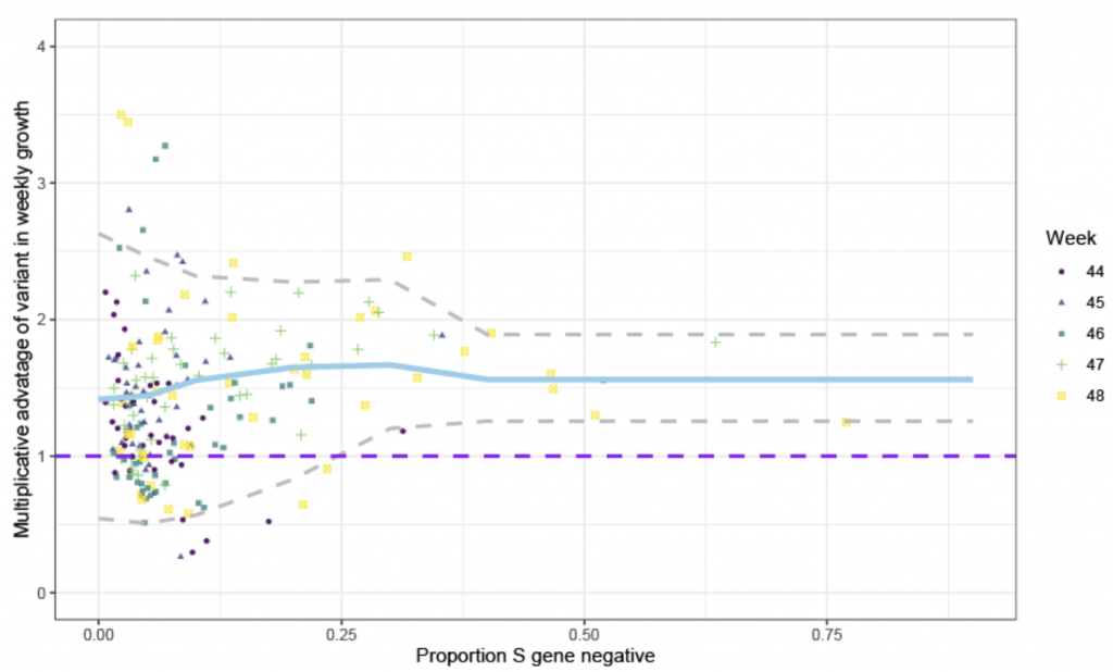
Source: PHE
How therefore, if increased transmissibility is not the culprit, to explain the surge in new positive tests, which reached 57,725 on January 2nd? The most salient point to make is that the number of tests carried out has leapt by +50% since early November. With a largely asymptomatic disease like COVID-19, the more absolute tests carried out, the more absolute positives are returned, especially when the authorities target testing capacity at the newest outbreak areas. There were 445,000 daily tests in the week to December 21st (the most recent data available at time of writing) and 36,410 a day came back positive (a positivity rate of 8.2%). If, for example, we compare that to November 4th, the day before lockdown, the 7-day average number of daily tests was 298k and the average number of positives found each day that week was 23,763 (8.0% positivity). So, there has been no real change in positivity, despite the leap in “new cases”, not least because there has been no real change in disease incidence either, which is still ~1.2%, the same as its pre-November lockdown peak, having bounced back after restrictions were lifted on December 2nd (see Chart 3 below). What there isn’t is any sign of though in this data, is any increased transmissibility.
Chart 3: Estimated COVID-19 incidence in UK population (%)
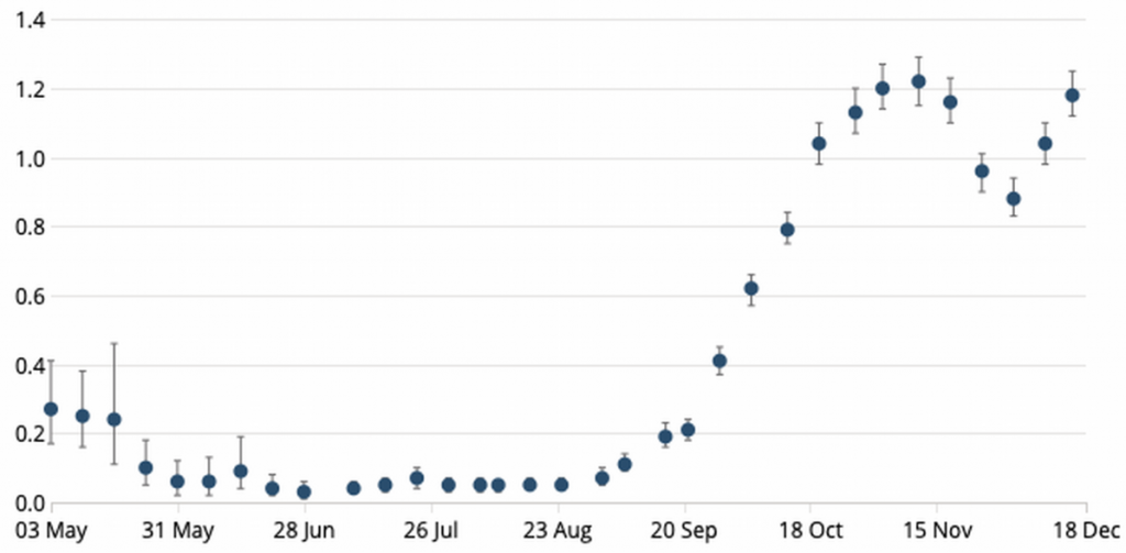
Source: ONS
Therefore, whilst it is quite possible that the new S-dropout variant turns out to be more (or perhaps even less) transmissible than those variants it is replacing, there is nothing logical sustaining that assumption at this stage. Which brings us to the claim that the new variant comes with a higher viral load, which supports the idea that it is more infectious because surely more virus means more opportunity to pass onto and infect new victims. However, the case for an increased viral load is even weaker than the assumptions backing the increased transmissibility claim.
Lateral flow devices
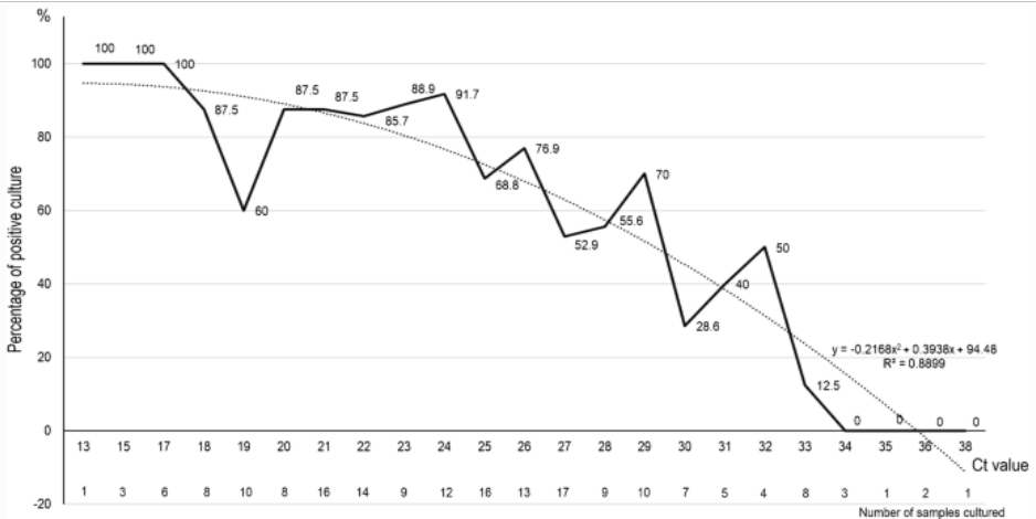
The University of Birmingham, which has just started up a new coronavirus PCR facility as part of the nation’s Lighthouse Lab network, studied the comparable efficacy of the Innova lateral flow device (LFD), a test whose advantage is that it gives immediate results, by testing 7,185 asymptomatic students, of which just two tested positive. The study then randomly tested 710 LFD negatives on their state-of-the-art PCR machines and found 6 further positives which the LFDs had missed and implying that out of the whole group about 60 positives might have been missed by using the LFD. What is really interesting about this however, is that all these 6 ‘false negatives’ required a cycle threshold (Ct) > 29, whilst the two LFD positives were at Ct 20 and Ct 25. As Chart 4 below shows, studies reveal that PCR positives at the limit of detection (LoD) cannot reliably yield live virus in vitro (in the lab) much above Ct 29 and zero live virus above Ct 33. Therefore, the LFD test is not necessarily as woefully insensitive as the Birmingham study concludes but is probably picking up (almost) all the positive cases. But what therefore is a PCR test that only turns positive at Ct > 33 telling us if there is no live virus present? The answer is that PCR tests set to the LoD not only pick up live infections at low Ct but also old, dead viral strands from infections that people have recovered from but which are only picked up by the PCR machine at the higher Ct. This feature, it turns out, is crucial for understanding the possible confusion about the S-dropout variant and its transmissibility.
Chart 4: Positive PCR result Ct & ability to culture live virus
The importance of calibration curves.
Birmingham Uni generated a calibration curve to compare Ct and viral loads for the PCR protocol. PCR machines output data by measuring the number of amplification cycles before a positive signal is seen (Ct). High numbers of cycles get more sensitive, detecting smaller and smaller amounts of DNA, but there exists a point when the output of the PCR machine no longer reflects the number of initial copies of the target gene, this is known as the limit of detection (LoD).
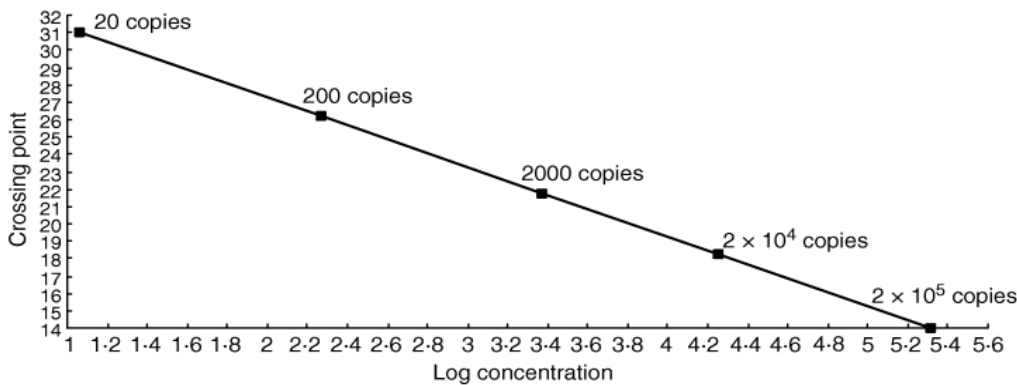
How much initial virus a Ct number represents is determined by calibrating the process using a series of increasingly dilute samples with a known number of viral copies. Chart 5 below shows that in the case of norovirus, for example, if amplification needs to be taken as high as 2 billion to get a positive, only about 20 initial copies of the virus RNA are being detected, crossing the threshold at 31 cycles (Ct 31). However, with fewer than 20 initial copies, the PCR becomes unreliable, no matter how many cycles are performed. Therefore, the LoD for the Norovirus PCR test is 20 viral copies per sample at Ct 31. Like the coronavirus, norovirus is a positive-strand RNA virus, so the PCR process is very similar. The chart plots 10:1 dilutions against the Ct at which the sample tests positive and falls, as is to be expected, along a straight line (logically, you shouldn’t be able to dilute something by a factor of 10 and get a stronger Ct signal). This sort of calibration curve is useful because the Ct for any unknown sample can be traced on the line and the corresponding amount of norovirus can be read off on the x axis.
Chart 5: Norovirus PCR positive Ct & number of viral copies
Faulty data
The data from the Birmingham University study has been used to create exactly the same type of chart for coronavirus detected using the Thermo Fisher TaqPath PCR test, as used in most of the Pillar 2 Lighthouse labs including Birmingham University (see Chart 6 below). Unlike the Norovirus calibration curve however, these observations, which are derived from serial dilutions carried out by the Birmingham laboratory, should all lie on a straight line too but clearly don’t. With increased viral copies, the positive Ct should always be lower because less amplification should be required. Yet several points on the Birmingham calibration curve are a significant way away from the line. Log10, 3.7 to 4 (i.e. between 5,000 and 10,000 viral copies) the Ct rises by 3.3 when it should, by definition, fall. A Ct 3.3 cycle error is roughly equivalent to a 10-fold difference in viral load. Yet this calibration curve is the only scientific link between Ct in the TaqPath protocol and viral load in any sample; and therefore absolutely central to the inference that the S-dropout has a higher viral load.
Chart 6: ORF gene PCR positive Ct & number of viral copies
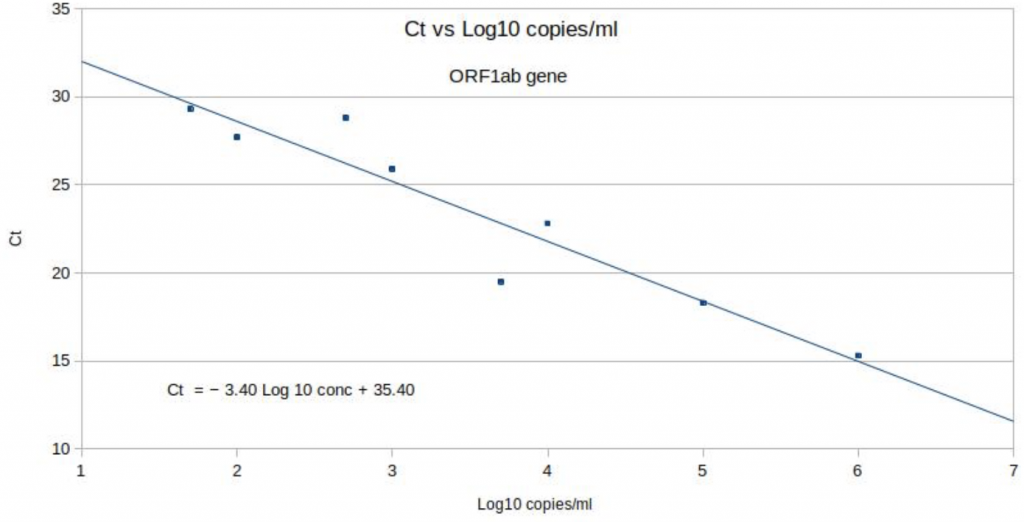
Source: Birmingham University, MacroStrategy LLP
Although the line of best fit would imply that the ORF target gene can be detected with as few as 50-100 viral copies per ml, the table below shows that nothing above Ct 25.8 can be reliably replicated (non-grey boxes), which is the true LoD of the TaqPath protocol for ORF. Even with the 2-out-of-3 rule, the protocol starts to fall over at Ct 30, just like with Norovirus. Yet, the pillar 2 PCR labs, including Birmingham, still register a positive test (‘diagnoses’ as the government now prefers to call to them), at Ct 38, i.e. samples at least 2ˆ8 (250x) more dilute than the PCR true LoD. We should treat all positives at Ct > 29 as merely shadows of old, prior ‘cold cases.’
Table 1: Ct values for 3 gene targets & viral copies per ml
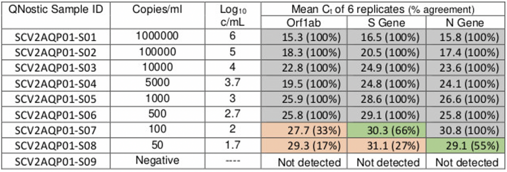
Source: Birmingham Lighthouse Turnkey Lab
New for old
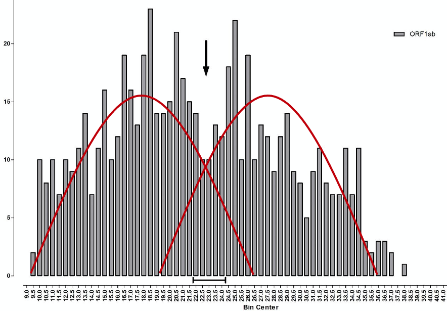
The median TaqPath PCR is positive at Ct 22-23 (~10,000 viral copies), whilst the median S-dropout turns positive at the lower Ct of ~18 (~100,000 copies), which implies a 10-fold ‘higher viral load’. However, unlike the calibration curve for norovirus, the points along the TaqPath curve are not straight, which looks very much like a calibration error. Therefore, whilst the ORF gene, at Ct 19.5, indicates an initial concentration of just 5,000 viral copies, 20x less viral load than the S-dropout gene, this is cherry picking the data, because at Ct 18.3 the ORF gene also indicates 100,000 viral copies per ml, exactly the same as the S-dropout median. Instead of the S-dropout viral load being “10-10,000-fold” higher as the study concludes, it is more like zero to 10-fold higher. When you consider that there are 3 x 10ˆ22 molecules in one ml of saline buffer, a factor of zero-10 is far, far less than a rounding error. For a detailed critique of the shortcomings of the PCR protocols for COVID-19, see here. Positives detected at Ct > 29 are mere shadows of past infections and live infections start to fall away above Ct 20. The arrow on Chart 7 below illustrates this, what the Birmingham researchers refer to as “a nadir in Ct frequency between 22-24…a possible multiphasic distribution of sample results” but they do not pursue this angle.
Chart 7: Frequency of Ct values for ORF gene positive samples
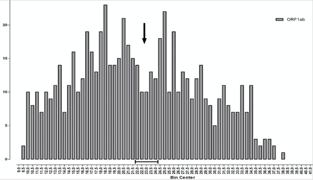
Source: Birmingham University
More precisely, what we have here is a biphasic distribution, the result of two fairly normal distributions overlaying each other (illustrated by the red curves on Chart 8 below). The one on the left, with its peak around Ct 17-18, is the distribution of new ‘live’ infections, whilst the distribution on the right, with a peak around Ct 27-28, reflects past cases that can only be identified following high Ct amplification. The observed trough between the two, from Ct 22-24 and marked by the arrow, indicates where the two viral distributions, new and old, overlap each other.
Chart 8: Frequency of Ct values for ORF gene positive samples
Source: Birmingham University, MacroStrategy LLP
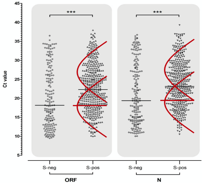
The Birmingham lab processes samples from all over England and the team illustrate these distributions in a pair of vertical scatter plots (see Chart 9 below) showing ORF gene positives on the left-hand side and all the N gene positives on the right. The two ORF and N gene positive distributions are further split into those where the S gene was also positive on the right (presumably old infections and from the North) and those that were negative for the S gene (mainly new infections from the South) on the left. The report makes the point that positive tests which were negative for the S gene tended to have a lower median Ct (i.e. higher viral load) than those which tested positive for the S gene as well (see horizontal black bars) and conclude that the S-dropout variant must therefore have a higher viral load (lower Ct). However, this conclusion is logically faulty on at least two levels.
First, if the S positive subset is multi-, or more accurately bi-phasic, then the median (horizontal black bar) is an average of not one but two distributions drawn by me in red (see Chart 9 below), one of which (old cases) has a higher median and the other (new cases) has a lower median line (horizontal red bars). Samples were processed between October 25th and November 5th, only 4 weeks after the first S-dropout was first processed; and because the S-dropout (S-neg) variant is so new, it has relatively few old cases that can only be picked up by high Ct > 30. It is only logical therefore, that the median Ct of new cases will be lower than that of new and old cases combined. Sure enough, it appears, that the median Ct of the S-dropout distribution is about equal to the median of new cases alone. It definitely isn’t safe to infer that the S-dropout viral load is any higher than that of its, now waning, predecessor variant, especially when the latter was at the same point in its infection cycle.
Chart 9: Comparative Ct values for viral targets
Source: Birmingham University, MacroStrategy LLP
Second, a lower Ct does not even mean you necessarily have a higher viral load. The protocols used have to show that Ct is proportional to the number of viral copies at that point in the curve, or there is something wrong with the protocol. Yet the chart shows that the ORF1ab gene target calibration was not proportional to the number of copies per ml. at several points on the curve where the TaqPath PCR protocol goes awry and the non-grey areas on the table show that results cannot be reliably replicated above a Ct of 26 for the ORF gene, Ct 30 for the S gene and Ct 31 for N. I.e. the true LoD is somewhere between Ct 26 (500 viral particles per ml) and Ct 31 (100 copies). All TaqPath PCR tests that don’t turn positive until Ct > 30-31, are therefore manifestly unreliable anyway.
The transmissibility feedback loop
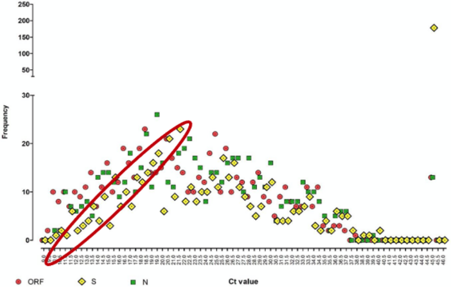
Of the 641 positive samples analysed, 178 (28%) had an undetectable S gene profile, which they artificially assigned a Ct of 45 (see yellow diamond, top right-hand corner of Chart 10 below). This compares to only 13 positive samples (2.1%) with an undetectable ORF (red circles) and another 13 with an undetectable N gene (green squares). The researchers jump to the conclusion that these missing S gene positives and their lower median Ct (which they forgot could have been caused by the multiphasic nature of the distribution) lead to “a conservative estimate of a significantly larger population of infectious subjects that have an increased viral load up to 10,000-fold higher” with commensurately increased transmission. The rest, as they say, is history.
Chart 10: Frequency of positive Ct values for 3 gene targets
Source: Birmingham University, MacroStrategy LLP
Whilst the researchers are clearly implying that if the primer is failing to capture one of its gene targets, that not only is there a large population of infectious subjects roaming around undetected, these people also carry a viral load that could be 10,000x higher than those infected with the earlier variant. As for the latter claim, we have already established that the lower median Ct could only imply a 10-fold higher viral load at most; the 10,000 figure being alarmist hyperbole. Yet even this isn’t even relevant because of the multiphasic distribution. So, we can junk the whole ‘higher viral load’ argument; but what about these infectious S-dropouts roaming undetected among us like latter-day Typhoid Marys?
Chart 10 clearly shows that even when the S gene was still being detected by TaqPath, it was so at a higher Ct than the other two genes, i.e. the yellow diamonds are shifted to the right (within the red ellipse). However, since only two of the three genes are required to give a positive result and the primer does a better job picking up both of the ORF and N genes anyway, the number of cases that will have gone undetected will be the 26/641 (4%) where either the ORF or the N gene primers failed. Is 4% truly what any responsible researcher would call “a significantly larger population of infectious subjects” (my bold)?
What we know
- An increasing number of positive ORF and N gene samples tested using the Thermo Fisher TaqPath PCR machine primers are no longer picking up the S gene, indicating a new S-dropout variant originated in the Medway area of Kent.
- The median Ct of samples positive for ORF and N but not the S gene is lower than the median Ct of samples also positive for S.
- The relative growth rate of the S-dropout is about 170% of the growth rate of those positive ORF and N samples that are also positive for the S gene.
Illogical academic data interpretation
- “A significant proportion of S-dropout samples are associated with lower Ct values of ORF and N in the same sample; from which it (sic) possible to infer a relatively higher viral load in these specimens” (my bold).
Yet, for the reasons explained above, it is not possible to infer higher viral load at all. A far more likely explanation is that the S-dropout variant is a newer variant, from which we can infer that there will be far fewer old cases to pick up with a very high Ct > 30.
- “Clearly, the higher viral loads inferred from S-dropout samples could determine the infectiousness of subjects, and thus the ability of the virus to transmit onwards” (my bold).
Or nothing of the sort. A naïve interpretation of median Ct, that fails to take account of the bi-phasic nature of the distribution, renders this conclusion utterly meaningless.
- “The significant difference in population median Ct value, between S-dropout and S-detected samples, represents between 10 and 100-fold increase in target concentration for S-dropout. The cluster of S-dropout samples having ORF and N Ct of between 9 and 15 (63/178 (35.4%); 46/450 (10.2%), respectively) is a corresponding further increase in relative viral load of between 10 and 1,000-fold” (my bold).
The difference in median Ct, which can be explained by the new variant being, uh, new, is < 4 Ct (actually about 3.6) between the S-negative and S-positive samples. Mathematically, 2ˆ3.6 equates to a factor of almost exactly 10. Not 100, not 1,000 and definitely not 10,000 (see 4. below).
- “A Ct value of approximately 15-16 corresponds to a viral load of 1 x 10⁶ copies per millilitre (mL). Therefore, our observed cluster of S-dropout samples at Ct less than 15 corresponds to a conservative estimate of a significantly larger population of infectious subjects that have an increased viral load up to 10,000-fold higher. Such capability of increased transmission has been ascribed to an S ‘variant of concern’ apparently spreading throughout the South-east of the UK” (my bold).
Ignoring the fact that the whole low Ct/high viral load idea only stems from ignoring the bi-phasic nature of the positive distribution and cherry-picking the data from the TaqPath calibration curve, you still only get a zero (more likely) to a maximum 10-fold higher implied concentration. “10,000-fold” is scientifically inexcusable, and deliberately alarmist, hyperbole. Then this wholly fallacious idea is fed back into the concept of increased transmissibility… except that this argument is all a house of cards. Besides, these numbers only seem large in the macro world. At the micro scale, where there are 3 x 10ˆ22 molecules in 1ml of water, the difference between 10,000 and 100,000 viral copies per ml? Hmm, not so much.
Conclusion
There is a new COVID-19 variant in the UK, which we only identified because it isn’t being picked up by the S gene primer, even when the ORF and N gene primers flash positive, on the Thermo Fisher machines. Being a new variant (i.e. R > 1) it is naturally growing faster (by 70%) but only relative to its predecessor, which is now past its peak and on the wane (i.e. R < 1). You cannot logically infer from this relative growth rate anything about transmissibility. It is even possible that this new S-dropout variant could be less transmissible than its predecessor was when it was in its ascendancy back in Sep-Oct. Whilst positive tests are growing fast, this can be wholly explained by the increase in testing (+36% from November 4th to December 21st). Positivity is even down slightly compared to a month ago. The lower Ct of S gene negative positive samples, from which has been inferred a higher viral load, from which has been inferred a positive feedback increase in transmissibility, is actually much more easily and logically explained by the variant being relatively new, which means there are relatively few old cases that can only be picked up by the highest Ct.
Footnote
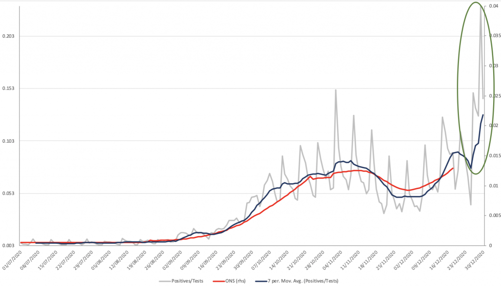
The UK government has explicitly tied the transmissibility of the new S-dropout variant (despite its existence being traced back to early October) to the very recent surge in new cases, which hit a record high of 80k positives on December 29th. Thus, 11 days after the disease prevalence was estimated to be < 1.3% of the population, and 9 days after a quarter of the population was put under Tier 4 lockdown, 23.2% of all people tested by pillar 2 came back positive (see grey line and green ellipse on Chart 11 below). Note that as with December 29th all the spikes in the data are Mondays, because testing capacity is redirected to new hotspot areas each week; but even the national 7-day average positivity had risen from sub-8% at Christmas, to 13% by NYE. This has all been driven by London, where 7-day positivity was 14.9% on December 20th, the day of Tier 4 lockdown, but nevertheless had risen to 17.8% on Christmas Day and is now 26.8% (20x higher than prevalence). How and why is too early to tell.
Chart 11: UK COVID-19 prevalence & pillar 2 test positivity
James Ferguson is the Founding Partner of MacroStrategy


Donate
We depend on your donations to keep this site going. Please give what you can.
Donate TodayComment on this Article
You’ll need to set up an account to comment if you don’t already have one. We ask for a minimum donation of £5 if you'd like to make a comment or post in our Forums.
Sign UpLatest News
Next PostBut What Would a Sceptic Have Done?