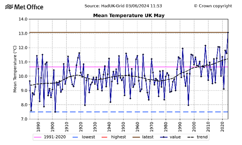
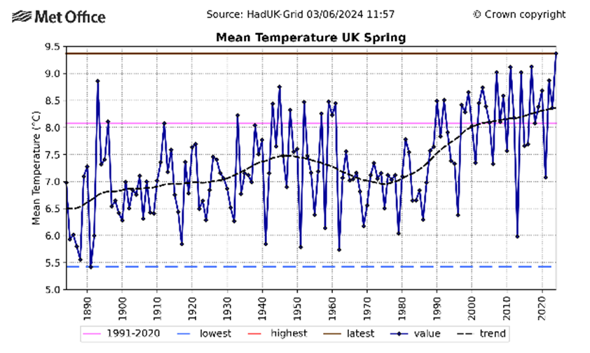
Weatherwise, it has been a rubbish May. And it has been an abysmal spring. It has been cold and wet. And everyone knows it. But according to the Meteorological Office, the U.K. has just experienced its hottest ever May, and its hottest ever spring. As news reports and the Met Office’s own press release have correctly indicated, this “may come as a surprise” to many people who actually live here (rather than on the planet that the Met Office’s scientists inhabit). To those people, many of whom had their heating on for a good part of the month, the Met Office’s statement, as well as the “akshully…” news reports that claim to shed light on the difference between perception and reality, look like actual gaslighting. Even if the claim is true, which remains to be seen, what it reveals is the inadequacy of temperature as a metric on which U.K. climate and energy policy rests.


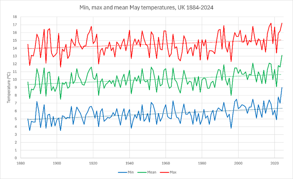
The Met Office’s charts for May and Spring show mean U.K. temperatures far in excess of what most people would expect. The mean temperature for May was a full degree warmer than the next warmest May in 2017. ‘Mean temperature’ is the average of the minimum and maximum temperatures recorded on one day. And the two extremes is obtained by averaging the highest and lowest temperatures of all stations in the MO’s network of weather stations. But as the following chart shows, while the max temperature is equal highest with 2018, it is the average minimum temperature which really makes May 2024 an outlier at 9°C, which is 1.2°C warmer than the next warmest average minimum, which was in May 2022.

The obvious point to make about this is understated by the Met Office, which explains: “This warmth was especially influenced by high overnight temperatures.” But this speaks to the inadequacy of temperature measurements of this kind to sustain climate change narratives. Whereas fears about global warming are driven by stories of relentless heat driving extreme weather such as heatwaves, wildfires and floods, a slight rise in minimum temperatures is the opposite of extreme: it is mildness. A 9°C average minimum temperature is not going to boil the planet, set the world on fire, or tear civilisation from its foundations.
But alarmists might point to the average maximum for May 2024, which is tied with 2018 as the warmest at 17.2°C. The problem, however, is that this says very little about what people are actually experiencing. Spring and May 2018 were notable for their record-breaking heatwaves. In April 2018, the hottest April temperatures for 70 years were recorded at 29.1°C, according to the Standard, caused by a huge plume of hot air from Portugal. The following month was the “sunniest and warmest on record in U.K.”, according to the Guardian, which began with a heatwave in which temperatures of 28.7°C made it “the hottest early May bank holiday weekend on record”.
Neither Spring nor May 2024 have had any weather events to compare with 2018. Yet max average temperatures do compare, and May 2024 min average temperatures exceed 2018’s. How can temperature therefore be a useful guide to what’s happening to our climate if it can seemingly underpin both extremely hot weather and extremely disappointing weather?
The problem is perhaps caused by these metrics being produced by cascades of averages. Data from weather stations across a nation that spans nearly 600 miles north to south and 300 miles west to east are mashed together as though a single metric of ‘climate’ for such a landmass was meaningful. Twenty four-hour minimum temperatures from all these stations are averaged. Then their maximum temperatures are averaged. And then these averages are averaged again to produce the ‘mean’. But anyone who has spent any time in the northwest of Scotland and the southeast of England know that these are radically different climes – as different in latitude as the south coast of Spain and its central region.
But perhaps the problem is even more radical than that. If the Met Office’s method of working out ‘average temperatures’ makes a dreary May like the one we’ve just had ‘hotter’ than one with a historic heatwave, eg May 2018, why should slight increases in ‘average temperatures’, as per the MO’s definition, concern us at all? The increased average temperature in May was, after all, likely driven by merely milder not extreme weather in a month that most people experienced as colder than average. Average temperature is supposed to be the most important metric of our time. Yet the same metric can mean anything between nearly 30°C heatwaves in April, and people wearing coats, hats and scarves in the week before summer. And a metric that can mean anything means nothing. It is a junk statistic.
None of this would matter if the Met Office and Britain’s news media were not so manifestly intent on gaslighting us into political obedience. But they want us to believe that our lives are deeply affected by such metrics, and use the weather forecast and news items about the weather to sustain the climate change narrative. Constant reminders of ‘danger to life’ herald something more than a breeze, a balmy evening or a scattered shower.
I wanted to see for myself how the raw data had been turned into this kind of zombie climate stat. It has been a long time since I bothered doing a deep dive into meteorological data, because it turns out that you do not need any kind of weather statistics to know, for absolute sure, that there is no ‘climate crisis’, so I haven’t felt the need. However, I was surprised to discover that data from the weather stations that are used in the Met Office’s analysis are not available to the public at higher than monthly resolution.
That’s a problem because in order to build an estimate of how useful minimum and maximum temperature data are, even in one location, never mind across an entire country, it would need to be compared to hourly data at a minimum. But not even daily data are available.
You might have thought that scientists and institutions that are so keen to tell us that their metric is so significant would be just as keen to make all of that data available to us. But you would be mistaken. The data is jealously guarded. It’s not for public consumption. We are supposed to take the good faith of institutional science for granted and are neither welcome nor even permitted to check for ourselves. ‘Follow the science’, means ‘obey’, not ‘try to understand’. And that’s what makes me – and, I hope, you – a sceptic.


To join in with the discussion please make a donation to The Daily Sceptic.
Profanity and abuse will be removed and may lead to a permanent ban.