Climate change is being driven by a change in the orientation of the Earth to the Sun rather than carbon dioxide emissions, new analysis of data from Berkeley Earth shows.
The analysis is set out in full below. The highlights:
- Analysis of Berkeley Earth data shows a significant difference in the rate of temperature increase between summer and winter in Greenland, with winter warming over four times more rapidly than summer.
- Significant seasonal variation in the rate of warming is not specific to Greenland but is a global phenomenon at similar latitudes.
- There is a correlation between warming rate and latitude, with a decreasing trend in warming rate as we move from north to south.
- This analysis suggests that it is the change in orientation of the Earth to the Sun, known as Milankovitch cycles, that is the primary driver of climate change.
- These findings raise questions about the credibility of the existing climate change narrative.
Berkeley Earth offers comprehensive land surface temperature data for the entire planet. It calculates temperature anomalies by comparing the actual temperature to the average temperature during the period from 1950 to 1980. In a previous article I used data from this site to show that there was minimal evidence of a significant increase in global temperatures, contrasting it with the magnitude of seasonal variations. While it is undeniable that our planet has warmed over the past 150 years, what is the root cause? Could it be attributed to the orientation of the Earth to the Sun, considering it is the only heat source?
I had already downloaded data for some specific regions, and as this is available in monthly increments it was a relatively simple task to interrogate the data to see if there were any seasonal variations in the rate of temperature increase.
To clarify, I am analysing the Berkeley Earth data from 1860 to 2020 by dividing them into three-month periods to calculate the average seasonal anomaly. For instance, winter includes December to February, spring includes March to May, and so on. I then graph these data and calculate the temperature change rate using a linear trend line. Comparing seasons each year is a dependable method because it allows us to draw conclusions based on the relative seasonal warming rates at specific locations. This approach reduces the risk of complications caused by factors like urban warming or thermometer inaccuracies.
I was expecting any seasonal differences to be minimal but to my surprise this was not the case. This is the analysis for Greenland for the period of high carbon dioxide emissions (Fig 1):
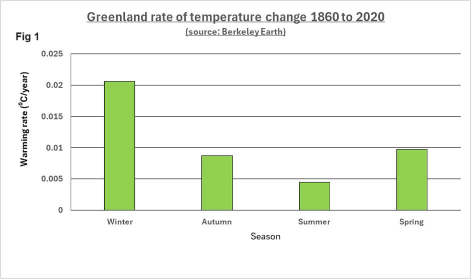
The chart clearly shows a significant difference in the rate of temperature increase between summer and winter (4.6 times greater). This difference intrigued me, prompting me to investigate if this pattern is consistent globally. Here is a map of the world (Fig 2) comparing the average annual warming rate (in black) with the seasonal variation (in purple) expressed as a percentage relative to the mean (relative standard deviation) for the four seasons. Higher values for both metrics indicate a more pronounced rate of warming and seasonal variation.
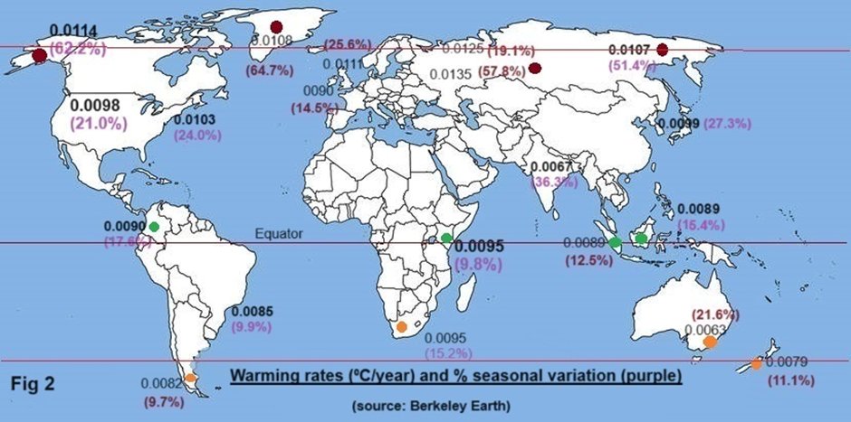
The key takeaways from the above (Fig 2) are as follows:
- A clear decreasing trend as we move from north to south in terms of warming rate and a decreasing seasonal variation. This lack of seasonal variation was expected at the equatorial latitude but not for the northern and southern hemispheres.
- Warming rates are consistent across latitudes that are at different ends of the earth.
(Data for Antarctica are only available from 1956 onwards so as this is not a comparable data set it has not been included.)
To try and shed further light I have taken four cities and regions from the furthest north, furthest south and proximity to the equator and taken the mean seasonal warming rates for the locations represented by red, green and orange dots respectively above (Fig 3).
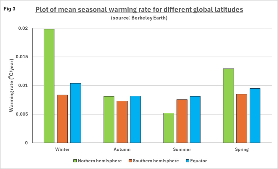
This chart confirms that the difference between winter and summer seen in Greenland was not specific to this region but a global phenomenon at this latitude. In this analysis, using four locations, winter is warming nearly four times (3.8 times) more rapidly than summer. This seasonal trend is evident, albeit to a much less extent, at the equator and in the southern hemisphere.
If we examine the observation that the warming rate was changing with latitude using these 12 data sets, we get the following graph (Fig 4):
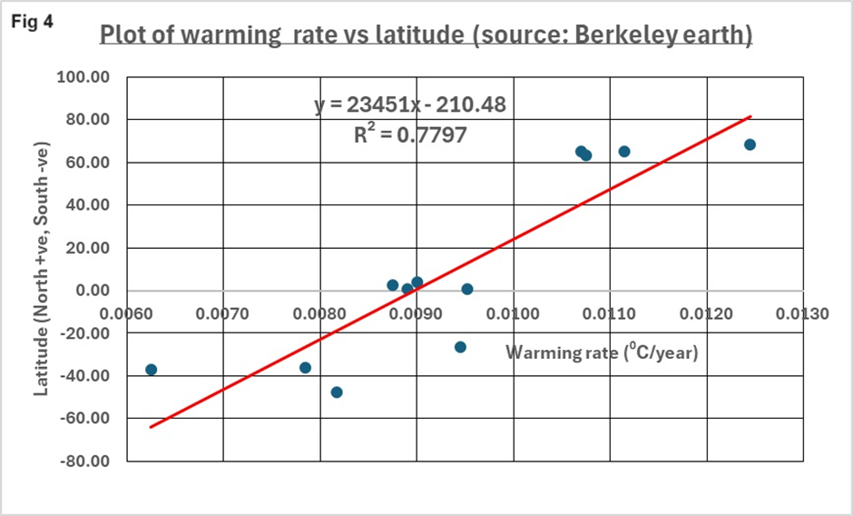
We can see that there is a reasonable degree of correlation between warming rate and latitude (R2 = 0.7797; a value of 1.0000 equates to a perfect correlation). There are many other factors that influence local climate. Air and ocean currents have a strong bearing and can change on a seasonal basis, but the locations above span the globe.
To further examine this annual cycle of the rate of warming at different latitudes I have taken Greenland as the most extreme and plotted the monthly rate of rise and compared this with New York, the southern hemisphere (Southern Chile) and the equator (Singapore) (Fig 5):
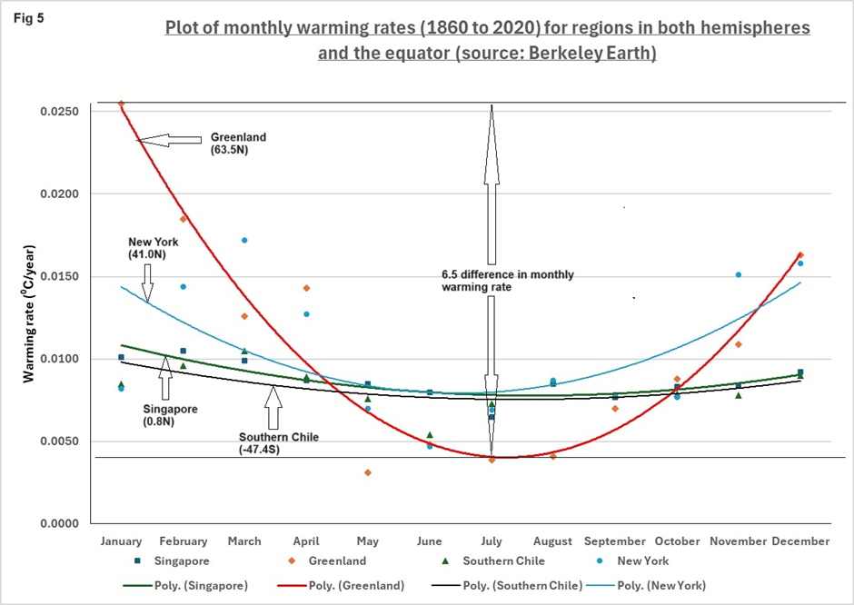
There remains a significant correlation between the time of the year and the rate of warming. For Greenland the difference between the monthly maximum (January) and minimum (July) rate of warming is a factor of 6.5. This large difference indicates that the Earth’s change in orientation to the Sun is playing a crucial role in the warming seen from 1860 to 2020. There is also a clear trend as we move from north to south in the maximum and variation of monthly warming. The second order polynomial curve fit has been determined using Excel.
This analysis suggests that climatic warming in the far northern hemisphere is highly seasonal, with Greenland exemplifying the most extreme winter-to-summer variations. Variations in warming rates across latitudes also point to the Sun’s proximity and angle as the primary driver of planetary warming during the period 1860 to 2020. These changes to the Sun’s orientation to the Earth are known as Milankovitch cycles. The changing seasons occur because the Earth orbits the Sun in an elliptical path and is tilted on its axis. Greenland’s average seasonal range is approximately 26°C and as we are looking for something that can increase the warming rate by 0.011°C per year this simple explanation is hardly far-fetched.
Climate scientists admit their models fall short in explaining past rapid temperature shifts in Greenland, which were much more extreme than what we are currently experiencing. Professor William Happer co-wrote a paper, released in 2020 but largely overlooked, that questions the concept of carbon dioxide as a greenhouse gas at its current levels. These findings and many others prompt unanswered questions regarding the credibility of the existing climate change narrative.
The outcome and implications of this analysis took me by surprise. As I was citing the work of Professor William Happer I asked him to perform a sanity check. He replied that the analysis “looks reasonable to me”. He added:
What has caused the warming of the past two centuries is still open to debate, but I think the evidence is pretty solid that much of the warming was a natural recovery from the Little Ice Age and had little to do with increased concentrations of greenhouse gases. Others have pointed out that the warming has been more pronounced at nights and at near polar latitudes. But it is nice to see this quantitatively confirmed in this analysis.
It is good that you point out strong evidence that the dogma that CO2 is the control knob of Earth’s climate is certainly wrong. But it is being used as an excuse for suicidal economic policies supported by glassy-eyed fanatics and clear-eyed opportunists. This is bad news for humanity.


To join in with the discussion please make a donation to The Daily Sceptic.
Profanity and abuse will be removed and may lead to a permanent ban.
Who would have thought that the cosmos was more of a determinative factor in shaping the Earth’s climate than human activity? Quelle surprise!
Right then, climate activists new approach will be: “we are campaigning to alter the worlds axis to stop climate change!”
‘Just Stop axis’
“We want to set off nuclear bombs, placed at strategic coordinates to change the tilt of the earth, to save humanity from climate armageddon..and we’re prepared to tip tins of soup on everything humanity holds sacred to get our way”
(Sounds crazy I know, but somehow, these days, not so much!)
The ‘activists’ will of course need to be DEI screened.
DEI screening is like the roads, it goes without saying!
Nett Zero Inclination, now!
Clever
Well Dinger I’ve only this last minute started reading todays edition and was about to add almost identical thoughts. So yep spot on!
I was going to ask what CM thinks of this…
Is the globe warming or isn’t it? I was under the impression it has recently been getting cooler. Now I’ve spotted Ferd111’s observation below. I think I’ll just keep quiet till I’ve gone through them all. I must’ve got up too late.
Great article thank you. The only issue with the article is that there is no ‘warming’ globally, many locales (as the article references) have cooled. Temp reading dates back to 1880 and is not global.
Greenhouse gases are also a chimera – the Earth is an open not a closed system negating by default the ‘glass ceiling’ nonsense a 19th century cult doctrine. Water vapour is 90% of the non-existent GHG, plant food a rounding error. For the record NASA also admits that plant food is a cooling agent at higher altitudes. There is no unidirectional heat or radiative transfer.
Well said
And on the same day, we get this
https://amp.theguardian.com/environment/article/2024/may/09/carbon-dioxide-atmosphere-record
Very extensive and well researched article. I have realised for a very long time though that trying to argue with people about “science” as regards the climate issue is going to end right up a cul-de-sac. Mainly because this issue isn’t really about science. We can have a Punch and Judy Show and activists can say black and I can say white and in the end nothing is achieved, because while we are bickering about what we think is “science”, the Politicians and Bureaucrats are busy getting on with what it is really about ——POLITICS. ——-The Politics of Sustainable Development. That Political Agenda which is about a world run by technocrats controlling the world’s wealth and resources, requires that there be a “climate emergency”, and with most of the mainstream media dancing to that tune the general public are mostly convinced there is one. Even when you point out to them there is no increase in the frequency or intensity of any type of weather event, they still remain convinced that this is only temporary and that the climate apocalypse is only around the corner, and that scientists know what they are talking about. ——-Yes they do, but it is also true that Who Pays the Piper calls the tune, and almost all so called science regarding climate change is funded by —–GOVERNMENT. The very same government that want to impose the Political Agenda called Sustainable Development on the world. ——-So when we are arguing about science we are arguing about the wrong thing. This is not about science. It is the hijacking of science in support of POLITICS.
And remember that there are loads of opportunists in the wings, that will come on stage to make a profit from it all. Lot’s of new equipment to manufacture and install, and plenty of long term maintenance as well.
Yes ofcourse. There is this feeding frenzy of opportunists farming the government subsidies. —–The whole climate scam is the greatest pseudo scientific fraud where the government created the trough with their phony junk science and the parasites jostle with each other to feed at it.
The arch subsidy truffle hound being Elon Musk.
Shouldn’t that be “truffle pig”?
Thank goodness.. Co2 levels are increasing..the plants are smiling
Experts and scientists say..
https://amp.theguardian.com/environment/article/2024/may/09/carbon-dioxide-atmosphere-record
Ffs!
So from this information supplied by scientists and experts, the total carbon dioxide (fizzy drinks gas) in the earths atmosphere has increased from 0.04% to a breathtaking 0.0421%!
We’re all doomed
It simply cannot be. That enormous fusion reaction, 93 million miles away, which powers literally everything on planet earth, is responsible for the climate, too?
It simply can’t be.
And geometry, too. It’s a real head-scratcher. I am a few degrees closer to the tropics these days, and the temperatures, for some reason, are considerably higher on a stubbornly consistent basis than they are in the UK.
I need Greta Thunberg’s help to understand this stuff. It’s simply toooooo complicated.
“Berkeley Earth offers comprehensive land surface temperature data for the entire planet.”
No it doesn’t! There is no global surface measuring and reporting instrument network which directly reads realtime temperatures.
Berkeley relies on Remote Satellite Sensing measuring radiation from orbit.
This is NOT data, it is derived numbers using computers and contains significant error margin due to distance, atmospheric condition, for example.
There is no meteorological data – that is directly observed and measured meteorological events – analysed over the last century to show any trend indicating any observable shift in the Earth’s climate system, or so-called global temperatures.
This indicates that any change is so slow and so slight, we just cannot see it amid the normal natural variation.
So more speculation dressed up as science.
I wish I’d read this ahead of attending a local Nature Recovery event; all bird- boxes, plant sales, willow-weaving etc (all of which I thoroughly approve).
The thing I couldn’t resist was a talk by an ex- IPCC climate scientist; how often does such an opportunity arise?
It was 30 minutes of the usual stuff that we all could have written, but when the time came for questions it was like being at a Downing St presser so I stuck my hand up and challenged his assertions on CO2.
(Could have challenged everything he said re climate change, global and sea warming – he even said the coral was dying…))
Wow!
The audience’s heads swivelled round, eyes blazed in disbelief. There was a buzz of comment as the scientist flatly denied that dissident scientists’ research was suppressed; they were just wrong, he said.
The MC hurriedly closed the session claiming time constraints but I had a distinct awareness of being considered a dangerous presence. Quite disappointing, as I was just getting warmed up.
Two people quietly approached me as we dispersed saying they agreed with me, but it will be interesting to see how other acquaintances that were present in the gathering speak to me as a result.
Oh I wish I had been there.
Well done.
Richard Muller Berkeley Earth founder 2012
Following an intensive research effort involving a dozen scientists, I concluded that global warming was real and that the prior estimates of the rate of warming were correct. I’m now going a step further: Humans are almost entirely the cause.
Opinion | The Conversion of a Climate-Change Skeptic – The New York Times (nytimes.com)