There has been no significant warming in one of the most climate-sensitive parts of the planet, analysis of Greenland ice core data shows, casting further doubt on the alarmist climate narrative.
We are all familiar with the climate change scare narrative. Red coloured maps of the globe, polar bears stranded on ever diminishing ice floes, extreme weather events etc. When you read a climate change related article or scientific paper it nearly always opens with a statement underlining the severity of the situation facing mankind. What is usually lacking is perspective.
I am not interested in ‘expert’ opinion unless it is supported by empirical data and perspective. Selected sources must be reliable and have ample past data to encompass solar cycle variation. Ideally these data need to come from a region of the planet that is sensitive to global warming. What data from the world of paleoclimatology fit that criteria?
When snow falls, it contains a mix of oxygen isotopes. During warm periods, more heavy oxygen isotopes are found in the snow, while cold periods have more light oxygen isotopes. By analysing these ratios in ice cores, scientists can learn about past temperatures and climate conditions. The ice is laid down in annual layers which can be dated accurately. Consequently, we can construct an accurate temperature record where sufficient ice accumulation exists, such as in polar regions.
If anthropogenic climate change is a real threat, due primarily to the burning of fossil fuels, then we are expecting to see a clear rise in temperature above and beyond the normal variation. This was attempted and published by Michael Mann et al. and is widely known as the hockey stick graph. The main problem with this graph is that it was constructed using 12 sets of proxy measurements which included three sets of ice core data. The ice core data went back only 500 years and the remaining extrapolation relied on tree ring data. There was considerable uncertainty of measurement which was highlighted in his original paper (Figure 1), and a period of 1,000 years provides us with limited perspective in relation to the impact of solar cycles.
Note the light grey area is an estimate of the uncertainty of measurement and extrapolation.
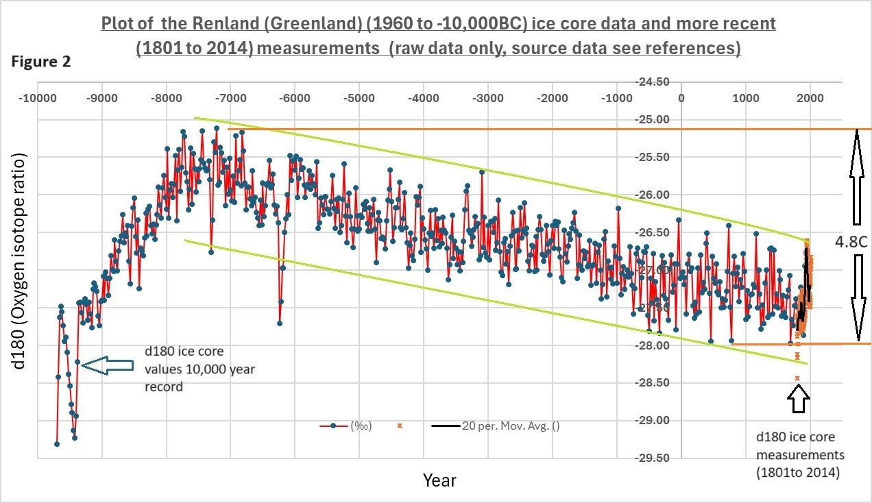
There seems to be a dearth of records that provide temperature proxies for recent times that are relevant to the sudden rise in carbon dioxide levels (1860 to current). However, I did locate data from two overlapping periods from Renland peninsula in Eastern Greenland. The two studies that reported the results from these ice core measurements had quite different themes. The first, which covered the period from 1960 to 10,000 BC, commented on the high temperatures in the Holocene period and the impact on the ice sheet. The second covering 1801 to 2014 examined local site variability. The creation of these datasets was a gargantuan effort. It remains a mystery why these papers did not comment on the temperature trends or indeed try and link the two datasets. Below is a graph combining these two isotope ratio data sets (Figure 2). The black line (far right) is the key as it is a 20 year rolling average of the more recent dataset (brown dots). The first dataset (blue dots) has data points every 20 years, so this rolling average enables a more valid comparison.
These data tell us we’re in one of the coldest spells in the approximately last 9,000 years. Was the only way up? Virtually all global records indicate a steady warming in recent times. I have added green lines to help visualise the ‘normal’ variation in the last 9,000 years. Clearly recent warming is within this normal variation.
I have added another graph (Figure 3) with linear trend lines to each of the datasets to demonstrate how important perspective is in assessing climate change. If we take the trend from 1801 to 2014 (purple dashed) and compare it with that from the last 10,000 years (green line) it seems alarming. But from the longer trend the reader can see that variation in both sets of data is quite normal.
There is also a serious lack of agreement between the Mann hockey stick graph (Figure 1) and these data. It should be borne in mind when making this comparison that the Mann graph attempted to reconstruct temperatures in the Northern Hemisphere whereas the data I have cited here are from a specific area of Eastern Greenland.
The next graph (Figure 4), focusing on the overlap period (1800 to 2014), provides the degree of validity of aligning these two datasets. There appears to be excellent correlation when comparing the black and red lines, implying the data are good proxies for temperature.
In summary, these data indicate there is no significant global warming signal coming from one of the most sensitive parts of the planet. Any warming may be latent, but this seems to be a bit of a stretch.
This absence of a signal could be explained by the fact that the relationship of carbon dioxide to global temperature is logarithmic and above a certain concentration there is minimal direct impact relative to solar cycles.
There are many climate scientists who have devoted their lives to saving mankind but unless these data are invalid, they need to return from the chill winds of the polar regions. Is it game over for the climate change scare narrative?
First published on Stephen’s Substack page. Subscribe here.


To join in with the discussion please make a donation to The Daily Sceptic.
Profanity and abuse will be removed and may lead to a permanent ban.
Truth v power.
Next time let’s remember there’s more of us than them and they’re terrified we’ll realise it.
It’ll spoil the cartoon, but I see ‘experts’ and politicians in lockstep, if not actually the ‘experts’ and the otherwise noisy types leading the elected representatives.
The problem is that impartial science is being politicized.