
In a previous article I highlighted how studying core non-respiratory mortality (NRM) trends, which have been very stable over the last 10 years or so, can provide a useful yardstick to measure any kind of extraordinary change that might occur.
Since the vaccine rollout there have indeed been radical changes to this metric, so as we approach the halfway mark of 2023 I thought an update was warranted. Unfortunately there is still no evidence of any real slowdown of this alarming development.
Here is a chart which shows what has been happening with raw non-respiratory mortality data during the four Covid years. The years are each displayed with 13 data-points of four-weekly (monthly) aggregated figures.
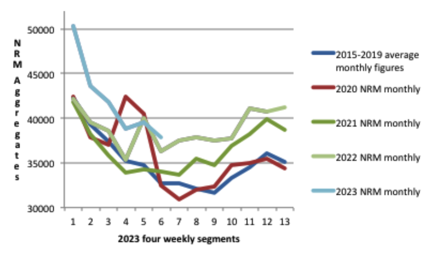
Each year appears to be worse than the previous one, and but for the still unexplained spike in non-respiratory deaths at the very beginning of the pandemic, 2020 would have been broadly similar to the 2015-2019 average. Something therefore happened in 2021 that changed the picture radically.
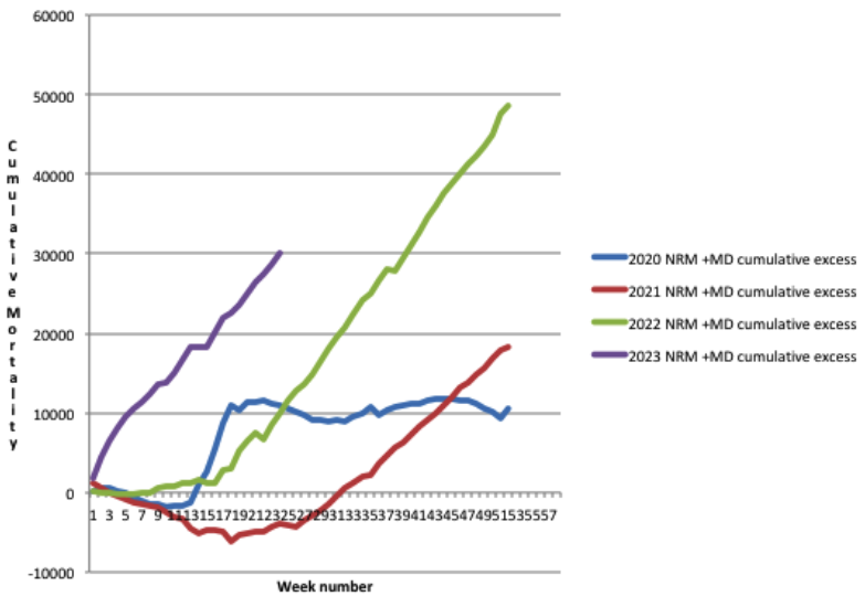
As all four Covid years are showing some excess non-respiratory deaths relative to the 2015-2019 average, the cumulative excess NRM can be displayed like this.
When looked at as a continuous curve with all four years shown consecutively, the chart then looks like this.
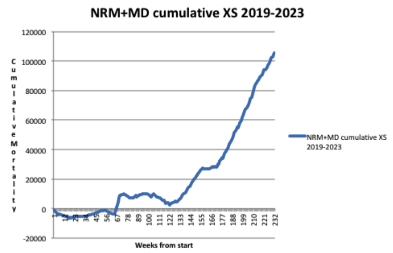
So, to summarise, the estimated total excess non-respiratory death toll now exceeds 100,000. Please note that in contrast to my previous article, this time I have already added the estimated mortality displacement (MD) into the cumulative figures for excess NRM. This reflects the fact that cumulative excess all-cause mortality through the Covid years (relative to the pre-Covid 2015-2019 average) stands now at just over 200,000. Mortality displacement lowers the expected number of deaths (so increases the excess) owing to deaths being brought forward in periods of higher mortality.
This is because even though adding in mortality displacement does not change the overall shape of the graphs, it displays more accurately the true picture of the scale of what has been going on with excess deaths in England and Wales. That a similar picture has occurred in many other countries around the world is illustrated by the recent Eugyppius article comparing excess deaths in Germany and Japan.
This chart shows just how stable the trend has been with non-respiratory mortality in the period from 2010 through 2020. The red line represents the 52-week moving average and the data are taken from the ONS weekly mortality reports for England & Wales.
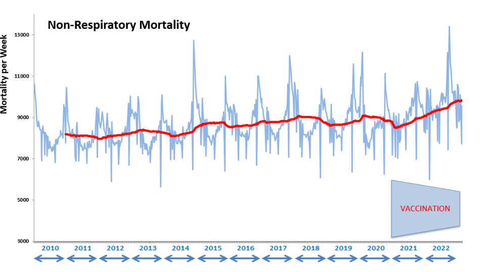
It can be clearly seen that there is a slight rising trend in the period from 2010 through 2020, consistent with a growing population of aged people in the U.K., then a much more abrupt change beginning in 2021.
Looking at multi-year trends in this way, rather than at more recent averages (like the five-year average favoured by the ONS in its mortality statistics for example), can mitigate against the effects of amortisation of a higher rate of mortality and thus normalisation of unwelcome new trends, as Nick Rendell pointed out in his recent article.
The chart also shows how the core mortality in the population typically follows seasonal patterns, rising in the winter and falling in the summer, and thus mimicking to a certain extent the patterns of mortality evident in the ebb and flow of the respiratory season.
Influenza-like illness is normally the main killer during these times, but evidence is mounting that there is a mutually antagonistic competition between rival respiratory pathogens. Thus the Covid years turned out to not be an exceptionally significant addition to overall respiratory mortality, because to some extent they just repressed the influenza deaths that would have occurred anyway.
There is though this strong correlation between the timing of respiratory deaths and core non-respiratory deaths. One could speculate that respiratory deaths, which vary in number each year, bring forward deaths from non-respiratory causes, and so a corresponding lull in these types of death follows naturally in the summer months.
So has Covid been so extraordinarily different from all the other respiratory diseases that we normally experience each year, and somehow increased the size of the winter non-respiratory mortality peaks, whilst also reducing the size of the normal summer lulls? Or is it perhaps something else entirely, as yet unexplained? As the catastrophe is still unfolding, answers are urgently required.
One glimmer of hope that all this will not be washed under the carpet is that mainstream media have begun to report on the heart death epidemic specifically, although at this stage the disturbingly large increase has been entirely attributed to such things as delayed diagnoses, reduced heart drug prescriptions and ambulance delays. Yet the elephant in the room is still never mentioned in polite company.


To join in with the discussion please make a donation to The Daily Sceptic.
Profanity and abuse will be removed and may lead to a permanent ban.
‘Yet the elephant in the room is still never mentioned in polite company’
At New Year 20/21 the grim jabbers went storming into care-homes up and down England to deliver the life-protecting jab to the main (in fact, the only) covid-vulnerable group, the extreme elderly and infirm. One of the care-homes was in central Bedford, where my 90-year-old mother died 2 days after they jabbed her. For several days at this time, before the curtain was brought down, spates of care-home deaths made the local news and TV reports all over England. During the next 3 months, 25,000 elderly and infirm people in England died right after receiving the jab that was supposed to protect them and deliver us all from the menace of covid. Hancock et al blamed the massacre on the ‘2nd wave’. Yet, just as they knew the 1st wave was due to midazolam, desertion and intubation, they knew the 2nd was due to the jabs. The purpose of both was to set up and push through the jab scam, one of the great sordid crimes of history, disgracing mankind.
Yes indeed. The explanation for the early 2021 deaths is clearly the jab. It was rolled out two weeks late and peak deaths, normally around 6th January were exactly two weeks later. See attached.
This possibly indicates a deliberate attempt to hide excess deaths behind a seasonal trend enhanced by covid.
See also the ‘excess’ prescriptions of midazolam correlating with excess deaths from 2020 onwards. Peak deaths come consistently two weeks later. And midazolam is increasingly being prescribed.
Some people say, “Of course, it is an end-of-life drug.” Not exactly. It is a drug used when end-of-life is expected or, dare I say, intended. Correct me if I am wrong, but the prescription of midazolam for respiratory illness seems inappropriate.
The prescription of Midazolam for respiratory illness is euthanasia, or murder if you prefer plainer speaking.
By the way, this is the same chart from 2018-2019, which is as far back as the data goes. It shows that there is not the correlation that we see since the hoax pandemic. For example, any hump over winter 2018-2019?
14 elderly people died in a home soon after vaccination in Sidmouth, down our way. The police investigated the poor care home staff for six months, but nobody ever investigated the vaccine.
Orders were issued from Hancock’s office that jab status was to be omitted from death certificates. Yet isn’t it the first thing you would want to know if you were rolling out a novel treatment? The same thing happened everywhere in the world. No data was allowed that might compromise the jabs. When Dr Claire Craig and I made FOI requests in Feb-21, we were told, – by the NHS, by our MPs, and by Sarah Caul (responsible for death statistics at the ONS) – that the information simply was not available.
All these nasty little clones of Fauci were no doubt leaked from the same military laboratory.
Amazingly I learned the other day from a link kindly posted here that assessment of vaccine safety and effectiveness does not routinely include looking at the long term impact on all cause mortality between the vaccinated and the control group.
Of course with the “Covid vaccines” the control group were given the “vaccine” after 4 months of the trial so the whole thing is worthless anyway.
“Public health”.
This is my chart of the excess mortality in England and Wales (based on a 4 weekly running average to reduce bank holiday reporting issue effects). It uses the ONS weekly all cause mortality data (up to week 24 of 2023) based on the post 2020 age groupings that they use.
It’s constrained by the data available for these narrow age bands to comparing against the 2015-2019 average.
It allows for:
Population size: by adjusting to per million deaths, and
Population ageing: by banding by age and
Mortality improvement trends: see the black dotted line which is the ONS medium term assumption (1.2%pa) for all age groups up to age 90, ignore this line in the 90+ age group. When I checked, that mortality improvement assumption is quite accurate when looking at historical trends up to 2019.
So this is about as fair a compare as you can do.
It is hard to pick out individual age bands. But the older age groups are all solid lines, and the middle age groups dashed lines, and the younger age groups dotted lines. So the idea is that you are looking at the overall picture.
The chart output speaks for itself. I’ll let you judge or comment to keep this post short.
Here is the same chart but untruncated. The previous chart was truncated so you could see what was going on currently
And here is the same excess mortality by age band but this time aggregated into calendar year figures (rather than a 4 week running average). Note some calendar year excesses mask differing effects in different parts of the year in particular in 2022 (so see the earlier chart to see how that calendar year excess derives for any particular figure)
These bars don’t allow for the 1.2%pa improvement mentioned earlier, if we were allow for that you can add on an extra roughly 6% (1.2% x 5) excess mortality for 2023 in every age group. Adding that lack of improvement in means positive excess mortality in all age groups in 2023
The consistently high excesses (even before adding in the trend mortality improvements that haven’t happened) in the middle age groups is particularly noticeable.
In the 30-34 age group there was actually no excess in 2020 but around 14% excess mortality in 2021-2023; how much of those excesses was caused by the experimental vaccines?
Thanks Freecumbria.
This is a table of deaths by age group over the last full year. 66,535 actual excess deaths representing a 12.5% increase above average 2010-2019 and 2.6% increase above maximum 2010-2019.
For some reason, the 74-79 age group has had a large excess throughout the year. Over the last three weeks, deaths in the 10-19 age group are greatly increased – 89 instead of the average of 63. This is a group that has near-zero risks from covid.
This is an interesting and informative article, pertaining to the blood work of Swiss banker Pascal Najadi, and it covers how the spike protein is still being produced in people 2 years after their last jab, increased cancer risks, DNA integration, amongst other things. It’s in French but there’s a letter by Prof Bhakdi in English with his assessment;
Spike protein DNA integration may explain that the effects are not immediate after vaccination but develop over time. Some scientists thus link the excess mortality observed in 2022 in all vaccinated countries with a permanent production of peak protein. An analysis by Jarle Aarstad goes in this direction and demonstrates a worrying correlation: for each percent of vaccination rate, we observe +0.1% excess mortality the following year.”
https://www.covidhub.ch/vaccines-produisent-proteine-spike-apres-2-ans/
So possibly then DNA is altered in either a future mom or dad , which means even if they have a baby with an un jabbed partner the child will be genetically modified in some way. Eventually due to the amount of Jabs people took all future babies will be affected ! Job Done !!..( After thought – this will affect mostly white people of European descent )
It was not unpredictable either, as it’s long been believed believed (rightly or wrongly) that a large portion of our genome was produced by reverse transcription of RNA viruses in the distant past. It may be a rare event, but if the evolutionary biologists are right then once it does it can easily spread through the entire human population.
And if you keep injecting most of the world with RNA that’s taken up thoughout the body, it will certainly happen, and soon.
“But we didn’t know anything about the virus at the beginning,” squawked the parrot to the Inquiry.
Yes the inquiry that’s not an inquiry ! Mmm, that sounds familiar ! Oh yes that’s it I’ve got it – The vaccine that’s not a vaccine , Dirty Dirty murdering & maiming Barsturds !!!…
Here are some other possible mating partners in the future: The Amish in the US (approximately 370,000) do not vaccinate, though they do suffer some genetic problems from inbreeding. What about Travelers in the UK? Were they able to avoid the jabs? What about the people who somehow managed to get all 5 jabs with the 30% of doses in the EU that supposedly were placebos?
Yes, I too wondered if the placebo people were the lucky ones. Except that most will since have had boosters from other batches.
If you want some light reading which explains further how and why mRNA jabs adversely affect (including CVE’s) the immune system –
https://doorlesscarp953.substack.com/p/walkthrough-mrna-vaccine-or-gene?utm_source=post-email-title&publication_id=650045&post_id=132207223&isFreemail=true&utm_medium=email
And this paper – calls for research to be done into the “serious adverse events of special interest” following the mRNA jab –
https://www.ncbi.nlm.nih.gov/pmc/articles/PMC9428332/
Shockingly, or maybe not, it’s over 9 months old.