A nurse friend who did not want to hear when I first questioned Covid jab safety two years ago is now furious about having been bludgeoned by the NHS into having three shots. She survived the first two but had massive bleeding after the third. Looking more deeply into the data, she found to her horror that the ‘safe and effective’ claim is completely unfounded.
I suspect there are hundreds of thousands of other healthcare workers feeling the same sense of betrayal, and that this is contributing in a major way to the current staffing crisis.
My friend’s experience is exactly in line with new figures from Australia showing a dramatic dose-response relationship between the number of jabs and the risk of having to go into hospital with Covid or dying from it.
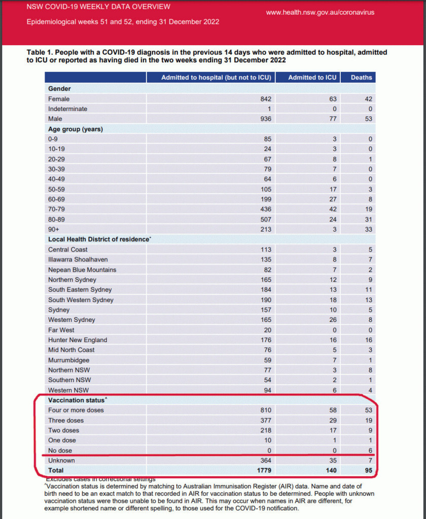
The New South Wales (NSW) data, for the two weeks ending December 31st, are a rarity in that they include vaccination status.

Out of 1,415 hospitalised patients where this status was known, 10 had received a single dose, 218 two doses, 377 three doses and 810 four doses. There were zero hospital admissions for Covid among the unvaccinated, who comprise 13% of the NSW population.
Deaths followed a similar pattern except that six unvaccinated people were reported as having died of Covid. None were in hospital, raising the possibility that their diagnosis was assumed rather than confirmed.
Only one patient died who had received a single jab. Nine deaths were in those who had received two doses, and 19 in the triple-jabbed. The figure then shot up to 53 in those who had four shots.
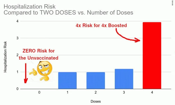
Businessman and mathematician Igor Chudov, reporting here on the NSW findings, acknowledges that the figures will be skewed by differences in how many people have had the different number of shots. After adjusting for those differences, however, he finds that the four-times-jabbed have a four times increased risk of hospitalisation compared with those who had two shots.

While some of this may be further explained by age differences, with older people being given more shots, Chudov concludes that the data show the Covid vaccines to be an “utter failure”.
He notes that a year ago, the NSW health minister Brad Hazzard declared: “There is no question that we will not get out of this pandemic without a very substantial portion of our population being vaccinated.”
That “substantial portion” – 84.3% – has been achieved. But even in Australia’s mid-summer, the country is in the middle of another Covid wave. And it is the unvaccinated who are at zero risk of being ill enough to have to go into hospital, in NSW at least.
Further evidence of the failure of the vaccine drive, Chudov notes, is that deaths overall in Australia are running at about a fifth higher than usual.
What awaits Australia in 2023? We do not know, and Covid proved everyone’s past predictions wrong. I cannot see how these endless waves of Covid will end when people’s immunity worldwide is unset by reckless vaccinations [see here].
The only thing I know is that if you find yourself in a hole, stop digging. I hope that Australians will soon stop taking Covid vaccines.
They will not be helped in that by the NSW health authority, which has decided to drop vaccination status from its weekly reports, as from December 31st.
It says the data were included from 2021, when vaccines were first rolled out, “to monitor trends in the relationship between vaccination and outcomes”. But now most of the population have received at least two jabs, and with timing differences between booster doses, “the trends between vaccines and outcomes cannot be interpreted”.
A similar, convenient inability to interpret unfavourable data has occurred in the U.K., as pointed out last month in a detailed analysis by Amanuensis, pen-name for an ex-academic and senior government adviser who contributes regularly to the Daily Sceptic. He or she wrote:
It wasn’t until early September 2021 that the UKHSA [U.K. Health Security Agency] started to include actual vaccine surveillance data in the Vaccine Surveillance Report. I’ve often wondered why it started to offer these data, as even in that September report the data didn’t support the “vaccines are good” narrative.
My favourite theory is that someone in authority, ignorant of the complexities of the immune system (that’s the vast majority of those in authority, if not all of them), demanded that the data be included to show the population how well the vaccines were bound to be performing.
The data first presented were troubling, showing higher rates of Covid in the vaccinated than in the unvaccinated for those aged over 40. The UKHSA included a small paragraph “to remind readers that you mustn’t simply look at the data and infer how well the vaccines are doing”.
However, data based on population-wide testing tend to at least offer a strong indication of what is really going on. The real-world data… were highly suggestive of a problem that should have been prioritised for rigorous investigation, not explained away with the flick of a pen.
Six reports later, the situation had deteriorated, with rates in the vaccinated higher than in the unvaccinated for all those aged over 30, and much higher rates for those aged 40-60.
The agency stopped publishing “helpful” charts, presumably because they made it too easy to interpret how bad things were getting, Amanuensis says.
They continued to publish raw data for a while, but with ever more text on the dangers of interpreting the figures ‘at face value’, and eventually a stern warning that the data should not be used to estimate vaccine effectiveness.
The last set of data on infection rates strongly suggested that the vaccines were significantly increasing the risk of infection with Covid. Of course, the UKHSA was keen to suggest that the differences seen between vaccinated and unvaccinated infection rates were actually due to… well, anything that they could think of that wasn’t the vaccines…
The UKHSA authors were right to point out some potential reasons for the very high incidence of Covid in the vaccinated population, but they left one potential reason out: that they had used a poorly tested vaccine that might have resulted in an increase in the risk of infection.
To include this potential reason would have been supported by prior research into candidate vaccines for coronaviruses (including SARS and MERS). Alas, we’ve gone far beyond the realms of ‘trust the science’ and it is clear that no one in authority is allowed to even whisper the potential for the vaccines to have made things worse.
We’re now nine months from that last table of real world data on Covid infection by vaccination status, and in the meantime studies from around the world continue to suggest that the vaccines increase the risk of Covid infection.
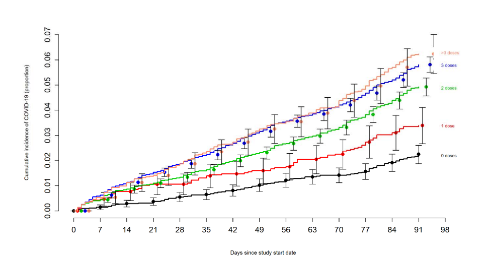
The most recent, from the U.S. state of Ohio, showed disease risk significantly correlated with number of vaccine doses given. Health workers who received three shots were approximately three times more likely to get infected with the Omicron variant, compared with the unvaccinated.

Amanuensis writes:
Perhaps if the UKHSA had been more interested in having an open mind compared with its ‘it’s anything but the vaccines’ attitude towards the data it presented there might have been more caution taken with the vaccine rollout. As a consequence we might currently be seeing far fewer than one in 20 of the population concurrently infected with Covid.
One glimmer of hope: my nurse friend says that whereas everyone at her hospital was bullied into receiving booster doses up to the third shot, the pressure has now stopped over fourth doses and beyond. At least hospital staff, it seems, are recognising the real-world data that regulators still wish to hide.
Neville Hodgkinson is a former medical and science correspondent at the Sunday Times. This article was first published by TCW Defending Freedom.


To join in with the discussion please make a donation to The Daily Sceptic.
Profanity and abuse will be removed and may lead to a permanent ban.
“The New South Wales (NSW) data, for the two weeks ending December 31st, are a rarity in that they include vaccination status.” They’ll adjust that, a cynic might say – but it’s looking as if the posters advertising the new drug were blatant lies.
This is no coincidence of course. Official NSW data from Asutralia show literally zero covid in all categories for those that did not receive any dose, back in the days called as “unvaccinated” and nowadays “blessed”. This set of real life data out of millions, is really sick. Check it for yourself.
https://app.powerbi.com/view?r=eyJrIjoiODQ4NTg4OGUtNWU5ZS00MjQ3LWJmODgtNzI1N2RmOWY3N2Y3IiwidCI6IjZmMGU5YzQyLTk2Y2UtNDU1MS05NzAxLWJhMzFkMGQ2ZDE5ZSJ9&pageName=ReportSection1c3fdc161d4008c845a6
Wow, talk about negative efficacy! Looks like the unjabbed got herd immunity the natural way a while ago, while the jabbed, and especially the boosted, seem to be stuck in perpetual limbo that gets worse with each jab.
Fascinating chart but aside useful to see what Power BI can do. Pulled out a couple. This one shows that 4 dose much higher risk of hospitalisation?
And this appears to show that any vax not doing much overall with deaths?
I hate to gloat but….
As an aside, but pertaining to the Australian data, Arkmedic has made a worrying observation and draws parallels to Harold Shipman;
“I think you’ll agree that there is no way that there should be 7x more deaths than hospitalisations in the unvaccinated group given that the corresponding ratio for two dose, three dose and four dose vaccinated are all less than 0.1 and really not much different from each other. In fact anybody that has been paying attention will know that the authorities have told you that “two doses is not enough” and “get your booster” (because two doses is not enough) and so it is not possible that this could be the ratio for unvaccinated folk.
Which brings us to a very dark conclusion on which I will end:
https://arkmedic.substack.com/p/the-shipman-line
Ah, so murder on a mass scale or depopulation.
I’m shocked
(For those who know, apologies for taking the P.)
The headline doesn’t match the conclusions of Chudov and the study’s findings. We need to know what percentage of the really olds received the 3 or 4 jabs. If they received a high percentage, then the jabs were merely ineffective and the old people died past their life expectancy anyway. Presuming that the authorities just counted the unvaxxed who died at home as covid deaths seems likely, so that number seems suspect.
Didn’t mean to sound callous about the elderly deaths. The aged are more susceptible to dying from flu, pneumonia, falls, etc., and covid of course than younger people. Were the few unvaxxed who died turned away at the hospital, told to get the jab as a condition or treatment, or did the attending doctor just put down covid on the death certificate? And again, knowing the ages of the multi-jabbed would help us understand the facts better.
“f you find yourself in a hole, stop digging“. I would be more inclined to use the spade to b€@t the living cr@p out of the people who made me to dig the hole, telling me all the while that it was safe and effective.
“Dramatic Figures Link More Covid Jabs With More Covid.”
What we on here call a …
‘No shit Sherlock’ headline.
No offence to Neville Hodgkinson who has put out excellent work throughout the Scamdemic.
Isn’t this most likely due to the suppression of the IgG3 anti-inflammatory antibody and promotion of the IgG4 pro-inflammatory antibody? To quote Coffee & COVID:
Greetings Sceptics , I’m still here just double busy atm , Anyway HOW is the lid being kept on the Jabbing disaster & added to that Krankie rears her head with calls to mask up again !
But The Daily Telegraph’s science editor Sarah Knapton in last Saturday’s edition informed us that the evidence does not show a risk.of vaccines overriding benefits? Surely she can’t be lying or wrong?