Earlier this week, the price on gas contracts in Europe went briefly negative. It was obvious this was a bubble, and a dive into the justifications for negative prices shows the whole thing was based on market speculation. I wrote an article for UnHerd noting that false signals like these were extremely dangerous because they breed complacency about the energy crisis.
Right on cue, articles are coming out telling us the crisis is over. The Financial Times journalist Chris Giles is ahead of the pack with a piece titled ‘The End of Europe’s Energy Crisis is in Sight’. When I read the title I groaned and expected Giles to make the case that the negative price in the market earlier in the week was a real market signal and not a wanton speculative excess.
Thankfully, he does not go in this direction. Instead, he claims that “it occurred because liquefied natural gas supplies keep arriving in Europe when storage facilities are effectively full”. What he fails to mention is that our lack of capacity to process massive amounts of LNG puts our energy supply at risk this winter, but no matter.
Giles goes on to mention the sabotage of the Nord Stream pipeline, noting that analysts expected this to harm European energy markets: many, he claims, thought it would cause the price of gas to shoot up. This is untrue – at least for serious analysts. When Nord Stream was sabotaged, it was operating at basically zero capacity. Low gas supply was already ‘priced in’.
Giles then waxes lyrical that the German economy has not yet collapsed, as many predicted. But of course, those predicting negative outcomes for German industry foresaw them coming by the end of winter, not the middle of autumn. According to my calendar, winter does not start for another two months.
Then Giles introduces an argument with some substance. He cites what he calls a consultancy – but which is actually a green energy lobbying group called Ember – and makes the case that renewables have been used in place of gas for electricity generation.
Dirty coal and clean renewables have been used to substitute for gas in electricity generation. Analysis by Ember, a consultancy, has found that there was a record year-on-year increase in solar and wind electricity generation across the EU between March and September.
Okay, this is a substantial claim. If wind and solar can be brought online quickly enough to replace large amounts of Russian gas, then Giles may be onto something. The Ember briefing paper makes specific quantitative claims in this regard:
Based on the average EU benchmark TTF Day Ahead gas price for March to September 2022, this additional gas would have cost the EU €99 billion. The year-on-year increase in wind and solar generation resulted in 8 bcm of gas savings, making up €11 bn in avoided gas costs.
Here we go: the increase in renewables apparently produced 8bcm (billion cubic meters) in gas savings. Let’s take this at face value. How much Russian gas did it replace?
Bruegel data tells us that Russian gas supply from March to September 2021 was around 80bcm. This fell to around 42bcm in 2022, a shortfall of around 38.5bcm. If Ember are correct, renewables managed to replace nearly 21% of this in 2022. And if we continue to shut off Russian gas next year, they’ll replace around 10% of the shortfall. These numbers are not to be sniffed at, but they’re not the gamechangers Ember or Giles make them out to be. If this is substitution, it is modest substitution.
But are the Ember numbers correct? Any statistician should look at them with suspicion. Why? Electricity generation fluctuates from year to year. Just because it increased between 2021 and 2022 does not mean that some revolution took place. The fluctuation could have been random. This is where Giles’s claim – based on Ember’s paper – comes in. He writes about a “record year-on-year increase”. Specifically, Ember cites a 13% year-on-year increase as being one for the record books:
In total, wind (192 TWh) and solar (153 TWh) generated 345 TWh of electricity across the EU from March to September this year — a record year-on-year increase of 39 TWh or 13%.
Well, we can check this because Eurostat publishes the numbers. Here are the year-on-year increases in renewables (wind and solar) usage in EU electricity generation.
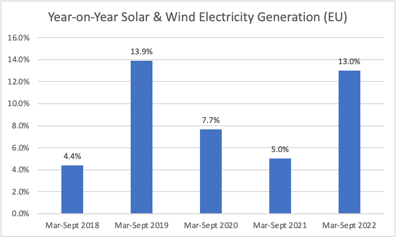
Here we immediately see that the Ember claim is false. In March-September 2019, wind and solar usage increased around 14% – higher than the 13% increase it cites this year. Note that this is with only five years of data – a miniscule sample – making its grandiose claims even more difficult to take seriously. But even if it hadn’t flubbed the numbers, 13% just isn’t that much. The average growth rate between 2018 and 2021 was 7.7%. A 13% increase is high, but not stunningly so. To see real substitution at work we would probably wanted to have seen a 50% increase or something in that ballpark.
Finally, Giles says the market will sort out the rest of the problem by ramping up LNG capacity. He cites no data in this regard – the market just does things like that, or something. I have explained what would be required of the LNG market to replace Russian gas in a Twitter thread here, so readers can refer to that. In summary: LNG is almost certainly not going to replace Russian gas anytime soon. This is obvious if you take a serious look at the numbers.
We all know what is going on here. Since the war started in February, many journalists have seen their role as cheerleaders. They have strong feelings about the war and so they want to minimise the potential downsides. Many predicted sanctions would crush the Russian economy. They didn’t. Instead, we got a serious energy crisis in Europe. Now the game is to ‘prove’ that this crisis does not exist. Or, at the very least, to try to downplay its severity and map out a path forward.
Let me try to appeal to these people’s own interests. If we continue to get policy in Europe wrong, Europe will become weaker relative to Russia. It will become poorer and unable to send arms to Ukraine. This is obvious. So if you are in a position to influence economic policy, your wartime duty, as it were, is to ensure that policymakers and businesspeople have a solid grasp of the actual problems – so they can deal with them effectively. If journalists try to find the best ‘spin’ to put on the problems, rather than helping us face them head on, they will weaken Europe and strengthen Russia.
I have no idea why people cannot grasp these obvious points. Although I suspect it has something to do with the dark powers wielded over them by the little blue bird.
Philip Pilkington is a macroeconomist and investment professional. You can follow him on Twitter here and subscribe to his Substack newsletter here.


To join in with the discussion please make a donation to The Daily Sceptic.
Profanity and abuse will be removed and may lead to a permanent ban.
£££s
Exactly; and € & $ into the future. It’s a long term investment in the trade, quite likely. Not only that, were the recorded deaths caused by Covid-19, or “with” it, in tandem with other illnesses?
Indeed- a new business model of rapid development and rollout based on the same dodgy basic platform
I also think we cannot trust any statistic on “Covid deaths”
Was the bigger motivation not something to do with vaccine passes, digital ID and CBDCs – ie a step on the road towards a social credit system and the ability to control people’s travel, expenditure and behaviour? And possibly also getting universal acceptance of the mRNA platform, maybe with a view to depopulation and transhumanism agendas? Or maybe trying to eliminate control groups for the vaccines by minimising the number of people unvaccinated?
Probably played a part
Different groups with varied agendas all had something to gain
And perhaps the avoidance of traditional assessment methods for brand new drugs. Originally on the basis that we were in an Emergency (Emergency Use Authorization), along with “vaccines” having an easier ride than anything else. Then, when minor alterations were developed on a new “platform” they might make a better profit on each occasion when a new demand occurs.
I wonder how many of those 162 had multiple comorbidities? My guess would be 162.
What’s the definition of a comorbidity? If it is a compromised immune system, then vaccination will soon become a comorbidity.
does anyone have an article i could share about the danger of the ‘vaccine’ for those with autoimmune diseases ? no one will listen to me and they are going downhill with every shot . thank you.
The key point here is the with COVID. This means it uses the usual definition of COVID death, someone died within X days of having a positive test result. This probably includes suicides, car accidents, mobsters discussing business issues with rivals and people getting mauled by lions.
Why, you ask? Altogether now…. Because-because-because-because-becaaaaaaause…. Because of the wonderful profits it makes!
Go ask the man behind the curtain.
Example- a man mending his roof, slips and falls and breaks his neck! It was found he had tested positive for covid a week ago, so, Death caused by covid!
‘Vaccine’ from drowning in a swimming pool, ‘vaccine’ from dying in a road traffic accident, ‘vaccine’ from being killed by an accidental injury… I can see huge business opportunity. Sheeple will unquestionably follow ‘the science’ unable to see the BS as proven by the recent events.
And the best ‘vaccine’ of all , is the ultimate protection – simply obey every single instruction uttered by Your Government and you will be safe, happy and healthy 4eva
Yes, the Government, in the famous words of Assange, exists to move public money into the private hands.
It is interesting to compare these figures with ONS figures for England & Wales.
We are obliged to use the ‘death with covid’ category – within 28 days of a positive PCR test. These include deaths with pre-existing conditions (e.g. heart failure) and co-morbidities (e.g. fatal accident)
The figures corresponding to Italy’s 162/72,422 (0.2%) are 436/80,830 (0.5%).
The ONS figures have been publicly available since January 2022!
Does this mean we carried out far more tests than Italy meaning that over twice the number of people dying from something else had a positive test result prior to their death?
I don’t know – but that could be an answer. After all, without PCR tests, what would have evidenced a ‘pandemic’?
I have written before that a simple comparison of 2020 all-cause mortality charts against earlier years shows significant increases in deaths around March/April 2020 in certain European countries (e.g. France, Italy, Sweden, Switzerland, UK), whereas in others there was no such increase at all (e.g. Austria, Germany, Romania, Slovenia).
I therefore conclude there was neither a global pandemic at the time, nor was a novel, deadly disease circulating in Europe: a novel, deadly disease would, after all, cause excess deaths in all neighbouring countries.
I can only assume that the excess deaths in those countries with increased mortality were purely iatrogenic, caused by the strict adhesion to WHO-prescribed treatments, which were not so strictly adhered to in other countries. Or does someone have a better explanation for the discrepancies between neighbouring countries?
I quote again Denis Rancourt (https://denisrancourt.ca/), whose team performed in-depth analyses of all-cause mortality data spanning many countries of the world:
Why? Italy was the control country in the west in order for the Western RPTB to see how much control they could exert through fear. Absolutely nothing to do with a deadly pathogen at all.
History shows 20% of us can think critically but sadly the rest can be controlled, “nudged” is I believe the new term, for simply being lied to. Bravo to those controlling the MSM.
Control of every human being on the planet is what they’re after, because they’ve known for 20 years that the capitalist/USA/banking system is finished – hence we have Climate/wokeism/deadly new virus etc.
Putin knows this full well – and China is pissing itself laughing at us all.
Just as an aside, read up on the real reasons WW 2 began – and it ain’t Germany invading Poland…
I do not agree that it reasonable for national statistics to take so long to publish. Data should be monitored continuously and it should normally be right in the first place.
private businesses have to produce accurate date promptly for tge tax man, shareholders and Companies House. Financial services businesses also have to file quarterly data to FCA and PRU.
as usual the public sector is not on top of the roles they are generously paid to do.
Why the pic of the motorbike helmet? As a rider I find that suggestive, distracting and, dare I, offensive.