And just like that, 20,000 fewer people died unexpectedly last year, according to the Office for National Statistics. Which is handy for a Government refusing to investigate the excess deaths crisis.
Okay, so we haven’t quite reached North Korean levels of data meddling and history editing. But this does not seem far off.
Under a new methodology, unveiled on Tuesday, the ONS cut excess deaths in 2023 from 31,442 to 10,994 – a 65% drop. This isn’t because the ONS officials suddenly discovered that all these people are actually still alive. The number of people who died last year hasn’t changed. What’s changed is the baseline for determining how many deaths you should expect to happen in a given week, and thus how many that actually occurred are in excess of that baseline.
Previously the ONS used a straightforward five-year baseline, meaning that the expected figure for a given week was simply the average number of deaths in that week in the previous five years (an exception was made following the pandemic, when the ONS dropped 2020 from its five-year averages due to its high death toll).
This simple if crude method is now to be replaced with a complicated model that tries to guesstimate how many deaths you should expect after taking into account factors like the age and size of the population.
Here is what the model looks like as an equation, where each part (i.e., each sigma Σ symbol) stands for a factor that the model is trying to account for:
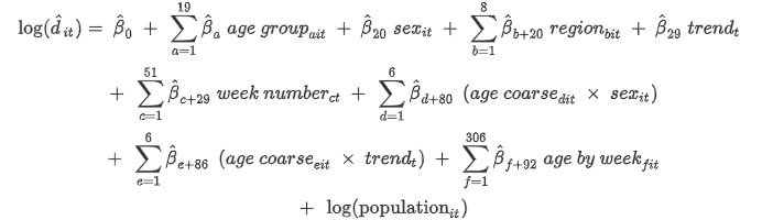
Not exactly comprehensible to your average politician, journalist, medic or researcher. Indeed, even Professor Carl Heneghan and Dr. Tom Jefferson have confessed that they “do not fully understand the ONS’s new model”.
But is it an improvement?
It comes with an apparent endorsement from Dr. Jason Oke, Senior Statistician at Oxford University’s Medical Statistics Group and a long-time collaborator of Drs. Heneghan and Jefferson. Dr. Oke said:
The excess death statistic rose from relative obscurity to prominence during the pandemic, putting it firmly in the public consciousness.
This, however, also exposed the flaws in the way it had been calculated – using historic averages, taking no account of prevailing trends or changes in the population.
As a result, excess deaths were overestimated before, during and after the pandemic.
Cambridge Emeritus Professor of Statistics Sir David Spiegelhalter was full of praise, calling it a “world-leading methodology, setting an appropriately high standard for national statistics”.
So should we, like these eminent statisticians, welcome the change?
The heavy use of modelling naturally makes anyone who’s been following data in the pandemic highly suspicious. Mathematical models are, by their nature, highly dependent on the assumptions, parameters and inputs their creators feed into them. But perhaps this one is different. Let’s see.
The ONS team has recalculated excess death estimates back to 2011 – the table is shown below. Believe it or not, 2023’s cut of more than 20,000 deaths is not the biggest change, not even close. 2016 was down by over 22,000, 2017 by 21,000, 2018 by over 24,000 and 2019 by – wait for it – over 40,000 deaths. On the face of it it’s hard to credit the claim that the old 2019 baseline was out by more than 40,000 deaths. But let’s continue.
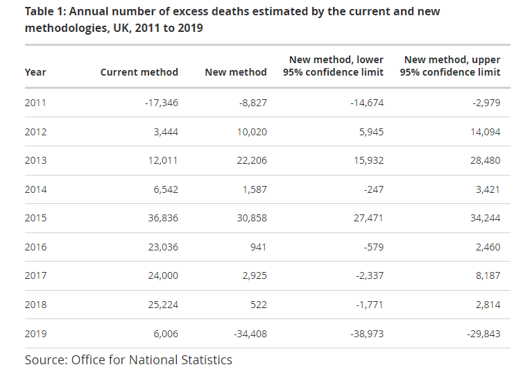
We should put the changes in context. The U.K. sees about 600,000 deaths a year, so a change of 20,000 is in the region of 3% and a change of 40,000 is around 7%. Not huge in relative terms. But equally, 20,000 or 40,000 is not a small number of deaths and can make the difference between a crisis and an ordinary year.
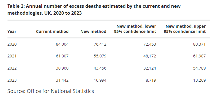
The changes are hugely variable. The years 2011-2013 see small increases in their excess deaths, yet 2016-19 see massive cuts. Then, in the pandemic years, the numbers suddenly stop moving around and stay largely the same (see table below) – which is, again, somewhat handy for the Government as it means it doesn’t need to revise down its scary pandemic death toll by very much.
This raises a key question: why did the underlying population trends that caused the 2019 figure to drop by over 40,000 abruptly (and temporarily) come to an end, so that the 2020 figure drops by just 8,000? Call me cynical, but that’s a big and convenient difference from one year to the next.
The ONS article explaining the change in methodology is helpfully detailed and informative. It anticipates people wondering what’s behind these huge changes and tries to give an answer. Here’s the ONS’s chart of how population size, age and mortality rate – the key variables in the model – have shifted since 2006.
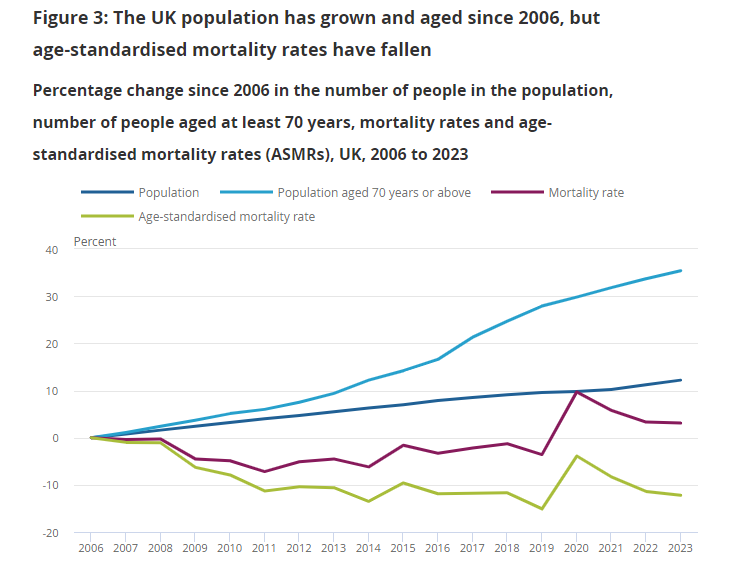
Here we see a steadily increasing population (driven largely by immigration over this period) and a more sharply increasing share of the population aged over 70 – the latter growing by 35% between 2006 and 2023. Note this is a percentage increase since 2006; it does not mean that 35% of the population was over 70 in 2023. In absolute terms the U.K. over-70 population was 11.5% in 2006 and 13.8% in 2023, growing by 2.3 percentage points.
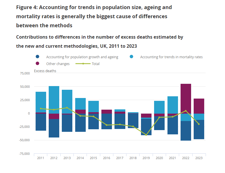
The ONS team explains that in the new model, the ageing and growth of the population counteracts a fall in background mortality rates to produce an overall change in the baseline and excess deaths. The chart below shows the contribution that each factor in the ONS model makes to the changes in excess deaths compared to the current system. The green line shows what this means for the resulting numbers of excess deaths each year.
Here’s the ONS’s explanation of what’s going on:
The U.K. population grew by 12.2% between 2006 and 2023… from 60.8 million to 68.3 million (Figure 3). All else being equal, having more people in the population each year means we can expect more deaths to occur. Furthermore, people aged at least 70 years, the group in which most deaths occur each year, made up an increasing share of the U.K. population (from 11.5% in 2006 to 13.8% in 2023), with the size of this group growing by 35.4% over the period.
Conversely, mortality rates have been decreasing over time. The age-standardised mortality rates (ASMRs) among the U.K. population generally decreased from 2006 to 2011, before levelling off from 2012 to 2018 and dropping again in 2019 (before the start of the pandemic).
These increasing trends in population size and ageing, and the generally decreasing trend in mortality rates, are not accounted for by the current methodology for estimating excess deaths. However, they are reflected in the new methodology.
Interestingly, although the 2023 figure was cut by around 20,500, the 2022 figure actually went up by around 4,500. The 2020 and 2021 figures, on the other hand, were down by around 7,500 and 7,000 respectively. Again, quite a bit of jumping around.
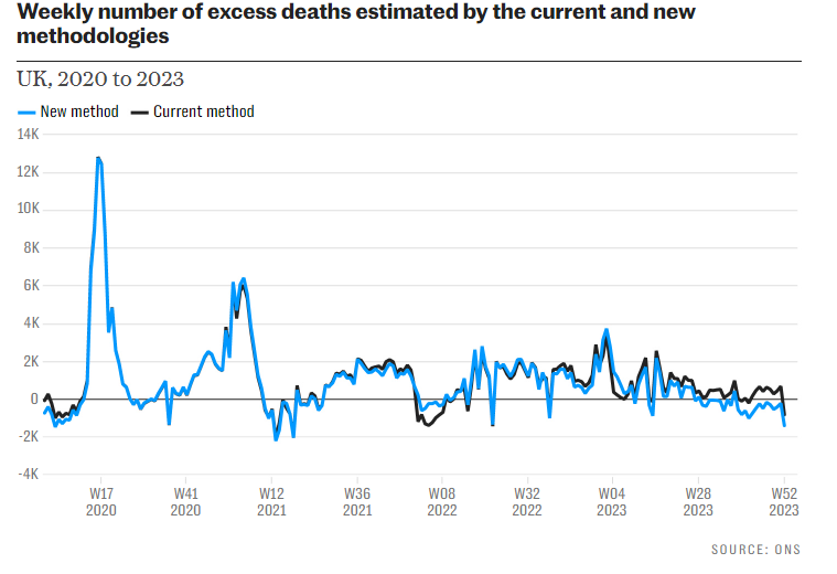
The chart below compares the new and current excess death estimates since the arrival of Covid. It shows that since the second half of 2023 the new estimate has been progressively dropping compared to the current estimate, so much so that an excess has become a deficit. Great news – the excess deaths crisis is over! The Government will be pleased.
While the new methodology certainly looks and sounds sophisticated, taking a step back it’s hard to make any real sense out of it. The changes it has wrought in the excess death figures – represented by the green line in Figure 4 above – are all over the place.
In Figure 3 we saw that the rises in both the general population and the over-70 population since 2006 have been steady; they don’t jump around. Why then do these steady demographic changes result in a jagged and jumping green line of excess death shifts? Why is 2015 adjusted down by 6,000 and 2016 by 23,000? Why is 2018 adjusted by 25,000, 2019 by 40,000 and 2020 by 7,500? These wildly diverging differences from one year to the next make no obvious sense when the underlying population dynamics move only steadily and slowly.
Heneghan and Jefferson in the Telegraph agree that there’s “something fishy about the ONS’s excess death figures”. They note that “while the difference in the total number of recorded deaths between 2020 and 2023 is 27,629, for example, the difference in excess deaths between these years is more than double at 65,418, suggesting that something is amiss with the new estimates”.
They also highlight that for 2022 and 2023, according to the ONS, “by far the biggest contributors to the changed figures are lumped together under the category of ‘other changes’. Quite what’s in this bucket of changes isn’t totally clear, although some of it is to do with the treatment of 2020 data”.
As ever with complex models like this it’s hard to get to the bottom of what exactly is going on, and hence why the model is spewing out such counterintuitive results. But with a string of apparently implausible outputs, it’s reasonable to suspect that the inputs may be faulty. I am wary in particular of the model’s reliance on age-standardised mortality rates (ASMR) and the European Standard Population which I, like statistics expert Professor Norman Fenton, am not convinced are reliable tools for adjusting data.
A further problem is that, despite its complexity, the model fails to take into account one of the biggest factors in play: mortality displacement, i.e., the periods of lower excess deaths that (should) naturally follow on from periods of high excess owing to vulnerable people dying earlier than expected. The ONS article says the team will be looking at including this in a future development of the model. It would, of course, significantly increase the number of excess deaths since 2020.
It should also be noted that the extra deaths in 2023, like in 2022, were not due to the usual diseases of old age, such as Alzheimer’s and Parkinson’s, which have been in deficit, but were largely due to cardiovascular problems. Deaths have also been up in the younger age groups, not just in the elderly. Both these things count against the idea that an ageing population is playing a large role in recent deaths such as would warrant raising the baseline to cover over them.
With the 2023 figure slashed by 20,000 and data in the second half of the year retroactively altered to transform an excess into a deficit, there is a legitimate worry that the excess deaths crisis is being artificially modelled to a close.
Nonetheless, it is worth stressing that even with these changes, there were still 11,000 excess deaths in 2023 and 43,500 in 2022 – years when Covid was only a minor player and everyone was supposedly protected from the virus by their multiple vaccine boosters.
The ONS can fiddle. But even on the new estimates, tens of thousands of people died unexpectedly in the past two years, and the Government is still showing no interest in finding out why.


To join in with the discussion please make a donation to The Daily Sceptic.
Profanity and abuse will be removed and may lead to a permanent ban.
60% of covid patients in ICU are unvaccinated, but why is that? Are they in ICU because of covid, or do they just happen to have a positive test besides the reason why they’re in ICU? Are they unvaccinated because they chose to not get one, or because they cannot get one for the same reason why they’re in the ICU: some other more dangerous conditions?
Comrade, asking questions like that is akin to killing your granny.
Thats murder surely
Murder is now government policy
https://twitter.com/LozzaFox/status/1478320036012077056
History tells us that you cannot believe any statistic from any government department or agency. Remember that every person entering hospital is swabbed and swabbed until they can find some genetic remant of a cold from ten years ago. So someone having a serious car crash and on life support is called a covid case. But apart from all the statistical lies, the biggest concern, and Our World In Data statistics show this, is that the curve of death always follows the curve of injection. Because this happens within the first two weeks following injection, these people are classified as ‘unvaccinated’.
Totally agree. Look at the statistics that came out after HIV and then Swine Flu. Total scaremongering and now it seems both were engineered in order to test drugs and vaccines on the unsuspecting population.
The most heinous crime in recent years was the BSE crisis that we also now know due to Neil Ferguson’s engineered modelling for the Globalists destroyed millions of healthy cattle and broke the back of British farming in order that Brussels could create new legislation to protect French farms and Globalist investment.
“60% of covid patients in ICU are unvaccinated, but why is that? Are they in ICU because of covid, or do they just happen to have a positive test besides the reason why they’re in ICU?”
It is precisely this kind of question that the widely encouraged confusion between Covid and SARSCoV2 makes difficult to answer.
That said, the answer is surely “the latter”.
Another question is why isn’t the false positive rate widely known? Every lab test has a false positive rate.
The rulers don’t want an educated or healthy population. They want people to be intellectually submissive, unwilling to think for themselves, unwilling to apply simple considerations of probability and logic, or even (what should be) common sense.
Hancock admitted false positives were 4%, so we can guess at least twice that to be correct.
4%? When the cycle count used is at least twice that recommended? The cycle count at 40 means that the common cold suddenly becomes Covid. 90% false positives is generally accepted; the setting of the high cycle count must have been a deliberate action to ramp up “case” (not the same as “ill”) to frighten people.
And it worked.
I believe we’re still using 45 cycles rather than the WHO recommended 35 (maximum).
I’m pretty sure that the false positive rate varies wildly depending on which version of the virus is tested for (why wouldn’t it?), but foremost depends on how close to full test capacity the lab is operating.
Early on in the pandemic I read explanations of how much care is required from the lab workers to avoid accidental contamination of samples (this already starts with rules for collecting and transporting the samples to lab). Adherence to testing rules clearly becomes more and more difficult under stress. And the pressure to do as many tests as possible (= make as much money as possible for the lab operators) is obviously ever present.
So it does not make sense to speak about any single “false positive rate” of the tests – in summer when there are no infections, you demonstrably have almost no false positives; but in winter during an infection wave you will most likely get tons of them.
By ‘covid patients’, I assume you mean ‘”Covid” patients’?
are they only testing unvaxxed non covid ICU patients? There will be a ‘cheat’ somewhere – reality fcuks the narrative…..
If they are testing unvaxxed ICU patients who have no symptoms of Covid (such as double pneumonia), that is a theft of NHS resources for propaganda purposes, and surely also an offence against the patient, even if this kind of thing happens all the time.
Different CT levels in the Serco labs? Different assays in the PCR tests? They are capable of anything.
Yes, I’ve heard that whisper about not testing the vaxxed as routinely as the pure bloods. But as said by cornubian, government statistics in regard to the Covid franchise are overall untrustworthy, very much like the fat blonde clown in the header picture.
‘Unvaccinated
A person who was ‘vaccinated’ in the past 14 days
This ^^^^^^^^^
Cecil, it’s worse than that.
ICNARC report, p44, re- identification and definition of vaccination status:
“Patents were included in the analysis if they were aged 18 years or over, resident in England, and were successfully linked to a positive COVID-19 test between 28 days before and up to 2 days after admission to the critical care unit….
Based on knowledge that it takes 2-3 weeks following each vaccination to reach maximum effectiveness, vaccination status was defined (prior to analysis) as:
• Unvaccinated Either no linked vaccination record in NIMS or first dose of vaccine received within 14 days prior to the positive COVID-19 test…”
It would appear that a person could in theory have received their first vaccination up to 6 weeks before being admitted to ICU and still be classed as “unvaccinated” for the purposes of the data analysis!
It appears (p 48 of the report I referred to above) that 5,720 of the unjabbed admissions (96% of them) had Covid as the primary cause of admission.
Based on a test that is largely meaningless.
As if any of that matters !!!
Also odd. Only 48% on Friday. That’s an enormous jump.
also, what does unjabbed actually mean? For many health authorities it’ll mean only having had one, and some even two, jabs.
DISCUSS: “Mass Psychosis” Trending on Twitter
https://off-guardian.org/2022/01/04/discussion-mass-psychosis-trending-on-twitter/
he concept of a ‘mass psychosis’, an unrecognised force which is influencing humanity in its darkest hour, has been gaining traction on social media. It might provide a useful mechanism to explain how so many people could be fooled by a fake pandemic, but is it in danger of letting certain narrative kingpins and zealots off the hook?
OFF GUARDIAN
When you are demonised for speaking the truth you are living in tyranny. Please come and join our friendly events.
Wednesday 5th January 5pm
Silent lighted walk behind one simple sign
“No More Lockdown”
Bring torches, candles and other lights
meet outside Town Hall, Wokingham RG40 1AP https://s.w.org/images/core/emoji/13.1.0/svg/1f526.svg
between Rose Inn & Costa
Saturday 8th January 2pm – Marlow
Berks & Bucks Freedom Day
Higginson Park corner of High Street & Pound Lane
Marlow SL7 1NF
and get your boost of freedom!!
Stand in the Park Sundays 10am make friends, ignore the madness & keep sane
Wokingham – Howard Palmer Gardens Cockpit Path car park Sturges Rd RG40 2HD
Telegram Group
http://t.me/astandintheparkbracknell
The only people with covid we know over the past two months are fully vaxxed And boosted. The only reason to fake the numbers of unvaxxed people in icu is to push the unvaxxed to take the vaxx. Are people really this dumb. All countries with the highest number of vaxxed, highest number of cases. These injections never worked. Still don’t. Meanwhile your immune systems are taking a hammering. Know anyone with adverse events post vaxx? Things like strokes, heart attacks, cancers, severe colds, unsteadiness, a fib, lung issues etc, kids with myocarditis, menses issues, malformations in newborns, miscarriages. turn off msm. Dig a little deeper for your data and info, it is all out there. Sadly, I am afraid listening to sage has been a disaster. by the way did you know the six foot distance social distance rule was, according to Dr.Redfield, a number pulled out of the air. one of many unscientific mandates with not a soupçon of validity. Promoted by sage and this government. Sheeple, wake up.
This is such an obvious and vital question and the one no one is asking.
The highest number of deaths in the unvaccinated, by age group, is amongst the over 80s. Why are these people unvaccinated? Are they part of the unvaccinated ICU cohort? What happens to the death and ICU figures if we disregard people whose fragile health prevents vaccination?
Why is nobody asking these questions?
I doubt this is true. Firstly nearly a third of medics are at home enjoying taxpayers largesse and secondly the figures are never as they seem. Those who are taken to hospital are more often than not very sick with other ailments and haven’t had a chance for a third jab, hence the unjabbed tag. Those who do go into hospital often find themselves on ‘covid’ wards and subsequently get labelled as such.
Even Dr Malone in his Joe Rogan interview stated that facts were being skewed by the UK Government due to their commitment to Imperial College over the top modelling.
How is it good news that the crisis is over, and Covid Passes remain?????
This is like ID cards introduced in WW2 and still in use in the 50s! There is no honest, medical reason for covid passes, or needless to say for coerced jabbing with a half-arsed faux vaccine that doesn’t even bloody work.
Because the passes are the thing they wanted introduced the vaccine was the excuse, in time these digital identity apps will encompass the bank account you are designated, the taxes etc will be taken from it directly, all your health and personal records will be kept on to it, and of course the social credit system will be added to this.
The Billionaire boys club has decreed it so.
Spot on I’m afraid 😟
I don’t see this as good news either. Also consider that 100,000 ‘key workers’ will be expected/required to get tested every day, so that those testing ‘positive’ can isolate themselves and create an even greater shortage of key workers.
And is it really necessary to refer – rather fawningly in the circumstances – to Chris Whitty as ‘Sir’?
Chris Whitty has long been a Gates foot soldier and nothing he says can be trusted.
He’s a Chunt !!
Or using Boris instead of Wanker.
The vaxx passes and discrimination policies based on them, as well as the slippery slope they open, are the key evils. That’s why all the dummies here getting hot about the (now mostly useless and always mostly harmless) vaccine are so annoying.
The vaxx passes are a part of their control system, but not much more. The real aim of the Covid franchise is massive depopulation and a transhumanised future for the very few that survive the ongoing cull.
Their introduction is not for health reasons, that’s why they still want them even though the ‘crisis’ is fading away. It’s all about Digital IDs for the Bio-Surveillance State.
Our only hope with the passes is that with Zac’ he successive jab fewer people submit and eventually they become meaningless! If we reach mid-summer and we still have passes (especially in countries where I live where they mean that I am banned from cafés/restaurants/cinemas/concerts etc. and we will have confirmation that this really was the name of the game
And so his reign of terror continues, drag him out of office and onto the streets and let the electorate deal with him
I want Dungford first.
Me too!
Humza first , Please ! Let me ……
And then Krankie.
Stand down you monster and take your criminal regime with you. You are a morally bankrupt charlatan and a deceitful liar.
“Covid Passes will soon be withdrawn from those that haven’t had a booster.”
This can surely only be very good news (though obviously in an ideal world they would be withdrawn and the perpetrators, and all involved, tarred and feathered – but that’s not realistic sadly because we don’t live in anything like a perfect world). They will rapidly lose support as the numbers of those discriminated against by them increase.
I’m not so sure going by the number in my town now muzzled compared to pre-Moronic; bedwetters all.
It’s pretty inevitable that the numbers boosted will be significantly fewer than those who fell for the scam the first time round. Granted, the mask compliance is disappointing, but people seem to find that easier than getting injected with an experimental therapy.
Which begs the question: why the obsessive drive to boost? For me this defeats the idea that technocracy/social credit etc is the end game. Were that so, why alienate the compliant part of the population by threatening to remove their slave privileges? None of it makes any sense; not within their internal logic nor within ours as sceptics. Wtf is actually going on?!
They are caught in a trap of their own making. The first round of injections clearly do not work, and that is good reason for resistors to decline. But they obviously cant leave it at that, so they have to bring out new variants to keep the whole panic/fear thing rolling. This leaves resistors further behind, and gaining in number, which is counter-productive for them. Like I said, caught in a trap of their owm making.
They want even more compulsive obedience.
It doesn’t seem as though they are about to tell foreign visitors to get boosted as the price of avoiding isolation, but…who knows?
Is the UK the only country with a requirement for multiple boosters – ie quadruple jabs?
Maybe this has something to do with it…
Precisely!
I’m becoming convinced that this is the reason for the vax pass – depopulation. Not for any particular psychotic or environmental motive, but simply because of the demographic doomsday that’s now become unavoidable. What is it now? Something, like 1.4 children per couple?
We’re way past the point that this can be rectified. Either the State and the corporates give up their business model, and set the people free to sort this out for themselves (by innovation or re-structuring of working practices); or the State and the corporates effect a severe and lasting reduction in life expectancy.
If you were Bill Gates, which would you go for?
If I were Bill Gates, I’d build myself a tropical island paradise with my billions and mind my own business.
Expensive, patent-bound unecessary drugs aren’t aimed at the third world, or possibly even the second.
Mass hysteria.
If they removed the pressure to repeatedly demonstrate compliance and also the imagined threat which drives people into doing that, this would amount to exposing the false premises and perhaps nudge the compliant to start rethinking their compliance.
Worse yet, the non-compliant might appear to them as having always been right and the whole project might collapse, the authority of the regime crumbling.
So the only way forward for the regimes to maintain this authority is to tighten the screws and keep up the “fervor” and create new divisions – even if this may cost them some temporary unrest (which will be squashed down thanks to the new laws and increased police force and acceptance for violence established in the previous round).
Far from being illogical, it is simply the continuation of the current plan, even though the relative mildness of the omicron variant has clearly made it more precarious for the organizers to keep on going. But the stakes are as high as ever.
Oh they’re masked up to the nines in my middle class northern town. I’ve never seen so many N95 duckpeople.
Oh jeez I was looking to escape up to north Yorkshire to escape the south east mask fest
Sorry to disappoint 🦆
Yep, just been out in two small supermarkets in Broomhill, a leafy/studenty area of Sheffield, and saw dozens of employees and customers,every single one of whom was masked up. I was the only one unmasked. It was back to the worst days of the full lockdowns.
Seriously depressing. It’s always been bad in Shefffield, but what is it about all the recent good news about the covid nonsense that seems to have made people even more cowardly than ever?
Yes I frequently find myself the only one with an exposed chin in shops at the moment. Have received scarcely a second look though; all very odd. Know Broomhill well – studied at Sheffield Hallam, love the city!
It’s my home (Sheffield, not Broomhill), but regrettably it’s been compliance central as far as covid coercion is concerned.
There’s an interesting shift here.
First the term “passport” was widely used, with connotations of being given freedom. As far as I know, it is only in the criminal justice system that a British citizen can have their passport officially withheld. More than that, the rules for whether or not you’re entitled to a passport don’t change once you’ve got one.
…and then, oh dear, SUCKERED!…it’s a “pass”…similar to what you need to get into a security-protected compound. And more than THAT, the understanding will soon be that “If you don’t obey every order to kiss arse, you don’t keep your pass”.
“Kiss Ass To Keep Your Pass”
Patent. Quick.
Presumably the next stage is a “permit”, whereby they graciously give you permission to access privileges, that they might give or withhold, such as going outside, eating, or living.
Well according to my MP they’re NOT “passports” but “Covid passes”! And they’re temporary, apparently. And you can show a negative LFT instead. So…all good, eh?
Yeah right. That’s one helluva dumb fuck MP.
How much per year do these bastards cost us?
It’s been called green pass in some countries, time to rename it to “freedom pass”… to cement what has been achieved thus far – no freedom without pass.
Change of shift in the 77 chair?
Leverage to get those double-jabbed late rebels back on board.
No, Toby Young. Good news is when this shit show is over, not while it continues.
I hope you’re not waiting for an op, or a screening.
Toby Y. is clearly part of the establishment, attempting to white wash their crimes at every opportunity he gets. I wonder if he gets paid a kickback for each such “raise hopes, calm down your audience” article, or whether he is personally worried that things may get out of hand for him once TPTB come to punish his own ass for being “opposition”.
Pot. Kettle.
Part of the issue is that so many people are addicted to taking bloody tests!
I am aware of two extended families who seem to have spent the whole Christmas and New Year period playing “pass the covid test”, as first one, then another, has taken a lft/ pcr test; sometimes taking 2 in a day, most days of the holiday. Only one has proved positive. Oh, and none of them is ill, and all are jabbed multiple times.
A work colleague rang in this morning, full of self importance, saying he “felt a bit rough”, so took a lft, which was positive. Hence he was off for a pcr test straight away, not coming to work. Unfortunately for him, the latter was negative, so he couldn’t skive at home, hahaha!
I’ve never taken a test, not once. I’m not ill, so have no need. If I’d been told, back in 2019, that people would rush off to take a dubious “test” at the first sign of a sniffle, and get hysterical about being unwell when they had no symptoms of anything whatsoever, I’d have thought people were mad!
Don’t they receive sick pay plus 500 queen’s heads (750 in Dopeford’s Wales) every time they test positive?
This would explain the numbers wanting tests. If it was not free and no bonuses, this whole charade would no longer work.
Never taken a test, had any jabs, scanned in anywhere or down loaded their fucking app..
Same here. Also the same (please let this be true) for many of the readers and contributors at this site.
No, neither have I.
Ditto.
They are mad
And as thick as two short planks.
Are they impermeable to learning what a false positive rate is?
What about its becoming more likely, the more times you throw a die, that you’ll get a 6, eventually become very likely indeed?
People are mad now – all of them – either driven mad by slavish adherence to the rules and by the lies churned out by MSM or zombified by their jabs. Just the way governments all over the world want it.
“off for a test at the first sign of a sniffle.”
They are fuckin mad.
We can only hope that the Tory Party soon tire of Johnson and we soon have someone more libertarian.
The other political parties would be worse than the Tories on Covid regulations.
And just who is that libertarian going to be GHF.. this is an agenda don’t forget, and there’s an ultimate aim which doesn’t include treating the plebs fairly.
Vaccine, digital passports are the aim, and then a Central Bank digital account linked to a Social Credit System..
A UK version of Ron DeSantis would be a start.
He’s nice enough fella old Toby, but by heck is he gullible..
Well, if one is after a gong, one must be careful!
That made me laugh.. 😉
He is of the “we must have a sensible debate” crowd – a sensible debate about the form of lockdowns, the nature and extent of NPIs, the precise for of a digital passport, especially the name, etc, etc. … ie a gatekeeper.
Caption competition for the photo?
Boris?
Who the fuck is ‘Boris’?
Do you mean The Pig Dictator?
Kim Jong-Johnson
i) Tin Pot Tyrant
or
ii) Great supine protoplasmic invertebrate jelly
Give it a break, Toby. How is any of this good news?
The mess we are in at the moment is down to testing. Solution: More testing!
The list of ‘key workers’ needing to test every day to go to their work will inevitably grow until it includes everyone.
If he really wanted this to end and for us to ‘live with Covid’, he would END testing, NOT extend it!
He’s also announcing that soon ‘double-vaxxed’ will not qualify for a ‘vax-pass’. More coercion, more blackmail. Got your booster, Toby? If you haven’t, no QPR for you, boy!
You are so naive, Toby. Johnson never gave you that knighthood this time round; looks like you’ll need to continue licking his arse for another 6 months.
I hate to speak ill of our benefactor but yes, I was similarly amazed at Toby’s interpretation of what constitutes “good news”. Good lord, with that kind of ass-backwards silver lining, you could start seeing the death of your own children as a positive way of saving money on Christmas and birthday presents. 🙄
Well said. I’ve lost count of how many times Toby has penned an article in defence of that bloviating mendacious oaf. I cannot fathom the blind spot he has when it comes to the corpulent one.
Ambition, and a desire to stay in the circle of the Great Master Debaters.
Pages 45-48 of the 31 December ICNARC report (found through
https://t.co/GBNMq4vFax and downloadable as
file:///C:/Users/richa/Dropbox/My%20PC%20(LAPTOP-HMAO90FG)/Downloads/ICNARC_COVID-19_Report_2021-12-31.pdf.pdf
give me a real problem.
It does indeed appear that a disproportionate number of those presenting to ICU with Covid as the primary cause (p 48) have, like me, had no jabs. This makes it harder to counter the argument that, by choosing to remain unjabbed, I risk clogging up ICU beds. [At least Johnson seems to have admitted that when he says ‘90% in ICU are unjabbed’ he means unboostered – the BBC summary has not reported this.]
The latest figures surprise me, as they indicate that the jabs may have a greater protection against ICU admission, than I had thought. Is there sleight of hand here?
This is still the same horseshit: The interesting number is not % of people in hospital who weren’t vaccinated but % of unvaccinated people needing hospital care. And then, there’s still the additional issue that these percentages are historical data and not likelinesses of future events.
This is apparently really difficult to believe but all these clowns with chips on their shoulders wielding statistics they claim prove them right are liars. Really all of them, not just the ones which whose opinions you happen to disagree. Their so-called methodologies are fundamentally rotten.
There’s the usual 14 days’ allowed after any jab (first, second or third/booster). So if you’re in there because of almost-immediate vaccine injury, you’ll count as unjabbed.
Exactly! This is a crucial bit of the data which current data-collection categories keep well hidden. I wonder what % of the supposedly “unjabbed” in hospitals or ICU were in fact jabbed within the previous 14 days.
You’re counted as unjabbed/unvaxxed if you received the vax within the previous 14 days.
He’s probably repeating the same lie he just confessed, thinking it worked the first time, why not again?
I am wondering if the older folk, who are more likely to get jabbed, are denied a place in ICU, as they’re unlikely to survive it anyway.
I remember someone posting a comment from a Scottish ICU nurse who said it was true that there were a lot of unvaxxed ICU patients, who were typically younger (but morbidly obese) who were prioritised for ICU covid help, as they were more likely to benefit from it than the near death vaccinated oldies.
The country can ride out the Omicron variant, but not the Pi variant. Coming next.
I don’t get this ‘100,000 key workers’ being tested daily. That’s barely enough ‘key workers’ to keep a county going, let alone an entire country, surely?
I once heard somebody on the radio explaining that joggers are addicted to pain, or rather, the endorphins produced by the body in response to the pain inflicted by the jogging.
I think zombies are addicted to fear. Can’t do without it.
It certainly gives their empty lives a purpose; performing all the rituals of COVID fear makes them feel safe I suppose, and superior.
I think they’re nuts.
Another explanation is that they secretly hope for the test to turn positive to make them feel special, they can post about it on Facebook and what not. A sort of attention whoring syndrome.
The free vacation from winning this lottery does not hurt either.
Yes, artificial fear followed by a calming feeling of safety when it passes. It would be interesting to study the brain reactions (particularly neurotransmitters like dopamine) of such people.
…”study brain reactions,”
Coming soon.
“The most ominous thing Boris did was to hint that Covid Passes will soon be withdrawn from those that haven’t had a booster. I imagine that this tightening of the Covid passport rules won’t require parliamentary approval so can be done without risking another rebellion. Bound to be controversial with the Parliamentary Conservative Party, though.
All in all, quite good news.”
No, not good news at all, he has just tried to obscure his branch Covidian doomsday cultism and has fooled you, Toby Young.
FFS.
None of this is ‘quite good news’ or any kind of good news. There won’t be a reason to declare good news until the regime is deposed, the criminals are in prison awaiting trial, vaccine passports, track and trace and all the other repressive tech paraphernalia have been decommissioned, and the last facemask has been thrown into a furnace. This is one more stage in the easing-off-pressing-down-again cycle. It isn’t over or nearly over. Look at the state of Johnson. He’s a shambling, furtive monstrosity. The guilt is written on his face. His bosses haven’t finished with him yet. And he hasn’t finished with the country.
and yet, the country is almost finished…
…
What’s the point of protecting people’s health when it never works?
What’s the point in protecting people’s health if they’re all going to die soon anyway?
Boris is full of BS. The “wave” is mostly of his own making with the most ridiculous over testing setup; the most erroneous and extreme over testing in the world (per head of population). And his shameful, twisted statistics about the unvaxed or unboosted a cowardly attempt to blame and demonise individuals to shift the blame from himself.
Some people say Boris has done well not to impose restrictions. Wrong. We are only slightly lighter than other countries and Boris has put them in via the back door with masks in classrooms and tests to get people isolated. It shows he really wanted lockdown but couldn’t face his own MPs, do he has done it by stealth.
I was hopeful this idiot would be removed as PM but he may have bought himself time with his MPs by not imposing full lockdown. That’s bad news because we can never rest easy with him in charge.
He’s definitely full of BS666.
Utterly depressing day. Mask compliance 99% (only myself and my family refusing – and now my daughter getting upset that she had to exempt herself and feel the “odd one out”)
return to school for year 9 involves a supervised test ahead of return. Our test is Friday PM. So daughter misses three more days of schooling – this is not picked up anywhere in the media, funny that.
omicron represents the best news (pandemic wise) of the past two years, yet tonight it’s like society is back to square one and determined to stay there.
As for their fucking Covid passes, how is that even legal ? Surely by now, after 2 years something would make the courts – Jesus Gina Millar got into court twice quickly to stop Brexit, it’s absolutely astonishing how when the powers that be what to expedite something then bang it’s done.
nothing is stopping this gravy train of doom is it ?
Whitty lies again. Vallance lies again and Johnson will eat himself in the end. I hate them all so much.
plus in case we forget, three out of 4 parties of the U.K. are under lockdown restrictions. Masks are everywhere again. Testing is beyond reason and house arrest under £10k fines exists for thousands upon thousands of people, so how exactly has this twerp done well to avoid more restrictions ? Society is shit enough and chock full of nonsense that does nothing but keep the narrative.
not even a suggestion about if we need Covid passes, it’s just a case of what = a covid pass. Just like Net Zero. It’s either 2030 or 2050. No option to say “no” just a case of when. Who gave these cunts so much power ? I never did.
I agree with you 100%…and another thing, before returning to work today after Xmas, the staff got an email saying we all had to do a LFT and upload the results online in 2 places – one on the govt website and once on the college’s own website. So, I had a look at the college website and there is a database with all the names of everyone – staff and student, who have ever tested positive, plain for all to see. How does this square with GDPR?
It doesn’t. You MUST report this to your college’s Information Officer as a formal incident/complaint. They must not be allowed to get away with that kind negligence in their compliance to this nonsense narrative. See also:
https://www.gov.uk/data-protection/make-a-complaint
“..we all had to do a LFT.”
The company cannot force you to do any medical procedure, if you do not give voluntary fully informed consent.
Here’s something that may be of interest.
https://www.gov.uk/government/publications/medical-devices-given-exceptional-use-authorisations-during-the-covid-19-pandemic/list-of-medical-devices-given-exceptional-use-authorisations
Note the following: “Device/model name: COVID-19 Self-Test to detect infection in asymptomatic individuals (Repurposed Innova/Biotime Test Kit) to detect positive cases amongst asymptomatic people..”
Now take a look at the original inserted instructions that came with these devices:
https://minhalexander.files.wordpress.com/2020/12/instructions-for-use-innova-sars-cov-2-antigen-test-ifu.pdf
“..intended for the qualitative detection of nucleocapsid antigens from SARS-CoV-2 in human nasal swabs or throat swabs from individuals who are suspected of COVID-19 by their healthcare provider. within the first five days of the onset of symptoms…. The SARS-CoV-2 Antigen Rapid Qualitative Test is intended for use by trained clinical laboratory personnel specifically instructed and trained in the techniques of in vitro diagnostic procedures, and proper infection control procedures and individuals similarly trained in point of care settings.”
they have not even bothered to update the booklet.
Human-to-human transmission of the virus has been confirmed and occurs primarily via respiratory droplets from coughs and sneezes within a range of about 6 feet (1.8m). Viral RNA has also been found in stool specimens from infected patients. It is possible that the virus can be infectious even during the incubation period, but this has not been proven, and the WHO stated on 1 February 2020 that “transmission from asymptomatic cases is
likely not a major driver of transmission” at this time.
The median incubation time is estimated to be approximately 5 days with symptoms estimated to be present within 12 days of infection.3 The symptoms of COVID-19 are similar to other viral respiratory diseases and include fever, cough, shortness of breath.
As far as I am aware, there isn’t one single documented cases of asymptomatic transmission anywhere in the world, yet the UK govt claims 1 in 3 (presumably modelled out of Ferguson’s posterior orifice)
I suppose you could look at this way. Fewer people have got boosted, many are seeing the reality of what having constant jabs means, and they ain’t having it now. These are the ones that are joining us. They have questions now. The newly called “unvaxxed” are increasing in numbers as they officially become as unvaccinated as the rest of us! The withdrawal of vax passports to all but those with the most up to date stabs, will suddenly ring alarm bells with many, as I’m seeing and hearing from people on our campaign days in town!
Its almost as if millions of people are stupid enough to think that having a booster pretty much intavenously on a drip(the next option surely) constantly is a good idea .Oh fuck there are millions of peple who think ………………………
WILLFULLY neglected tosay i imagine .The government smell an election for sure and this is them being nicer to the people they have been treating like pieces of shit for two years .Also the population of which there are quite a few ddont believe this crap anymore .Its the propaganda equivalent of the Russians wheeling out Breshnev decalring him a picture of health when he was probably already dead !!
I sometimes think you’re far too easily pleased Toby.
Exactly. If you think this is good news to any extent, Toby, it must be that the last 20 months has finally ground you down.
Good news would be the removal of all restrictions, the reinstatement of school education as normal and the abolition of passports to show whether you had partaken of an experimental medical injection.
“…I imagine this tightening of the COVID passport rules won’t require parliamentary approval…. All in all, quite good news.”
I’m speechless.
I’ve a feeling old Toby secretly loves watching his Eaton chums run riot over the great unwashed, but every now and again it gets the better of him and his fat finger presses send..
Me too – I’m speechless about so MUCH of the entire piece, Whitty ‘neglecting to mention’ etc etc (memo to TY – it is called ‘lying’ where I come from).
And the fact that parliamentary approval won’t be needed to remove freedom to move for a large swathe of the population – and ALL this is considered to be ‘good news’??
Remind me again, Toby, but this site relies on donations no? How in the name of God do you think you are going to get anyone to make a donation to fund this site if this is the top article they read on this site. They will offski to TCW or LeftLockdownsceptics very smartly
Also ‘Plan B’ was the extreme one in about November.
The status quo was the more mainstream one.
We’ve been played again by SAGE, or is it SPI-B.
I’m in New Zealand and agree with the above that the main horror of Boris’s announcement, is the quiet introduction of passes and passports and how Plan B is suddenly the normal option and acceptable. You are being played with the distraction of numbers not correctly quoted etc, of ‘battles ahead’ ‘war is not over’ hyperbole.
Once the slightest introduction of any passport is in (as it is under Plan B) I can tell you with absolute surety (from NZ) that it is the beginning of the loss of the liberties we have taken for granted for such a long time. My 12 year old unvaccinated child can no longer enjoy a normal life here. No cafes, no restaurants, no swimming pools, no cinemas…..on it goes. My 12 YEAR OLD child!
Getting rid of medical passports is something you must fight to do from the very start, along with the emergency protocols where these things can come in unapproved.
How can you say “all in all, quite good news”.
I too am speechless.
“FFS Toby, please use your undoubted intellect to reconsider where we are – and how we came to be there – with this entire shitshow; the stumbling bumbling mumbling apology of an alleged Leader of the UK’s official Government, waffling throughout the entire Press briefing last night , including at least one question that he was barely able to stagger through with repeated “er, er, er” should have been an emetic experience for you if you conceive that the PM “has shown leadership”….FFFHS WAKE UP!!!!!!!!! – he does not have the capacity to be on top of his brief which is the minimum prerequisite!!!!
FFS x many.
Worrying if this data turns out to be true …
What if the largest experiment on human beings in history is a failure?
https://rwmalonemd.substack.com/p/what-if-the-largest-experiment-on
One would think this would be a major story. Somehow though I don’t think any mainstream journalists are going to write about this.
Bring me the bleached buffoon and stand well clear….
Drunken sot taking on bleached buffon?
Churchill had a special exemption from prohibition restrictions in the US – bottles of wine classified as a medical requirement.
About those ICU numbers. I note that the number of deaths in the unvaccinated is about equal to the number of ICU admissions, but around 2-3 times more vaccinated die than are admitted to ICU.
Maybe Boris could explain what’s going on.
Bloody hell!
Perhaps the ill vaccinated people are being looked after in the so called ‘virtual hospital wards at home’ and as such, aren’t admitted to a real ICU?
And let’s bear in mind the position of the “opposition” Labour Party on this:
“‘I think the answer to schools is that we should have vaccinated more children.‘
Labour Leader Keir Starmer says the answer to keeping schools open is more vaccinations, ventilation and mass testing.”
https://twitter.com/GMB/status/1478272575285477377
I know what that b*stard needs, and it ain’t a stiff talking to. A creep and then some. He makes my skin crawl..
Him and a few others….
I despise Sir Queer more than the Pig Dictator
Good news, is it?
Is it really ‘good news’ that the pig dictator is condemning 100,000 workers ( at least, for now) to being medically raped every working day?
I once admired you. Not now.
You can bin my account for all I care. I won’t be posting here again.
How is this good news? That there are any restrictions is unacceptable.
Here’s a good 90-second summary of the U.S. experts’ past pronouncements on vaccines ….
https://www.facebook.com/chris.buechler/videos/1015799722480254
Our healthcare system is about to experience a tsunami! Potential side effects of jabs include chronic inflammation, because the vaccine continuously stimulates the immune system to produce antibodies. Other concerns include the possible integration of plasmid DNA into the body’s host genome, resulting in mutations, problems with DNA replication, triggering of autoimmune responses, and activation of cancer-causing genes. Alternative COVID cures EXIST. Ivermectin is one of them. While Ivermectin is very effective curing COVID symptoms, it has also been shown to eliminate certain cancers. Do not get the poison jab. Get your Ivermectin today while you still can! https://ivmpharmacy.com
GB News: “I had Omicron at Christmas”. How does anyone know what they had, is every test checked for the variant and how would it be over the christmas period. Are they checking millions of swabs for the variants?
No one knows what they had as they funny tell you this info. They also don’t state the CT number of the PCR. Without the CT value it means nothing.
If one of the three PCR reactions doesn’t work they class it as an Omicron case.
No interviewer has ever asked how they knew it was omicrom, I agree no cycles either, when they state that they had omicrom, its ridiculous
What he needs to do now A.S.A.P. is scrap testing, which in itself is causing considerable economic, societal & NHS harm.
Imagine if it really was a highly contagious virus, this ludicrous testing regime would shut down the entire country without mandates & “rules”.
People would literally be starving to death, including the feckless schizophrenic middle classes. Take note, devi shrekdar et.al.
Ah so this is good news Toby?
”The most ominous thing Boris did was to hint that Covid Passes will soon be withdrawn from those that haven’t had a booster”
So all he has to do then to follow Macron completely is widen the scope of the passports under any pretense at all.
Yeah, great news (sic)
Can I suggest that the Daily Sceptic adopts a style guide and refers to public figures by their surname. Referring to the PM as Boris makes it sounds as though you are talking about a friend.
He is talking about a friend .
I can just about stomach Bozo but for ease and speed would prefer CC…
Chief Cnut.
Good news? Good news?
Complete abolition of all covid measures now might, just might, be regarded as good news.
The arrest pending trial for crimes against humanity of Johnson, Hancock and the rest of the cartel is what I would call good news.
Why does the UK stand almost alone (in Europe anyway) in its reluctance to marginalise, vilify and criminalise the unvaccinated?
Is it cultural, strategic, or something else?
CG on that I have no idea. Truly baffled. Is the intention to work up the population even more? Increase stress levels? Push us to breaking point? A mealy ‘I’ll show you whose boss?’
My defiance increases by the day.
It probably is strategic in terms of timing but the notion of marginalising and vilifying was put in to the public sphere when the newly ennobled master of the dark political arts opined on Marr’s show that the unvaccinated needed to be “distinguished” from the vaccinated halfway through last year.
Maybe that should be “its perceived reluctance…”. Just give it time. The longer they delay, the more credibility they will be seen to have when they tell everyone that “It is with much regret….”
“He opened by urging “utmost caution”, saying anyone who thinks our battle with Covid is over is “profoundly wrong”.”
Anyone fighting a battle against Covid has a 99%+ chance of winning with just their natural immune system you twat.
“All in all, quite good news.”
Toby’s words. Reflecting on utter garbage and lies put out by one of the two most disgusting PM’s ever to inhabit No 10.
At the moment Bliar leads because his kill bag clearly exceeds Bozo’s. On current trends Bozo will be the overall winner by year end. Krankie will be runner-up, the rapists dad will be dragging his arse in last.
Still, in line with Bill and Charlie’s predictions the body count should be substantial and the meandering maiden that is the NHS should be suitably bereft.
All going to plan then.
“Those who believe the battle with Covid is over are profoundly wrong”. How many more absurd and utterly pointless measures do we need to implement then? The Governnent’s subliminal messaging appears to be “Muzzle up and keep the NHS inefficient”. The crisis is being strung out. I note that the narrative of fear still dominates politicians on the continent. Boris appears to lack the courage and/or conviction to fully break away from the European mindset. I suspect that in his heart he is a closet remainer.
How can TY possibly conclude it’s “quite good news”? He should be thoroughly dissecting Johnson’s putrid outpourings, not taking crumbs of comfort. The fact that Plan B hasn’t been consigned to the dustbin of useless and illiberal policies should have TY quaking on his readership’s behalf. Everything the cabal want (digital ID via health pass) is being kept firmly in place.
Please read Dr PaulAlexander’s substack blogs each day and Coffee and Covid with Jeff Childers. Two great resources for up to date info. So many others. Turn off msm (radio, tv, newspapers, magazines) until some sense of integrity returns, in that line of work, if ever.
The moronic variant is clearly just a cold. Why does any private sector worker bother to test themselves? I get why the lazy public sector workers (in general) do this. Perhaps they just wanted an extended Christmas and New Year holiday, perhaps they do indeed have the psychosis that Dr Malone mentions.
I must correct you there, it’s the moronic scariant.
You’ve probably seen it – if not YOU MUST
https://vladtepesblog.com/2022/01/03/full-dr-robert-malone-interview-with-joe-rogan/
You haven’t mentioned Whitty’s claim that it’s ‘misinformation’ to suggest vaccines may have any adverse effects.
In his world, every single claim of an serious adverse effect – death, myocarditis, thrombocytopenia, Guillane Barre, anything at all- is a lie. Are you going to let him get away with this?
Have you thought about the implications for vaccine safety of having that safety monitored by someone who has already adopted a quasi religious faith in vaccines – such that he must necesssrily reject all worrying data as heretical?
What does this say about how safety signals will be dealt with? About the Yellow Card system? About the honesty of the NHS? How can we now place any faith at all in the ability of the regulator to investigate & analyse safety data properly? And in the absence of that faith who would trust the medical intervention bring forced on us with such demented zealotry?
Please can you supply a link to this comment?
Whitty has to be referred to the GMC for gross professional misconduct if he is suggesting that comments about the existence of adverse effects of “vaccination” constitutes misinformation.
The FDA had a conference call in October 2020 covering the anticipated adverse reactions of the drugs. The MHRA (or relevant) must (should) have done something similar. Has this been FOI’d?
https://www.fda.gov/media/143557/download
Incidentally, early attempts at developing genetic malaria vaccines in the late 1980s were failures. The drugs were quickly withdrawn from use. The reason – those taking the drugs experienced worse symptoms than the ‘unvaccinated’ – aka ADE. Sounds familiar? Whitty is a global malaria specialist, so he must know this.
I cannot bear to hear a word he says. He is so bl**dy patronising he makes me sick.
In my experience the totally unjabbed ie those who have not injected their bodies with any poison have stayed well away from NHS. Most have their ivermectin supplies, colloidal silver and other well known over the counter remedies. There is a real and very deep distrust of the NHS among older people due to their knowledge of the use of midazolam.
It seems to me that lies, lies and statistics have been shamefully used as propaganda against the unjabbed to scare them into doing something they are never going to do.
It will be very interesting what truth comes out in a few years when the media is sidelined for new more interesting and honest street journalism and when this crop of stained, Blairites finally leave the stage to make way for new ideas and newer parties.
The scumbag is only a month too late.