Any actor knows that the time to leave the stage is when the audience starts to laugh at him. With the latest ‘World on Fire’ show collapsing under the weight of fake statistics, crystal ball attributions, scientific deceptions, made-up estimates and Justin Rowlatt airlifted into heat-torn Alicante, it is surely time to pull down the curtain on this increasingly ridiculous show. When the audience sides start to split as the weather maps turn ‘Cerberus’ black, and heat records soar halfway up the tailpipes of Typhoon jets, it is perhaps dawning on the eco-extremists that they need to lift their game. As last week’s U.K. by-election in Uxbridge showed, a few electoral shifts might be all that is needed to wipe out their vision of a collectivist, all-controlling Net Zero Hades.
Running through all the hysterical reporting has been the outrageous use of fake estimates and statistics. Mainstream media were full of reports last week that temperatures would hit 48°C in southern Europe, a steer that seems to have come from the European Space Agency (ESA). It said that many countries were facing a major heatwave including Germany and Poland, while air temperatures were expected to climb to 48°C in Sicily and Sardinia – “potentially the hottest temperature ever recorded in Europe”. The temperature in Sicily never went above 35°C, according to the Time and Date website that reports past weather from around the world.
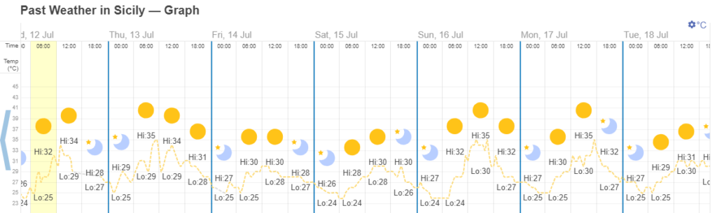
But it turns out the ESA was pulling a fast one. It was not referring to the ‘air’ temperature, the standard measurement made two metres above the ground, but the actual temperature on the surface. This latter measurement of course is going to be many degrees higher. The climate science site No Tricks Zone noted: “By the time the ploy was exposed by careful readers, the news had already gone around the world.” Commenting on the affair, German’s Achtung Reichelt is reported to have called it “the most intense climate lie since temperature recording began”. Calling the ESA’s press release “sloppy and manipulative”, it charged that none of it was true.
The climate narrative is now all about individual ‘extreme’ weather, to the despair of many scientists who note climate change is a measurement of long-term trends. But long-term temperature trends do not tell the correct political story since little global warming has been evident for over two decades.
Meanwhile, Arctic surface sea ice waxes and wanes on a decadal basis, but the recent general recovery has been quietly dropped from the Net Zero-inspired narrative. While Europe and the United States explode with fire and brimstone heat, and the fish are sous-vide in the boiling oceans, sea ice in the Arctic continues with what appears to be a small cyclical recovery. According to the U.S.-based National Snow and Ice Data Centre (NSIDC), the latest summer daily melt was similar to the 1981-2010 average. At July 17th, the ice extent was the 12th lowest in the 44-year satellite record.
The climate investigator Tony Heller recently lifted the lid on the deceptions surrounding Arctic sea ice. “They bury all the older data [pre-1979] and pretend they don’t notice sea ice is increasing again,” he charged. A linear decrease in the end-summer ice extent since 1979 is widely promoted, but Heller points out the minimum is actually higher now than 10 and 15 years ago. Plotting the trend as a moving average shows that the decline in summer sea ice stopped a decade ago.
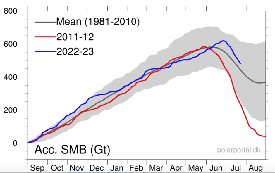
The Australian climate journalist Jo Nova recently referred to lies that were told by omission, suggesting that the whole climate movement was built on this “active deception”. Last year’s big omission was coral reefs, that have shown spectacular growth on the Great Barrier Reef of late. This year’s missing scare story is the Greenland ice sheet, where a significant, unreported recovery is in progress.
Almost halfway through the short summer, the accumulation of surface ice on Greenland is more than the 1981-2010 average and a big improvement on a decade ago. But the current improvement could be seen in a much better light. Why are the Danish Polar Portal compilers of the below graph using a 1981-2010 average, when data can be included up to 2020? The NSIDC uses a similar average comparison in its Arctic ice graphs. The Greenland ice sheet lost 51 gigatonnes a year in the 1980s and 1990s and 166gts in the 2000s. In the 2010s the loss was around 244gts, a fivefold increase since the 1980s. Obviously if a 1990-2020 average was shown – with a 50gts loss replaced by one of 244gts – it would amplify the recent recovery by raising the baseline. Last year, the Greenland ice sheet was reported to have lost just 50gts, an amount well within a margin of error that could suggest a small actual increase in the overall size.
When dealing with any statistics regarding climate change these days, it is good advice to start counting the spoons. It has always been an irritation to extremists that up to 10 times more people die of the cold than the heat. Greenpeace founder Dr. Patrick Moore recently displayed how the Lancet medical journal tried to come to the rescue, with the graph pictured on the left below.
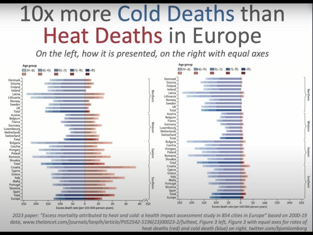
To even up the score, with blue for cold and red for heat, the Lancet used an unequal y-axis – a technique so obviously misleading it is hard to understand how anyone could even think of using it. The graph on the right was produced by the Danish economist Bjørn Lomborg, and it corrects the distorted Lancet image. Dr. Moore tweeted: “This is disgraceful for a supposedly scientific journal.”
It seems that the biggest risk of dying in the current British summer – 19°C and showery at time of writing – is to die laughing.
Chris Morrison is the Daily Sceptic’s Environment Editor.


To join in with the discussion please make a donation to The Daily Sceptic.
Profanity and abuse will be removed and may lead to a permanent ban.
Patrick Moore was doing more politics than science. The Lancet article is here. You will see that the objective of the article is “identifying patterns of vulnerability on the basis of city-specific characteristics and demographic structures” it has nothing to do with climate change and makes no secret of the fact that excess deaths due to cold are much higher than excess deaths due to heat. The obvious reason the two sides of the chart have different scales is that is hard to see the variation in heat deaths if you use the same scale (as apparent in the Lomborg chart). Thus it would be necessary to have two charts to show the variation which would then make it hard to compare the cold variation with the hot variation.
As a scientist and engineer I simply don’t accept your attempt at justification. Excess death rate per 100,000 person-years ( should be ‘person.years’ ) is the unit on both sides of the x axis, or horizontal axis. Therefore the scale should have been the same. The scale on the vertical axes of the bar chart has no relevance other than 3 assortments of countries in Europe and Scandinavia. The comparison is left with right not between assorted countries. The Lancet chose to present data deliberately to deceive. As Patrick Dr. Moore tweeted: “This is disgraceful for a supposedly scientific journal.”
There is zero evidence that the article was intending to deceive. It doesn’t follow that because the unit is the same on both sides that the scale has to be the same.
Oh, for Pete’s sake – it is blatantly deceptive on a casual read…
It may deceive the casual reader but the paper was not intended for the casual reader. Until Moore made a big thing of it it was an obscure paper of a highly technical nature.
If that’s the case, the data should have been presented in two separate charts.
MTF, I salute your efforts, but, mate…give it up. The scam is clear and obvious, even to an unscientific dope like me. Real debate is welcome – but this?
Only in the clown world can scales be adjusted to make a stupid point. But there again the Lancet does have form in this area
Er…I can see the variation in death rates perfectly well on the right hand chart.
Tiny variations of tiny numbers don’t matter. Heat deaths per 100,000 are consistently below 0.05%. That’s don’t exist for all practical purposes. This plainly obvious in the equal axis chart: Considering the differences between left and right sides, one can conjecture that heat deaths are only there at all because someone badly wanted heat deaths to figure here. But they actually don’t.
Heat deaths per 100,000 are consistently below 0.05%
makes no sense. This should have been Heat deaths are consistently below 0.05%.
From a cursory read of the article I could see no textual comparison of the effects, therefore there was no need to present the two on a single chart. I can see only one reason for doing it, and it wasn’t for clarity of presentation, it was to invite comparison and using unequal scaling was clearly deceitful.
The important point for public health is that cold deaths need addressing more urgently than heat deaths.
Come off it..! That’s a really poor argument for what is a really misleading chart.
I hope you keep fighting your losing battles. It gives the non easily manipulated people the chance to see all your absurdity and call it out as such ——–Keep donating to Daily Sceptic and I look forward to seeing you defend reports of pigs farting an octave higher because of climate change and frogs bursting because of global warming. ——“We must act now” huh? Because by 2010 frogs will be bursting with increasing regularity according to the “science” —-oops I meant models.
No, sorry. The imagery of the chart is what conveys the impression desired by the author(s) regardless of the text, and there is just no justification or excuse for presenting data on 2 different scales like that. The (common) x-axis could easily have been expanded, and even both hot and cold charted on the same side to create the room and provide the true visual comparison at a suitable resolution.
If the sceptical community hadn’t seized on it, why would anyone look at the chart without reading the paper?
An reputable scientist and scientific journal should not accept different y-axis, no matter what they’re trying to portray.
That’s the X-axis.
For me the issue isn’t temparature but exposure to UV light and the change in bandwidth that we are having to become accustomed to. Previously I could happily spend ten hours a day out in the sunshine but now after a couple of hours I feel burning and fatigue. I have no doubt at all that there has been a change in UV distribution and increase in UVB. I wouldn’t get too confined on the subject of carbon dioxide lest you get distracted from more serious and pressing issues. I think we are still in a position to reverse the damage that has been done and to obviate any consequences of natural fluctuations.
There it is again – that curious idea that we can “do” anything about the climate. Merely stopping doing something is rather difficult when we don’t actually know what we’re doing – but reversing what we don’t know we’ve done?? How about accepting that you’ve gotten older and that you can’t tolerate so easily now what you could ten/twenty/thirty years ago? I can’t either.
I’m 70 (well in a couple of weeks) I cycle 3 to 4 times a week, play golf twice a week, take the dogs out twice a day and help “she who must be obeyed” on her allotment twice a week. All out in the sunshine (when we get it this summer). I never wear sunscreen and so far so good. Stop whinging get out there and get some vitamin D inside you. You only live once.
There’s no doubt the climate is changing. None of it is due to CO2 “emissions” but that’s the only thing our mad leaders want to “cure.” Trillions of OUR money thrown at ridiculous and pointless net zero targets.If the entire planet achieved net zero today the amount of CO2 in the atmosphere wouldn’t reduce for 100 to 300 years.
If there is any human caused change to the weather it’s because of ridiculous rates of population increases in 3rd world countries, mass deforestation world-wide and the construction of 100’s of new concrete heat trapping mega-cities.
It’s got nothing to do with methane from cow farts and beneficial gas CO2.
I’m not sure how much we achieve when we completely deny the existence of at least some global warming. It’s definitely happening. However, our attacks on our politicians, climate “scientists” and the mainstream media need to be aimed at stopping the utterly pointless and crippling rush into net zero madness. Instead our money needs to be spent on mitigation of the effects of warming and in educating 3rd world countries to stop having averages of 4.5 children per poverty stricken couple.
“There’s no doubt the climate is changing” ????. That statement is meaningless since the climate changes constantly on all time scales. ———-The only thing that would be worth stating would be if the climate didn’t change. Now that really would be news.
I don’t really think there’s any harm in ‘Chris’ (above) stating that “There’s no doubt the climate is changing”, unless he’s implying that others here think that it isn’t, which they don’t. He makes the statement in order to then say “None of it due to CO2). Without the preceding statement, this part is less forceful. No harm done!
You are entitled to that opinion, but as a person who has been questioning this political agenda for nearly 20 years I would never say something like “There is no doubt the climate is changing”, because to most people “climate change” means a climate that is changing because of humans, and in my opinion that statement concedes that it is. In the battle against the eco socialist climate scaremongers I concede NOTHING.
Ridiculous rates of population growth in our country too!
We see the same mentality in govt and activists in both the reported CO2 concentration and the vaccine effectiveness. They use relative instead of the correct absolute numbers. The difference between relative and absolute numbers is orders of magnitude, but the relative ones look scary or good, depending on the desire result, so are used. As Patrick Moore said: “disgraceful for a supposedly scientific journal.”, but also disgraceful for any media outlet.
At which point does deliberate manipulation of statistics intended to deceive start getting called for what it really is ….LIES?
Oh what a tangled web…….
As ever! “There are three kinds of lies: lies, damned lies, and statistics.”
I’ve just learned a new word, ‘Agnotology’ which is defined as “the study of how ignorance arises via circulation of misinformation calculated to mislead.”
I found it here, a very interesting piece…
https://slaynews.com/news/0-3-scientists-agree-humans-causing-climate-change/
The ‘Goebbels effect’ in another guise.
I think what is confusing people here is that they are looking at the diagram out of context. It is just one diagram in a relatively obscure paper brought to the public attention by Moore and Lomborg. The paper itself makes it very clear that excess deaths due to heat greatly exceed excess deaths due to cold. From the findings on the first page:
“Across the 854 urban areas in Europe, we estimated an annual excess of 203 620 (empirical 95% CI 180 882–224 613) deaths attributed to cold and 20 173 (17 261–22 934) attributed to heat. These corresponded to age-standardised rates of 129 (empirical 95% CI 114–142) and 13 (11–14) deaths per 100 000 person-years.”
It would only make sense as an attempt to deceive if the authors expected casual readers to see the diagram out of context. This only became plausible when the sceptical community seized on it and started repeating it all over the internet.
“very clear that excess deaths due to heat greatly exceed excess deaths due to cold” – you mean the opposite, of course!
You are right. I meant the opposite. This is right up there with their findings on the first page.
Marianna, Marianna, where art thou Marianna?
Rowlatt and his fellow travellers make good use of the aphorism that “The lie travels round the world before the truth has time to put its boots on”
The diagrams are classic examples that should be used ins schools to teach children how they are being lied to. Another example is the Al Gore ice core data where he told everybody they could see the correlation. Schools need to teach children about correlation analysis. Douglas Murray describes it as educated imbecility and he is spot on.
It’s an ideology and a religion so facts do not matter.
Only faith.