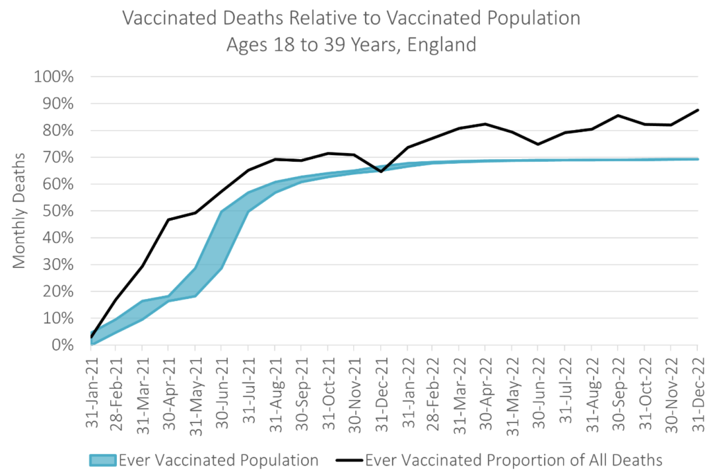
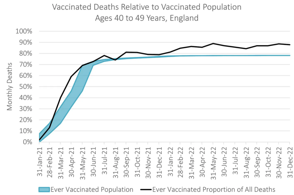
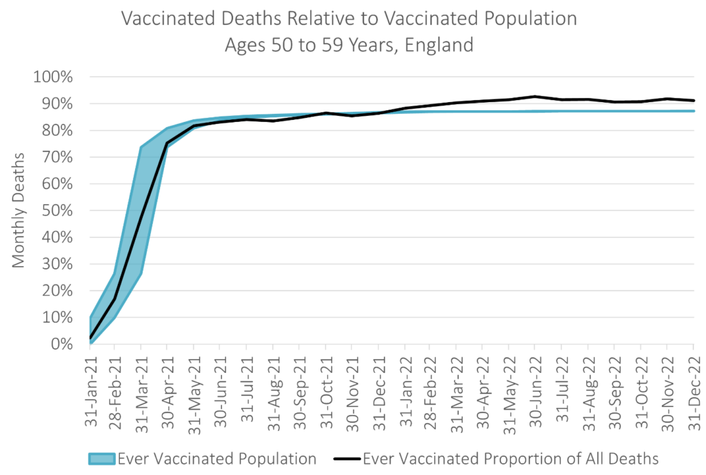
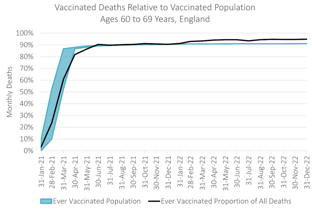
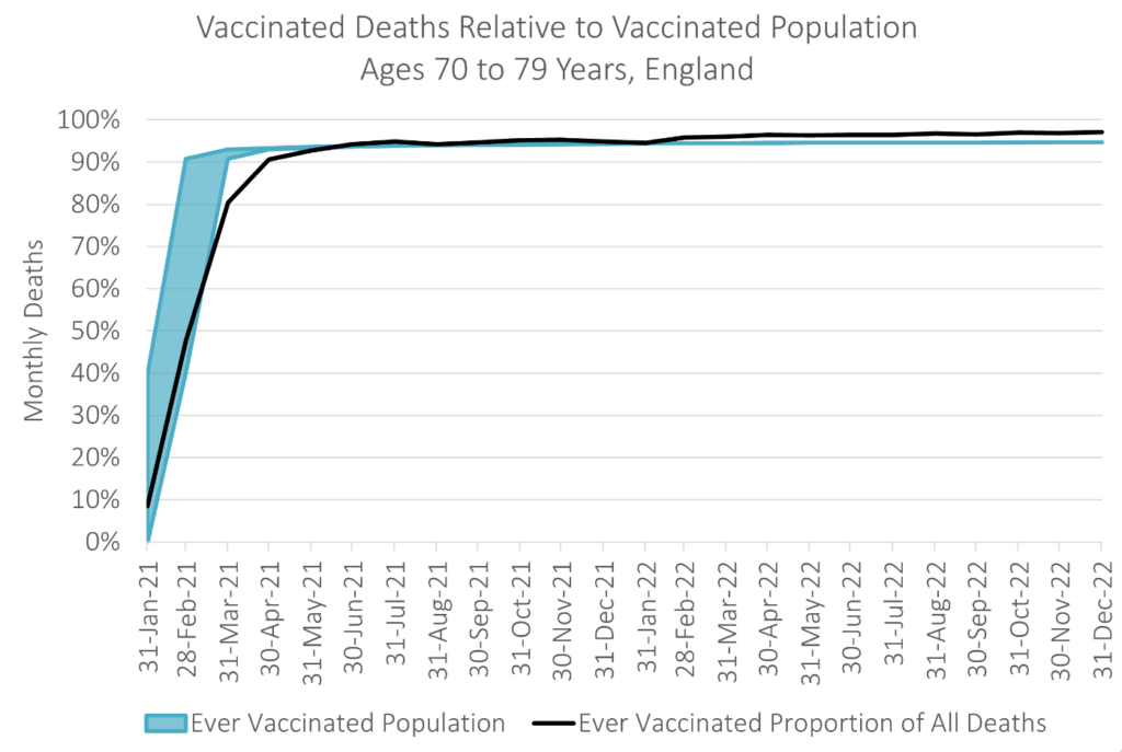
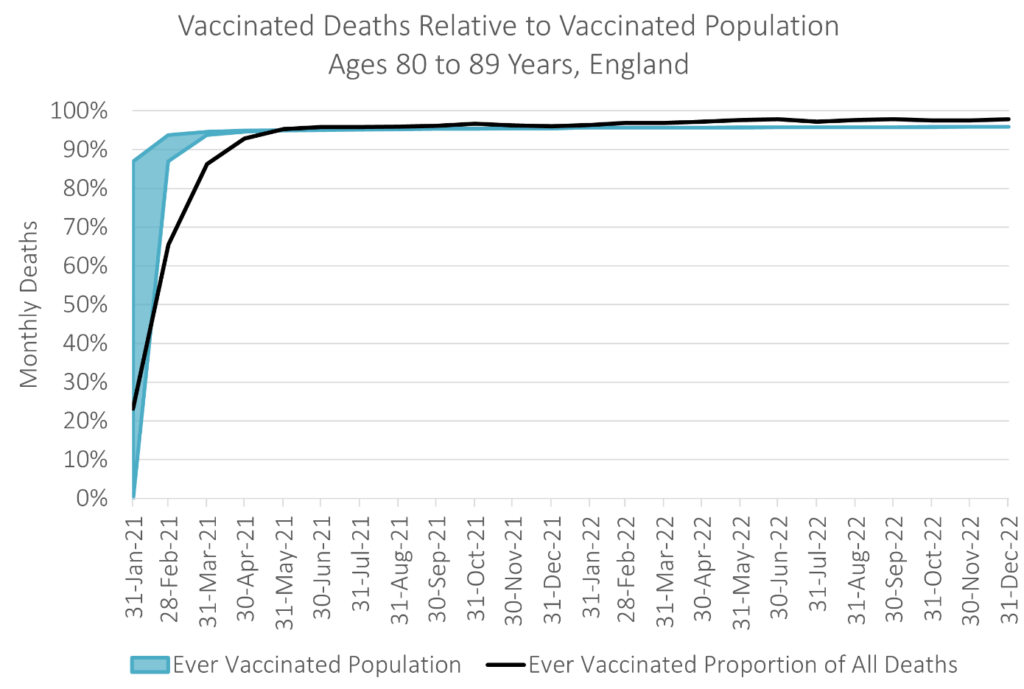
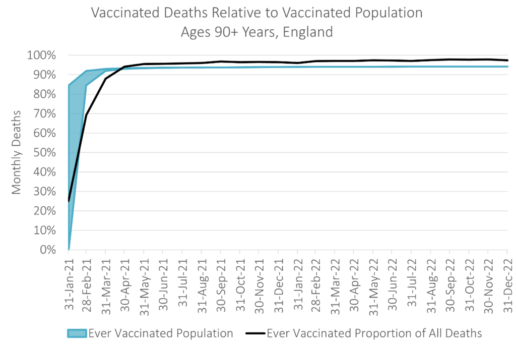
The new official data on deaths by vaccination status in England were released on Tuesday by the ONS and they show the vaccinated are over-represented in all-cause mortality in all age groups for most of 2021 and all of 2022.
The charts showing this, produced by Joel Smalley, are reproduced below. While confounders cannot be excluded with these data, it would also be fair to say that they are hardly indicative of a protective effect, particularly given the healthy vaccinee bias which means vaccinated people are usually healthier on average than unvaccinated people.
I should note that there appear to be some serious issues with the ONS data that need to be addressed. In particular the population estimates seem very low, particularly for the unvaccinated. Linked to this, while all deaths appear to be included, the population data only include individuals registered on the census. Since the unvaccinated are less likely to be registered on the census, this will artificially increase the death rate in the unvaccinated population.
There are also some missing data which Dr. Clare Craig has pointed out to the ONS and which officials have said they will address (UPDATE: The dataset has now been corrected on these particular points). The data have also changed since the last release, with the May 2022 data point that showed parity between vaccinated and unvaccinated death rates now altered. The reason for this is unexplained though may be due to a reporting lag.
Dr. Sarah Caul from the ONS tweeted out a graph showing the age-standardised mortality rate (per 100,000 person-years) over 2021 and 2022 by vaccination status, split into Covid and non-Covid deaths.
In theory this is a very useful graph. Of course, the flaws in the data (such as skewed population estimates) mean we can’t really be sure how useful it is. But it’s still worth looking at it more closely.
Dr. Caul notes that “throughout the time series those unvaccinated had a higher age-standardised COVID-19 mortality rate than those who had had any vaccination”. She seems to be implying that this means the vaccines are benefitting people, and this is the message many have taken away. The Mail, for instance, ran a story headlined: “Death rates are NOT higher among Covid-vaccinated Brits, according to official stats debunking major anti-vaxx myth.” It claims: “Mortality levels were actually higher among the unvaccinated.”
However, that is not the correct message of these data or this chart. Rather, their main message is that the data are biased, though there does also appear to be a signal of elevated non-Covid deaths in the vaccinated.
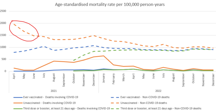
The first thing to note is that downward slope in April to June 2021 in the unvaccinated non-Covid deaths. Why were the unvaccinated dying so much of non-Covid causes in April, and why did they stop dying so much by June? There are two prime suspects for this. First, the ‘moribund unvaccinated effect’ (also known as one form of the ‘healthy vaccinee effect’) whereby those close to death are not vaccinated, temporarily elevating the death rate in the unvaccinated. Alternatively, it may be a miscategorisation issue, whereby the vaccinated who die shortly after vaccination are counted as unvaccinated. I tend to favour the former, but whichever it is, it is surely an artefact of some kind.
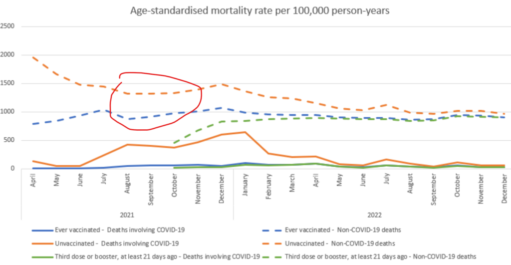
The second point to note is that once the unvaccinated non-Covid death rate stabilises in June, it remains significantly above that of the vaccinated during 2021, at around 40-50% higher. This means that the unvaccinated are dying of non-Covid causes at a rate up to 50% higher than the vaccinated. Since the vaccines cannot elevate the death rate of the unvaccinated, and assuming they are not miracle drugs that ‘cure all that ails you’, this is evidence of heavy bias. It may be a healthy vaccinee bias or a population estimate issue (as Igor Chudov argues), but once again it is an artefact confounding comparisons between vaccinated and unvaccinated. Since the gap between vaccinated and unvaccinated Covid deaths (solid orange and blue lines) is on a similar scale, this raises questions about how much of that difference is also bias.
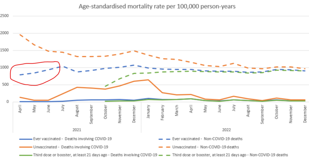
The next thing to note is that conspicuous rise in death rate in the vaccinated from non-Covid causes between April and July 2021, to around 30% higher, where it then largely remains. This is not simply the reverse of the decline in the unvaccinated death rate in the same period described above because the elderly vaccinated population is much larger than the elderly unvaccinated population by this point so the relatively few missing deaths will not have a significant impact on reducing the death rate. Instead, this seems to be a real rise in the non-Covid mortality rate of the vaccinated. This makes sense as it corresponds to when non-Covid excess deaths first rose in mid 2021. A comparison between the mortality rate in April 2021 (around 750) and April 2022 (around 950) is particularly striking. What we could do with is a baseline showing the normal mortality rate for England so we can see whether these rates are elevated compared to that, but that has not been provided.
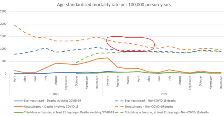
The next thing to note is the drop in the non-Covid death rate in the unvaccinated in the first half of 2022, by around 30%. Why do the unvaccinated became much less likely to die over this short period? It is not explained and I have no suggestions either, but such a huge improvement in the health of a cohort does need some kind of account; it is presumably an artefact of some kind. Responding to queries on Twitter, Dr. Caul simply stated that: “More research would be needed, [it] could be based on the characteristics of those likely to be vaccinated/unvaccinated.” After June the non-Covid death rates for vaccinated and unvaccinated become similar, but the reason they have converged – due to the vaccinated rate increasing and the unvaccinated rate mysteriously decreasing – remains under-explored.
Two further anomalies worth noting are that the July 2022 heat wave oddly seems to affect only the unvaccinated, and the sharp rise in deaths in December 2022, seen in the weekly ONS deaths data, is completely absent here, though the latter may be due to a reporting lag. Neither of these things instils confidence in the data. The fact that the chart is age-adjusted rather than split by age is also unhelpful as there are serious doubts about the suitability of the age-adjustment model for the pandemic period.
All-in-all, we are limited in what can be drawn from these data, though the rise in the vaccinated non-Covid death rate in spring 2021 seems to match the rise in excess deaths in the same period and is a possible signal of concern.
I’ll leave you, as promised, with Joel’s graphs, showing for each age bracket how the vaccinated are over-represented in all-cause deaths for much of 2021 and all of 2022. These use raw data and NIMS population data so are unaffected by some of the issues noted above.


To join in with the discussion please make a donation to The Daily Sceptic.
Profanity and abuse will be removed and may lead to a permanent ban.
And sadly, it’s governments of both colours responsible.
But only one colour will blame Brexit.
Another victim of Dogma and Ideology. Shut it down on the same day the Government launches its laughable ‘scheme for growth’, while India and China are continuing to build coal fired power as they are UN ‘Developing’, not ‘Developed’ countries. I wonder what future historians will make of all this…
and gleefully announces it is part of per annum U$300 billion fight against the weather….the retard in these cults and in gov’t runs very deep (as does the money laundering, corruption etc)
Fair play to them. If there’s free money flying about then who can blame them for taking it?
What manufacturing jobs Labour can’t kill with net zero, they’re killing with taxation.
Expect more private sector job killing with unlimited immigration, defence cuts, loss of mining, high energy prices …
Tories no better.
Make anything more expensive = get less of it.
Not difficult to understand.
Make manufacturing more expensive, get less of it.
Make employing people more expensive, get less of it.
Try telling that to Rachel from Accounts.
Good. More job losses please.
No jobs, no electricity, no food – might just get the dozy population beyond just signing petitions.
Those of us old enough will remember the Conservative Party 1979 election posters: “Labour Isn’t Working” with a long queue outside the dole office.
Of course since Labour is just Continuity Conservative it might equally be said: Conservatives Isn’t Working.
Conservatives want to drive us off the cliff at a slower rate. But they both agree on the direction. We will see how much the public can tolerate.
They’re NOT Conservatives. They’re imposters.
Totally open gaol for Reform, hope they used it in Parliament to admonish all of the Uni-parties who push this cr*p with no critical inquiry.
Slightly off topic but on BBC Radio Four they were banging on about why Elon Musk is so interested in UK affairs’
Here is where American readers might say – Hey what’s this to do with us? Didn’t we toss those guys out in 1776?
Well, because these days, according to the report, one of the values in news is that
Wow! People still listen to BBC Radio Four? I’m surprised any regular of this site listens, unless it’s to understand how the other side thinks.
There are still some good programmes on Radio 4 that are worth listening to, not many, but some, some that aren’t infused with the BBC’s woke agenda and don’t blame climate change or Elon Musk for the latest problems.
The shipping forecast perhaps…
And if you’re awake in the small hours, you can listen to the propaganda channel (World Service) on the same frequencies. While the old Droitwich 1500m transmitter is still working (it is at present), it’s got a long range well into northern France.
The latter of course, and no DAB.
The governments have been signalling this for some time. Why the surprise?
As far as I’m aware nobody in government has done or commissioned any report on the economics of having almost no vehicle industry. They all seem to spout platitudes about affordable EVs in the future but the only examples seem to be made in China.
Because there are no business people in government, or indeed Parliament, and no real economists either.
My belief is that know all of this very well, they just don’t give a toss.
Especially Ed Miliband!
“Cllr Hazel Simmons MBE, leader of Luton Council”
Member of the Net Zero Labour Party so she can damn well shut her gob.
How can she “suck it up” if she’s “shut her gob”?
Hazel Simmons of the Labour Party and never had a proper job in her life outside the public sector. Welcome to the result of the stupid policies of your party.
There are plenty of “green jobs” being created, producing solar panels, wind turbines, EVs, batteries, heat pumps etc. The only slight inconvenience is that they’re all in China.
Mopping up the last dregs of a once proud country and industry. All of us in a state of squalid impotence and them taking delight in us knowing it. We know that they know, they know that we know etc. The Wendigo system is a tough nut to crack that is why you seldom hear cogent proposals of a solution.
Net Zero Closes British Car Manufacturing
You can ask the question, how do you give a blood transfusion to a corpse? And a second question, are we a corpse? And if we aren’t a corpse then that are we exactly, what do we have left? Even at this level you will struggle to get satisfying answers.
Nuts zero, green communism is killing us. An the British voter gave Labour a chance by not voting for someone. Fecking idiots we are. Britain deserves its punishment for being so stupid. Could’ve voted Reform instead, but didn’t. Dumb assess.
Start mining coal and fracking the gas that’s under out feet. Build new, high tech, clean burning coal plants and out us back to energy independence and stable and reliable power. Get British industry back. Make England Great Again – MEGA
That is really really sad. A friend of mine at SITP works in the paint shop there. A very brave man who stood up to their ridiculous “Covid” rules, had running battles even with his Union over it and won!
RIP Vauxhall Luton 🥲
First they closed Aluminium smelting … and voters did nothing
Then they closed all coal production …. and voters did nothing
Next they closed steel production …. and voters did nothing
Then they banned gas and oil exploration … and voters have done nothing
Then they tried to drive Farmers out of business … and voters have started to wake up
Now they’re closing car manufacturers
They’re coming for YOU next.
WAKE UP. It has nothing to do with the Climate and everything to do with destruction of our lives.