As I noted on Monday, internationally comparable mortality data – specifically, estimates of life expectancy – are now available in most countries for the years 2020 and 2021. These allow us to see which countries fared worse and which fared best during the pandemic.
Unsurprisingly, the picture hasn’t changed much since all we had to go on was excess deaths. Still, the life expectancy estimates are easier to interpret and are therefore worth digging into.
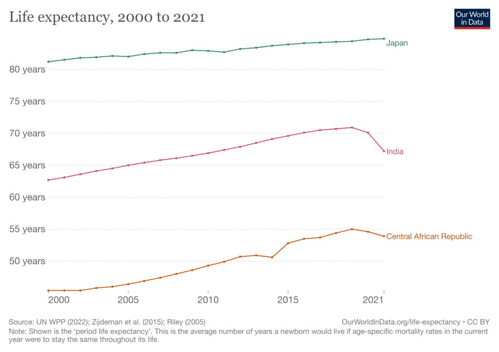
The chart below plots life expectancy from 2000 to 2021 in three countries that represent the full spectrum of human mortality: Japan, India and Central African Republic.

Interestingly, the pandemic had no discernible impact on Japanese life expectancy, which increased year-on-year in both 2020 and 2021. By contrast, Indian life expectancy fell by a total of 3.7 years. In Central African Republic, life expectancy fell by only 0.8 years.
Perusing the figures for a large number of countries, there seems to be a general pattern whereby middle-income countries like India saw larger declines in life expectancy than low-income countries like Central African Republic. In other words: high-income countries saw the smallest declines; low-income countries saw intermediate declines; and middle-income countries saw the largest declines.
The comparatively small declines seen in high-income countries are presumably due to factors like better healthcare systems and earlier vaccination of the elderly. But why the intermediate – as opposed to large – declines in low-income countries?
One possible explanation is that the data aren’t very good and a lot of deaths were simply missed. Another is that because Covid disproportionately targets the old, and there were fewer old people in these countries to begin with, the number at risk of dying was lower. A third explanation is that most low-income countries are concentrated in Africa, where the population may have higher levels of immunity.

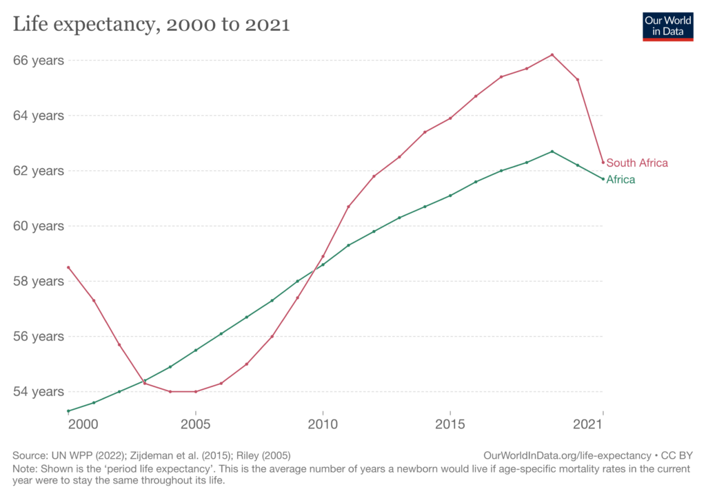
One reason to doubt the last explanation is that South Africa is in Africa, and it saw a much larger decline in life expectancy than the continent as a whole (shown above). Consistent with the second explanation, South Africa has a higher median age than most of its neighbours.
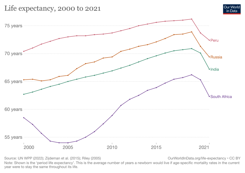
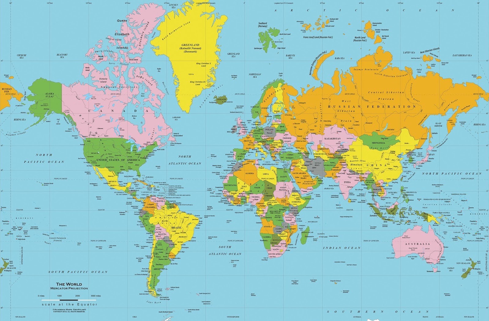
Contrary to some earlier evidence, particularly hard-hit countries from the middle-income bracket can be found on all four major continents, as the graph below indicates.

Unsurprisingly, high-income countries fared best during the pandemic. But interestingly, it was middle-income countries that fared worst; although this may be partly due to poor data quality in low-income countries.
Stop Press: Statistician Nigel Jacklin has looked at the European mortality date for 2017-22 and concludes there’s not much difference between the years 2017-19 and 2020-22. You can read his post on LinkedIn here.


To join in with the discussion please make a donation to The Daily Sceptic.
Profanity and abuse will be removed and may lead to a permanent ban.
There was no pandemic.
There was a pLandemic.
If anyone needs someone to talk to we meet every Sunday.
Stand in the Park Sundays 10.30am to 11.30am From 1st January 2023
Make friends & keep sane
Elms Field (near Everyman Cinema and play area)
Wokingham RG40 2FE
What are the numbers for Belarus?
I just checked now. According to the same source, Our World in Data, Belarus (who largely ignored the pandemic and eschewed lockdowns) lost about two years of life expectancy, compared to four years in Russia (who was quite strict at first, though later less strict than the world average, and created their very own jabs). And another source actually says that they gained a fraction of a year.
Also, Nicaragua (who also largely ignored the pandemic) and Tanzania (ditto) either largely broke even in terms of life expectancy after a brief hit in 2020 (Nicaragua) or saw a small drop of less than a year (Tanzania). And Brazil didn’t do great, but fared better than their stricter neighbor Peru. Before the pandemic, Peruvians actually lived a bit longer than Brazilians, and now, the reverse is true.
And of course, Sweden largely broke even from 2019 to 2021 after a brief hit in 2020, and even gained a bit from 2018 to 2021.
There was no pandemic in the county where I live. FOI requests to local crematoriums and cemeteries proved that. Yet the council commissioned a permanent monument to the victims of the ‘pandemic’ which has been erected next to the town’s war memorial. I find it grotesque.
Joining in to shout something I and many others have been shouting since the start:
THERE WAS NO PANDEMIC!
Seconded.
The USA lost nearly two years of life expectancy from 2019 to 2021. Free Florida lost 1.5 years, while New York lost 3 years, twice as bad:
https://www.wfla.com/news/florida/floridians-life-expectancy-drops-by-1-5-years-according-to-cdc/
And California? They also lost 3 years. Of course, we know that China’s *other* weapon of mass destruction, fentanyl, also contributed mightily to this trend, especially in San Fransicko.
https://jamanetwork.com/journals/jama/fullarticle/2794146?guestAccessKey=acd69ea5-6be4-4e56-9486-17878426d1b9&utm_source=For_The_Media&utm_medium=referral&utm_campaign=ftm_links&utm_content=tfl&utm_term=070722
So much for lockdowns, masks, and NPIs saving lives, right?
EDIT: The first link should read “from 2019 to 2020”, not 2021, as not all data are updated yet for every state.
There was no pandemic.
We must avoid using the language of the enemy, chosen to distort.
Covid is unexceptional.
India has a young population, but massive conurbations, pollution.
South Africa has high density townships.
The common cold targets the elderly, particularly those with a history of respiratory infections, comorbidities.
Japan has a high quality Bacillus Calmette-Guérin (BCG) vaccination program, the principal element of tuberculosis control in Japan.
‘This randomized, double-blinded, placebo-controlled trial shows that multi-dose BCG vaccination is safe and prevents COVID-19 with an efficacy of 92%–100% (depending on case definition) relative to placebo.’
‘This clinical trial has several strengths.’
‘…the subjects are from the United States. This is important because all subjects, prior to enrollment, were confirmed by diagnostics and by history to be unexposed to tuberculosis and lacking prior BCG vaccinations. The United States has never had a country policy of neonatal BCG vaccinations.’
‘…..our trial uses a very potent strain of BCG, Tokyo-172. BCG strain differences for other off-target indications are important, and this strain of BCG exhibits some of the highest in vitro potency and is highly immunogenic.’
‘….it is now appreciated that Japan, as a country with mandatory BCG vaccines and as one of the oldest populations in the world, has remarkable resistance to COVID-19’
https://www.sciencedirect.com/science/article/pii/S2666379122002713
‘Our findings suggest that routine infant BCG vaccination coverage in young generation had a significant impact on prevention of local COVID-19 spread in Japan.’
https://www.ncbi.nlm.nih.gov/pmc/articles/PMC7419263/
BCG vaccination has limitations, taking a while to provide protection, but if the government wants to protect future population against further viruses, avoid the stupidity of lockdown, a new BCG vaccination program for all infants and the so far non BCG vaccinated could very well be the way to go, using Tokyo-172.