It’s been widely reported that England is in the throes of an ‘excess deaths crisis’. We’ve covered it here at the Daily Sceptic, and so have many other outlets.
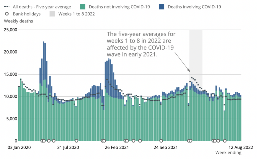
According to figures published by the ONS, England and Wales has seen over 17,000 excess deaths since the start of May – which is 12% higher than the five-year average. What’s more, only 7,600 of these can be attributed to Covid. And that’s if you generously assume that every “death involving Covid” qualifies as such.

Lockdown sceptics (such as my colleagues Toby and Will) have suggested the excess deaths we’re seeing might be due to the delayed effects of lockdown. For example, perhaps more people are dying now because of missed cancer screenings back in 2020. They’ve also suggested that adverse reactions to the vaccines might be playing a role.
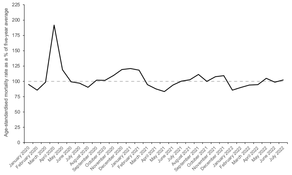
However, I’m not sure there’s really anything to explain. The chart below shows age-adjusted excess mortality in England since January of 2020. It is based on data published by the ONS.

As you can see, there was a big spike corresponding to the first wave and a small hump corresponding to the second wave. Since the start of 2021, however, we haven’t really had any excess mortality – at least on average. Zooming in on the last three months (data for August are not yet available) there’s nothing to report.
Age-adjusted mortality was 4.9% higher than the five-year average in May, was 1.2% lower in June, and was 2.2% higher in July. Averaging across the three months, it was only 2% higher than the five-year average. To put this figure into perspective, age-adjusted mortality was *92%* higher than the five-year average in April of 2020.
So what explains the difference between my chart and the one above? Two things: choice of baseline, and age-standardisation (plus the chart above includes Wales).
My chart uses ‘2015–2019’ as the five-year average. By contrast, the ONS recently switched to using ‘2016–2019 plus 2021’ as the five-year average. The latter time period omits the year 2015, which had unusually high mortality. As a result, the average of ‘2016–2019 plus 2021’ yields a lower baseline than the average of ‘2015–2019’, which has the effect of exaggerating excess morality.
A more important difference is age-standardisation. My chart plots the age-standardised mortality rate as a percentage of the five-year average, whereas the chart above compares the absolute number of deaths to the five-year average.
Because England’s population is ageing, the absolute number of deaths is increasing each year – or has been since 2011. This means that the five-year average underestimates the expected number of deaths in the year of interest. (Earlier in the pandemic, lack of age-adjustment led pro-lockdown commentators to overestimate the number of deaths caused by Covid.)
Incidentally, John-Burn Murdoch at the Financial Times correctly notes that excess mortality is much lower once you adjust for age, though for some reason he still finds an elevated level in July. (This may be because he used ‘2016–2019 plus 2021’ as the five-year average, rather than ‘2015–2019’ like me.)
Two caveats are in order. First, age-adjusted mortality data for August are not yet available, and they may show a greater uptick. Second, it’s possible that people are dying from the delayed effects of lockdown, but this isn’t showing up as age-adjusted excess mortality because the five-year average is the wrong counterfactual.
In other words, it’s possible we’d now be seeing negative excess mortality (i.e., ‘mortality displacement’) if not for the delayed effects of lockdown. This is by no means implausible, as there has been considerable mortality displacement in Sweden – which didn’t lock down.
However, going by the conventional way of doing things, there’s currently no ‘excess deaths crisis’ in England.


To join in with the discussion please make a donation to The Daily Sceptic.
Profanity and abuse will be removed and may lead to a permanent ban.