I’ll start off this week with data not from the latest UKHSA Vaccine Surveillance Report, nor even from the U.K. – the first chart for today shows the excess deaths in Israel since 2017 for those aged 65 or over. Just something to think about and I’ll come back to it at the end.

In this week’s UKHSA report the story is much the same as prior weeks – infection rates are still highest in the triple vaccinated except for individuals aged under 18 or over 80; the data for those aged under 18 continue to shift towards decreasing vaccine protection, while there’s not much change in vaccine performance for those aged over 80. At least infection rates are declining across the board as this January’s Omicron wave recedes into history.
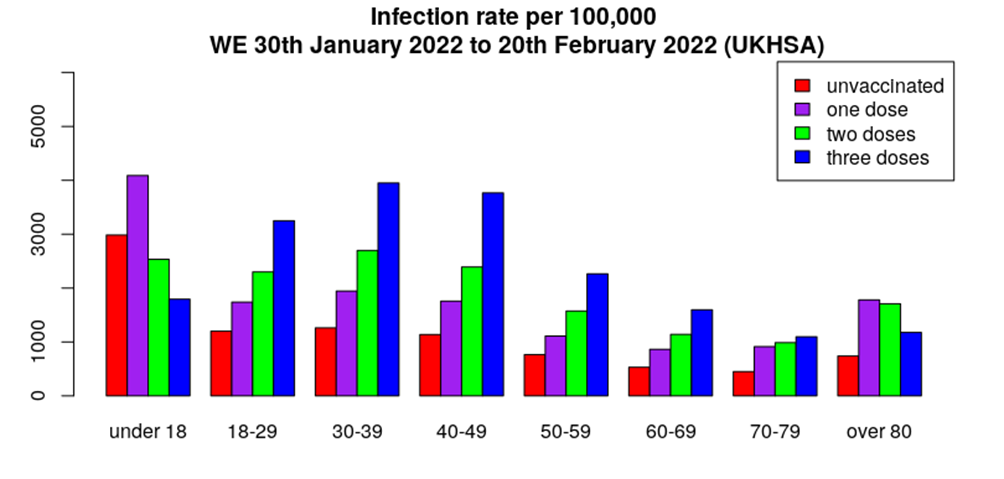
Using the rates data above to estimate vaccine effectiveness against infection again shows the vaccines to be performing poorly, with all vaccinated bar those under 18 now showing substantially increased risk of infection (and thus also onwards transmission). Strikingly, the triple vaccinated aged 18-70 have around triple the risk of infection compared to the unvaccinated.
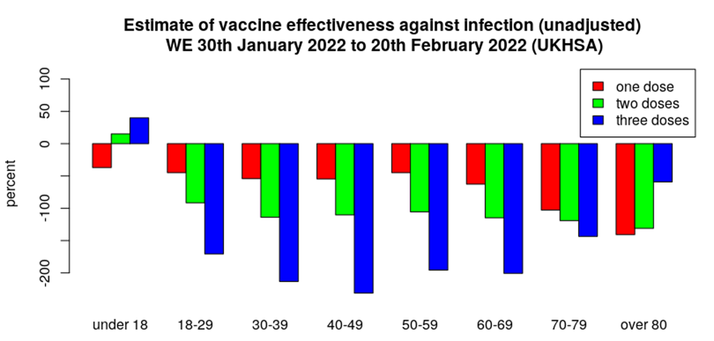
Plotting vaccine effectiveness against infection by time shows that while the vaccine effectiveness for one or two doses is broadly flat, albeit mostly negative, across all age ranges, the protection offered by three doses continues to drop relentlessly. This now appears to be more serious than a simple waning of vaccine protection; the data instead appear to be more characteristic of a dose-effect, with the more doses given resulting in increased risk. Time will tell if this is indeed the case.
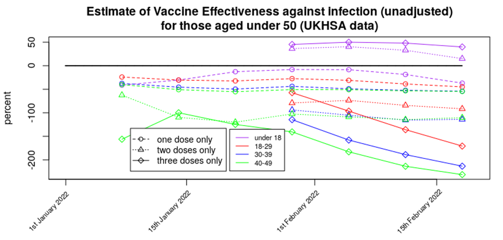
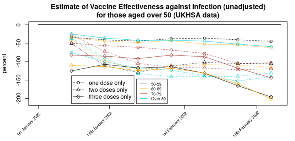
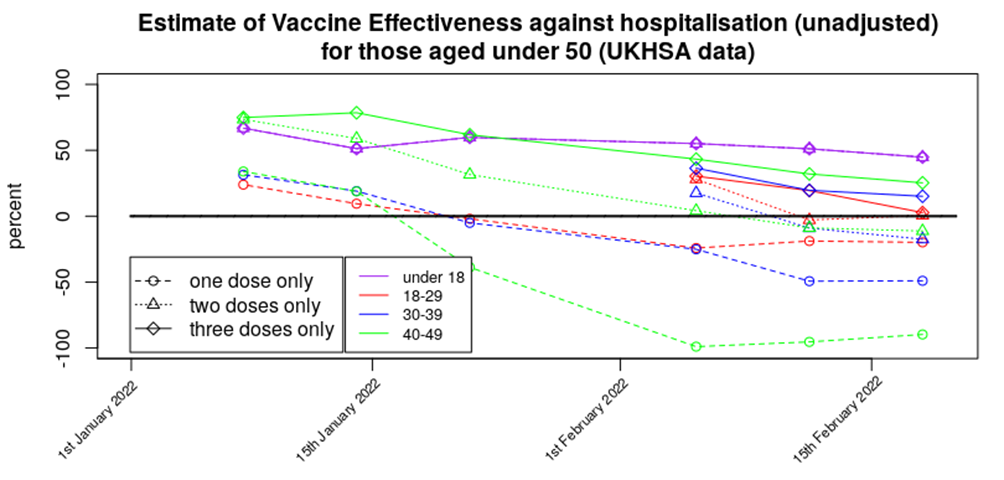
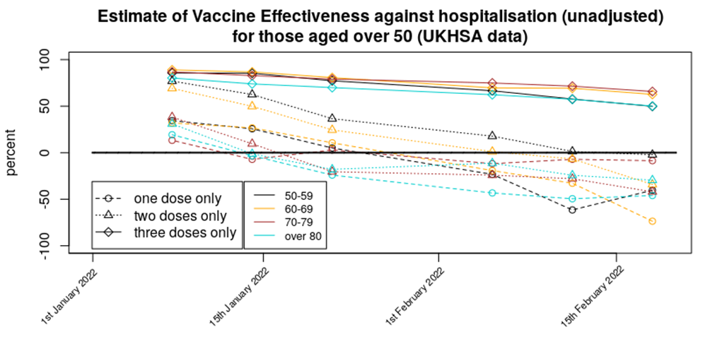
Protection against hospitalisation shows a similar picture to last week’s data, with a continued drift downwards in the protection offered by three doses. The protection offered by three doses appears to be better in those aged over 50; it isn’t clear why this should be the case, although I note that the immune system does change with age, and particularly for those aged over 65-70 – it might be that the vaccines offer more benefit for those suffering from age related immune dysfunction. The situation with one or two doses appears to be drifting downwards with two doses increasing risk of hospitalisation slightly (slightly negative protection) and one dose being associated with substantially increased risk of hospitalisation risk.
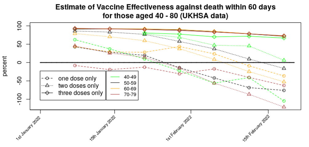
The protection offered by the vaccines against death perhaps shows the most worrying trend, with a rather significant downwards slope deeper into negative territory for one or two doses of vaccine, and a lower but nevertheless prominent slide in vaccine effectiveness for those triple jabbed. It is important to add that while these data do show that while a triple dose of vaccine does appear to reduce the risk of death from Covid, they don’t offer any information whatsoever about any side-effect/complication risk of the Covid vaccines.
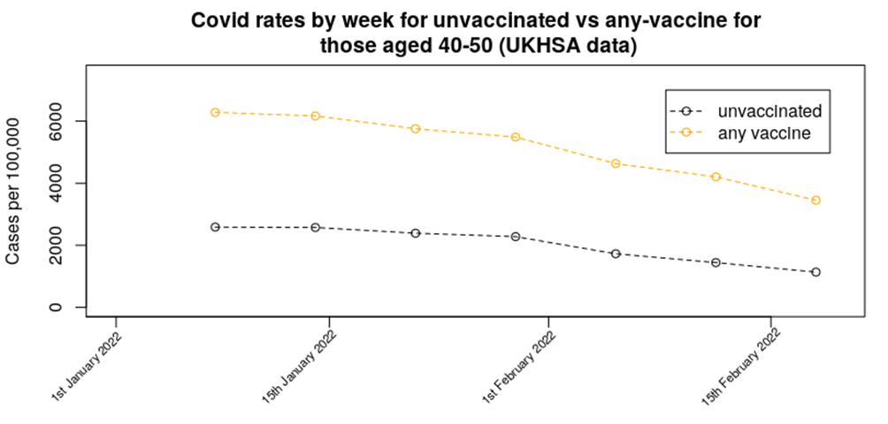
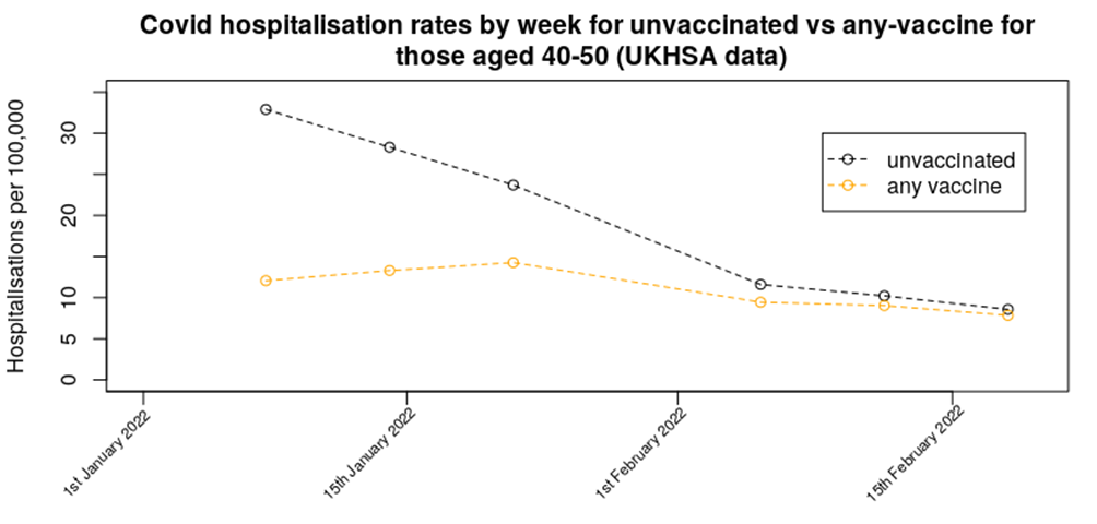
The above graphs show vaccine effectiveness and thus don’t really indicate the impact of the vaccines on the progression of each Covid wave – I think it might be instructive to show a little data on how the vaccines appear to have impacted on Covid rates since the start of the year. I’ll focus on one age group – those aged 40 to 50 – as this will keep the graphs relatively simple, but note that similar trends are seen across all age groups. I’ll also lump all vaccinated together into one group called ‘any vaccine’.
The changes in case rates are perhaps what you’d expect if you’d been following the UKHSA publications over the weeks – rates are higher in those that are vaccinated, but in both the vaccinated and unvaccinated case rates were highest at the start of the year and have been declining at a relatively similar pace since.
The data for hospitalisations, however, shows a different pattern. While the hospitalisation rate in the unvaccinated has declined significantly since the start of the year, the data for those having taken any vaccine shows a much more subdued reduction, with signs of a slight peak in hospitalisations around the latter part of January. Note how the hospitalisation data ends with there being little difference in hospitalisation rates between the unvaccinated and those having taken any vaccine.
But it is the deaths (within 60 days of a positive test) data that shows the most worrying trend. The vaccines still appear to offer protection against death. However, while the death rate in the unvaccinated has been in a strong trend downwards since the start of the year, the death rate in the vaccinated has been trending upwards.
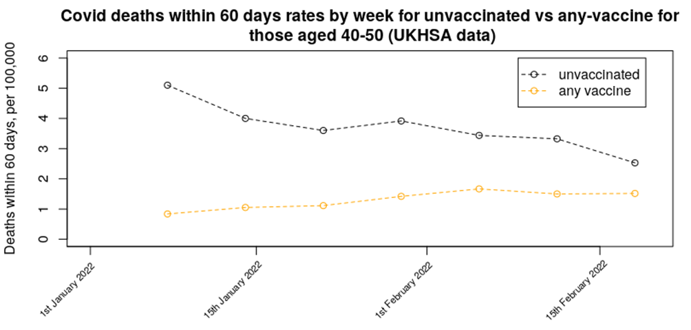
These data are very concerning as they suggest that serious Covid disease is now behaving differently in the vaccinated than in the unvaccinated; since the start of the year hospitalisations have reduced markedly in both the vaccinated and unvaccinated, but while deaths have decreased in the unvaccinated, they have increased in the vaccinated and remain relatively high. It isn’t clear why this should be the case, but several potential reasons jump out:
- The curve above could reflect the change in death rates as the Omicron variant replaced Delta. In this case the data would suggest that the net impact of Omicron is of increased mortality rates in the vaccinated; the increased numbers of cases and increased vaccine escape in Omicron result in an increase in deaths despite the indications that the mortality rate of Omicron is lower than that of Delta per infection. However, the curve in the graph above doesn’t match the rapid switch to Omicron variant seen at the end of last year. In addition, the mismatch between the curves for hospitalisations and deaths in the vaccinated suggests that there is more to it.
- The change in mortality rates indicated in the figure above does better match the spread of Omicron BA.1.1 variant in the U.K. However, this variant is not very different from variant BA.1 and there are no other indications that it has any substantial impact on the severity of disease.
- It might be that Omicron variant BA.2 is more deadly than we think to the vaccinated. In this case the slow climb upwards in the deaths data for the vaccinated would reflect the slow increase in BA.2 variant in the U.K., despite the dramatic reduction in cases of the BA.1 variant. BA.2 is still only present in relatively small numbers in the UK (about 25% according to the UKHSA’s Technical Briefing 37) and thus would need to be much more deadly in the vaccinated to get the change in mortality rates of the magnitude seen.
- The mortality rate data seen above could arise due to differences in the time course of infection in the vaccinated versus unvaccinated. The unvaccinated appear to be following the known progression of Covid disease, with those few that succumb to Covid doing so about two to three weeks after infection. The vaccinated, however, appear to be having a more protracted disease progression and dying sometime later. Quite how much later is not clear – looking at the chart suggests that the period of increased mortality isn’t over yet.
A simple examination of the relative trends of the vaccinated and unvaccinated mortality rates suggests that the two curves will cross over some time between the UKHSA week 10 Vaccine Surveillance Report and the report for week 11, although I note that the data shown in the graph above are for deaths within 60 days; if it is due to a slower disease progression in the vaccinated then the data could well be curtailed as the 60 day point after infection is reached. Any Covid deaths that occur after the 60 day point will be regarded in the data as connected with neither vaccination nor Covid – they’ll be relegated into the realms of ‘short illness’ and ‘sudden death’ that fills too many news reports in recent times.
These data indicating that deaths in the vaccinated aren’t declining as expected after the January Covid wave are very concerning, whatever the reason. Under normal times there would be an urgent investigation into what exactly was occurring and why, and what mitigating actions were required. But these aren’t normal times and I imagine we’ll get the same action as has occurred when other ‘inconvenient’ data have emerged about the vaccines – i.e., nothing will be done.
And that brings me right back to where I started, with that graph of excess deaths in what is probably the most vaccinated country in greater Europe. Something has occurred in Israel to give a significant rise in deaths in the last few weeks, far above what might be expected at this time of year – they’ve now got their highest death rate in those aged over 65 since Covid began two years ago. I note that while Israel and the U.K. began vaccinating at about the same time, in Israel they gave the second dose approximately 30 days after the first, while in the UK we waited approximately 90 days – this has resulted in Israel being about 60 days ahead of the UK in terms of the impact of vaccination on their population…
Amanuensis is an ex-academic and senior Government scientist. He blogs at Bartram’s Folly.


To join in with the discussion please make a donation to The Daily Sceptic.
Profanity and abuse will be removed and may lead to a permanent ban.
And still Sajid is after your children.
https://www.mdpi.com/1467-3045/44/3/73
Intracellular Reverse Transcription of Pfizer BioNTech COVID-19 mRNA Vaccine BNT162b2 In Vitro in Human Liver Cell Line by Markus Aldén 1
 ?1b5ed457ed71c59e,
  Francisko Olofsson Falla 1,
  Daowei Yang 1,
  Mohammad Barghouth 1,
  Cheng Luan 1,
  Magnus Rasmussen 2 and
  Yang De Marinis 1,*
 ?1b5ed457ed71c59e
1
Department of Clinical Sciences, Lund University, 20502 Malmö, Sweden
2
Infection Medicine, Department of Clinical Sciences, Lund University, 22362 Lund, Sweden
*
Author to whom correspondence should be addressed.
AbstractPreclinical studies of COVID-19 mRNA vaccine BNT162b2, developed by Pfizer and BioNTech, showed reversible hepatic effects in animals that received the BNT162b2 injection. Furthermore, a recent study showed that SARS-CoV-2 RNA can be reverse-transcribed and integrated into the genome of human cells. In this study, we investigated the effect of BNT162b2 on the human liver cell line Huh7 in vitro. Huh7 cells were exposed to BNT162b2, and quantitative PCR was performed on RNA extracted from the cells. We detected high levels of BNT162b2 in Huh7 cells and changes in gene expression of long interspersed nuclear element-1 (LINE-1), which is an endogenous reverse transcriptase. Immunohistochemistry using antibody binding to LINE-1 open reading frame-1 RNA-binding protein (ORFp1) on Huh7 cells treated with BNT162b2 indicated increased nucleus distribution of LINE-1. PCR on genomic DNA of Huh7 cells exposed to BNT162b2 amplified the DNA sequence unique to BNT162b2. Our results indicate a fast up-take of BNT162b2 into human liver cell line Huh7, leading to changes in LINE-1 expression and distribution. We also show that BNT162b2 mRNA is reverse transcribed intracellularly into DNA in as fast as 6 h upon BNT162b2 exposure. View Full-Text
Keywords: COVID-19 mRNA vaccine; BNT162b2; liver; reverse transcription; LINE-1; Huh7
Evil Rides Out!
So everything trending exactly as we’ve expected.
Is that Darth Schwab?
Clucking bell this is a seriously worrying update.
You can monitor the israeli data at the link below , it is not reliable [under reads] beyond week 4 at the moment.
Or about 2-3 weeks prior to the most recent report
https://www.euromomo.eu/graphs-and-maps
Are you really still surprised?
With the recent discovery of vaccine mRNA being able to incorporate into the DNA of liver cells (https://www.mdpi.com/1467-3045/44/3/73) I don’t think it is out of the question that immune system silencing to spike proteins are leading to increased infections of the vaccinated. The chance of getting a grant to study this is less than 0 🙂
For RNA to be incorporated into cellular DNA requires reverse transcriptase, where does this originate? The study referred to is in vitro not in vivo, are the liver cells being used typical of liver cells in vivo?
Line-1 elements are part of the eukaryotic genome and part of the full transcript includes a reverse transcriptase enzyme. The liver cell line used here is cancerous but the advantage is you have a consistent cell line which I think in this case has been used for 30 years. The next step would be to do the same experiments on mice and analyze the liver tissue.
Discovery identifies a highly efficient human reverse transcriptase that can write RNA sequences into DNA — ScienceDaily
Cells contain machinery that duplicates DNA into a new set that goes into a newly formed cell. That same class of machines, called polymerases, also build RNA messages, which are like notes copied from the central DNA repository of recipes, so they can be read more efficiently into proteins. But polymerases were thought to only work in one direction DNA into DNA or RNA. This prevents RNA messages from being rewritten back into the master recipe book of genomic DNA. Now, Thomas Jefferson University researchers provide evidence that RNA segments can be written back into DNA via a polymerase called theta, which could have wide implications affecting many fields of biology.
From memory around 10% of the human genome is viral origin. Virus have been dumpling their genes into our DNA for a long time
So that’s OK for Pfizer to do likewise then?
Try this.
https://youtu.be/MjxlvduyJyc
Ask Bill or Ant they may fund some research.
Only if it pays!
Calmly expressed – but the reality is of course horrific and the implications frankly diabolical!
Do sheepies even realise what this means as some still seek to ‘vaccinate’ their own children?
Play stupid games, win stupid prizes, that’s my position now. I have endured too many assaults on my liberty and my rights and too much slander to care what happens to the jabbed anymore. I started off respecting the choices of others and I still do but I can’t muster much sympathy after what has happened this past year. My sympathy is reserved for those who have suffered through no fault of their own, such as the cancer patients who no doctor would see. Obviously, I wish no harm on anymore and I do not want those I care about who took the jab to suffer any ill effects but as for the rest, good luck I guess?
Pfizer had to deliver a warning to its shareholders in February regarding clinical trial information which might have negative impacy on the stock valuation if you want to see it for yourself watch the highwire carve out
https://thehighwire.com/videos/financial-insider-exposes-covid-fraud/
Keep watching to see if life insurance company data – capturing excess deaths among 18 to 64 age cohorts from “all causes” – and even health insurance data (capturing possible vaccine “adverse effects” – starts to be mentioned in the financial and mainstream press. Also, the data from funeral home companies that are publicly traded.
Ed Dowd, a former manager at BlackRock, deserves the most credit for publicizing such data. His theory is that this data cannot be concealed forever. If it ever comes to light, Moderna, Pfizer and all the other mRNA “vaccine” companies could very well go bankrupt – in a hurry. Needless to say, heads should also roll at ALL “public health agencies” in the world.
This said, one strongly suspects that such relevant mortality data will be censored or ignored … for obvious reasons.
Insurers will get a central “bank” hush money “investment”
My take on it exactly – a cover-up will be financed, somehow or other, and anyone who speaks out will be silenced [or worse]
BTW moderators, took me 8 goes to verify that I am not a robot – some of the images were so tiny that you would have needed a magnifying glass to work out if they contained a bicycle in the very far distance or not
Anything to bury the mounting casualty rate!
They freeze Putin’s assets as a ‘war criminal’ – but Gates,Schwab Soros and Fauci just carry on as they please!
FoI To Association of British Insurers might squirrel this information or a direct request to L&G, Aviva, AIG Life, Met Life, Prudential, Phoenix as representatives of the UK Protection market historically for data on death (and Critical illness..) claims from mandatory returns to their regulator – PRA; you may need an Actuary to translate the spreadsheet though….
In short “their cover is blown”?
These stats don’t take into consideration holiday effectiveness and as such are unrepresentative.
Is that for the double-vacs (sic!) or the triple-vacs?
Still many countries requires this crap to be administered to you otherwise no entry.
Botswana is on another level any unvaccinated arrival must be vaccinated on site. In case of refusal you have to pay nearly $500 fine and leave immediately.
This stupidity is breathtaking, isn’t it? Oh well, that’s Botswana off my holiday list.
Stupid?
Ripping off travellers?
And I thought most African countries are measured. There are always outliers.
Think also of those in countries where they are forced to take the job or lose their livelihoods – and are not permitted to leave.
There are no holidays for them.
This is something much worse than governmental stupidity.
Vaccines and Fake Covid PCR tests have proved a ‘nice little earner” worldwide!
TL:DR = If you’re vaccinated, you’re screwed
As the Indian Dr from World Doctors Alliance put it…The vaccine is the Gun and your immune system is the bullet.
knowing my luck with Russian roulette I don’t fancy my chances
Still negative vaccine effectiveness against testing positive in every age group when comparing unvaccinated vs vaccinated (any dose) which is the most obvious compare. See attached chart.
Effectiveness against testing +ve worsening in every age group for a second week. So still greater negative effectiveness.
And at least double the rate of positives in the vaccinated (any dose) vs the unvaccinated in all the age groups covering ages 18-79
And down to just 11% of deaths within 28 days of +ve test in the unvaccinated and 89% in the vaccinated (any dose).
And now down to 25% of +ve SARS-C0V-2 test emergency care admissions in the unvaccinated and 75% in the vaccinated (any dose).
Thanks for presenting these stats/charts.
How can there have been more covid attributed deaths post vaccination if they are as effective against death as the data has shown? And with milder variants and more natural immunity. Its nonsense. How do we know they help against death? We are comparing numbers per quota of population. What do you need for accurate rates, accurate numbers of population for the respective groups. To me this is a fundamantal and conscious manipulation of data that has over egged the vaccinated numbers and under egged the unvaccinated. A proper clinical trial with like for like individuals and no dodgy practises would be needed to show any realistic benefit. Such a thing would never be allowed to happen.
Wow. Every paragraph of this article includes shocking data – data that Would be urgently investigated in “Normal times.”
The bottom line (to me): The vaccines are KILLING people. Governments around the world are mandating or strongly coercing people (including children) to get a vaccine that is less effective at preventing infection than no vaccine … and a vaccine that is also resulting in more deaths than are seen in the non-vaccinated.
Those promoting COVID vaccination are promoting increases in deaths. They are committing crimes against humanity.
Have not heard, for some time, from the Jabaholics who routinely defended the jabs as efficacious…..I wonder why?
I just copied and pasted a piece written by the “Ad Council” in the USA that is still trying to do everything it can to get children vaccinated. Virtually every sentence in this piece is a lie or dubious. The piece was published by USA Today and I found it at the top of my Facebook feed. I’m going to debunk the claims/statements sentence by sentence – this might take 2,000 words and I take on this project knowing that no mainstream media site would ever publish this rebuttal.
https://www.usatoday.com/story/sponsor-story/the-ad-council/2022/02/24/medical-experts-answer-questions-covid-19-vaccines-children/6912579001/?fbclid=IwAR3S1f560jR9IGuH9EDCE6fuqcfQqeuGBc-mCWUiUA6hDlX8aQEYOknMxfQ
More power to your keyboard..
Very sadly now too late for many children.
It is so vert hard to fight , when all the Institutions of the US Federal State are forcing this agenda on behalf of the WEF and the CCP.
That’s obviously because over time there will be fewer of them, which in a sense proves that the jabs are ‘efficacious’ – but not necessarily in the ‘official’ way pushed by the Vax propaganda.
I get that!!
It is those who attempt to blind others with “scientific” dense replies whenever, say, the efficacy of the jabs is called into question because of an article about ONS /UKHSA data , e.g.
Not seen a sniff of that knee jerk response for a while – only ever saw that/those replies has a “deflection” exercise particularly when the question of jab induced “immunity” was raised. I just think that the weight of evidence of what these jabs do and are is so great, like a non receding tide, any further “defence and denial” type reply is 100% counter productive to these jabapparatchiks “case”…(and makes “them” look more factually bankrupt very day) ……if they ever had one.
I think you got there!
We now just need to convince 70% of the population to see any change of policy .
In the meantime Johnson and Javid will be very quietly signing UK Health Policy Autonomy over to Bill Gates and his ‘owned’ WHO on March 1st!
“Safe and effective” anybody?
Nobody with a brain!
I still don’t get it.
A look on YT of the Downing St presser of 21st Feb shows Whitty’s slides showing a whacking great chunk of unvaxxed presenting to hospital (ICU?) compared with the jabbed, across all age groups.
I could understand it when the timeline was from May 2021 when most were still unjabbed (- on the day, the slides moved on too quickly for me to process what was on the graphs)
but the worst one was showing figures from this winter season.
Can anyone help reconcile the differences between Whitty’s graphs and those in this article?
https://www.youtube.com/watch?v=77p5n1ESb6c. (17.06-18.24)
Some time ago the in-house doctor gave a very useful critique of a mischievous press conference showing techniques such as monkeying with the timeline which gave a distorted picture when presented to laypeople unused to interpreting this stuff. There hasn’t been one for the latest Vallance and Whitty show, an it would have been very helpful.
Probably because they include in ‘unvaccinated’ those people who are within 14 days of being jabbed, presumably because that’s when most of the adverse reactions, including death, occur.
Global health policy has been weaponised against the masses so it’s necessary to present data in whatever form is required in order to support the narrative.
Prof Norman Fenton of Queen Mary College, London has done a great job of debunking this fraud by re-analysing the data in the way anyone with a moral compass would expect.
Surely, a decent percentage of world citizens know by now that ALL “public health data” is manipulated to protect and support “the narrative.”
And, FWIW, it’s not just health data. All the economic data has been manipulated as well.
Foreign Affairs have been farcically and frigteningly manipulated to generate conflict to create food and fuel shortages and experiment with te seizure and freezing of individual Bank Assets.
Aren’t people getting the full WEF picture yet ?
“Businessmen they drink my wine ploughmen dig my earth/
None of them along the line know what any of it is worth
*****
All along the watchtower, princes kept the view
While all the women came and went, barefoot servants, too.
Outside in the distance a wildcat did growl
Two riders were approaching, the wind began to howl.”
( Bod Dylan)
“Apocalypse Now ” anyone?
The “narrative” now appears ti be rising numbers of deaths and injuries by vaccine as US and German Insurance companies have now observed.
In the UK we are now openly talking about ‘Yellow Card’ ststs multiplied by ten.
Less than 3 doses and you are considered unjabbed, aren’t you?
So effectively, when a 3rd jab is available, the double-jabbed revert to zero? I think one of these slides breaks the population down to 1, 2 and thrice-jabbed; I assumed some degree of consistency from the CMO.
See France.
You become “Unjabbed” by text on Macron’s whim1
If you are still around to be bothered that is.
Whitty ……………..”Darkness Visible”!
With thanks to No_Pretzel_Logic on zerohedge.com for this comment.
At least two big pharma are going to get their azzes wiped.
Wall St, insurance companies and many others know about the fraud perpetrated by Moderna, Pfizer, etc. Some predictions are MRNA at $0, Pfizer at under $10.
Plus lawsuits GALORE. “Bankruptcy For Moderna, Definitely Pfizer” | naked capitalism
That is likely why the script flipped bigly in the last 4 – 6 weeks.
Watch the work/analysis of Ed Dowd … and see if more of his colleagues or the financial press start to report on what his research has found.
And why anybody still claiming absurdities like ‘still providing some protection against serious illness and death’ needs a good, hard slap across the face.
Exactly. After all, we’re only talking of months here, not a year or more down the line. ”Still providing” is a nonsensical phrase.
How about a ten year jail sentence?
If the “vaccines” were “safe and effective” you’d expect to see a noticeable drop in all cause mortality compared to when we didn’t have the “vaccines”. Has that been the case? Isn’t that the key question?
Same type of argument as with face nappies – if they worked, muzzle mandates would cause a drop in cases, but that never happens in reality.
But we are talking the Covidian Cult here, where any outcomes seen as positive are attributed to whatever measures they are hyping, and any contrary outcomes or lack of outcomes are simply ignored, with the claimed outcome often being the opposite of what the data actually shows.
All cause mortality IS lower than the 5 year average.
We now know the answers – it is the biggest most deadly ‘scam’ in medical history – why not just say it?
I would say I’m concerned for the jabbed. But I’d be lying.
I’m afraid I’m more than concerned. The jabbed include people I love, like and generally care about.
My rage against those who coerced, lied and bullied knows no bounds. For them, and them alone, I consider the consequences of jabbing might well be just desserts.
Yes, I agree with you on this. While I’m concerned and saddened beyond measure that people I love have put themselves at risk (and those that have suffered symptoms are not joining the dots) I’m more infuriated, as you are, at the evil b*ggers who’ve coerced and manipulated the gullible, because those gullible made the mistake of thinking that our ”leaders” would never do us harm.
I know many ex soldiers who’ve just blithely gone ahead and taken the poison, without a lot of thought, because this is what they did all their working lives – believing in the honour of the people they served.
It’s an outrageous abuse of trust. They exploited the decency of people who are simply incapable of lying the way they have.
The gross betrayal of the trusting British People by this diabolical scam knows no parallel in our history.
The scale of the damage and potential damage to health and life is currently impossible to asses.
Very very unworthy – you don’t know how and why some people decided rather than be coerced into having the jabs, some from Employer mandate pressure to maintain there livelihoods, others for highly personal medically orientated reasons after months and months of metal gymnastics and agonising.
Humans are capable of expressing compassion for others……a lack of compassion is….what’s the first word that comes into your head?
“mental”
That’s it my arm has been finally twisted, how do I download the Vaxapp. I’m going to phone my GP and get myself double jabbed. So I can go on holiday.
you forgot to put (Sarc) at the end of your post.
some poor idiot might read it and think that you were serious and do likewise
I’m not sure you can get double jabbed at the same time and some destinations may require an additional booster or two, so it’s always advisable to consult a holiday rep first.
Sister had her 14 year old son jabbed a couple of months back – ever since he has suffered from not only severe cold-like symptoms but also recurring cold sores around the mouth and rashes behind the ears – even with all these symptoms appearing so soon after receiving the jab she still took him for his second jab today so that they can fly out to Spain next weekend.
Either she is incredibly stupid and can’t make the link between this sudden appearance of recurring bad colds her son can’t seem to shake off, mouth sores and skin rashes – and having the jab … or she is incredibly selfish – I can’t make out which? . It would be no good me pointing out the obvious because I know she’ll dismiss it.
I only hope that trip abroad for a few days was worth risking her sons health for.
This is horrible.
I see people who have become blind and deaf, but far from mute. They cannot see the dangers and cannot hear the warnings.
Too late for millions now!
I have lost all tolernace with this now. This is disgraceful and I am hearing of it far too often. Your nephew’s health may now be permanently damaged- we don’t know do we as there have been no long term studies- and there is a good chance of him now being infertile. These parents allowing this for a holiday and failing to do some due diligence even if just for their kids let alone themselves, need to hang their heads in shame. How will they live with themselves if and when they find out what they have allowed their children to be injected with? Assuming they are still around that is.
Why stop with these jabs – how do you explain the massive explosion in auto immune diseases post Second World War?*
If you have children, and you “forced “, by a lack of an enquiring mind and inaction, to have them vaccinated as children, did you FULLY understand the consequences? Did you read the inserts provided with these jabs? Were you able to give “fully informed consent”?
As a baby boomer, I belong to the endemically duped – just did not know – for certain, but had suspicions – about it until circa March 2020. Read “The Real Anthony Fauci..”* and “Doctoring Data” for a balls out expose of the Pharma led deliberate policy of injecting money making medications that had in the vast majority of cases dubious effects…..with few honourable exceptions.
Then, if you have the integrity, “hang your head in shame”. Then, I suggest you direct your ire at MHRA/UKHSA/Whitty/vanTam/Vallance/Health Secretaries/SAGE/Ferguson/Gates et al – for doing what Big Pharma wanted.
Life reflects Art; remember the scene in “The Fugitive” when the good Doctor confronts the PI fraudster presenting the case for a miracle drug, “Provasin”, after he found out that the trial data was switched to hide the drug’s true bad effects? Not Hollywood fantasy as it turns out.
He hasn’t got a fully developed immune system yet and what he did have the stupid woman has injured!
I am broken hearted to report that the same thing has happened to my 19 year old daughter who, against my wishes, took the poison having been coerced by ‘the wee thug’ Sturgeon to get the passport to go clubbing in Edinburgh. She has been constantly ill since August as have all of her flatmates. I’m devastated
The Police, the Media the Medical Authorities and 75%of MPs are not in the least interested in accounts such as yours – this total betrayal runs throughout the UK Establishment . and all our Institutions.
The Met Police have just binned a given Crime Number ignored and denied thousands of pages of evidence, testimonial and expert witness statements of vaccine damage and alleged crimes and have refused to investigate it further!
And yet people still talk about conspiracy “Theory” when the facts shout otherwise!!
Scores of similar accounts – yet still they carry on!
Nothing more to say is there?
The plan is working but too slow. Time to call young leader Putin to initiate plan B. We’ll wait until the next Davos meeting but hold it in the Maldives and if the prevailing winds are correct Vladimir can initiate the limited nuclear exchange. We calculate elimination of major cities will leave sufficient Chinese population to cater for our needs when we emerge from hiding.
We can trust Xi can’t we? Can’t we?
Barking up the wrong tree I’m afraid.
Have you any idea of the unbelievable level of corruption between Poroshenko and Biden after the Maiden Coup in Ukraine staged by Neo Con Victoria Nuland ( now Biden’s assistant Under Sec. of State) for the CIA?
I modestly suggest you may have some listening to do.
As usual, the Great British Public are being treated like morons.
So try this:
https://www.bitchute.com/video/B7sQCDRKpN1O/
No wonder they want to silence RT!
Maybe the injections are doing exactly what was intended. Killing people, there is a pensions timebomb about to explode in Europe and USA, too many people too little money, Governments and the money system will collapse, solution? Less people, problem is diminished,
You said it Hester- thousands avoid the Giant Dead Elephant in the room !
Vietnam – C-19 death toll
Spring 2020 = 35
Autumn 2020 = 35
Summer 2021 = 35
Winter 2022 = 39,000
”….with those few that succumb to Covid doing so about two to three weeks after infection.”
But aren’t we to assume that it’s people with other serious illnesses who are ”succumbling” to the disease, as we have done all through this nonsense? That they are ”succumbing” to a combination of their comorbidities, and eventually die WITH ‘covid’ rather than ”succumbling” to it alone, as this suggests?
Question, age over 70, rheumatoid arthritis. Vit c, d, zinc, Quercetin daily. No covid jabs. Have not been ill in over two years with a cold, flu or covid. Why? Don’t know anyone who died from covid. Know at least twenty people with adverse events post covid jabs (heart attack, stroke, racing heart, serious lung infection, severe allergic reaction, severe lung infection, blood clot) two now dead. Know over twenty people who were triple jabbed and then got covid. I don’t think my story is a rare one.
We are also over 70 we also take vit C D and Zinc with Quercetin, no jabs, no prescription drugs, also no colds or flu for over 2 years. Neither of us have had any flu jabs either.
Well done!
I’m 56 (and don’t exactly take care of myself) and I have not tested positive for COVID in two years (have been tested twice, once after my wife tested positive and once after a co-worker did). I actually think one reason for this is that I might have natural immunity – from a “case” I had in January 2020 – six weeks before the first “official” case was recorded in my state. In January 2020, I had almost all of the classic Covid symptoms, including fever, extreme fatigue and body aches, a terrible “dry” cough and loss of taste and smell. FWIW, I went to the doctor and tested “negative” for the flu. My doctor and an administrator at this medical group later told me that this practice had tons of people who were coming in with flu symptoms who tested negative for the flu. “We thought there was something wrong with the flu tests,” the administrator told me. I think a certain percentage of these SICK patients actually had COVID, myself included. I still wish there was a study done of people like me – those who had COVID symptoms before March 2020 – who never later tested positive for COVID. If these numbers are “statistically significant” this would seem to be evidence that this virus was spreading months before our trusted health officials said it was in my country (the USA). How many of people like me may have developed “natural immunity” when the virus wasn’t even supposed to exist? FWIW, somehow I don’t think such a study will ever be done.
arn’t these stats for vaccinated higher because more people are vaccinated?
is the rate per cohort or rate in population generally.
No.
isnt this just because there are more people vaccinated, so the observated rate of infection is greatest in the biggest group.?
It’s a rate as you have said not a number. It is expressed as rate precisely to allow for difference in cohort sizes.
but it doesnt explicitly say per cohort, if the rate in in the general population, the biggest group will show a greater rate ?
In summary: you are at least no worse off not having taken the pseudo-vaccines.
That was predictable to anyone who asked the simple question, why, given that 10% of Colds are caused by coronaviruses, if effective vaccines were possible do we not already have vaccines for those? And a second question why do we not have sterilising ‘flu vaccines after near 80 years of research and making them, and whose effectiveness is negligible?
As predicted by the ‘Awake”months ago .
As not reported on the censored UK Media.
Conclusions anyone?
The jab may, at least temporarily, reduce your chances of dying from a virus that has mutated so that its hardly killing anyone, but as the jab also has a death risk from taking the jab, I doubt it is now beneficial to any age group. So, it seems the unjabbed are now doing better than the jabbed.
But the real question now is this: how negative does the “benefits” of the jab go? And, is that negatively increasing with every boost (as seems very likely given the increasing risk of getting infected with every new jab). And does that increasing risk created by the jab only apply to covid, or does it apply to every coronavirus? And finally: could that increasing risk turn pretty benign viruses into killers?
Is the jab creating a situation where taking the jab repeatedly makes you more and more susceptible to all coronavirus’ (i.e. the common cold), yet not taking the jab immediately makes you susceptible … but not as susceptible as those who continue taking the booster will eventually become. And could that susceptibility be life threatening … or will it just be more “colds”.
And, this is the real crunch: will taking the booster enough times eventually make people so susceptible, that the short term benefits fade so quickly that they provide no benefit at all? And, instead, they rapidly become extremely susceptible to all coronaviruses with deadly consequences?
Should we be surprised at the convergence of death rates between the vaxxed and the unvaxxed? Or even the rising death rates in the vaxxed?
Probably not, as there is an additional reason that this may be happening: the rising rate of hospital infections. These are 60-day deaths, remember, so with a variant that is so transmissible that it cannot be controlled in a hospital setting, it is not unreasonable that everyone who dies after more than a few days in hospital will have tested positive.