


The following is a guest post from Lockdown Sceptics’ in-house doctor, formerly a senior medic in the NHS.
In early November, Patrick Vallance and Chris Whitty were summoned before the House of Commons Science and Technology Committee and questioned about their presentation of data to justify a second lockdown. Following their appearance, the government was obliged to ‘correct’ a number of misleading graphics which portrayed the situation as being far more serious than it actually was. The Government was officially criticised by the U.K. statistics watchdog for the misleading presentation.
After last night’s Downing Street press conference I expect Greg Clark, the Committee Chair, will be scheduling a repeat appointment.
Professor Whitty’s presentation was a blatant example of data selection. At the risk of image overload, I will run through a few points he made and quite a few more that he somehow overlooked. This is by no means a comprehensive critique – to be frank, I don’t have time and I doubt the readers have the patience to go through all the egregious errors and data manipulation that went on last night. We will have to leave that to the Science and Technology Committee.
Let’s start with hospital admissions. The official slides measure admissions per 100K population. Here it is, showing an alarming rise in admissions in the North West of England in Graph One.
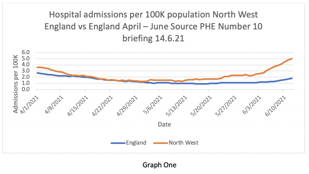
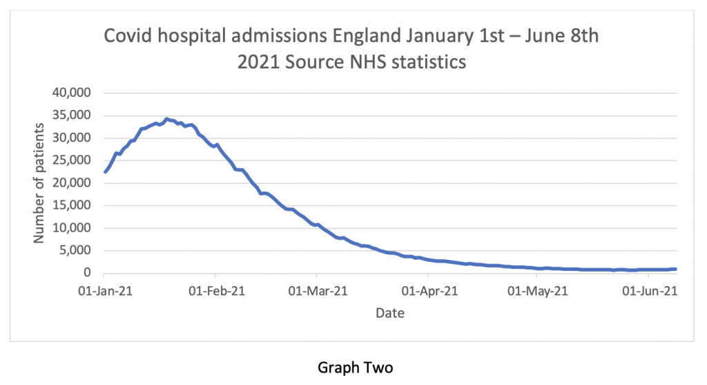
But Graph Two puts that ‘alarming rise in admissions’ into context – it’s so tiny one can’t actually see it. This is a classic statistical trick – altering the ‘y axis’ scale to imply a greater increase and altering the ‘x axis’ only to show the bit of data that supports the hypothesis and deliberately to exclude data points that refute it. For some reason, the following contextual graphic didn’t make it into the briefing pack.
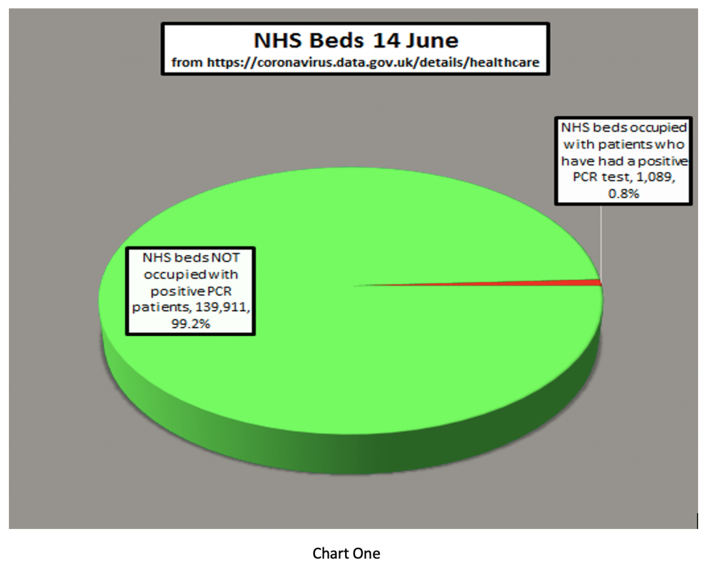
Next, the Prime Minister said that “the doubling of patients being hospitalised is very concerning for the Government”. It isn’t clear to me where he got the information that the number of patients being hospitalised has doubled – I can’t find it anywhere. I wonder whether number 10 might find Chart One useful. It shows the number of COVID patients in hospital vs the total NHS inpatient load. At present, less than 1% of inpatients in NHS beds are occupied by patients who’ve tested positive for COVID-19. In fact, there are 1079 patients and 1257 hospitals – we literally have more hospitals than patients.
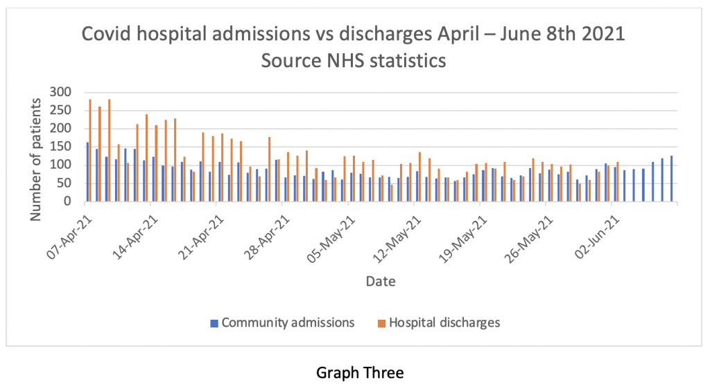
Of course, stating the number of admissions to hospital can also give the wrong impression if it isn’t balanced against the number of discharges. The NHS does not release discharge information very often, but we do have it up to the beginning of June – admissions and discharges are compared in Graph Three (blue for admissions, yellow for discharges). Clearly, admissions and discharges are pretty much in balance at the end of May and beginning of June. Earlier in the series, discharges exceeded admissions, despite the warnings of catastrophe from SAGE about the re-opening of pubs and schools.
What this graph means is that the total inpatient load on the NHS is virtually static at about 1% of capacity – patients are going out as fast as they are coming in. So, where’s the problem?
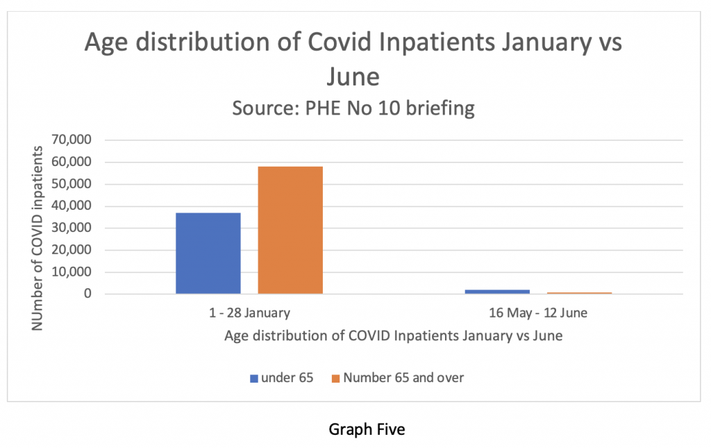
Professor Whitty did show a slide illustrating the percentage change in the age profile of patients admitted to hospital. Here it is in Graph Four. It shows the effectiveness of the vaccine in keeping older people out of hospital. But it implies that there are larger numbers of younger people being admitted instead.
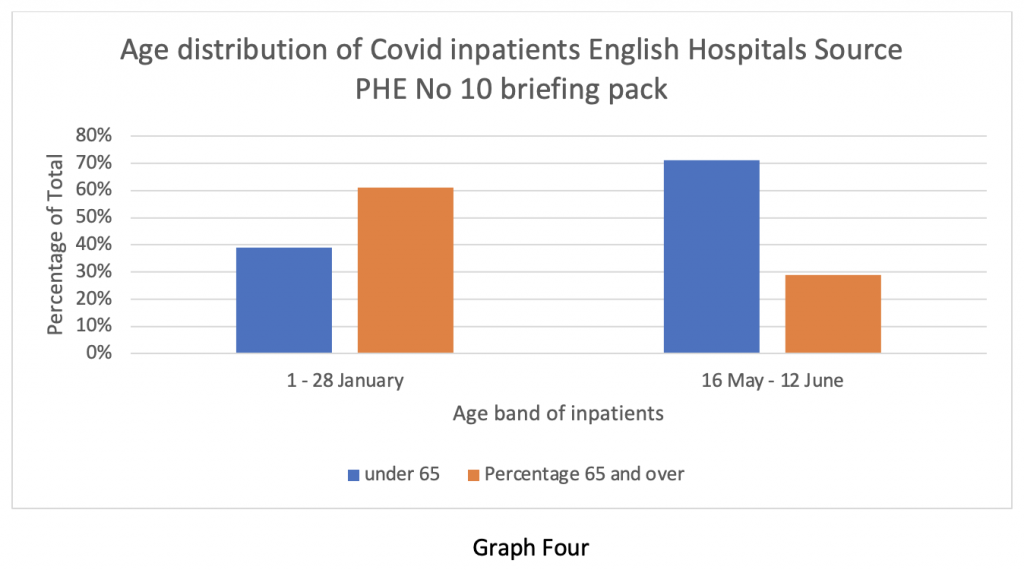
But when we look at the absolute numbers, we see the data presented in Graph Five. It shows the overall absolute numbers admitted now as a tiny fraction of those in January. Another classic statistical trick.
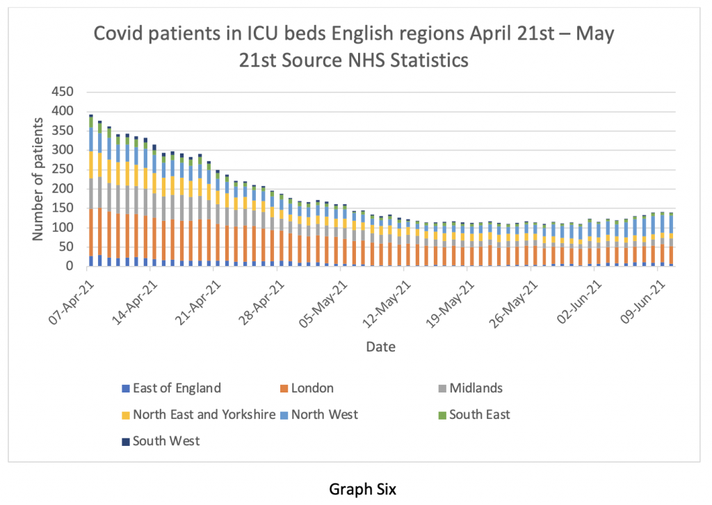
Of course, how seriously ill the patients are makes a big difference to outcome. Graph Six shows the number of COVID patients in ICU up to June 10th. There has been a tiny increase in the number of ICU cases in the last two weeks – arguably statistically insignificant, but we are well below the numbers from six weeks ago. I wonder why Professor Whitty forgot to mention this?
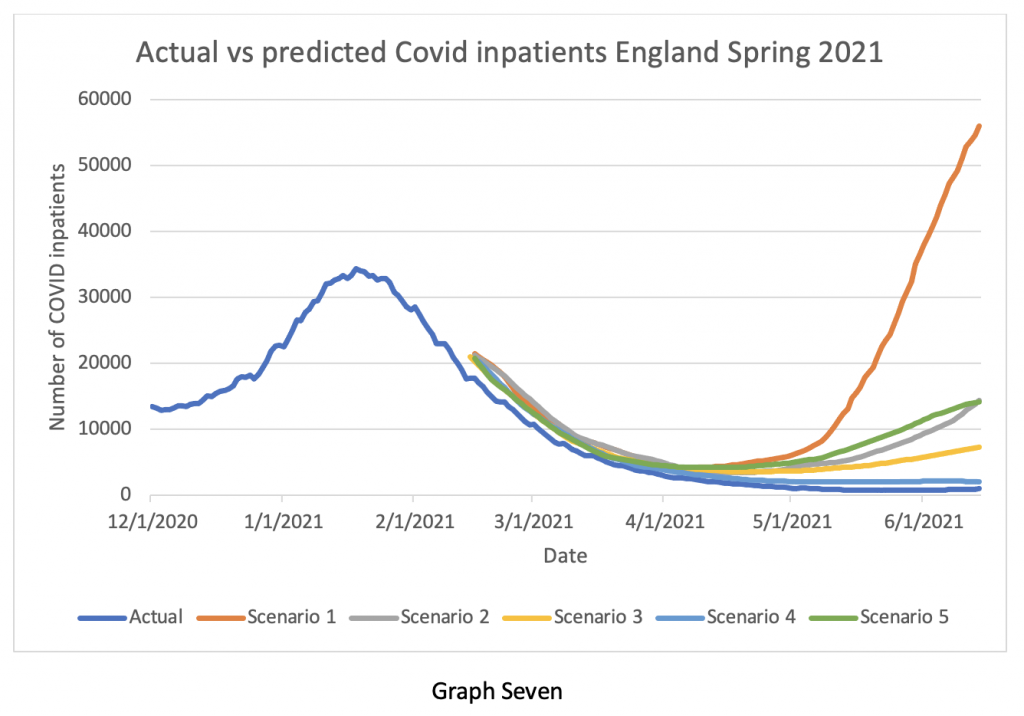
Much was made of the possibility of the situation with the Delta variant getting out of control and there being an ‘exponential rise’ in cases – I think I’ve heard that before somewhere. So, Graph Seven compares what actually happened (the lower blue line), with what the modellers from Imperial, Warwick and others predicted would happen in April and May. Look at the vertical axis – the predicted numbers of patients by the various modellers were out by factors ranging from Eight times to 50 times. The closest prediction still said we would have twice as many inpatients at the beginning of June than we actually have. Given this astonishingly inaccurate performance, why does Professor Whitty continue to have confidence in the modellers? And why does the Government continue to believe him?
And at the risk of boring the readers with official documentation, I came across a briefing note dated June 3rd 2020 from SPI-M-O, one of the acronym salad committees advising the Government.
Point 26 is interesting:
Analysis based on CO-CIN data indicated that as of 1st May, 30% of positive tests in hospital were linked to hospital acquired infection, including those in up to the fourth generation of transmission following discharge. Since then, as the number of cases in hospital have decreased, the proportion of infections that are hospital associated has increased, and was approximately 80% as of the 1st June. These estimates are preliminary and dependent on modelling assumptions used. SPI-M-O consensus statement June 3rd 2020.
To be frank, I’m still not quite sure if that can be true – do they really mean that 80% of the hospital inpatient load acquired Covid while in hospital for other reasons? Regular readers will recall I have frequently drawn attention to the (officially denied) high incidence of nosocomial infections, but I have never seen an estimate as high as 80% before. I think someone in authority needs to examine that statement and the raw data behind it very carefully and explain it to the public. It’s such a shocking number.
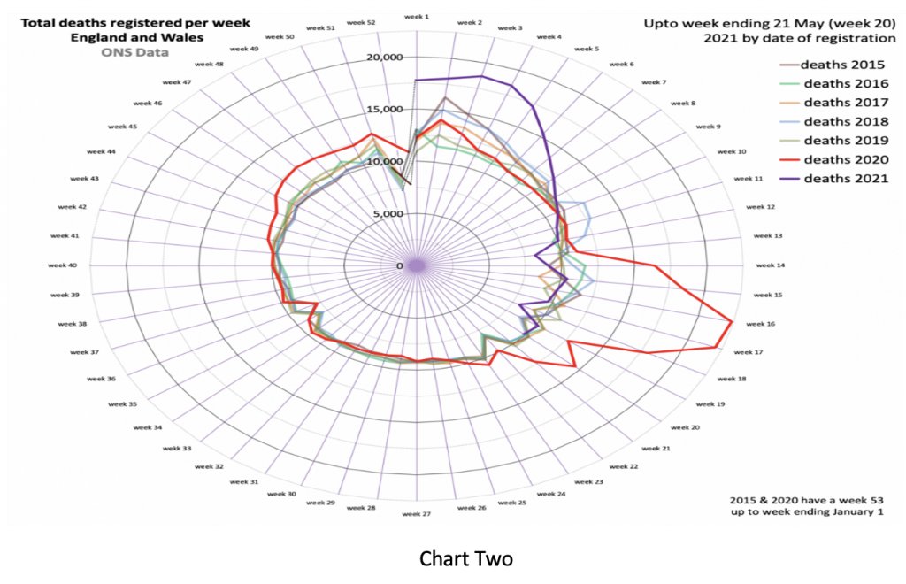
Next, we look at deaths. Here is my favourite Nightingale graphic, courtesy of Professor Carl Heneghan’s team at the Oxford Centre for Evidence-Based Medicine. The purple line shows overall deaths in England and Wales being below the five-year average up until the end of May.
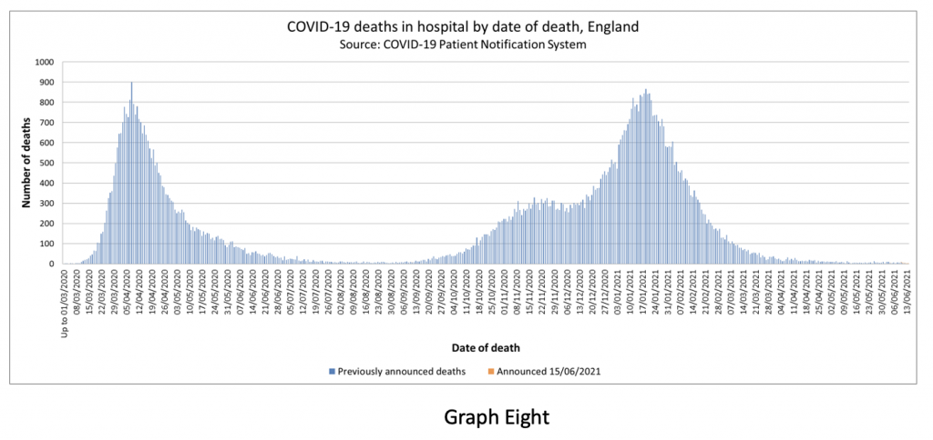
Of course, there is clearly a lag between infections, hospitalisations and deaths, so Graph Eight shows the overall Covid mortality. Can you see the worrying rise in Covid-related deaths in the last two weeks? No? Well, I can’t see it either – because it isn’t there.
The statistical tricks and data selection on display last night should be obvious to a junior medical student. They cannot be an accident or oversight. What really bothers me is just how blatant and amateurish this trickery is. It implies the Government is aware the deception will be seen through in an instant by anyone familiar with the whole picture – but doesn’t care.
The WHO still recommends that lockdowns or other societal restrictions are used as an intervention of last resort – when there is literally no other option left to prevent health services from being overwhelmed. There were occasions in the last 12 months where a reasonable case could be made to support short lockdowns. We are quite clearly not in that position at the moment.
My concern about the current situation is not just the manipulation of health data for political reasons (although that is certainly worrying), but that societal restrictions are now being viewed as a normal tool for the Government and ‘our NHS’ to use whenever they see fit – these are lockdowns of convenience, not of necessity. If the British public does not wake up and stop this behaviour, then it will continue ad infinitum.
I end with a fairly lengthy quote from Michael Gove talking in 2003 about identity cards in a Newsnight discussion:
It’s not the case that the state can demand of me certain things, those who exercise power, exercise power at my, your and David’s pleasure. Ultimately the important thing to recognise is that we as free citizens devolve power upwards – we don’t operate at the licence or leisure or pleasure of those who happen to govern us at any given point… I just have an a priori preference for limiting the powers of the state at any given time, because the general rule over the whole of human history is that once powers are yielded to the state at moments of crisis or emergency it is never the case… that the state hands them back.
I couldn’t put it any better than that.
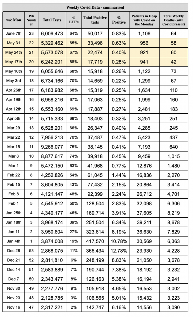
Stop Press: A reader has helpfully put together a data table showing the total number of tests, the number of positive test results, the percentage of positives, the number of patients in hospital who’ve tested positive and the total weekly deaths. As you can see, the latter two numbers are fairly flat.


Discussion
Comments
This week across the site:
To join in with the discussion please make a donation to the Daily Sceptic.
Profanity and abuse will be removed and may lead to a permanent ban.
Looking at nosocomial infections, here’s a chart I posted on LS back ion 12-11-20 taken from NHS data. Nosocomial infection averaged around 80% throughout 2020, it dropped a bit during the summer when hardly anyone was in hospital.
This data was always hidden in plain sight.
And what’s new about the idea of nosocomial infection in hospitals? Reminds me of an occasion when I was in one in the middle of winter for some major surgery. One of the reasons why they wanted you out as soon as possible was to have the capacity available, but the other was that you’re less likely to catch something else while recovering.
I have argued for some time now that several senior members of SAGE are politically motivated and are working to establish the authoritarian nanny state they crave. Putting a spin on the data is all part of the process and, once again, it seems they have sold Johnson a pup. I doubt they will succeed in the long run. It’s a slow process, but more and more people are waking up and I suspect compliance with mask wearing etc., will largely collapse in a few weeks when the predicted wave of fatalities fails to materialize. Real anger will only come when people are finally presented with the full bill for lockdown.
I am not sure what upsets me the most – the continuing reliance on failed and discredited modelling or the misuse of statistics. The idea that those responsible might be rewarded with a national honour is quite appalling.
I think the government is scientifically illiterate. It may be forgiven for that but not for continuing to ignore the counter-arguments, like this, from experts outside the SAGE coterie who have, in the main, been proved correct.
The Telegraph has spotted Wittty has been making up Ditties of Doom again and pointed out the graphs are wrong!!
I saw part of the SAGE modelling docs on Twitter.
Unless I’ve misread this, it seems to say that Mid Jul to Mid august would see c6 million infections (over 200k/day for 30 days).
THis can’t be right?
https://pbs.twimg.com/media/E33ZoVBWYAEv6wT?format=jpg&name=large
https://ariversideview.wordpress.com/2021/06/14/report-on-tonights-briefing/
Well, absolutely. I am grateful to the writer for laying out for us these transparently partial and deceitful misuses of the data. But, as you say, anyone with half a brain can see that these ‘projections’ and ‘illustrations’ don’t stack up; so the government must know, and the Mainstream News Media must know, but still choose to parrot the narrative as presented. The question is, why? I have read Mike Yeadon’s contribution below, and I still harbour some hope that he is a little hysterical, but all the possible explanations begin to point in the direction of some kind of non-Covid policy behind all this.
“A little hysterical”?
I think I prefer my experts in the field leaning towards hysteria with truth in their sails than waiting for my politicians and their lying advisors to get their ducks in a row and declaring “whoops” (at best).
When we’ve gone from Nightingale back ups (long ago disbanded) to Heathrow holiday camps (all shiny and new), I think we can safely assume the emergency they’ve prepared for has sweet FA to do with health.
It’s about time we all channelled our inner hysteria into a roar that focuses the minds of our national broadcasters and media. Remember them, the 4th Estate?
Klaus must have pissed himself laughing coming up with the title of his bible.
I’ve sent today’s LS update to my MP David Warburton, with some comments about what I think of his government’s lies. I think we all should do the same because all MPs will be brainwashed by this government’s rubbish
I have sent the link to Douglas Ross, leader of the Scottish Conservatives. My experience however is that they either ignore anything vaguely controversial or critical, or perhaps send a very anaemic reply.
As long as none of the journalists at the government press conferences can interpret a graph and question it, they will get away with their distortions and lies.
That (last one) table is very useful, but it would demonstrate the situation even better if there were two more columns, 1) Total deaths from all causes, 2) percentage from Covid-19. Even then, we should bear in mind that there is some evidence that deaths where Covid-19 is the primary cause are being significantly over-stated.
This is an excellent piece. But I doubt it will gain any traction among my family and friends (with a couple of exceptions). It seems to me that people in general don’t want to be made to think. They just want to be left alone in their little comfortable bubbles. They don’t know that their comfortable bubbles are a a sham. They will have a rude awakening when they eventually wake up. Then it will be too late.
Still, I’ll share it. Can’t say they weren’t warned.
I agree – vast majority of population couldn’t even SEE the lies unfolding from the charts Whitty was presenting and people don’t want to think. Sadly too many people have been well convinced by the 15 months of lying and have completely bought into the whole thing – how on earth can you persuade someone that they have had a medically dangerous jab which they cannot now undo???
What is of concern is how supine society and especially my science and medical colleagues are. No reputable medical individual can distort information as Whiitey did withy breaching his professional guidelines. Consent under the Montgomery judgment demand full. disclosure. He is affecting the medical and mental health of us all by supporting this. Gobbledygook of science. Where is the opposition ! Planet Normal, Talk Radio Lockdown Skeptics etc but we are an ce había chamber but need a political in house supporter.
Pity none of the journalists at the government press conferences can interpret a graph.
I was screaming these things (in my mind) at the TV as the ‘damn liars’ were saying them.
Good. Now, the task is to persuade as many people as you can that we’re being lied to.
There is no other possible route to salvation. None,
No one is coming to save us & the position becomes ever more perilous.
Good summary, but no idea why CEBM uses and this post repeats the (mis)use of the classical gee-whizzery of Florence Nightingale charts. The use of the radius as a surrogate Y axis and the use of a circle as a plot area means a non-linear scale. Compare the visual impact of going from 0 to 5,000 and 15,000 to 20,000. Both are increases of 5,000, and so they should appear the same, but see what happens in the Nightingale chart. Result: dramatic visual exaggeration of peaks, eg last spring (red hernia bulging out at 4 o’clock). Time to put the Nightingale charts to bed.
The situation is even more perilous even than indicated by this very good piece.
The reason is that the deception analysed here is by no means the first deceit.
In fact, every single one of the narrative points about this virus is a LIE. Always has been. And scores of countries adopted the same set of lies all pretty much at the same time & all discarded their pandemic preparedness plans. Simultaneously, severe censorship & repression of dissenting opinion was introduced.
Only a very stubborn person, faced with this evidence, resists reaching the unavoidable conclusion that this ‘pandemic’ has been used by persons unknown, operating at supranational level to disable scores of democratic countries.
The appropriate response was to be truthful about age based risk stratification & to deploy medicines as we discovered them. No lockdown should ever have been imposed, because they don’t work & never could work.
When people lie persistently about something important, there is a malign motive. They’re hiding something or slipping something in that otherwise wouldn’t be.
All we need to is to recognise we’re being lied to & that this has been a persistent feature. The real situation is that it’s midsummer & there… Read more »
Absolutely right, however angry we get will that be enough to tip the balance though?
Judging by how brainwashed and stupid the masses are – we are in for a short but mortal fight or many years of a dystopian, totalitarian nightmare.
One thing is clear now: no return to our normal life.
And I include my family in the stupid majority – I am the lunatic, they’re all the caring people who see the biggest threat of our time… blah blah blah.
Am I imagining things when BJ mentioned, on the 14th and this is not verbatim, that the delay would enable more people to be “vaccinated” (my sarcasm) to better enable the irreversible return to normality in July. Was this not the same person who stated, not so long ago, before the entire world that “lockdown” was responsible for the reduction in ? cases/deaths/hospitalisations?. Now he wants more jabs that were not “as effective” as lockdown ( but not for children?) to avoid a non medical intervention that he reckons…has “worked” ( my sarcasm again ) worked “better” than …jabs.
Am I going bonkers here I ask myself..
I wonder if fully entangled in the web of their own lies they can even see their own contradictions.
The Presstitute MSM will not point them out, that’s for sure.
They don’t care whether people with half a brain cell see through their lies. Their statistics are aimed at the sheeple so that they can say we did what the people wanted. I can’t believe that there is not a legal way to get rid of these scoundrels. Unfortunately they have the judiciary in their pockets.
Thank you an absolutely first class piece of analysis.
Has anyone sent this to the Speaker, the backbenchers I think it would be most educational.
And finally looking at this very, very clear evidence that the Country is being deliberately misled by the Government and its advisors can I ask what the F is going on here because it aint Covid, what are they up to?
I’m feeling a little buoyed up by the media push to scare us about climate change today. It’s as though they’ve been told to deploy the other climate boogie man to replace the covid boogie man.
I hope you’re joking?
I expect the switch to climate change restrictions.
I wouldn’t be surprised if, in a few months, the media is calling for depopulation as “the right thing to do” to save the planet.
Excellent excellent article thank you very much for explaining this to a non-statistical mind. I always know when there’s a rat you can smell it a mile away by their shifty eyes and they never quite seem to believe in what they are talking about. I went to enough sales pitches at work to sort out the wheat from the chaff. And this was definitely the latter. All this however has got absolutely nothing to do with a tiny tiny tiny bug that may or may not exist. And all to do with control by fear. Vaccine passports are nothing to do with medical status it’s just another way of prying and keeping us under control. We are being manipulated for depopulation and “climate change” purposes. Never thought I hear myself saying things like this but as Mike Yeadon said recently this is not a conspiracy theory as it is not a theory and it is a conspiracy. Sorry if I mis-quoted you Mike but you get the drift.
Thank you Doc. We all know the lies are taking over like weeds. I plan on copying this piece to hand to folk around me who think their govt is ‘doing a really good job’. Truth needs to spread to stop the weeds in their tracks.
Basically, this is what the ‘Wolf of Wall Street’ did.
Mathematics Help Online
Misleading graphs
http://passyworldofmathematics.com/misleading-graphs/
Excellent presentation of the facts, and I would suggest LS forwards this article to every MP! As a point of minor interest, I imagine the ‘David’ referred to by Mickael Gove in the 2003 Newsnight interview was Mr Blunkett, who now counts himself among the more lockdown sceptical politicians. How times change! But also, perhaps a reflection that the real issue is how power affects how people think, rather than whether this is all about a leftist agenda?
Good point. Power corrupts.
I’m more curious about the other David and that tune he was humming.
This chicanery is used to push dodgy stocks- I’ve seen it many times over the years. You just have to find a bit of the chart that looks impressive in isolation and hey presto- you have a winner! Send it to enough people with a message like Get in now before it’s too late- this COULD double/triple, etc. Could being the magic word of course, probably won’t and in fact this is actually just a correction in a huge downtrend and we’re desperate to move all this junk stock never seems to make it into print. It’s bad enough when this happens and it does get clamped down on generally, but for our elected leaders to use such tactics is truly sickening. That they know they’ll get away with it is beyond anything I can put into words.
Another graph was presented in the media tonight, which suggested that the UK had the higgest incidence of cases in Europe (thanks of course to the varriant formerly known as Indian).
The bar chart was tagged with the number 107 against the UK, with all other countries with smaller bars and numbers below. Of course, previous figures for cases have all been weighted per 100,000. It was only by reading the explanation below provided by the newpaper that you realise that the figure was 107 cases per MILLION.
In effect, the country continues to be lockrd down because 10 in every 100,000 might have a cold.
I do not even want to think about it where this magic money comes from to pay just for tests.
A friend was at Peterborough show ground last week, next to it a testing station. No-one there except staff, and in the evening she counted 20 mobile testing units. All need staff, equipment, foil lettering, diesel, insurance etc.
Replicate this around the country, the sums are just unbelievable.
I went to a ‘test centre’ to ask for advice on how to get a test elsewhere, as for getting a negative test result for travelling – the generous NHS just tell you to piss off if you want a test so you can travel, and the NHS test results, despite showing ‘negative’ may not be used for travel – either they mean nothing, or it’s so the private testing companies at the airports don’t miss out on more victims.
I chatted with the three guys at the gate (for an hour) who warmed up to me – they told me the whole thing was a load of bollocks and there wasn’t even any Covid, and that the testing was a scam. And then they pointed to the pile of cones that weren’t being used and asked me to guess how much they cost – it was something like 57p per cone per day – all rented from a private company.
The NHS test centres look like concentration camps – perhaps to get you used to the idea that these are the kind of places you’re going to end up in if you don’t toe the line and brainwash yourself.… Read more »
When returning to the UK one has to compulsory buy a days 2 & 8 test set.
Yet one can also additionally buy a day 5 early release test.
Hmmm, why can’t they use the day 8 test for the day 5 early release test instead? Same bullshit PCR tests.
Someone’s till is going ker-fuckin’-ching whilst our pockets are going what-where-who-the-fuck!
A finance person recently pointed out that the 2008 GFC might have been engineered or at least exploited to create the conditions where we accept massive money printing, which has been necessary to finance lockdowns.
Had this casual acceptance not been in place, lockdowns simply couldn’t be done, as it’d have triggered a sterling crisis in short order.
This introduces an interesting evolution of economic thought, could taxes be used in place of interest rates to manage inflation. The benefits are that the money goes back to Government rather than middle class savers to be spent on climate change. This allows the perpetual printing of money, the introduction of UBI, the control of inflation, the subservience if the middle class.
They already play with it to some extent, such as via the excise duty on fuel oil (which they have frozen for a while). It affects the consumer price index (CPI) a bit. Remember, we also pay tax on top of duty, so adjusting the VAT rate is another tactic.
Great analysis, well done
Often lurk, rarely comment. Earlier today the Telegraph website had a front page splash by Henry Bodkin explaining how shonky the graphs last night were. I tried to show it to the missus just now, and it had gone! Eventually found it in the politics section, not even a reference to it on the front page now! I find this deeply sinister. Were they lent on?
Still there if you hunt for it, but definitely squirrelled away.
https://www.telegraph.co.uk/news/2021/06/15/fear-freedom-doom-laded-government-graphs-dont-show-us/
2243 comments on that Telegraph article now!
Has anyone noticed the really BIG FRAUD in graph 1, they used the american date format to trick people and make them think, without a careful reading, that it referred to Jan 4th when admissions were genuinely relatively high (not so high as some bad flu seasons, not high enough to ever justify lockdowns, but still high enough to make things stressful for hospital staff). In reality it refers to 1st April. For the government to make such a bizarre and deceptive choice of date format when plotting that graph would tend to imply there is malicious intent and while this whole coronapanic amy well have been a cockup initially such deception indicates it is now being used very deliberately.
I was about to comment on this but you had beaten me to it. May I say I feel you are being extremely generous by saying ‘would tend to imply’.
It’s fraud. Blatant and sinister.
Well spotted. They do the same in graph 7.