It’s summer in the Northern Hemisphere so the heat hucksters are out in force. Alas, there are currently thin pickings in the U.K. – last year’s star of the show – where the summer has turned distinctly chilly. Further north is also very disappointing and largely absent from the public prints. Arctic sea ice continues its steady decade-long recovery, and current levels on the Greenland ice sheet are above the 1981-2010 average. But no matter – African countries surrounding the Sahara and nearby southern European locations can always be guaranteed to raise a scorchio cheer, along with Death Valley in the Arizona desert. Guaranteed climate change fearmongering in action here, every day of the week.
Come rain or shine, flood or drought, the weather is being ruthlessly weaponised to persuade us to embrace a collectivist Net Zero plan. Last week, heavy rain caused some flash flooding in Vermont. USA Today claimed that “dramatic flooding” was rare in Vermont, adding: “Expect more amid climate change.” The BBC reported the event, adding the routine house scare that “climate change makes extreme rainfall more likely”. What is missing in all this propaganda is any proof of the claims and any attempt to put bad weather into an historical perspective.
In a paper looking at the climate variability of the American state’s natural hazards, published in 2002 by the Vermont Historical Society, it was noted:
One of the most pervasive hazards that impinges upon and marks the Vermont landscape is flooding. Rarely does a year elapse without a flooding event of a significant magnitude being reported in at least one of Vermont’s 14 counties or perhaps state-wide, making this the number one hazard across the state.
On July 4th, Matt McGrath of the BBC reported that the world’s average temperature had reached a new daily high of 17°C. McGrath partly attributed the rise to “ongoing emissions of carbon dioxide”, and reported the view that July will be the hottest month in 120,000 years. Quite how anyone can know that is a mystery.
It turns out that the hottest day claim, which provided clickbait for headlines around the world, was the product of a computer model called Climate Reanalyzer, run out of the University of Maine. The operators perhaps felt a pang of guilt over the widespread use of their modelled figure noting, a few days later, that much of the elevated global temperature “can be attributed to weather patterns in the Southern Hemisphere that have brought warmer than usual air over portions of the Antarctic”. In other words, long-term climate change, human-caused or natural, had nothing to do with any rise, it was a local meteorological event.
It is important to understand that all these ‘records’ are based on historical data that are incomplete, often inaccurate and are rarely more than 100 years old. Until recently, sea temperatures in the Southern Hemisphere were recorded from a bucket thrown from a passing ship. All the major land surface temperature datasets are ravaged by growing urban heat corruption, and recent temperatures have been further warmed on a retrospective basis via ‘adjustments’. Growing questions are being asked about the accuracy of many recordings, with the U.K. Met Office willing to declare ‘records’ from a runway used by Typhoon fighter jets and other sites that the World Meteorological Organisation states come with an error estimate of up to 2°C. Meanwhile, the most accurate record we have of air temperatures is compiled from satellite data by scientists at the University of Alabama in Huntsville and this shows less warming since 1979. The results are rarely noted in mainstream media, and last year Google demonetised one of the compilers by banning him from receiving money from its AdSense scheme.
Climate historian Tony Heller has released a short film noting that “fake historical data” and bright red maps are key tools being used to scare people into compliance with an anti-energy agenda. The highest temperature ever recorded on the planet was 58°C in the Libyan desert, and the record stood for 100 years before climate alarmists managed to erase it from the record. Temperatures over 50°C are not unknown in Libya, with 50.2°C recorded in June 1995 at Zuara.
In the past, Heller notes temperatures over 38°C were recorded in Alaska over 70 years ago. In 1957, the Soviet weather service reported a week of 38°C temperatures north of the Arctic circle. In Phoenix, Arizona, there were 18 consecutive days of 43°C in 1974, at a time, Heller notes, when there was a fear of global cooling. This record may be broken in the near future he continues, but it will not have anything to do with global warming, just as the temperatures in 1974 had nothing to do with global cooling. The U.S. is likely to see highs of 38°C in Texas and the desert southwest, observes Heller, but in 1936, 13 states were over 43°C and 30 passed 38°C. Illinois was over 45°C, and people were reported to be dying from the heat in Detroit at the rate of one every 10 minutes.
The fact is that the percentage of the United States that reaches 38°C sometime during the year has plummeted since the 1930s.
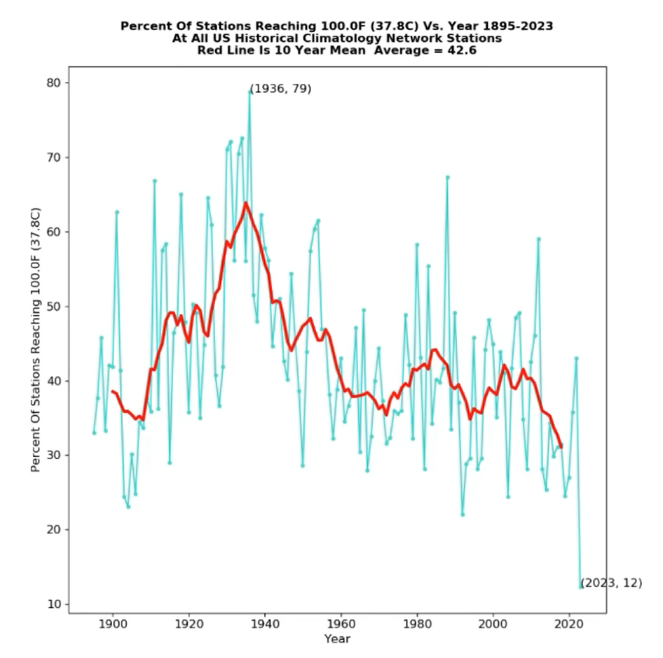
The graph above shows that since the mid 1930s, the number of U.S. weather stations recording at least 38°C (100°F) has fallen by half. In addition, it shows the trend sharply decreasing since the turn of the century. People in authority, argues Heller, are pushing for the demise of fossil fuels using fake statistics and blood-red maps. The red fires of hell, he suggests, have always been used to scare the public into conforming.
Chris Morrison is the Daily Sceptics Environment Editor.
Stop Press: Tourists are turning their backs on the Med, giving the above average temperatures – apart from the Brits, according to the Mail.


To join in with the discussion please make a donation to The Daily Sceptic.
Profanity and abuse will be removed and may lead to a permanent ban.
‘Last week, heavy rain caused some flash flooding in Vermont……..USA Today……“Expect more amid climate change.”
‘One of the most pervasive hazards that impinges upon and marks the Vermont landscape is flooding. Rarely does a year elapse without a flooding event of a significant magnitude being reported in at least one of Vermont’s 14 counties…..’
The Vermont Historical Society 2002
Brilliant stuff…..just picking myself up off the floor….
Thanks.
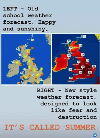
Last year, I shared one of those “weather maps then and now” pictures on Facebook, and it was deleted. This speaks volumes about who is in on this agenda.
Does anyone also remember how it used to be that when temperatures were over 25 degrees celsius, the forecasters would suddenly change to using Fahrenheit? Did temperatures in the “high eighties” sound more dramatic?
I remember when a few years ago, announcements of “worst drought ever” was followed by three weeks of non-stop rain.
I was explaining the change in use of colours on weather maps to my wife and sister the other day. My wife as usual rolled her eyes. Have you got a link you could post on here. I’ve seen one myself but can’t remember where.
GlassHalfFull posted one under the ‘And Finally..’ segment.
Anyone remember Dennis Howe? He was the Minister for Sport in the 70s. He was also appointed Minister for Drought during the long hot summer of 76 think it was? Anyway within a week of his appointment the heavens opened and it didn’t stop raining for months! What a hero!!!!!
We’ve really got to clamp down on these so-called ‘Historical’ societies and all the dis-/mis-/mal-information they spew out. Ban ’em I say. /sarc
The picture is quite appropriate. What was once an occasionally magnificent civilisation has turned into a comedy, or in truth a tragedy in the true sense of the word. How the mighty have fallen. We know more than ever, but our failings of character will destroy us.
NudgeWatch.
Centrica says “Suggestions that hydrogen is unlikely to be part of the solution … risks undermining the energy transition and increasing the costs for everyone….we also want the move towards a low-carbon economy to be a fair and just transition – a step forward that creates job opportunities for thousands ….leaves no worker or community behind.
And it must be a transition that sees us using the expertise and experience of workers in our existing oil and gas industries, and retraining them for the new, green energy sources of the future.
In order to deliver, the Government must take decisive policy decisions. Working with business, unions and academics, ministers must construct a clear strategy on how we deliver a secure, resilient, net zero energy system. And we must also ensure we create a well-funded, flexible skills system…”
Too many “musts”
https://www.telegraph.co.uk/business/2023/07/18/net-zero-opportunity-transform-economy-energy-transition/
Centrica spewing nonsense.
Thats not a policy. Its not a plan. Its a wish list
The weather is not playing ball in the UK at the moment. So the hunt is on for some cataclysmic weather event some where on the planet. What there isn’t one ? F**k it make something up.
Growing questions are being asked about the accuracy of many recordings, with the U.K. Met Office willing to declare ‘records’ from a runway used by Typhoon fighter jets and other sites that the World Meteorological Organisation states come with an error estimate of up to 2°C.
The neat thing about using the passive is you don’t have to specify who is asking the questions. As far as I can see it is pretty much confined to committed climate sceptics.
Meanwhile, the most accurate record we have of air temperatures is compiled from satellite data by scientists at the University of Alabama in Huntsville and this shows less warming since 1979.
Why is the RSS analysis of the same data less accurate than the UAH analysis? More to the point – less warming than what? The satellite record began in 1979 so it can’t mean less than before 1979. It certainly shows warming. This has been consistent at +0.13C/decade (0.12C over sea, 0.18C over land) for a long time.
“The neat thing about using the passive is you don’t have to specify who is asking the questions.”
Well, I guess we’re just taking a leaf out of the propaganda and psychological manipulation playbook of our enemies. Check out any opinion poll, survey, BBC or other MSM news report and you are quite likely to find cherry picked “questions are being asked” references intended to nudge and create an impression. This is war, which can only end with the crushing defeat of one side or the other.
“This has been consistent at +0.13C/decade (0.12C over sea, 0.18C over land) for a long time.”
Could you quantify ‘long?’
That would involve rooting through the record and I am afraid I don’t have time to do that. Sorry.
Of course you don’t!
However, I did calculate the linear regression coefficient from the beginning of records to every month. This can’t be what they use because the answer since 2012 has been consistently about 0.14C per decade not 0.13C – but it does illustrate that the trend has not changed for 10 years or more.
Spectacularly silly reply.
Why is it silly? (Note my comment here.)
Why is the RSS analysis less accurate than the UAH analysis?
UAH has corrected clearly spurious data in the older NOAA-11 to NOAA-14 satellite instruments and the other datasets have not. These satellites used an earlier MSU instrument and had orbital problems that needed to be corrected for.
Satellite temperature measurements are more useful than surface measurements in climate studies for several reasons:
The data used is all collected the same way and with similar instruments.
More atmospheric mass is included.
The temperature measured is mostly above the chaotic boundary layer of the atmosphere and is more stable.
Radiosonde data is available as an independent check on the calculations.
Regarding the fourth point above, the UAH temperature calculations correlate best with the radiosonde data, suggesting that it is the best satellite temperature record.
The RSS decision to include the clearly flawed NOAA-14 data in their calculations is highly questionable when the clearly superior NOAA-15 data is available for the period in question.
I had forgotten this particular line. I expect the RSS team have their reasons for including the spurious data – they aren’t idiots – but this is beyond me.
The radio sonde data story is much more complicated than sceptics like to make out. Radio sonde data requires a lot of selection and analysis with the result that there are several radio sonde temperature data sets with significant differences between them. For example, this (rather old) blog post discusses a comparison of UAH, RSS and the RATPAC dataset – RSS is closer than UAH.
Of course they have their reasons, and they are not alone:
‘From late 1998 through 2004, there were two satellites operating: NOAA-14 with the last of the old MSU series of instruments on it, and NOAA-15 with the first new AMSU instrument on it. In the latter half of this overlap period there was considerable disagreement that developed between the two satellites.
Since the older MSU was known to have a substantial measurement dependence on the physical temperature of the instrument (a problem fixed on the AMSU), and the NOAA-14 satellite carrying that MSU had drifted much farther in local observation time than any of the previous satellites, we chose to cut off the NOAA-14 processing when it started disagreeing substantially with AMSU. (Engineer James Shiue at NASA/Goddard once described the new AMSU as the “Cadillac” of well-calibrated microwave temperature sounders).
Despite the most obvious explanation that the NOAA-14 MSU was no longer usable, RSS, NOAA, and UW continue to use all of the NOAA-14 data through its entire lifetime and treat it as just as accurate as NOAA-15 AMSU data. Since NOAA-14 was warming significantly relative to NOAA-15, this puts a stronger warming trend into their satellite datasets, raising the temperature of all subsequent satellites’ measurements after about 2000.
RSS, NOAA, and UW satellite datasets are the outliers when it comes to comparisons to radiosondes and reanalyses, having too much warming compared to independent data.
But you might ask, why do those 3 satellite datasets agree so well with each other?
Mainly because UW and NOAA have largely followed the RSS lead… using NOAA-14 data even when its calibration was drifting, and using similar strategies for diurnal drift adjustments.
NOAA and UW are, to a first approximation, slightly altered versions of the RSS dataset.’
When we get into discussing the relative merits of different radio sonde datasets I think it is time to stop! Thanks for an informative session.
Excellent ‘get out of jail’ line…..
Bon voyage!
Bon voyage, MTF, indeed.
Take care that the door doesn’t crack your arse as you depart.
https://s.w.org/images/core/emoji/14.0.0/svg/1f923.svg
Christ this MTF guy is an ahole. Sorry MTF, but you’ve come up with some doozies today. You make some good points and you also talk crap. You’ve got people checking their facts though, which is good. Otherwise they’d be…well, they’d be cherry-picking wouldn’t they.
What I have done to get you so worked up? I have made three comments today (not counting this one). Which are the ones that offend you?
https://dailysceptic.org/2023/07/18/bright-red-weather-maps-and-fake-temperature-records-drive-climate-panic/#comment-890325
https://dailysceptic.org/2023/07/18/bright-red-weather-maps-and-fake-temperature-records-drive-climate-panic/#comment-890235
https://dailysceptic.org/2023/07/18/bright-red-weather-maps-and-fake-temperature-records-drive-climate-panic/#comment-890296
Worth remembering that RSS was consistently LESS “warm” that UAH until about 4-5 years ago.
Then someone “had a word” with RSS and they tweaked their algorithm (or Al Gore rhythm?) And are now consistently a bit higher than UAH.
Not a lot in it, but the whole Climate Scam is based on tens of thousands of these little tweaks and studiously ignoring Urban Heat Island effects and fraudulent use of weather stations with blatantly poor locations.
Figures don’t lie. But liars sure do figure.
RATPAC-A2 has virtually no adjustments after 1998, so contains warming shifts known to have occurred in the Australian and U.S. VIZ sondes for example.
The IGRA dataset used in Christy et al. 2018 utilized 564 stations, whereas RATPAC uses about 85 globally, and far fewer just in the tropics.
RATPAC-A warms relative to the other radiosonde/reanalyses datasets since 1998 (which use over 500 sondes).
I think all the climate ‘sceptics’, I know accept that the climate changes. It changes every day, as it has for 4.5bn years.
What we are less convinced by is
I could go on for a while, but this is no longer about winning the argument. The argument is already won. Climate Science is a fraud, a scam, fallen for by many, supported by millions of useful idiots, but a scam nonetheless. When you see the lie, it cannot be unseen.
Well said
May I correct one error which I suspect most of the people you speak on behalf of would not support.
‘Man Made’ if you can distinguish it is 3% of a fractional gas. The biggest source being volcano’s
It is virtually certain that all the increase in CO2 since about 1800 is down to man. which is about 50%. It is true that about 3% of the CO2 going into the atmosphere is from man made sources but prior to man made sources CO2 was in balance – inputs matched outputs. So the 3% is all the recent excess CO2 which has accumulated to give us the current 420ppm.
Thought you’d left the building, FFS. The point about CO2 is that it’s an irrelevance. All the mewling and crying about the appalling levels of the damn stuff is just so much babyishness. Who gives a sh*t about 420ppm? Spend the money on other stuff. Spend it on researching more realistic ways of replacing fossil fuels, if indeed that’s really necessary. Christ!
Warming has indeed been around for a very long time:
‘Spectral analysis of 2000 year global proxy temperature data H.-J. Luedecke*, C. O. Weiss**
The proxy temperature records utilized represent about 500,000 individual measurements.
These together with satellite- and HADCRUT4 data for the recent past were used to construct a global temperature history for the past 2000 years by averaging the different records.
The “climate” according to definition was obtained as the 30 year running average of the yearly data.
The climate curve thus obtained shows clearly the historically known extrema (Roman optimum, Medieval optimum, Medieval little ice age; and, very pronounced, the historically documented minimum of 1450).
The climate curve shows the warming from 1870 to 1990.
The yearly data were then Fourier-analyzed.
The spectrum shows 3 overwhelmingly dominant cycles of 1003, 463 and 188 years period, already known from local studies, along with a number of rather weaker cycles.
According to the dominance of the 3 main cycles, the sum of these cycles closely represents the climate curve obtained by the 30 year averaging (with correlation of 0.8).
The cycle sum also exhibits rather precisely the warming from 1870 to 1990, which is usually attributed to influence of CO2. This latter result was recently independently confirmed by neural network prediction of the period 1870 to 1990 temperature, based on patterns contained in proxy temperature data from 0 AD to 1830 AD, for various locations worldwide.
These findings point to a rather low climate sensitivity of CO2.
Conclusion:
Climate change during the recent centuries is periodic.
Warming since 1870 attributed to CO2 is in reality caused by the 200 year solar De Vries cycle
Present cooling, increased warming 1970-1997, is due to periodic (65 year) Atlantic Multi-decadal Oscillation (AMO) and the Pacific Decadal Oscillation (PDO).
Spectral analysis figures show that all temperature changes are natural, with no trace of warming by C02
As I am sure you know there have been many, many papers examining the temperature record over various periods and possible causes. This is just one contribution. On the face of it is a rather dubious technique. They appear to have just subjected the data to Fourier analysis, and not surprisingly identified some cycles, only one of which (the 200 year) has some known physical basis, then when it recently doesn’t conform introduced AMO and PDO to explain it. But I can only read the abstract so who knows.
Oh, I see!
I thought ‘the science is settled’…….
Of course it is not settled. Science is never settled.
And yet we are to be subjected to all manner of nonsenses based on ‘who knows’, in other words, the square root of beggar all……..
Back again already?
You shouldn’t raise false hopes.
So you would prefer not to have read an opposing point of view? I think there are some on this forum who welcome it and you can always just skip my comments.
Anything outside of a pleasant (for humans) 19-22 C temperature range is now considered extreme. Heavy rain? Extreme! Heavy snowfall? Extreme! Hot sunny day? Extreme! FFS, take an umbrella or an ice cream and stop whining.
Seconded
19 -22 C the perfect environment for those with laptops that rarely go out of doors, so anything other than their perfect environment is going to be extreme, but for those of us who do go to the world outside of a laptop, it is just weather. As an aside, did you notice the ten year mean average of the chart within the article, suggests a steady reduction in the high temperature extremes, which could indicate global cooling.
I’ve always wondered why we even still have weather forecasters on the telly. I mean, surely with everybody having the internet at their fingertips, even on the go, these weather people are redundant now? I’ve not watched the weather forecast on TV for years, I just look on my phone. And if anyone says “it’s for the old people” then I just think that’s lame and doesn’t ring true tbh.
They are all wrong most of the time anyway. Look at the forecast for 3 to 5 days ahead and keep checking it. The forecast keeps changing until you reach the day in question, 3 to 5 days ahead, and it is more often than not completely different. Regardless of anything else, if their models can’t accurately predict the weather a few days ahead, how on Earth can they predict it (or the climate) 50 to 100 years ahead.
Well exactly. Over here in the NL, where everyone cycles as our preferred means of transport, we all have a ‘rain radar’ app. It’s very accurate for real time or just a few hours in advance and that way you get to dodge the rain and avoid getting wet. But start looking at any forecast that’s further into the future and you get less accuracy. That’s just how it is when you live somewhere with unpredictable weather patterns. It must be very boring indeed being a weather forecaster somewhere like Australia or California for instance.
“They are all wrong most of the time anyway.”
Exactly.
At 9 am last Tuesday we were advised of Very Heavy rainfall commencing at 2pm. By 11 am this had moved to 3pm. At noon 3pm had become 4pm and a small downpour actually occurred at 5pm. In other words the Met Office is firkin useless.
However, by 2030 this country will be too hot to live in – king Chuckles said so and he and Khant have a clock to prove it.
Tossers the lot of them.
That’s invariably been my experience too. It’s a waste of time looking to see what the weather is likely to be on any particular day at least until the day before.
But even on the day they sometimes get it wrong too. One afternoon as I was about to go out, in Belfast, I was listening to the BBC Northern Ireland news and weather on Radio Ulster (broadcast from Broadcasting House in Belfast, 2 miles from where I live) and the weather person said it will stay dry this afternoon. Two minutes later I walked out the door and it was raining! The weather person must have been in a basement, because if she had looked out the window she would have seen it wasn’t dry!
I deleted the weather app on my ‘phone last week simply because it was always hopelessly and consistently wrong.
We had a Training Course this weekend and throughout the last week the forecast threatened rain of Biblical Noah proportions on both Saturday and Sunday. In the event Saturday was worse than Sunday contrary to predictions and we lost five minutes work owing to rain over the whole weekend.
The only thing that is reliable about weather forecasts is that they are ALWAYS wrong.
Ironically, about 25 years ago the Independent had a column “do we need”, and once it was TV weather forecasters. Climate change hadn’t been invented then (it was still “the greenhouse effect” era, having moved on from “the hole in the ozone layer “), and this article cited that what tv forecasters say is actually complete gibberish. As if anyone cares about “winds over the North Sea”; they can’t see the map behind them, so they wave their hands vaguely over where they think Scotland is; they say a lot about yesterday’s weather, which we already know; and the well-trained ones fix their eyes on the camera, as if to hypnotise the viewer. Poor old Michael Fish.
It’s all to do with “perception management” to frighten the masses who are then easier to control with draconian measures.
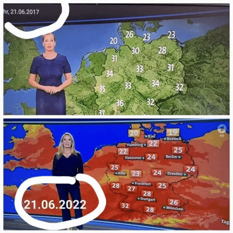
Brilliant. I saw another pair of similar maps where the earlier map (again with higher predictions) had little smiling “sun” symbols scattered across the green. Can’t find it now.
I also have this one.
Tony Heller constantly points to how today’s climate catastrophists emphasise dramatic weather events and ignore or hide all the thousands of dramatic events in the past. Bad weather is not new.
“Bad weather is not new.”
Strictly speaking there is no such thing.
Weather just IS.
Spanish Alert !! – It reached 127 degrees Fahrenheit, 52.8 degrees Centigrade in Zaragoza.
In er, 1935.
Don’t worry though, it was a false claim but even if it was correct it doesn’t disprove climate change caused by humanity.
So there.
One day last week it was 14 degrees with heavy rain and a lashing wind, enough to snap off a few sweetcorn tops and demolish a runner bean tripod. Yet a Met Office weather report insisted it was an orange-coloured 19 degrees although ‘feeling cool in the breeze’. Complete fabrication.
Red Weather Maps Fake Temperature Records – Climate Change Hoax in full swing
Leaflet to Print
Tuesday 18th July 7pm
Third Tuesday Freedom Drinks
The Little Angel A4130 White Hill &
Remenham Lane Remenham,
Henley-on-Thames RG9 2LS
I agree about the fake weather maps but you should look into how the constitution of UV light has undergone significant changes especially in the last two years. You might go out on a not particularly sunny day and find yourself feeling more sunburn than you would’ve done on a brighter day in years past. The most fundamental aspect of our physical reality right now is the manipulation of the weather. It is almost too horrific to contemplate given the scale of the operation but it has to be faced. They will tell you that they have to carry on now because if they stop then catastrophe will ensue. And each passing moment reuires more and more intervention. Like an addict requiring greater and greater quantities of a substance to bring on a simulacrum of normality.
I’d love to know where the claims of a global temperature of 17 degrees comes from. http://www.global.temperature says that the current global temperature, based on data from over 52,000 weather stations, is 14.15 degrees. They give the temperature anomaly compared to a 1991-2020 baseline as about +0.25-0.3 degrees which corresponds pretty well with the UAH data. Presumably by using a huge number of weather stations they can minimise the UHI and by reporting raw data without any adjustments give a pretty good idea of reality.
You can simulate this situation with some precision.
First, stick your feet in the freezer. Then lie down so your head is in the oven, in which you can easily adjust the setting.
Now, “on average”, you will be really comfy.
Someone sent me this…The British Bullshit Corporation has entered a whole new league of bullshit terror tactics where ‘climate change’ is concerned.
https://www.bbc.co.uk/iplayer/episode/m001nx70/why-sharks-attack
I can’t view it of course because it’s BBC iPlayer and I don’t go there but I’m guessing it’s probably sensationalist alarmist propaganda BS. But hey what do I know eh? Other than it’s doing the rounds right now.
The ‘intro’ page says it all though. The bastards are now using human activity and using the climate change BS effect on bloody sharks, to scare people.
See the link to actual stats re shark attacks on human beings if you’re interested in the facts according to ‘official’ sources.
Here’s the real stuff…
https://www.statista.com/statistics/268324/number-of-shark-attacks-worldwide/
Also, and even more informative…
https://worldanimalfoundation.org/advocate/shark-attack-statistics/
Little FACT CHECKER me says…Sharks kill around 10 people a year, and humans are responsible for killing over 100 million sharks. Easy peasy to check, but no, Aunty Beeb is the only source of true facts eh?
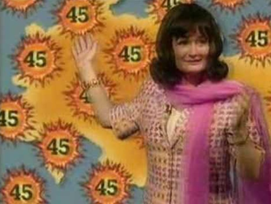
Scorchio! indeed.
I’ve coincidentally been rewatching The Fast Show these last few days. It’s still Brilliant!
Thank you Chris for continuing report all this abject merde. We have ears, and we are listening and propagating.