The more vaccine doses an area of England has received, the greater the number of excess deaths it has experienced, an analysis of official data has found – adding to worries that the novel Covid vaccines are contributing to the sharp rise in excess deaths seen since mid-2021.
The analysis looked at excess death rates and vaccination rates for all 300-plus lower tier administrative areas in England. It used the pre-pandemic five-year average (2015-19) as a baseline and controlled for confounding factors such as age and deprivation by comparing the findings in the vaccination era to those in the first Covid wave, before vaccines were available (Figure 1).
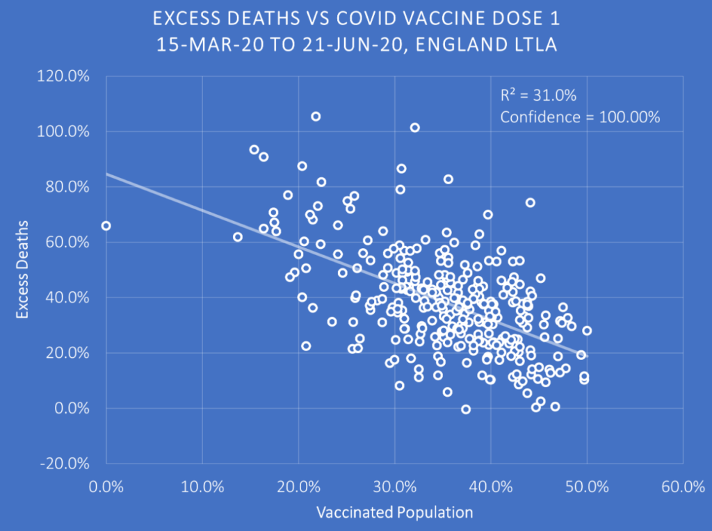
In the first wave (March 15th to June 21st 2020) the areas which would go on to be more highly vaccinated had lower excess deaths on average (the reference vaccination rate is as of March 7th 2021, first dose only). This is a result of the healthy vaccinee effect, whereby people who choose to get vaccinated tend on average also to be people who had better health outcomes pre-vaccine (note that vaccination and health both tend to correlate with wealth). As a result, even if the vaccine was a placebo that had no effect, more-vaccinated areas would have fewer excess deaths on average than less-vaccinated areas. The downward slope in the chart above is thus a baseline for what happens after vaccine rollout. After the vaccination rollout, if the slope becomes steeper then it means that the more-vaccinated areas have even lower excess deaths than they did before the rollout, indicating the vaccine may be lowering the death rate and saving lives as intended. On the other hand, if the slope becomes shallower or reverses direction then it means something is counteracting the background health advantage of the more-vaccinated areas, suggesting the vaccines may be having the opposite effect of the intended one and increasing excess deaths.
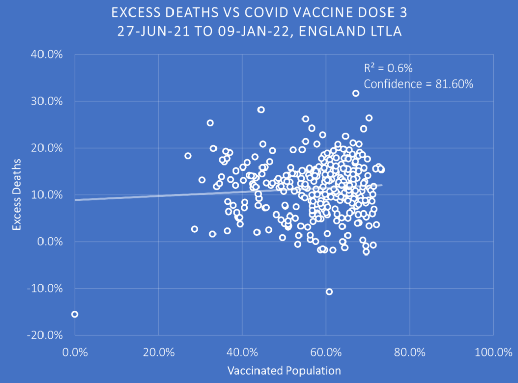
The analysis looked at the three periods of excess deaths in England after the vaccine rollout (Figure 2). These are, broadly, the Alpha period of winter 2020-21 (December 20th 2020 to March 7th 2021), the Delta period of the second half of 2021 (June 27th 2021 to January 9th 2022) and the Omicron period of 2022 (March 27th 2022 to January 1st 2023) – though it’s important to keep in mind that for the Delta and Omicron periods many or most of the excess deaths were not Covid related.
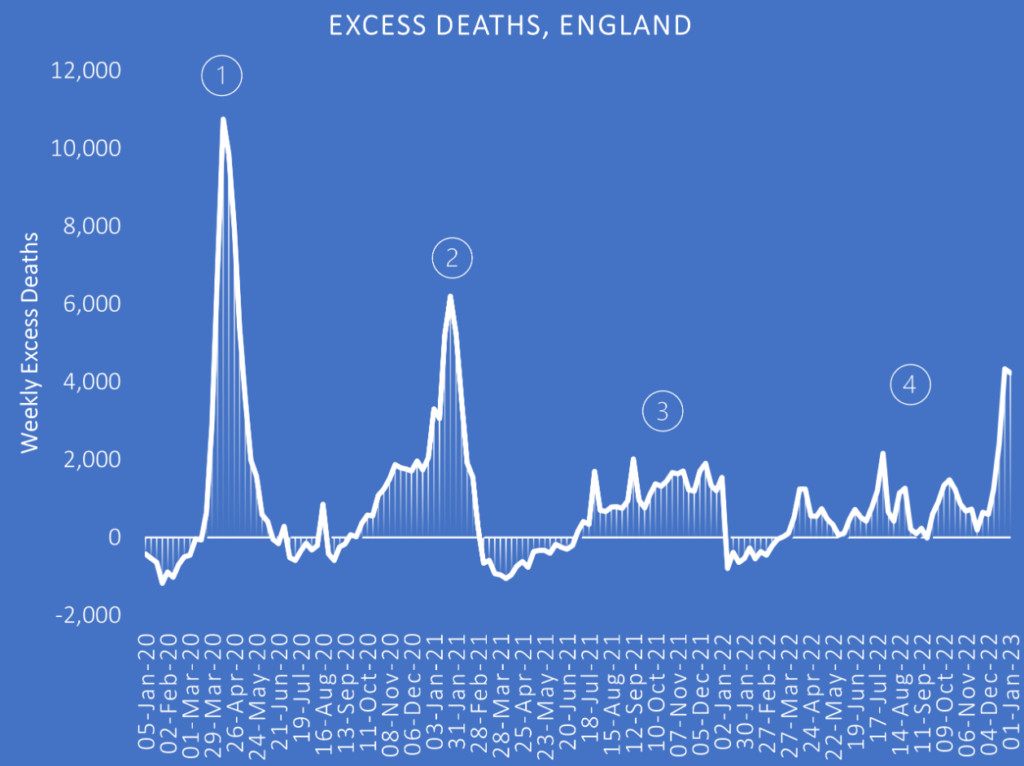
The low vaccine coverage during the Alpha period, very early in the rollout, make the findings for that period uninformative and they have been omitted here.
The results for the double-dosed during the Delta period, on the other hand, are striking (Figure 3). (N.B. ‘double-dosed’ here doesn’t include triple-dosed; the 0% vaccinated point is the City of London.)
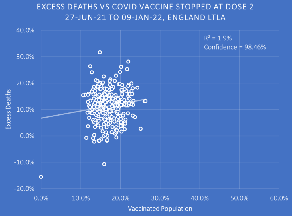
The downward slope of the pre-vaccine baseline (the healthy vaccinee effect) has gone completely, and now there is a shallow upward slope. Far from the more-vaccinated areas seeing improvement from the vaccine, then, those areas have seen their death rates increase so that they now are slightly higher on average than the less-vaccinated areas. This worrying finding is only confirmed when we look at the triple-dose data for the same period (Figure 4).
Once again, areas with higher third-dose coverage, far from seeing an improvement in outcomes over the pre-vaccination baseline, see excess deaths increase to the point that the more-boosted areas are slightly worse off than the less-boosted areas, the downward slope now reversed into a slight upward slope.
Worse, the upward slope only gets steeper as we move into 2022 and the Omicron period (Figure 5).
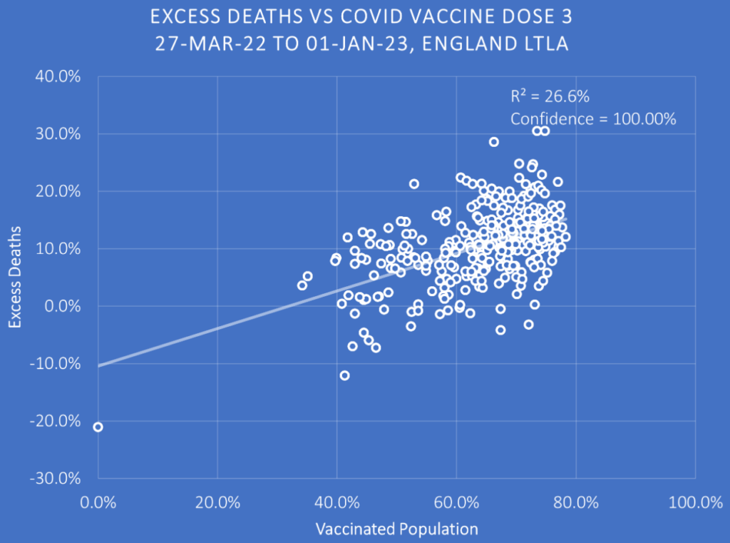
Here, the significant upward slope indicates that the excess deaths in 2022 are much more concentrated in more-vaccinated than less-vaccinated areas of England. This would be bad enough, but recall that the baseline is the ‘healthy vaccine effect’ whereby the excess death rates pre-vaccine were significantly lower in what would become the more-vaccinated areas. Putting the two charts side-by-side (Figure 6) shows the stark difference in excess death rates before and after the vaccine rollout.
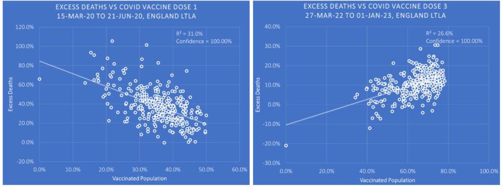
The reversal in the slope is indicative of a major reversal in the health outcomes of the more-vaccinated areas. It may be that the reason for this change is not the vaccine – full data by vaccination status are required to confirm or refute this. But given that most of the other likely factors (e.g. age, deprivation, background health conditions) are controlled for by the fact that areas are being compared to their own historic baselines, it is hard to think what it could be. (To be fair, some of it may be mortality displacement from 2020 owing to more people in the less-vaccinated areas dying earlier on, though that can’t be all of it given the trend gets worse for the more-vaccinated areas over time rather than better.)
At any rate, it offers no support to the claim that the vaccines reduce overall deaths, suggesting that any finding that claims they do may be a result of the healthy vaccinee effect.
Data analyst Joel Smalley, who is behind the analysis, commented: “As always, remember, the burden is not on me to prove that Covid jabs result in higher excess deaths, the obligation is solely on the jab pushers to prove unequivocally that they reduce death.”
The Government has refused to carry out an investigation into the cause of the recent wave of tens of thousands of excess deaths in England. Perhaps this is why.


To join in with the discussion please make a donation to The Daily Sceptic.
Profanity and abuse will be removed and may lead to a permanent ban.
Meanwhile in ‘Narrative-land’:
Let’s bomb Russia.
Trans rapists’ feelings matter more than the safety of incarcerated women.
Princes and Princesses are victims too.
Brrrr. It’s cold because of Vlad.
Of course we wouldn’t have to do any of this roundabout calculation if the ONS simply published the data they have hidden for cause of death by vaccination status. They hid this data just as excess deaths rose post pandemic. Sure it is important to get confirmation. But does a healthy person with common sense person who would like to reduce risk really need to know any more than that?
My old maths teacher used to say the most effective statistical test was to graph the data, stick the sheet on the door at the end of the corridor, and see whether or not you could see the trend from the other end.
These graphs fail that simple test.
Without the artificial trend lines to suggest anything, the graphs are just blobs with no readily discernable trend. This is borne out by the R^2 values, that don’t get above 0.32, which is poor, and in some cases are below 0.01, which is just laughable.
Now don’t mistake me for passing judgement on the basic premise, I’m merely pointing out that the graphs presented are not the way to go about proving anything, other than that there’s no clear benefit either.
Dear down-tickers, please tell me how I’m wrong.
I’ll wait.
I’m not a down-ticker and I am not saying you are “wrong” but isn’t that what trend lines are for – to make a trend clearer to see? Are you saying the trend lines are incorrect? The differences are not enormous, but that doesn’t change the fact that they are marked.
How would you suggest “proving” anything?
The R^2 value is a figure between 0 and 1 (or 0% and 100%) that describes the deviation between the trend lines and the data points. Google “R squared” for more info.
But basically the closer to 1, the smaller the error between the trend and the data. An R squared of 0 means no similarity.
An R squared of below 0.5 is pretty poor, meaning the trend doesn’t fit the data well at all. An R squared of below 0.1 is just silly, almost no correlation.
So the trend lines given are pretty meaningless. The data points are just a cloud, rather that a string of points for example.
Thanks
So how would you propose to present this topic, or wouldn’t you?
The topic and data is interesting, but the trends don’t show any meaningful relationship. So rather than claiming one, far better to point out the obvious point: There is no meaningful relationship!
Take figure 4 for example. Irrelevant trend line, miniscule r squared. In effect a random line stuck over a diffuse cloud of data. Yet that’s actually the pertinent point: The data is a big diffuse cloud. For vaccination levels anywhere from 30%-70% the level of excess deaths is anywhere from 0%-20%. So no sign the jabs are helping (certainly not the 90% they claim), and a huge sign that there’s massively elevated deaths across the board regardless of level of jabs. So that’s the story I’d look at.
“90% safe and effective” my hairy butt.
I’d like to see all-cause mortality by age, general health and vaccination status. That seems to be exactly what countries do NOT want to publish but also the most obvious way to look at this issue.
Indeed. My suspicion is that there will be a big jump in the death rate amongst the youger groups, but the total numbers are swamped and hidden by the usual high numbers of deaths in the much older groups. Hence why they don’t want to break the figures down.
A blob is roughly round. These are not blobs they clearly have an oval shape that would be visible from the end of a corridor.
By ovals I mean eclipses with major axes tipped up or down from the horizontal
Ellipses
Not for me. I’m sure I could detect a downward trend in the left-hand chart in Figure 6 and an upward trend from the right-hand chart from the scatter plots alone without the addition of trend lines. But perhaps that is because I have an economics background. I did notice the right-hand chart is truncated for some reason. Perhaps, that was by accident.
Fig 6 shows the two “best” R squared trend lines, yet both are well below 50%. There is a faint trend, but such a low value of R squared means it’s pretty weak. The other graphs are even worse. A bit like when a random study shows a change in mean, but the confidence is below say 50%, when 95% is considered a good minimum. The results are just not viable.
I’m sorry, but I think you’re missing the point. There is a reason Will has shown the these two graphs side by side, they should be looked at together. The left-hand graph shows the relationship between ‘vaccine’ up-take and excess deaths during 2020 before anyone had been injected. Therefore, there is a common factor or factors between vaccine up-take and excess deaths during 2020. Will suggests that it is the wealth of inhabitants of the local authorities. Now, if everyone was injected with a placebo, you would expect a similar graph on the right to the one the left. However, if the injections had done what we have been told was the intention and saved lives, the graph on the right should be a steeper downward sloping line with a higher R squared value. I would add that as the period covered is post a period of high excess deaths, most of the plots should be below 0% excess deaths. Instead what we have is an upward sloping line. Note, that given the confounding factor or factors revealed by the first graph, there could never be a strong upward relationship. That there is any relationship at all in the ‘wrong’ direction is strong evidence the injections kill more people than they save. It is but one piece of the jigsaw and the complete picture could be revealed in full by the release of data held by governments of all-cause mortality by vaccination status, as per the post by TheBasicMind. The fact they don’t and the ONS did but stopped during the Summer, speaks volumes. We’ll see what the ONS belatedly produce on 21st February 23.
I partly agree. What’s clear is that the whole 90% effective thing was total baloney. That the excess deaths are still way above zero should be the big story. My concern is that the weak trend lines don’t help, and could become ammunition to discredit the main point.
Even if the premise turns out to be correct, it does seem reasonable to say these graphs don’t provide strong enough evidence to support it. The main cluster of the vaccinated population falls into a tight spot that shows no trend at all, and the trend, weak as it is, relies on sparse outliers. Given the number of confounding factors besides Covid and vaccination status that might differ pre and post pandemic (including effects of lockdown, trashed economy, stress, unaddressed health problems), those outliers can’t be relied upon as compelling evidence.
I know this will probably get downvoted to hell, but the problem is that in both the case of claimed Covid fatalities and vaccine related fatalities, we’re dealing with a small signal in terms of the general population that can only be clearly identified with reliable statistics from agencies tasked with collecting them.
It looks like PHE, the ONS, the NHS, pharmaceutical corporations and organisations worldwide failed to collect reliable information, and even where they might have, they’re being cagey about making it available. It reminds me of the ‘Climategate’ email where a researcher responded to an FOI from a sceptic with ‘why should I make my data available if they’re just going to try and find something wrong with it?’ A potentially lethal line of thinking when dealing with life and death matters.
A small signal in a massive population still means tragedy for a significant number of people and their families. As importantly, given we don’t have any long term safety data for these ‘vaccines’ which in any other universe would be considered experimental, it’s impossible at the least to say that the cost of the vaccination programme outweighs the claimed benefits. Even taking a view conforming to the official narrative, this means there is no sensible justification for continuation of the programme, especially in terms of younger people; doubly when considering factors like leaky vaccine-enhanced viral mutation and ‘original antigenic sin’. If there was justification, we’d be seeing significant deaths from Omicron+ and significant reduction of these deaths in the vaccinated population, and there are neither.
What is clear, at least anecdotally, is that Covid vaccines are causing harm to a subset of the population, even if small, and that officials don’t seem very interested in finding out why, or what the long term implications of this might be.
Exactly.
gavinfdavies, do you agree with Joel Smalley that “the burden is not on me to prove that Covid jabs result in higher excess deaths, the obligation is solely on the jab pushers to prove unequivocally that they reduce death.”
And also what is your explanation for this?
“In summer 2021, each month 15,000 or so working-age people started a PIP claim. That monthly figure had remained little changed for years. It then steadily increased, such that by July 2022 (the latest data) it had doubled to 30,000. This report investigates the increase.”
https://ifs.org.uk/sites/default/files/2022-12/The-number-of-new-disability-claimants-has-doubled-in-a-year-IFS-report-R233.pdf
And also, gavinfdavies, how would your old maths teacher have explained this Rasmussen poll in the United States?
“68% of adults say they’ve gotten a COVID-19 vaccination…
…7% reported major side effects from the vaccine”
= 12 million Americans (not counting those who died) reported MAJOR adverse effects, as many Democrats as Republicans.
https://www.rasmussenreports.com/public_content/lifestyle/covid_19/concerns_about_covid_19_vaccines_remain_high
I’d say that I wasn’t talking about that at all. I certainly don’t disagree with it.
As per my original post:
“Now don’t mistake me for passing judgement on the basic premise, I’m merely pointing out that the graphs presented are not the way to go about proving anything, other than that there’s no clear benefit either.”
Good. I get your point.
Here is an excellent YouTube video from the head pollster at Rasmussen talking about the findings of the poll:
(I admire the way he pre-empts, at the beginning of the video, any objections YouTube might have that might cause them to take down the video.)
https://youtu.be/ljrMPvk4mjo
Did you notice the link to the article on the right that references their follow up survey? Note the survey found, if accurate, that ‘49% of American adults believe it is likely that side effects of COVID-19 vaccines have caused a significant number of unexplained deaths, including 28% who think it’s very likely’
Also ‘28% of adults say they personally know someone whose death they think may have been caused by side effects of COVID-19 vaccines.’ And ‘48% of Americans believe there are legitimate reasons to be concerned about the safety of COVID-19 vaccines’
https://www.rasmussenreports.com/public_content/political_commentary/commentary_by_brian_joondeph/why_have_so_many_people_died_suddenly
The numbers are extraordinary and if they are reflected in the UK, our MPs need to start taking the issue seriously pretty quickly.
I agree with you and have posted something similar. The problem with your maths teacher is that he did not understand that correlation does not mean causation, As, you say, these are blobs on a graph. Where is the statistical analysis?
But all the blobs in the last graph are in the wrong place. Imagine a clock face the trend line in the first graph is pointing roughly in the direction of four o’clock. If the injections worked to reduce deaths the trend line should have moved in a clockwise direction. It doesn’t matter how tightly the blobs are clustered around the trend line, it is the direction of travel that matters. Instead the trend line in the last graph has moved in an anti-clockwise direction and now points roughly in the direction of two o’clock. The trend line has moved backwards in time, as has medical science and ethics during the last few years. To me the injections are killing more people than saving lives. Note, I’m not saying they are the only cause of excess deaths. Professor Fenton has carried out a more sophisticated analysis where he looked at the injections and other potential causes of excess deaths: –
https://wherearethenumbers.substack.com/p/the-devils-advocate-an-exploratory
The authorities could put the matter to bed by publishing all-cause mortality data by vaccination status and the trends over time. But they’re not.
You’re welcome Will.
What is the reason for the residents of the City of London to be uninjected? I assume a technical reason unless they were all tipped off by Bill Gates.
I expect the vast majority moved out of the City. That’s certainly what my adult son did …. he moved back to Mum in Dorset for the duration
We can all get bogged down in statistics, but do you actually think that the ONS hasn’t been nobbled?
For the life of me shouldn’t we pushing the proven harmful biomolecular effects of mRNA jabs more?
https://www.sciencedirect.com/science/article/pii/S027869152200206X
And if the sheep are a bit dim, here is an easier to understand and much shorter version :
https://osf.io/epr24/
It is truly an amazing psy-op given just how much has been brought to light recently. If you were duped into taking it would it be easier to listen to the truth or persist in untruth. I would say that for at least three quarters they will stick to the daydream until the bitter end. This should not be looked at with contempt but rather with pity. It doesn’t bode well for anything that might come after the event to come. Nonetheless no matter how naive and ridiculuous people are you have to carry on trying to help them anyway.
Three sections of excess deaths:
First – Vulnerable ejected from hospital to care homes. No GP visits no care no relatives – the ill sped on way with Midazolam
Second – Elderly + vulnerable dosed with AZ vax from late Dec 2020. Many deaded within 10 days with adverse reaction
if you survive AZ you are in the clear – so that’s good
Third – Pfizer boosters for the lucky ones – sub clinical damage from circulating spike reveals itself in excess deaths = not good
But not fully credited – a bonus point from Lockdown + the terror inflicted by the cretins Johnson, Hancock etc – HUGE STRESS causes vascular disease
I’m in my early 60s (unjabbed).
The number of of my friends, relatives, acquaintances, neighbours (and contacts of all of these I have been told about) who have suffered and several have died from strokes, heart attacks and cancer in the past 2 years has exploded ….. more than in the previous 20 years put together. Two remaining acquaintances have terminal cancer; one stroke victim could go at any time; a friend (58) who has had two life-threatening heart attacks is now permanently disabled.
Now, since I am getting older, I expected that I would start to hear more of these sad stories …. it is a fact of nature and part of the “circle of life.” But the increase has been dramatic and has correlated with the roll-out of these jabs. None of my unjabbed friends (mainly but not exclusively my local SitP group) have suffered similar events.
I trust the evidence of my own eyes and ears ….. and I am convinced that these jabs are killing people.
The fundamental flaw in this argument is that it is based on the assumption that increased deaths can only have been caused by the vaccines. It is just the same as the assumption that temperature increases can only be be caused by carbon dioxide increasing.
I don’t think anyone is saying this. The argument is that the injections are a major cause although there are other causes such as the effects of lockdown, delays in diagnoses’ and longer waiting times for ambulances etc. All other possible causes are considered by the Government, media and public health bureaucrats with varying degrees of plausibility except for one gigantic and rather smelly elephant in the room.