Seemingly everyone’s adopted the Great Barrington Declaration now – the October 2020 statement that called for focused protection of the vulnerable rather than blanket one-size-fits-all interventions. We also appear to have reverted to the 2011 pandemic preparedness plan and the orthodox epidemiological approach that prevailed up until March 2020 is back in vogue.
The ‘pandemic’ involved the overturning of so much received wisdom without evidence. The untried and untested approach of lockdowns, masks and novel vaccines became the orthodox. Protection of the vulnerable, the build-up of herd immunity through infection of the fittest, became heresy.
Initially we were told that we would only vaccinate the elderly and vulnerable. We then proceeded to vaccinate everyone. Now we’re back to only vaccinating the over-50s and vulnerable.
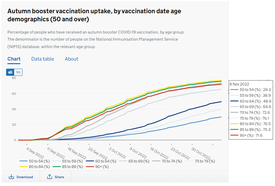
Figure 1 shows the take up of the Autumn Booster campaign by age. In the 50-54 age-group only 29.3% have take up the option so far. In the over-70 age groups about 25% of those eligible have declined. Who would have predicted that two years ago? What do these figures say about trust in the health authorities?
Should we be surprised at this collapse in demand for Covid vaccines? Probably not. Figure 2 shows cumulative Covid Hospital admissions from March 19th 2020 to November 7th 2022. You can see that hospital admissions in recent months are running above the trend line – clearly, mass vaccination hasn’t made much difference, at least on this metric.
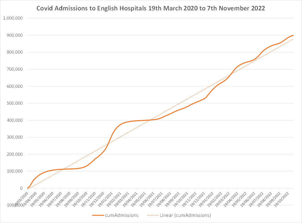
Of course, not all the people now or at any time admitted to hospital with Covid are there primarily due to Covid, but the chart makes the point that it certainly hasn’t gone away; it’s just gone from the headlines. It’s also true that the current variant is far milder than the initial variant and people are, rightly, less concerned about getting it again.
The population, it would appear, are increasingly coming to the conclusion that the reduced risk from Covid isn’t due to continued vaccination but due to evolution of the virus to a more benign state alongside the increase in natural immunity. Many have decided they’d rather have another dose of Covid than another dose of vaccine – or indeed, realised that they’ll get Covid again anyway.
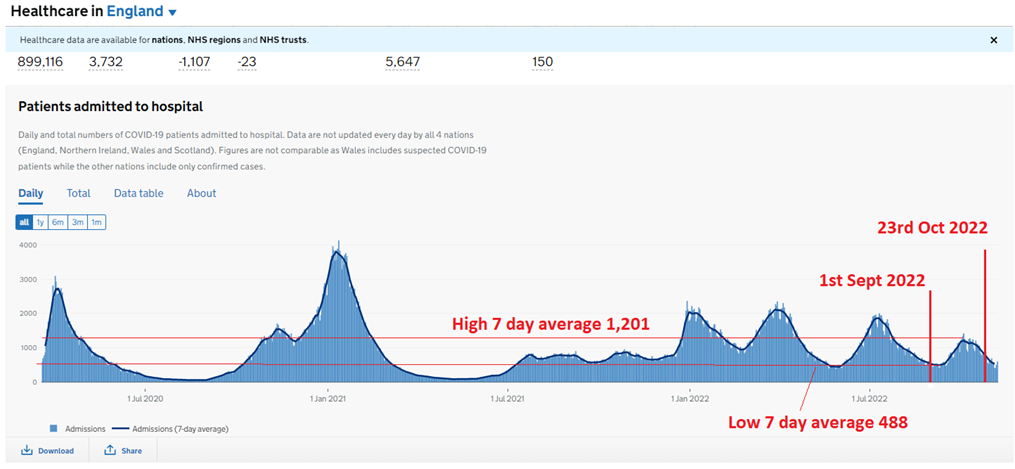
The week 44 UKHSA Vaccine Surveillance Report provides data on Covid hospital admissions from September 1st to October 23rd 2022. In the chart below I’ve highlighted in red the dates covered by the report. This period covered most of this autumn’s ‘wavelet’. During this period hospital admissions swung from a seven-day average low of 488 to a high of 1,201.
Now, let’s look at the make-up of those hospital admissions by vaccination status.
The UKHSA has used the following to define vaccination status:
- ‘Unvaccinated’ – no evidence of previous vaccination at the time of admission
- ‘D1’ comprising only one dose of the primary course by the time of admission
- ’D2’ comprising only two doses of the primary course by the time of admission
- ‘D3 – Group 1’ comprising three doses of the primary course only by the time of admission (no evidence of any booster) or at least two doses of the primary course and a booster (either Autumn 2021 to 2022 booster or Spring 2022 booster) by the time of admission but no evidence of the Autumn 2022 booster
- ‘D3 – Group 2’ at least two doses of the primary course and the Autumn 2022 booster by the time of admission with or without any of previous boosters (Winter 2021 to 2022 or Spring 2022 booster)
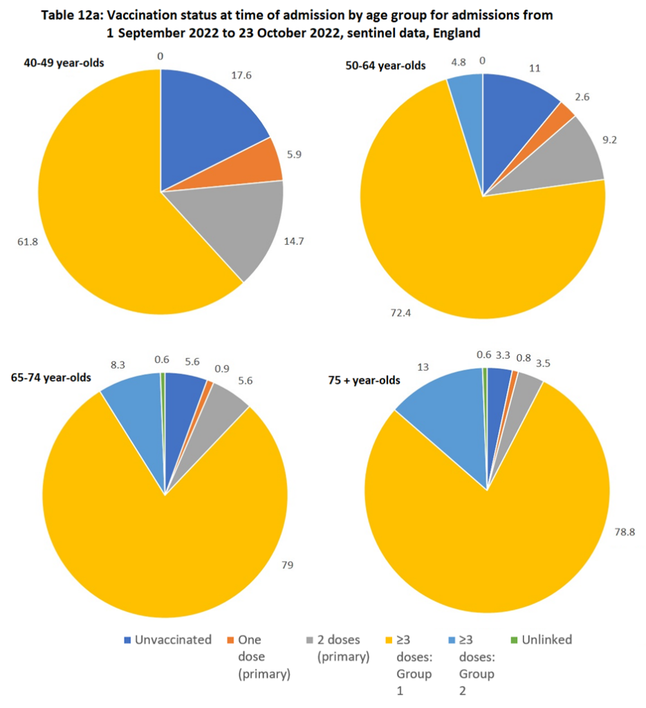
Of course, it’s worth noting that the ‘Group 2’ section of the over-three doses (the paler blue) are people who have had an autumn booster, a campaign that didn’t get started until part way through the period covered by this report and so had a relatively low impact on the numbers.
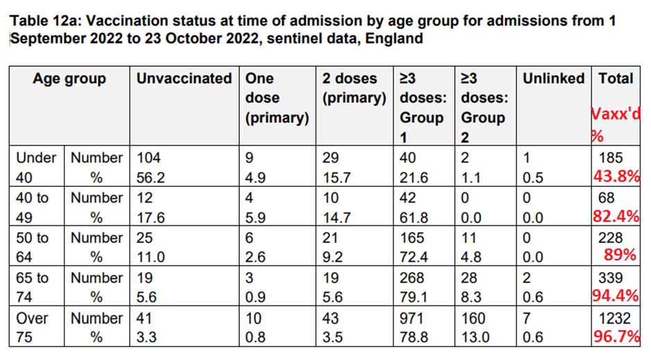
One thing is very clear from the charts, the unvaccinated are no more likely to be hospitalised than anyone from any of the other groups. Only 3.3% of those hospitalised in the over-75 age group were unvaccinated yet at least 5% of this age group are unvaccinated.
Table 12a, reproduced below from page 48 of the UKHSA report, shows the raw data and the percentage figures from which the pie charts are produced.
It seems to me that there’s great value in repeatedly going back to the raw data rather than accepting the ‘adjusted’ data that we’re fed by the authorities and media. The people of the U.K. appear to coming to the same conclusion as they survey the ‘raw data’ of their own experience and those around them.


To join in with the discussion please make a donation to The Daily Sceptic.
Profanity and abuse will be removed and may lead to a permanent ban.
I wish this were true but I fear any change is down to the fact that the population isn’t being bombarded anymore with relentless calls to get jabbed and threatened if they don’t.
If my immediate circle is any indicator of the population, then the problem is, paradoxically, that Covid isn’t a problem to them. They have returned to pre-2020 behaviour. The problem is that don’t even consider analysing what on earth happened in the last two years. Instead they want to forget and then either forgive (following the Oster Declaration, rather than the Barrington Declaration) or seriously believe that without Lockdown/Vax/SocialDistancing the consequence would have been even worse. They ignore the £20,000 per taxpayer debt that Sunak is dealing with, or blame it on The Tories. The virtue-signallers, mask-enforcers and Karens really believe that, despite the opposition from the sceptics, the battle against Covid was won by the Government. If that attitude prevails, then another wave of Covid or flu will re-activate them and we are in for another Lockdown. Meanwhile the perpetrators of the scam are hiding in the shadows. Or the jungle.
They don’t need another wave of Covid, it’s now segued to Climate Emergency.
Morphed into something even less measurable, in effect. Even easier to create the impression of Something is being done for your benefit (not).
At least there’s no un-trialled vaccine for ” Climate change ” Poor lambs.
Why did the population not come to the conclusion the virus was benign in the first place – the absence of sick people around them, in the streets, work place, home, neighbourhood, was a good clue, with the only alleged sick and dead people on the fake graphs and projection all over the media?
IIRC we were all dashing around stocking up on toilet paper and pasta. We were addicted to 5pm briefings by the Three Stooges, as though it was the Saturday football results every day. Anyone who studied data and came to their own conclusions were excommunicated. Now it’s all over we can watch the same people on #iacgmooh or actors on Scotch Egg: The Musical for a reminder of what fun we had. These are distractions from the financial and clinical disaster that we still don’t realise we are living through. So long as we keep getting the Cost Of Living allowances and the telly works we shall all meekly join in this current series of Bread and Circuses.
I had almost none of the brainwashing because I have not watched the TV for 23 years. I have fallen out with most, if not all, the main stream media because they seem to be overwhelmingly left leaning, even those ostensibly on the right, and now have gone online which has been very illuminating. I am also an ex-soldier with severe trust issues and had a ‘mystery’ virus in December 2019 which very nearly killed me. I know enough about viruses and the human immune system to lknow that I would never get it again and if I got a variant then I would have some small protection from that. In short, not having it. Stick it up your own vein.
Lemmings.
Radio adverts that I unfortunately catch on my travels are still pushing it as safe & effective
UK coming to its senses?
We know infection, serious symptoms and fatalities from Covid are as much as 4 times higher in the vaccinated, depending on how many boosters they have had, compared with unvaccinated.
We know that the above 70s are only high risk if they have other serious health conditions.
We know there is no comparative data to show efficacy in any age group certainly not the over 70 group.
We know widespread and repeat vaccination causes antigen imprinting rendering a large swath of the population defenceless to new variants of the CoV 2 virus and other pathogens too.
We know the experimental products pose significant risks to both short term and longer term health and fertility, and a significant number of fatalities.
If the UK was coming to its senses, no sensible people would be accepting these products at all and no sensible Government would be offering them.
I think it’ll always be the elderly that are the target group though and more susceptible to pressure, such as the annual flu shot, they’ll just line up for whatever they’re told by the doctors. Of course many oldies in advanced age no longer have possession of their faculties so are at the mercy of the health care system but elderly people have always been more trusting of doctors, I think, than younger generations. It’s the latter that tend to be less afraid to challenge and are more critical.
If it isn’t the midazolam/morphine death combo it’ll be the mRNA Covid/flu jabs that’ll be the death of many elderly, but their age and comorbidities will easily and conveniently mask the deaths.
I fear you’re right. As a DS subscriber I’m obviously not typical. I’m 86+, fit, and, at first trusted the government and had two AZ jabs, became slightly doubtful and hesitantly took the Pfizer booster, then finally realised what was going on and stopped ALL jabs, Covid and flu and won’t ever take another. My wife has taken all the jabs and doesn’t like me talking about it. So, in the interest of domestic tranquility, I stay silent. I take 5,000 IUs of Vit D + K2 a day, had Covid last June and found it to be like a cold, over in five days.
I watch what’s going on with ever-increasing incredulity, shake my head at the utter corruption of the public health establishment in the UK and US and generally keep my head down and my mouth shut. Coward, I know, but I prefer a quiet life.
The corruption is more widespread than public health. Much of the public sector blunders around and then diligently covers up the blunder, using all manner of procedural devices designed for other purposes. It’s going to take a lot of people opening their mouths to Drain The Swamp!
I’m 66 and like you had the 2 jabs and a booster. It did nothing good as far as I can tell. I did experience some terrible headaches after the booster for a week or so but thankfully that was all.
A friend of similar age, who declined all jabs, caught covid and very kindly gave it to me last year. The severity and length of covid for both of us was pretty much the same. Of course, my wife caught it as well, also jabbed, with similar symptoms. So it didn’t protect me, didn’t stop transmission and didn’t seem to make any difference to the severity of the symptoms.
I’m declining all further jabs, but I’m being pestered by the NHS and my doctor to have one.
I’m with you Steve, although only 75+, with the same jab profile which I only took to go on holiday with wife and daughter. And I think we might be married to the same wife! I too keep quiet
The government is corrupt !
Sort of. It’s mainly just apathy. Coming to our senses would be realisation/admission that the jabs are an evil, stupid idea. We’re a fair way from that entering the mainstream.
I am willing to bet that the majority of elderly people in care homes (and of course other younger people in residential care homes) have virtually no choice over whether or not to keep having covid boosters. Even if they have not got diminished mental capacity, they are sitting ducks for a bit of mild bullying, along the lines of; “well, everyone else has had it, Mr Jones, why do you want to put yourself at risk?” Or “you don’t want to end up in hospital, do you?” You have got to be strong minded to resist this sort of pressure, and many might think they are getting to the end of their lives anyway, and they don’t want to rock the boat or fall out with their carers. Sad to say, all the people over 80 (and most of the people over 65) that I know are still far more frightened of covid than dodgy vaccines.
They are going to say Why do you want to put the others at risk? These people are an infinitely disgusting lot. OTOH, the obviously sensible thing would a return to the three generation family living in a single house and I don’t see how that could happen in our breathless and atomized modern professional world.
And they probably do not have full access to available information about it, unlike those of us here. Many of them are not in a position to look after themselves, which is why they’re there, and trust the carers.
Not even that – they probably get it regardless. Happened to my mum with the flu jab when she was in care: no choice, no questions, no informed consent, just shoved in her arm along with all the other residents. And she had all her marbles right to the end. Fortunately she passed BC (before covid) or no doubt would have been yet another Mid and Morph statistic.
In Australia our government has quietly changed its recommendations, we asking out out of any responsibility, by not recommending the 5th jab. Still pushing antivirals and banning ivomectin, however.
Pathetic cowards!
https://joannenova.com.au/2022/11/vax-rollback-hits-australia-experts-now-not-recommending-fifth-dose-for-almost-anyone-just-anti-virals/
I so hope that sense prevails, however it is no quite what I am seeing. People I know in their fifties are going for their 4th booster. When I politely suggest that ‘this medical intervention does not appear to work very well if there is a need for so many injections in such a short time’ they look puzzled. They then proceed to tell that apparently people are now getting quite ill after the jab…
And then the ‘I have got Covid’ with the addendum that it would have been so much worse if they hadn’t been vaccinated…
but maybe I move in certain circles
Someone send this article on to Benjamin Butthole. I thought his ilk was a dying breed but nay, there he was on Twitter yesterday, calling people vaccine refuseniks. From Covid to Gender WooWoo that boy seems determined to seal his reputation as a virtue-signalling simpleton.
Can we cancel the undeserved award to Chris Whitty who single handedly destroyed the UK economy with his fake propaganda. Anybody seen him by the way. Room-sharing with Lord Lucan probably.
One striking example of how attitudes have changed: enter flu/Covid symptoms into the online NHS 111 symptom checker and you get this message:
“Your symptoms might be caused by a common infection like cold, flu or COVID-19.”
And it tells you to stay at home “if you do not feel well enough to go to work”.
Absolute sea change from the hysteria of 2020 and 2021.
It’s 2.5 years now and even the most skeptical Covid skeptic hasn’t worked it out yet.
Covid 19 DOES NOT EXIST!
When are you going to understand that?