I recently reported on a Swedish study which looked at all-cause death rates by vaccination status. It purported to show that compared to three doses, a fourth vaccine dose reduced all-cause mortality in the Omicron waves by an absurdly high 71% in the over-80s and 39% in care home residents during the first two months after inoculation. I pointed out this made no sense as we can only expect the vaccine to reduce Covid deaths, not deaths from other causes, and Covid deaths during the Omicron waves only made up around 8% of total deaths among the triple-dosed. Since even on official data a fourth dose would only cut Covid deaths by less than half compared to a third dose, this means we would expect a drop in total deaths of at most 3%, not 70%.
A second study on all-cause mortality by vaccination status has been brought to my attention. (These are currently the only two I am aware of; there may be others but they are yet to cross my radar.) This study, published in Vaccines in July, is from Hungary and focuses on spring and summer 2021 as the vaccines were rolled out and the country experienced its Alpha wave. (The study refers to this as the ‘third wave’, but Hungary’s ‘first wave’ in spring 2020 was largely a non-event and this was the country’s second wave of excess deaths, the first occurring in autumn 2020.) The study estimates vaccine effectiveness against all-cause mortality to be 49-75% during this wave, depending on vaccine type. Such figures are still way beyond what is believable, even allowing for the fact that this is comparing vaccinated to unvaccinated (rather than the single-boosted) and is shortly after vaccination and is pre-Omicron, as it still implies that the vaccine is considerably reducing not just Covid deaths but deaths from other causes (heart attacks, cancer, dementia etc.) as well. So what’s gone wrong this time?

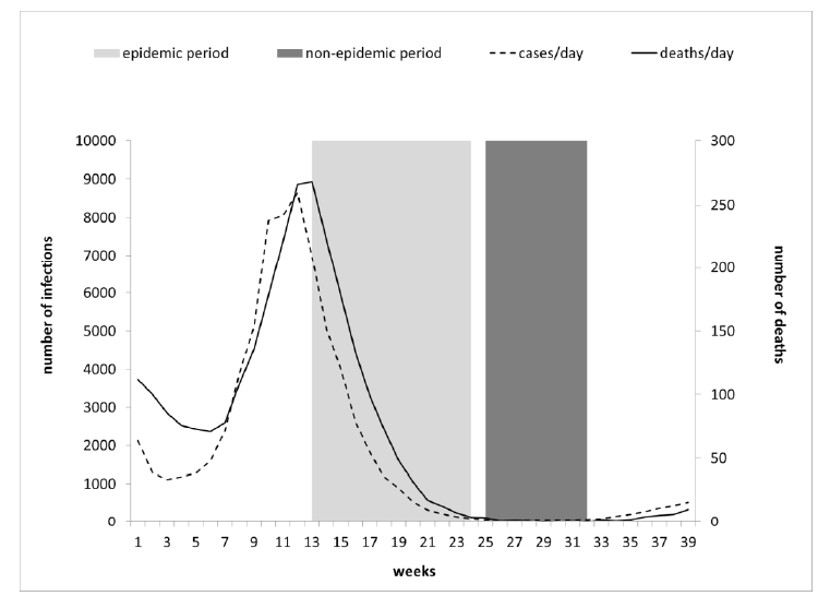
The chart above shows the study period. It is split into two parts, an epidemic period (light grey) during the second half of the Alpha wave, starting at peak deaths, and a non-epidemic period (dark grey) starting shortly afterwards when there were almost zero reported Covid deaths. This sensible split should allow the researchers to calibrate their vaccine effectiveness estimates by taking the mortality rates during the non-epidemic period as a baseline.
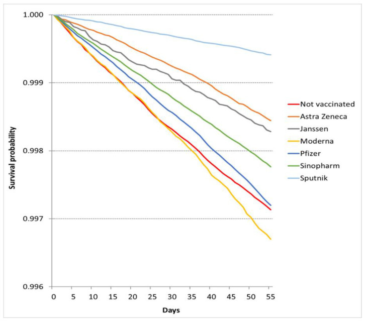
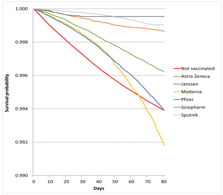
Below are two key charts showing the crude (unadjusted) survival rates in each cohort, depending on vaccine status or type. The top chart is for the non-epidemic period, so should show the normal background rate of deaths in each cohort, and the bottom one is for the epidemic period, so should show deaths elevated by the Covid wave.
Note that the study states that it excludes the partially vaccinated, defined as those who have received one dose and are fewer than seven days after their second dose. Unvaccinated here means no doses and vaccinated means ‘fully vaccinated’ i.e., seven days after the second dose. This means any deaths between the first dose and seven days after the second dose will not be included. It appears that individuals change cohorts as they receive doses during the study period, though how the researchers have handled this is not always clear.


A look at these charts reveals some striking inconsistencies. Notice in the non-epidemic chart (top), the red unvaccinated line is the lowest (along with the yellow Moderna line). This means the unvaccinated cohort has the highest death rate (because the lowest survival rate). But if we look at the characteristics of the cohorts in the supplementary appendix (Table S3) we find that the unvaccinated are around eight to nine years younger than the vaccinated, both across all vaccinated (45.5 vs 53.6 years) and among those vaccinated with Moderna (54.5 years) and Pfizer (53.8 years). The rates of comorbidities are also half the level or below in the unvaccinated compared to the vaccinated (e.g. heart disease 1.5% vs 3.1%, cancer 1.3% vs 3.5%). Why, then, is the mortality rate higher in a younger, healthier cohort?
The same point can be made in another way by noting that 39% of the deaths in the non-epidemic period (6,548 of 16,853) are attributed to the unvaccinated, who make up 31% of the study population, while 61% of the deaths are attributed to the 69% of the population that is vaccinated (see Table 3). Why is the younger, healthier cohort over-represented in the deaths? Similarly, 0.29% of the unvaccinated cohort died in the non-epidemic period versus 0.21% of the vaccinated. These rates make no sense. We can get a sense of how high the death rate in the unvaccinated is by considering that in Hungary around 1.6% of the adult population typically dies each year (130,000 of 8.2 million), so in this 55 day period you’d expect a maximum of 0.24% of the population to die – and since this is during summer it should be lower still (deaths are around 20% lower in summer than winter). Yet 0.29% of the unvaccinated died – at least 20% more than would be expected. Remember, this is a non-epidemic period when Covid deaths were near zero. Why is the death rate in the unvaccinated at least 20% higher than the expected background rate, while the vaccinated death rate is below it (0.21% vs 0.24%), when the unvaccinated are the younger and healthier portion of the population?
The authors briefly acknowledge this issue in the conclusion, referring to the “huge variability of survival across cohorts by COVID-19 vaccination status during a period when the COVID-19 epidemic was not active, meaning the vaccine could not exert a protective effect”, and accepting that the observed differences “were not attributable to the sociodemographic characteristics of patients, the presence of the most prevalent underlying diseases, or the structural characteristics of [general practitioners] providing care for patients”. They do not attempt to explain the discrepancies however or properly address the huge impact these will have on their results. Indeed, they adjust their results for a ‘healthy vaccinee effect’, which on their data is the opposite of the reality, making the problem even worse. Since the unvaccinated are used as the baseline to estimate vaccine effectiveness, and the mortality rate in the unvaccinated is inexplicably high, this problem obviously nullifies any VE estimates in the study.
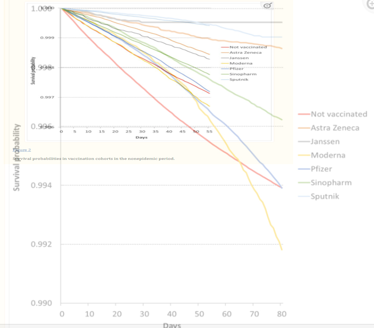
Further problems can be seen by superimposing the two charts on top of each other (noting the different scale on the axes) to allow easy comparison by eye of the mortality rates in the epidemic and non-epidemic periods.

It can be a little tricky to see what’s going on in this composite image, but focusing on the blue Pfizer lines (the lower pair of blue lines), you can see that the two lines coincide for about 25 days before the death rate in the epidemic period deviates. This implies that the Pfizer cohort during the first 25 days of the epidemic period had the same death rate as in the first 25 days of the non-epidemic period. Yet as we have seen, the epidemic period begins with the peak of Covid deaths, meaning the Pfizer death rate should begin high and then ease off. Instead it begins at a ‘normal’ rate and then increases – the opposite. In addition, note that the epidemic-period Pfizer cohort is older (57.9 years vs 53.8 years) and has more comorbidities than the non-epidemic-period Pfizer cohort (this v is because more younger people are vaccinated by the later, non-epidemic period), so the crude death rate in the epidemic period should be higher still. Yet the death rates are the same for 25 days, during the peak of the Covid wave.
Likewise, look at the yellow Moderna lines: the death rate starts out lower in the epidemic period than the non-epidemic period and only goes above it after 50 days, despite it beginning at the peak of a Covid wave (the epidemic line is the slightly thicker, fainter line). With AstraZeneca too (the brown lines), the death rate in the epidemic period is much lower throughout than in the non-epidemic period. It’s also unclear why the non-epidemic death rate in the AstraZeneca cohort is so much lower than for Pfizer or Moderna when it has a very similar average age and rate of comorbidities.
None of these death rates makes sense: the unvaccinated rate in the non-epidemic period is much too high and the vaccinated rates in the epidemic period appear much too low. No wonder the study comes up with such crazy high estimates of vaccine effectiveness.
One of the findings that might be worth taking note of is that the curves for both Pfizer and Moderna in the epidemic period bend sharply downwards in the second half, indicating an accelerating death rate. This is despite the period beginning at peak Covid deaths, which then ease off. Given all the other unexplained anomalies in these data this may well be just one more. However, if there is any validity to the underlying data, it may indicate an alarmingly accelerating mortality rate among the mRNA vaccinated cohorts, even as Covid deaths ease.
Once again, I am left disappointed. I had hoped that studies of all-cause mortality by vaccination status would be key to evaluating the overall risks and benefits of the vaccines. However, both this study and the Swedish one have produced nonsensical results with data that have no clear correspondence to reality.
The current study claims at one point that “there are 15 countries using routine all-cause mortality by vaccination monitoring”. This intrigued me – I was not aware of any countries doing this, except for the U.K. ONS, whose data have serious issues that make them unreliable. However, following the reference to the webpage brought up an “Our World in Data” page which did not in fact list any countries providing these data. Another disappointment.
All-cause deaths data by vaccination status should provide us with crucial insights into the benefits and harms of the vaccines. Yet, so far, very few researchers have looked at these data at all, and where they have, the results have not passed the reality test and have failed to live up to the promise. The wait continues.


To join in with the discussion please make a donation to The Daily Sceptic.
Profanity and abuse will be removed and may lead to a permanent ban.