

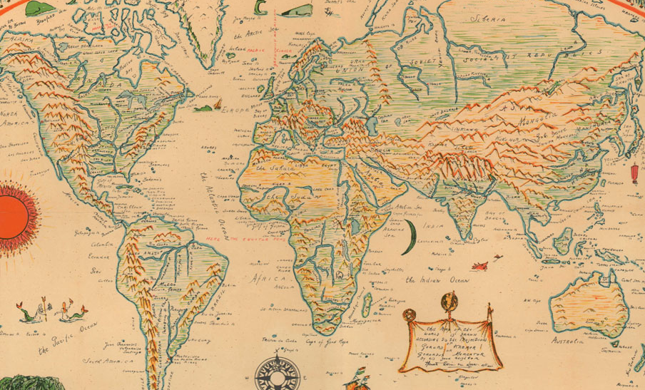
So there has been a resolution by the United Nations to junk Mercator. You know, Gerardus Mercator and his old map of 1569: which, adjusted here and there, still survives to bother the Africans, though I wrongly thought Mercator was obsolete even least 40 years ago. It was Togo that led the resolution. Here is the story in the Guardian:
The United Nations has voted to adopt a resolution for the world to formally phase out the traditional Mercator map of the globe in favour of one that more accurately displays Africa’s size.
In a session at its headquarters in New York, the UN General Assembly officially retired the 16th-century Mercator projection in favour of one based on the more accurate 2018 Equal Earth design.
At the session, 164 countries voted in favour of the resolution. Only the US voted no, with its representative saying the resolution was “superfluous”. There were six abstentions.
UN resolutions are non-enforceable, so countries and institutions will not be mandated to use only the new projection or forbidden from using the old one. However, the outcome is expected to result in an update of classroom curriculums and everyday technology given the wide usage of the Mercator projection in education, technology and governance.
The irony is that the more accurate one makes the map in one respect the less accurate it becomes in another respect. As Ross Clark pointed out in the Spectator – and, again, this should be obvious, but it does need to be recognised:
There is no wholly satisfactory way of representing a spherical Earth on a flat piece of paper. And it is true that Mercator maps, where lines of longitude are drawn parallel and do not converge on the Earth’s poles as they do in the real world, have a major drawback in that they make northerly – and southerly – countries appear much larger than they actually are, while the equatorial regions appear much smaller.
Clark notices the real issue here. The issue is not scientific, it is political.
The General Assembly [has voted] on whether to try to eradicate world maps drawn on a Mercator projection on the grounds that they are ‘colonialist’ – and replace them with a favoured map which is much more honest in representing the size of individual countries. The campaign against ‘cartographic colonialism’ began with an online ‘correct the map’ campaign and has now been taken up by Togo, backed by the African Union countries.
As soon as we see the word “colonial” we are not talking about science. We are talking about symbolism: political symbolism. But there is a third thing. As Clark reminds us, the reason Mercator was in use for so long was in fact that it was useful.
It was adopted because it makes navigation much simpler. Draw a straight line on a Mercator map and you have just drawn a ‘rhumb line’ – which is a route across the Earth’s surface following a constant bearing. In other words, draw a straight line, say, from Plymouth, England to Georgetown, Guyana, and that is the line you will follow if you set out across the Atlantic following a consistent compass bearing of 225 degrees.
Now, it is at this point that I think it is necessary to take a step back and explain all this in terms of some geographical fundamentals.
Geography – the grand word for our sense of the earth – is important. But it is not simple. Geography, as I think even this short meander has shown, is three things: it is scientific (that is, about our knowledge of the world), it is useful (that is, it enables us to do things in the world), and it is symbolic (that is, it enables us to tell ourselves a story about our place in the world). These may combine, but they may also contradict.
And so it is with maps. A map may seem to be a simple thing. But there are types of maps, or three possibilities about what exactly a map might be showing us. A map might be:
- scientific: giving us accurate depictions of the earth, or some part of it;
- useful: serviceable, enabling us to get from A to B;
- symbolic, or political: dramatising our dominion or our lack of it.
And we cannot grasp the ins and outs of the United Nations story unless we can see the differences between each of the possibilities.
As is always the case, science is the least important and therefore comes last.
Useful maps, as should be obvious if you think about it, are usually linear. Consider a route planned for you by a phone. It is a line. Consider the Tube map. Consider the AA Book of the Road. Consider your memory of how to get to school from your house. Lines are useful. Some of the most remarkable medieval maps were linear maps. Take portolan maps. Though they sometimes look to our eye as if they were scientific or spatial maps, they were in fact linear maps of coastlines, designed to be useful to marine navigators. They had almost no information about the hinterland: instead, they offered a lot of information about the relative order of coastal towns and harbours.
Symbolic maps run from the Babylonian double circle with two lines of the double rivers of the Tigris and Euphrates inscribed on pottery to the great Mappae mundi of the Middle Ages: those great circular maps, centred on, say, Jerusalem, which divided the known world into three continents of Europe, Asia and Africa. The British Isles were distorted and elongated and peripheral. A symbolic map is not useful, and it is not scientific. It is, instead, political or religious: it locates us in an axial world, a centred world, a world given to us by God: a world with a purpose for us.
Scientific maps came last. And the scientific map was slow to be established because of the profound distinction between what was known to exist and what was supposed to exist. This is an important distinction to understand, especially for us, since we – since the 1880s, in all our schooling – have treated these two things as if they are the same. But in ancient times they were not the same:
- what was known to exist was the world we had concrete knowledge of: the Greeks called it oikoumene, the inhabited or known world, and this oikoumene ran from Spain to India and, securely, from Germany to North Africa,
- what was supposed to exist (after the experiment of Eratosthenes) was a world about four times larger than the oikoumene (the Greeks gave the other three parts names, two of which are forgotten, but the fourth of which gave us the word Antipodes).
Ancient geography wanted to be scientific, but it could not be. On the one hand they had concrete knowledge of the oikoumene. But on the other hand, after Eratosthenes, the geographer who calculated the circumference of the Earth using two sticks, everyone – at least in Alexandria – knew that there was a terrible gap in their knowledge. The oikoumene was only one-quarter of the earth. We knew that there were three other quarters.
So a true scientific geography was only possible once we had concrete knowledge of the entire Earth, the earth of the four quarters. And this came, naturally, with Columbus, Magellan and circumnavigation, and the whole rigmarole of latitude, longitude, James Cook and whatnot. Scientific maps, like Mercator’s, could only be drawn once what was known to exist and what was supposed to exist were superimposable on each other; and this superimposition was a slow process. It began in the 1490s and was not really complete until, say, the 1880s. Exploration turned the Greek abstract knowledge of the globe into a concrete knowledge of all the Earth, and so we could fill in the map of the Earth. Note: the last part to be filled in was ‘darkest Africa’ – the bit usually white on the maps. Africa was called ‘the dark continent’ because it was unknown.
This may all seem a bit academic. It is. But it is all highly relevant to this story.
What Togo et al. wanted from the United Nations was a revised symbolic map of the world. It is not about size or scale or use. All talk of science is irrelevant. And there is nothing useful about such a resolution. It is about significance.
The irony is that it has opened a can of worms. Japan noticed that Russia possesses the Kiril Isles. Ukraine has noticed problems with Crimea. I wouldn’t be surprised if the Turks complain about North Cyprus not being represented. And there is always the disputed territory of the West Bank and Gaza, plus of course Taiwan.
I am rather on the side of the United States about this recent change. For some reason the Americans are better conservatives and respecters of tradition than any of the rest of us.
The United States voted against what it called the ideological framing of the resolution. The American representative said the objection was less about whether Africa is correctly sized than about the political purpose of the resolution.
The USA is the only country that opposed the resolution. And for a good reason. That it was political. And we may well judge that, just as we inherit law and language, so we should be willing to inherit the symbolic shapes by which we have known the Earth. I certainly recognise better the Earth from Mercator, despite its distortions, whereas the distortions of the Peters projection – which we had on our wall as boys, Jonathan and me – and of the so called Equal Earth projection come to my mind as distortions. But this is just my simple view. And the truth is that most maps I look at are local, where the projection is simply the most convenient one.
The great problem now, and has been since the 1880s, is that we live in a singular world, and that everyone looks at the map to see where they are; and that this map is no longer a boutique, bespoke drawn just for us: it is a shared map. So we no longer fight in the dark. We fight in the open, since light has flooded into every corner of the earth. But we also fight in a different way. We fight over the map, the same map. We fight over the symbol.
Mercator rose, we may judge, for three reasons. He was scientific, in his way, but he was also useful, and he inadvertently lent the then rulers of earth a symbolic significance by setting out their countries on a generous scale and in an attractive squared shape. It was an imperial map. And it was a compromise. Anyhow, it looks as if the end is nigh for Mercator. Perhaps Greenland, Canada and Russia have some reason to hold onto it: for they are very grand according to Mercator. But the United Kingdom will doubtless cravenly follow its imperial underlords in the grifting Global South. The Mercator projection is no longer useful, it is no longer scientific, and it seems it no longer gives the world (or most of it, following Togo) what it wants symbolically. So it is the end for Gerardus Mercator and his map of 1569.
(The ultimate irony is that the actual symbol for the United Nations is a “a map of the world representing an azimuthal equidistant projection centred on the North Pole, inscribed in a wreath consisting of crossed conventionalised branches of the olive tree, in gold on a field of smoke-blue with all water areas in white. The projection of the map extends to 60 degrees south latitude, and includes five concentric circles.” And in this azimuthal equidistant projection Africa is vast and colossal and as global southy as anyone working in a British university could possibly want it to be. The northern hemisphere is central, admittedly, but tiny. Togo is not complaining about that. Nor are the other 164 countries.)
A final thought as to why America opposes the change. The one thing everyone knows about the Mercator map is that Greenland is very big and Africa is very small. At first I accepted the American claim that the Africans are playing politics. But isn’t it likely that the Americans are playing politics too? Consider. In the Mercator map, Greenland is as big as Africa. And what does Trump keep talking about? Greenland. I imagine he keeps talking about Greenland because he is staring at a Mercator map. Show him a Peters map with its Greenland at 1/14 or whatever the size of Africa and he’ll soon lose interest.



Discussion
Comments
This week across the site:
To join in with the discussion please make a donation to the Daily Sceptic.
Profanity and abuse will be removed and may lead to a permanent ban.
First, since the Mercator map is the best one for navigation, shouldn’t someone be asking the Africans & Third World how they intend to navigate using their political map?
Secondly, isn’t the political Equal Earth map the best one for showing the insanity of trying to cram the whole population of Africa, India & South America into tiny Europe and even tinier Britain? And into the smaller Australia and USA?
Thirdly, isn’t this nonsense yet another reason for all the nations of the West to abandon the Useless United Nations?
I think Trump is interested in Greenland because ICBMs from Russia fly over it on their way to the USA.
I’m certainly in a tiny minority. But I have a feeling that many DS articles are at least twice as long as they need to be. The key to successful communication is to write what your readers need to read rather than what you wish to say.