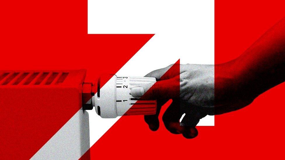
Ofgem recently announced an increase in the energy price cap for the period April-June 2025. Overall bills went up 6.4% from £1,738 to £1,849 including VAT for dual fuel users paying by direct debit.
Various commentators were quick to blame rising gas prices for the increase. They were right to do so, because about £79 of the £111 increase in total energy bills can be attributed to the direct fuel component of our bills which is mainly gas. The increase in electricity bills was £33, of which £27 came from increases in direct fuel costs which is mostly gas.
Some of you may have seen my appearance on the Jacob Rees Mogg show on GB News debating this with Bob Ward. In that discussion, I urged viewers to zoom out and consider the longer-term drivers of higher bills, reeling off some statistics on the cost of renewables subsidies. That exchange prompted me to dig a little deeper into the changes in the Ofgem price cap since its introduction in 2019 and to peer into the crystal ball to see where electricity prices are heading.
Electricity Bill Components
Ofgem splits our bills into components, which we can further break down into smaller elements to determine how much of the increase in bills is due to gas and how much to renewables.
Direct Fuel Costs
Direct fuel costs are the largest component of electricity bills, and most of these costs are attributable to gas. The name is something of a misnomer because this component includes the cost of Contracts for Difference (CfD) subsidies. For the purposes of the analysis below, CfD costs have been stripped out of the direct fuel figure and attributed to the cost of renewables.
Capacity Market
The Capacity Market is primarily required to provide backup for intermittent renewables. Before we had renewables on the grid, we did not have a capacity market to speak of. For this analysis, the increase in capacity market costs has been solely attributed to renewables.
Adjustment Allowance
The Ofgem explanation for this cost is somewhat vague. It appears to be an allowance for suppliers to cover bad debts run up by customers struggling to pay their bills. This cost has been attributed to “Other Costs” in the analysis below.
Policy Costs
Policy costs comprise a myriad of elements, including the cost of the Renewables Obligation (RO) and Feed-in Tariff (FiT) subsidies. Other elements include the Warm Home Discount (WHD), which helps low-income households with their bills, and the Energy Company Obligation (ECO), which requires suppliers to deliver energy efficiency measures to homes. The total cost of this element is approximately £500 million per year for electricity and £217.5 million for gas bills (see Annex 4 Tab 3e ECO). There are additional components, such as assistance for those in areas with high electricity distribution costs, the Green Gas Levy and, new this period, Network Charging Compensation to offset the high electricity charges of energy-intensive users. For the purposes of this analysis, RO and FiT costs have been excluded from policy costs and attributed to renewables.
Network Costs
Network costs refer to the total expenses associated with operating the transmission system, the distribution network and grid balancing services. For the purposes of this analysis, the increase in network costs has been attributed to renewables, as the majority of the rise is due to additional balancing costs caused by the increase in intermittent renewables and the connection of remote wind and solar farms to the grid.
Operating Costs
These are an allowance for the operating costs of electricity suppliers and, for this analysis, have been classified as other costs.
Other Costs
There are several other cost elements that make up only a small proportion of the overall bills. These include an allowance for Smart Meters, an adjustment for paying by different payment methods (PAAC), another adjustment for those paying by prepayment meters (PAP) and Headroom for uncertain costs (HAP), which is supposed to act as an incentive for suppliers to compete in the marketplace.
Profit and VAT
There is another element called EBIT, which is supposed to represent a fair profit margin for suppliers. For electricity, this has increased from 1.88% in 2019 to 2.53% of the pre-VAT total as of April 2025.
The VAT rate has remained constant at 5% since 2019, but, of course, because bills have risen, the total amount of VAT paid has increased as well.
Change in Electricity Bills
Now we have the definitions out of the way, we can look at which parts of our electricity bill have changed the most since April 2019. All data is from Ofgem Annexes 2, 4 and 9, using Tab 1c, where the figures are for constant consumption of 2,700kWh per year (see Figure 1).
Overall, electricity bills have gone up by £339, from £587 to £894 including VAT. The biggest component increase is in renewables-related items, which have risen by £128. Of this, network costs are up £75, the Capacity Market by £12 and the three subsidies have increased by £40, split into a £25 rise for RO’s, £11 for CfDs and £4 for FiTs.
Direct fuel costs are up £113, largely reflecting the 50% increase in wholesale electricity prices, from £61.90/MWh to £93.07/MWh. In the same period, gas prices have risen more steeply, by 77%, from £21.75/MWh to £41.45/MWh. The gas price they have used equates to about 121p/therm, which was the gas price in mid-January. It rose to a peak of over 140p in mid-February but has since fallen to around 100p/therm. Gas futures prices have also fallen as global tensions have eased, with the ceasefire in the Israel/Gaza conflict and the prospect of peace in Ukraine. Of course, gas prices would fall further and faster if we lifted the ban on onshore and offshore drilling, increasing our own domestic supply of gas. We might hope that both gas and electricity bills will fall below the price cap if suppliers can take advantage of the latest lower prices. Of course, the renewables-related costs will not fall with gas prices – in fact, CfD subsidies will rise – so we will not feel the full effect of falling gas prices in our bills.
Other costs are up £49 since 2019, with operating costs (£20), the Adjustment Allowance (£14) and Smart Meters (£6) making up the bulk of the change. Policy costs (excluding ROCs and FiTs) are up £21, with ECO (£14) and WHD (£4) making up the bulk of the change. The increase in overall bills has pushed up VAT by £16. Increased bills, coupled with a bigger margin, have pushed up the profit element of bills by £12.
Where are Electricity Bills Going?
We should now look into our crystal ball and make some informed judgements about where electricity bills are going.
Cost of Subsidies
If we start with the biggest scheme, ROs, we can see from the OBR Outlook that the RO scheme cost £7.6 billion in 2023-24, and the cost is forecast to rise to £8.5 billion in 2026-27. This element of our bills will continue to increase.
The second scheme is Feed-in-Tariffs (FiT), and we can see from Ofgem’s latest report that it cost nearly £1.9 billion in 2023-24, or around £221/MWh. FiT contracts are index-linked, so we can expect the cost of the FiT scheme to continue to rise in line with inflation, meaning this element of our bills will also continue to increase.
Finally, we have the Contract for Difference (CfD) scheme, where data from the Low Carbon Contract Company shows the CfD scheme cost a record £2.4 billion in subsidies during the calendar year 2024. CfD contracts are index-linked as well, so we might expect the cost of subsidies to rise as the indexation of existing contracts outweighs the lower prices of some new developments.
We can expect the total cost of subsidies, about £12 billion – or the equivalent of £420 per household – to continue increasing over the next few years.
Grid Balancing and Backup
If we turn now to balancing and backup costs, the NESO report for 2023/24 shows grid balancing cost £2.54 billion. As the grid takes on more intermittent sources, we might expect the volume of grid balancing to increase, but the cost will largely depend on the price of gas.
According to the OBR, backup from the Capacity Market cost £1 billion in 2023/24, and they forecast these costs to rise to £4 billion per year in 2027/28. Even if balancing costs remain constant, we can expect the total costs of balancing and backup to rise by £3 billion by 2027/28, or the equivalent of over £100 per household.
Clean Power 2030
NESO estimated the Clean Power 2030 Plan (CP2030) would cost £44-48 billion per year to the end of 2030, or a total of £264-290 billion over the six-year period. Assuming a cost of capital of 8% and operations and maintenance costs of 2% for CP2030, this would result in an ongoing cost of £26-29 billion per year, or £900-1,000 per household. This could be offset to some extent by using less gas, with the maximum gas saving estimated at about £7 billion per year if gas prices remain at 120p/therm for the foreseeable future.
Taxes on Gas-Fired Electricity
Energy bills are also increased by the taxes placed on gas-fired electricity generation, which is subject to the Emissions Trading Scheme (ETS). The UK ETS Authority has set the carbon price for 2025 at £41.84 per tonne of carbon dioxide. Actual carbon prices vary somewhat, but this price can be used to estimate the extra costs of gas-fired generation. Modern gas turbines emit around 350kg CO2/MWh of generation, so gas-fired generation attracts a carbon tax of about £14.60/MWh. NESO’s CP2030 plan anticipates carbon prices rising substantially to around £147 per tonne, so even though the amount of gas-fired generation on the grid will fall, the cost of this generation per MWh will increase, with higher carbon taxes adding further upward pressure to energy bills.
Conclusions
We can see that the direct and indirect costs of renewables have been the biggest drivers of increased electricity bills since 2019. Increased gas prices have also played a part in this rise, but there is reason to believe gas prices will fall with easing global tensions, and even more reason if we were to lift the damaging bans on new gas drilling.
However, looking forward we can see that electricity bills are going to keep on rising because of increased subsidies and backup costs. The extra spending on new renewables and grid infrastructure contained in CP2030 plan means prices will continue to go up from their already high levels.
It is time to change course and abandon Net Zero, declare an energy emergency and go all out for cheap and abundant energy.
David Turver writes the Eigen Values Substack, where this article first appeared.
To join in with the discussion please make a donation to The Daily Sceptic.
Profanity and abuse will be removed and may lead to a permanent ban.
“The important point is the big picture: the fact that in one big country with lots of different regions taking different public health responses, there was no obvious relationship between interventions and outcomes. “
That’s absolutely key. Unless lockdowns can be clearly shown to make a decisive difference, then, in scientific terms, the support for what was always an unlikely idea doesn’t exist.
For sure. And makes Boris Johnson out to be the bare faced liar we all know he is.
“it was the lockdown which brought the cases down”
Liar.
Trouble is, BBRC, is that millions of people believe him.
That is what politicians strive for and what they are paid to do. Our job is to say the truth, of the two measures that can affect infections (lockdown and vaccination) vaccination is best at present.
No substantive evidence for vaccines, either.
Again – the null hypothesis stands.
Vaccines for the over-60s, and that’s assuming proper vaccines, and not these experimental ones.
PHE would beg to differ based on an analysis of 300k subjects and follow-up. The degree of protection from vaccination from symptomatic disease is far from the null.
See the plot, the effect is obvious, no need for dumb-arse hifallutin Latin.
I fell off my bike ten days ago.
Since then, Covid infection rates and deaths have gone down substantially.
Behold, I can work miracles.
I’m sorry you fell off your bike, but it’s a stupid claim, missus, hence are we to assume you are stupid? Explain the link, or find a better theory.
If you need it explaining, you are the stupid one. Look at the definitions of correlation and causation, anybody with half a brain can see that the drop off in a seasonal virus is nothing to do with ‘vaccines’ or NPI’s.
*please note, I don’t think that Annie actually fell off her bike, probably apocryphal fellah.
Sorry you don’t understand standard English. Another item to catch up on.
“PHE would beg to differ”
How true that is. They’re into misleading – as noted by the CEBM, if you recall.
Just quote to me the ARR figures, that I’m sure they’ve published
For many reasons we use relative risk reduction. You’re obsessed with unmeasurable absolute values.
what about this for you null hypothesis, a plot assymptotically trending to zero? You think it’s just good luck? yeah right. You are demented with bitterness. No problem spurn the vaccine, and get lockdown, harder, longer, sooner…. you are the perfect author of your own misery, too stubborn/stupid for your own good.
Getting those blinding lights again where you can’t see anything but this monotonously repeated graph which simply describes the expected curve?
Which curve is interesting on the upward slope in suggesting that the introduction of the vaccines might well have caused a rise in mortality that may have actually delayed the natural decrease.
You are quite entitled to buy into the vaccine mythology that gives the Covidevils more power – but don’t expect others to do so.
Oh … and simple logic is another thing to try to get a grasp of. As well as the folly of resorting to ad hominem (now that is Latin) gibberish when you’re losing an argument. It’s always a tacit (from the Latin) admission of defeat or ignorance.
Earlier to-day you were claiming that self-imposed lockdowns had resulted in a 70% plus decline in the infection rate (See Oxford study post).
That, of course, was complete nonsense. There is no evidence that lockdowns have any more than a marginal effect on infection rates as we see from the US.
There are two measures that might account for it, lockdown, vaccination or both. It does not matter which dominates, and there is presently no way to tell anyway. if they work, I’m happy..if you’re not happy, too bad.
Neither lockdown nor vaccines can satisfactorily explain the 2 peaks or the subsequent declines.
1/ The declines began BEFORE lockdowns could have taken effect.
2/ This means that infection rate was slowing several days before that (dynamics of virus transmission)
3/ ZOE is useful as a leading indicator but it doesn’t capture hospital and care home infections which caused a big chunk of the deaths in Dec & Jan.
4/ The most reliable data are the figures related to DATE of Deaths since they are not influenced by scale of testing. This shows a peak on or about Jan 21st 2021 (using 7 day moving average) .
The Mean time from initial infection to death follows 2 Gaussian distributions, i.e. ;
Incubation Period ~5.1 days
Symptoms to Death ~17.8 days
Total Time ~23 days.
This puts peak infection at the end of December – possibly a bit later since many of the over 80s died following the Pfizer vaccine which significantly suppressed their immune systems.
Further to my other reply to you, Tim Spector (ZOE) actually supports my point about cases falling before lockdown. The UK introduced the second lockdown on Nov 5th. On November 6th, TS writes
https://covid.joinzoe.com/post/over-the-second-wave
Before every lockdown the “COvid death” curves were on a downward trend
“There are two measures that might account for it, lockdown, vaccination or both.”
Errr … So what happened in April 2020 when neither applied??????
> to what happened in April 2020 when neither applied?
in April 2020, the PM was in critcal care and 1,000 a day were dying with covid19.
If you look at deaths rather than infections then the decline last spring was almost as steep as this year. Obviously the decline last year wasn’t due to vaccines, so it makes no sense to claim this years decline was.
Yes – I’m afraid the key point was entirely missed. As usual. I don’t think the fact of a steep ‘unaided’ decline from a higher point in a similar curve was noticed, either.
Hopefully fon has had his jab just like a good boy should.
He / she will be dead within twelve months.
Enjoy it while you can.
I can show lockdown probabley did buy a very small advantage here, but at huge cost, not really worth it.
There are only two measures, lockdown and vaccination, both have some effect. Vaccination has the biggest effect now, in conjunction with better weather.
False dichotomy: there is another skywalker, sorry, way, the way in which we protected the vulnerable and took basic precautions, banning large indoor events but otherwise letting people get on with their lives like a liberal democrasy should.
you can vote on it…
No, we can’t.
Look at the graph. Read the article. Lockdowns don’t work to control the virus spread. They may temporarily delay it, that’s all, if everyone, absolutely everyone is confined to their homes, but you destroy the economy, people would die from other causes, and the virus would spread around again as soon as lockdown is lifted.
Unless you do what Australia and NZ did of course: lock down until the virus is eliminated (easier for them to do because seasonality meant it didn’t get very prevalent in the first place) and then seal the borders to stop it getting back in.
Most countries don’t have that capability though.
I vaguely aggree with that, it’s a good plot, but tells us little.
Unfortunately, that won’t change their minds, or stop them from imposing them again.
They’re not going to let data get in the way of a good narrative.
The plot tells us it’s not worth doing lockdown, but ut tells us that in a complicated way! It’s a good plot that tells us nothing. In conclusion, there appears to be no material difference between doing lockdown or not doing it, it is best to not do it since lockdown is disruptive.
Two of the main things that differentiate various states are their relative populations and their climate. So let’s look at this graph, in particular the 4 outliers at the right which all did winter lockdown, and had high death rates, and the outliers on the left which did no lockdowns. Sometimes in statistics, the outliers tell the story.OK, first the high fatality outliers
Rhode island, 1,057,125, climate cold
Massachusetts, 7 m, cold
New York 20m, v. cold (see midNight Cowboy)
New Jersey, 9m, v cols (see above)
So big populations, relatively, and all cold and damp (maritime).
So no obvious answers leap out yet, so let’s see low mortality outliers
Hawaii, 1.5m, v. warm.
vermont, .6m, very cold
Alaska, .75m, very cold
Maine 1.3m, v cold
So again nothing obvious. The size/climate number on the outliers do not give the game away. So I’m stuck. What IS going on. What’s the big difference? The plot’s colour pattern says the distribution of outcomes wrt lockdown/no lockdown is random.
There are 20 states with below average mortality that did lockdown, and 14 states, with above average average mortality that did lockdown. It is too close to call, but it slightly favours a lockdown approach. But let’s see the other side of that. There are 9 states with below average mortality that did not lockdown, and 8 states, with above average average mortality that did not lockdown. it is too close to call, but it favours a slightly no lockdown approach.
So certainly no at all clincher in the plot. It’s a good plot that tells us nothing. In conclusion, since there appears to be no material difference between doing lockdown or not doing it, it is best to not do it since lockdown is disruptive.
There is a real virus around, its called ‘fon’.
It’s harmless.
Well at least you’ve acknowledged this here. Elsewhere you blather on about lockdowns and vaccinations being the only two ways of dealing with disease. It’s obvious lockdowns cause at least as much damage in the short term as they prevent, and in the long term far more.
>lockdowns and vaccinations being the only two ways
please tell us the others.
Growing natural population immunity; seasonal effects – the basic nature of viruses.
The fact you even need to point this out to him/her/they demonstrates the worthlessness of continuing a discussion with him/her/they. I tried to yesterday, but it’s just a waste of keyboard time.
Fon has hit the bottle.
Hilarious.
There are two ways to deal with fon, who is clearly a 77 Brigade amalgam:
take the piss or ignore the dozy ducker.
Dr Fauci says the people in the states that locked down didn’t obey the lockdown. And he seems to think he is making a point in his favour by doing so, which is worrying.
And in the states that didn’t lockdown, people just did it anyway, more rigorously than the ones that had it but didn’t obey? amazing
Surely the main reason lockdown doesn’t work is that people with a high viral load generally feel pretty unwell so stay at home without being told to do so. Therefore anyone who feels well enough to go out is unlikely to be highly contagious and it’s therefore pointless to make them stay home.
Isn’t Oregon the state which kills old people?. If it’s the one I am thinking of, hospice care also suffered after this started. And now… you see where crimes against humanity lead.
Brilliant article on the US ‘case study’. I know nothing is really new but for the less informed these are the key arguments that go against the lockdown strategy as a viable or successful one. The real ‘negacionists’ are the ones (MSM/politicians/experts) who either don´t want to see this evidence or find funny arguments to, in desperation, try to counteract it. Trouble is: this is the REALITY and you cannot pretend it doesn´t exist!
The argument most people use against this kind of data is this:
‘Yeah but those states still had SOME measures like masks/social-distancing and without those? The deaths would have gone up! And if those non-lockdown states had locked? Their deaths would be even lower.’
‘And anyway the population density is different so you can’t compare them.’
Not my argument but it’s what people always say to me. People appear to not want to believe the counter arguments.
Not sure why I got downvoted for that. I’m just relaying what people say to me!