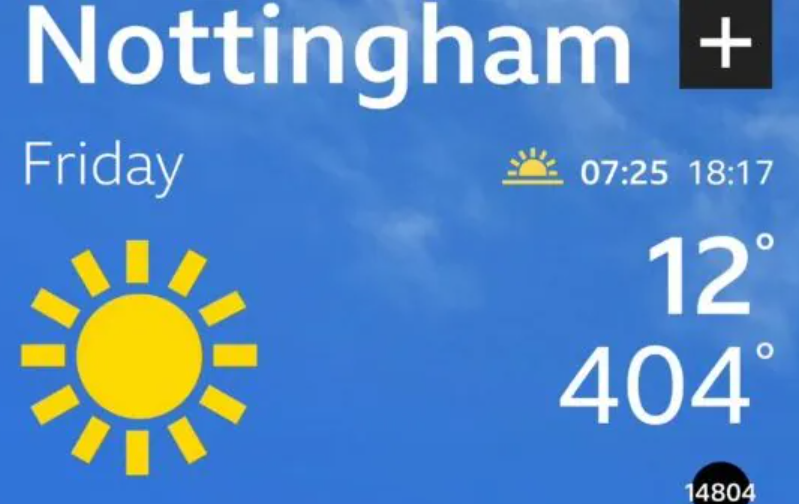
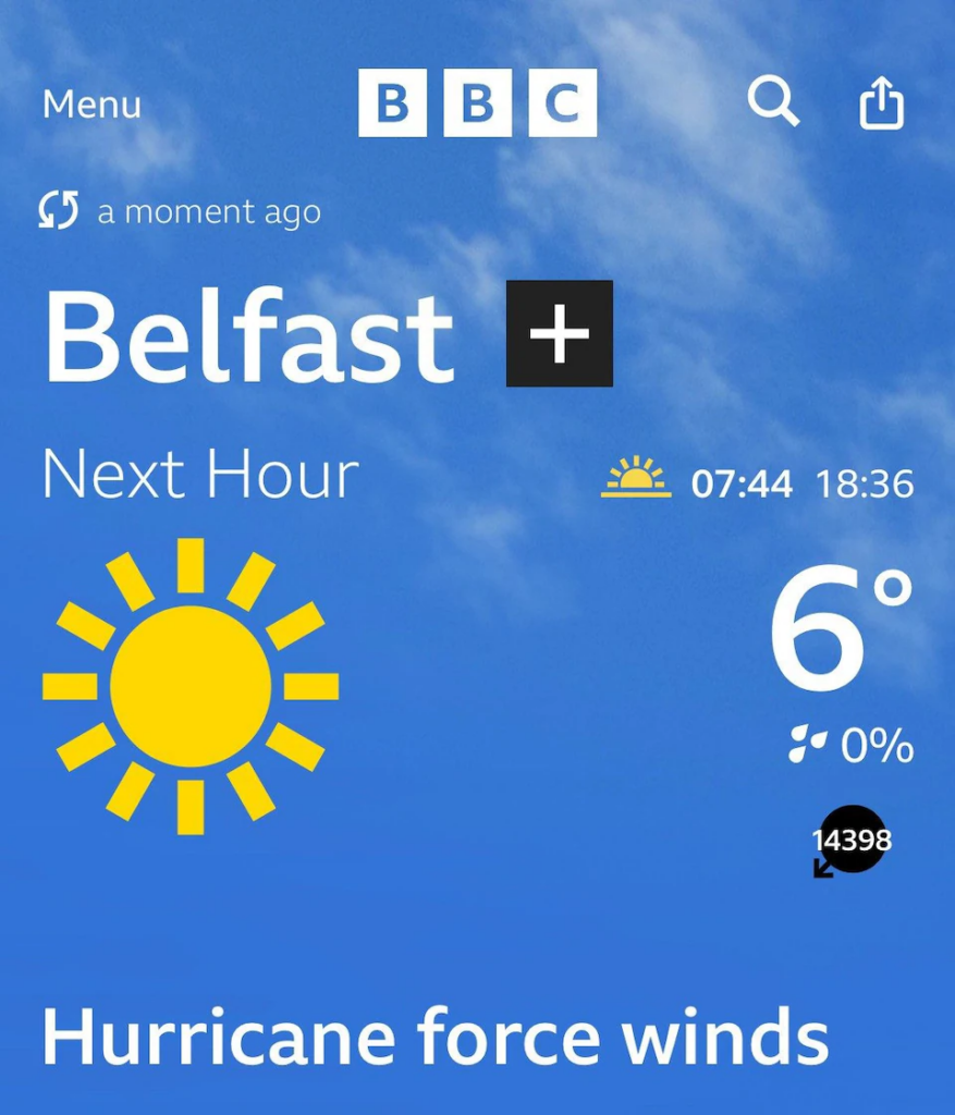
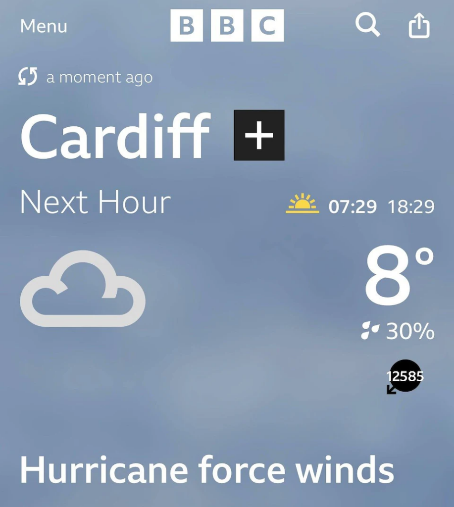
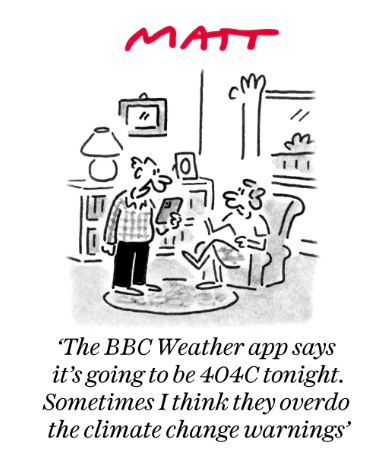
The BBC Weather app incorrectly forecast winds of 15,000mph in Oxford Circus and temperatures of 404°C in Nottingham amid a countrywide software failure. The Telegraph has the story.
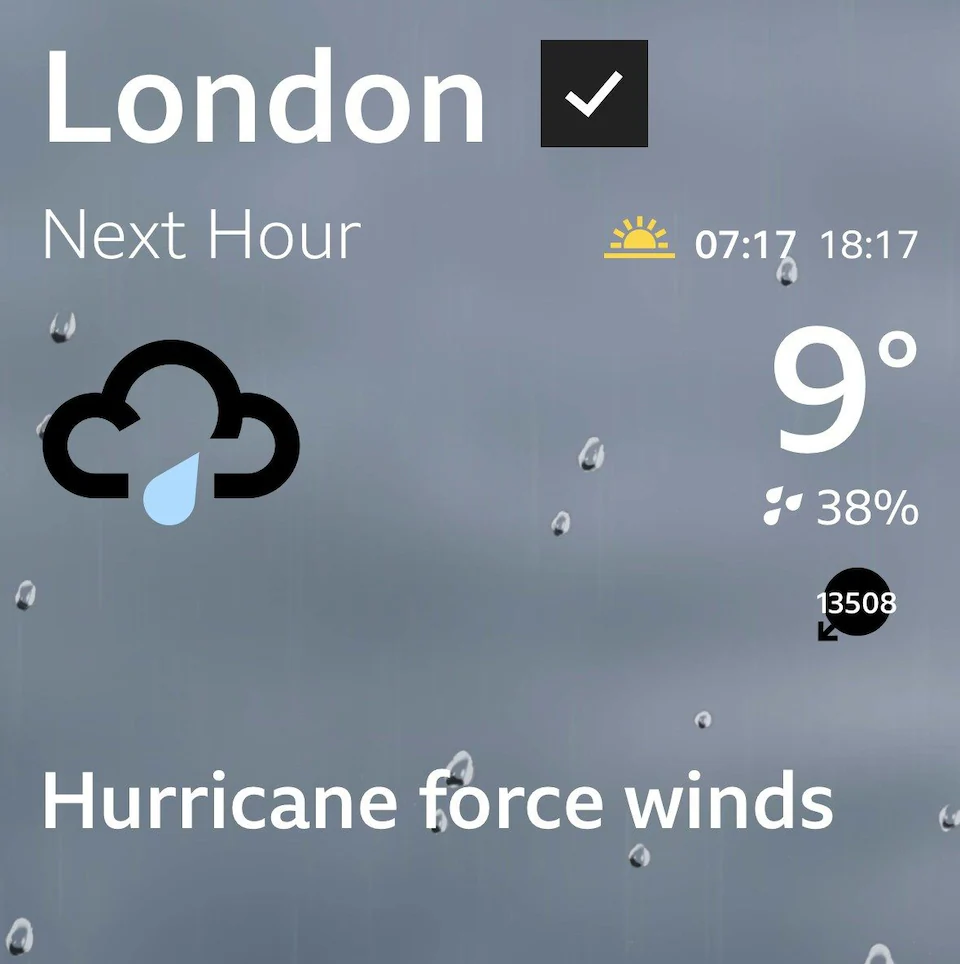
Wind speeds of 15,345mph were predicted in Oxford Circus, central London, while temperatures of 404°C were forecast in Nottingham.
BBC Weather said it was were working to fix some “data issues” on its app and website, and apologised for the inaccuracy.
Commenting on BBC Radio 4’s Today programme, host Nick Robinson said: “If, like me, you’re one of those people who reaches for your phone first thing in the morning to look at the BBC News app or BBC Weather, you might have noticed that there are hurricane force winds in Oxford Circus.
“Let me just reassure you, there aren’t, because I’m in Oxford Circus. I’m afraid there’s just a little problem with the data on the BBC Weather app, which suggests that the wind speed is 350mph – which I think is something of an overestimate – but it is being dealt with, rest assured.”
Co-host Emma Barnett added that Robinson was providing “a live debunking of misinformation”.
It came as Hurricane Milton brought winds of up to 120mph as it made landfall in Florida, causing nearly three million households to lose power.
Matt Taylor, a BBC presenter, wrote on X, formerly Twitter: “Don’t be alarmed folks – Hurricane Milton hasn’t made it to us here in the U.K.! There’s been a data glitch between our suppliers and the app/online. Folk are working to solve the issue.”
UN Chief António Guterres took to X to herald the arrival of his long-predicted global boiling… okay, that bit wasn’t true. But these days, is it that easy to tell the data glitches from the alarmist propaganda?
Worth reading in full.


To join in with the discussion please make a donation to The Daily Sceptic.
Profanity and abuse will be removed and may lead to a permanent ban.
This morning on the BBC a reporter was still calling the, by then category 3 storm that hit Florida as a once in a 1,000 year event.
You could hear the disappointment in their voices as the vehemence kept declining.
I was impressed how a Category 5 storm has reduced to Category 1 in less than 24 hours. Just goes to show how the ocean provides the energy for the winds.
Makes more sense than the usual crap which issues from their mouths.
And at least it’s actually possible on a planet somewhere.
Wind speeds as reported would have been of real use to mankind – such high speed winds would have blown the BBC off the planet.
Praise the Lord.
“We got the misinformation, we got the disinformation, we got the malinformation – but we got no information. So we face no choice but to be defunded for the rest of eternity! Praise be to Marianna Spring!”
Apologies to Precious Little
True, though I believe the bird choppers don’t operate at high wind speeds so no windfall of “clean, green, cheap electricity”
OK the app and or data were clearly in error. But when the particular problems are resolved how will you be able to assess the accuracy of the new forecasts? I’ve noted in other weather apps how past forecasts are no longer visible so it is difficult to work out which supplier of forecasts is most reliable.
Good point
I have both the Apple and BBC weather apps on my phone. Looking a day or so in advance, the Apple one usually turns out to be more accurate. You could argue that a day in advance is not that useful, but any more than that and it seems to become unreliable quite quickly, because of our variable climate. The general temperature range is reasonably accurate but my requirement for weather forecast is mainly will it rain or will it be sunny, and that is hit and miss in the UK.
My requirement for a forecast is more along the lines of ‘should I wear a hat when I walk the dog’?
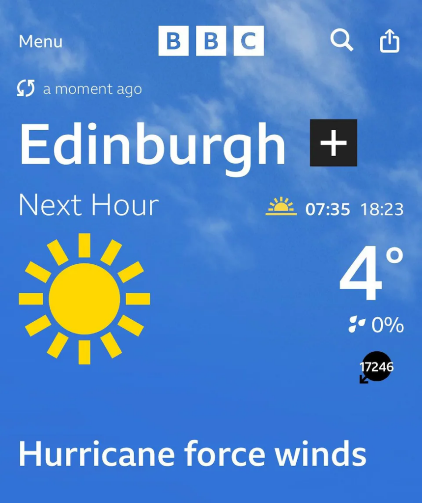
17,246 mph North Easterly in Edinburgh? 22 times the speed of sound? Maybe the dog had better wait…
I find the iOS app very accurate for next few hours forecasting – it often gets rainfall start and stop correct to within a few minutes.
The BBC is not a trustworthy source for anything.
Safety Integrity Level = 0 (or even negative, if that was possible!).
Climate change has finally arrived! Extreme climate blowhards hits British Isle without a warning!
That’s around Mach 20 folks!
These occasional glitches which give rise to ludicrous figures are a source of amusement. However, being immediately identifiable they are harmless to climate data logging. A more serious problem is undetected consistent errors. Three example spring to mind, but these are just the ones that were publicised (eventually) and which I can remember.
#1. The great hemispheric warming of a few years ago. Owing to some fault in the algorithms for translating raw satellite data into temperatures, the temperatures in the Western hemisphere were for a time (months?) recorded as much higher than they really were: notably, the poles were ridiculously warm, being the same as Mexico. The fault was eventually tracked down and is obvious when the data is viewed visually (see attached picture). However, this had already led to overestimates of global warming. I daresay that while the original mistake was unquestioningly incorporated into the official narrative in the media, the subsequent correction was quietly ignored.
#2. The Egg Harbor(?) fiasco. For many days television viewers were shown figures for temperatures in the vicinity of a well-known tourist attraction in North America. Eventually somebody queried why he was shivering on the shores of the lake when the weather report was hot enough to boil an egg. Again, it was corrected, but doubtless the high figures stick in the public mind while the correction is forgotten.
#3,. In collecting temperature data, some investigators (UEA/CRU???) gained access to historical NOTAMs worldwide. NOTAMs are weather information to pilots, and include temperature at airports. The data was sent manually, with the character ‘M’ before a number being used (in place of ‘-‘) to denote negative temperatures. In Siberian winters, which are well below zero, the operators at some airports tended to omit the M, as it was “well-known” to their target audience that “40” meant “-40”. However, when this historical data was harvested semi-automatically to provide evidence of global warming, the algorithm assumed the temperature was positive, resulting in ridiculously high temperatures for Siberian winters. The error was originally eclipsed because, by merging data from the erring airport with the majority of correctly-entered figures, the effect showed up as a small increase in Siberian winter temperature, significant to alarmists but not an obvious error. (There was also a rumour that city officials exaggerated cold to get extra government money during the Soviet era; after that era, there was no point in exaggerating the cold, so the “temperature” appeared to go up in recent decades!)
Obviously the supersonic wind speeds in Oxford Circus will be corrected, but what other consistent errors lurk in climate data, and how does one obtain funding to search for them?
Shorter version: Which part do software errors which aren’t obvious to the casual observer play when creating weather data for publishing?
More important: What about software errors in climate simulation programs? Do theses actually work like the people who maintain and use them claim or are they basically “non-deterministic”, ie, generate random outputs which are then post-processed to show the desired trend?
As these are essentially tools for policy-based evidence making, I think the latter is very probable. An accurate clima simulation showing no catastrophic warming/ climate change would be of exactly no use to the people employing it. Plus, this stuff is technically complicated enough that only very few even have a chance to understand it, hence, it’s ideally suited to hide politically motivated tweaks to the algorithm the model is supposed to employ.