There is an ongoing debate on Jay Bhattacharya and Rav Arora’s Illusion of Consensus Substack, which concerns the recent claim made by Bret Weinstein on the Tucker Carlson show that up to 17 million people worldwide may have died as a direct result of the Covid vaccination campaigns.
This estimate was disputed by Danish scientist Tracy Beth Høeg, and her analysis featured in a recent Daily Sceptic article here.
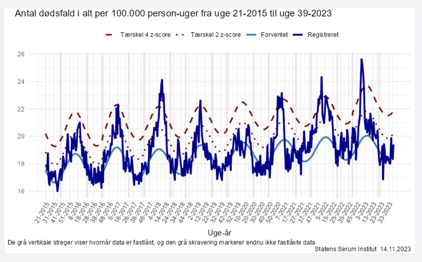
What immediately caught my eye in her article was the chart from Professor John Ioannidis showing the excess deaths of a variety of countries during the Covid period. This chart showed Denmark very near the bottom with no excess death reported at all:

Dr. Høeg then went on to discuss the Danish data specifically, and used them to try to prove that the claim made by Weinstein was not plausible.
I had previously looked at Danish mortality data in my early articles in the DS, and knew that they looked very similar to the U.K. data that I have followed throughout the Covid years. I was therefore somewhat sceptical of the idea that Denmark had little to no excess death during that time.
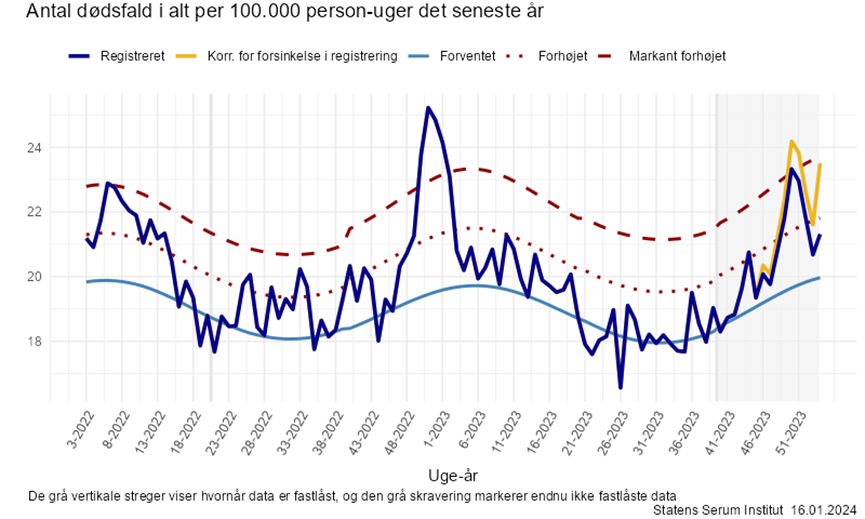
Following the link provided by Høeg to the Danish all-cause mortality (ACM) data for the years 2016 to 2023, the first thing you see is this chart:

It is very clear from this that there has indeed been excess death in Denmark, at least throughout 2022 and 2023, as the dark blue line trends above the light blue baseline most of the time.
Dr. Høeg then uses another chart produced by the same institute, which acknowledges this, but estimates only 6,000 excess deaths during the whole period:

As this does not meet her criteria of finding excess deaths at 0.31% of the vaccinated population, which equates to around 15,000 deaths, she claims that the Weinstein estimate must be wrong.
However the critical line to look at in her reasoning is the following one: “Now of course excess mortality depends on the baseline period you use, so estimates will differ.”
The question is, what is the baseline used in the Danish Institutes estimate of its own excess deaths? It is the wavy light blue line in the chart above, which marches steadily upwards throughout the whole period.
So, I downloaded and analysed the raw data. The expected number of annual deaths starts at 52,957 in 2016 and ends at 58,456 in 2023, a rise of 10.4%. I then checked the population data for Denmark and discovered that the figure changed from 5.728 million in 2016 to 5.911 million in 2023, a rise of 3.2%.
As Denmark has a diminishing fertility rate, in common with most of Europe, this rise is mostly through immigration, which is primarily of working age adults. The great bulk of annual mortality is always derived from the older generations, so even a gradual rise in expected deaths of 3.2% is highly improbable.
I therefore took the weekly figures for actual deaths during the four pre-Covid years of 2016-2019 and averaged them out for use as a more realistic baseline. The annual ACM death rate baseline would then be 56,232 persons. Here are the annual deaths for the four Covid years:
- 2020 58,473. Excess: 3.99%
- 2021 60,064. Excess: 6.81%
- 2022 62,262. Excess: 10.72%
- 2023 61,005. Excess: 8.49%
The average for the three vaccination years of 2021-2023 is 8.7%, which equates to 14,634 persons.
However there is one other very important factor that is missing from this analysis, and that is mortality displacement (MD). When there has been a period of excess death it should normally be followed by a period of deficit, as Andrew Bridgen recently pointed out in his address to the Westminster Hall debate on trends in excess deaths.
The older the cohort where the excess death has occurred, the faster this deficit becomes apparent in the statistics. As the average age of death due to Covid was around 80 years of age, this is obviously a cohort with relatively few years of life remaining. Crucially also, this cohort comprises about two thirds of normal expected annual mortality, so the deficit in the subsequent years will amount to about 9% of the cumulative excess deaths.
What this means in reality is that rather than pointing upwards, the light blue line in the Danish statistics ought to have been trending downwards significantly, as the cumulative excess increased over time. If you factor in the mortality displacement to the Danish figures you get the following result:
- 2020 58,473. Excess: 3.99%
- 2021 60,266. Excess: 7.17%
- 2022 62,809. Excess: 11.70%
- 2023 62,094. Excess: 10.42%
The average for the three vaccination years of 2021-2023 is 9.8%, which equates to 16,471 persons.
This level of excess mortality does meet the criteria that Dr. Høeg was searching for in the Danish data. It also poses the question of credibility for the Ioannidis analysis of the other 33 countries in his chart. If his interpretation of the Danish data can be so easily fudged so as to make deaths look ‘near normal’, then one might assume a similar process has occurred with all the others too.
The answer to the question of to what extent vaccines were involved in these excess deaths can however only be determined when record level data, linked to vaccination status, is released. The recent refusal of Steve Kirsch’s request to the ONS (aided by prompting from Andrew Bridgen) does not bode well in that regard.


To join in with the discussion please make a donation to The Daily Sceptic.
Profanity and abuse will be removed and may lead to a permanent ban.
Loving the meme collection! What I find hilarious is that these brain-damaged vax junkies are actually broadcasting the polar opposite of the message they’re trying to convey. “Stay the hell away from these shots that blatantly do not work!” should be the subliminal message.
And in the spirit of humour, here’s my offering. This video is from 2010 but has aged incredibly well. And guess who it stars……?
https://rumble.com/vtw2ot-vaccine-zombie-music-video-2010.html
It demonstrates that the propaganda worked, in as much as he seems to believe that all it does is to mitigate the symptoms. Which is what the manufacturer said, near enough, along with his apparent belief that it could have been worse if he hadn’t used it.
A bit like Ivermectin then, but you don’t have to plan weeks ahead with that.
I wonder how many teenage girls he passed it on too
This…
LOL
Great Memes. They almost write themselves. Memes are getting so good, I struggle to twig what’s satire and what’s not anymore!! Or maybe it’s something else.
Something very odd is happening when these people keep telling you that they have had the ‘cure’…many times…but still got the disease…LOL!
They don’t even appear to be vaguely aware of how ridiculous they are and is seems to have become another covidiot … ‘badge of honour’ ….
Metatron is Joel Smalley, who along with Dr Claire Craig, were two of the first people I found who were speaking out against the agenda, and they have been consistently excellent….they are both worth following…..
You have to let them cover their embarrassment by claiming it ameliorated their symptoms, however you can content yourself by knowing that is why they said it. They are embarrassed to know they have been duped.
The Branch Covidians are not exactly known for their common sense, lol.
“I’m grateful to be vaccinated and boosted, which has kept my case mild” – That’s clearly an assumption. An awful lot of what’s claimed to be science is based on assumptions but stated as if it’s fact. Gullible and naive people aren’t aware of the difference.
This is quite telling (in German).
The German military is 100% vaxxed and boosted. Being German AND soldiers, it also tests for, tracks and records its personnel’s infections thoroughly.
Due to a FOI request, it just became public that the incidence rates in the military were always about twice! as high as the ones of the general population, demonstrating the sofar clearest correlation between high vaxx rate and high infection rate. https://reitschuster.de/post/bundeswehr-daten-belegen-hohe-impfquote-korreliert-mit-hoher-inzidenz/
Does anybody really believe Billy C has been triple jabbed and boosted?
“I did not have sex with that woman.”
You’re not supposed to take the jab for a few months after a case, so a positive test can be an excuse (for someone who wants it) not to get the booster for a while longer.
The satire literally writes itself, lol
I swear, if Trojan made prophylactics anywhere near as leaky as these jabs, they would have been sued out of business a century ago, lol.
The fact that he has to announce the fact that he has, apparently, caught something tells me all I need to know. Why not just stay at home and stay quiet? Why the constant need to inform his followers? Does he advertise his constipation? Does he tell the world that he’s got the sniffles? Of course not, he’s advertising vaccines or the gene therapy treatments that pose as them. He’s a salesman. That’s it.
And not a very good salesman Aethelred. The best salesman sell you without you noticing or leave you with a warm feeling after you have bought.