Global pause, plateau or cooling – or, if you are reading the political climate narrative in mainstream media, are we heading for almost immediate climate Thermogeddon? Earlier this year, we published a graph showing satellite temperature measurements since the start of the latest pause up to March 2022. It indicated a global cooling trend of 0.14°C a century. Another five months on and the near eight-year pause continues, as does the almost unchanged cooling trend. Since the high point back in 1998, global warming has run out of steam. A pause from that date to about 2012 has now been followed by the latest eight year hiatus, with just a two-year period of mild warming in between.
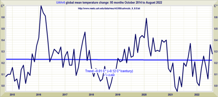
Not a lot of cooling, it might reasonably be noted, and we are still operating within a fair margin of error. But measuring climate change is about trends, not making fanciful, one-off claims that human activity causes Pakistan’s flooding during the monsoon season or causes summer heatwaves. The current temperature trend could be heading downwards, and if it continues the scientific arguments for Net Zero simply disappear. That of course is why you will never see the above graph in the mainstream media.
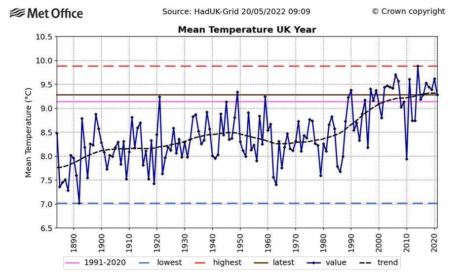
You probably will not see the above one either, even though it’s compiled from Met Office figures. This graph plots the average temperature of the U.K. going back to 1880. The temperature trend is not dissimilar to most territories within the populated northern hemisphere. There has been a little warming over the last two decades, mainly around a very strong El Niño natural oscillation in 2015-16. But the curve is clearly flattening. In fact, according to Met Office figures, the 2010s were actually colder in the U.K. than the 2000s. In the past, the average temperature rose by about 0.4°C from 1910 to 1945, fell after that date by about 0.25°C to 1970, and then showed a rise over the next 30 years of around 0.7°C. The slowdown set in around the start of the millennium. Throughout these periods, carbon dioxide continued to rise in the atmosphere.
Is it possible from data and trends such as this to reasonably conclude that humans control the climate and are causing untold damage? Damage, of course, that can only be remedied by imposing a command-and-control Net Zero agenda? One looks in vain in the recent temperature record for any obvious link between rising or falling numbers and higher CO2 emissions. Similar disappointment is to be found when attempts are made throughout most of the historical and paleoclimatic record.
Before he died, the Earth Sciences Professor Bob Carter said it was remarkable that given the expenditure of time and effort since 1990, no summed human effect on the climate had ever been identified or measured. “Therefore the human signal most probably lies buried in the variability and noise of the natural climate system,” he said. The Daily Sceptic has published extensively on past climate changes, showing periods when abrupt movements occurred over very short time periods. Professor Carter notes that compared with the ancient climate record, “temperatures during the last 20th Century were neither particularly high nor particularly fast-changing”. The warming within the 20th Century fell “well within” the natural rates of Holocene warming, as shown by high quality ice core records, according to Carter. A warmer or cooler planet than today’s is far from unusual: “Nature recognises nothing ‘ideal’ about mid-20th Century temperatures,” he added.
It is difficult to promote a climate scare with plateauing temperatures, so most of the effort has been switched to catastrophising natural disasters and single event ‘extreme’ weather events. But much of the narrative is fuelled by the often adjusted and modelled surface datasets that show higher recent warming than those produced by the satellites. Since 2013, the Met Office has made two adjustments to its HadCRUT global dataset, adding 30% more warming to recent temperatures. The 1998-2012 pause is no longer visible in the latest HadCRUT5, despite the Met Office writing about it in 2013. In his essay, Professor Carter drew attention to the measurable effect humans have on local climate caused by building towns and cities that absorb radiant heat from the Sun. The local warming is known as the urban heat effect and it is evident in many of the rising temperatures reported by surface datasets.
It came to light recently that a specialist dataset, designed to remove all urban heat distortions, has been compiled by the American weather service NOAA. The U.S. Climate Reference Network (USCRN) shows little evidence of a warming trend between 2005 and May 2022. When NOAA set up the 114 station project in 2005, it noted that it was aiming for “superior accuracy and continuity in places that land use will not likely impact during the next five decades”. Perhaps unsurprisingly, NOAA never mentions USCRN in any of its monthly or yearly public climate reports these days.
Of course, a surface dataset that has been given a little extra warming, and is corrupted by the urban heat effect, can continue to be used to proclaim continuing record temperatures. This feeds into what seem like increasingly desperate attempts to convince people that climate modelled claims of a 3-4°C rise by the end of the century is likely, absent Net Zero. The recent warm summer over large parts of Europe was of course mana from heaven for the climate alarmists. It was undoubtedly hot and records might have been broken. But just how hot was it in recent historical terms? There was a high temperature of over 40°C recorded at RAF Coningsby, set yards from the runways used by a squadron of after-burning Typhoon fighter jets. And it was replicated at Heathrow, another airport, as well as at a weather station just yards from one of the largest tropical greenhouses in the world at Kew.
But individual temperatures, however high or low, are not evidence of long-term changes in the climate. Paul Homewood has compiled this graph from the longest continuous temperature record in the world – the Central England Temperature Series.
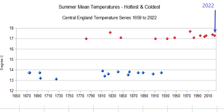
According to Homewood’s reckoning, it was much hotter in 1976 than 2022. Indeed it was hotter in 1826 and 2018, and this summer was no hotter than 1995 and 2006.
If we look back in the paleoclimatic record we would be bound to find countless summers that were hotter than 2022. Something to consider when you next see ‘ever’ tacked onto a media report promoting another climate scare.
Chris Morrison is the Daily Sceptic’s Environment Editor.


To join in with the discussion please make a donation to The Daily Sceptic.
Profanity and abuse will be removed and may lead to a permanent ban.
The BBC need to examine THEIR biases, urgently
They’re institutionally oikophobic.
How many is it now? 10? 20? 100?
I was going to go for a walk this afternoon, but I’m so weighed down by the burden of white privilege that I think I’ll just stay home instead.
The BBC is a lost cause: no further comment possible.
Going for a walk is racist.
‘Going for a walk’ is a blatant misuse of a distinctly middle class interpretation of white privilege.
Only if it’s in the countryside
It’s anti-“covid” restrictions too. The fines must be eyewatering…
Loads of money is being spent making the countryside more ‘accessible’
Yes, they need to remove all those signs in the countryside saying ‘people from ethnic minorities are not welcome here’. At least, I presume there must be all those signs otherwise non-white folk would be flocking to use the countryside the same as white folk…??
“….being white might give you certain advantages – for instance you are more likely to see people who look like you on TV”.
The person that wrote that plainly doesn’t watch much TV.
or instance pre arch tyrant blair you used to be more likely to see people who look like you in the street
I think to be fair that you’re still more likely to see White faces, overall.
You will however see other faces heavily over-represented.
Well, I say that, but we’re still waiting on the 2021 census results.
I lived in Nigeria. There are more blacks than whites.
How did you get on when you urged them to educate themselves about their black privilege?
I know a Welsh Eurosceptic who was an honorary Yoruba tribal leader. A complete myth that UKIP are somehow racist.
You’re not more likely though, unless you’re very selective in what you watch.
Clearly not written by a mathematician.
Down here in the South West, we’d long ago assumed that we were the last white folk left in England.
Nah, there’s some in Copeland.
It is also suggested that parents “could talk about how being white might give you certain advantages – for instance you are more likely to see people who look like you on TV”.
Err, not if I watch the adverts.
And not if you watch a BBC drama.
Misomer Murders were in trouble for being too “white” weren’t they? And the new Dunkirk film.
Exactly. They’ve got it backwards in that TV is being “wokeified” to be more inclusive of minorities such that everybody has the same chance of seeing people who look like them on TV, regardless of their race! Cue a reality check.
I have an Asian friend, very dark skinned, who said to me couple of months ago “Have you noticed that nearly every advert on TV features a mixed race couple? What’s going on?” I had of course, noticed, but if I had said the same thing to any of my left-wing friends (oddly enough, most of my friends are left-wing) I’d have been called a racist.
It’s very rare to come across a TV advert that actually reflects what society in this country looks like. I spoke to an agency recently who said they are constantly required by the production companies to find black and Asian actors for adverts, and that it is actually very difficult to do due to real-world demography.
that’s cos the Marketing Depts of the Co.s that buys the ad space are infested with ESG acolytes
Which tribe owns most of the advertising agencies?
Can’t believe companies pay them to openly mock their customers.
https://www.youtube.com/watch?v=YYucMt0vrXg
As opposed to those light skinned Asians in Siberia.
The entire media is a farce.
Load of cobblers. It completely depends on the colour of the people around them in their social circle / school, etc. If most of them happen to be white (demographically more probable in rural areas, for instance) then they will be friends with them, rather than seeking out black or brown children in the neighbouring county in the name of racial impartiality!
I do live in a rural area, where 90% of the inhabitants of the county are white. Despite that, my nephew and niece (both primary school age) are good friends with the kids of a Ugandan family who live down the road from them and go to the same class – not by virtue of them being black or Ugandan, but simply by virtue of their living a few houses down from them!
Children are born racially impartial – they will never become racist unless they’re taught to be!
Spot on.
“they will never become racist unless they’re taught to be!”
Exactly. And it’s people like Uju Asika who teach them to be racist.
It’s a mistake to waste your time trying argue/reason with this BS. Simply call it out for what it is: cultural Marxist social engineering with the intention of breaking the people of this country.
We were a nation of white people, and still predominantly a nation of white people. Therefore the racial attack is being waged against white people.
This has never been about non-white victimhood.
Well said. And it isn’t just us dealing with this nonsense.
If you’re children are finding it difficult to find black friends to play with, there are lots of Pakistani males who hang round pizza shops and taxi firms who would love to entertain them.
Actually all children gravitate towards people that look like them. This has been studied almost to exhaustion. Black toddlers drawn to other black toddlers etc.
This is normal. The elite’s obsession with racial differences is what is abnormal.
Maybe a lot of white kids don’t have black friends because the idiots at BLM, the BBC etc. have convinced black kids that their white peers are the enemy/likely to oppress them so they don’t make friends with them.
First ‘Breath is Death’, now it’s ‘Solidarity is Division’
My grandchildren live in a town with a population of 12,000. They are almost all white. There is just one black family in the town; I think there are two Asian. There are no black children in my grandkids’ school and they have no black friends. This is nothing to do with bias (my 9 year old granddaughter is a big fan of Rosa Parks!) but entirely due to demography.
I will be doing all I can to safeguard my children from the BBC.
Dont we have bigger things to concentrate on other than whether my 6 year old’s friends are 15% black, 10 % Muslim, 10% gay, 0.0000001% transgender, 5% ginger haired, 7% disabled, 8% Asian, 3% Roman Catholic and 50% below average height.
I have my priorities right even if the BBC doesnt.
And 75% below average IQ which is the norm these days thanks to State education, education, education and the morons who have colonised teaching.
Do you though? This is propaganda to prevent you speaking out against the actual problem of population replacement. Is that a priority for you, the world your children and grandchildren will live in?
On a positive note, it is good the BBC is an outlet for this drivel and the intellectually handicapped that think that way, so we can see the infestations in our society.
Does your child have Black or Brown friends over for playdates? Could you be doing more?
Okay – I could do more.
Ill start by explaining to my children that black, brown and white are adjectives and do not require capital letters.
To capitalise selectively on the basis of skin pigment to imbue the adjective with ‘importance’ when compared to the non-capitalised adjectives is racist.
And so is her internal bias against Jews… why weren’t they mentioned as desirable playmates?
Correct. And if I’m not mistaken, every instance of the word “white” in this article is lower-cased! What’s with that?!
Exactly…..
Though we could be generous and put it down to typos.
If not that would make typing racist wouldnt it?
A bit like maths is according to Durham university.
Perhaps they ought to examine the local environment of nearly all non-urban dwellers to realise the opportunity simply doesn’t exist.
Important proviso the BBC forgot to mention.
Your child must NEVER be friends with anyone whose family:
Voted Conservative
Supports the UK
Is aristocratic
Has a Union Flag
…..
Or drives a diesel car
Eats meat
Has a gas boiler
Or voted to leave the EU.
Gosh, I tick all four of those boxes!
Ladies and gentlemen – We have ‘Royalty’ amongst us.
owns their own house
despises the MSM
thinks Russia may have a point
knows that NATOEUUSA are a terrorist organisation
Thinks the WEF is a really, really bad organisation
This, yet again, goes to show the smallness of the BBC’s world. They will be horrified to discover that, beyond the leafy bounds of Islington, there are massive areas of the country where everyone is white. In my village of around 1000 people there are only white British, so it would be a bit difficult to find your child a black or brown playmate – unless we start bussing in suitably coloured children. The large majority of this country is white, but you would never know it from tv, would you?
It’s like what’s on the Hate-screen is totally unreal propaganda that in no way represents this country, and all the shows are there to nudge your thinking.
I agree, we are largely a white country still, but if you look at adverts on the TV, you’d think we were in Africa.
Don’t know if anyone else has noticed, but in the advert for a new delivery company, the delivery driver is white-ish, but every customer to whom he delivers is black.
Is this a big problem? How many toddlers in the UK today are White British?
Nearly 1 in 3 children born in 2020 were to immigrant (foreign-born) mothers. The ONS doesn’t even want to talk about ethnicity.
We are being replaced. When the penny finally drops it will be brutal. All avoidable.
Clearly the BBC should “Examine Their Biases” if they are driving the population nuts with their woke agenda while gleefully extorting money from us for the privelege of watching/listening to it .They won’t do so of course, they’ve been allowed to be a law unto themselves for far too long. Then they act with surprise and anger whenever there is talk about changing to a subscription basis.
An anachronistic institution that’s amazingly up itself and way beyond its sell by date.
I was treasurer for a preschool for many years. At no point did we have any black or brown children. None live in the area. Nobody is racist or has biases.
I asked a black friend of mine if she’d consider a move to the countryside & she said no as she didn’t want to stand out & be different. This is very human & I totally get it. But it’s not racism.
People are so keen to think the worst of each other.
White privilege, toiling for a pittance to build the infrastructure before others from elsewhere come to reap the benefits of employment they provided then more than likely, going into a workhouse until you die
It still about £8,000 per year in infrastructure.
Any migrant earning less than 26,000 won’t pay enough in tax to break even.
£250,000 per child to educate them. When it is the occasional Dutch or German couple, no problem. But the average number of children Somali women have is 5.7. it all adds up.
yet the cat chewing kids can’t add up after that malinvestment.
Floella benjamin arrived from Trinidad aged 10.
“Many of the childhood experiences in that new culture,and unbelievably hostile environment,were character building. They gave me the tools and fortitude to become the person i am today.”
Barroness Benjamin OBE
Pick a window or door ms Asika but do leave quietly.
I think we are all a little tired of hearing about the hardships of those who voluntarily came to our country.
This must be the same Floella Benjamin who was distraught because she couldn’t see enough people who looked like her on TV. Well, Floella Benjamin doesn’t look like me, so obviously she has nothing to say that could possibly be relevant to me.
The BBC is a political campaigning organisation – the news and entertainment operations are there to provide funds and give them access to the public, but their purpose is to change society, to change public opinion.
The BBC are now just paid puppets for the WEF and the global corporate and political cartel.
Precisely. And this is a classic tactic. Accuse you of not having enough minority friends with the implicit assumption this is the norm in a northern European society, that we are an ethnic mix.
That takes you one step away from the norm, and that bit harder to ask the obvious questions about mass immigration and the inability of many to assimilate.
By continually reminding us we are not living up to this false ideal we become unable to ask why we have any non-whites here at all. We were never asked to vote on this.
I was talking to an acquaintance of mine once. He had moved to my multi-ethnic city from some provincial place in England. I asked him what his home town was like. His answer “It’s full of white people”. This was 10 years ago. The propaganda had already done the job on him.
It is concerning. You’ll note there is rarely any news of South Africa as it demonstrates too readily the problems our children will face.
Population of England and Wales by ethnicity
https://www.ethnicity-facts-figures.service.gov.uk/uk-population-by-ethnicity/national-and-regional-populations/population-of-england-and-wales/latest
The most recent government figure is 21% non-white. My own estimation is 35%.
Where I live there has been a massive influx of subsaharan Africans in the last two years. I was not allowed to leave the country but somehow huge numbers of Africans have come here.
But first, here’s nasty little race baiting grifter Uju Asika to examine her own biases and racism…
Is it ok for black children to have only black friends?
Yes no probs. It’s called white privilege
Talking from considerable experience, “being as direct as possible” is rarely considered as “being kind”, in fact quite the opposite.
What this clown really means is, be as direct as possible whilst using inclusive language, which is a contradiction in terms and achieves absolutely nothing for mankind.
Achieving things means upsetting people.
If you have no enemies, you’re not doing anything worthwhile.
Is there equivalent advice for parents whose toddler might only have black friends, or Asian friends? Or is bias strictly limited to white people?
WARNING. Your comment is not OSB Compliant and will be removed.
To avoid removal, please edit your comment according to Section 32, Paragraph 18, clause 23.iv, titled “This only goes one way.”
It’s none of the BBC’s feckin business who our grandson has as friends.
I think I know what my biases are, and they are none of the BBC’s business, and as of now I am pretty happy with them.
withdraw their funding. Stop paying Al Beeb’s tax.
I have. Join us.
Are we equal or are we not? That is really what all this crap comes down to. If some people do not want to integrate then they will not and that is their choice. I’m sick of being racially abused because I happened to be born an English, white (I’m actually a kind of brown, very few are white) and heterosexual male.
No, we are not equal.
**** the BBC
Don’t forget children, the most important thing in life is the colour of your skin, not the content of your character.
As a counterbalance to the BBC’s argument, I would invite them, or anyone else for that matter to watch a broadcast from India, China, Japan, the Middle East, or Africa, and count how many people you see that aren’t from that demographic on their screens.
They would automatically be derided as being non inclusive and racist.
Racism is an official part of the Chinese school curriculum. They are flattering towards Europeans, but blunt about Africans and Indians. Their travel advice is equally blunt. They even warn their citizens about travelling to London because of the ethnic mix there, especially women.
The world does not share our rosy view of racial and cultural mixing. They understand how precious homogeneity really is.
I have only read a couple of sentences but this is PMSL funny.
Your grandchildren may not find it quite so funny.
Next there will be FB messages going out to parents from nurseries and After school clubs:
The George Floyd Nursery for Underprivileged Children of No Colour have a request-
Can we borrow a couple of blacks or browns?
Owing to a massive reproductive failure in the People of All Colours demographic during the disruptions caused by Lockdown 2020 -2022, the George Floyd nursery is appealing to those parents of colour with toddlers to please come forward and register with our nursery.
Preferential rates are available.
Please note, this may seem offensive but the intent is to hi-light the craven and insulting wokery of corrupt organisations such as the BBC which seeks only to rip asunder the communities of this land.
Here down in the South West, that applies to most rural babies. But then, the BBC turned its back on rural people decades ago. We’re horrid, monocultural and tend to vote Tory. Tho’ Johnson’s doing his best to bugger that up.
The indigenous Brits are being ethnically cleansed by the Tories and Labour.
We are only being colonized. The ethnic cleansing will come later, when we are a minority.
This is weird advice as in many parts of the world the tensions are between people of the same colour who look pretty much the same. Northern Ireland would be an example near to home and in Eastern Ukraine the tension is between the ethnic Ukraine and the ethnic Russian but most of us could not tell them apart. In parts of the UK there is still tension going back to the English civil war (seriously, yes there is), if you are from a Cavalier town do your children know any children from a Roundhead community? Much of Africa is riven with tribal tensions, you and I might struggle to tell the difference but they surely know and some of these tensions are very bitter.
The advice given seems to imply that if you cannot see the difference then there is no difference when in fact the differences between people who look the same are some of the most bitter and fierce of them all.
No multicultural society has ever survived never mind flourished. They know that. This is to create a cowed population trained to not speak their minds for fear of censure.
Covid lockdowns would not have happened in 1950s Britain. Mass immigration has many benefits for our rulers.
It’s coming back to me, as a child if someone started telling how to behave my first thought would be, if only I could put into words what I would actually like to say to this arse and get away with it! A little like the government speaking double dutch through a proxy such as the BBC.
Pure bigotry and racism, dished up by the HQ of Division, Hypocrisy, Self Righteousness, Greed and Profligacy.
HMG needs to put the kibosh on this foetid sewer as soon as it can.
Why would they do that?
The irony is that these clumsy, cringeworthy, race-obsessed tactics and sermons are more likely to cause racial division. I can’t be the only one who is sick of being lectured? The football fans who booed the kneeling idiots felt the same way. The sense of being constantly hectored and harassed for the sin of having white skin in a northern European country. It is deeply judgemental. And it also generates a visceral hatred of the disgusting imbeciles who peddle this annoying tripe. To hell with them and their ideas.
You are being eradicated. This is just the opening salvo. It will get much worse.
The intention is to cause racial division. A bit of argy bargy keeps an awful lot of so-called multi cultural issues in jobs. Here in Oldham the council love to tell us how strained race relations are, but they’re not.
Racial harmony will cost some people their jobs, much better to stoke up tensions. It’s like big pharma, the last thing they need is healthy people. No money in it.
Spot on….’divide and rule’ underpins policies across the board…probably the raison d’etre for ALL policies.
Tory government with 80 seat majority and its total failure to tackle cultural Marxism sees this state owned media behemoth engaged in endless terrorism against the population that pays for it. What a vile state of affairs.
Same in every western country. We are ruled by the private fetishes of an elite of which forced mixing of cultures is just one.
”Elite”?
What about black children who only have black friends?
Totally EVIL tripe from the parasite classes.
I’m looking forward to the 2021 census results being released.
Between 2001 and 2011 the “White British” population declined overall, but increased in my constituency, Corby, because of “white flight”: lots of people wiv Essex accents.
I’m sure the 2021 census will show that both processes have continued.
My village was 99% white at the 2011 census, with the non-whites mainly being the mixed-race children of white mothers and black fathers who had buggered off.
I think the 2021 census will show us being 98% white.
I have seen absolutely no evidence of the non-white children being excluded.
So if they can’t groom your kids into genital mutilation they want to enrol them in a street gang?
Teachers will have your kids coming home with government approved facial tattoos ready for the school to prison pipeline.
It’s Homeschooltime.
The BBC is ‘racist’ – anti-White racist!
Why are the lads at the bbc allowing this woman to write anything?
These people are dangerous, they should all be locked up and throw the key down the drain!!!
Sorry, but as a progressive parent, I’m far too busy right now – trying to ensure my lot have oodles of trans, non-binary, and gender-fluid pals while questioning their own sexual identity – to worry about other stuff.
Look on the bright side. At least, with the Beeb, you don’t have to endure those
banal, politically-correct TV ads which depict the UK as multicultural paradise full of happy, ethnically-mixed families.
Maybe one day this will be reality. But until then can we cut the fantasy propaganda, which I suspect is as counterproductive to selling products as it is to promoting integration.
High time that referring to race or colour in any context was stopped completely. What has external appearance to do with anything? Absolutely primitive. Nobody is “white” and nobody is “black”. We are all shades of brown even varying with the seasons. So just stop it all now and get out of the primeval soup.
Which black American actor was it who said that the way to stop ‘racism’ is to stop talking about it?
So glad I stopped paying the TV tax last year. I recommend everyone who’s unhappy with the BBC do the same. Removing their funding is the only way to show dissatisfaction, they won’t listen to anything else.
What a load of patronising garbage.
The lack of self-awareness of the dimwitted liberal oiks who write this tripe is quite stunning.
Why is it that this stuff is produced by only non-white people.
When did the majority start living by the rules of the minority?
Yes I know, I am now a racist. Or have always been.
The BBC needs complete reform.
This is what I’m experiencing, parents of colour not allowing their children to mix with the white children but instead choosing to mix with each other, excluding the white children..
Oh dear, oh dear, oh dear…I guess I should also look at my biases since I don’t seem to have any friends other than white or slightly brown ones and certainly no black ones in my immediate circle. At the very least, I should be forced to learn about my white history of oppression in a re-education camp and then go out and actively seek some black friends of my own. Hang out in cafes with a foolish grin and make small talk with anyone of another colour other than my own entitled one and get phone numbers and make picnic dates etc etc. What a load of (insert profanity here) nonsense. The BBC are totally out of order here and have no business getting involved in family life. If I met a black person and we got on like a house on fire, laughed at similar jokes, took the micky out of each other and generally had a good time then yes that person would be a friend of mine. I don’t have a problem befriending anyone of any hue, religion, creed, nationality (including Russian), weight, shape or gender. They can be what they like BUT first we have to get on and that is a question of feeling a connection and to feel a connection, there need to be some shared experiences, likes, viewpoints and importantly humour otherwise it’s a fabrication.
Excellent summary.
As with most things BBC they should be told to stick it where the sun don’t shine. To think we’re paying for this sh1te beggars belief.
When I was a child back in the 50s we had none of these problems. We lived peacefully in our own land among our own people. Nobody asked me if I wanted this to change, it was in no manifesto that our country should change beyond all recognition demographically, giving us the extensive problems we have today. What folly it was. Was life better in the 50s? Absolutely it was.
Some kids live in predominantly white areas so have white friends and vice versa.
I have 5 grandchildren under 11 and we don’t push any colour agenda. If you make a big thing about it you’re likely to turn them into racists. Despite living in a white area they have a few coloured (or whatever the hell your “allowed” to say) friends and seem oblivious of it – as they should be.
The girl (white and blonde) chose a “brown” doll last week and no one commented – which is how it should be.
I’ve always been under the (obviously false) impression that the BBC’s job is to report what’s happened in the world – to inform us – and to entertain us. How much clearer does it have to be that it’s trying to “educate” us, to “teach” us what to think, how to behave? Yet still people watch it, I’m told.